2023 Primera POP-UP @amore_seongsu
Concept
We organized a pop-up store for customers to understand and experience the skin barrier solutions of Primera, a seed technology-based brand.
Inspired by Primera’s sensual brand video, the space was organized under the concept of “THE EVOLUTION-FROM SEED TO SKIN BARRIER”. Inside the pop-up store, customers are invited to take a journey from 1986, when Primera began, to the present day, and understand and experience Primera along the way.
01. Outside
The visitor’s journey begins in the first space of the pop-up, where Primera’s ‘seed’ is presented as a central art object.
The exterior installation, featuring a car and a giant seed reminiscent of those in the brand’s video, is designed to harmonize with the garden behind it.
Strategic lighting and brand posters enhance the scene, creating an immersive feeling of having stepped directly into the video itself.
This large-scale installation serves as a powerful focal point, capturing the attention of both pop-up visitors and passersby in the vibrant Seongsu neighborhood and sparking their curiosity.


02. Check-In
This area serves as the entry point where visitors collect their tickets before embarking on the Primera journey.
To ensure the pop-up is accessible to international guests, tickets are provided in three languages: Korean, Japanese, and English.
In this space, posters and short videos offer a final introduction, setting the stage for the experience to come.


03. Reception
The ‘SINCE 1986’ space is dedicated to showcasing the brand’s history and seed heritage.
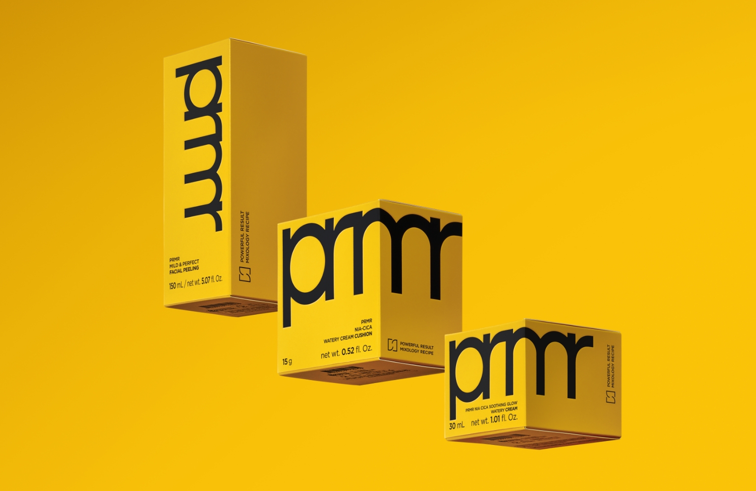
Four different types of content, including Primera advertisements from the 80s and 90s, are played across seven retro CRT televisions. Detailed touches, such as brickwork and vintage film reels, are used to create an authentic, nostalgic atmosphere. In a striking contrast, a vibrant ‘SEED YELLOW’ vinyl graphic extends from the floor up the main wall, serving as a screen for projections of Primera’s current brand video. This allows visitors to witness the brand’s full evolution, from 1986 to the present, all within a single, immersive space.
Four different types of content, including Primera advertisements from the 80s and 90s, are played across seven retro CRT televisions. Detailed touches, such as brickwork and vintage film reels, are used to create an authentic, nostalgic atmosphere. In a striking contrast, a vibrant ‘SEED YELLOW’ vinyl graphic extends from the floor up the main wall, serving as a screen for projections of Primera’s current brand video. This allows visitors to witness the brand’s full evolution, from 1986 to the present, all within a single, immersive space.


04. Hallway
This transitional space connects the Reception area to the Garden Lounge, using posters and a continuous ‘SEED YELLOW’ visual motif to guide visitors and maintain the pop-up’s narrative flow.
Following this yellow path leads visitors to a key brand slogan and the primary customer experience zone. Here, guests are guided by staff through informative videos and product demonstrations that clearly explain Primera’s skin barrier solutions. Adjacent to this area, the wall displaying the entire Primera product line is accented with ‘SEED YELLOW’ tambour boards, reinforcing the brand’s signature color.
Following this yellow path leads visitors to a key brand slogan and the primary customer experience zone. Here, guests are guided by staff through informative videos and product demonstrations that clearly explain Primera’s skin barrier solutions. Adjacent to this area, the wall displaying the entire Primera product line is accented with ‘SEED YELLOW’ tambour boards, reinforcing the brand’s signature color.


05. Promotion
Serving as a preview to the Garden Lounge, this space provides the first in-depth introduction to Primera’s hero products: the VitaTinol Serum and the Organience Serum.
To immediately capture visitor attention, the area is saturated with Primera’s signature brand colors.
The design prioritizes a strong visual impact, keeping text to a minimum to let the products and imagery speak for themselves.


06. Garden Lounge
The Garden Lounge serves as the main space of the pop-up, designed to showcase the modern, evolved state of the Primera brand.
From the entrance, the signature ‘SEED YELLOW’ is used prominently.
The floor is finished with a matching tile carpet, creating a powerful and immersive impression for visitors as they enter.
In the center of the lounge, a circular fixture reminiscent of a conveyor belt is complemented by hanging banners above, adding a sense of volume and dimension to the space.
Six monitors on the central fixture continuously play videos explaining Primera’s skin barrier solutions.
As an interactive feature, cameras mounted above the monitors allow visitors to see their own reflection mirrored on the screens.
The square structures holding these monitors serve a dual purpose: they are designed to visually represent Primera’s ‘Seed Tech’ capabilities while providing the necessary structural support.


The top of the central circular fixture was crafted from acrylic to resemble a conveyor belt, with metal accents added to enhance the detail.
On this surface, fan-shaped acrylic plates and risers were used to display the pop-up’s hero products: the VitaTinol Serum and the Organience Serum.
This meticulous attention to materiality extended beyond the main fixtures in the Garden Lounge.
Every custom-made item throughout the pop-up was designed with materials carefully selected to harmonize with the overall concept and mood of the space.


In the Garden Lounge, visitors could participate in a lucky draw with nine potential prizes, including the event’s hero products: the VitaTinol Serum and the Organience Serum.
Participation was open to guests who had collected three punches on the ticket issued at Reception.
The act of pressing the machine’s button to dispense a prize was designed to symbolically evoke the absorption of Vitamin C and Retinol into the skin.
In keeping with the overall aesthetic, the lucky draw machine itself was finished with metallic sheeting to match the surrounding space.


07. Flower Shop
This collaborative space, designed with artist Sambypen, is built around his cute, colorful characters and the Primera logo.
The exterior windows are covered in vibrant, character-themed decals to attract attention.
A void in the shape of the reversed Primera logo is intentionally left clear, sparking curiosity about the space within.
Inside, visitors find an immersive room with nine full-length mirrors arranged to create an ‘infinity’ effect, perfect for capturing unique photos.
The collaboration also produced six unique postcard designs featuring Sambypen’s characters, and a dedicated station was set up for visitors to sit and write their own messages.


After visiting the pop-up store, customers are greeted by the exterior.


After visiting the pop-up store, customers are greeted by the exterior.
- Amorepacific Creatives
- Design
- Kang Rami, Kang Areum, Kim Jungyea
- Shin Yunji, Lee Yeseul
- Kang Rami, Kang Areum,
- Kim Jungyea, Shin Yunji,
Lee Yeseul


![Exhibition [The House of Beauty Scientists] 's work list thumbnail](https://cdn-design.amorepacific.com/contents/2024/08/02172154/24_88_list_thumb.jpg)


