Primera ‘Cera Capsule Sunscreens’
| Product Design
Summary
Introducing Primera’s new barrier care sunscreen line, enriched with their ‘Seed tech’ technology. The lineup showcases three special
types: the ‘Cera Capsule’ sunscreen for essential barrier care; the ‘UV Tone-up Sunscreen’ that gives your makeup an extra glow; and
the ‘Man in the Pink Sunscreen,’ customized for men’s skin. Each one is designed so you can easily see and feel the different benefits they bring.
Concept
Primera has launched three low-irritation sunscreens that strengthen the skin barrier and reduce sensitivity caused by external stimuli.
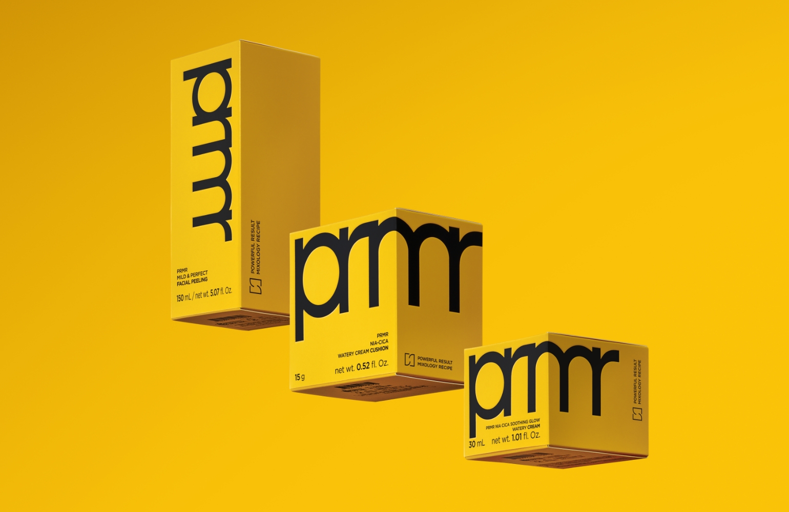
The bold PRMR logo is prominently placed on the front of each container as a defining design element, reinforcing brand presence.
A precision applicator tip allows users to conveniently apply the desired amount directly to the face.
While maintaining a consistent layout system that intuitively communicates the benefits of each variant — Barrier Care, Tone-Up, and Men’s —
the tube backgrounds and logo colors were customized to reflect each product’s unique characteristics.


[Repairing Ceramide Capsule UV Protector]
This sunscreen features a deeply moisturizing formula
housed in a sleek,
shimmering silver tube — perfect
for summer. A vibrant yellow PRMR logo boldly
stands
out, making the product instantly recognizable
whether
in your bag or on your vanity. True to its
essence, this is a fundamental
barrier-care sunscreen
that focuses on skin health and hydration.
housed in a sleek,
shimmering silver tube — perfect
for summer. A vibrant yellow PRMR logo boldly
stands
out, making the product instantly recognizable
whether
in your bag or on your vanity. True to its
essence, this is a fundamental
barrier-care sunscreen
that focuses on skin health and hydration.


[UV Protector Tone-Up Primer]
A tone-up sunscreen launched to celebrate the 2024
cherry blossom season.
The soft pink hue of the formula
can be appreciated directly through the tube design.
The silver tube, overlaid with translucent pink and
finished with a baby-pink
logo print, adds a charming,
makeup-inspired touch to this tone-up sunscreen.
cherry blossom season.
The soft pink hue of the formula
can be appreciated directly through the tube design.
The silver tube, overlaid with translucent pink and
finished with a baby-pink
logo print, adds a charming,
makeup-inspired touch to this tone-up sunscreen.


[Man in the Pink UV Protector Toning Effector]
A men’s sunscreen infused with tone-up pigments that
naturally brighten
and even out the complexion. It adopts
the same color scheme as the newly
redesigned Man in
the Pink All-in-One Essence, featuring a metallic
blue-
black finish on the front of the tube to emphasize its
masculine
and performance-driven identity. The PRMR logo
pattern is subtly
integrated into the background in a calm
tone, adding refinement and
depth to the design.
By minimizing contrast between the background and logo,
the signature magenta pink — the defining color
of the
Man in the Pink line — stands out even more vividly.


- Amorepacific Creatives
- Product Design
- Kim Jihyun
- Photography
- Lee Yunjin
- BM
- Jeon Eunkyung
- Development
- Han Jinhyoung, Kim Boram


