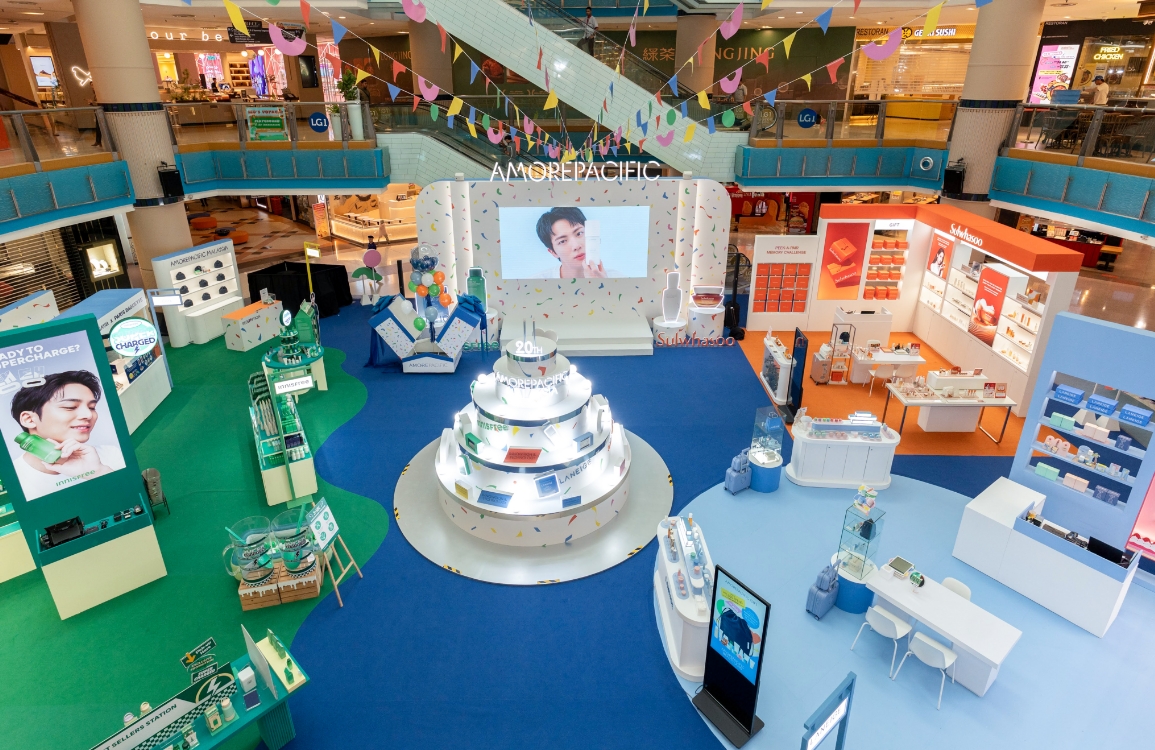
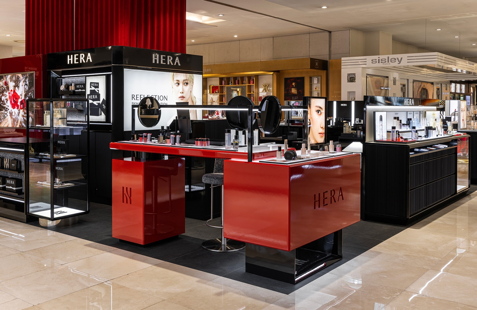
mimo by MAMONDE showroom design
Summary
The newly launched brand <mino by MAMONDE>, a second brand of MAMONDE in 2024, opened a showroom at the Daiso Haeundae Marine City branch in December.
The beauty showroom, a new cosmetic zone in Daiso’s newly developed mega stores, is set up in a shop-in-shop format. It provides a space where
customers can test and purchase the brand’s entire product lineup while experiencing its identity. The <mimo by MAMONDE> showroom is designed
to serve as a promotional space for the brand while also being arranged in a way that allows customers to comfortably explore
the products and make self-directed purchases.

CONCEPT
When preparing the MIMO BY MAMONDE showroom, our foremost consideration was Daiso’s main target audience — the Z + Alpha generation.
What kind of store would attract these consumers, who pursue anti-flex values and make smart, cost-efficient purchases?
Rather than simply offering low-cost products, they prefer small, affordable versions of premium-quality items — a form of smart consumption.
To align with this mindset, we sought to establish Mamonde’s identity as a secondary brand of Amorepacific, backed by advanced technology and credibility.
Accordingly, the space was designed using logo-inspired fixtures, symbolic patterns, and graphic seating elements, all of which reinforce brand recognition.
The second key concept was lowering the entry barrier. Given Daiso’s price-competitive positioning, we prioritized easy-picking displays over luxurious setups filled with detailed product and ingredient information.
Drawing inspiration from shipping boxes, we incorporated the appearance of stacked stock boxes as a design motif — communicating accessibility and approachability while maintaining a clean aesthetic.


The fixture located at the entrance was designed using the brand’s main symbol as the structural motif for its legs.
Occupying most of the store area except for minimal circulation space, this fixture fills the compact space of just about 2 pyeong, serving as a sculptural centerpiece that draws attention while intuitively promoting the brand.
The tabletop is made of translucent colored Astell material, giving it a lighter and more refined appearance.


The VMD was designed in harmony with the fixtures, using the same materials and concept.
Considering the younger target demographic, we added kitschy, playful details, while concise one-point POP signage communicates key product benefits clearly.
Customers naturally pause upon seeing their reflection in the mirror mounted atop the display and are encouraged to try product testers placed on trays. The central fixture intentionally holds no stock, prompting customers to step deeper into the store — an intentional spatial strategy to guide movement and engagement.
Customers naturally pause upon seeing their reflection in the mirror mounted atop the display and are encouraged to try product testers placed on trays. The central fixture intentionally holds no stock, prompting customers to step deeper into the store — an intentional spatial strategy to guide movement and engagement.

The left-side pillar of the store was restructured into a wall-mounted shelf, effectively maximizing vertical space.
In Daiso, where purpose-driven and impulse buyers coexist, narrowing product choices can serve as an effective strategy to guide purchases.
To this end, testers of best-selling and recommended products were placed on the upper shelves at natural eye level to capture attention, while box-style VMD displays at the bottom hold actual products, allowing customers to move seamlessly from trial to purchase.


Along the inner window shelves, boxes inspired by delivery packaging are neatly stacked—an idea drawn from warehouse-style retail environments that evoke a natural sense of self-service and easy picking.
Recognizing that Daiso Beauty products are perceived as compact, affordable, and low-commitment purchases, we determined that a casual and approachable display would be more effective than a luxurious presentation.
At the top of the shelves, POP displays intuitively highlight each product’s key selling points, accompanied by stacked items below, allowing customers to make quick and effortless purchase decisions.
At the top of the shelves, POP displays intuitively highlight each product’s key selling points, accompanied by stacked items below, allowing customers to make quick and effortless purchase decisions.
- Amorepacific Creatives
- Space Planning & Design
- Kang Haein, Kim Seunghyun
- Interior
- Kim Seunghyun
- Vmd
- Kang Haein


![Exhibition [The House of Beauty Scientists] 's work list thumbnail](https://cdn-design.amorepacific.com/contents/2024/08/02172154/24_88_list_thumb.jpg)