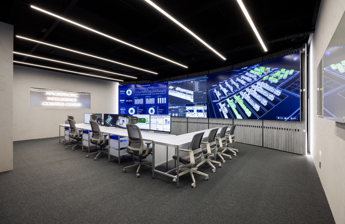
AMORE FACTORY Intelligence Control Center
Summary
Big Data and AI are no longer optional—they are essential.
The ‘Intelligence Control Center’ was established to provide an at-a-glance overview of production status and support rapid decision-making.
While inheriting the design identity of the existing Amore Factory, this space maximizes the immersive experience of data visualization by strategically placing ultra-large monitors within a compact area.
Transcending the role of a conventional control room, it is set to become the central hub for data-driven strategic decision-making.
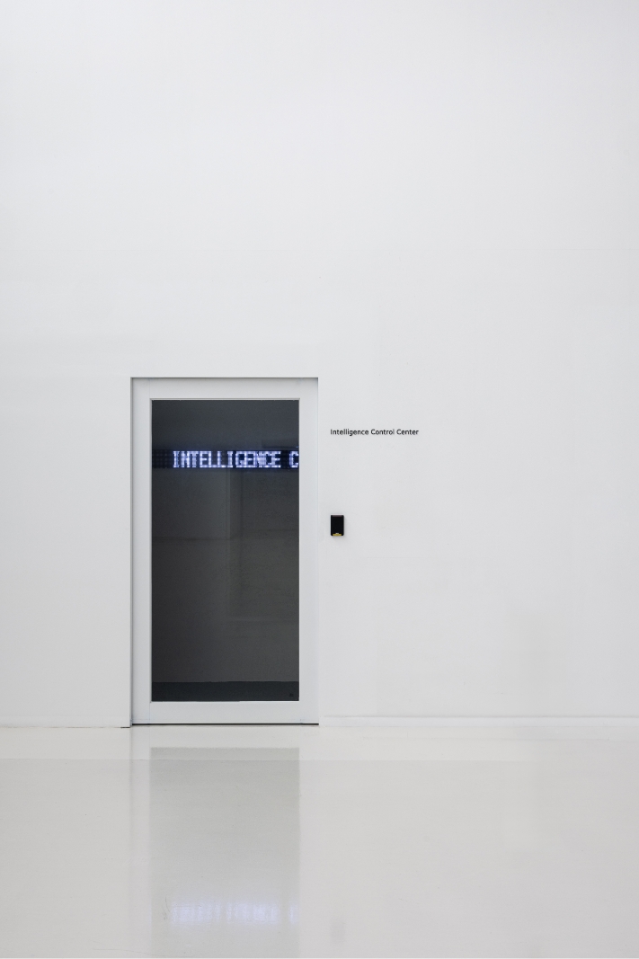
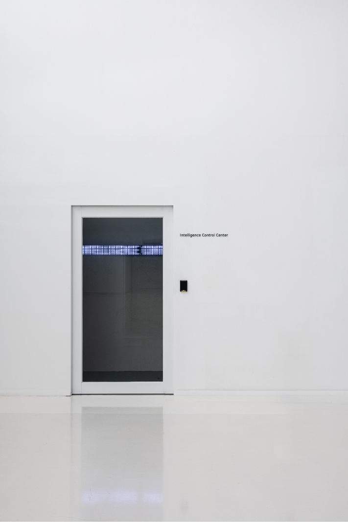
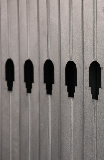
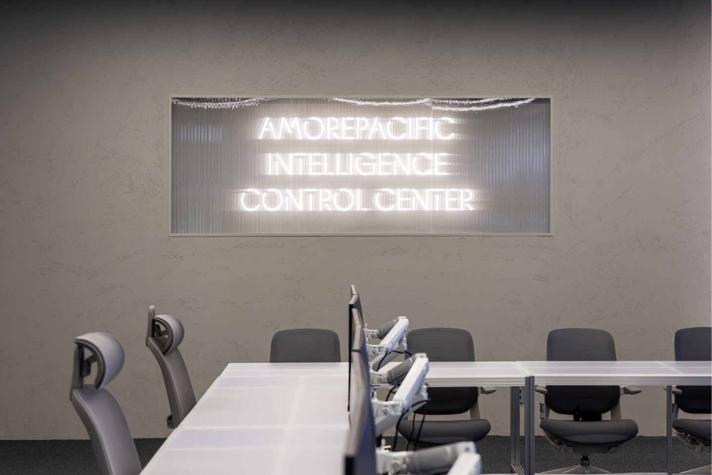
Entrance
The entrance maintains the consistent design language of the Beauty Park Headquarters.
However, to address the transparency of the glass doors, an internal partition wall was installed to obstruct the view, thereby ensuring information security and preserving the immersive atmosphere.
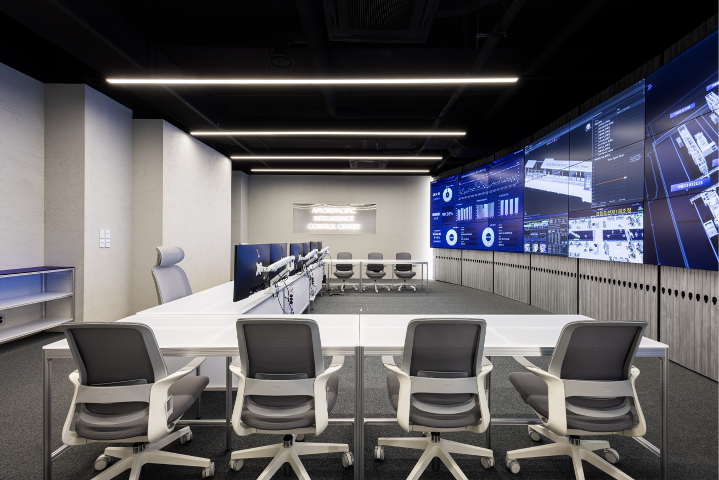
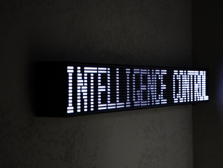
This wall features LED dot signage with scrolling text reading “Intelligence Control Center,” metaphorically representing a space where digital data is in constant flow.
This setup also creates a dramatic sense of reversal, contrasting the restrained exterior design with the impact of the massive display revealed upon entry.
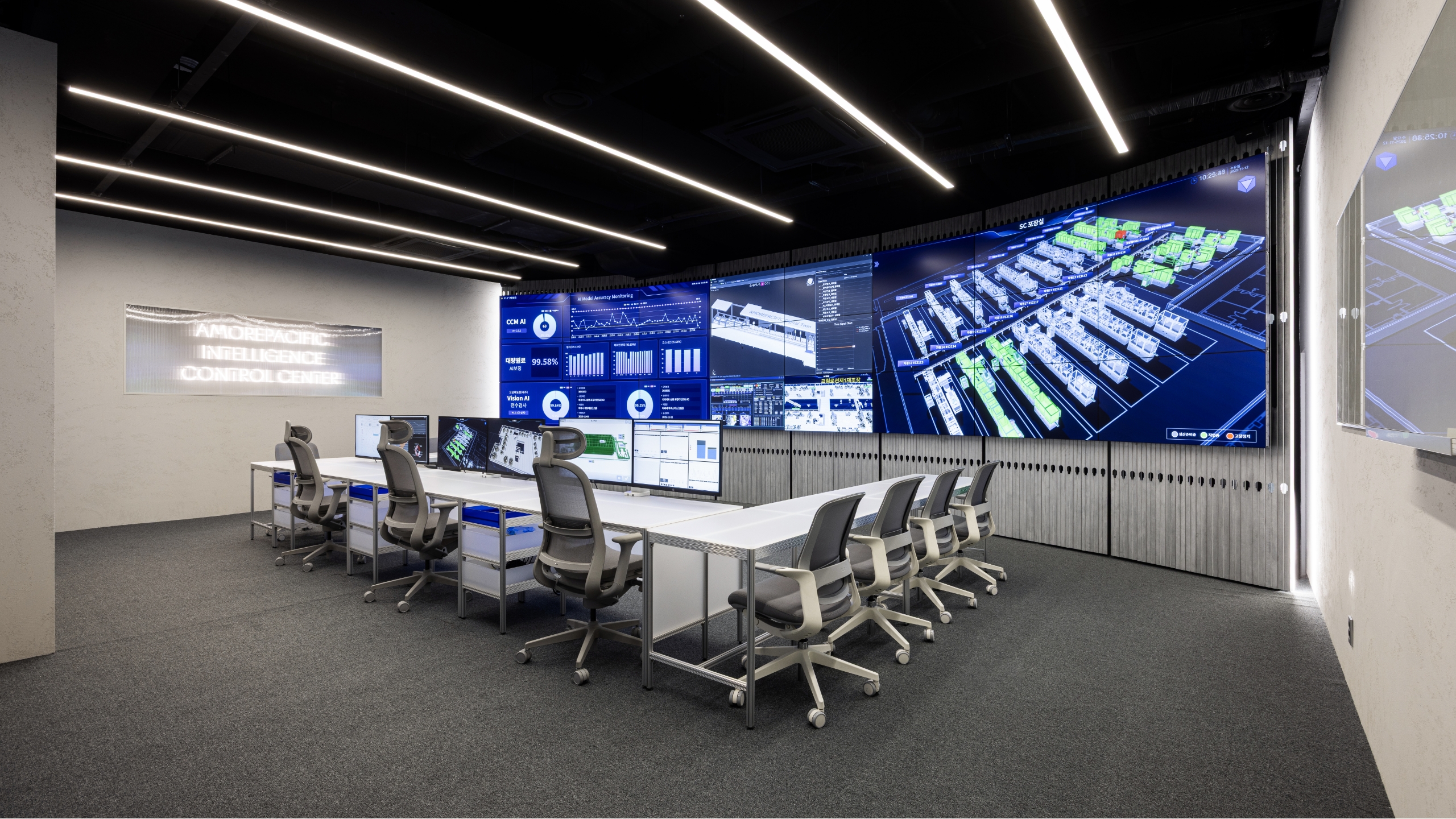
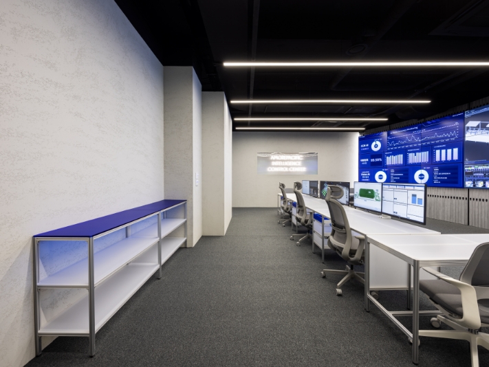
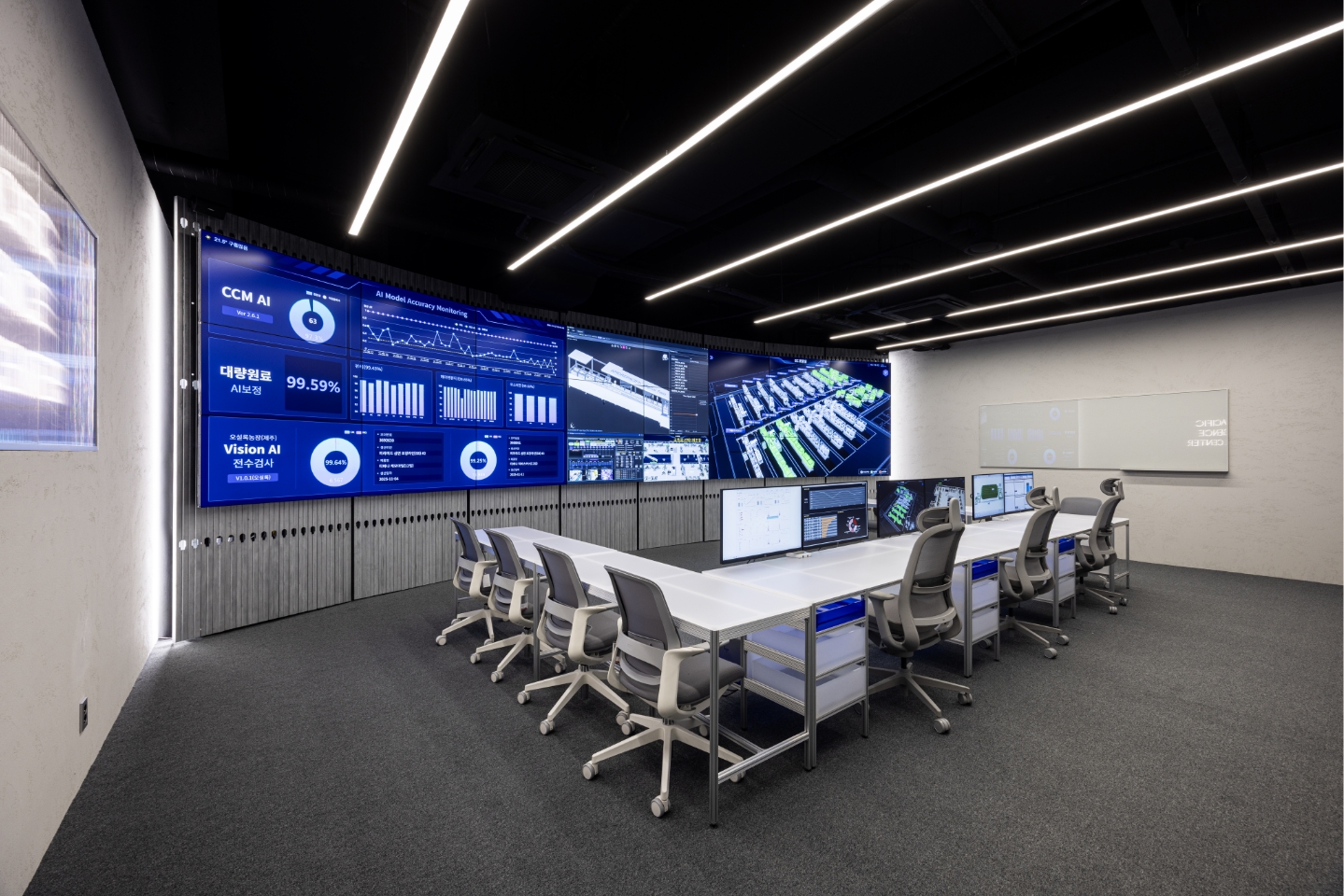
Layout & Display
The most critical factor in planning this space was the efficient arrangement of displays to strictly serve its purpose.
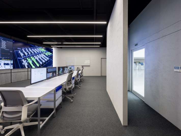
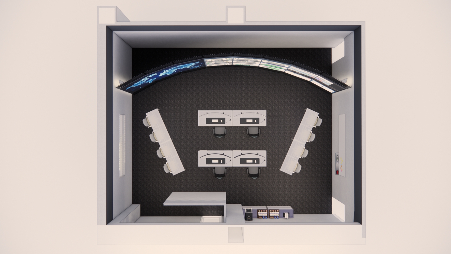
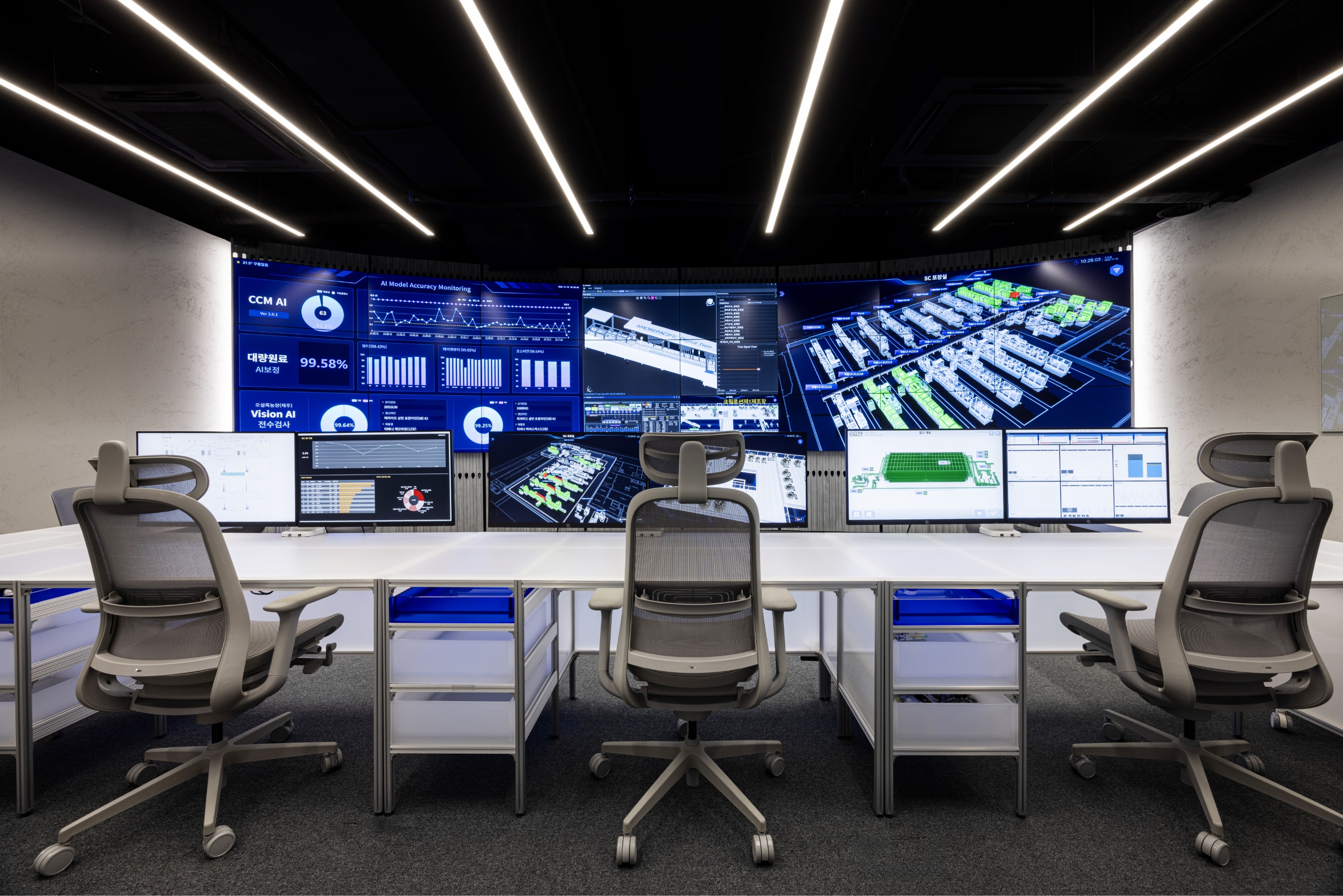
Recognizing that commanding visibility is essential for rapid decision-making, we transformed the longitudinal wall into an ultra-large integrated display wall that functions as a single, massive canvas.
To achieve an optimal monitoring environment within the limited space, a curved form was applied to the display wall.
This was a strategic design choice to minimize peripheral visual distortion for seated users and to maximize immersion, creating the sensation that the information screen is enveloping the user.
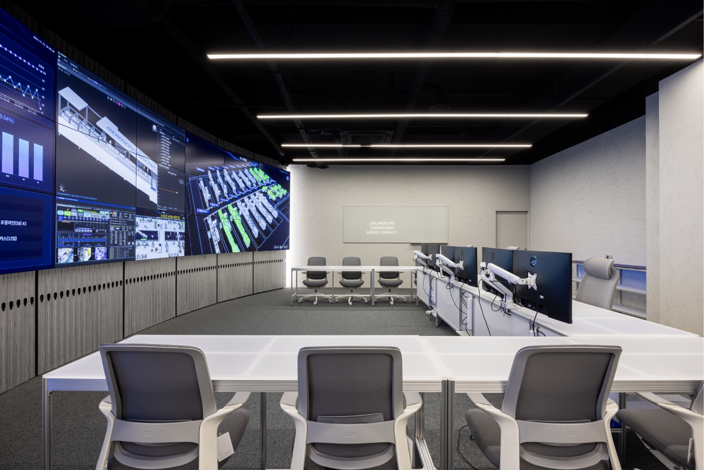
Additionally, the void space created behind both ends of the curve was effectively utilized to secure clearance for maintenance access and equipment control boxes.
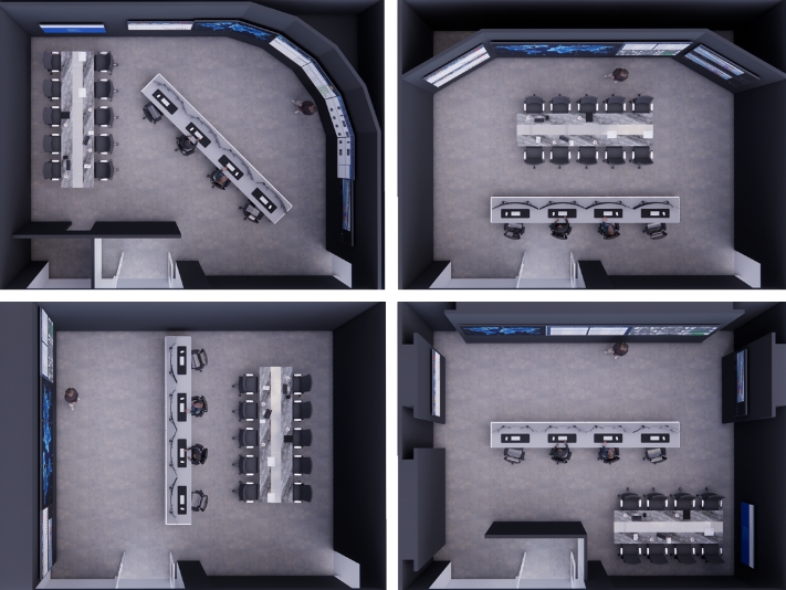
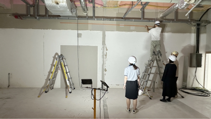
To verify how this massive scale—comprising twenty-four 55-inch monitors arranged seamlessly—would be perceived by the user, we simulated the dimensions of the monitor wall using masking tape, both in the office and on-site.
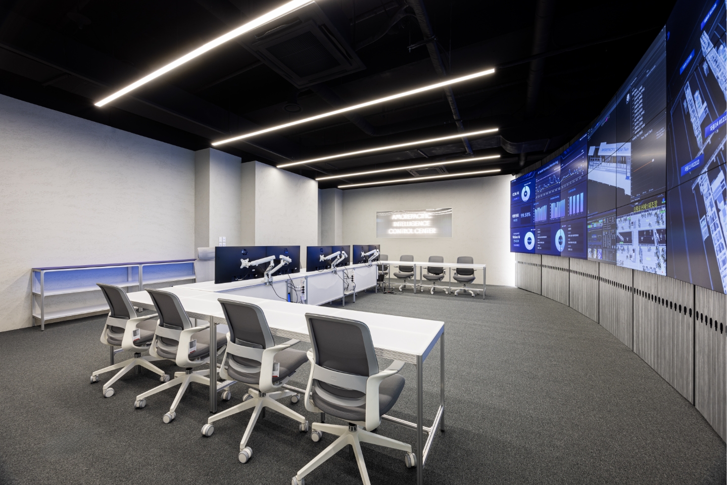
Material
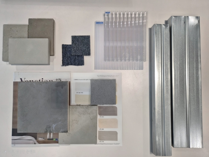
To maintain continuity with the spatial design direction of the Amore Factory, we utilized a special paint finish resembling exposed concrete alongside aluminum profile fixtures.
The achromatic finishes convey a sense of solidity and reliability, effectively serving as a backdrop that allows the displays to stand out.
Material
To maintain continuity with the spatial design direction of the Amore Factory, we utilized a special paint finish resembling exposed concrete alongside aluminum profile fixtures.
The achromatic finishes convey a sense of solidity and reliability, effectively serving as a backdrop that allows the displays to stand out.
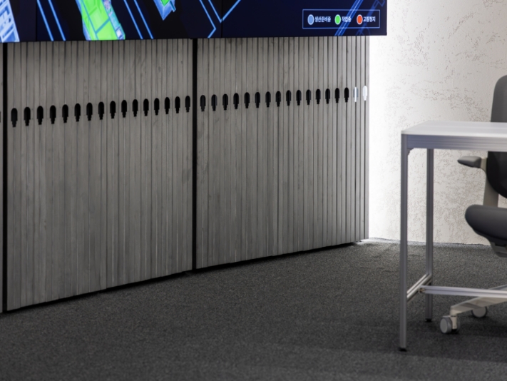
Notably, for the display wall, structural studs were treated with a vibration finish and utilized as the primary finishing material.
By transforming these structural elements—typically concealed within walls—into visible design features, we achieved a distinct industrial aesthetic.
At the same time, this approach ensures the wall serves as a robust, functional structure that securely anchors the monitors.
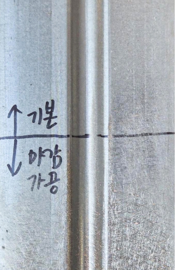
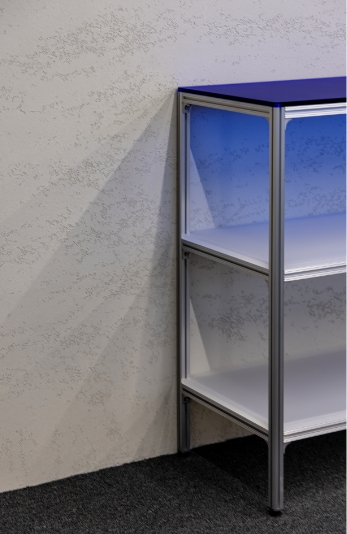
It is widely recognized that blue reduces eye strain compared to warm tones and provides superior contrast against white, making it a preferred choice for data visualization screens.
Drawing inspiration from this, we introduced blue as an accent color within the achromatic environment to foster visual harmony with the displays.
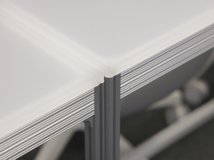
Portions of the profile desks and tables were fabricated using Blue Astel, creating an effect where the blue hue softly diffuses depending on the illumination.
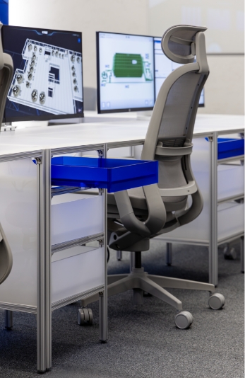
It is widely recognized that blue reduces eye strain compared to warm tones and provides superior contrast against white, making it a preferred choice for data visualization screens.
Drawing inspiration from this, we introduced blue as an accent color within the achromatic environment to foster visual harmony with the displays.
Portions of the profile desks and tables were fabricated using Blue Astel, creating an effect where the blue hue softly diffuses depending on the illumination.
We envision the Intelligence Control Center establishing itself as the pivotal hub for the data-driven SCM operations pursued by Amore Factory.
We look forward to this space instituting a rapid response system for anomalies and significantly elevating the practical utilization of AI data analysis.
- Amorepacific Creatives
- Interior Design
- Hyun Younghun
- Operation Manager
- Moon Wungki


![Exhibition [The House of Beauty Scientists] 's work list thumbnail](https://cdn-design.amorepacific.com/contents/2024/08/02172154/24_88_list_thumb.jpg)