Sulwhasoo S.I Design Upgrade : SHINSEGAE THE MAIN
Summary
Sulwhasoo has long regarded art and heritage as core assets in visualizing its brand universe. The 6th generation store was conceived as a strategic extension of the brand philosophy and aesthetic first embodied in The House of Sulwhasoo in Bukchon—transforming retail into a daily touchpoint where customers can experience and emotionally connect with the brand. The latest S.I (Store Identity) upgrade, first applied at the Shinsegae The Main, enhances luxury value through refined updates to detailing, finishes, and furniture, with the aim of evolving into a high-end store that appeals to a broader spectrum of luxury customers. Serving as a design prototype for future global flagship stores, this new concept also strengthens Sulwhasoo’s competitive edge in the luxury beauty category.


CONCEPT
The House of Sulwhasoo: With Object Series is a project that translates the brand’s aesthetic sensibility, craftsmanship,
and artistic objects into spatial form. Rooted in the brand’s color strategy, the space presents highly refined objects
unique to Sulwhasoo—through sculptural and symbolic furniture, display systems, and finishing materials that go beyond
mere functionality.


Sulwhasoo Color
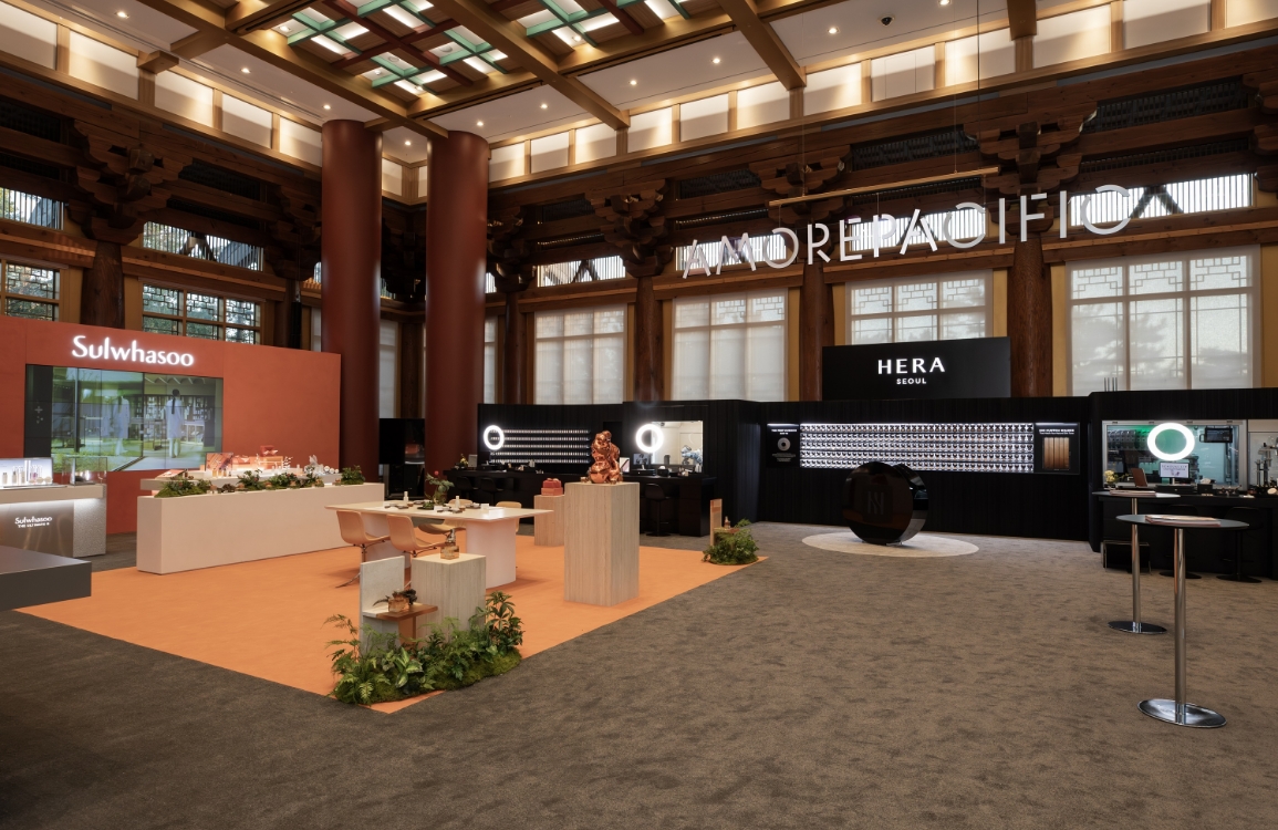
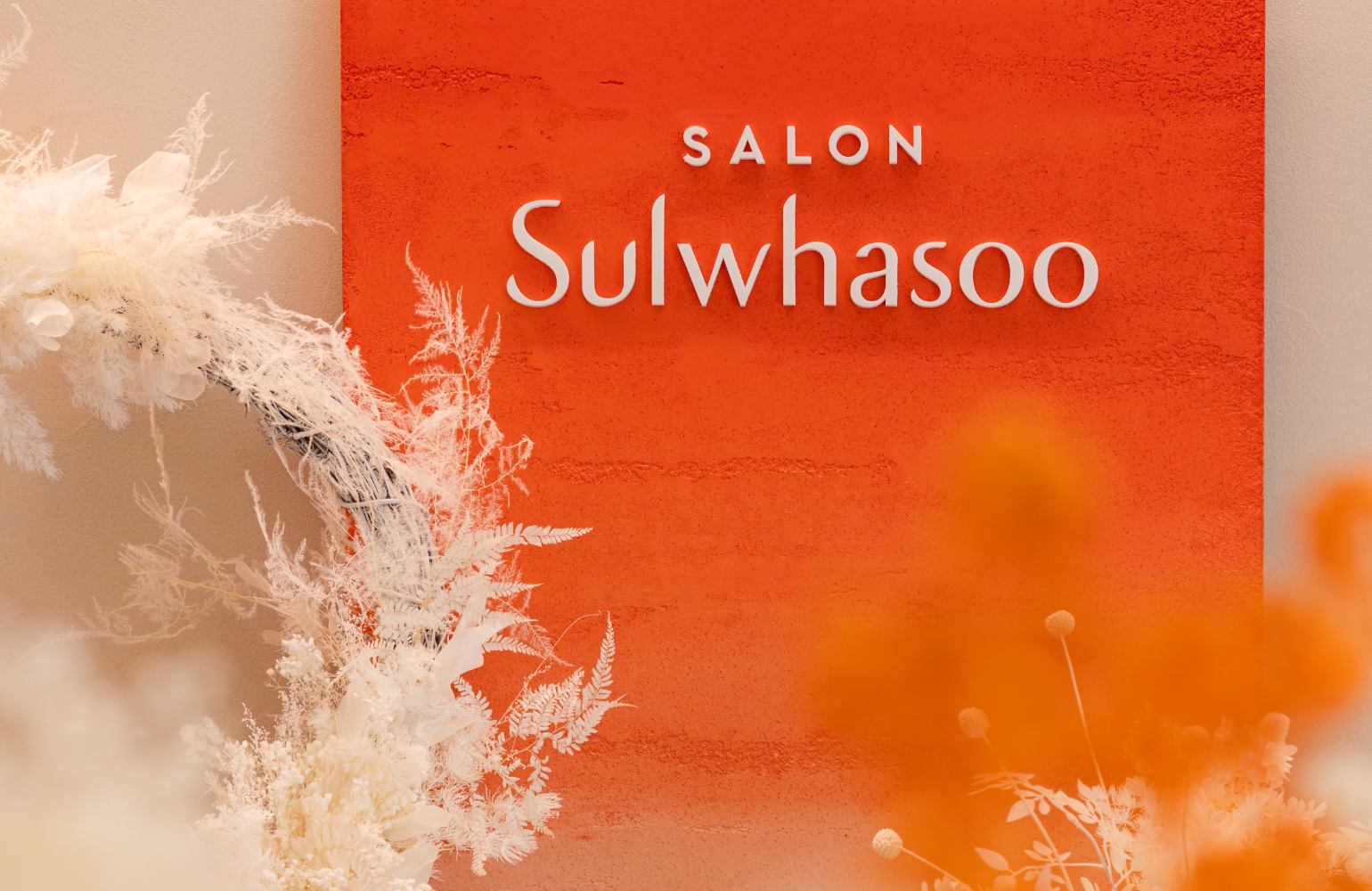
Sulwhasoo’s signature amber color is applied throughout the space using highly refined finishing materials.
This creates a striking visual contrast against the otherwise neutral environment, while simultaneously reinforcing a cohesive brand identity—seamlessly connecting the design language of product packaging, spatial elements, and customer experience.
This creates a striking visual contrast against the otherwise neutral environment, while simultaneously reinforcing a cohesive brand identity—seamlessly connecting the design language of product packaging, spatial elements, and customer experience.


Jihambo Zone
By integrating the checkout area and the Jihambo content into a unified structure,
the design streamlines staff workflow while positioning the brand’s core philosophy at the closest point of customer interaction.
Jihambo, which means “a wrapping that hold wisdom,” is Sulwhasoo’s signature service that conveys the brand’s refined elegance and heartfelt intention. More than simple packaging, it symbolizes the brand’s deeper values of beauty and hospitality.
This fusion of function and storytelling elevates the space beyond logistical efficiency, establishing a powerful visual anchor where Sulwhasoo’s narrative is most clearly expressed.


Signature Table
The signature table functions as a sculptural centerpiece that visualizes the brand’s aesthetic and spatial identity,
going beyond a simple product display. While maintaining its original form and display logic,
the table incorporates storage in the lower structure for added practicality,
and features a softly curved base design that completes it as an artistic object within the space.
going beyond a simple product display. While maintaining its original form and display logic,
the table incorporates storage in the lower structure for added practicality,
and features a softly curved base design that completes it as an artistic object within the space.


Counseling Zone
Positioned at the center of the store, the Counseling Zone is divided into Casual and Luxury areas,
allowing for flexible service tailored to each customer’s needs and stage in the purchasing journey.
This zoning enables more nuanced and personalized engagement based on service expectations, product interests,
and the depth of customer involvement—ultimately bringing to life Sulwhasoo’s philosophy of thoughtful hospitality and tailored care.

The 6th generation Sulwhasoo store embodies the brand’s
aesthetic and philosophy within a contemporary retail
environment. This space—where functionality meets
emotion, form blends with practicality, and personalized
experience aligns with brand consistency—serves not
merely as a store, but as a strategic hub for realizing
Sulwhasoo’s core brand values. It also functions as a
scalable design platform for delivering a consistent brand
experience across global markets in the future.
- Amorepacific Creatives
- Space Design
- Kim Yonghwan, Jeong Seongah
- VMD Design
- Park Juhyeon, Kwon Sujin
- Photography
- OBJECT LEUCI
- Channel Sales
- Lee Saro


![Exhibition [The House of Beauty Scientists] 's work list thumbnail](https://cdn-design.amorepacific.com/contents/2024/08/02172154/24_88_list_thumb.jpg)


