PRIMERA VITA-TINOL LINE
Summary
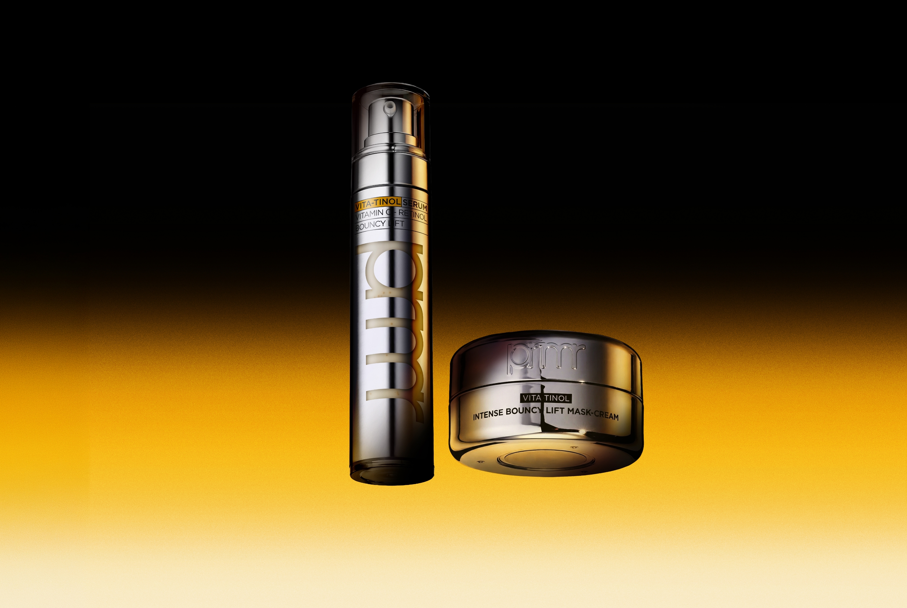
Primera’s Vitatinol Serum, the flagship product representing the brand’s mixology technology, was renewed with optimization for the retail environment in mind, and the new Vitatinol Cream was also developed in alignment with the same design logic.
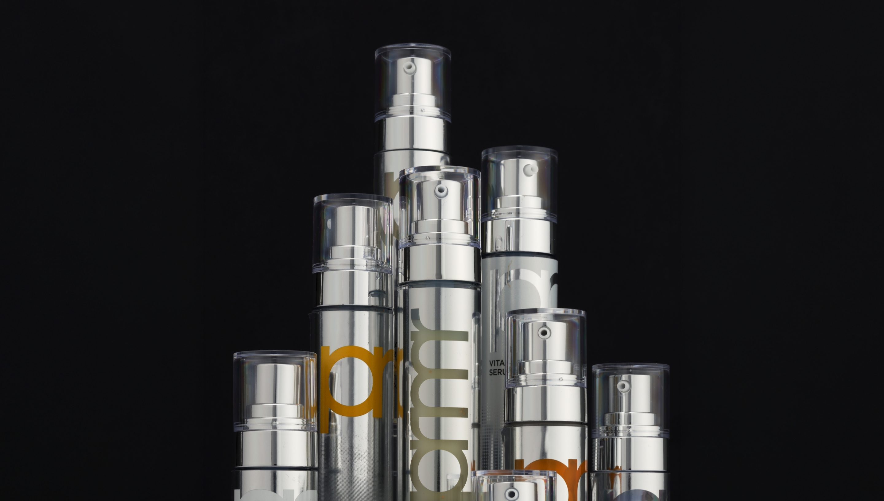
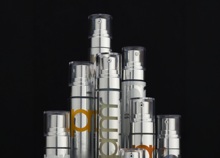
Silver, the signature color of the Vitatinol line, was used as the main color to visually express its professional and technical image.
To maximize the visibility of the brand logo across both online and offline retail environments, “prmr” was placed vertically on the front, and a layout was adopted to emphasize the combination of vitamin C and retinol—the line’s mixology concept.
In the case of the serum in particular, the graphics were refined so that the product name could be clearly recognized in offline displays, and a systematic design system was applied to allow for flexible expansion of the lineup in the future.
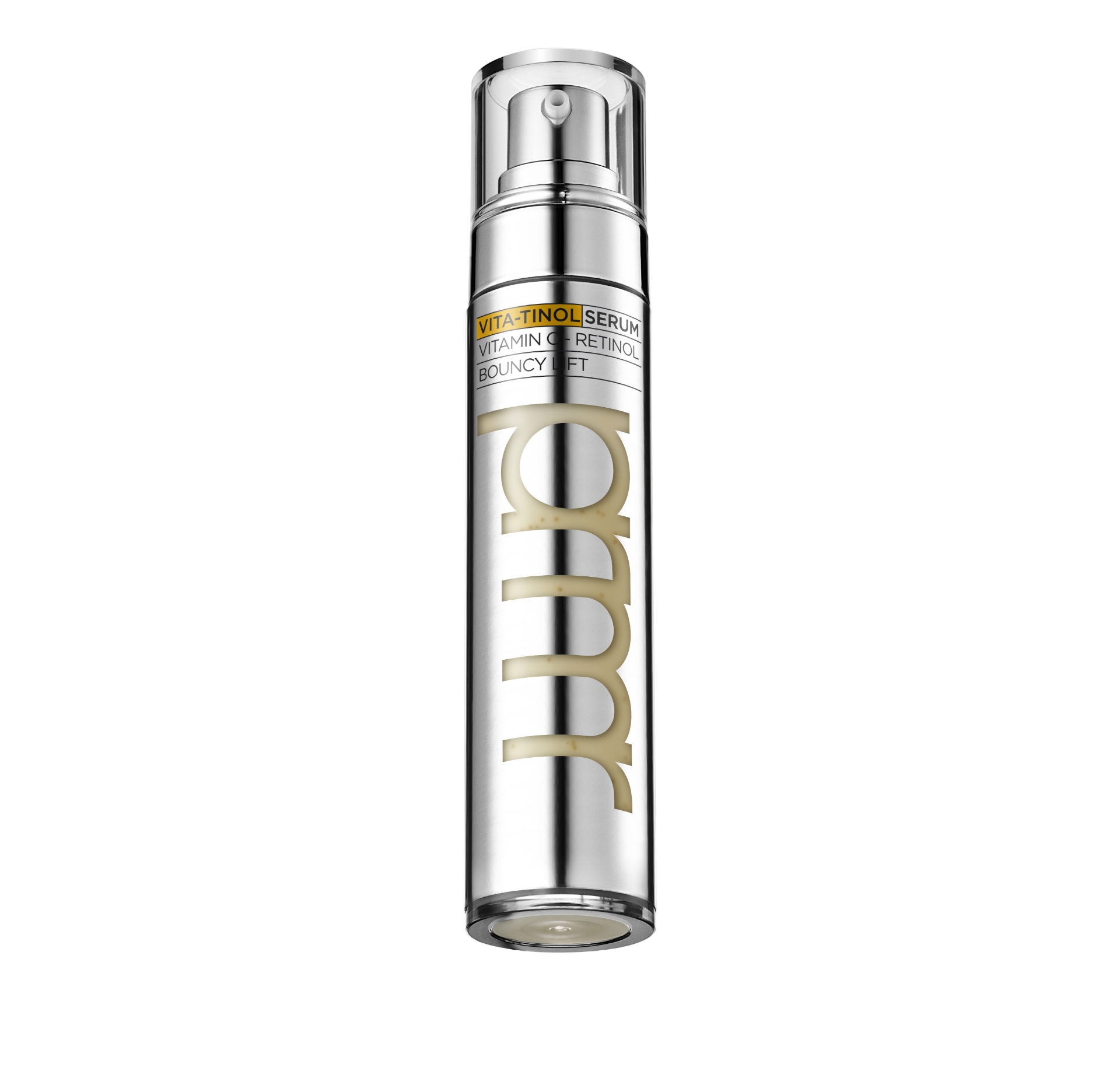

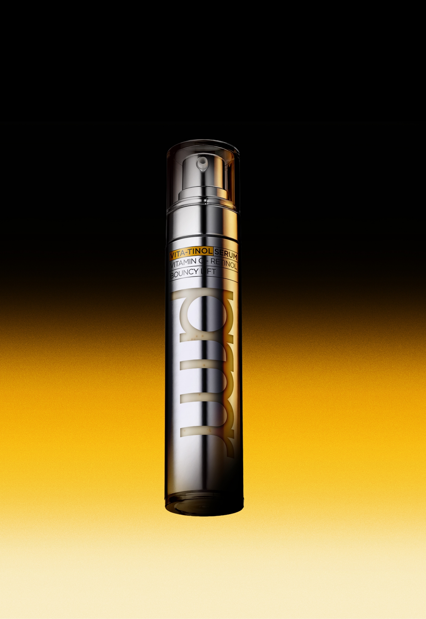
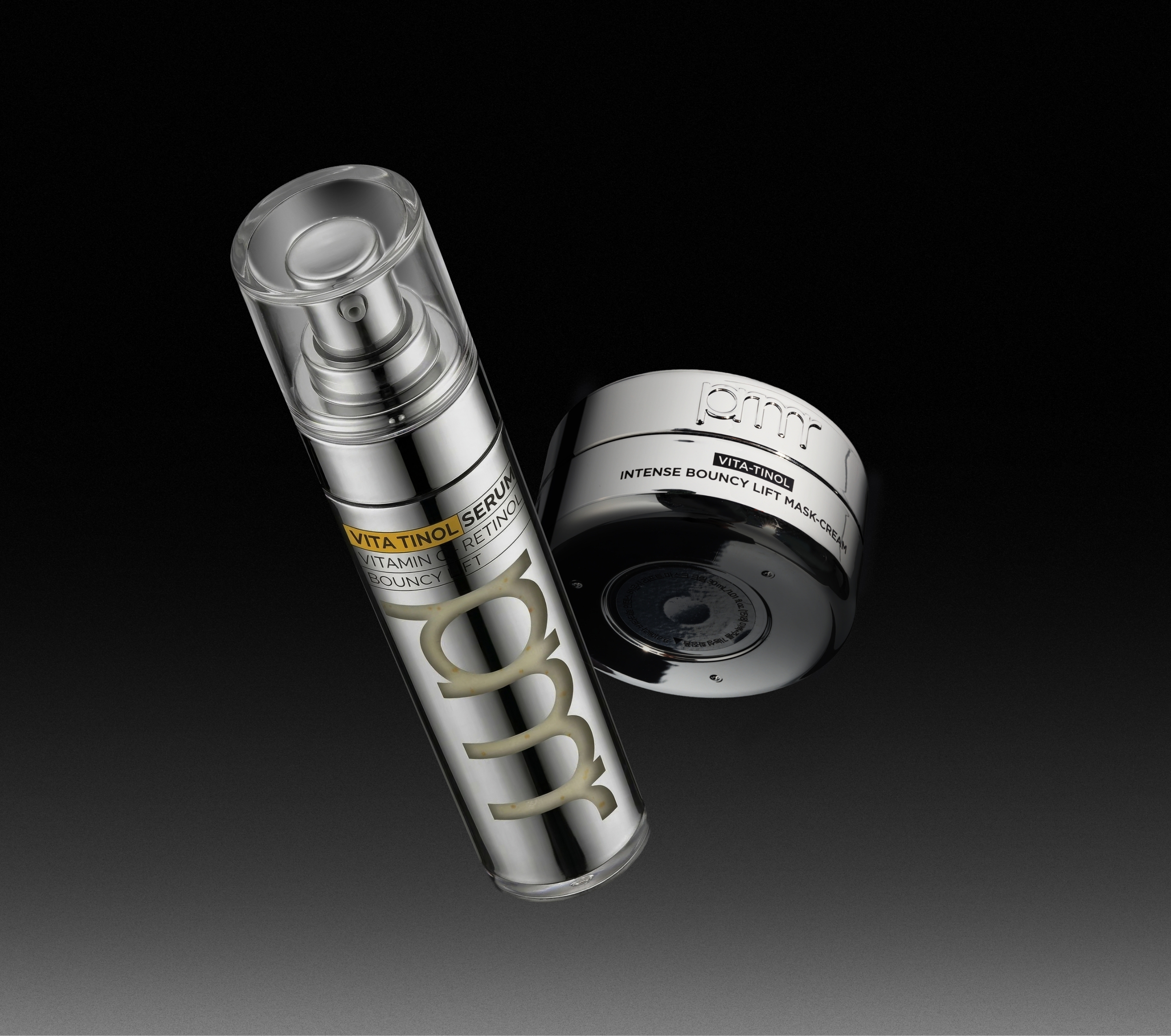
Vitatinol Serum is the signature product that most strongly represents the function of the Vitatinol line, and the design was developed so that the mixology formula could be communicated directly through its appearance.
For this reason, a wide transparent window was applied so that the capsule formula unique to Vitatinol Serum could be clearly seen from the front.
The most significant change made through the renewal was the visible area of the logo on the front.
Previously, because Primera was sold mainly through dedicated counters in department stores and duty-free shops, the logo was able to secure sufficient visibility even within the surrounding retail environment.
Accordingly, the logo on the serum container was arranged horizontally around the package. However, in more competitive environments such as multi-brand stores and online shopping malls, the product is displayed alongside other brands, and it becomes difficult for other brand elements of Primera to be shown together.
In response, a design more focused on clear information delivery was adopted.
As a result, the logo was repositioned vertically, and the design was refined to place greater emphasis on the product information text.
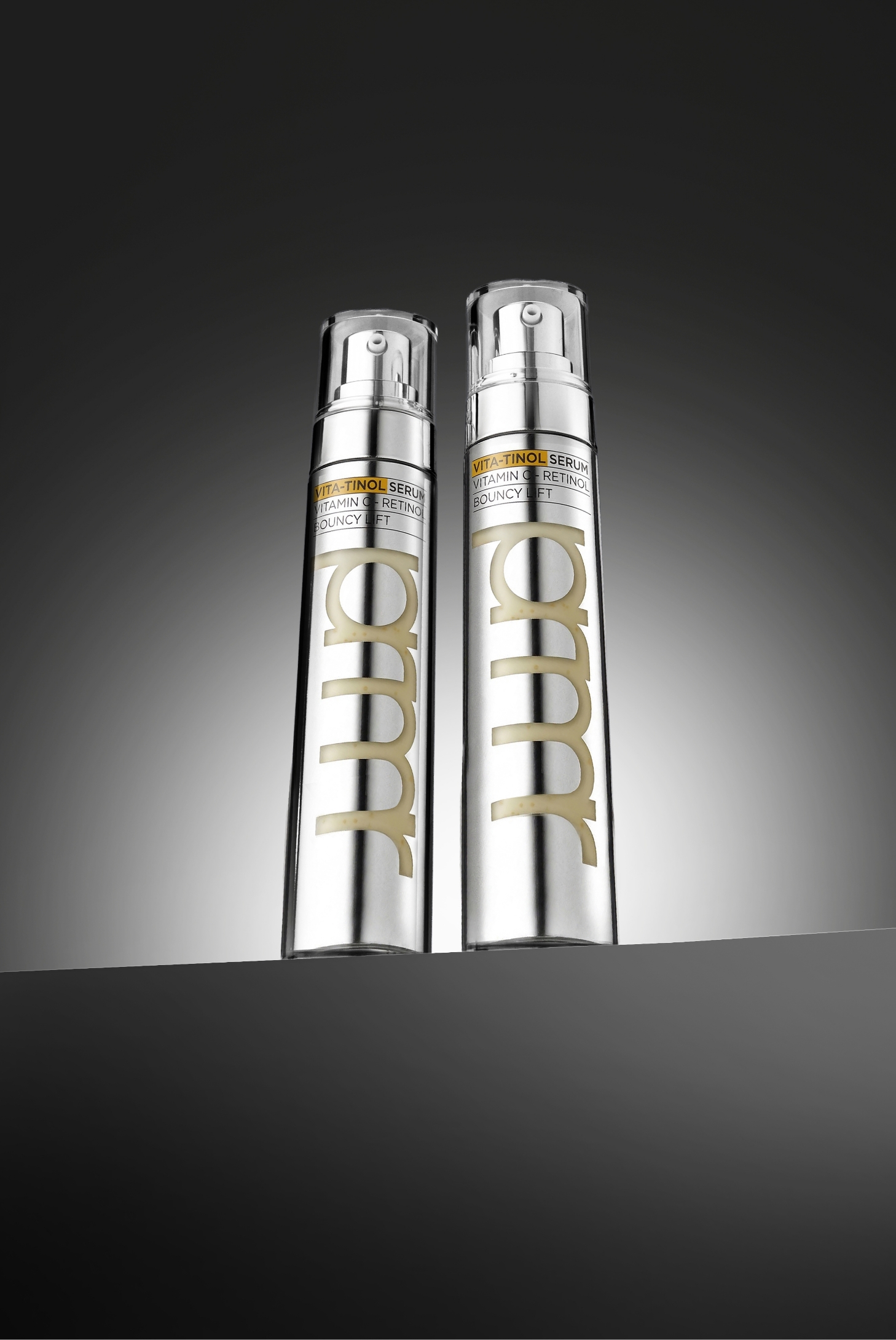
With visibility in the retail environment in mind, the vertically arranged prmr logo was applied to suit the form of the container.
This allows the brand presence to be communicated clearly not only in physical displays across online and offline retail spaces, but also in front-facing product images.
In addition, considering the way the product would be displayed on offline shelves, the informational text was positioned at the top, while the fact that the vitamin and retinol formulas are mixed was emphasized as the most visually prominent element in the layout.
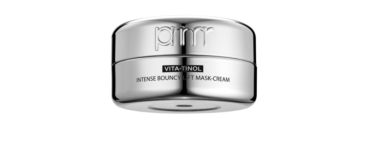
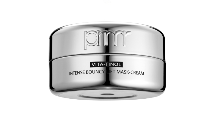
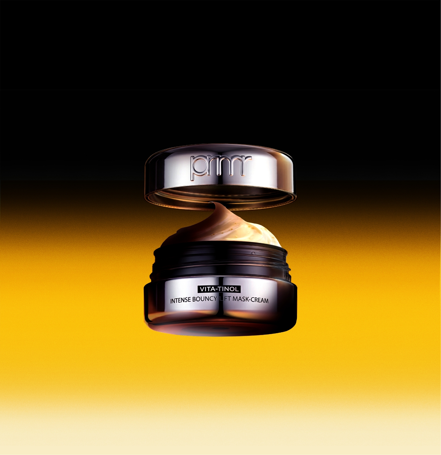
Vitatinol Cream follows the design code of the serum while reflecting the specific characteristics of its own container.
In the cream product, the prmr logo is placed horizontally and appears at its largest scale.
In the copy layout as well, the mix of vitamin and retinol formulas is emphasized as the most visually prominent element.
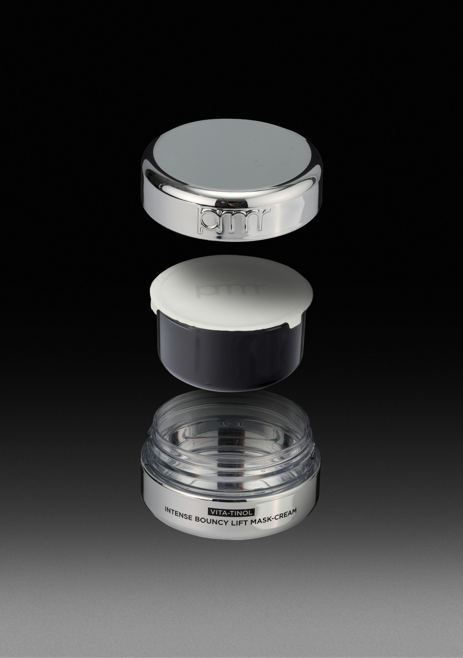
The cream uses a refillable container structure to reduce plastic consumption.
Its compact design, free of unnecessary ornamentation, also improves ease of production.
- Amorepacific Creatives
- Design Directing
- Lee OhKyung
- Product Design
- Kim Bitnuri
- BM
- Choi Kowoon, Kim Minkyoung
- Development
- Byun Jiyoung, Oh Hyungtaek
- Photography
- Shin Sangwoo