PRMR JP MBS VMD
Summary
Primera meets customers across approximately 1,199 MBS stores throughout Japan. This project began with the aim of creating a new fixture system that could communicate the brand’s presence more clearly, even within a changing product operation environment.
While improving the operational efficiency of the existing fixtures, we analyzed the customer sightline structure within Japan’s MBS stores and built a new graphic system that allows the brand message and key products to be recognized more intuitively. By combining a modular structure with a differentiated visual strategy, we completed a display system that can flexibly respond to the changing retail environment while strengthening Primera’s unique brand experience.
While improving the operational efficiency of the existing fixtures, we analyzed the customer sightline structure within Japan’s MBS stores and built a new graphic system that allows the brand message and key products to be recognized more intuitively. By combining a modular structure with a differentiated visual strategy, we completed a display system that can flexibly respond to the changing retail environment while strengthening Primera’s unique brand experience.
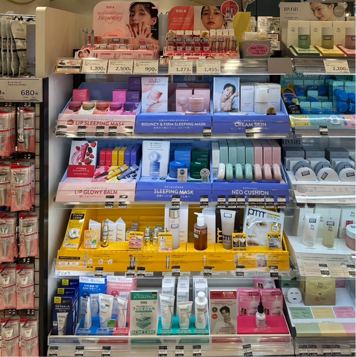
The existing fixtures in Japan’s MBS stores have communicated brand and product information primarily through back-panel graphics and front band graphics.
However, the structure, which required the entire fixture to be replaced whenever a new product was launched or SKUs changed, had clear limitations in terms of operational efficiency and maintenance.
In addition, in actual store environments, the fixtures are often positioned at a lower level, causing customers’ attention to first focus on the front band graphics and tester area. In this context, a new approach was needed—one that goes beyond simply displaying products and effectively guides the customer’s eye while clearly communicating the brand message.
Starting from this retail environment, the project aimed to design a retail experience in which the brand and products could communicate more actively with customers.
In addition, in actual store environments, the fixtures are often positioned at a lower level, causing customers’ attention to first focus on the front band graphics and tester area. In this context, a new approach was needed—one that goes beyond simply displaying products and effectively guides the customer’s eye while clearly communicating the brand message.
Starting from this retail environment, the project aimed to design a retail experience in which the brand and products could communicate more actively with customers.
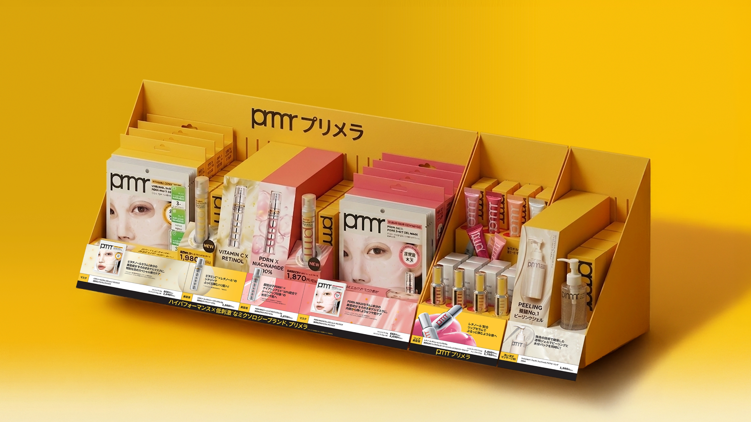
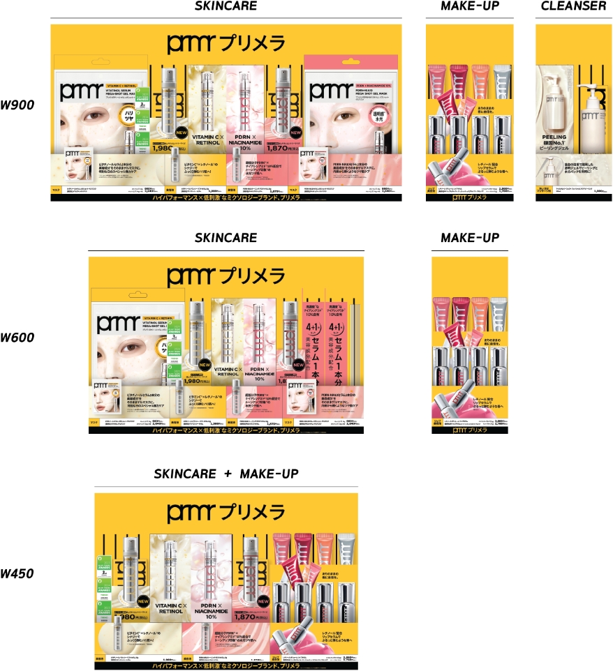
The core of this renewal was to build a modular fixture system capable of responding to a changing product operation environment.
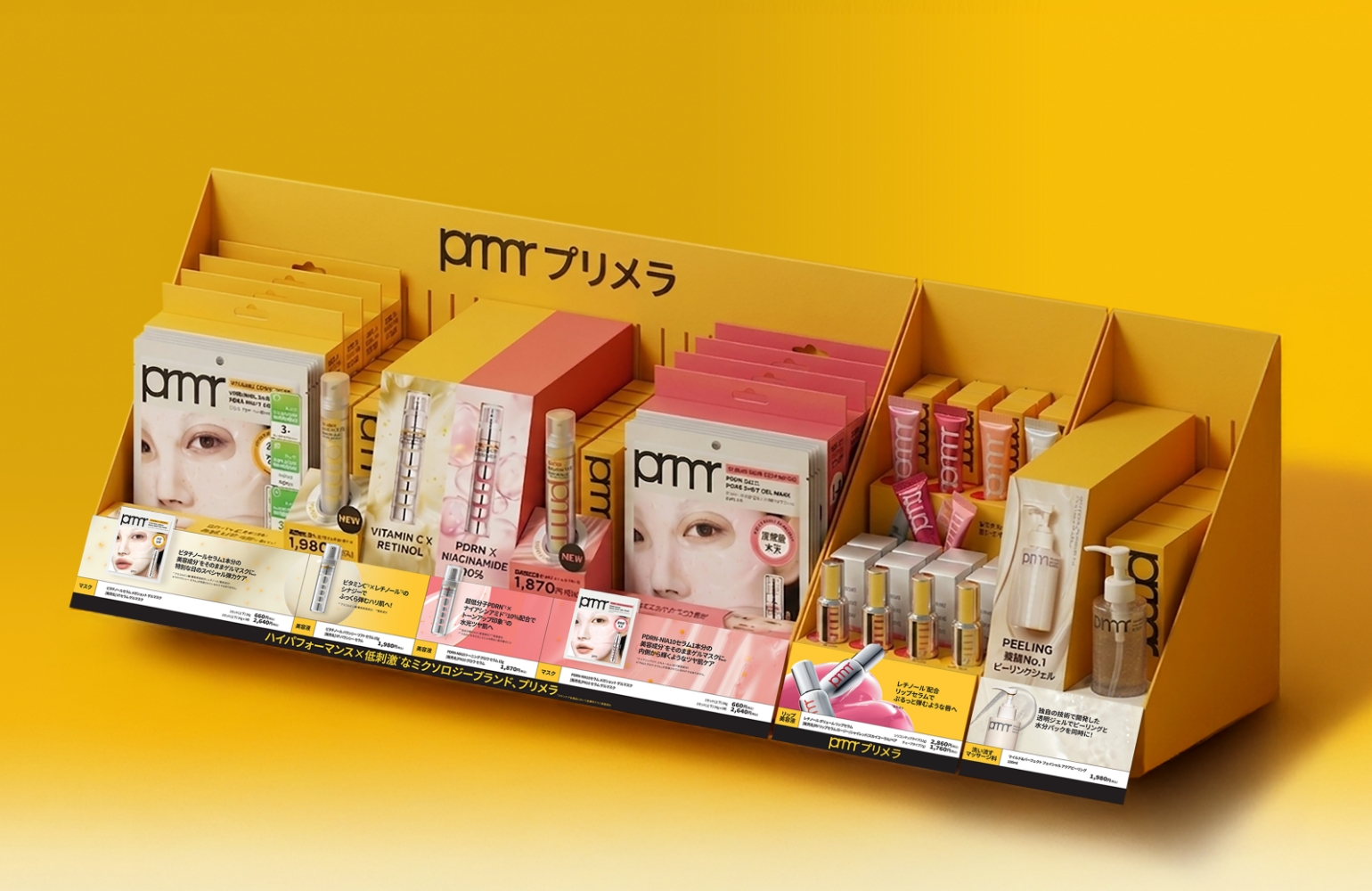
While the previous method required the entire fixture to be replaced whenever products changed, the new system was designed so that only the necessary areas could be selectively replaced. By applying a category-based modular structure for skincare, makeup, cleansing, and other product groups, the system improved operational efficiency and established a foundation for flexibly responding to changing SKU compositions.
Taking into account the various fixture conditions and interior interference factors that occur within Japan’s MBS environment, we completed a structure optimized for actual store operations.
While the previous method required the entire fixture to be replaced whenever products changed, the new system was designed so that only the necessary areas could be selectively replaced. By applying a category-based modular structure for skincare, makeup, cleansing, and other product groups, the system improved operational efficiency and established a foundation for flexibly responding to changing SKU compositions.
Taking into account the various fixture conditions and interior interference factors that occur within Japan’s MBS environment, we completed a structure optimized for actual store operations.
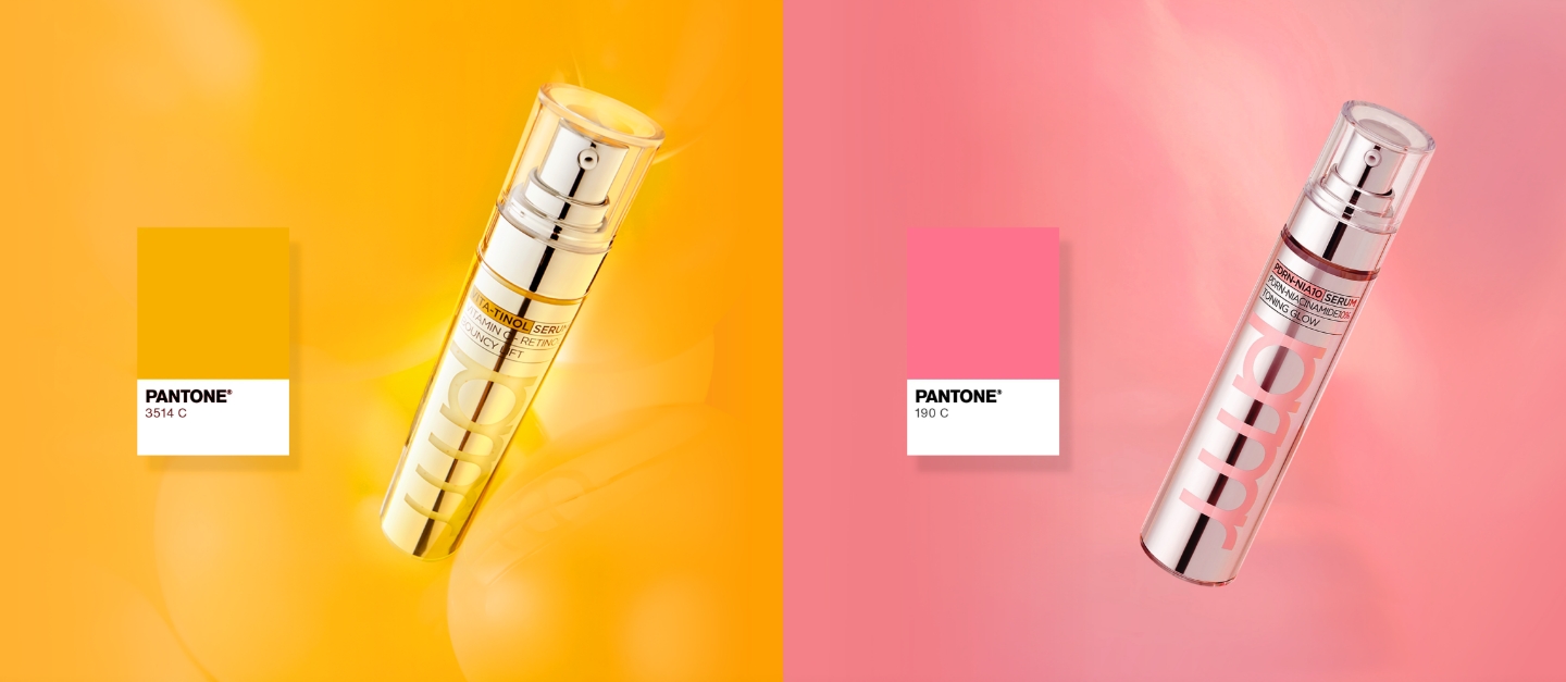
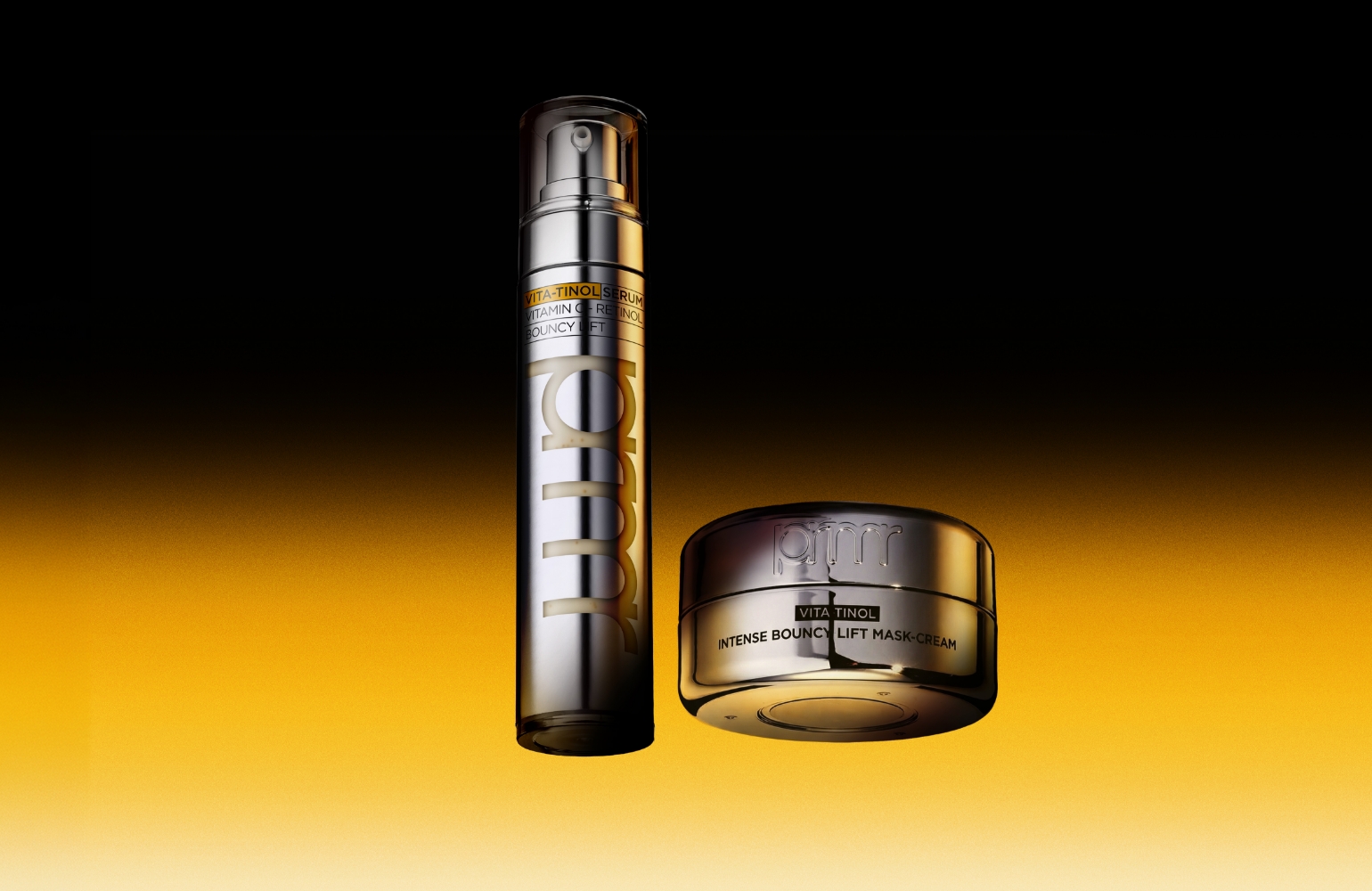
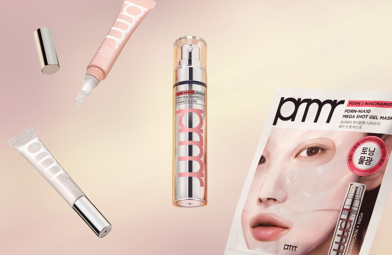
In this renewal, the brand experience was expanded around Primera’s key growth lines, Vitatinol and PDRN.
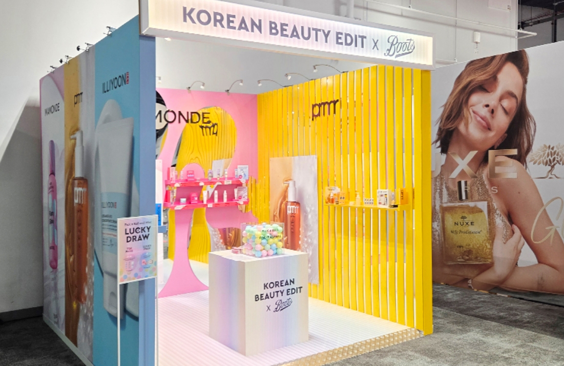
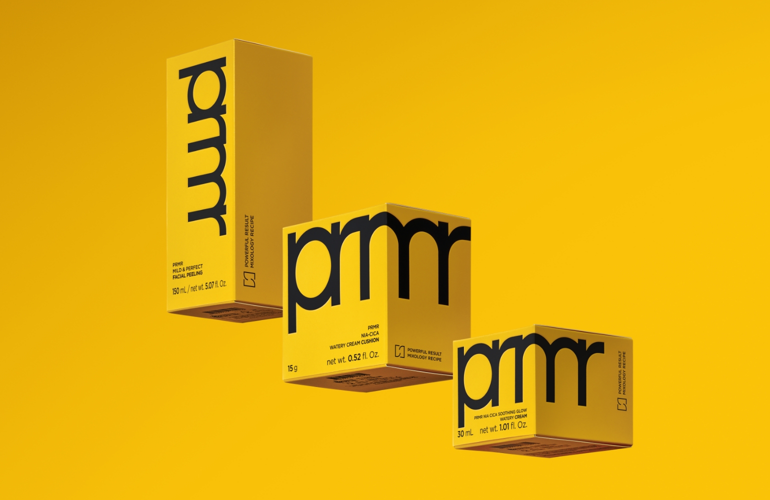
The vivid yellow of Vitatinol and the pink color of PDRN were used not simply as product identifiers, but as core elements that shape the overall visual experience of the fixture. The two contrasting colors help customers intuitively recognize each line, while also strengthening the presence of the brand area within a limited space.
The vivid yellow of Vitatinol and the pink color of PDRN were used not simply as product identifiers, but as core elements that shape the overall visual experience of the fixture. The two contrasting colors help customers intuitively recognize each line, while also strengthening the presence of the brand area within a limited space.
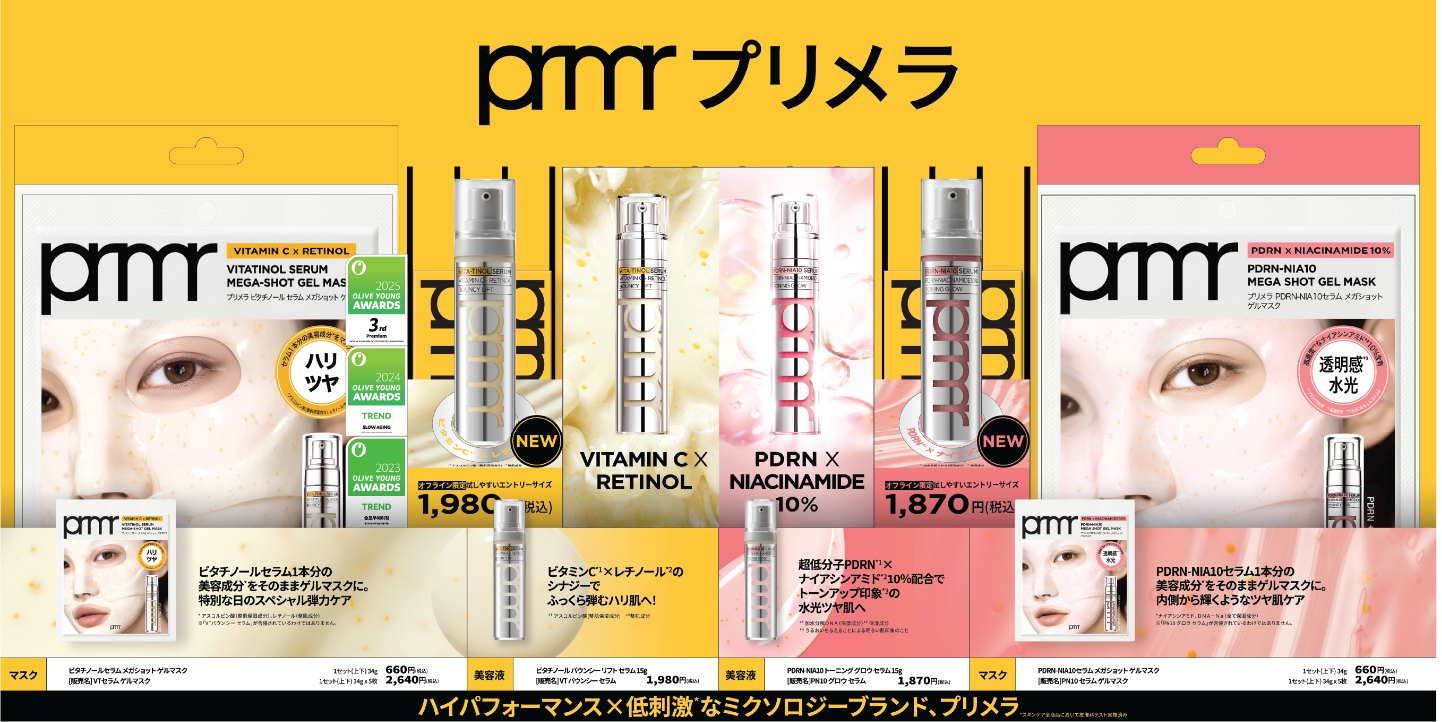
In Japan’s MBS stores, customers’ eyes often reach the front band graphics and tester area before the products themselves.
We took this sightline flow as the starting point for the design.
For the front graphics, we applied a pop-up structure in which the product image appears to extend beyond the space, naturally guiding customers’ attention toward the brand area.
Key messages and product information were also strategically arranged so that sufficient information could be delivered even within a limited space.
Through this approach, customers are able to first recognize the brand and then move into a more natural product exploration experience.
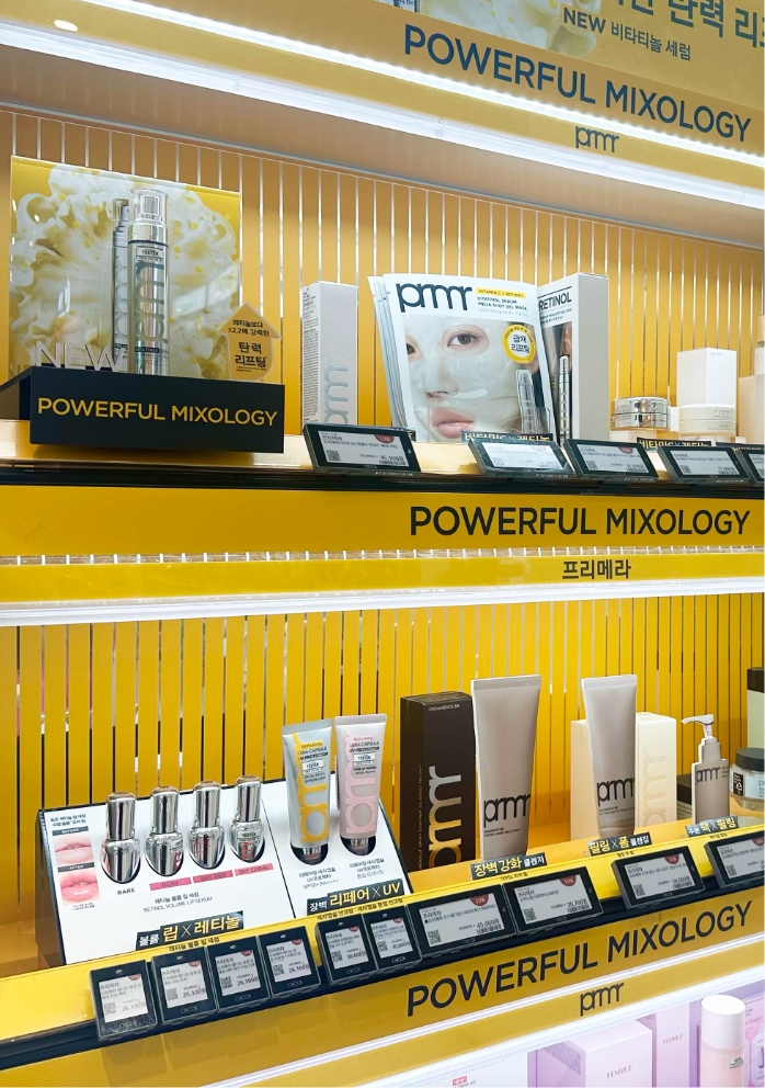
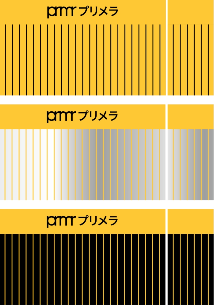
For the Japan fixtures, we applied a new graphic pattern system unique to Primera.
The repeated stripe pattern is a graphic reinterpretation of the tambour board element that Primera has consistently used in its existing spatial and fixture designs.
Rather than functioning as a simple decorative element, the pattern was designed as a visual language that reinforces brand recognition and connects the entire fixture as one cohesive brand space.
This graphic system was first tested in domestic stores to verify its visibility and spatial impact, and was then applied in the same way to Japan’s MBS environment.
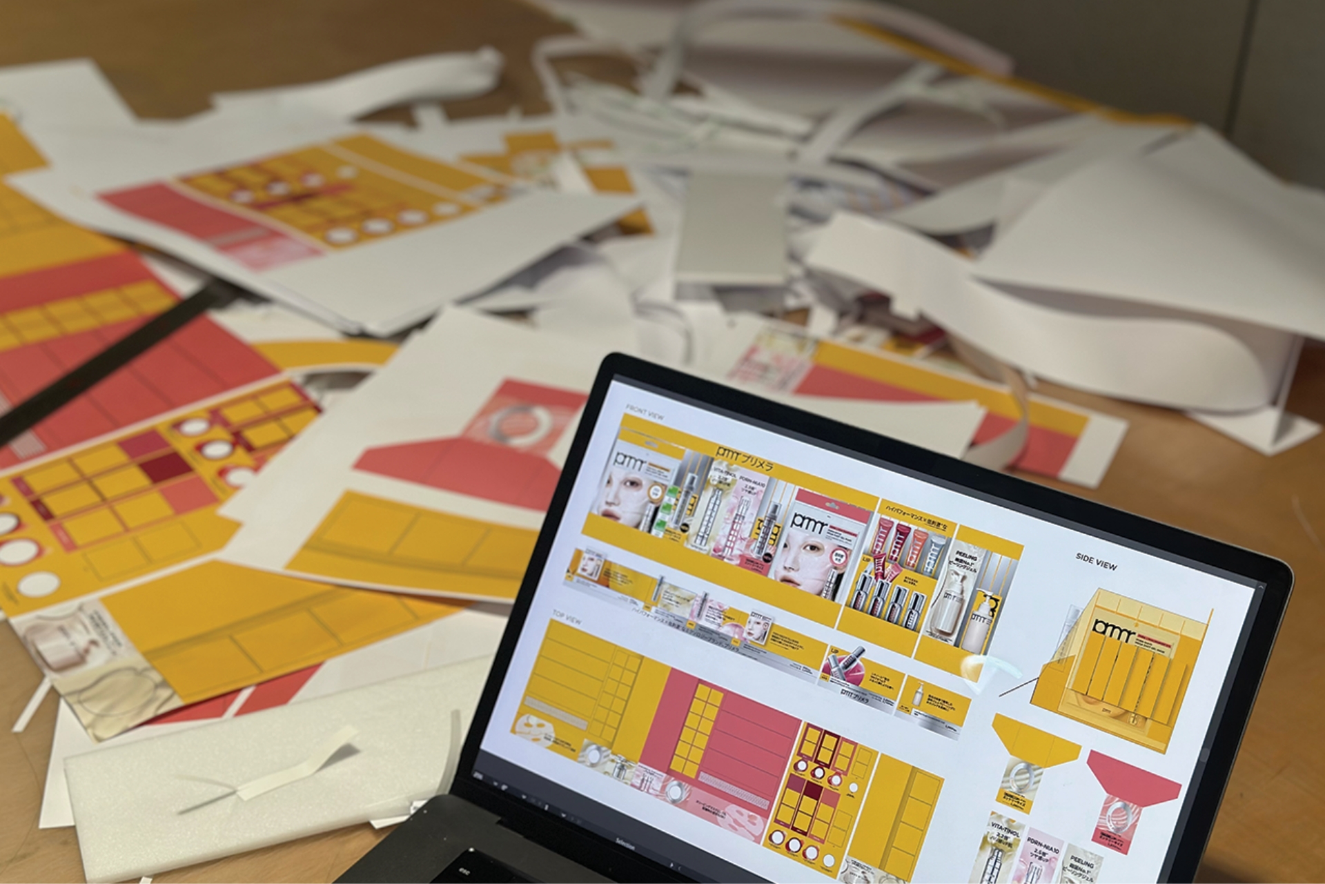
Rather than changing the fixture to match
changing SKUs,
we designed a fixture system
capable of responding to change.
changing SKUs,
we designed a fixture system
capable of responding to change.
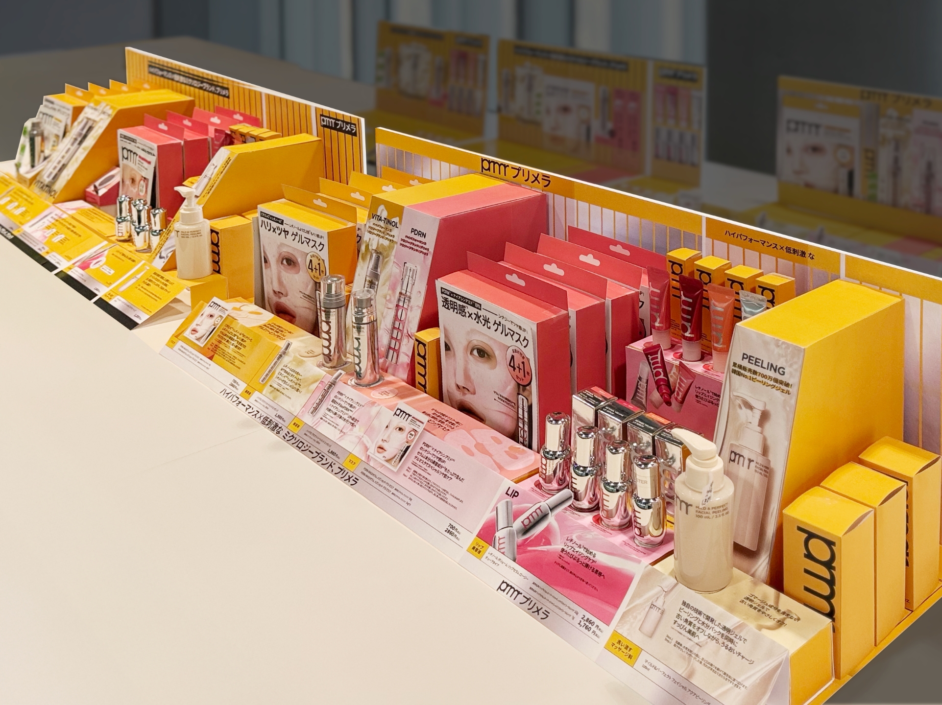
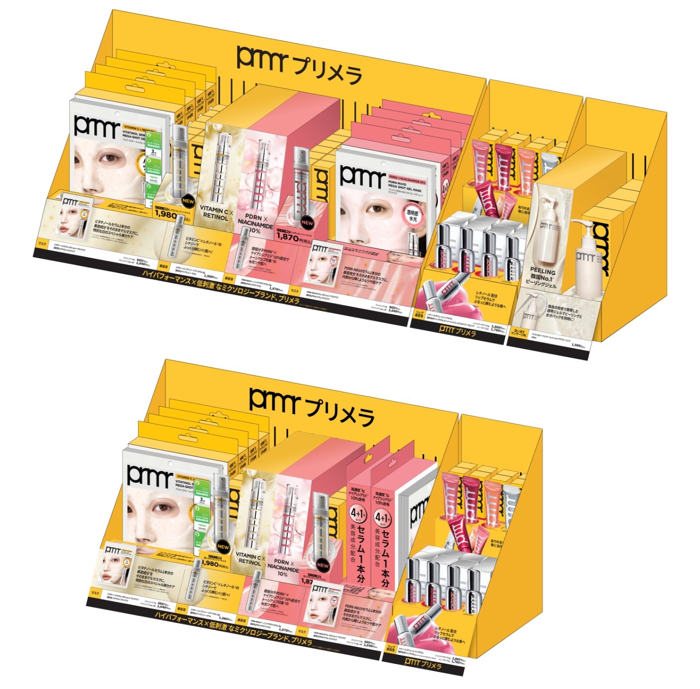
The final design was completed as a new system optimized for Japan’s MBS environment, while maintaining Primera’s brand identity.
The strong color strategy and repeated graphic pattern make the brand presence more distinct and help guide customers’ attention naturally toward the key products.
The modular structure also established a foundation that can flexibly respond to a product operation environment where changes occur frequently.
This project goes beyond a simple fixture renewal, serving as an example of building a new communication system through which the brand and products can communicate more effectively with customers.
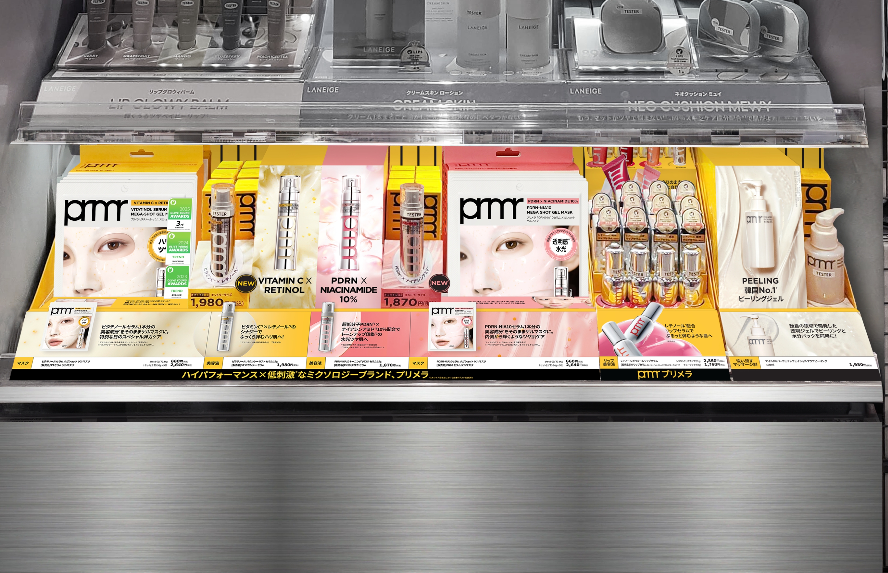
We viewed the fixture not as a single structure, but as a system that delivers the brand experience.
The modular structure allows the system to flexibly respond to changing SKU operations,
while the graphic and color systems make the brand presence more distinct.
This project is a design project that newly defined the way Primera meets customers within Japan’s MBS environment.
The modular structure allows the system to flexibly respond to changing SKU operations,
while the graphic and color systems make the brand presence more distinct.
This project is a design project that newly defined the way Primera meets customers within Japan’s MBS environment.
- Amorepacific Creatives
- VMD
- Kang Rami, Kim Jungyea
- Creative Director
- Lee OhKyung
- GTM
- Ko Jihyun, Kwon Seongyeong,
Mizuki Yaegashi