2nd Exhibition, Mamonde : Heading to the whole process of experience
마몽드, 디자인, 경험의 전체를 향하다
Summary
Mamonde : 디자인, 경험의 전체를 향하다.
1991년 런칭 이후 세대를 뛰어 넘으며 뷰티 트렌드를 이끌어온 브랜드 ‘마몽드’가 2012년 글로벌 환경에 적합하도록 리브랜딩(Re-branding) 프로젝트를 진행했다. 역사를 가진 브랜드인 만큼 지켜가야 할 것들과 새롭게 변화해 가야 하는 부분들에 대해 신중하게 고민했다. 그리하여 ‘꽃을 연구하여 아름다움을 발명하는’ 마몽드의 핵심(Core)은 ‘FLOWER’, ‘EXPERT’, ‘FEMININE’ 으로 새롭게 정의했다. 그리고 ‘노랑’을 마몽드의 브랜드 컬러로 재탄생시켰다. 이 네 가지 요소는 이번 리브랜딩 프로젝트의 핵심 키워드다.
Mamonde : Design, Heading to the whole process of experience
Mamonde, since launching in 1991, which leads Korean beauty trend transcending generations, recently implemented a rebranding project customized to the 2012 global environment. We have deliberated much about what we should keep and what we should change in our brand logo. We, <Inspired by Flowers, Mamonde> decided to keep <FLOWER>, <EXPERT<, <FEMININE> and to rebrand and define our brand color, yellow. These are the keywords of our rebranding project.
Mamonde, since launching in 1991, which leads Korean beauty trend transcending generations, recently implemented a rebranding project customized to the 2012 global environment. We have deliberated much about what we should keep and what we should change in our brand logo. We, <Inspired by Flowers, Mamonde> decided to keep <FLOWER>, <EXPERT<, <FEMININE> and to rebrand and define our brand color, yellow. These are the keywords of our rebranding project.


Concept
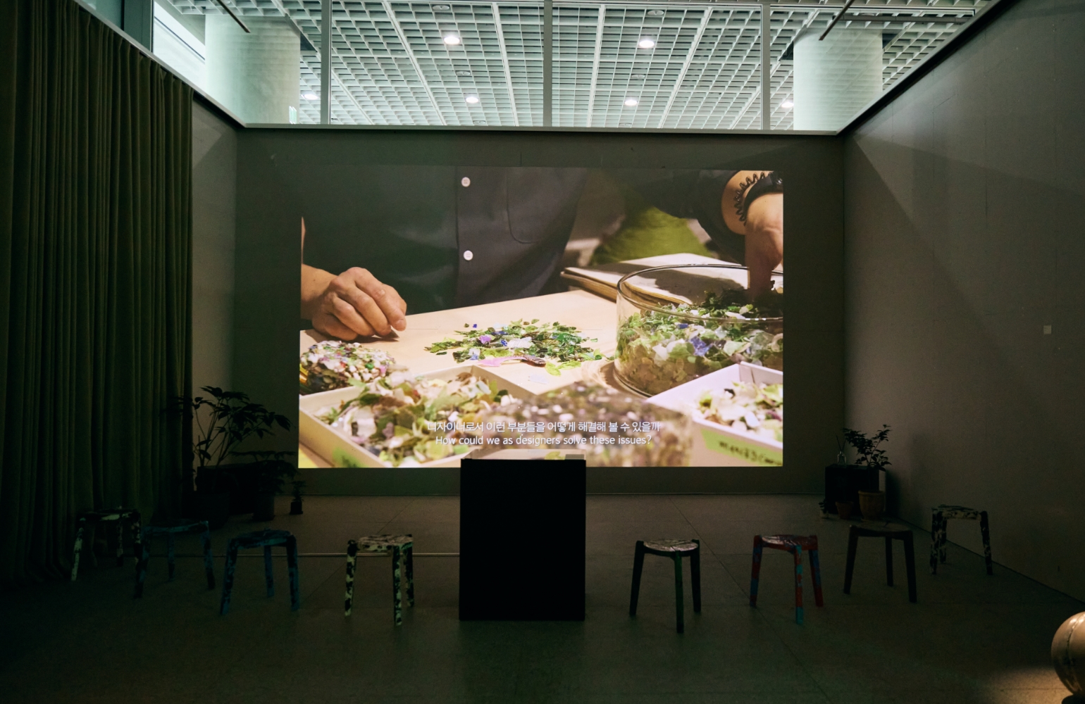
브랜드의 새로운 정체성을 ‘어떻게’ 공유할 것인가도 중요했다. 우리의 고객들은 제품이나 서비스의 각 과정들을 따로 분리해서 인식하지 않는다. 작은 패키지에서부터 방문하는 매장, 웹사이트까지 브랜드와 관련된 ‘전체적인 경험’이 인식을 결정하고 있다. 때문에 우리의 디자인 역시 브랜드의 크고 작은 그림들을 전체적인 관점에서 조망할 수 있어야 했다. 고객이 매장에 들어와서 나가기까지, 보고 듣고 겪는 모든 경험을 하나하나 찾아내 디자인했다. 제품, 인테리어, 그래픽 등 각 분야의 전문가들이 수많은 질문을 던지고 그에 대한 답을 시나리오로 엮었다.
브랜드의 새로운 정체성을 ‘어떻게’ 공유할 것인가도 중요했다. 우리의 고객들은 제품이나 서비스의 각 과정들을 따로 분리해서 인식하지 않는다. 작은 패키지에서부터 방문하는 매장, 웹사이트까지 브랜드와 관련된 ‘전체적인 경험’이 인식을 결정하고 있다. 때문에 우리의 디자인 역시 브랜드의 크고 작은 그림들을 전체적인 관점에서 조망할 수 있어야 했다. 고객이 매장에 들어와서 나가기까지, 보고 듣고 겪는 모든 경험을 하나하나 찾아내 디자인했다. 제품, 인테리어, 그래픽 등 각 분야의 전문가들이 수많은 질문을 던지고 그에 대한 답을 시나리오로 엮었다.
We place emphasis on how we share our new brand identity. Our customers for certain products or services experience all the courses all at once. They don’t accept the package, store, and website separately. It is said that “One must not mistake the forest for the trees,” so we always emphasize brand design rather than the design of only a specific part of the total brand identity. We have to identify everything our customers see, hear, and do in our store and design all of them. We have asked numerous questions and put the answers into a scenario.


![The exhibition [HEALING TIMES]'s work list thumbnail](https://cdn-design.amorepacific.com/contents/2024/01/22132941/24_00_list_thumb.jpg)


![Exhibition [The House of Beauty Scientists] 's work list thumbnail](https://cdn-design.amorepacific.com/contents/2024/08/02172154/24_88_list_thumb.jpg)


![[EXHIBITION] The House of Beauty Scientists _Busan's work list thumbnail](https://cdn-design.amorepacific.com/contents/2025/06/26102143/25_25_list_thumb.jpg)