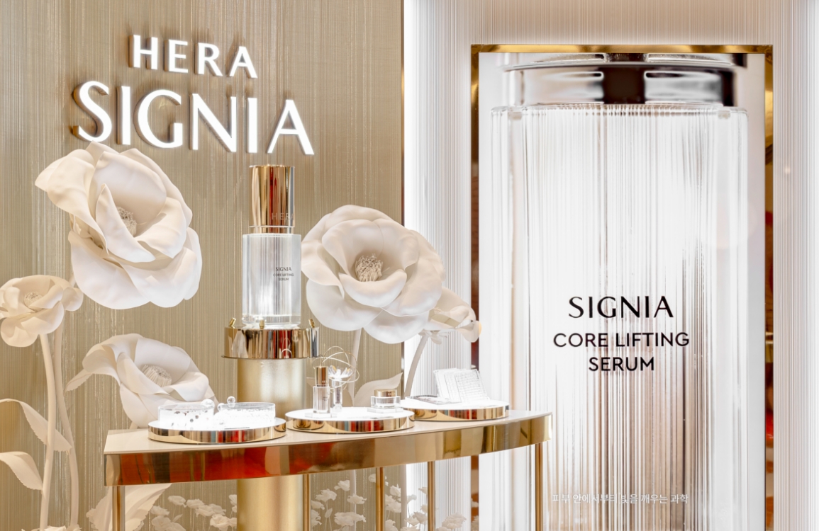
IOPE: New Store Identity
Summary
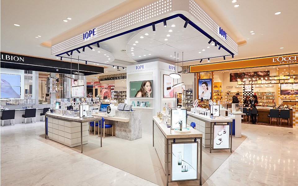
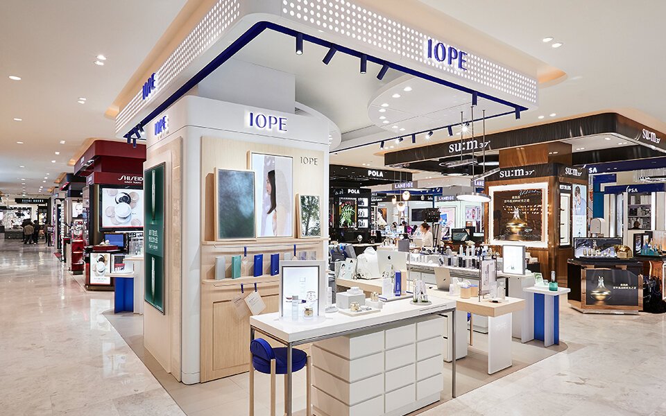
IOPE New Store Identity is the second-generation Store Identity design for delivering the reframed brand story. While the existing IOPE focused on functionality and technological prowess, emphasizing bio-science, the new brand philosophy aims to begin research from people and base science on plants. This is the new direction IOPE seeks to pursue.
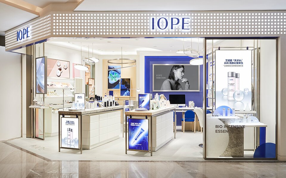
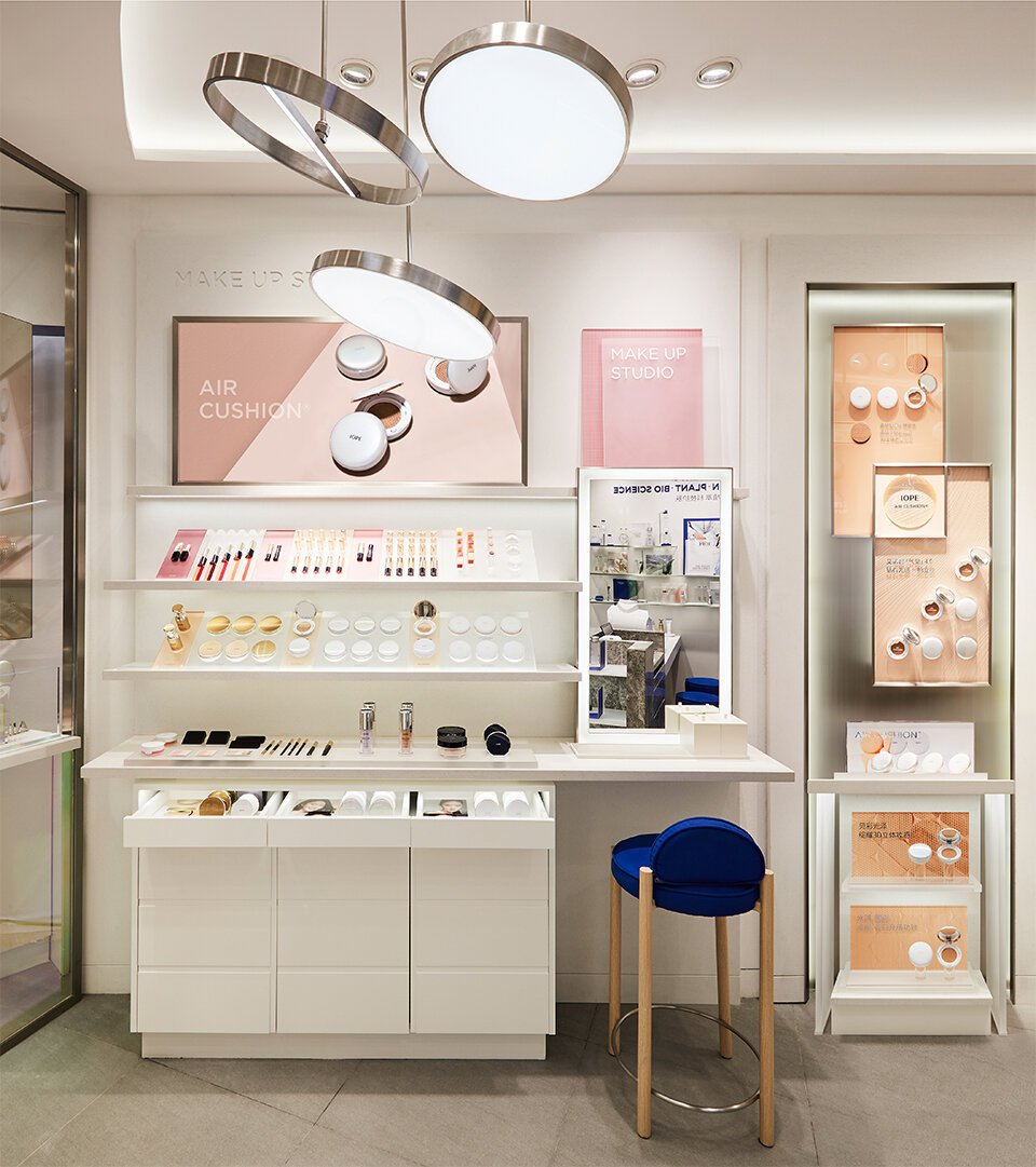
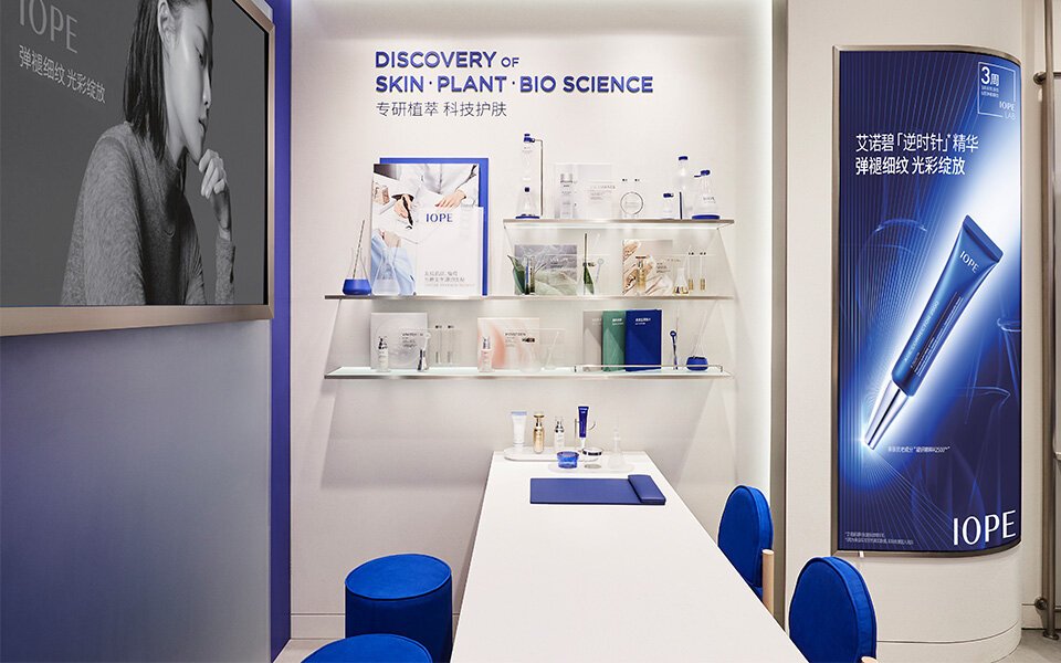
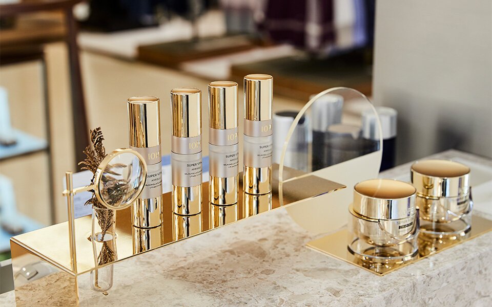
Centered around the counseling services of IOPE LAB™, a symbolic space dedicated to the research of skin science, plant science, and bio-science, the new store identity aims to present a premium functional skincare brand image. It incorporates service environments suitable for the channel’s characteristics and symbolic design elements representing the research brand, such as magnifying glass-shaped ceiling pendant lights and bespoke lighting objects on tables. The graphics used in the space are inspired by the dot patterns applied to the packaging of the reframed products, symbolizing the essence of scientific technology through cylinder-like laboratory apparatus.
Centered around the counseling services of IOPE LAB™, a symbolic space dedicated to the research of skin science, plant science, and bio-science, the new store identity aims to present a premium functional skincare brand image. It incorporates service environments suitable for the channel’s characteristics and symbolic design elements representing the research brand, such as magnifying glass-shaped ceiling pendant lights and bespoke lighting objects on tables. The graphics used in the space are inspired by the dot patterns applied to the packaging of the reframed products, symbolizing the essence of scientific technology through cylinder-like laboratory apparatus.
Concept
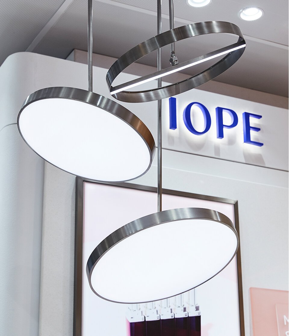
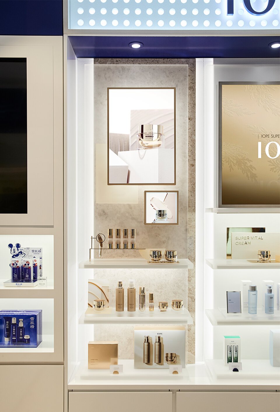
In the new S.I., the graphic motif serves as a metaphor for the story of discovery, derived from the circle of a magnifying glass. One half of the circle represents the world discovered by IOPE through a new perspective—the result of continuous plant research—symbolizing the ultimate solution for customers. The other half represents the unknown world yet to be revealed through research, symbolizing the potential realm of valuable discoveries for customers.
Centered around the counseling lab, the open layout and double-sided tester bar create a welcoming space where BAs and customers can engage in conversation from anywhere. The True Blue color is used only as an accent, transforming the store into a bright white space that makes the skincare lines stand out. Vertical video panels are arranged like gallery frames, giving brand content a more unique presence. The magnifying glass circle motif is also implemented as a lighting object, linking the product with the design concept.
Centered around the counseling lab, the open layout and double-sided tester bar create a welcoming space where BAs and customers can engage in conversation from anywhere. The True Blue color is used only as an accent, transforming the store into a bright white space that makes the skincare lines stand out. Vertical video panels are arranged like gallery frames, giving brand content a more unique presence. The magnifying glass circle motif is also implemented as a lighting object, linking the product with the design concept.
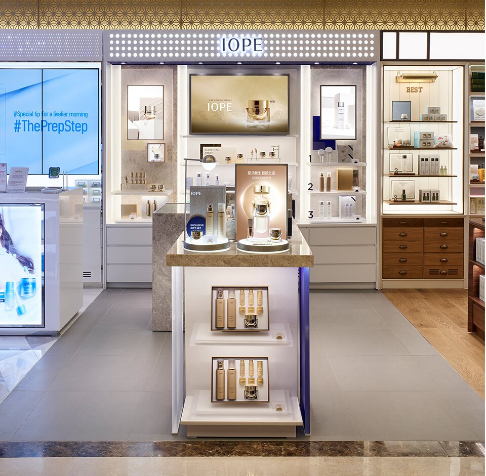
Department Store Type – Hankwang Department Store
Department Store Type – Hankwang Department Store
Department Store Type – Hankwang Department Store
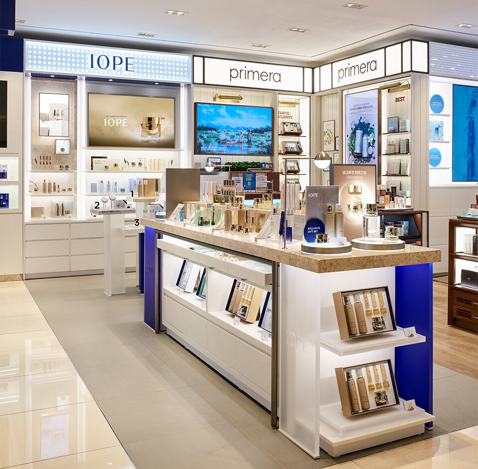
Road Shop Type – Shanghai Plaza 66
Road Shop Type – Shanghai Plaza 66
Road Shop Type – Shanghai Plaza 66
Road Shop Type – Shanghai Plaza 66
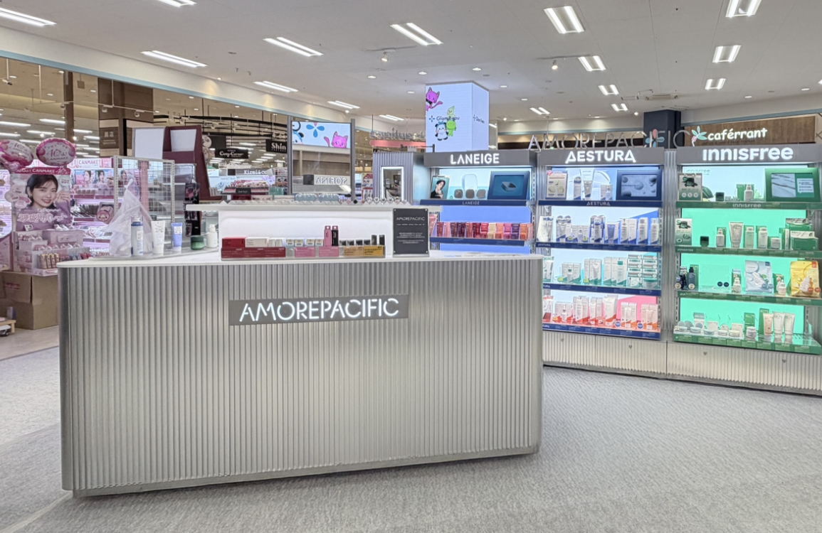
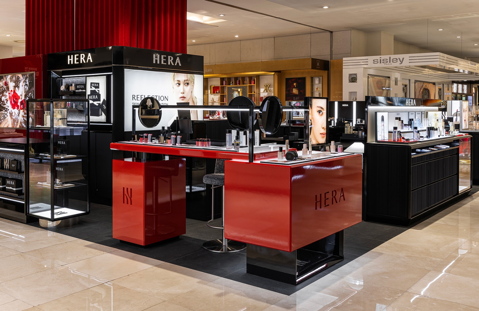
Duty-Free Channel – Lotte Busan Store
Duty-Free Channel – Lotte Busan Store
Duty-Free Channel – Shilla Jangchung Store
Duty-Free Channel – Shilla Jangchung Store
- Amorepacific Creatives


![Exhibition [The House of Beauty Scientists] 's work list thumbnail](https://cdn-design.amorepacific.com/contents/2024/08/02172154/24_88_list_thumb.jpg)