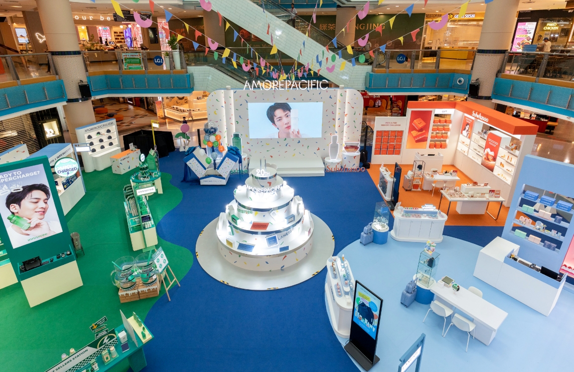
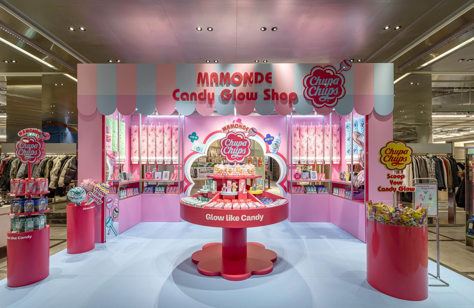
MAMONDE X CHUPA CHUPS Pop-up Store
Summary
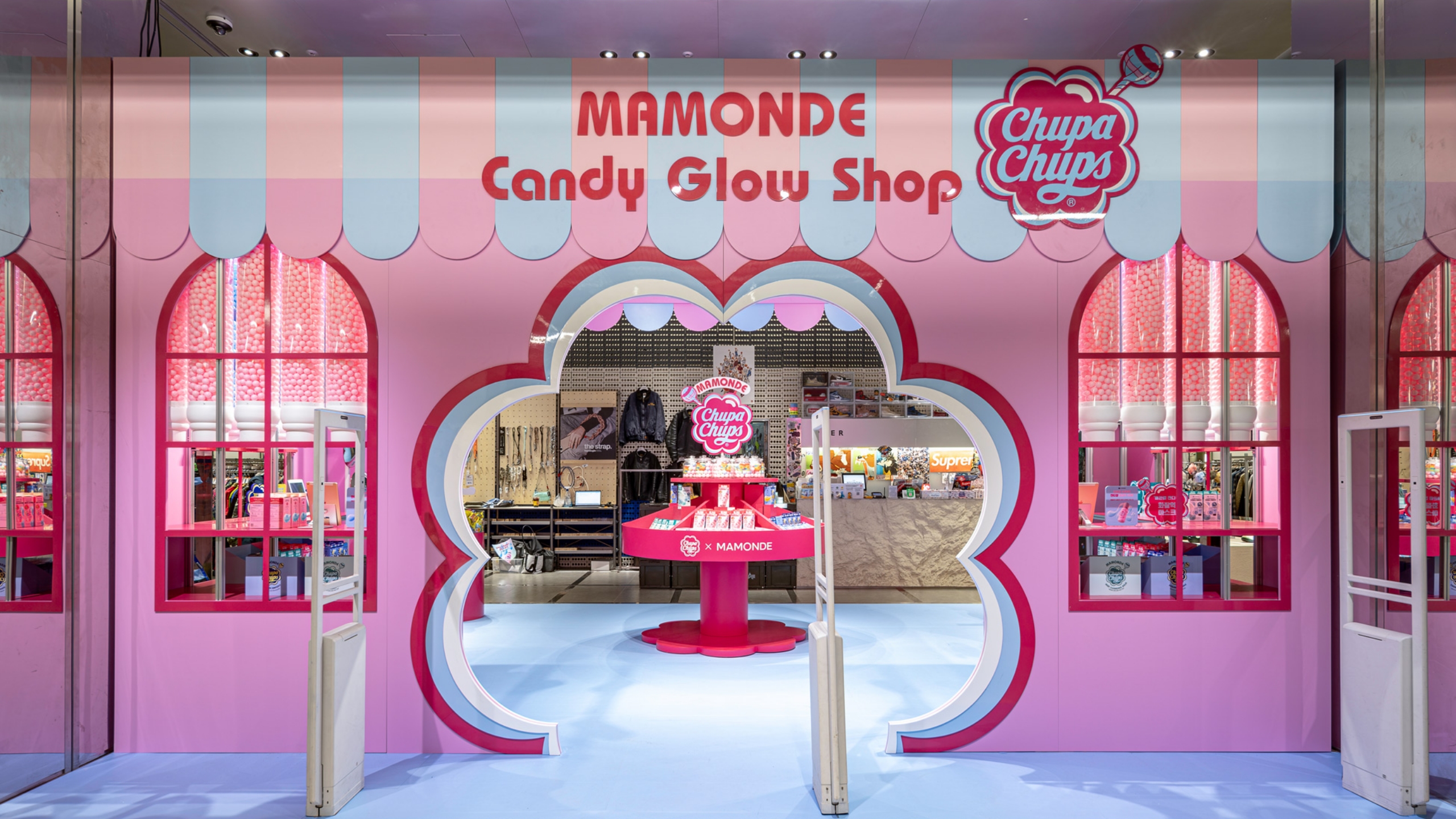
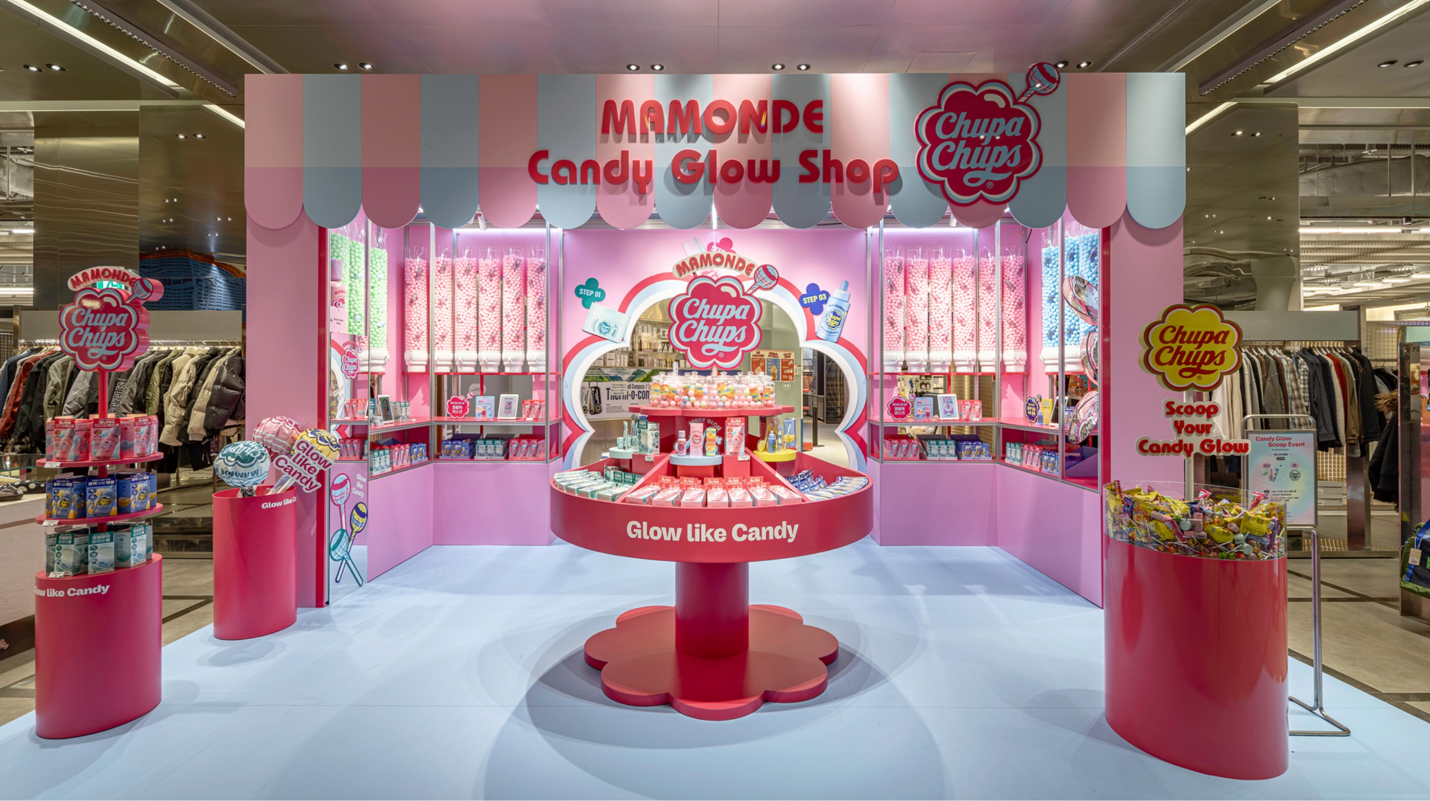
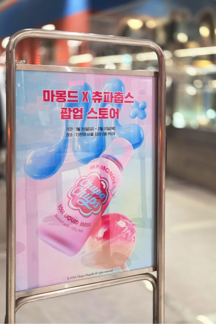
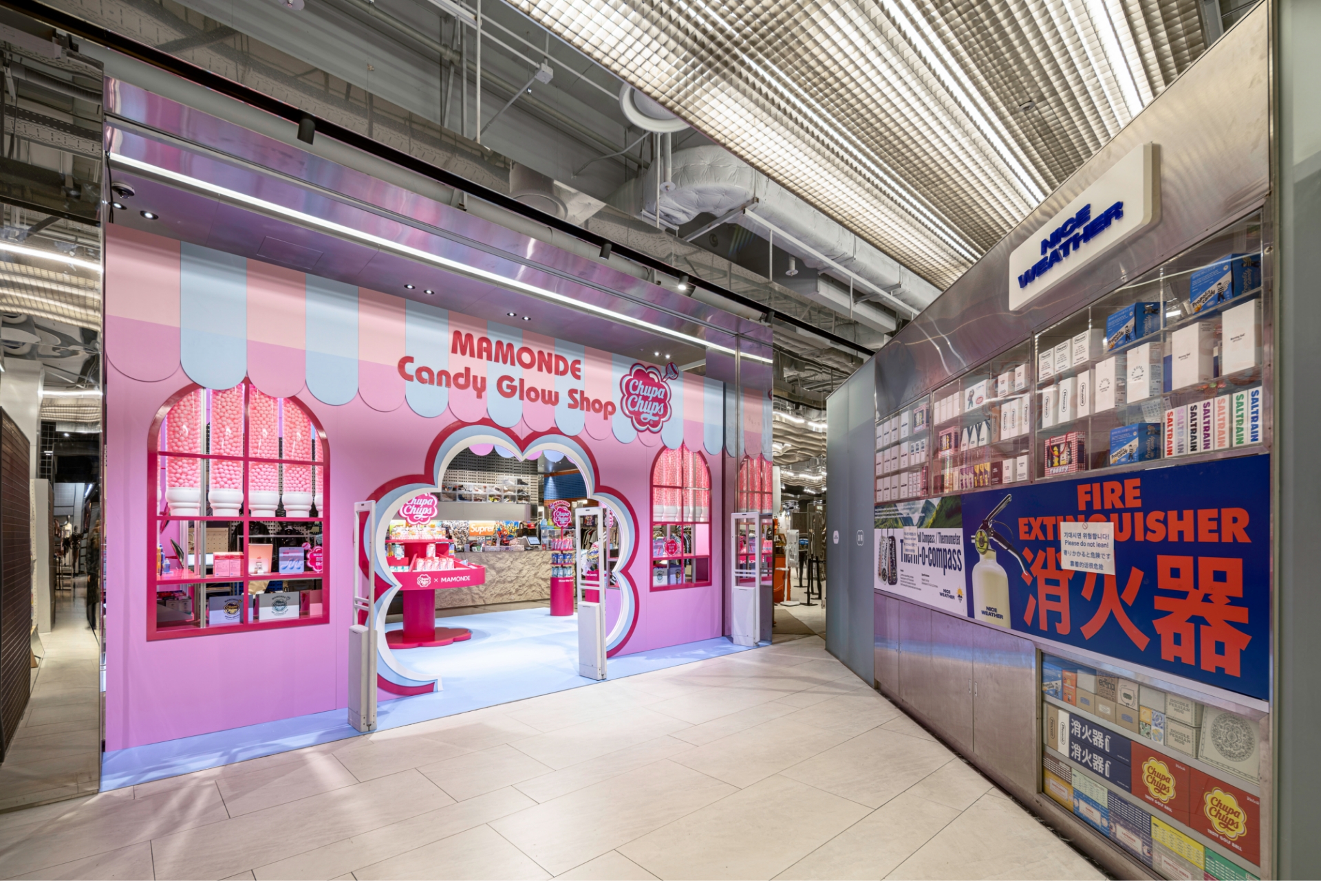
To celebrate the release of the “Candy Glow Edition” in collaboration with the global lollipop brand CHUPA CHUPS, MAMONDE opened the “MAMONDE Candy Glow Shop” pop-up store at The Hyundai Seoul.
Inspired by a candy shop, the pop-up features a colorful and playful energy from CHUPA CHUPS infused with MAMONDE’s glow skincare messaging, creating an intuitive and photogenic brand experience.
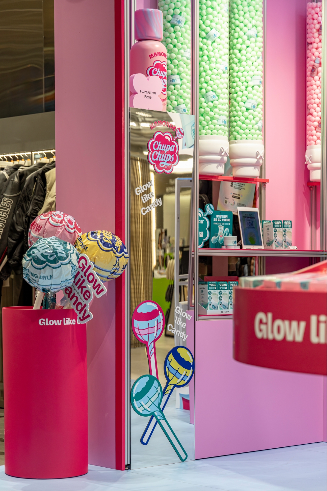
Centered around the main theme “Glow Like Candy,” the “Candy Skin Glow” concept was applied throughout the entire space, allowing visitors to naturally experience the product effects and the brand’s unique mood.
Concept
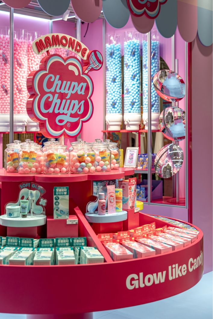
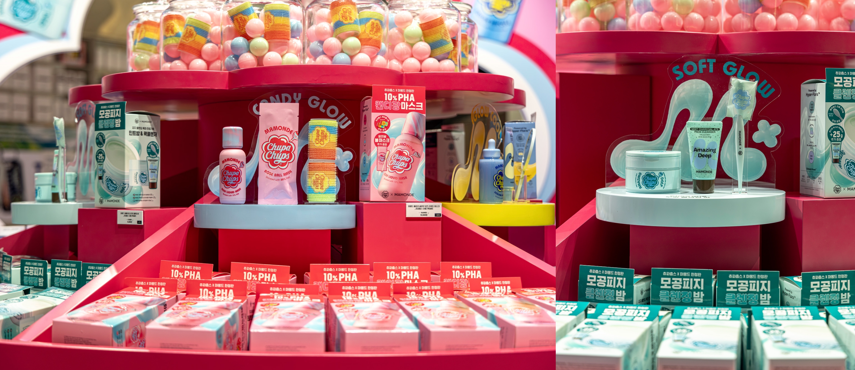
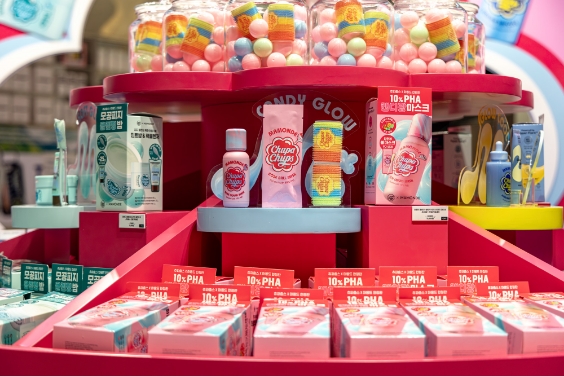
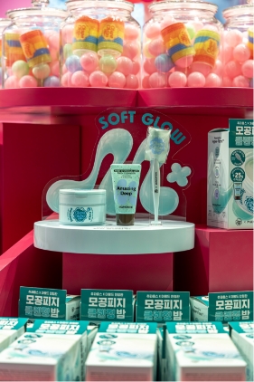
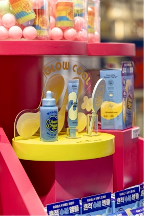
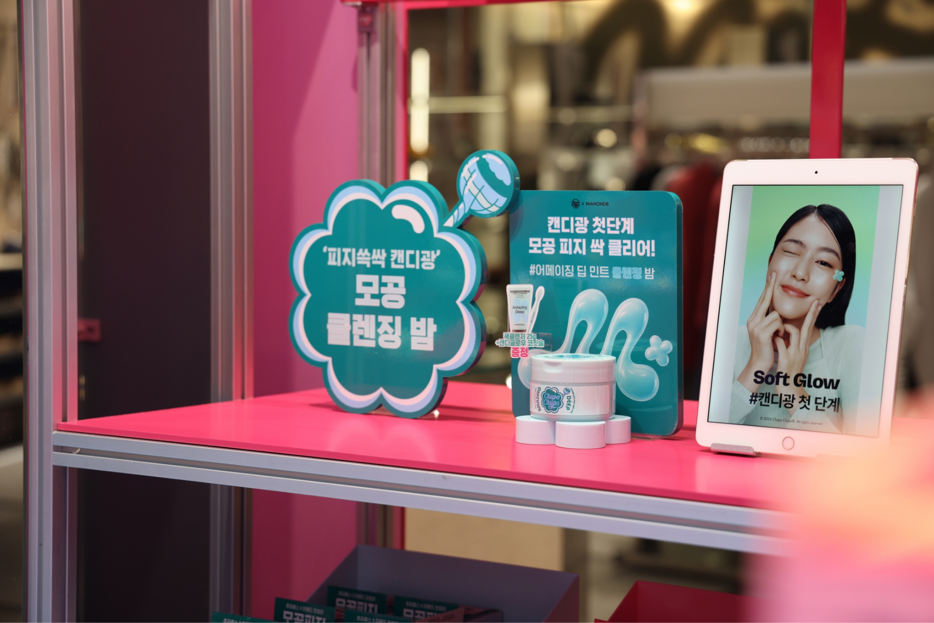
This pop-up showcases the MAMONDE x CHUPA CHUPS collaboration, featuring the “Flora Glow Rose Liquid Mask,” “Amazing Deep Mint Cleansing Balm,” and “Calming Shot Azulene Ampoule.”
The design reinterprets a vibrant “Candy Shop” using the collaboration’s bold color palette.
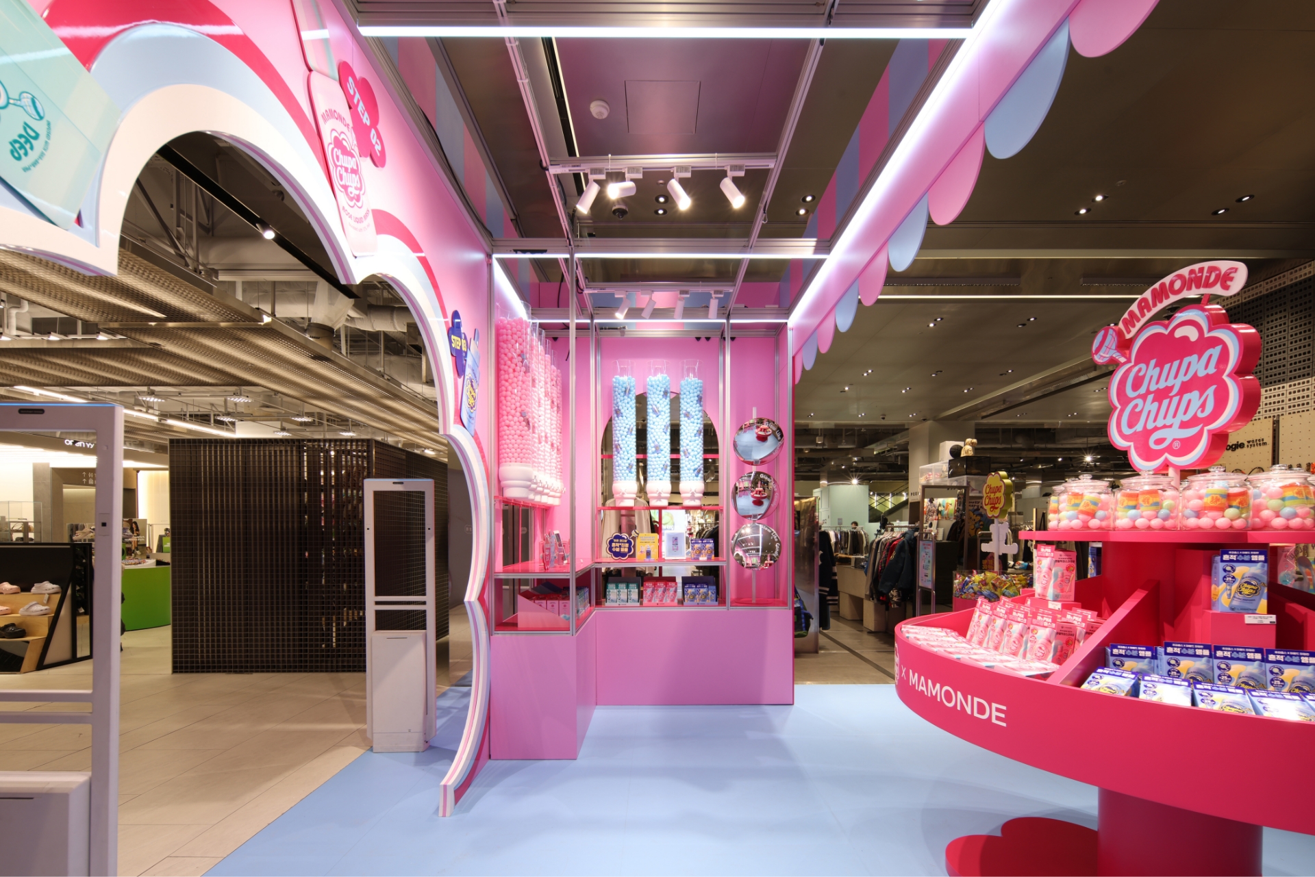
The exterior’s colorful awnings and window frames create a cheerful welcome. Inside, wall-mounted candy dispensers and repetitive displays evoke a fully stocked shop, enhancing visual density.
The palette is led by the signature rose-pink of the “Flora Glow Rose Liquid Mask,” accented with magenta and rose-blue. Mint and blue tones from the other two products are balanced to distinguish each item’s identity while maintaining a harmonious rhythm.
CHUPA CHUPS’ iconic daisy motif is applied in various scales throughout the space to highlight the partnership. Through charming photo zones and rich product displays, the pop-up embodies the themes of “Sweetness” and “Abundance,” immersing visitors in the brand’s playful mood.
Considering the site environment with multiple entry points, the central fixtures were designed in a circular structure to draw the eye from any direction.
This layout allows visitors to compare and experience the three collaboration products at a glance, with each special set, its original product, and the promotional merchandise displayed together for an intuitive look at the actual contents.
Furthermore, products were displayed in high volume to ensure that key keywords and iconic package graphics are repeatedly exposed, creating a powerful visual grouping effect.
The arrangement was strategically designed to facilitate a seamless flow, allowing visitors to easily pick up products as they move through the space.
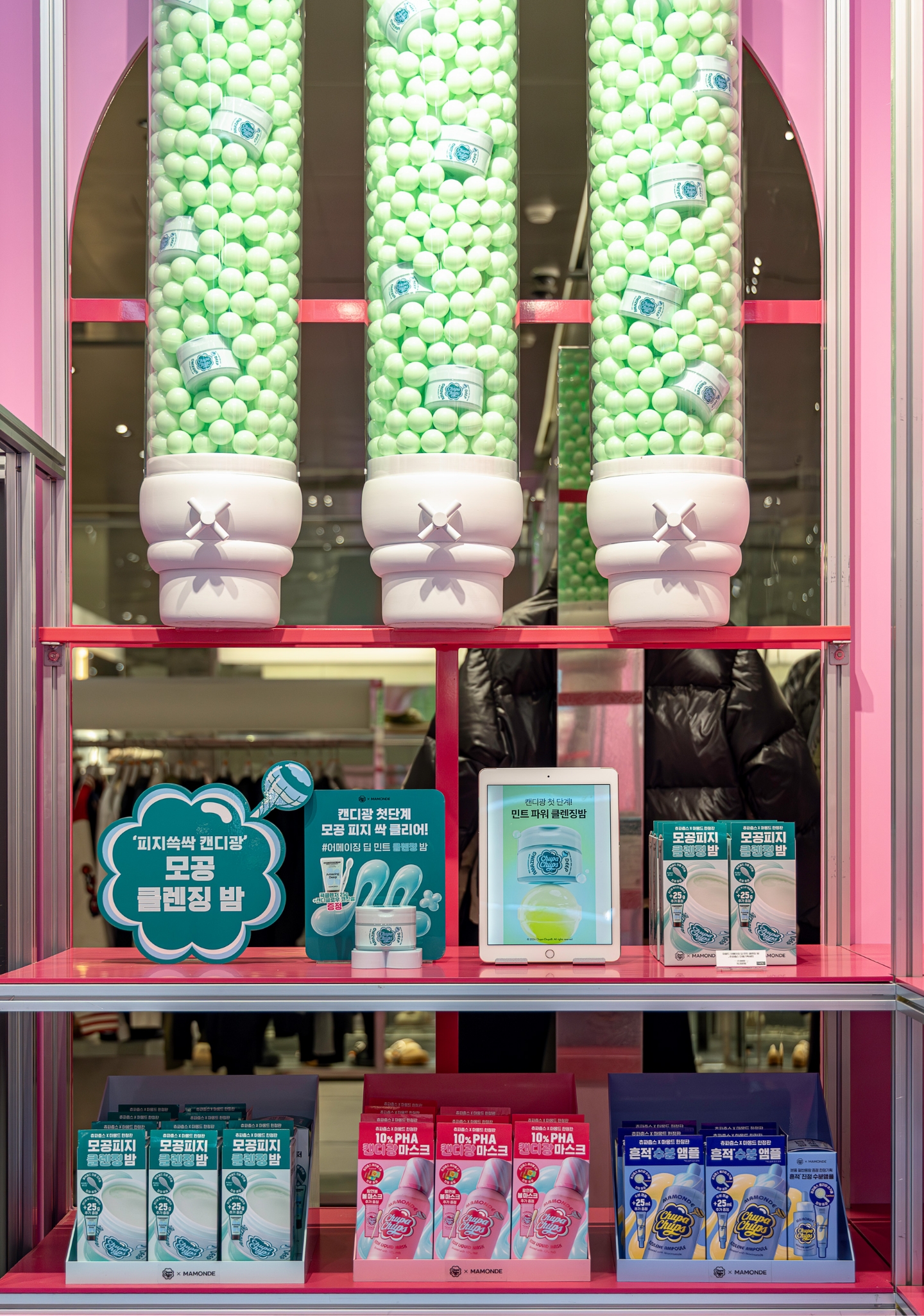
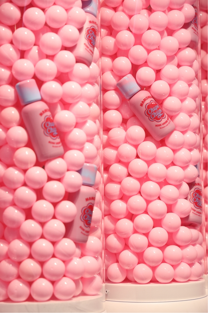
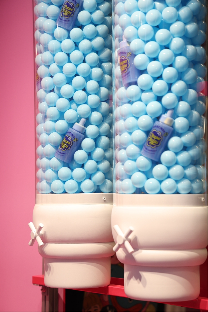
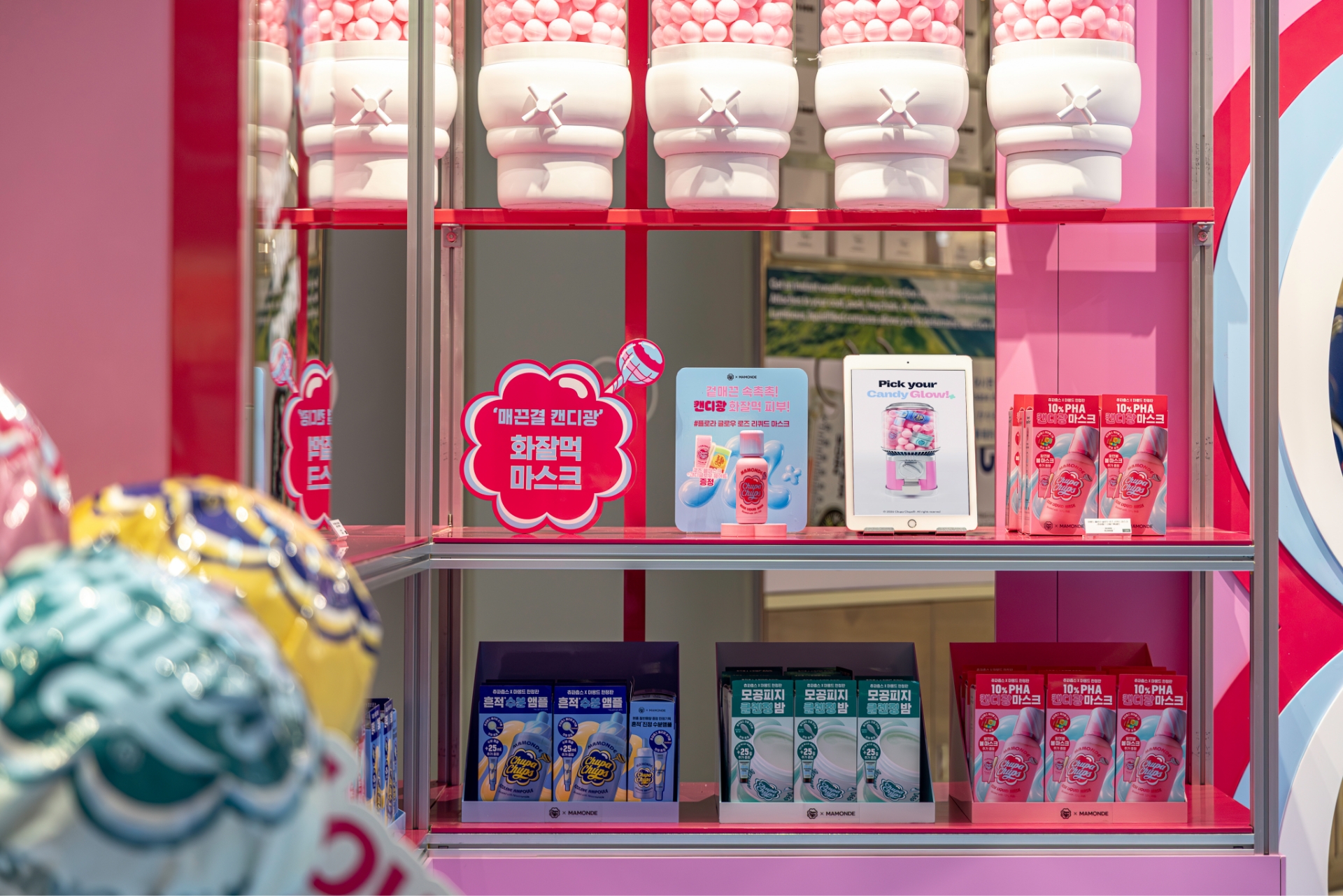
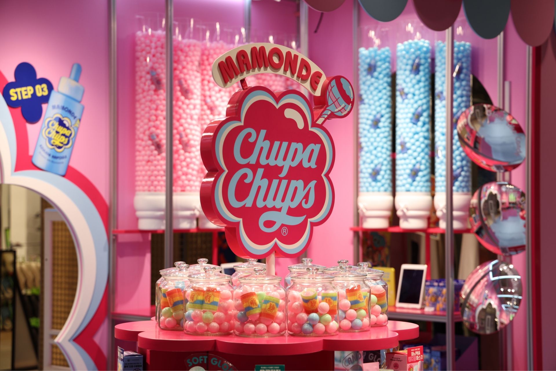
The candy dispenser models installed along the walls were inspired by the large-scale wall displays found in actual toffee shops or chocolate boutiques.
By filling transparent cylinders with colorful candy-like balls and nesting the products among them, we created a high-impact atmosphere that makes the entire space feel like one giant candy shop.
Positioned at eye and hand level beneath the candy wall, the layout ensures that product benefits and core messages are instantly recognizable.
By integrating POP displays explaining specific benefits, dynamic videos that add liveliness, and testers for hands-on experience, the path was strategically designed to guide visitors from identifying their skin concerns to the final purchase.
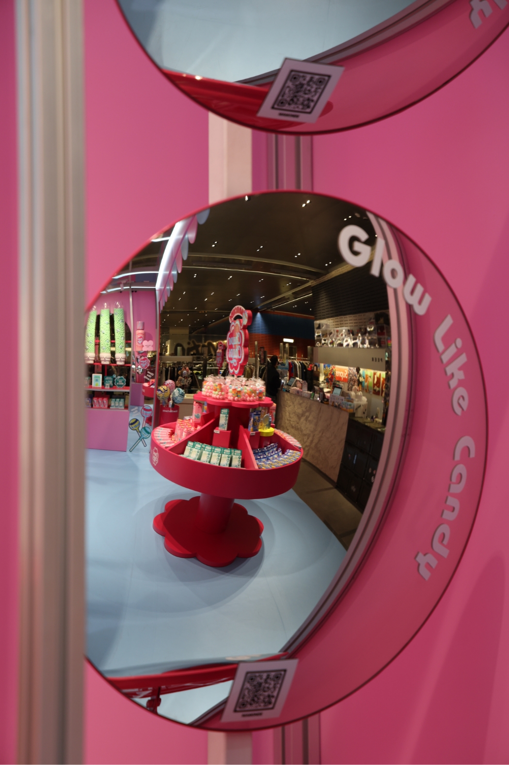
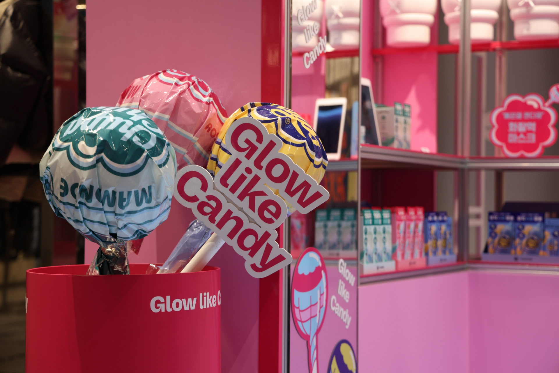
Charming props and mirrors were arranged throughout the pop-up space to encourage visitors to capture and share their memories naturally.
Large-scale installations of the three collaboration-design CHUPA CHUPS lollipops were placed alongside “GLOW LIKE CANDY” message pickets.
Mirrors were adorned with graphics and slogans, ensuring the brand’s message was seamlessly captured in every visitor’s selfie.
Additionally, a set of convex mirrors—reminiscent of smooth, glossy candies—was installed to add an element of fun for photos from various angles.
To enhance digital engagement, QR codes were strategically placed, allowing visitors to easily connect to MAMONDE’s official social media accounts.
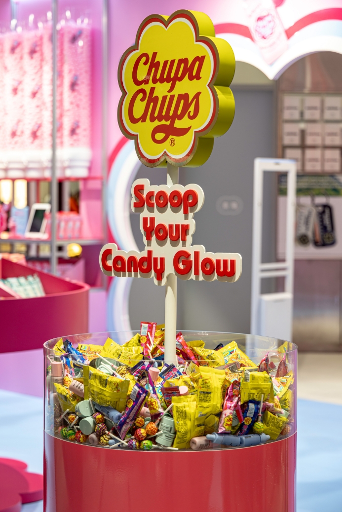
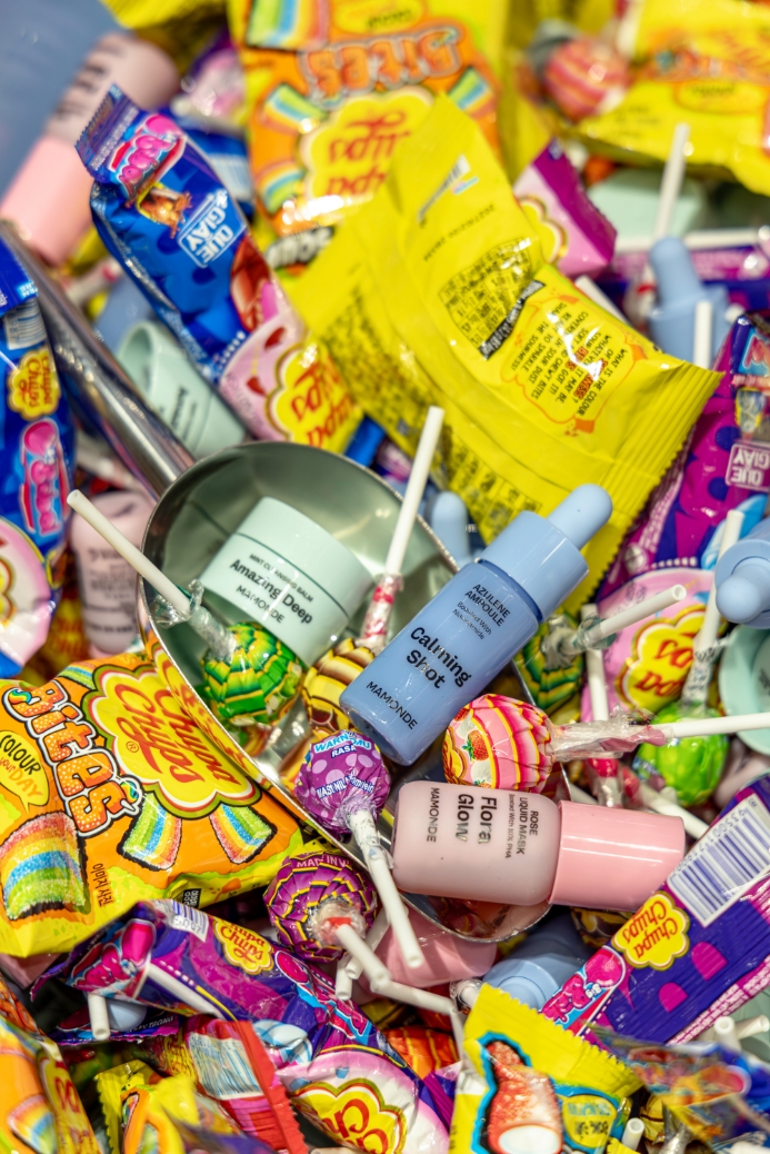
At the MAMONDE x CHUPA CHUPS pop-up store, a “Scooping Event” was held for customers who made a purchase.
A dedicated promotion fixture was designed to allow participants to scoop up both MAMONDE product samples and sweet CHUPA CHUPS candies, adding an element of interactive fun.
The fixture featured the original CHUPA CHUPS logo to clearly communicate the collaboration branding.
It was also designed to showcase the gifts overflowing within, intuitively signaling that a unique giveaway event was in progress.
The overall intention was to deliver both visual delight and an engaging participatory experience simultaneously.
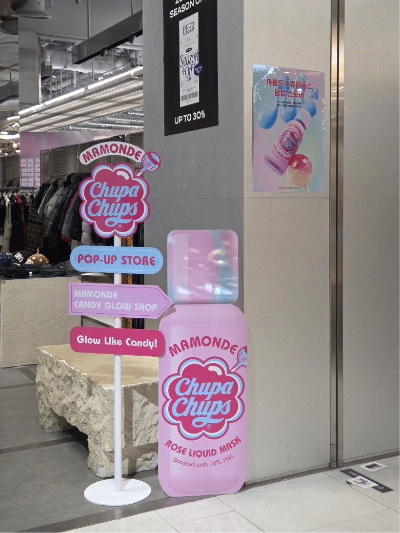
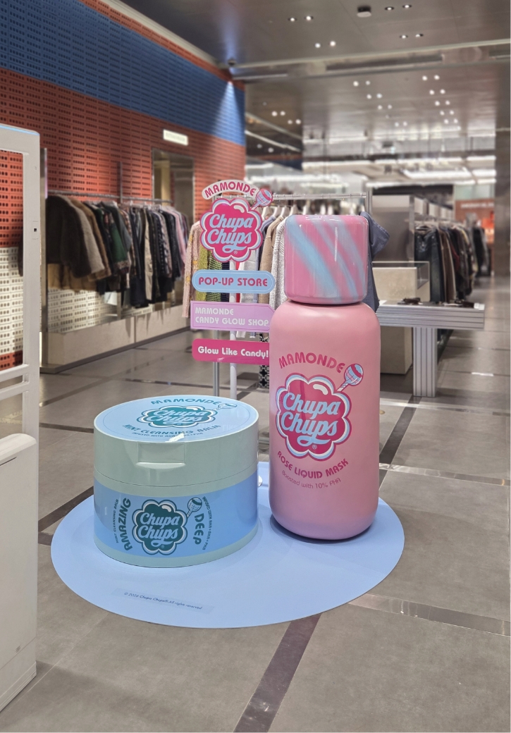
Along the pathways leading to the pop-up store, additional signage was strategically placed to intuitively signal its presence.
By incorporating the concept colors and collaboration graphics at every approach, we ensured that visitors could quickly recognize the pop-up from a distance and be naturally drawn into the space.
This design creates a continuous brand experience that begins well before entering the store.
This project was designed to weave the brand motifs of MAMONDE and CHUPA CHUPS into a single visual language, allowing the entire space to speak the message “Glow Like Candy” directly.
Beyond simply creating beautiful scenes, the goal was to deliver a brand experience that is understood at a glance, enjoyable while experienced, and memorable upon departure.
By layering various elements—from diverse display installations and photo zones to the scooping event—we meticulously refined every detail to ensure each moment was “a scene possible only through this collaboration.”
This project allowed us to deeply realize the power of energy created when products, graphics, and space align in perfect harmony.
Moving forward, we will continue to explore new spatial attempts that add depth to the brand experience.
- Amorepacific Creatives
- Space & VMD Design
- Baek Jiyoung, Choi Yeonjae
- Brand
- MAMONDE Team Kang Jeonga
- Photography
- H.SPACE


![Exhibition [The House of Beauty Scientists] 's work list thumbnail](https://cdn-design.amorepacific.com/contents/2024/08/02172154/24_88_list_thumb.jpg)