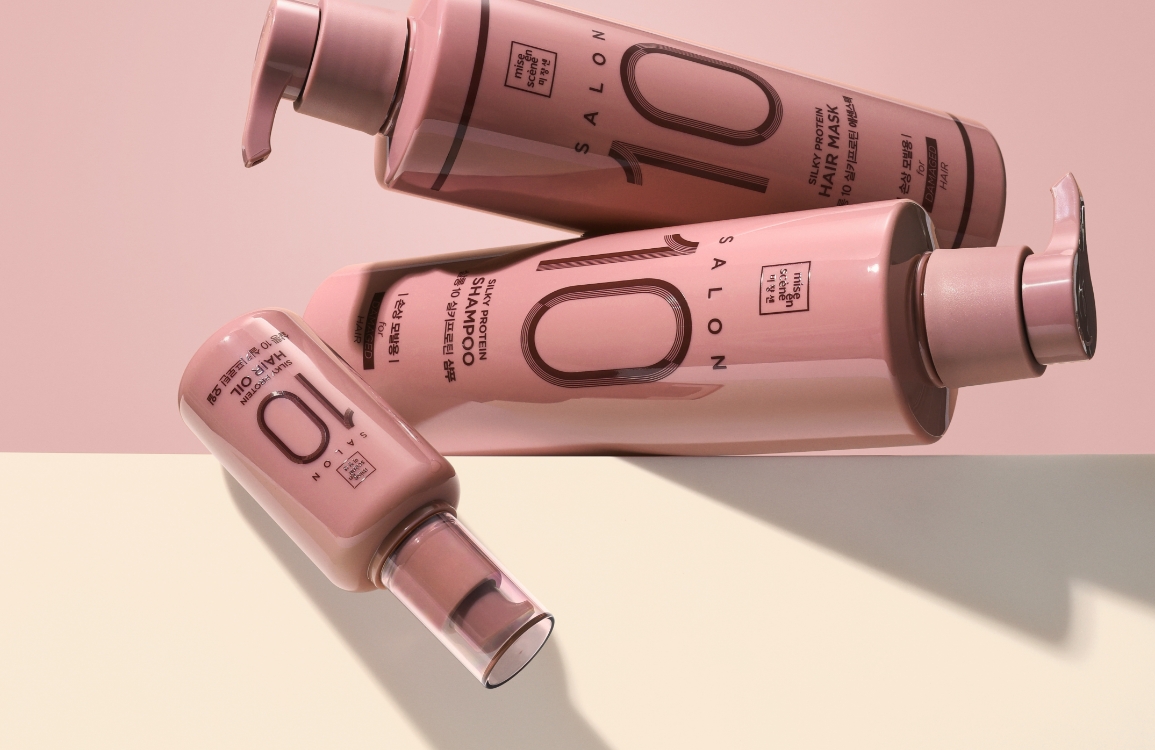
Miseenscene Package Design Renewal
Summary
Mise en Scène, from the French word meaning “to direct on screen”. Mise en Scène, a hair cosmetics brand founded on the philosophy of directing hairstyles and images to perfection, has redesigned its Perfect line.
Concept
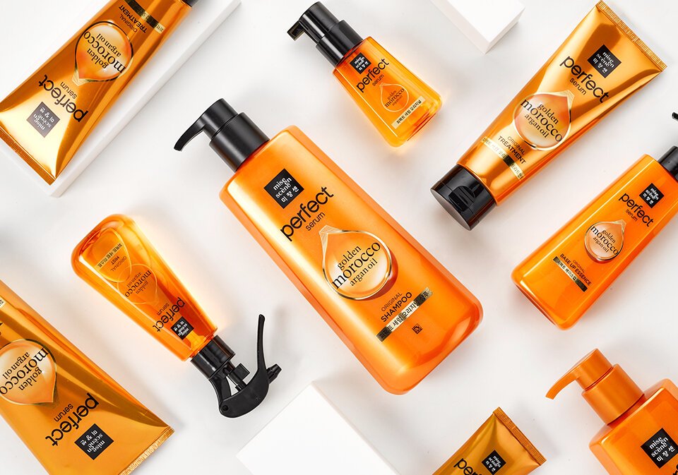
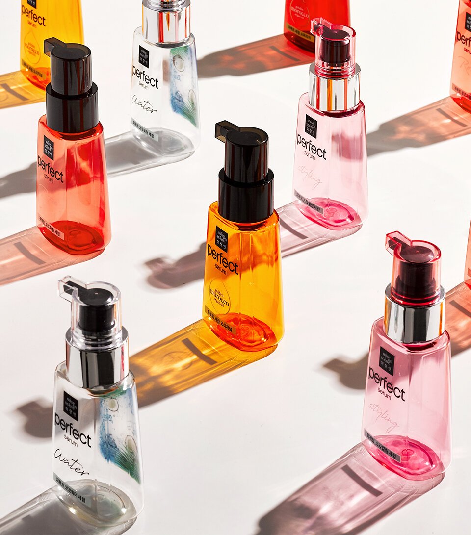
Mise-en-scène is one of the most popular lifestyle brands among the 30-plus brands under Amorepacific. The key focus of the redesign was to avoid confusing existing customers while retaining elements that clearly identify it as Mise-en-scène, and to emphasize functionality and sophistication. The triangular container shape and color, which immediately identify the product as Mise-en-scène Perfect Serum, were kept, but the rounded edges of the previous container were refined with sharper, more linear edges to enhance detail. The somewhat flat oil-shaped icon was replaced with a three-dimensional image, and Moroccan oil—one of the seven oils in the formula—was highlighted by placing its typography prominently on the front of the package. Meanwhile, the gold border graphic symbolizing the blend of seven oils was retained to preserve continuity with the existing brand image. Based on the assessment that the brand logo has achieved a certain level of market recognition, the square Mise-en-scène logo was reduced in size by approximately 30–40% from the previous design, while giving greater prominence to the “Perfect” naming.
- Amorepacific Creatives