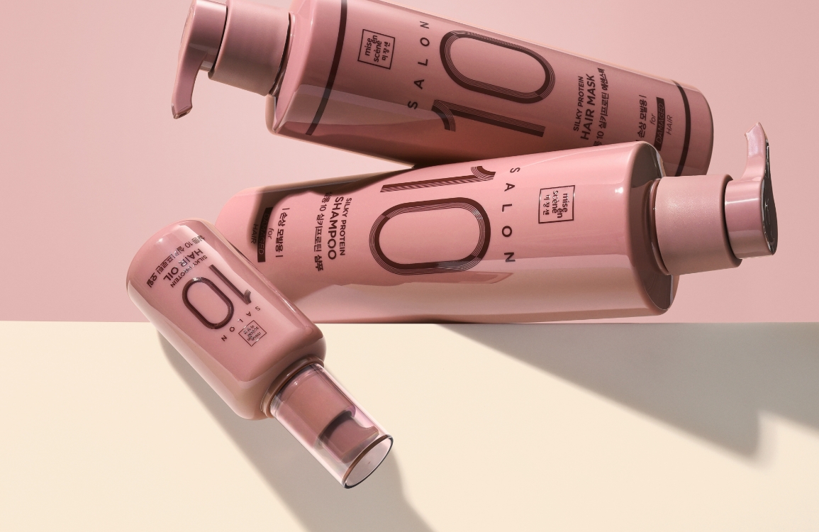
Mise en scene Perfect Serum Original Contents
Summary
Mise en Scène Perfect Serum has been a beloved national favorite since its 2011 launch. This renewal aimed to enhance the product’s appeal and strengthen
its presence by more clearly and powerfully communicating its identity. The project began with the question, “How much can we change from the design we’ve
kept for over a decade?”—a question that led to much experimentation with shape, color, and graphics. We’d like to share not only the final design but
also the process behind it.
Background
To solidify the serum’s presence in the competitive hair care market, we conducted internal analyses and customer research on the formula, concept, design, and
overall communication. The existing product was known for great cost-performance, but lacked elements that delivered emotional satisfaction. This renewal inherited
the product’s core strengths while enhancing its emotional and aesthetic value, transforming it into a product with higher perceived value.

Concept
Based on the key message, “softness with a different finish,” the concept was redefined to position the serum as one that provides optimal care for damaged hair and
long-lasting softness, using advanced formulations and technology. The previous design, optimized for offline environments, included extensive on-pack information.
The new design focuses on home-use environments like bathrooms and vanities, stripping away decorative elements for a cleaner presentation. Despite its minimalism,
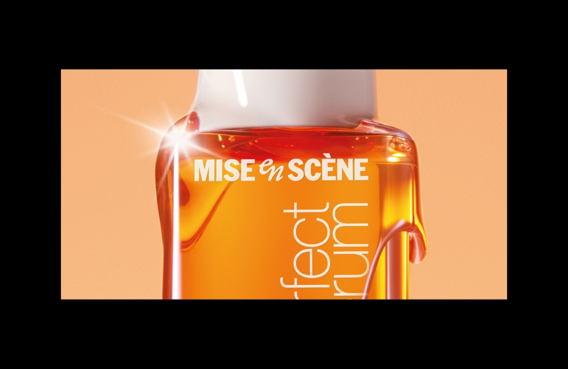
the design clearly communicates the “Perfect Serum” identity, strengthening its presence. The new bottle retains the distinct angular silhouette of the original
but simplifies the overall shape to emphasize elegance and control. The front’s straight lines convey modern strength, while the soft curvature on the back reflects
the concept of “softness with a twist.”

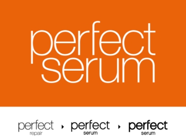
The product name “Perfect Serum” has gradually become bolder over time to improve shelf visibility. The contrast between “Perfect” and “Serum” helped organize front-facing
information and draw attention in physical retail. However, feedback revealed that customers recognize the product as “Perfect Serum” as a whole, and the previous approach
was ineffective for small digital thumbnails in e-commerce. Returning to the original Helvetica base, we adjusted font weight for better visibility across platforms and
aligned “Perfect” and “Serum” at the same level to deliver a unified identity.

Original Contents – Behind Story
Due to the sensitivity of the hair/body market, we began the renewal with small design changes. Retaining the iconic triangular-flask-inspired bottle,
we experimented with revised graphics and label applications. Maintaining elements like color and select visual motifs, we explored ways to differentiate
Perfect Serum’s identity. This process built confidence and ultimately led to a full redesign of the bottle shape.


With shape constraints removed, we explored a wide range of concepts—from updated versions of the original design to entirely new forms. After assessing each
direction’s feasibility and issues, we finalized a new design. Orange was selected as the main color to symbolize Perfect Serum, and elements of the previous
shape were preserved. The final form minimizes unnecessary curves, enhances visual restraint, and harmonizes with bold new graphics to reinforce presence and identity.


- Amorepacific Creatives
- 디자인
- 안윤정
- 비주얼 디렉팅
- 이경주
- 비주얼 촬영
- 신상우
- BM팀
- 김미선
- 개발팀
- 김지훈


