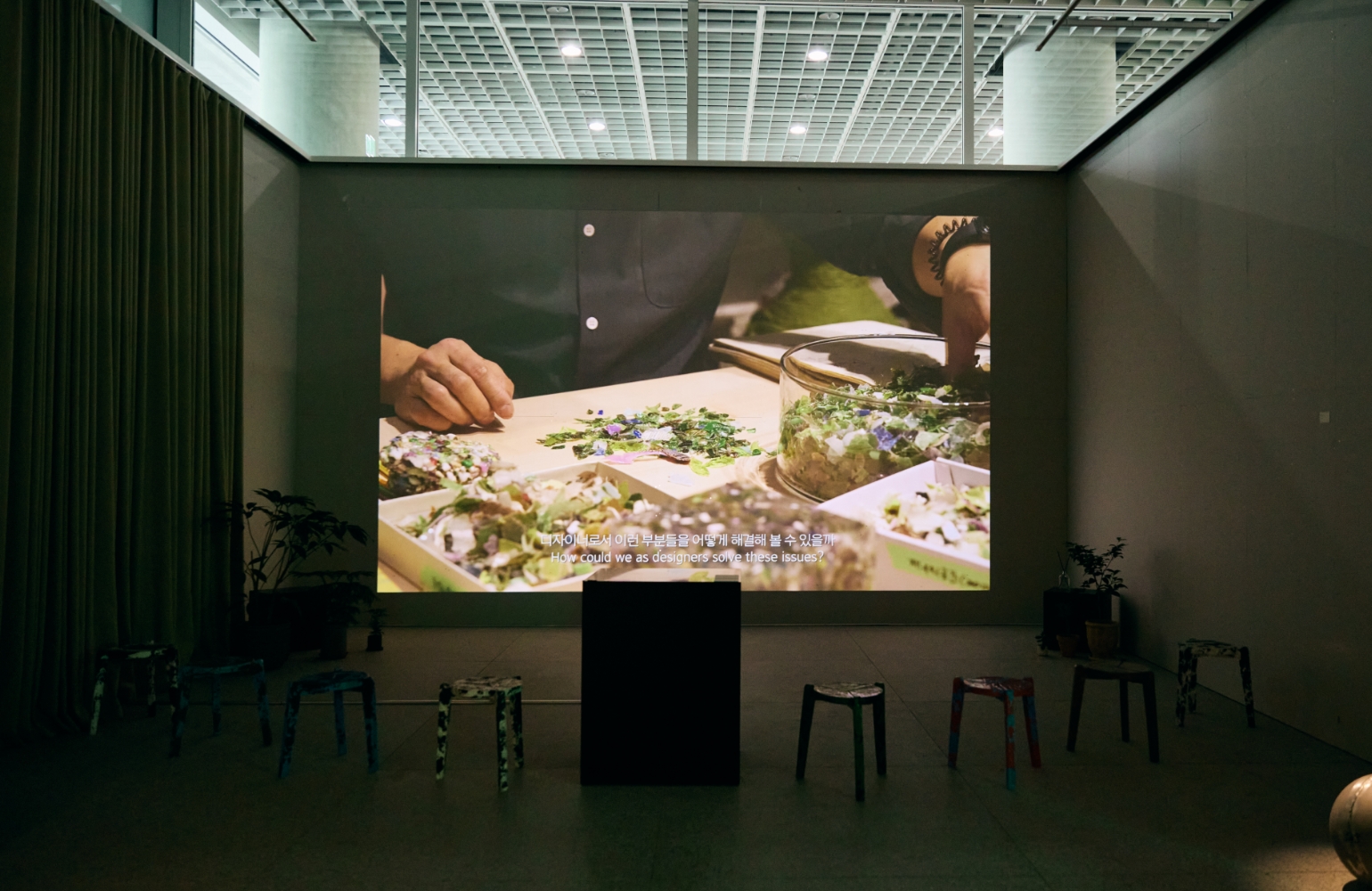
AMOREBASIC is a reasonably priced beauty tool PB brand proposed by Amore Mall (www.amoremall.com). It was launched with the goal of
preventing customer churn by improving Amorepacific’s current beauty tool product gap, and attracting new customers with differentiated
products that reflect customer needs. The design team designed the brand name/brand concept through TF with the Amore Mall team,
and worked together to build the brand from package design to visual content.
Brand name
The name AMOREBASIC signifies essential, everyday beauty tools. The brand is designed to be closely integrated into a customer’s daily routine,
enhancing the effectiveness of their cosmetics. With the brand concept, “Daily essentials for a new basic,”
we hope to inspire positive change by helping customers build smarter beauty habits.
Package Design
The direction for the package design was to create a clear impression in both retail and home environments, using only essential elements—typography
and color—without decorative flourishes. Bold typography on the front of the package clearly communicates key information like the product name
and specifications, conveying the end-benefits in a smart, concise way. The black and neon green color combination enhances the brand’s visibility,
both in online thumbnails and when products are displayed in groups. A simplified graphic element representing the product’s form
(cotton pad, sponge, cotton swab, etc.) is placed at the center of the package to highlight its features and create a modern, stylish mood.
Visual contents
AMOREBASIC’s visual content maintains the same intuitive, attention-grabbing aesthetic as the packaging. To highlight the unique characteristics
of the beauty tools, we developed vivid close-up imagery and conceptual motion graphics, resulting in a dynamic and modern visual identity.
1) Visual images
AMOREBASIC’s still-life imagery was developed by focusing on the inherent form and texture of the products.
We stacked and arranged these familiar beauty tools to create unconventional, sculptural forms.
The images emphasize the soft texture of the tools against the skin, evoking a clean and comfortable feeling.
2) Video
AMOREBASIC’s concept motion graphics were developed based on the unique properties of the product materials. Starting with the soft,
lightweight quality of pure cotton, the video uses conceptual motions of compression, application, and regeneration to express the core brand concept.