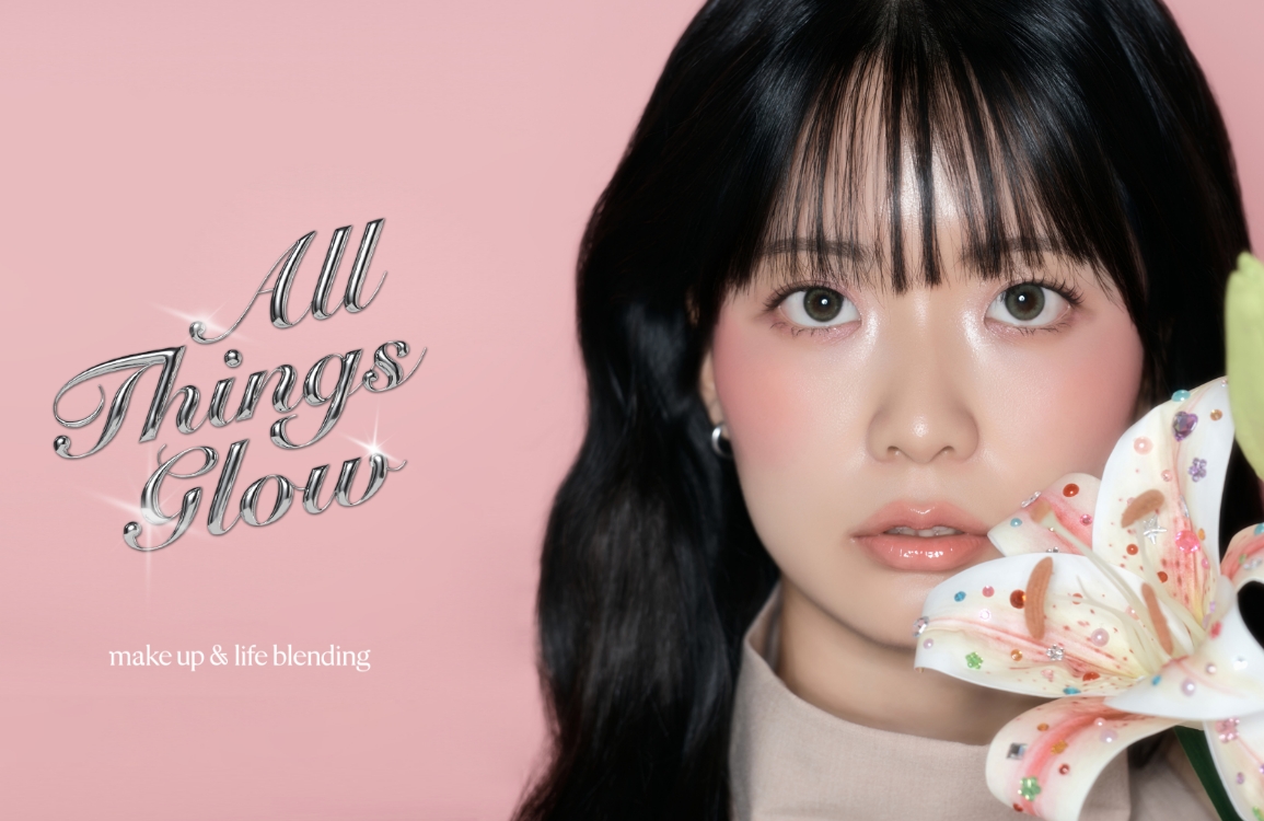
Amore Seongsu MAKEUP&LIFE BLENDING ‘A Vow of Love’
Summary
As the season transitions from the calm of winter to the vibrancy of spring, the excitement and jubilation of love’s fruition is captured in this makeup look for the season’s special occasions with a reddish orange accent color.
A sacred and eternal moment of promise, the orange color symbolizes overwhelming energy, and the deep texture of the makeup is used to create a complete look for a dramatic day.
We hope you’ll embrace the season of love with these reddish orange makeup looks from makeup&life blending.
Shooting Day
1

2

3

4

5

6

7

1 A camera that captures every moment of Merable
2 Constantly adjusting hair that gets tousled during the shoot
3 After finishing the loose-hair shots, restyle it into a ponytail and shoot again!
4 Models who keep smiling tirelessly, even during long hours of shooting
5 Experimenting with props in various creative ways
6 Unselected cuts that didn’t make the final edit but have a unique mood I personally love
7 The process of creating freckles
Final Selection


This Merable was created under the concept of “Love’s Vow” to celebrate the month of love.
The key color, a reddish orange, blends the symbolism of love with a few drops of orange to evoke the vitality of spring.
It was contrasted with black outfits and hair to maximize the color’s visual impact.
Unlike previous works that focused on close-up shots, this project features full-body compositions taken from a distance,
and includes cuts where the makeup artist is directly visible—bolder attempts than ever before.
We present the “Love’s Vow” makeup look, highlighting the eyes, cheeks, and lips.


Makeup artist
KIM DongHyun
Model
KIM ChaeRyung

Look 1. Love in the Eyes (Eyes point makeup)
Using the vibrant warm beige palette, Espoir Real Eye Palette All New Every Beige, apply the shade #Salty Beige as a base.
Next, blend #Salmon Beige into the eyelid crease to add depth.
With a bullet or point brush, apply #Smoky Mocha Beige to the outer corner of the eyes, then gently blend the edges to soften the transition and avoid harsh lines.
Fill in the upper lash line with a black pencil liner, and lightly apply it along the lower lash line for a more defined look.


Makeup artist
CHA MinKyung
Model
PARK HyeRim

Look 2. Romantic Sunset (Cheek point makeup)
To create lively, three-dimensional contours with a dewy foundation that glides along the skin’s natural texture, use a glow-type formula.
Apply blush generously to evoke a fresh winter flush on the smooth, radiant base.
Sweep a wider, bolder shade lightly across the entire cheek, blending it out for a soft, natural finish.
For dry skin, use a cream-based cheek or lip product such as Hera Sensual Fitting Glow Tint 304 Sequence to ensure better adherence.
Start from the center of the cheek and gently blend outward to define the shape.


Makeup artist
KANG JungChang
Model
PARK ChoHee

Look 3. Deep Reddish Orange (Lip point makeup)
The classic lipstick Hera Rouge Classic 301 Seoul Red, with its refined color and luxurious glow, adheres precisely and comfortably to the lips, adding a touch of elegance to your look.
Thanks to its anchoring adhesion technology, it glides on smoothly and stays firmly in place, maintaining vibrant color without fading.
Thanks to its anchoring adhesion technology, it glides on smoothly and stays firmly in place, maintaining vibrant color without fading.
Artist Table @ Amore Seongsu

After applying the key color, reddish orange, across the entire table,
we created an environment where visitors can comfortably and vividly experience the Merable look.
Beyond simply allowing on-site product testing for the three featured looks, we also placed product stock directly on the tables, enabling visitors to purchase items immediately for added convenience.
Large-scale visuals were installed on the walls for the first time, creating a striking focal point that naturally draws the attention of passersby.
In addition, Merable introduction texts were provided in three languages—Korean, English, and Japanese—to accommodate the growing number of international visitors.
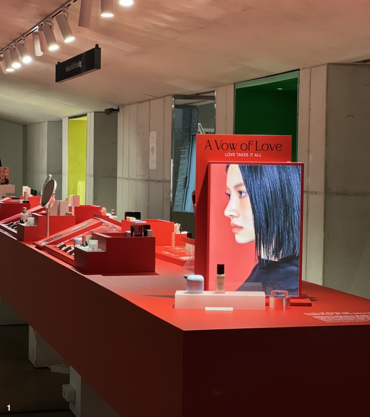
1 At the entrance of the table, a glorifier with illuminated imagery marks the beginning of the “Merable Zone.”
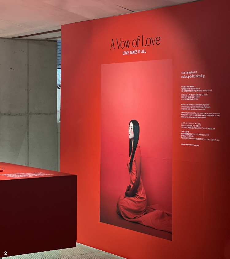
2 A large visual with an artistic mood — my personal favorite among this project’s results.
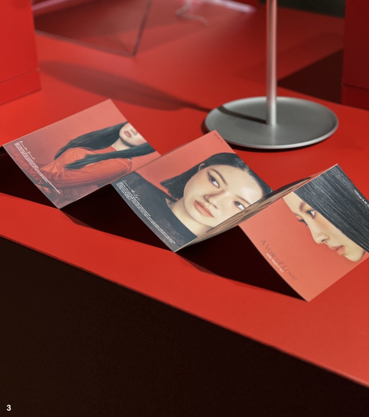
3 A five-panel folding screen–style lookbook displayed on both sides.
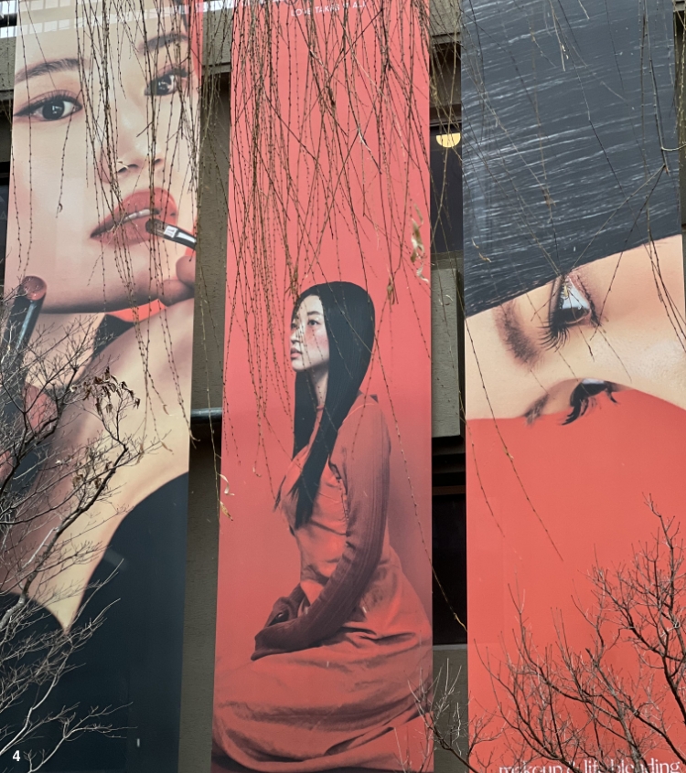
4 Three outdoor banners, each with a distinct design.

After applying the key color, reddish orange, across the entire table,
we created an environment where visitors can comfortably and vividly experience the Merable look.
Beyond simply allowing on-site product testing for the three featured looks, we also placed product stock directly on the tables, enabling visitors to purchase items immediately for added convenience.
Large-scale visuals were installed on the walls for the first time, creating a striking focal point that naturally draws the attention of passersby.
In addition, Merable introduction texts were provided in three languages—Korean, English, and Japanese—to accommodate the growing number of international visitors.


1 At the entrance of the table, a glorifier with illuminated imagery marks the beginning of the “Merable Zone.”
2 A large visual with an artistic mood — my personal favorite among this project’s results.
3 A five-panel folding screen–style lookbook displayed on both sides.
4 Three outdoor banners, each with a distinct design.


- Amorepacific Creatives
- Design
- Chung Keypeum
- Planning
- Yi Sangjae
- Class & Service Planning
- Choi Ree