Amorepacific Design CenterKang Hye Rim, Designer
The Rarekind press kit project was designed to create a unique “experience” that reflects Rarekind’s brand concept of discovering unexpected, hidden charms and expressing one’s own personality. We spoke with designer Kang Hye Rim, who led the design team behind the project.
Editor Urbanbooks Lee Bom
Photographer Amorepacific Shin Sang Woo
Support Amorepacific Yeo You Mi, Urbanbooks Ho Eun Hye
Kang Hye Rim, the designer responsible for all stages of the RareKind Press Kit Project
Please provide a brief self-introduction.Hello, I’m Kang Hye Rim from the Corporate Design Team. I’m responsible for product design for RareKind, Lirikos Makeup, and Steady, and I oversaw all stages of the RareKind Press Kit project—from planning to design and production.
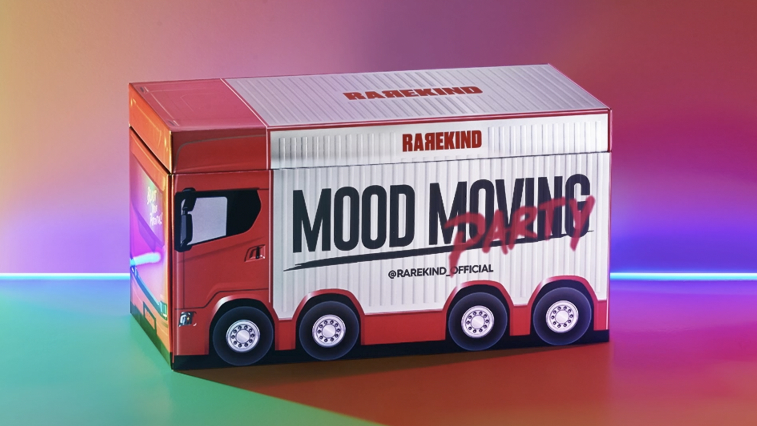
Please explain the RareKind Press Kit project.The RareKind Press Kit was designed to let people experience the mood and products of RareKind, a lip-focused makeup brand. We aimed to express a punk yet pop vibe through the concept of a pop-up bus. The idea stemmed from the question: what if a pop-up bus could visit customers, convey the brand’s atmosphere, and serve as a platform to introduce the products? Initially, we wanted to build an actual pop-up bus and take it to popular festivals to promote the brand. However, due to high costs, this wasn’t feasible. Instead, we used the concept as inspiration for designing bus-themed packaging. Given the tight schedule, we decided to make the most of the rectangular drawer-style boxes we had previously used, refining their design to resemble a bus. To create a stage-like setting for the product display, we incorporated fun elements like a mirror ball on the first floor. By simplifying the initial idea and adapting the existing box structure, we were able to complete the project within the deadline.
When you open the box designed in the shape of a pop-up bus, a mirror ball is placed at the center, flanked by six types of RareKind Over Smudge Tints on either side. A CD mini-album-shaped Shading & Blusher and the new X-Mark Tint Stick are neatly arranged in the drawer. The mirror ball at the center creates a dramatic focal point, allowing users to fully experience the RareKind brand mood while exploring the products.
This press kit really captures the mood of the RareKind brand. What was the most important thing you focused on?Pop-up stores have a strong guerrilla-event vibe, delivering unexpected joy to people — and we focused on how best to capture that feeling. We wanted to create a dramatic effect when opening the box, so we decided to include a mirror ball inside the kit to evoke the lighting of a festival. I had seen another beauty brand incorporate flashing lights into their kits before, and I thought it was a fresh idea. It made me realize that we could design a kit in a similar way. Since the experience a product can offer is often limited beyond its visual appeal, I wanted to provide a unique sense of joy — and we made every effort to reflect that in the design.
The initial plan was to create an actual pop-up bus and visit popular festivals to meet customers. However, due to limited time and budget, we couldn’t realize this idea—so instead, we created a pop-up bus in the form of a stand.
What were the most challenging aspects of producing the actual kit?We had to place the order within two months of receiving the brief, which gave us very little time to finalize the structure and design. We began by commissioning the structure from a manufacturer, then refined the design based on feedback, completed sampling, and delivered the final artwork—all within that tight two-month schedule. Modifying the chassis structure directly was one of the biggest challenges. Another major hurdle was how to define and express the concept of the pop-up bus. Since RareKind is a brand that communicates a sleek yet unconventional identity, we spent a lot of time thinking about how to express that uniqueness through the bus design. Although the “newtro” trend was gaining popularity at the time, we felt it didn’t quite match RareKind’s image. Instead, we chose to focus on the theme of “festival.” The brand also has a distinct metallic vibe, so we decided to incorporate that as well. For inspiration, we referenced American festival trucks and buses from the 1970s and 80s to bring that metallic, energetic aesthetic to life.
The X-Mark Tint Stick, introduced in the RareKind Press Kit project, adheres instantly to the lips upon application and offers excellent staying power.
With bold typography and a metallic mood, the color of the container handle changes depending on the lighting.
Introducing RareKind’s new product, the X-Mark Tint Stick.This long-lasting tint allows you to maintain flawless makeup, even through a full-on party. The ‘X-Mark’ concept was inspired by its water-resistant formula, which doesn’t smudge even when you drink or come into contact with water.
What was the most important aspect you focused on when designing the X-Mark Tint Stick container?We incorporated RareKind’s bold and confident personality into the design by expressing various lip expressions through black-and-white dot graphics. The bold red typography “Don’t worry, X-mark” highlights the product’s presence, while the metallic finish on the container handle reflects different charms depending on the lighting.
We used the keyword “festival” as our concept and created the kit by referencing American festival trucks and buses from the 1970s and 1980s.
Is there any memorable episode from this project?The main feature of the kit is the mirror ball, but finding the exact one I wanted wasn’t easy. (Laughs) Typically, when producing a product, we utilize various channels. For items like pouches, we usually outsource production to a promotional product agency. But this time, due to tight deadlines and my deep understanding of the brand’s mood, I was involved in every step — from planning to design and production. I wanted the mirror ball to fit perfectly within the size I envisioned, and for the consumer to be able to turn the on-off switch directly while it was inside the case. Some mirror balls kept spinning endlessly, and many had the on-off switch on the bottom, making it impossible to operate when placed flat. I specifically wanted one with a side switch. Mirror balls also come in various designs — some with built-in bulbs, others with fragmented mirrors to reflect light. Due to time constraints, I had to search through online shopping sites one by one. Since most products lacked detailed descriptions, I remember calling different companies to find the perfect one.
How has the trend for press kits changed recently compared to before?It seems that press kits now need a conceptual point beyond just being abundant or having a unique structure. Famous social media influencers who receive press kits from various brands tend to post multiple times if the kit feels special. That’s why RareKind put a lot of effort into including the mirror ball — to highlight the brand’s concept and ensure it aligned well with the overall theme.
I’m curious about the reactions of those who actually received them.I’m curious about that too. (Laughs) It usually takes about a month for reviews to start coming in. Since we began sending them out in late August, I think we’ll start seeing reactions around October. The internal feedback has been positive. The BM team placed some of the press kits on their desks, and they attracted a lot of attention — so much so that a small display was even set up in an open area within the company.
RareKind press kit feed uploaded to Instagram
Personally, what kind of achievements do you think you have made through this project, either personally or professionally?Personally, it was a fun project. Unlike product design, press kits have no space constraints and involve relatively low production costs. Because of that, I was able to work more freely than on other product packaging design projects. Although the timeline was short, it was a great opportunity for creative work.
If you were to work on a press kit project in the future, are there any ideas you would like to apply?
I usually focus on the concept when designing products, but in the case of RareKind, I think it would be great to create a conceptual press kit related to music, such as a music festival.
For example, a press kit inspired by musical elements like cassette tapes or LP records could feel refreshing and fun for both the press and consumers.
We would like to know about Rare Kind’s future strategy.Rare Kind is a brand that seeks out hidden charm and expresses individuality. We will strive to ensure that our press kits and future product designs reflect this uniqueness.
Launched in November 2018, Rare Kind is a lipstick brand
that encourages people to discover their own charm and express their individuality
under the slogan, “BLAST YOUR POTENTIAL.”
RareKind Press KitThis kit allows you to experience the mood and products of the RareKind brand. Inspired by the newtro trend, we designed a pop-up bus-themed packaging to express a punk yet pop vibe. To create a dramatic effect when opening the rectangular box, a mirror ball, which is synonymous with festivals, was placed on the main part of the kit box, allowing users to enjoy the RareKind brand mood while experiencing the products.
Design Key PointsThe graffiti typography “PARTY” is spray-painted on the side of the pop-up bus to suggest a funky party vibe. To hint at the excitement inside, the rear windows are illuminated with the RareKind slogan “BLAST YOUR POTENTIAL.” RareKind’s signature bold red is used as an accent color, and the reflective material changes with the lighting, giving it a chameleon-like presence. When the box is opened, a mirror ball at the center lights up, setting the mood for a full-scale party. On the first-floor stage, six types of Over Smudge Tints are displayed, while the second-floor drawer holds two CD-mini-album-shaped Shading & Blush products and X-Mark Tint Sticks.