Mise en scene Salon 10 Professional
Summary
Mise en scene’s premium haircare line, has launched Salon10 Professional,
the fourth generation of its channel-specific haircare line, with evolved usage and efficacy that can be felt after just one use, applying patented solutions that were previously only available in Amorepacific salon products. Considering the target and channel, the new graphic assets were developed and applied in coordination with the existing Salon10 identity to capture the professional code of the new line while strengthening the brand’s recognizability and core.


Background
Mise-en-Scène Salon 10 Professional delivers confident, high-performance formulas that provide visible results after just one use, reinforcing the brand’s expertise in intensive damage care.
During the design process, it was essential to express the confidence of these advanced formulas while considering specialized retail channels and target users.
The design approach aimed to strengthen the overall brand identity—preserving the core essence of Salon 10 while introducing a distinct professional code unique to the new line.
Concept
The design of Salon 10 Professional was developed to achieve multiple goals: engaging a younger audience, optimizing for specialized channels, and reinforcing brand equity.
Drawing on insights from extensive internal and external panel research, we selected colors that balance mass appeal with bold visibility, enabling strong shelf presence and cohesive clustering in competitive retail environments.
A grid-based graphic system was also established to communicate the brand’s professional credibility in a refined and consistent visual language.


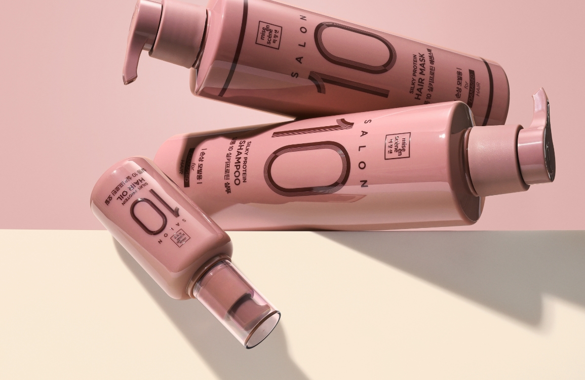
Color
Rather than relying on the lengthy product name “Mise-en-Scène Salon 10 Professional,” the line adopted approachable pet names (e.g., Purple Treatment) for easier recognition.
Each variant features a distinctive, high-contrast color palette, chosen to create a strong sense of unity and visual impact on the shelf while distinguishing itself clearly from competitors.

Extensive consideration was given to factors such as store lighting, competitive environment,
and consumer preference in selecting the final purple shade and accent color.
and consumer preference in selecting the final purple shade and accent color.

Graphic
From a brand-based design perspective, the new Salon 10 Professional identity was developed with consideration for its connection to Salon 10 Basic, while elevating it to reflect the higher level of the Professional line.
Various design directions were explored — such as utilizing “10” purely as a symbol, omitting “Salon,” or positioning “Professional” as an independent typographic element with an informational function — to define the most balanced expression.
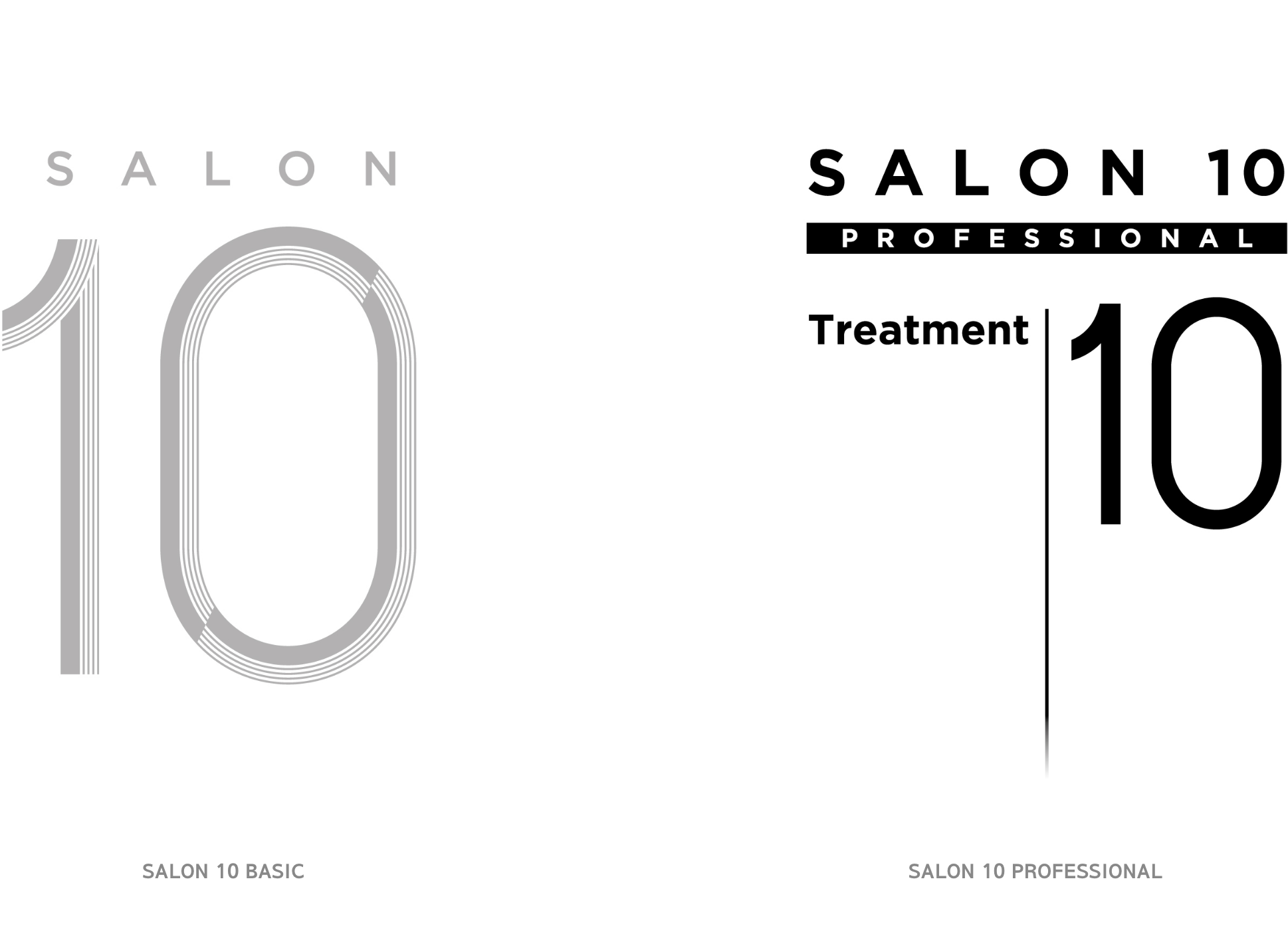
Building on the existing Salon 10 BI, which features a delicate interplay of thick and thin lines, the design enhances color contrast while refining the structure to prevent moiré interference across any image scale by filling all fine lines.
The visual hierarchy among “Salon,” “10,” and “Professional” was carefully adjusted to achieve balance, while line-based grid graphics were applied to the informational text to express the brand’s expertise in damage care.
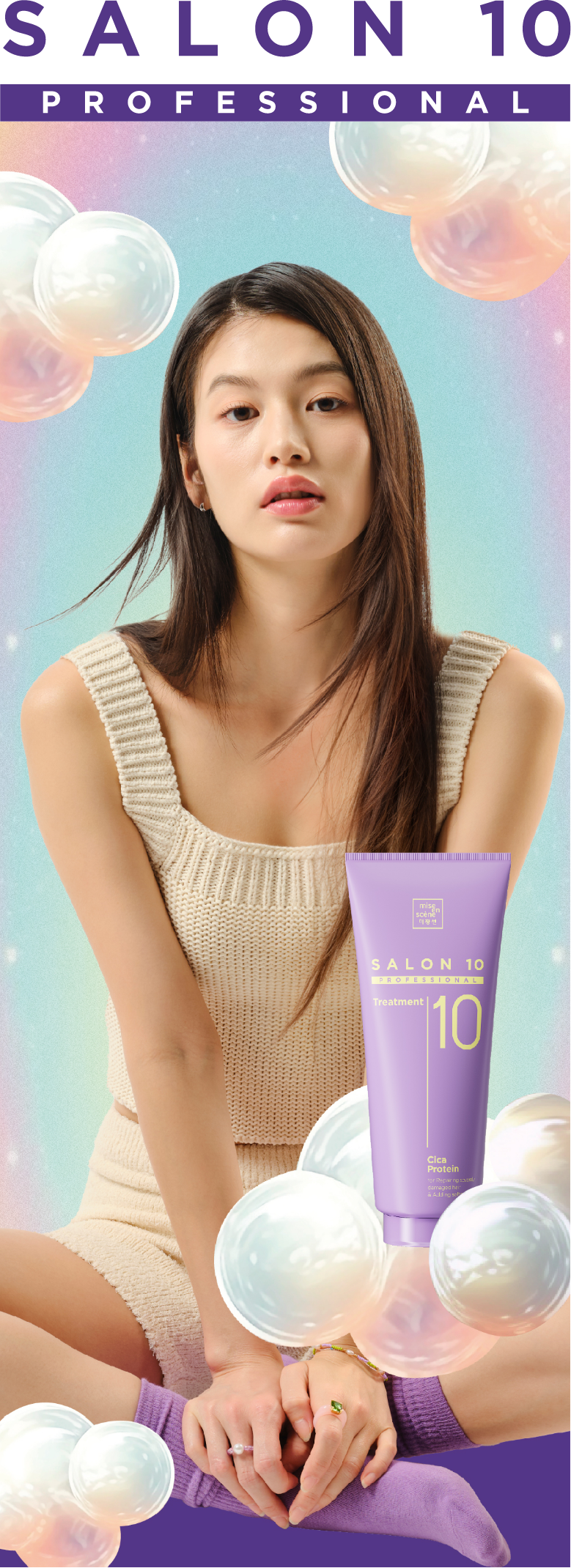
Communication
Building on Salon 10’s long-standing “Home Salon” concept, the communication reinforced the brand’s core identity while emphasizing the product’s ability to make hair smooth and flowing.
The message highlighted high-performance home hair care that delivers salon-like results with ease, differentiating it from the calm, everyday mood of the Basic line while maximizing resonance with younger audiences.

The key visual features a model in relaxed homewear—resting comfortably yet showcasing perfectly styled hair—to convey the idea of effortless, professional-quality care at home.
Lighting that accentuates bold, trendy colors, along with kitschy nail accents, accessories, and custom illustrations, were utilized to enrich the visual storytelling.
Additionally, creative assets generated through Midjourney were incorporated to enhance the campaign’s contemporary appeal, positioning Salon 10 Professional as a next-generation, high-performance haircare line.


Communication
Building on Salon 10’s long-standing “Home Salon” concept, the communication reinforced the brand’s core identity while emphasizing the product’s ability to make hair smooth and flowing.
The message highlighted high-performance home hair care that delivers salon-like results with ease, differentiating it from the calm, everyday mood of the Basic line while maximizing resonance with younger audiences.
The key visual features a model in relaxed homewear—resting comfortably yet showcasing perfectly styled hair—to convey the idea of effortless, professional-quality care at home.
Lighting that accentuates bold, trendy colors, along with kitschy nail accents, accessories, and custom illustrations, were utilized to enrich the visual storytelling.
Additionally, creative assets generated through Midjourney were incorporated to enhance the campaign’s contemporary appeal, positioning Salon 10 Professional as a next-generation, high-performance haircare line.
Visual

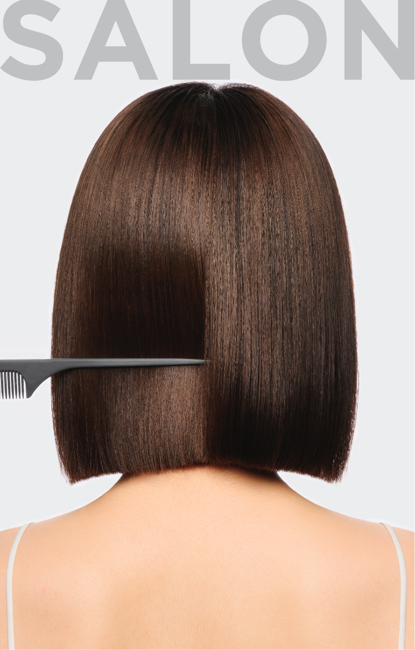


To visually express the professionalism of a salon, the imagery incorporates not only
hair tools but also home interiors and products, creating visuals that emphasize an approachable
home-care atmosphere—one that allows users to easily achieve salon-quality results in the comfort of their own space.
hair tools but also home interiors and products, creating visuals that emphasize an approachable
home-care atmosphere—one that allows users to easily achieve salon-quality results in the comfort of their own space.


The core ingredient, Cica Protein, was rendered through 3D graphics to communicate its technical sophistication.
This innovative ingredient combines Cica, which helps repair damaged scalp and hair barriers, with Protein, which replenishes essential nutrients.
Presented with a luminous and ethereal aesthetic, the visuals reinforce the image of a next-generation treatment that represents a new standard in hair care.

- Amorepacific Creatives
- 디자인
- 구혜원, 이성엽, 김소영
- 촬영
- 스탠스틸 스튜디오
- BM팀
- 김미나, 김미선
- 개발팀
- 이성현
- 비주얼
- 윤민혜, 구혜원, 이성엽, 제너럴 그래픽스
- 3D 그래픽
- 아우브
- 일러스트레이션
- 허희경