"Arita Chinese" font receives an award at the 2017 Red Dot Award
아리따 중문 글꼴 ‘아리따 흑체’, 레드닷 어워드 수상
Summary
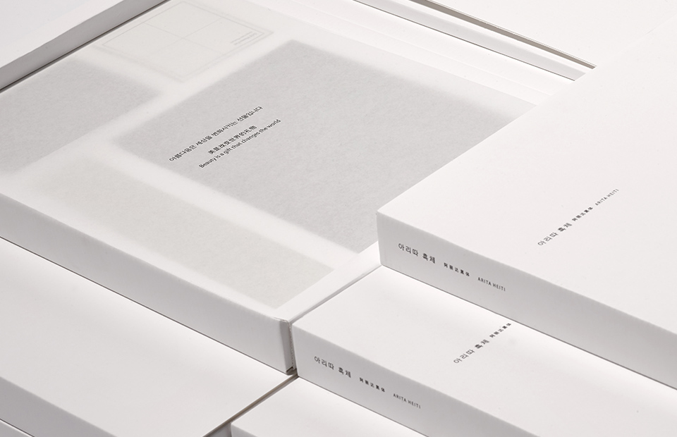
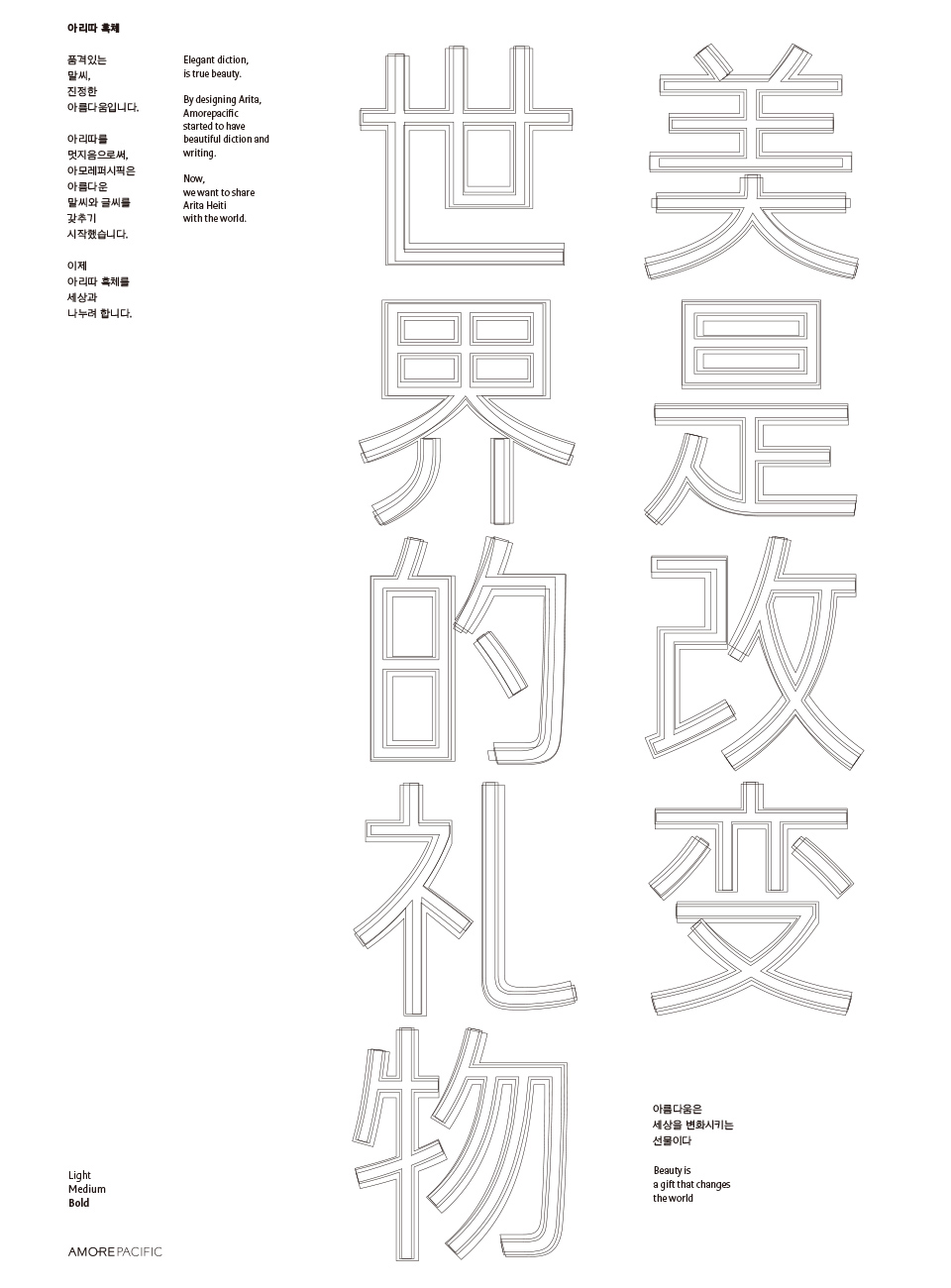
국내 첫 중문 기업 서체인 아리따 흑체는 아모레퍼시픽이 추구하는 현대적인 여성의 아름다움을 담아냈습니다.
Aritta Heukche, which is Korea’s first Chinese business font, reflects contemporary women’s beauty pursued by AMORE PACIFIC.
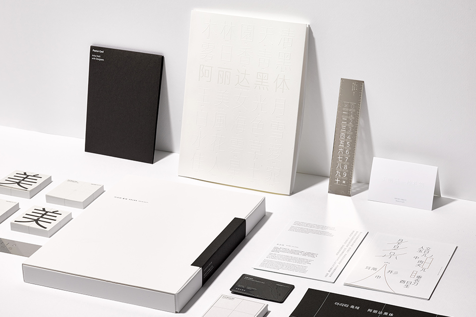
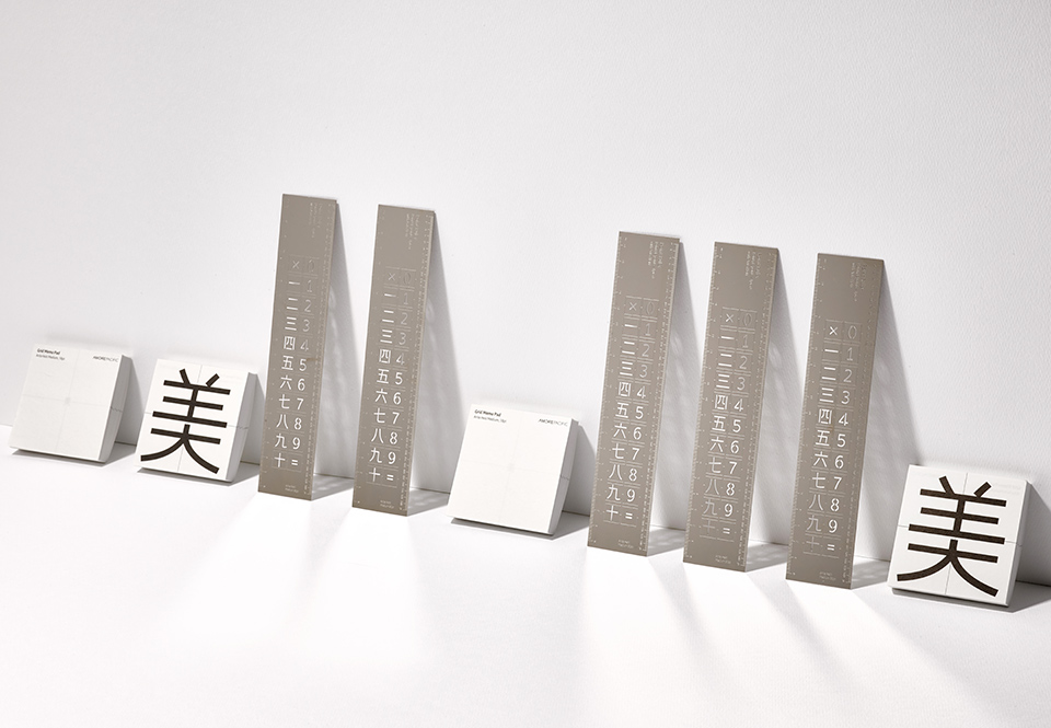
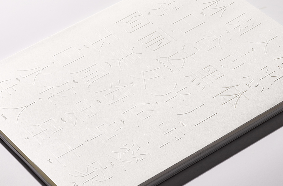
중국에는 “글씨는 곧 그 사람과 같다(字如其人)” 라는 말이 있습니다. 글씨에서 글쓴이의 품격이 드러난다는 뜻입니다. 아리따는 우아한 외모와 단단한 내면을 지닌 현대 여성의 고운 말씨입니다. 독립적이면서도 굳세지 않고, 대담하면서도 자연스러운 모습이 아리따가 품고 있는 여성상입니다. 사모하는 여인을 한 폭의 초상화로 그려내듯, 정정옥립(亭亭玉立) 자연미려(自然美麗) 기운생동(氣韻生動), 세가지 경구를 중심 생각으로하여 글자의 구체적인 이미지를 다듬어갔습니다. 2016년 6월 본문용 굵기의 아리따 흑체를 시작으로 두 가지 굵기를 추가하여 아리따 흑체 3종을 2017년 완성했습니다.
In China, there is a saying: “Handwriting is like the person (字如其人, ja-yeo-gi-in) since it reflects the person’s character. Aritta is contemporary women’s gentle writing that reveals elegant appearance and strong inner side. Aritta depicts women who are independent yet not too strong but bold, with a natural appearance. As if drawing the portrait of an admired woman, a concrete image of the font is created by thinking of three expressions: jeong-jeong-ok-rip meaning fair, slim, and graceful; ja-yeon-mi-ryeo meaning beautiful; and gi-un-saeng-dong meaning rhythmic vitality. By adding two thicknesses to the original Aritta Heukche for the main text created in June 2016, 3 kinds of Aritta Heukche are completed in 2017.
- Amorepacific Creatives