Mise en scene Salon 10 line
Mise-en-scène ‘Salon 10′ has transitioned from a brand primarily focused on offline supermarket sales to a true omnichannel brand.
In line with this shift, the design has been transformed. Instead of focusing on loud, attention-grabbing elements for the shelf,
the new look is designed to blend seamlessly into the customer’s home interior. The new design centers on a ’10’ logo, which
symbolizes functionality, and uses a simple layout to evoke a professional salon atmosphere. Furthermore, to reduce environmental
impact, the containers are made from recycled plastic.
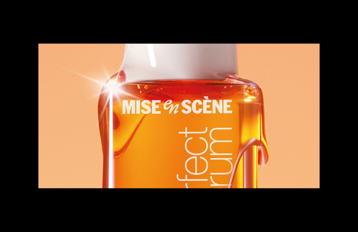
Through the brand visuals, we aimed to express a sophisticated, salon-quality feeling while still maintaining the brand’s accessible, mass-market positioning. The overall visual mood is intended to evoke the sun, the earth, strength, and nourishment. We created a substantial, nourishing image by using warm, rich colors and intense, sun-like lighting. Tone-on-tone textures were used throughout the visuals to add variety to the simple product forms. The key visual color, a deep reddish-brown, was chosen to contrast with the calmer product colors, increasing the product’s visibility both online and offline.
Through the brand visuals, we aimed to express a sophisticated, salon-quality feeling while still maintaining the brand’s accessible, mass-market positioning. The overall visual mood is intended to evoke the sun, the earth, strength, and nourishment. We created a substantial, nourishing image by using warm, rich colors and intense, sun-like lighting. Tone-on-tone textures were used throughout the visuals to add variety to the simple product forms. The key visual color, a deep reddish-brown, was chosen to contrast with the calmer product colors, increasing the product’s visibility both online and offline.


To convey the feeling of a professional yet everyday salon care experience, the model shots intentionally
avoided a studio atmosphere, instead featuring casual, everyday clothing and hairstyles.
avoided a studio atmosphere, instead featuring casual, everyday clothing and hairstyles.


In line with the ‘home salon’ concept, the product design is generally simple, allowing it to blend easily into daily life while subtly evoking a salon feel.
The container retains its existing simple and basic form.
The main color is a calm, grayish-ivory, which is the natural color of the PCR (Post-Consumer Recycled) plastic used.
The most prominent element, the ’10’ symbol, is rendered in Salon 10’s signature gold to express an elegant, professional feeling.
The most prominent element, the ’10’ symbol, is rendered in Salon 10’s signature gold to express an elegant, professional feeling.


The ‘Salon 10′ symbol was designed to express the perfect number ’10’ through a harmonious interplay of finely woven lines and planes.
The word ‘SALON’ above the number allows the brand name to be read naturally, while its generous letter-spacing is intended to convey the
calm, relaxing atmosphere of a salon.


- Amorepacific Creatives
- Design
- Kim Bitnuri
- Visual
- Kim Bitnuri, An Yoonjung
