MISE-EN-SCENE INNERPLEX
Summary
Innerflex is a new, premium, high-performance home repair line from Mise-en-scène, designed for severely damaged hair.
For the Innerflex project, we handled the entire creative process, from product design to visual strategy and product detail page creation.
The product line is centered on a new type of hair strengthening agent. Our design strategy was twofold: first,
to create a functional product design that highlights the brand’s technical expertise, and second,
to develop a distinct and fresh visual identity to captivate a unique target audience.

Logo Design
The name ‘INNERFLEX’ features a repetition of letters with strong horizontal and diagonal strokes (I, N, R, P, L).
To ensure readability in this complex two-word structure, we focused on creating a consistent rhythm and generous spacing.
A clean, rational sans-serif font was used to regulate the letter width. The ‘INNER’ portion of the name is emphasized in a bold weight
to highlight the product’s core benefit: its ability to penetrate deep into the hair’s structure.

Product Design
-Graphic
Focusing on the core technology of reinforcing broken bonds within the hair structure, we used a minimalist black-and-white color palette.
The product name, technical description, and usage instructions are clearly organized within a chart-style line graphic.
To encourage the use of the hero product—a pre-shampoo treatment—we introduced a numbering system that prominently begins with ‘0’.
An infographic at the bottom helps users intuitively understand the three-step ritual for the product line.
-Product
The container’s shape has a unique sculptural quality within its simplicity. The pump cap, meticulously designed with a repeating ribbed texture,
serves a dual purpose: its practical function is to prevent slippage, while its aesthetic function is to connect with the linear elements seen
in the logo and graphics. The ‘Direct Blow’ composite material of the container is soft and malleable, providing a comfortable and stable user experience.


Color
Using a light gray base, we built a color system that pairs each product with a distinct fluorescent accent to feel
functional without being mistaken for hair dye.
Hair Strengthener (0): Hyper Pink, to signify the powerful effect that enables bold styling.
Shampoo (1): Dazzling Blue, to communicate the cleansing function of its rich bubbles.
Treatment (2): Neon Green, to symbolize the connection between technology and naturalism.


To captivate our target audience—individuals who express themselves through
diverse and bold hairstyles—we aimed for a sensory and experimental mood.
diverse and bold hairstyles—we aimed for a sensory and experimental mood.
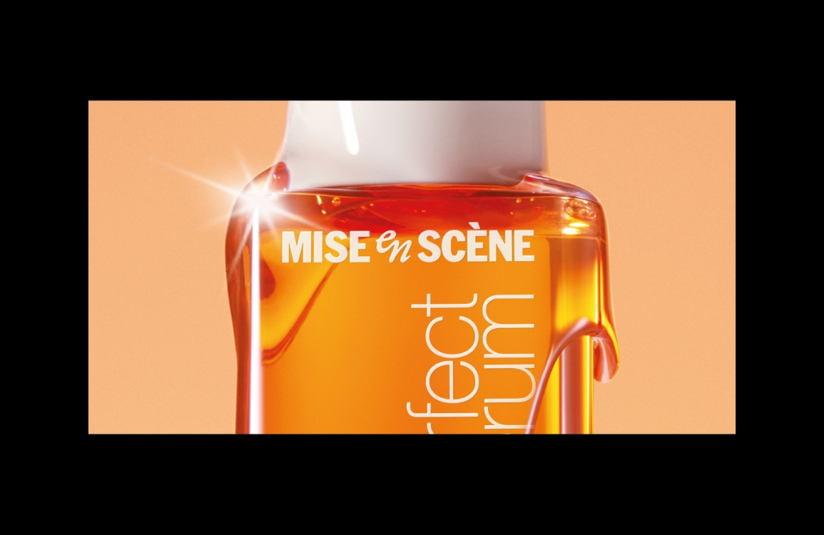
We created product shots that feature fluorescent accents on a gray base, making the white products stand out.
These shots express each product’s characteristics by incorporating unique materials like hairstyling tools and textures inspired by hair itself. For the user-focused shots, we featured models who embody the target audience, with elements like nail art and tattoos, using intense contrast between color and light.
These shots express each product’s characteristics by incorporating unique materials like hairstyling tools and textures inspired by hair itself. For the user-focused shots, we featured models who embody the target audience, with elements like nail art and tattoos, using intense contrast between color and light.


The model visuals were designed to authentically express the product’s core function: the ability to restore
severely damaged hair to a state as if it were virgin hair, even enabling perms on bleached hair that is typically resistant.


The model visuals were designed to authentically express the product’s core function: the ability to restore
severely damaged hair to a state as if it were virgin hair, even enabling perms on bleached hair that is typically resistant.
VIDEO
We created a 20-second video to clearly communicate Innerflex’s unique damage-care technology through motion graphics.
By adding a design-led interpretation to the scientific content, featuring cross-sections of the hair shaft and
molecular bonding structures, we aimed to make the information both simple and compelling.
GIF
For content requiring clear information, like usage instructions,
we created GIFs and 3D animations designed to intuitively communicate the product’s benefits and efficacy.
we created GIFs and 3D animations designed to intuitively communicate the product’s benefits and efficacy.

- Amorepacific Creatives
- Design
- Yoon Minhae, Kim Soyoung
- BM
- Kim Daehee
- Development
- Lee Kyuseok
- 3D Film
- RF VISUALS STUDIO
- Visual
- GENERAL GRAPHICS


