2024 MISE-EN-SCENE Professional Line AD
Summary
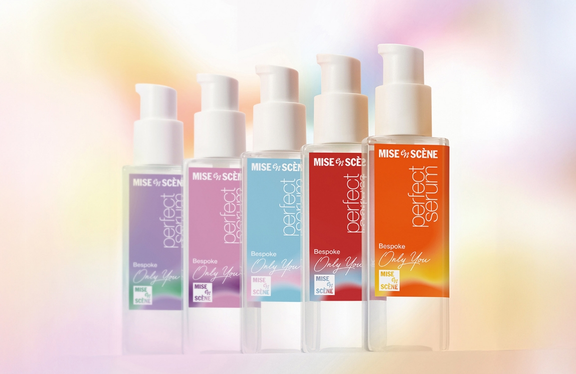
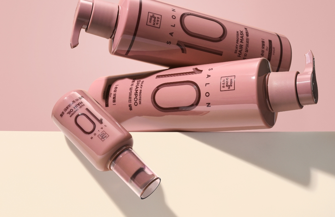
Mise en Scène Proline is the oldest volumizing product in the brand, and it is a line that you can choose according to your hair concerns. It is composed of three lines: damage care, volume care, and scalp care, allowing customers to choose the right product according to the type of concern they want to manage.
Through this AD, we aimed to break away from the aging image and reinterpret the branding core to strengthen the cohesion and identity. We also color-coded the line for each hair concern and emphasized the functionality of the products with simple yet refined graphics.


Product Design
We maintained the brand’s color identity by retaining the signature red, purple, and green tones, preserving the visual equity of the existing product line.
The shoulder line of the container was raised to create a higher eye level, improving visibility and prominence on the shelf.
To add distinction to the simple cylindrical form, the silhouette was designed to narrow subtly toward the bottom, introducing a refined tension to the shape.
A rounded square base with sides that gently flare outward enhances both the softness and stability of the overall form, achieving a balance between visual elegance and structural harmony.
Graphic Design
Whereas the previous design emphasized functional ingredients through decorative graphics, the new approach focuses on clarity and recognizability.
The product name is presented in bold type, strengthening the sense of visual grouping across lines and helping customers easily identify products by type and category.
Each line’s signature color is applied as a bottom accent, enhancing intuitiveness for self-selection at a glance.
A clean sans-serif typeface completes the design, expressing a modern and minimalist look aligned with contemporary aesthetic trends.

- Amorepacific Creatives
- Design
- Yoon Minhae, Wang Hayoun
- Photography
- PRT STUDIO
- BM
- Choi Jinwoo
- Development
- Lee Seonghyun