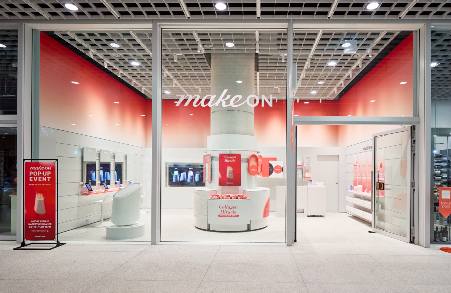
VITALBEAUTIE Super Line Pop-up Store
Summary
VITALBEAUTIE’s Superline is an inner-beauty collection scientifically formulated to promote healthy beauty from within.
Centered around its core message, “The Super Routine You Take Before You Apply,” we created an experiential popup at Amore Seongsu where visitors could taste and feel the products firsthand.
The space was designed with a ‘kitchen’ motif to seamlessly connect the experience to everyday routines.
Guests explored the flavors, textures, and benefits of Superline products—allowing them to discover their own personalized inner-beauty ritual.
Through this experience, Superline was positioned not just as a product, but as a sustainable beauty habit that naturally integrates into daily life.
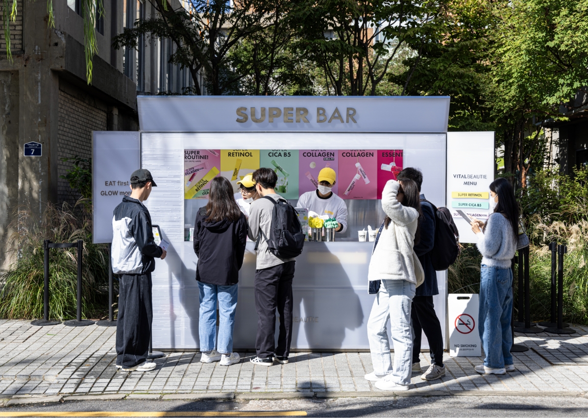
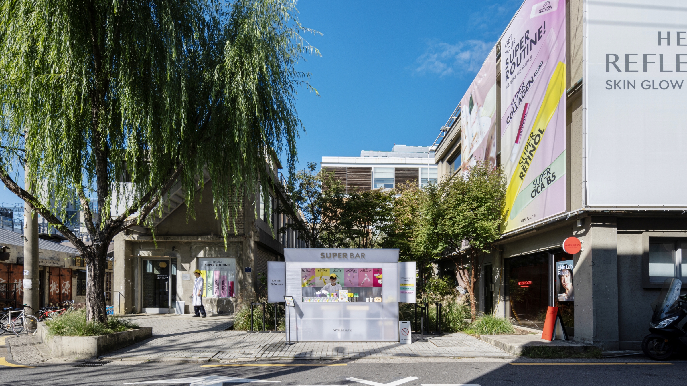
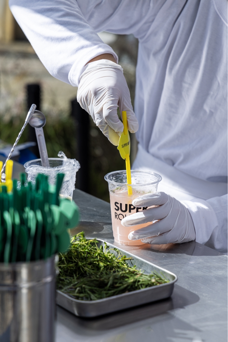
SUPER BAR
In the outdoor area, we created a tasting-style “Super Bar” inspired by a kitchen motif.
Guests who completed all missions within the popup could receive a brand-prepared beverage or dessert here, making the Super Bar the final touchpoint that completes the overall experience.
By positioning the Super Bar outside, we naturally exposed the interior popup program to passersby and created an entry point that encourages spontaneous participation. The structure uses white polycarbonate and steel as its primary materials, expressing the brand’s scientific and rational identity. At the same time, the poster graphics and menu compositions incorporate a vibrant color palette inspired by the unique characteristics of each Superline product. This combination creates a light, enjoyable atmosphere where visitors can easily explore the diverse benefits and varieties of Superline.
By positioning the Super Bar outside, we naturally exposed the interior popup program to passersby and created an entry point that encourages spontaneous participation. The structure uses white polycarbonate and steel as its primary materials, expressing the brand’s scientific and rational identity. At the same time, the poster graphics and menu compositions incorporate a vibrant color palette inspired by the unique characteristics of each Superline product. This combination creates a light, enjoyable atmosphere where visitors can easily explore the diverse benefits and varieties of Superline.
Graphic
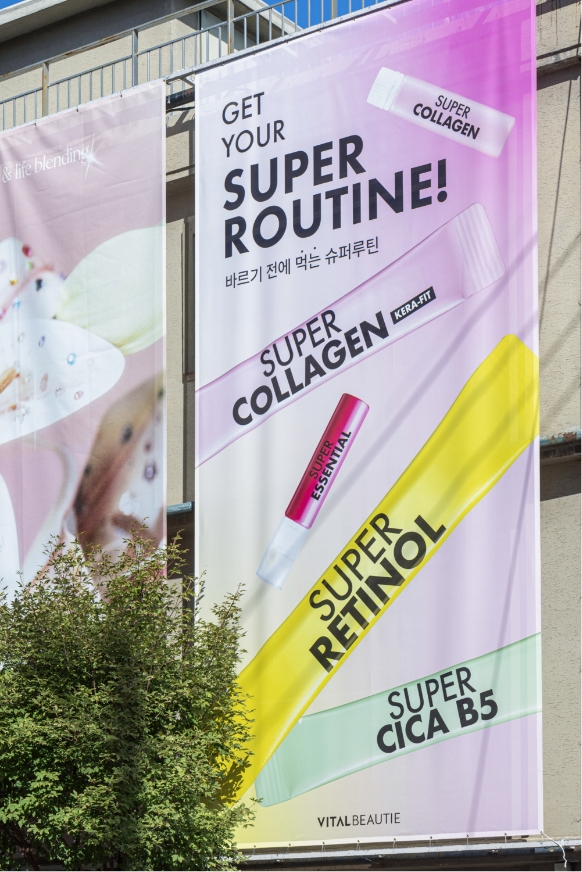
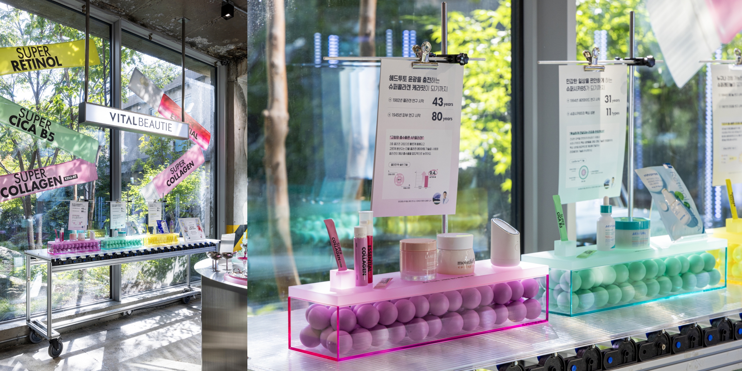
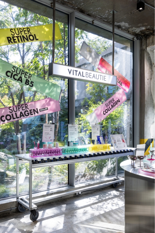
The main graphic for the popup was designed to intuitively communicate the five product families that make up the Superline.
Within the Superline, each lineup offers distinct benefits and purposes, allowing visitors to discover a “Super Routine” that best fits their lifestyle.
We structured the categories around key ingredients—retinol, cica, and collagen—and established clear color palettes to represent each product family, enabling customers to visually distinguish the lines even from a distance.
The design focuses on striking a balance between the functional messaging of each product and the light, everyday-friendly personality of the Superline.
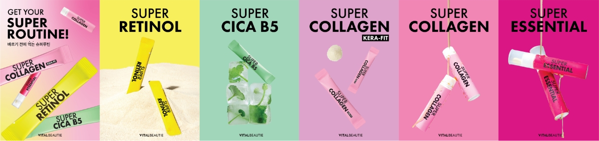
For the posters, we established a unified design system based on the signature color-driven, product-focused layouts previously used for the Collagen, Retinol, and Essential lines.
While maintaining the existing visual language of the brand, the popup expanded and adapted this system across the entire Superline.
Each line’s unique color and tone were preserved, yet the layouts, messaging, and graphic elements were consistently integrated to ensure that the Superline is perceived as one cohesive brand experience.
Reception
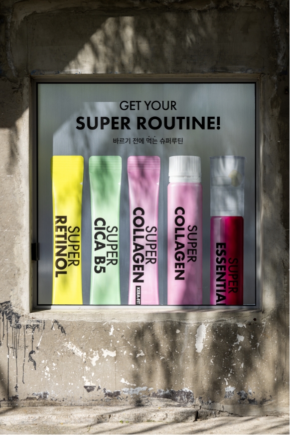
Upon entering the Amore Seongsu store, visitors first encounter the reception area.
As this zone sits along a transition path where most customers briefly check in and move on, the focus was placed not on in-depth engagement but on delivering a strong initial impression of the popup and its products.
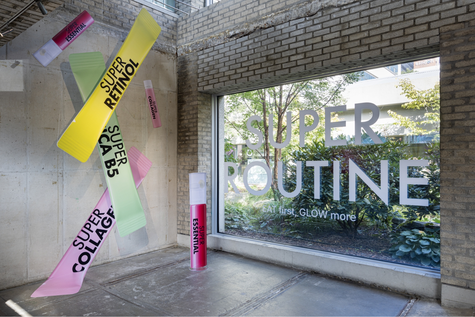
Superline products were arranged in both graphic and three-dimensional forms to visually occupy the entire wall, while the popup’s key message was applied as a white sheet graphic on the window. This configuration allows the brand’s energy to be communicated instantly the moment customers step into the space.
Superline products were arranged in both graphic and three-dimensional forms to visually occupy the entire wall, while the popup’s key message was applied as a white sheet graphic on the window. This configuration allows the brand’s energy to be communicated instantly the moment customers step into the space.
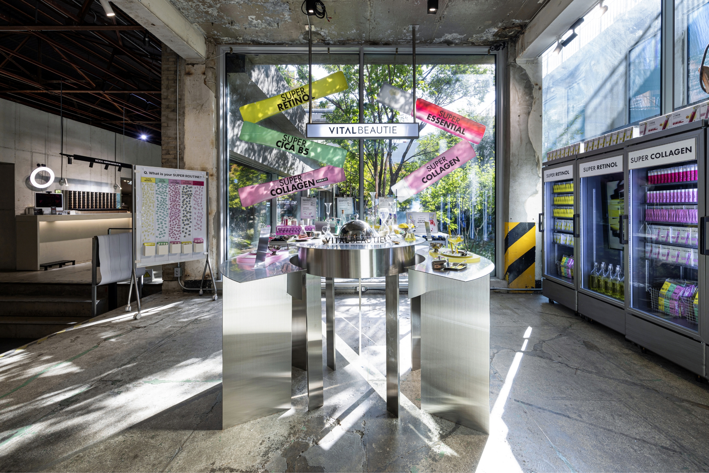
SUPER KITCHEN
The main space was designed using kitchen-inspired fixtures and props, creating an environment where Superline’s idea of a “routine you take before you apply” could naturally connect to everyday acts of consumption.
At the center of the space, a circular steel table anchors the visual focus while balancing the kitchen’s friendly atmosphere with the brand’s rational, scientific tone. Along the right-hand circulation path, refrigerators were arranged to display products and brand videos inside, subtly reinforcing the message of a “super routine you take before applying.” Additionally, large product graphics were applied to the exterior windows—covering a significant portion of the space—to ensure that the graphic system used throughout the popup is experienced consistently within the interior as well.
At the center of the space, a circular steel table anchors the visual focus while balancing the kitchen’s friendly atmosphere with the brand’s rational, scientific tone. Along the right-hand circulation path, refrigerators were arranged to display products and brand videos inside, subtly reinforcing the message of a “super routine you take before applying.” Additionally, large product graphics were applied to the exterior windows—covering a significant portion of the space—to ensure that the graphic system used throughout the popup is experienced consistently within the interior as well.
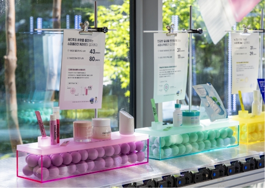
The three products displayed on the central round table—Retinol, Cica, and Kerafit—were styled like dishes thoughtfully set on a dining table, emphasizing the idea of “consumable products” in an intuitive, immediate way.
The distinctive fresh color palette of the Superline was highlighted so that each product’s flavor impression could be naturally evoked.
Ingredient- and efficacy-focused POP graphics were placed alongside the products, creating a space that reduces both the psychological and physical distance between the brand and the customer.
This setup ensures that visitors feel the vibrancy and core message of Superline the moment they enter the space.
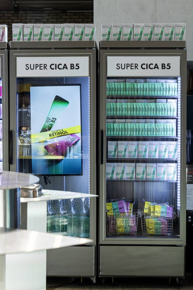
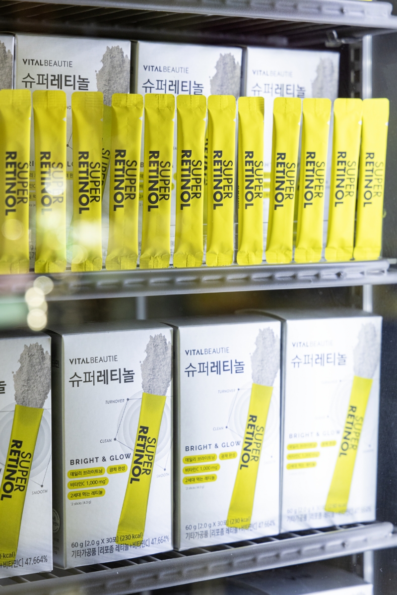
Inside the refrigerators installed in the space, both the product packaging and individual sachets were displayed together, allowing visitors to clearly understand the structure and format of the Superline range at a glance.
To complement the neutral silver tone of the packaging, the individual sachets were intentionally revealed, making each line’s distinctive color and functional message more pronounced.
Monitors were also placed inside the refrigerators to continuously play product videos, adding rhythm and energy to the overall space and guiding visitors’ attention to pause, explore, and naturally engage with the display.
On one side of the space, fixtures made from structural profile materials were installed to evoke a more rational, research-driven mood.
Here, each Superline product was paired with its corresponding topical skincare item, emphasizing the logical rationale behind incorporating inner beauty supplements alongside topical routines.
VITALBEAUTIE’s dermatological research history and technological expertise were also presented through POP information graphics, reinforcing the scientific credibility of the line.
This setup allows visitors to clearly understand that Superline shares the same functional objectives as topical care—and that its benefits can be reinforced and expanded when incorporated into a daily ingestible routine.
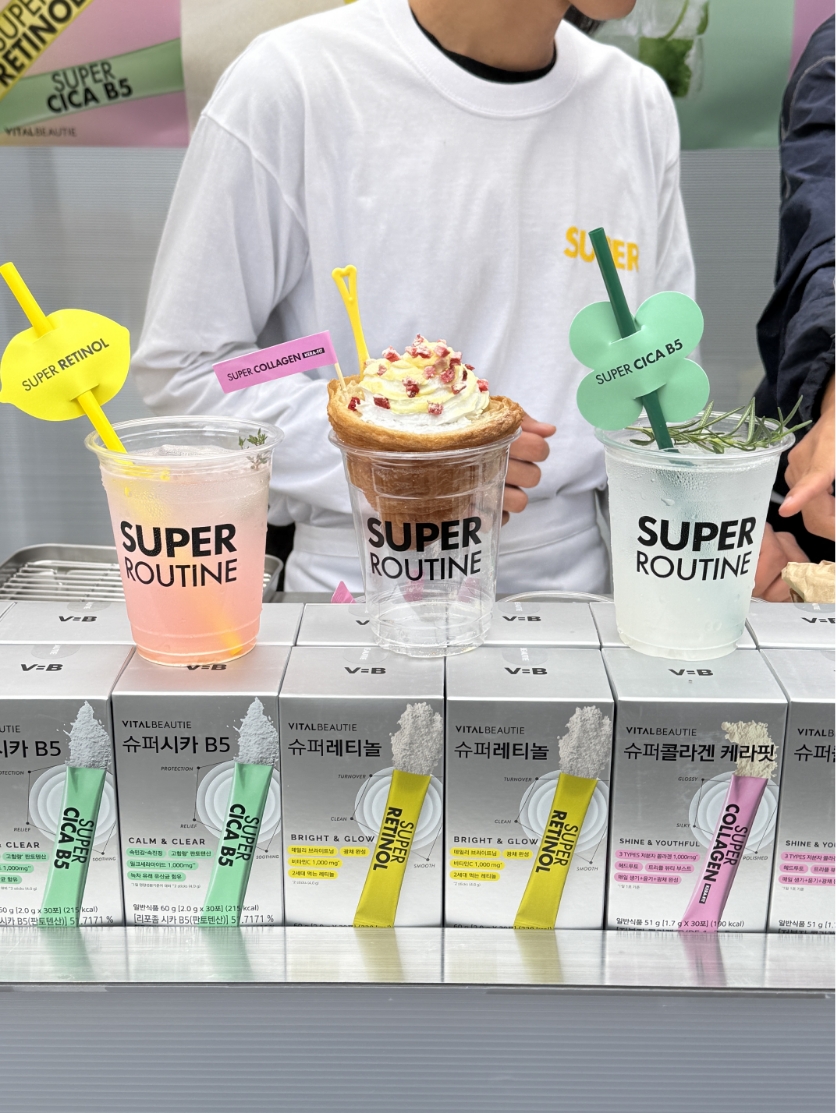
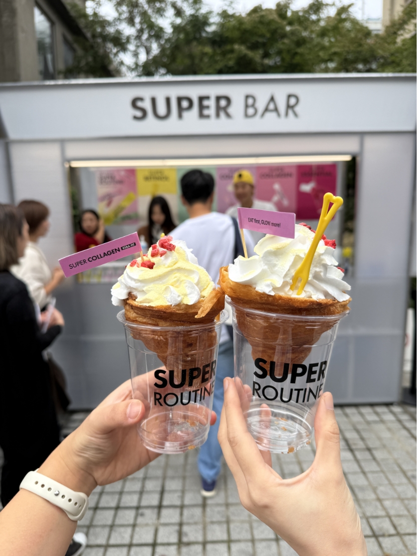
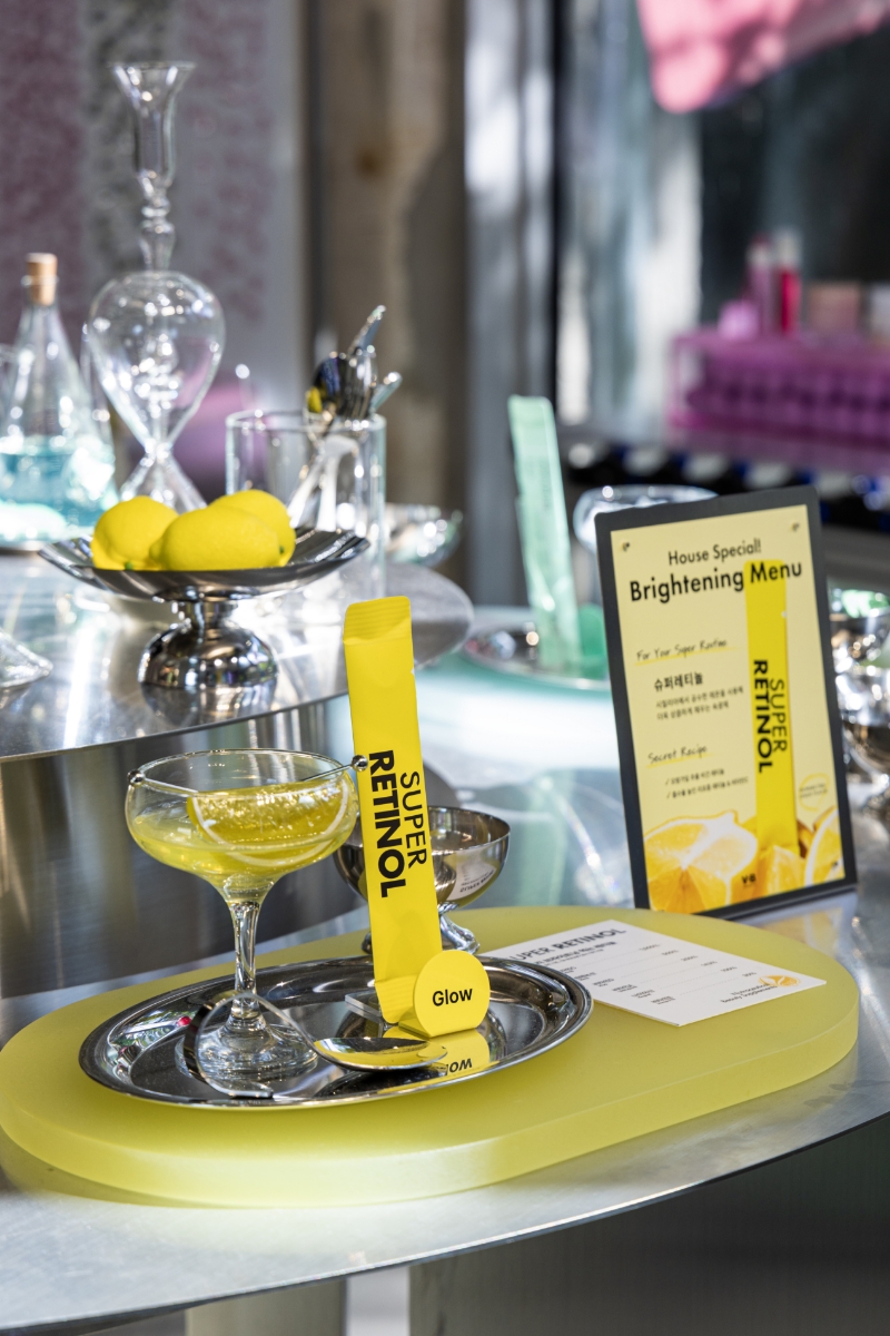
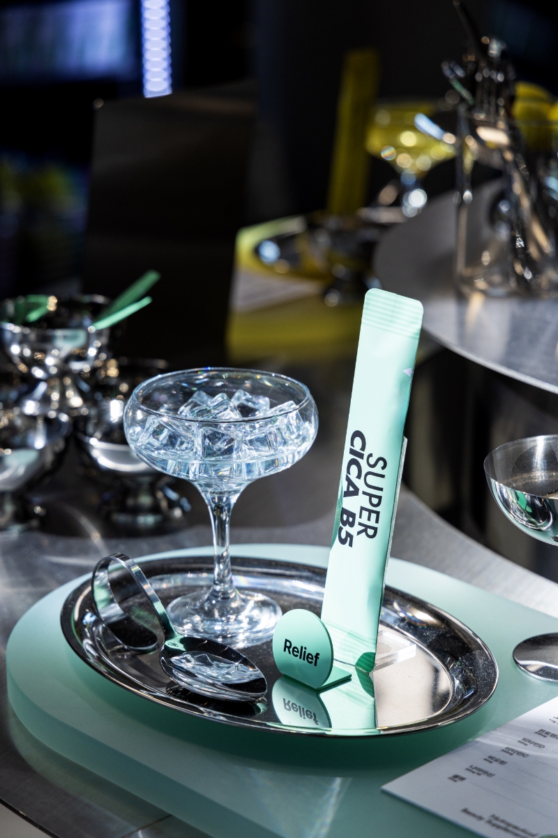
Customers who complete all missions within the pop-up are rewarded at the final touchpoint—the Super Bar—where they can choose one complimentary beverage or dessert.
Retinol and Cica were blended into chilled drinks to deliver both functional benefits and a sensory experience, while Kerafit was served as a topping on croissant cream to highlight the enjoyable, treat-like aspect of the “ingestible routine.”
This final step reinforces VITALBEAUTIE’s commitment to creating inner beauty products that go beyond functional efficacy by also considering taste and palatability. It was intentionally designed to guide customers naturally from exploration to direct consumption, allowing them to fully experience the Superline’s benefits in an engaging and memorable way.
This final step reinforces VITALBEAUTIE’s commitment to creating inner beauty products that go beyond functional efficacy by also considering taste and palatability. It was intentionally designed to guide customers naturally from exploration to direct consumption, allowing them to fully experience the Superline’s benefits in an engaging and memorable way.
- Amorepacific Creatives
- Space Design
- Kim Seunghyun, Choi Yeonjae
- MC
- Jung Hyunwoong, Lim Yehee, Yun Ahrang
- Photography
- HSPACE


![Exhibition [The House of Beauty Scientists] 's work list thumbnail](https://cdn-design.amorepacific.com/contents/2024/08/02172154/24_88_list_thumb.jpg)