Beauty point rebranding project
뷰티포인트 리브랜딩 프로젝트
Summary
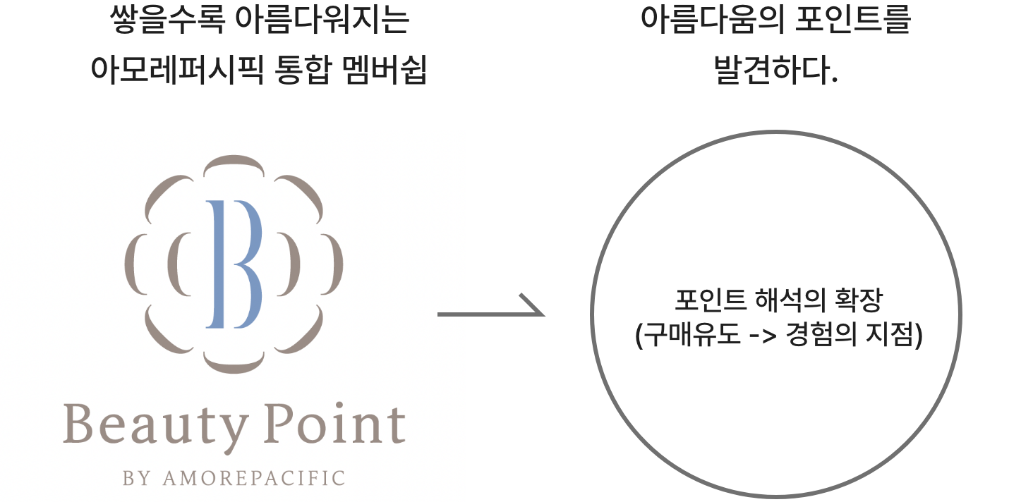
뷰티포인트는 아모레퍼시픽의 통합 멤버쉽으로 쌓을수록 아름다워지는 멤버쉽이라는 슬로건으로 고객에게 혜택을 전달하고자 했습니다.
오랫동안 이어온 멤버쉽의 혜택을 단순히 포인트를 쌓는 것에서 좋은 경험을 전달하고자 멤버쉽 개편을 진행하게 되었고, 이과정에서 커뮤니케이션 메세지의 변화를 고객이 더 잘 느낄 수 있도록 리브랜딩 프로젝트를 진행하게 되었습니다.
오랫동안 이어온 멤버쉽의 혜택을 단순히 포인트를 쌓는 것에서 좋은 경험을 전달하고자 멤버쉽 개편을 진행하게 되었고, 이과정에서 커뮤니케이션 메세지의 변화를 고객이 더 잘 느낄 수 있도록 리브랜딩 프로젝트를 진행하게 되었습니다.
This article has been translated by an AI.
Beauty Point is Amorepacific’s integrated membership program, which aims to convey benefits to customers with the slogan “The more you accumulate, the more beautiful you become.
We decided to reorganize the membership to convey the benefits of the long-standing membership from simply accumulating points to a good experience, and in the process, we conducted a rebranding project to better communicate the change in communication message to customers.
커뮤니케이션 메세지의 변화

“포인트’의 의미를 재해석한 메세지의
변화를 나타낸
아이덴티티 디자인”
변화를 나타낸
아이덴티티 디자인”
기존 포인트를 쌓는 것에 초점이 맞추어져 구매유도를 위한 커뮤니케이션 메세지가 아닌 고객이 뷰티포인트를 통해 새로운 뷰티
경험을 할 수 있도록 멤버쉽 제도를 변경하며 포인트라는 의미를 재해석하고 확장하고자 했습니다. 이를 브랜딩 컨셉
으로 잡아 풀어내보고자 했습니다.
Rather than focusing on simply accumulating points, we aimed to reinterpret and expand the meaning of
“points” by restructuring the membership system so that customers can enjoy new beauty experiences through
Beauty Points. The goal was not just to drive purchases, but to offer a richer, more meaningful engagement.
From a branding perspective, we sought to explore and express this shift through diverse design proposals.


전사 통합 멤버십으로,
코퍼레이트 아이덴티티를 반영한 디자인
코퍼레이트 아이덴티티를 반영한 디자인
뷰티포인트는 특히 전사를 통합한 멤버십 제도로 기업의 아이덴티티를 반영하여 고객이 아모레퍼시픽을 만나는 지점에서 기업의
일관된 경험을 할 수 있도록 하였습니다.
Beauty Points, as an integrated membership system across the entire company, were designed to reflect
Amorepacific’s brand identity. This allows customers to experience a consistent and unified brand experience at
every touchpoint where they engage with Amorepacific.
concept 01
다양한 혜택, 경험,
영감을 만들어나가는 뷰티 ‘포인트’
영감을 만들어나가는 뷰티 ‘포인트’
기존 심볼의 동백의 유지하며 여러가지 조합으로 형태를 만들며 혜택, 경험, 영감을 표현
While retaining the original camellia symbol, we explored various combinations and arrangements
of its form to express the ideas of benefits, experiences, and inspiration.

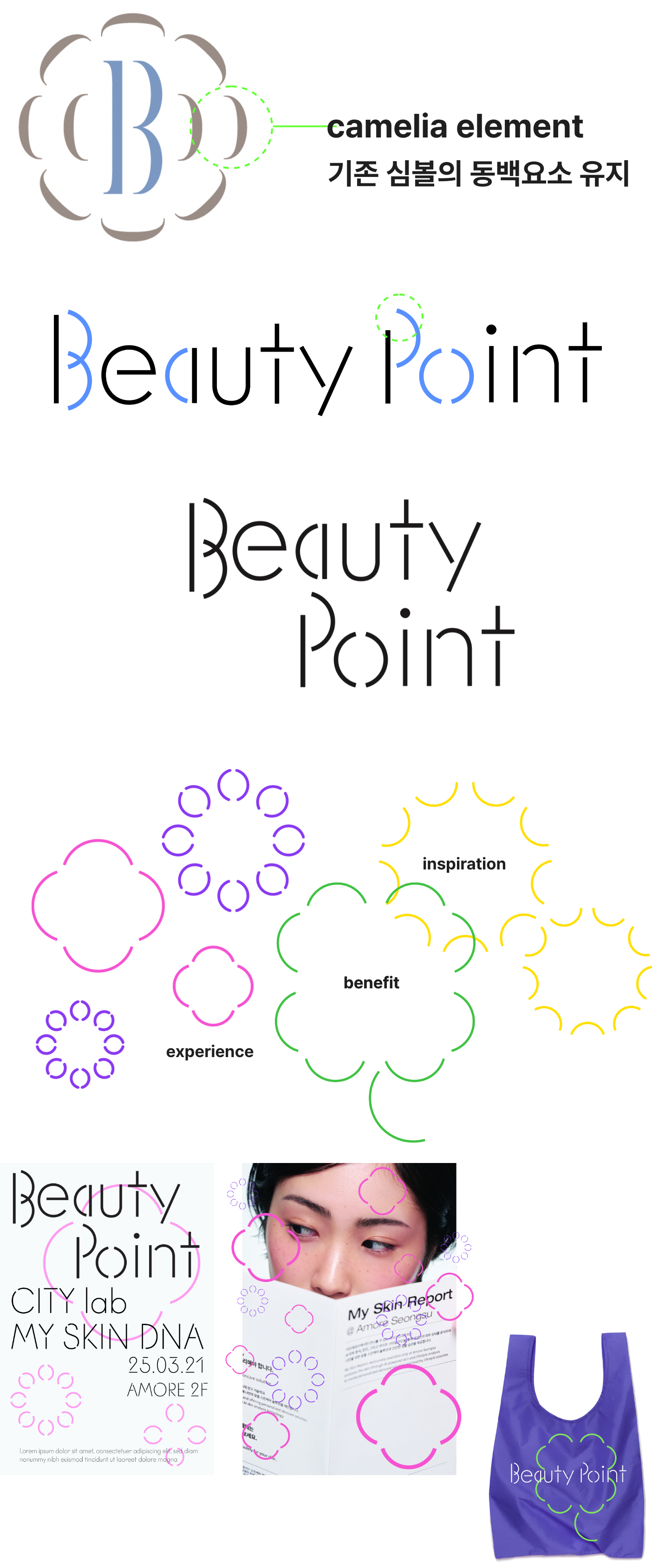
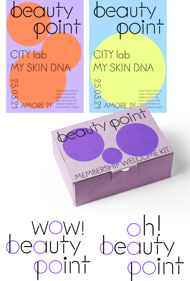
concept 02
곳곳에 생겨나는 아름다운 ‘포인트’
다양한 곳, 다양한 경험을 통해 곳곳에 생겨나는 아름다운 지점이라는 컨셉을
표현하기 위해 뷰티포인트의 이니셜의 o의 형태를 살려 다양한 지점으로 표현해봤습니다.
표현하기 위해 뷰티포인트의 이니셜의 o의 형태를 살려 다양한 지점으로 표현해봤습니다.
To visualize the concept of beautiful moments and experiences appearing in various places, we focused on the circular shape
of the “o” in Beauty Points. This form was used as a flexible graphic element to represent diverse and scattered points of beauty.
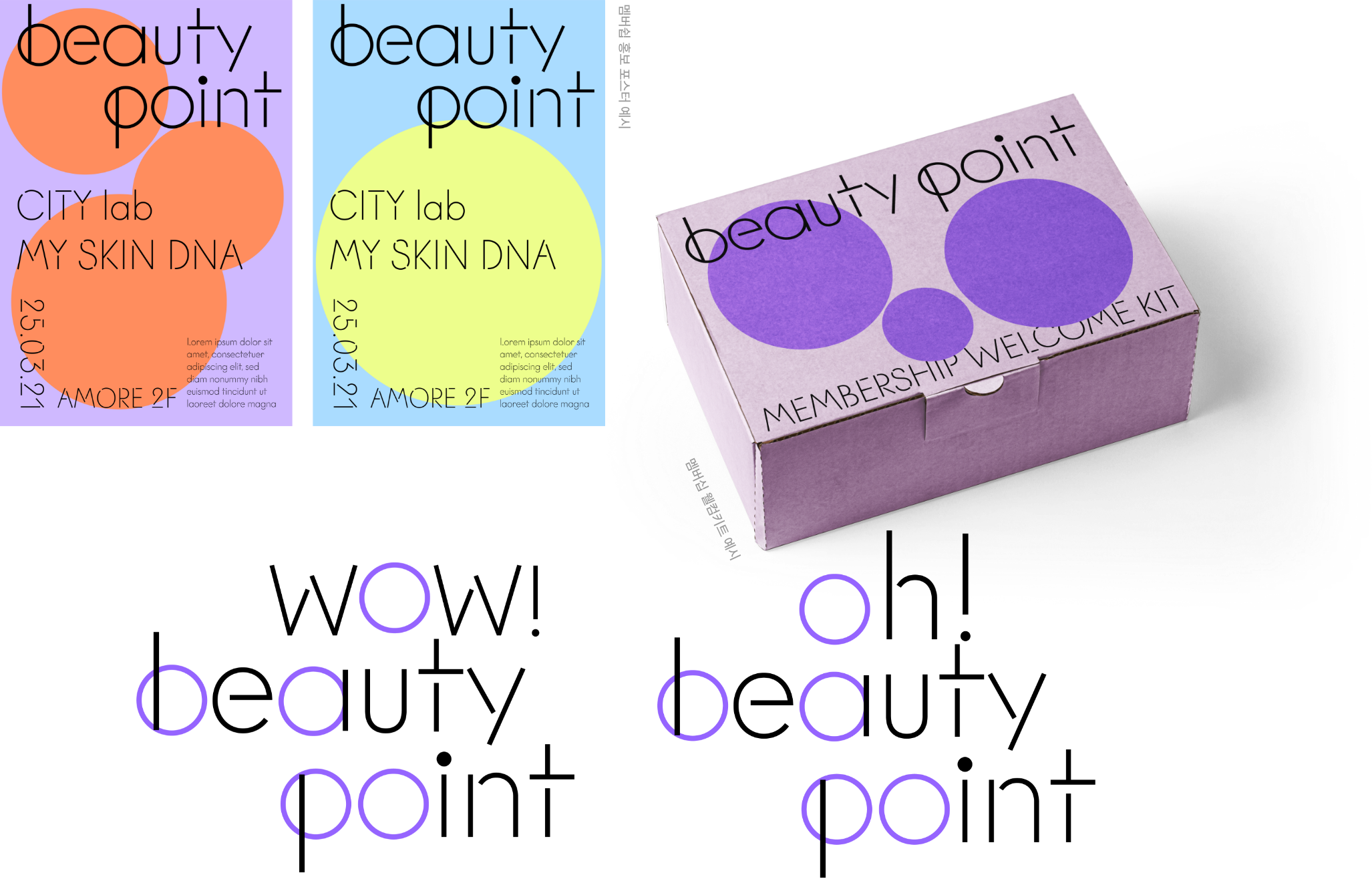
concept 03
아름다움이 시작되는 지점


sns 심볼 적용 예시

멤버쉽 홍보 포스터 예시
뷰티포인트를 통해 아름다운 경험을 시작할 수 있는 포인트라는 의미로 지도에 지역이 표시되고, 그 위 핀이 꽂히는 형태를 반영한 디자인으로 모바일 환경에 가독성을 높여야 할 경우에는 ‘뷰포’로 줄여 애칭처럼 불릴 수 있도록 제안해본 시안.
A proposed design that reflects the concept of a point marking the beginning of a beautiful experience through “Beauty Point.” The design features a map with
regions marked and a pin placed on top, symbolizing the point of experience. To improve readability in mobile environments, the name can be shortened to “Viewpo,”
serving as a friendly nickname.
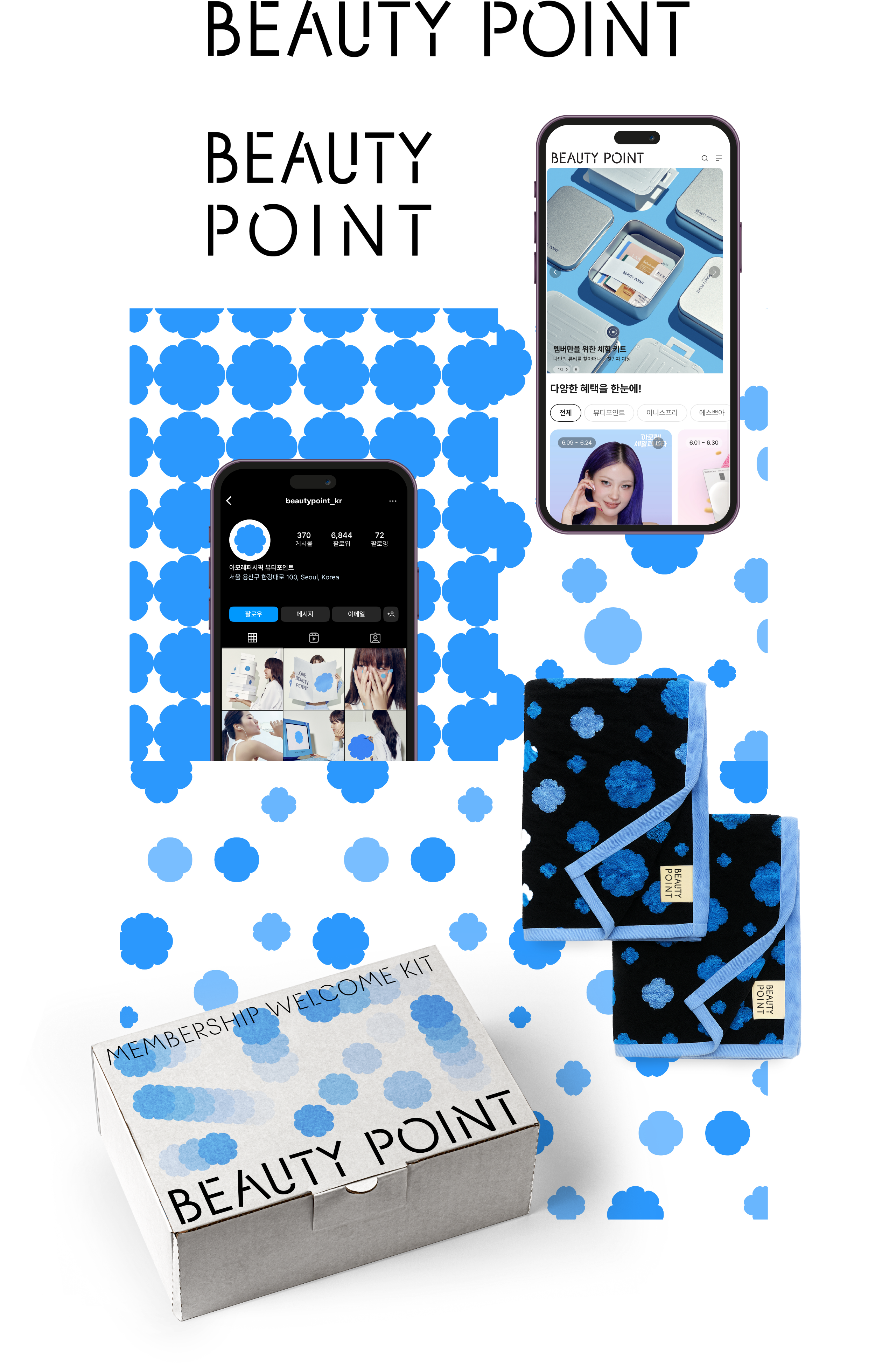

최종 디자인 확정은 위와 같은 형태로 디지털 환경에서 가장 잘 읽힐 수 있는 방식으로 담백하게 풀어낸 로고디자인과
기존의 동백 심볼을 그대로 유지하고, 다양한 경험의 지점을 표현할 수 있는 패턴의 형식으로 진행했습니다.
로고 작업시 카카오톡 발신이나, 웹 등 작게 쓰이는 환경을 최대한 고려하는 것에 대해 많이 스터디 할 수 있었던 프로젝트 입니다.
기존의 동백 심볼을 그대로 유지하고, 다양한 경험의 지점을 표현할 수 있는 패턴의 형식으로 진행했습니다.
로고 작업시 카카오톡 발신이나, 웹 등 작게 쓰이는 환경을 최대한 고려하는 것에 대해 많이 스터디 할 수 있었던 프로젝트 입니다.
The final design was confirmed in a form that is simple and clear, optimized for readability in digital environments. The logo design retains
the existing camellia symbol and is developed into a pattern format that can express various points of experience.
This project offered a valuable opportunity to study how logos are used in small-scale environments such as KakaoTalk message senders and on the web.
This project offered a valuable opportunity to study how logos are used in small-scale environments such as KakaoTalk message senders and on the web.
- Amorepacific Creatives
- Identity Design
- 천나리