PRIMERA VITA-TINOL BOUNCY BALLOON LIP SERUM
Summary
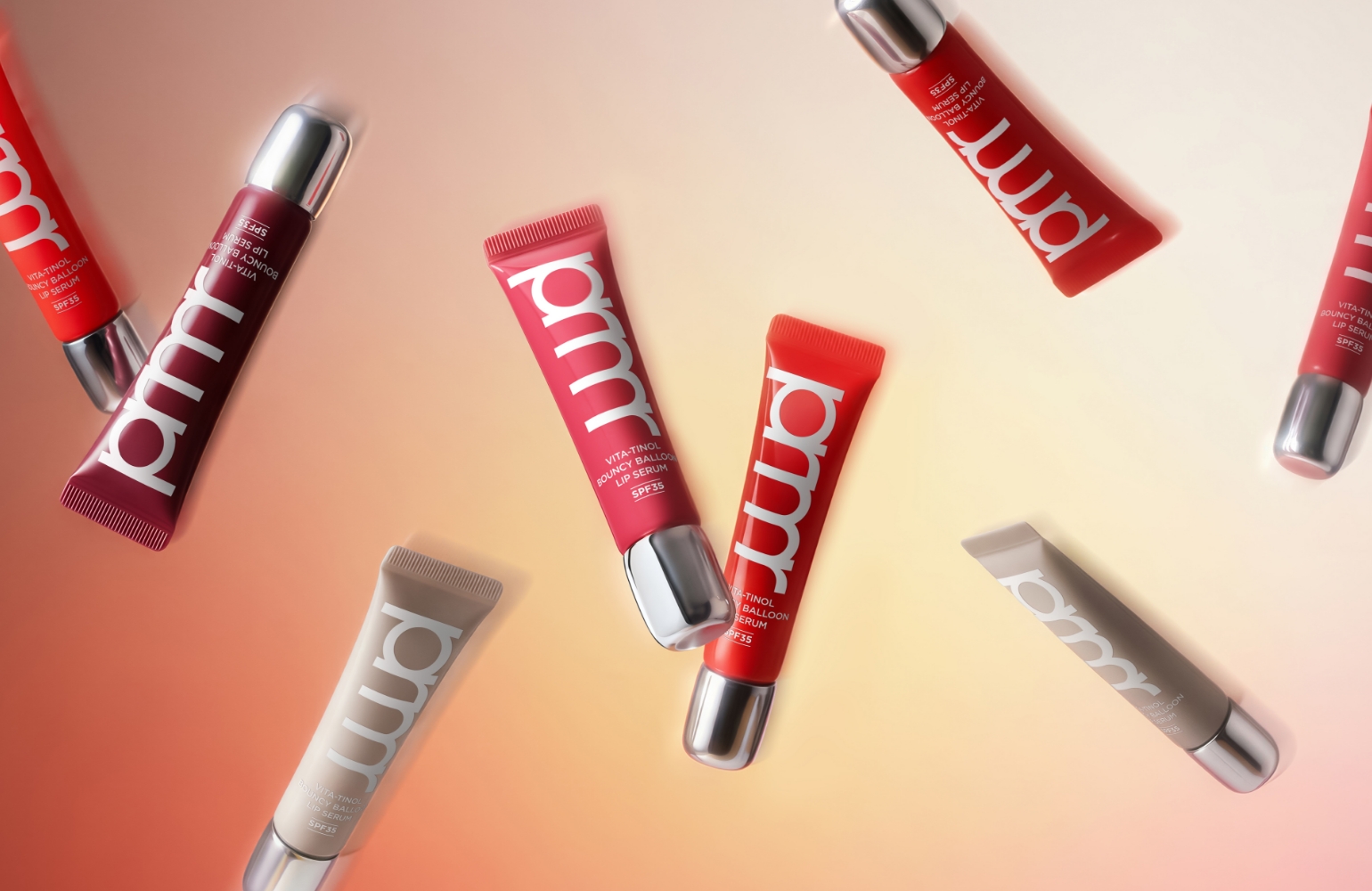
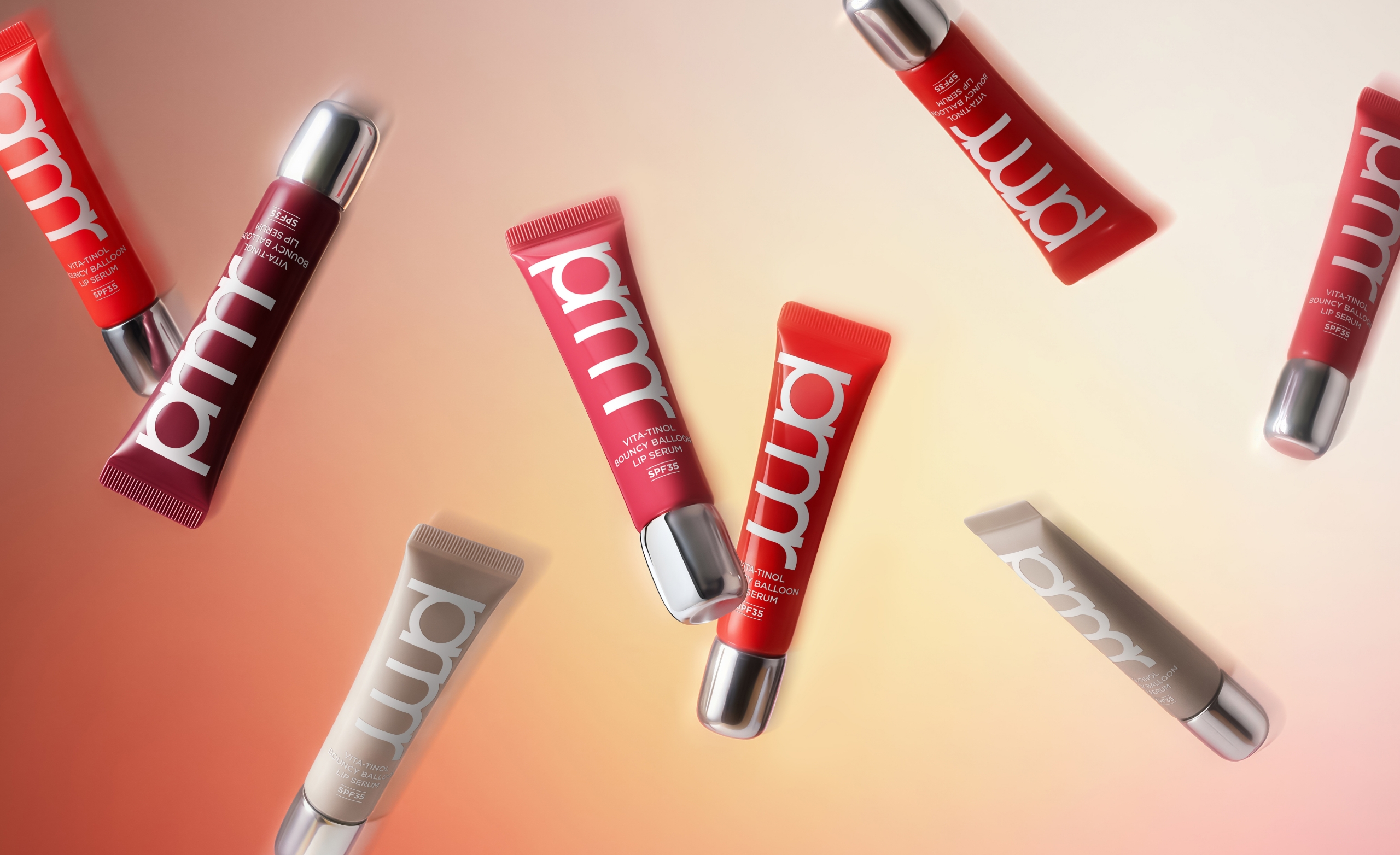
The new PRIMERA VITA-TINOL BOUNCY BALLOON LIP SERUM has been redesigned with a tube-type package that enhances both portability and ease of use, replacing the previous round container. The core of this redesign lies in maximizing practicality through the tube body while seamlessly carrying over the distinctive design language of PRIMERA’s existing lip products, creating a strong sense of visual continuity across the brand. In line with the new product design, the in-store VMD was also reconfigured so that key product features, such as the silver cap and lip applicator, are communicated intuitively through both the visual presentation and display structure. This approach ensures that the product and retail space come together to deliver one cohesive brand experience.
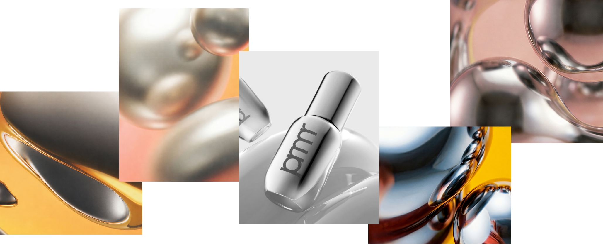
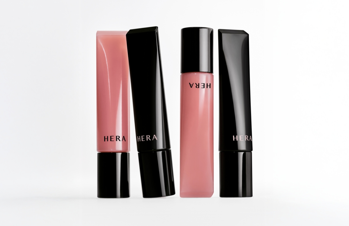
The Lip Retinol Serum’s signature rounded aesthetic has long been a defining characteristic of PRIMERA’s lip products. As the package structure transitioned to a tube format to improve usability, the starting point of this design was the question of how to preserve the product’s distinctive sculptural quality while adapting it to a more practical form.
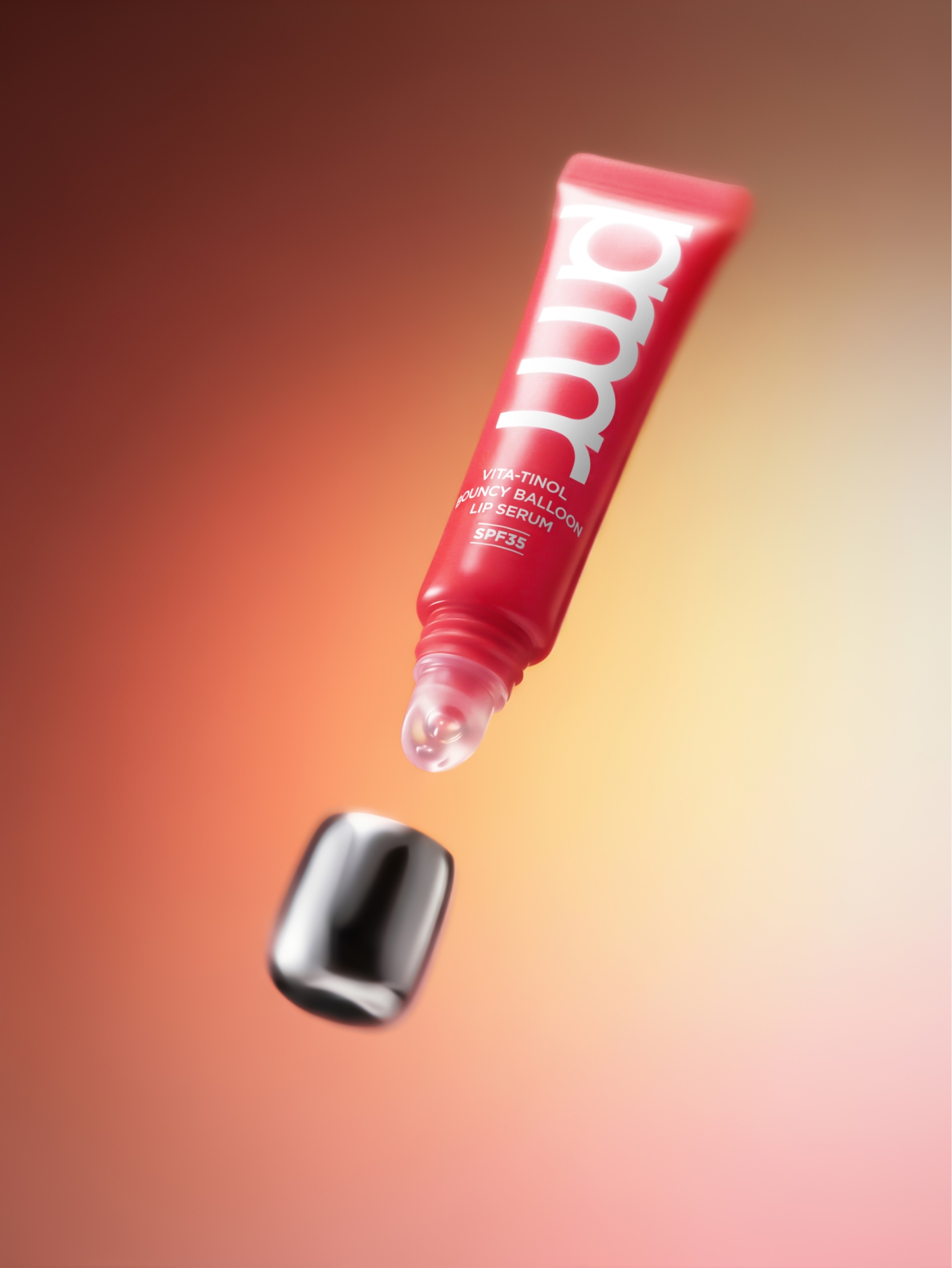
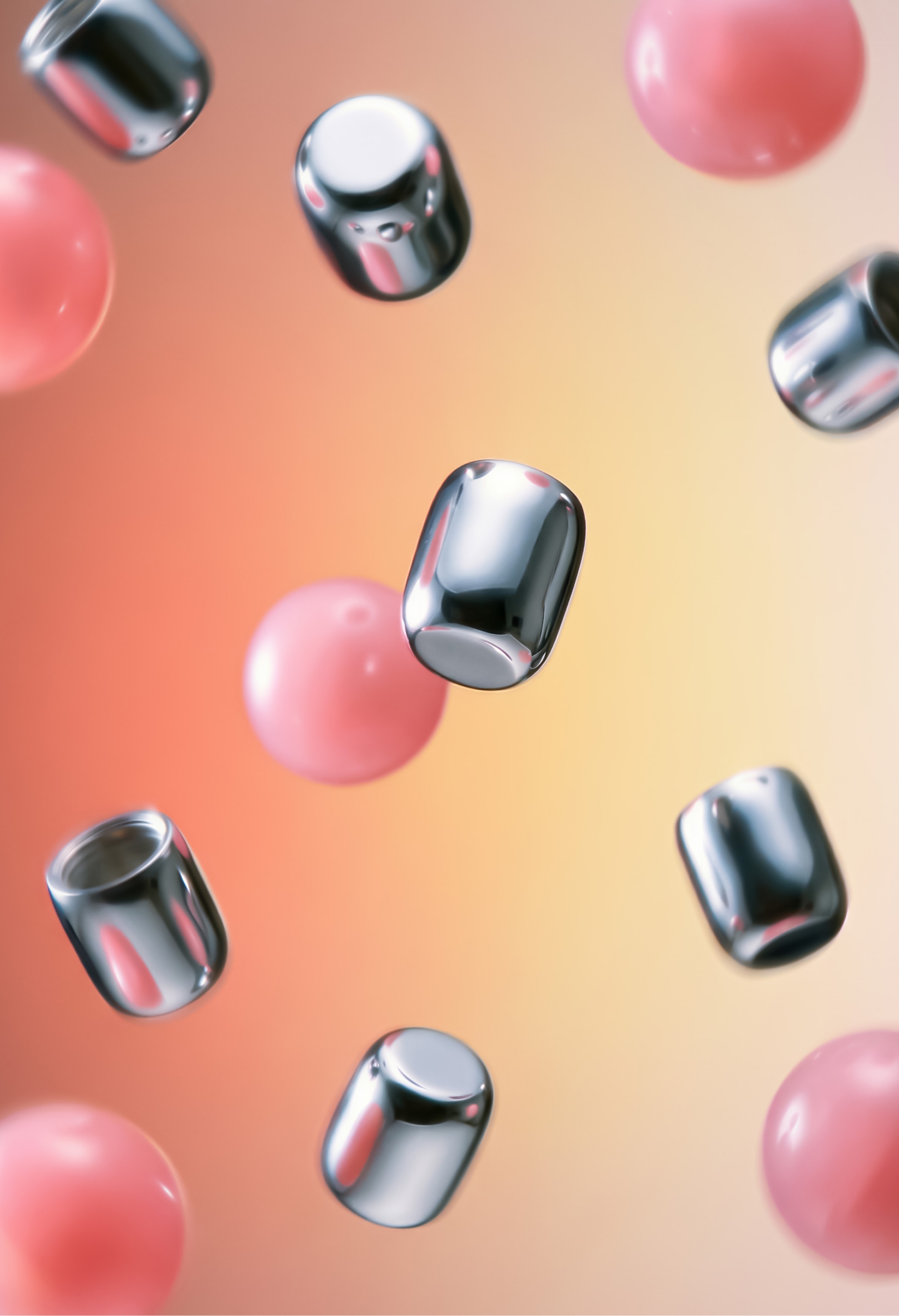
The solution was to distill the product’s existing design language into the cap. By pairing the tube package—which could easily have become flat and ordinary—with a bold, generously rounded cap, the design effectively carries forward one of the brand’s most recognizable visual assets.
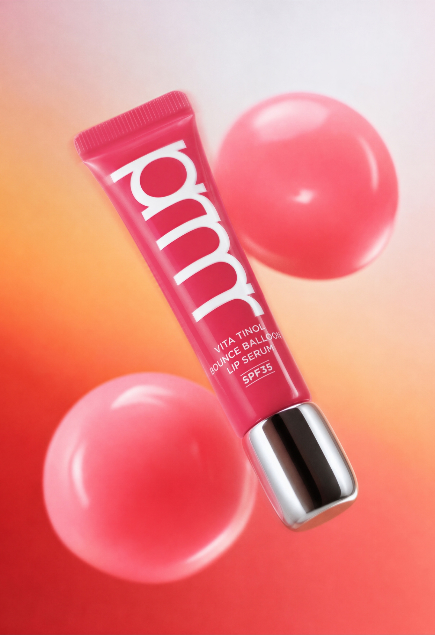
More than a purely aesthetic curve, the rounded cap that anchors the package intuitively evokes the plump volume that builds across the lips. Like a balloon gently inflating, the product’s promise of creating supple, bouncy lips is communicated first through the cap’s generous volume—both visually and through the tactile sensation of holding it. By combining a practical tube body with a rounded cap that playfully expresses the product’s essence, the design achieves a bold transformation without losing sight of its core identity.
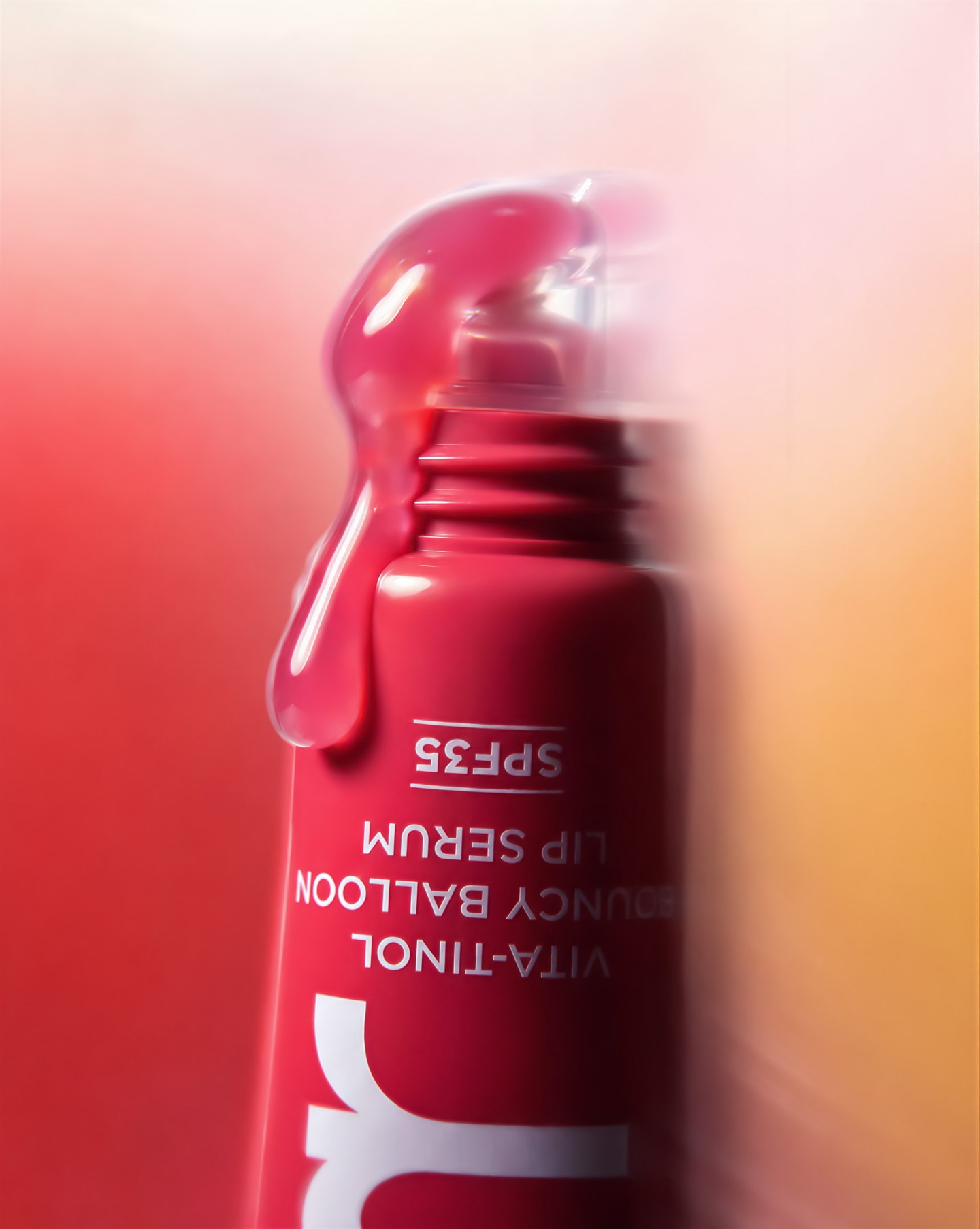
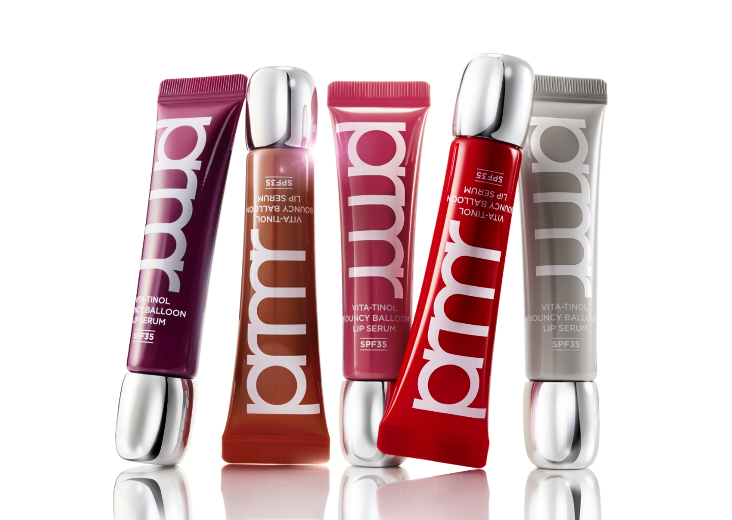
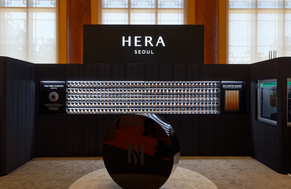
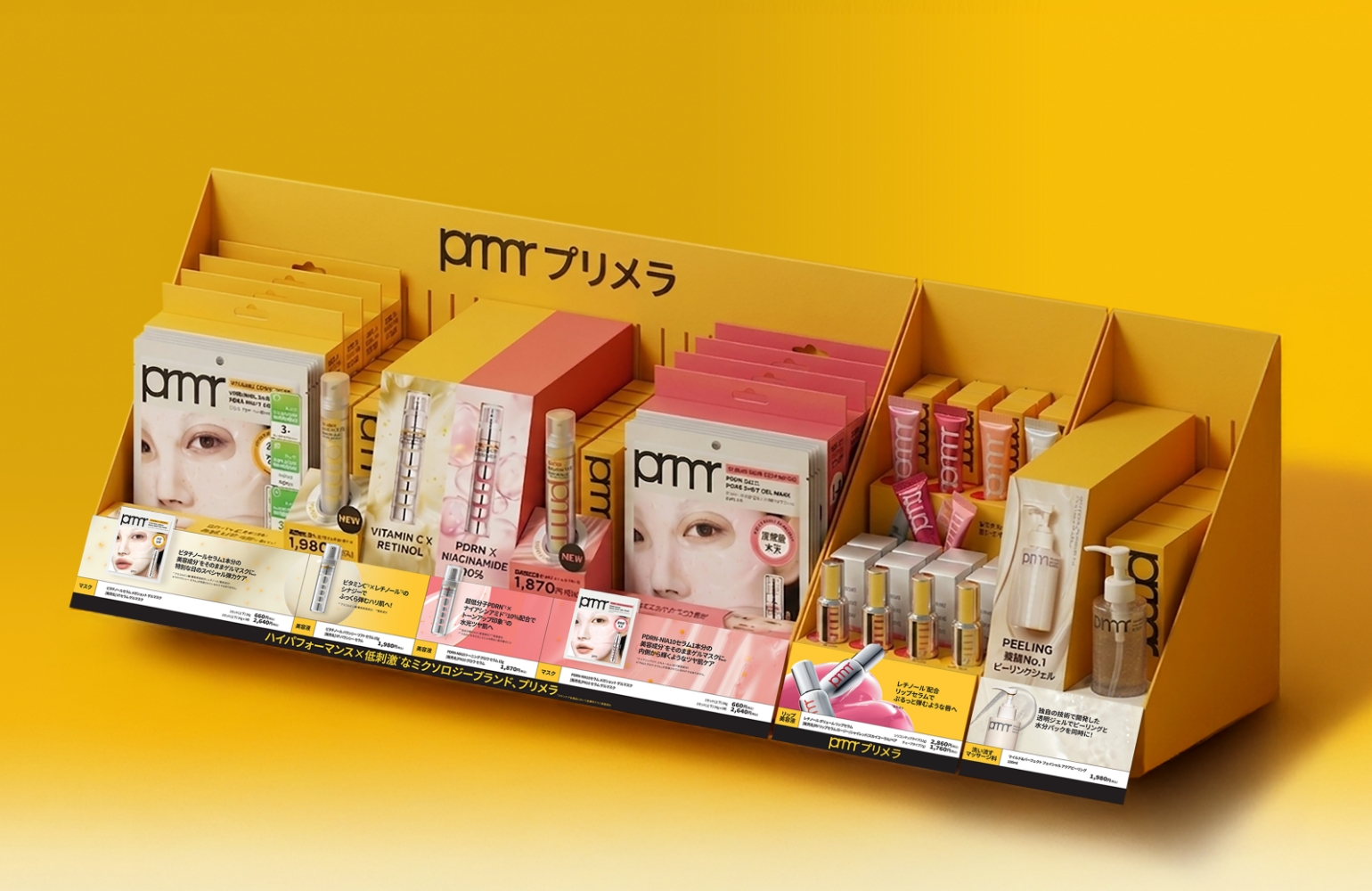
In line with the renewal of the VITA-TINOL BOUNCY BALLOON LIP SERUM, the lip serum display fixture used in MBS was also redesigned.
To ensure that the product’s new identity is communicated consistently within the retail environment, the visual presentation and display structure were developed in connection with the package design. The space was planned with careful consideration of both the product’s key characteristics and the user experience.
To ensure that the product’s new identity is communicated consistently within the retail environment, the visual presentation and display structure were developed in connection with the package design. The space was planned with careful consideration of both the product’s key characteristics and the user experience.
The previous Lip Serum VMD was primarily focused on communicating the product’s color payoff. While the visual presentation and display structure were designed to allow customers to compare the full range of shades intuitively, they had limitations in conveying the defining features of the renewed product.
As the renewed Lip Serum combines the hygienic and user-friendly benefits of a tube package with the signature design identity of the original metallic container, a new VMD was required to communicate both the distinctive silver cap and the lip applicator.
As the renewed Lip Serum combines the hygienic and user-friendly benefits of a tube package with the signature design identity of the original metallic container, a new VMD was required to communicate both the distinctive silver cap and the lip applicator.
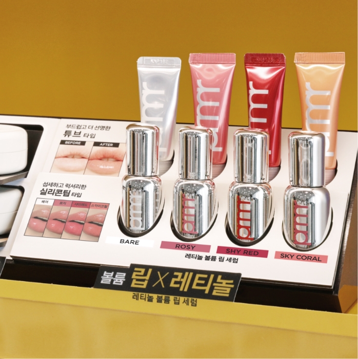
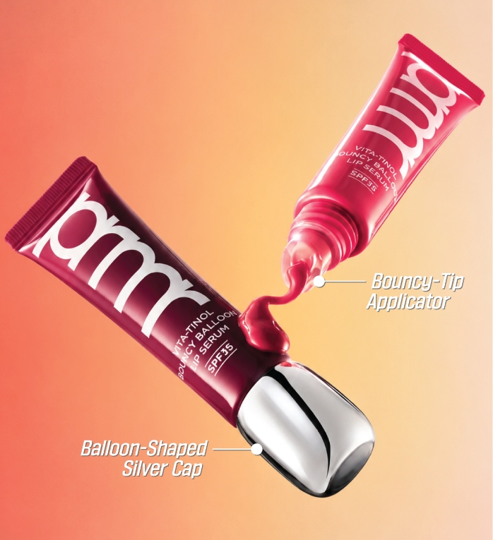
The renewed VMD was designed with a focus on effectively communicating the two defining features of the updated product. The signature silver cap, which embodies the brand’s design identity, and the lip applicator, a key element that represents the product experience, were established as the primary visual motifs. The display and visual composition were carefully designed so that customers could naturally recognize these two defining features from the very first moment they encountered the product.
To reinforce the product’s renewal points, both the visual composition and merchandising structure were thoughtfully designed in tandem, allowing customers to experience not only the product’s distinctive design language but also its enhanced usability.
To reinforce the product’s renewal points, both the visual composition and merchandising structure were thoughtfully designed in tandem, allowing customers to experience not only the product’s distinctive design language but also its enhanced usability.
To develop a VMD structure that could effectively highlight the product’s key features—the silver cap and applicator—we explored a range of layouts and display configurations. Taking the product’s form and visibility into consideration, we compared multiple approaches, including upright and horizontal placement, as well as different relationships between the key visual and testers, to identify the structure that would present the product most effectively.
Through an iterative process of developing and comparing various structural designs and mock-up samples, we arrived at the optimal display solution.
Through an iterative process of developing and comparing various structural designs and mock-up samples, we arrived at the optimal display solution.
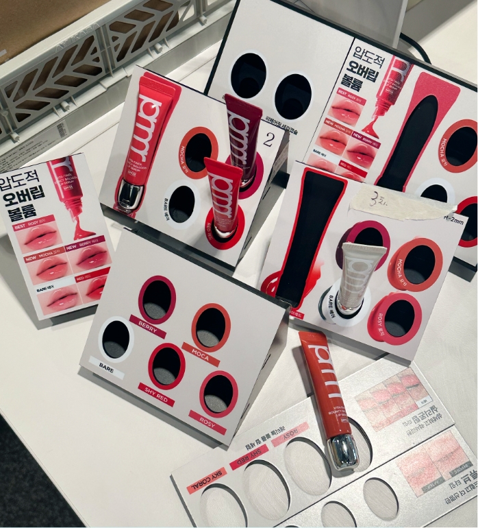
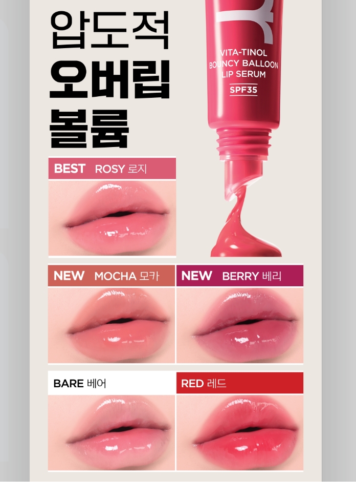
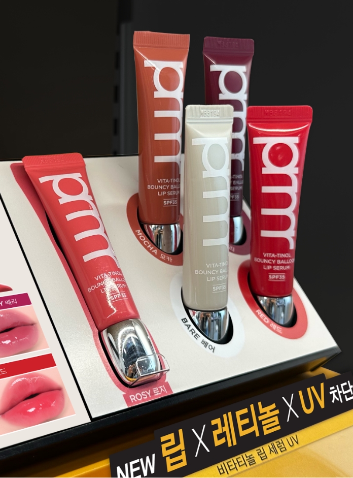
The visual area was designed to communicate the product’s key message and color information at a glance. By enlarging the lip applicator, the composition effectively highlights both the formula and its application, while bold, oversized typography was applied to the product name and key messaging to ensure strong visibility even from a distance.
The tester area was arranged so that customers could immediately understand the product’s overall silhouette and renewed package design. In particular, the products were displayed horizontally rather than in the conventional upright arrangement, allowing the silver caps to emerge as a distinctive visual focal point.
Together, these elements communicate the product’s defining design features and brand identity in a more intuitive way.
The tester area was arranged so that customers could immediately understand the product’s overall silhouette and renewed package design. In particular, the products were displayed horizontally rather than in the conventional upright arrangement, allowing the silver caps to emerge as a distinctive visual focal point.
Together, these elements communicate the product’s defining design features and brand identity in a more intuitive way.
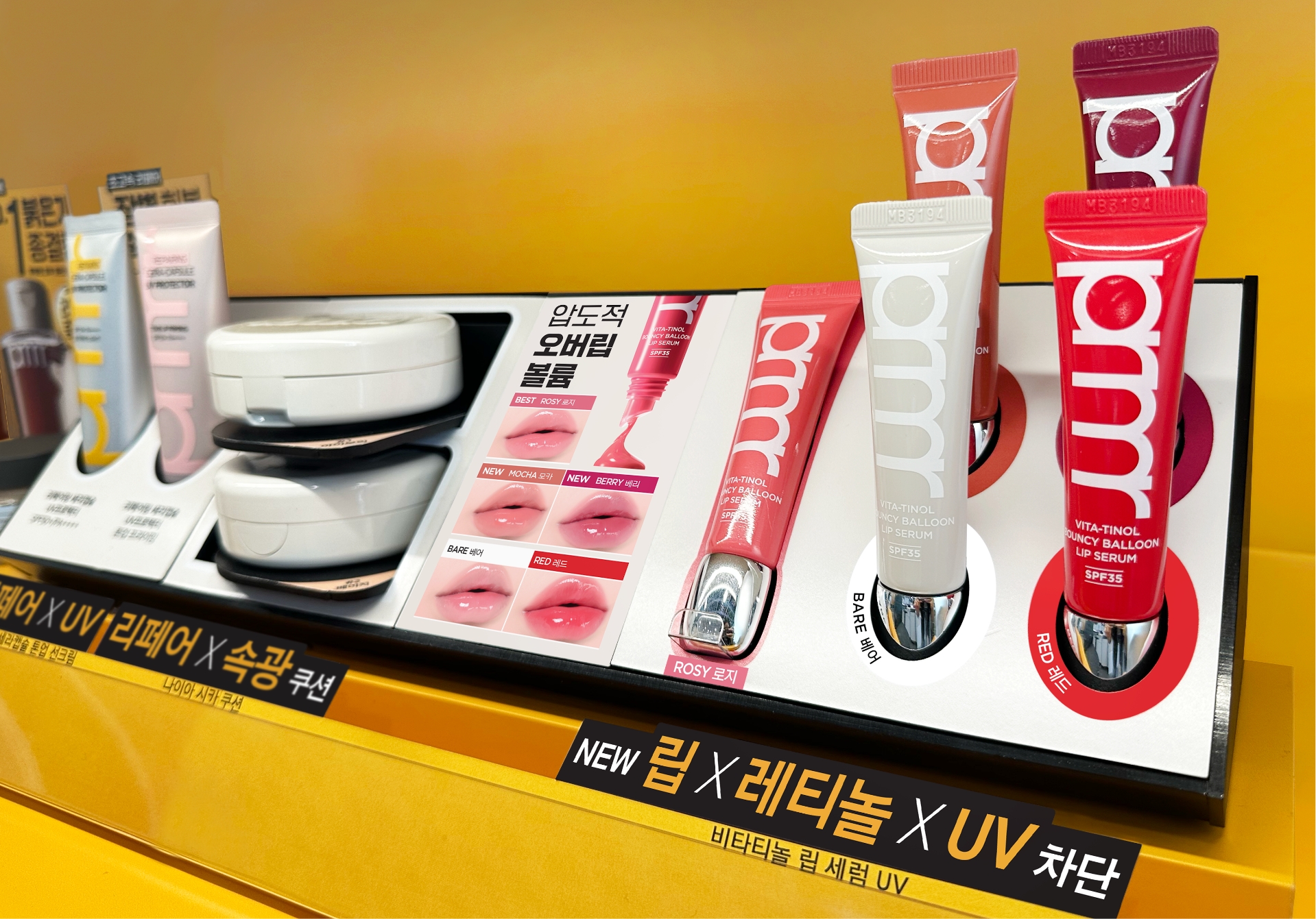
The product and the space are not designed
as separate entities, but as
interconnected
elements that come together to complete
a cohesive brand experience.
as separate entities, but as
interconnected
elements that come together to complete
a cohesive brand experience.
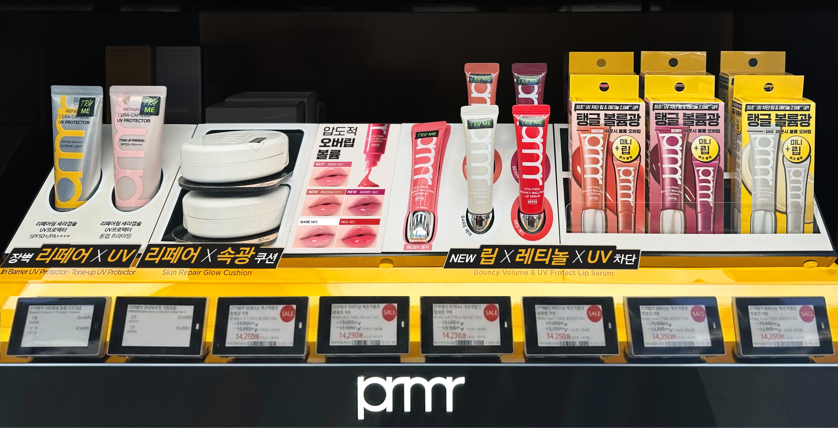
This project extended the renewed product’s key design elements into the retail space,
enabling customers to experience its evolution and the brand’s values more naturally.
enabling customers to experience its evolution and the brand’s values more naturally.
- Amorepacific Creatives
- Product Design
- Hong Damee
- VMD
- Kim Jungyea
- Design Directing
- Lee Ohkyung
- BM
- Park Jinkyung
- GTM
- Kim Hanna
- Sales
- Kim Sieun
- Development
- Park Songeun, Byun Jiyoung
- Photography
- Shin Sangwoo