Longtake body care product design
Summary
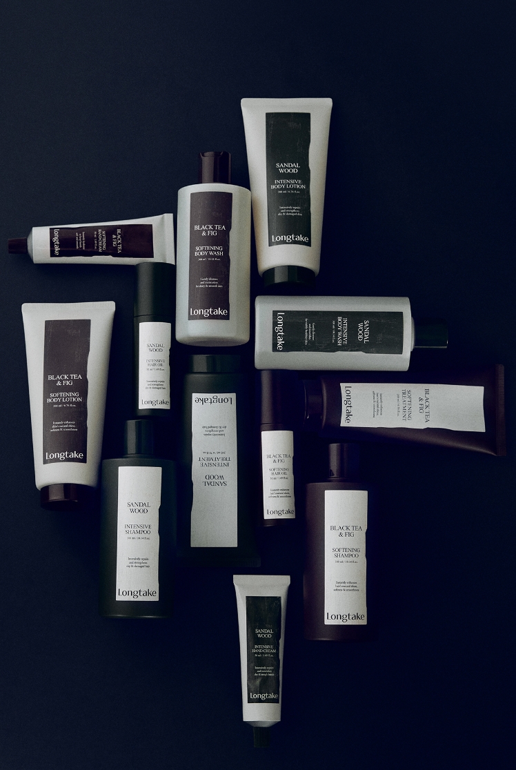
Longtake, a brand that started with hair care, expanded its lineup to include hand and body care with sensual fragrances and gentle use, and
we designed a new line of products. We redefined the elements that make up the identity of product design to establish a baseline for design
variation before expanding product types, and designed from a usability and aesthetic perspective, considering the role of the product in
the customer’s usage scene.
Background
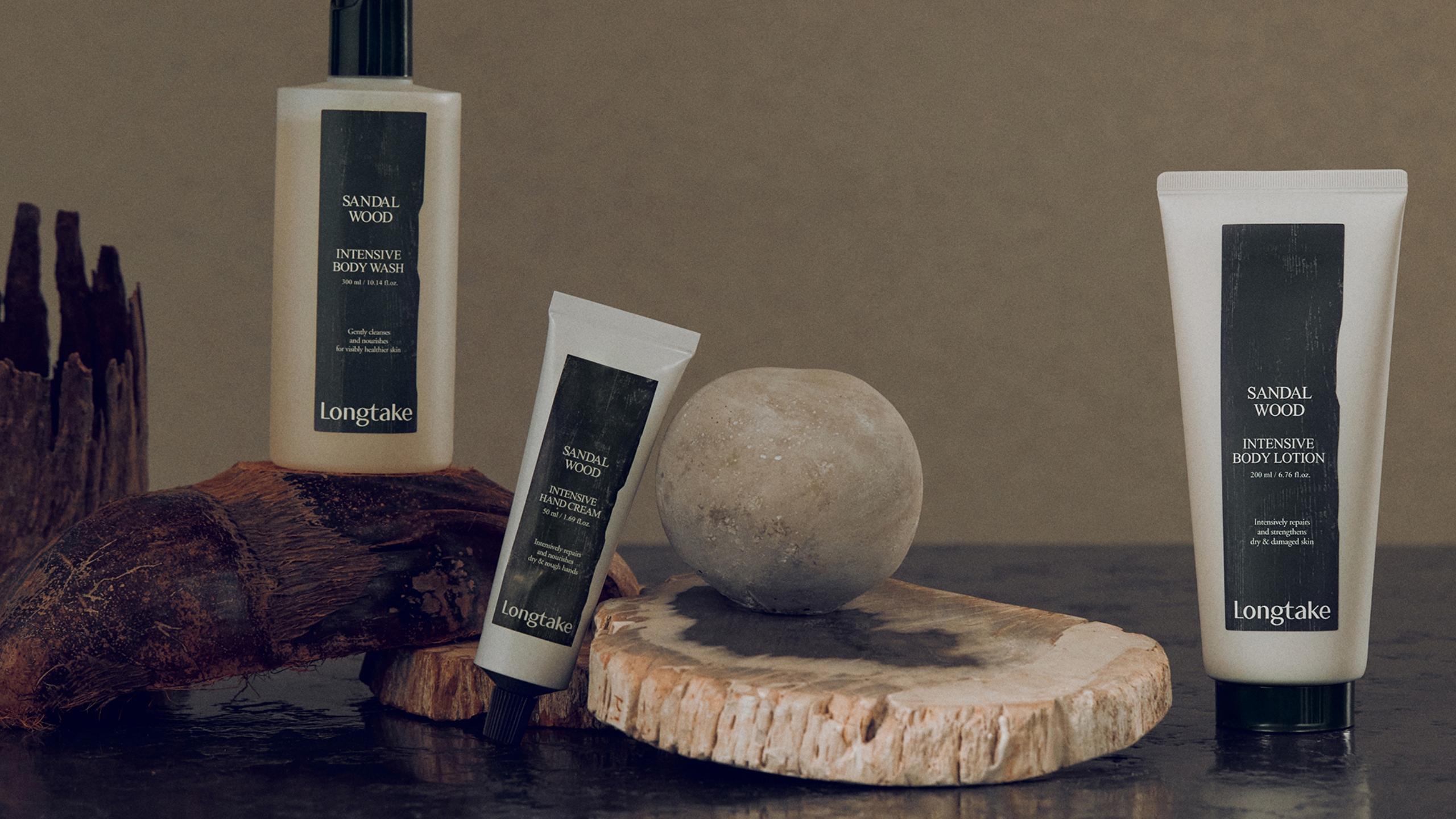
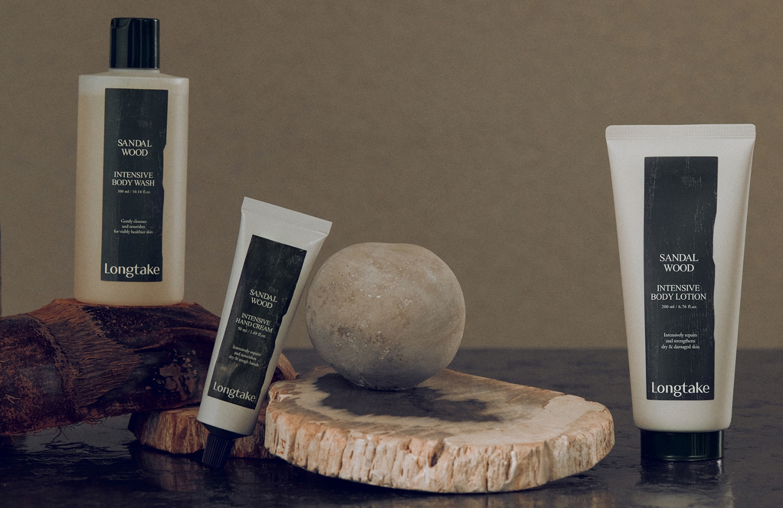
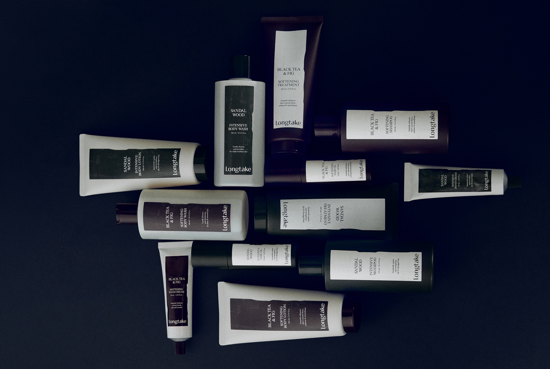
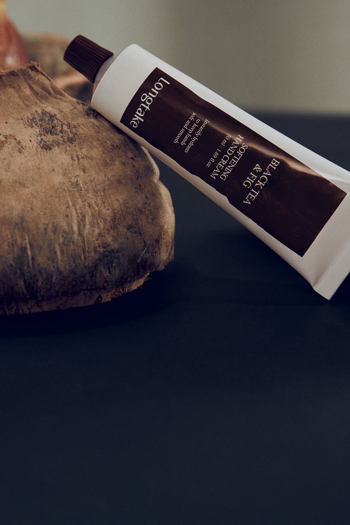
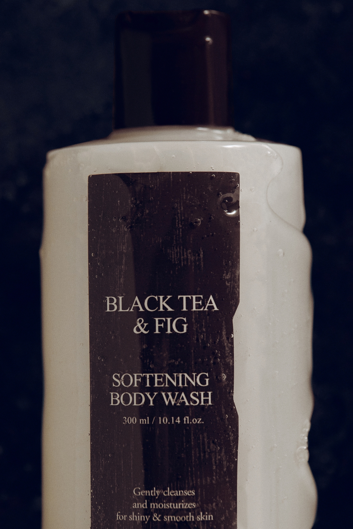
Following the Longtake hair care line, we launched a body care line consisting of body wash, body lotion, and hand cream. As the category expanded,
we aimed to resolve potential confusion between hair and body products in shared usage environments. Anticipating that text alone—especially on an
English-focused front design—would not be sufficient for clear differentiation, we first defined the design identity and established boundaries
before developing variations for the new body line.
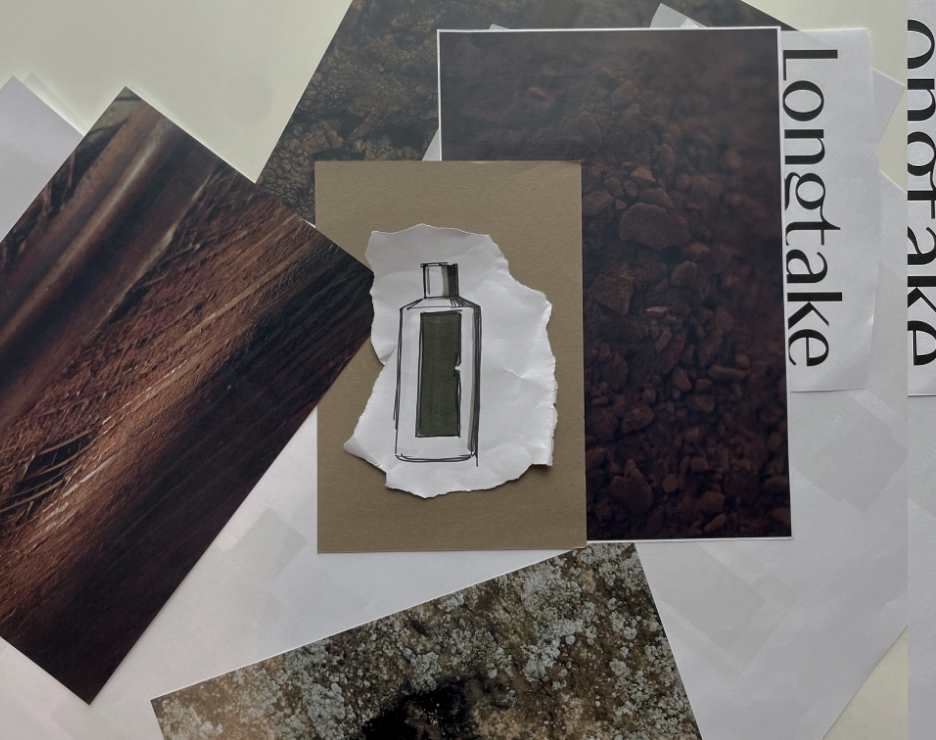
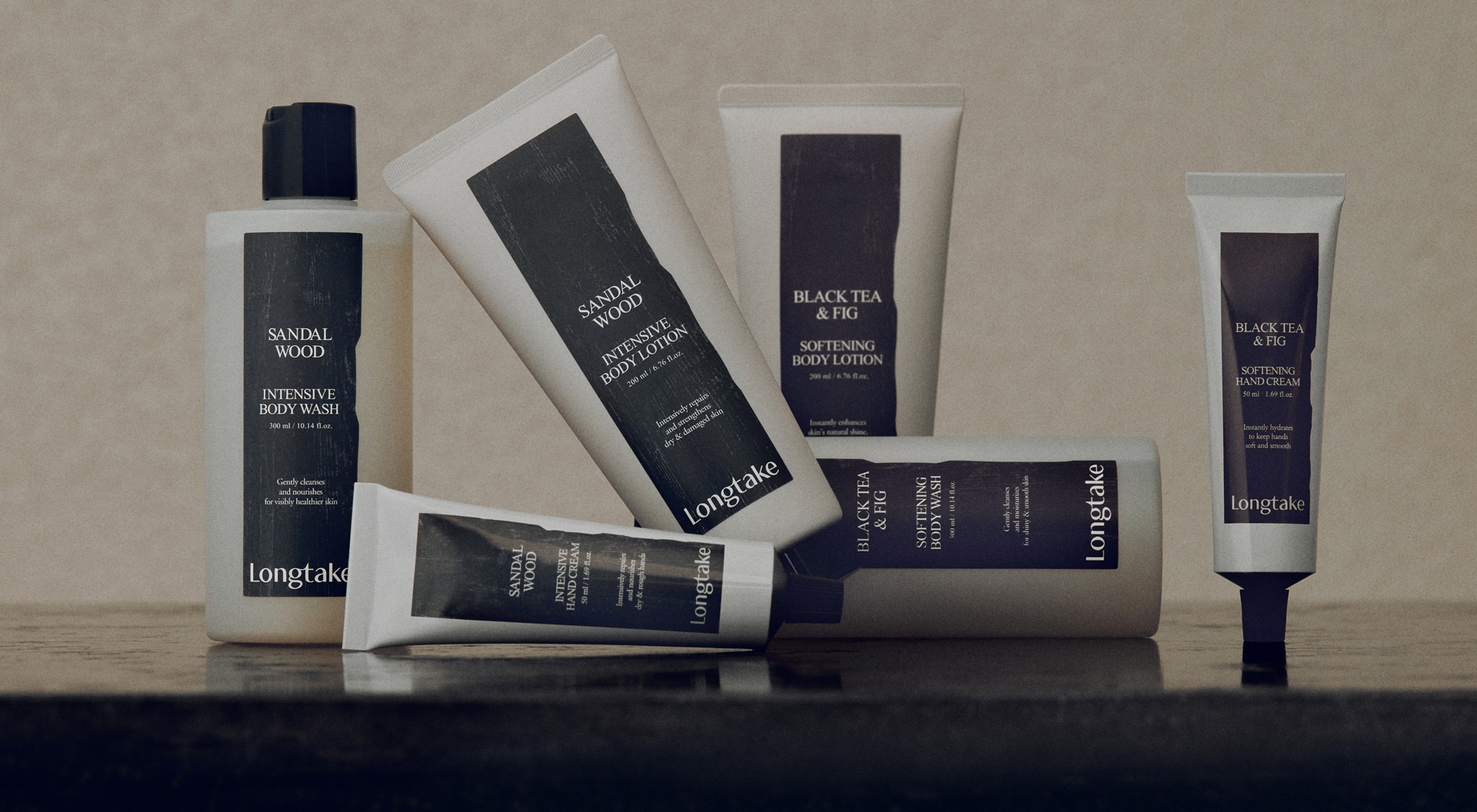
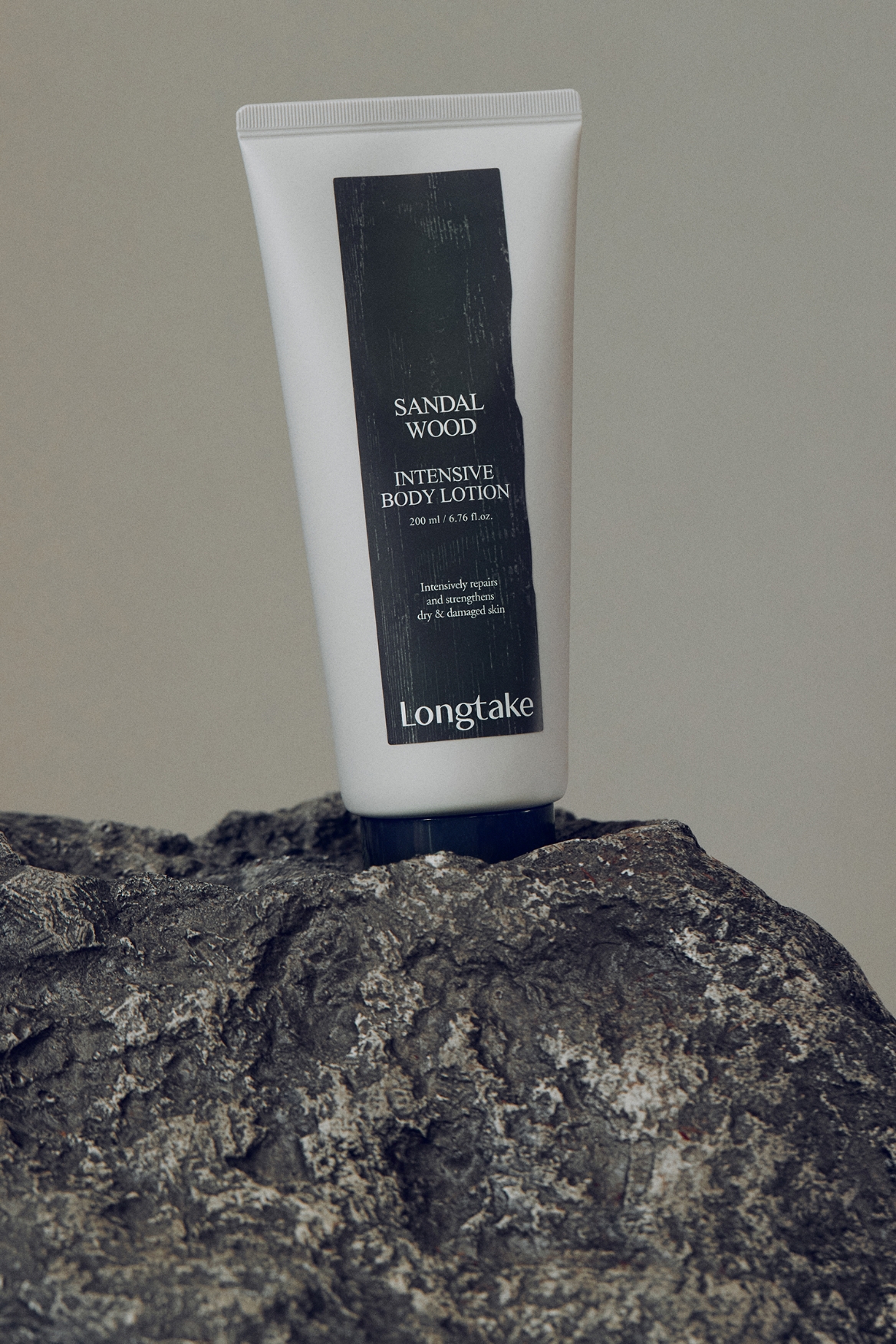
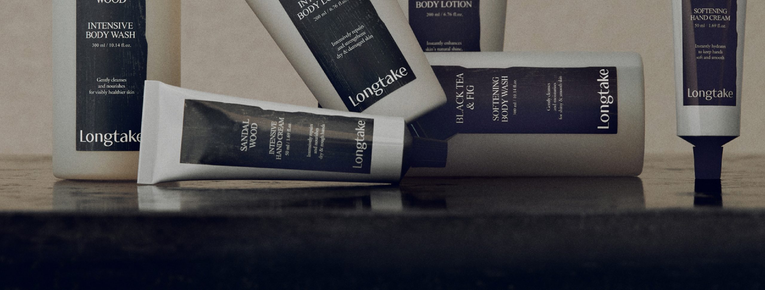
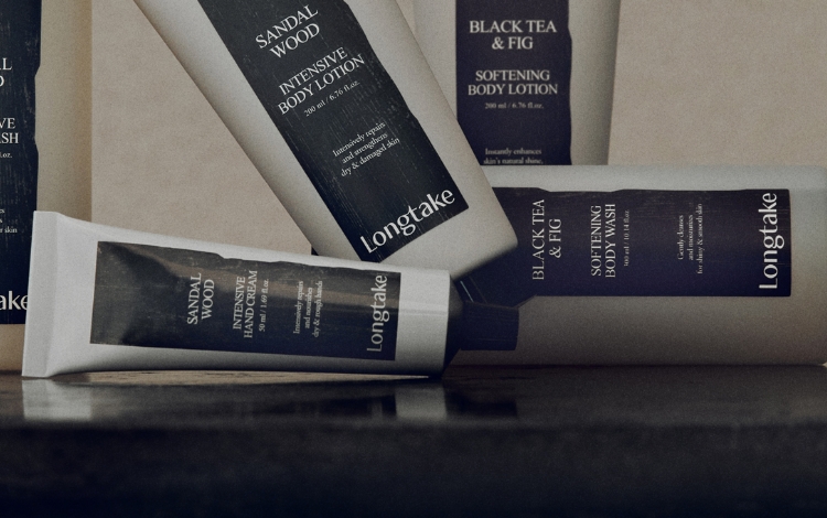
Key elements shaping Longtake’s visual identity include: 1) a scent-to-color logic for easy recognition, 2) wooden-textured labels, and 3) strong
contrast between bright labels and dark bottles. Based on these elements, we developed new body care packaging that enables intuitive product recognition.

Process
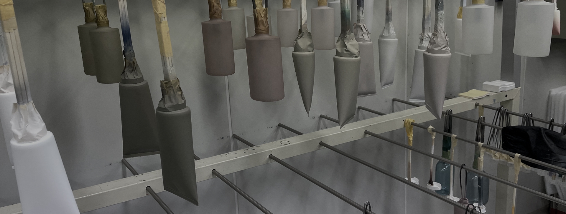
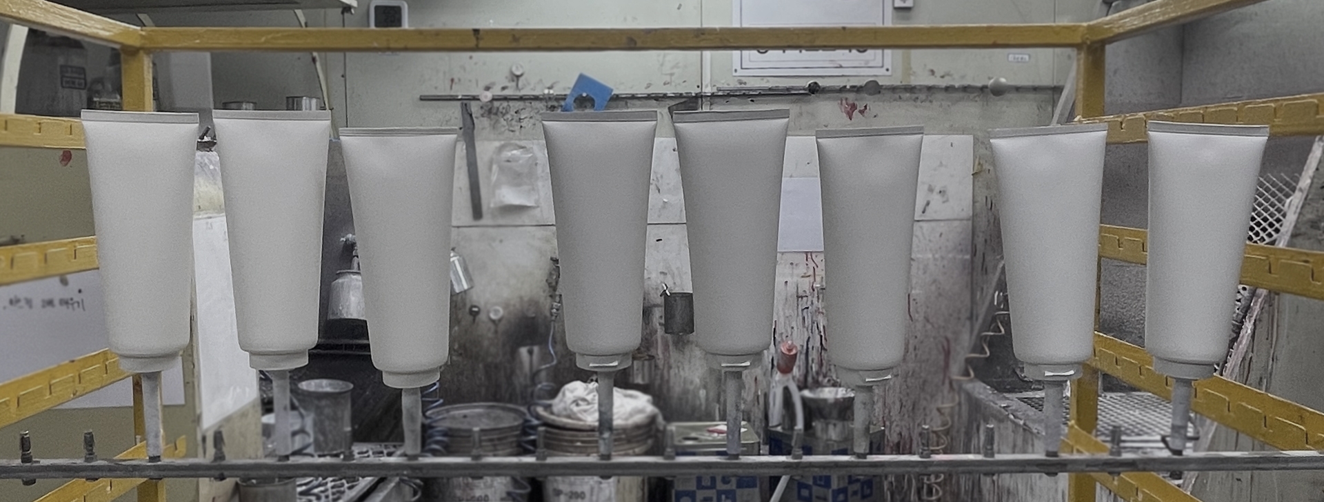
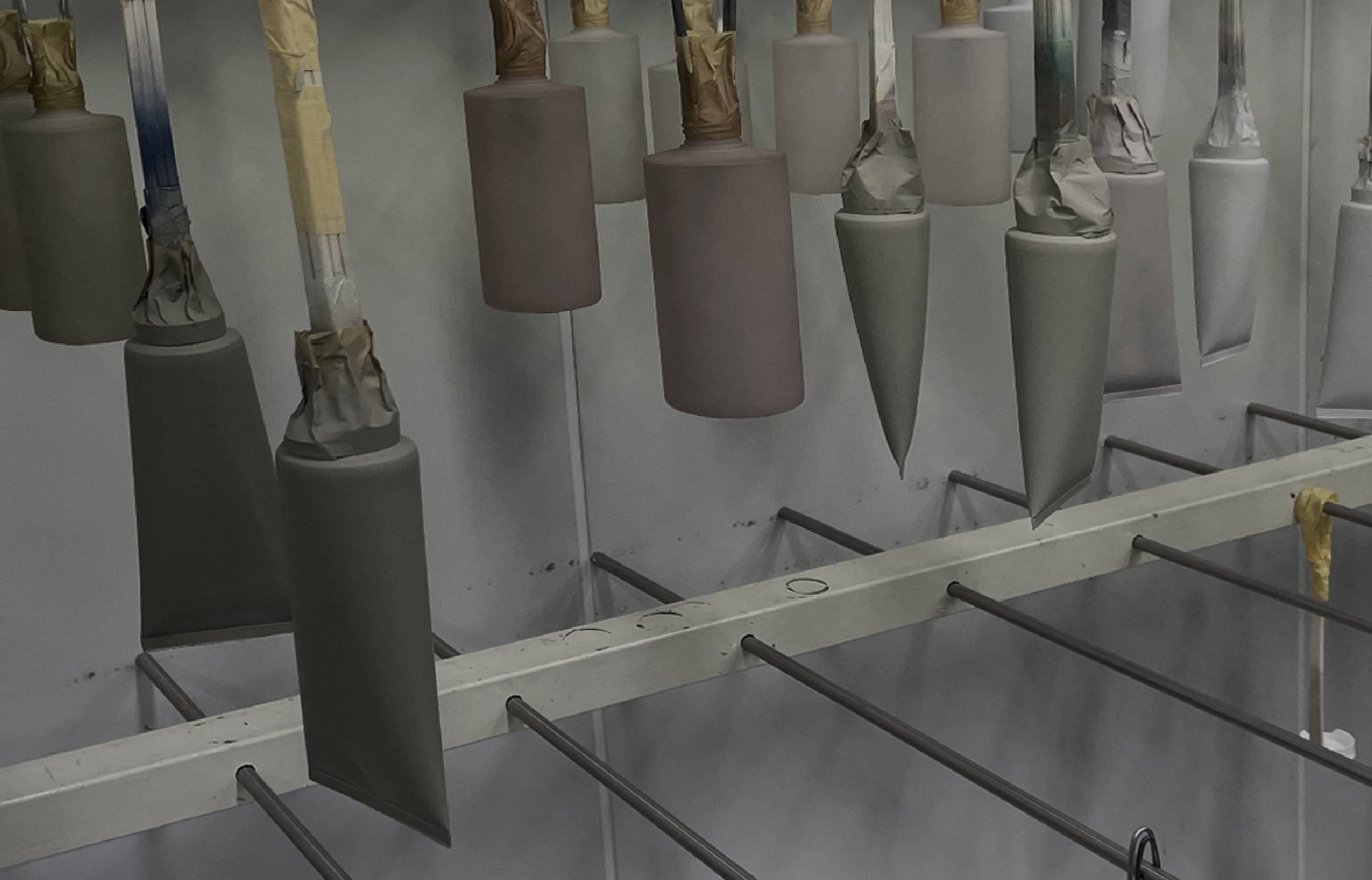
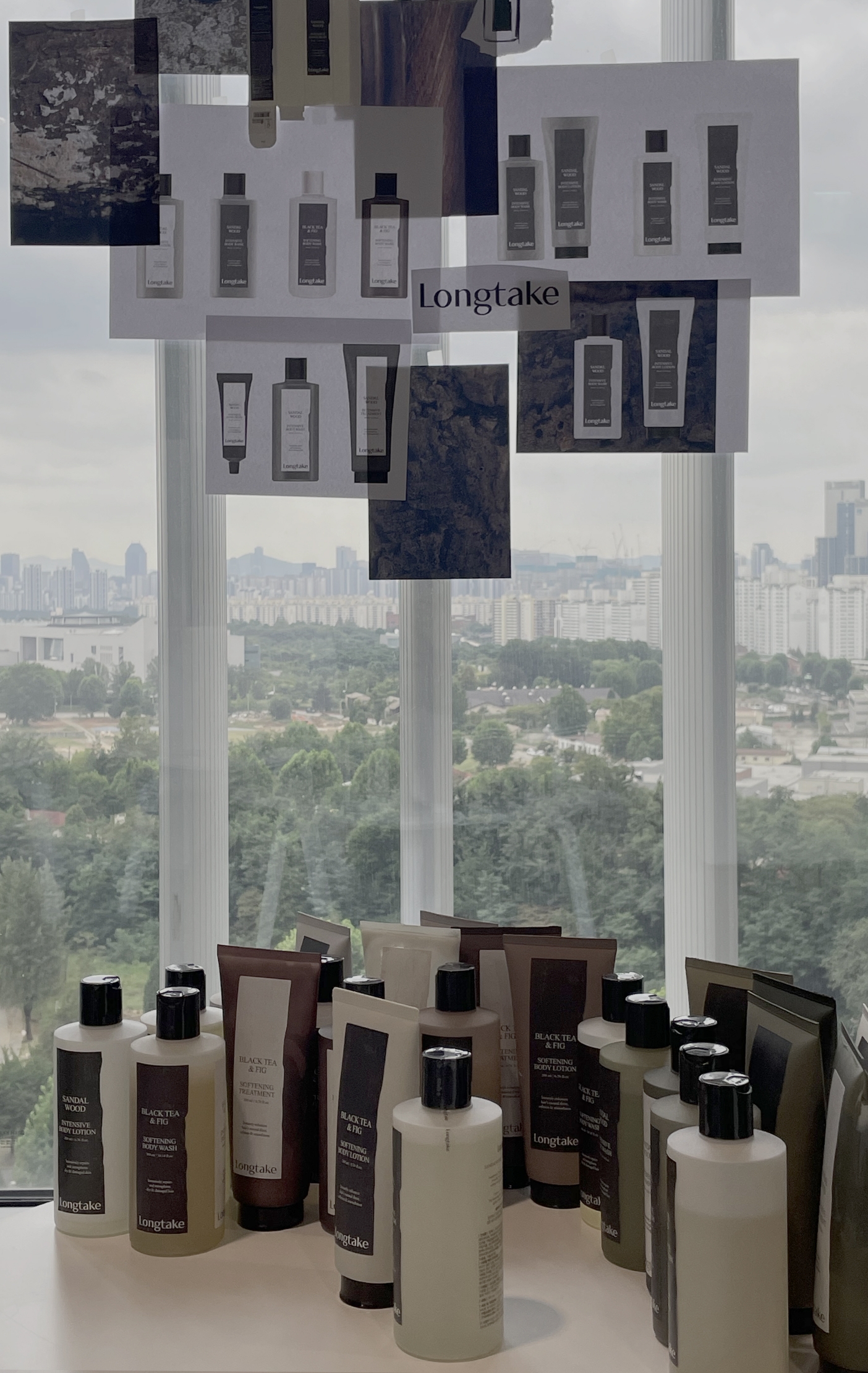
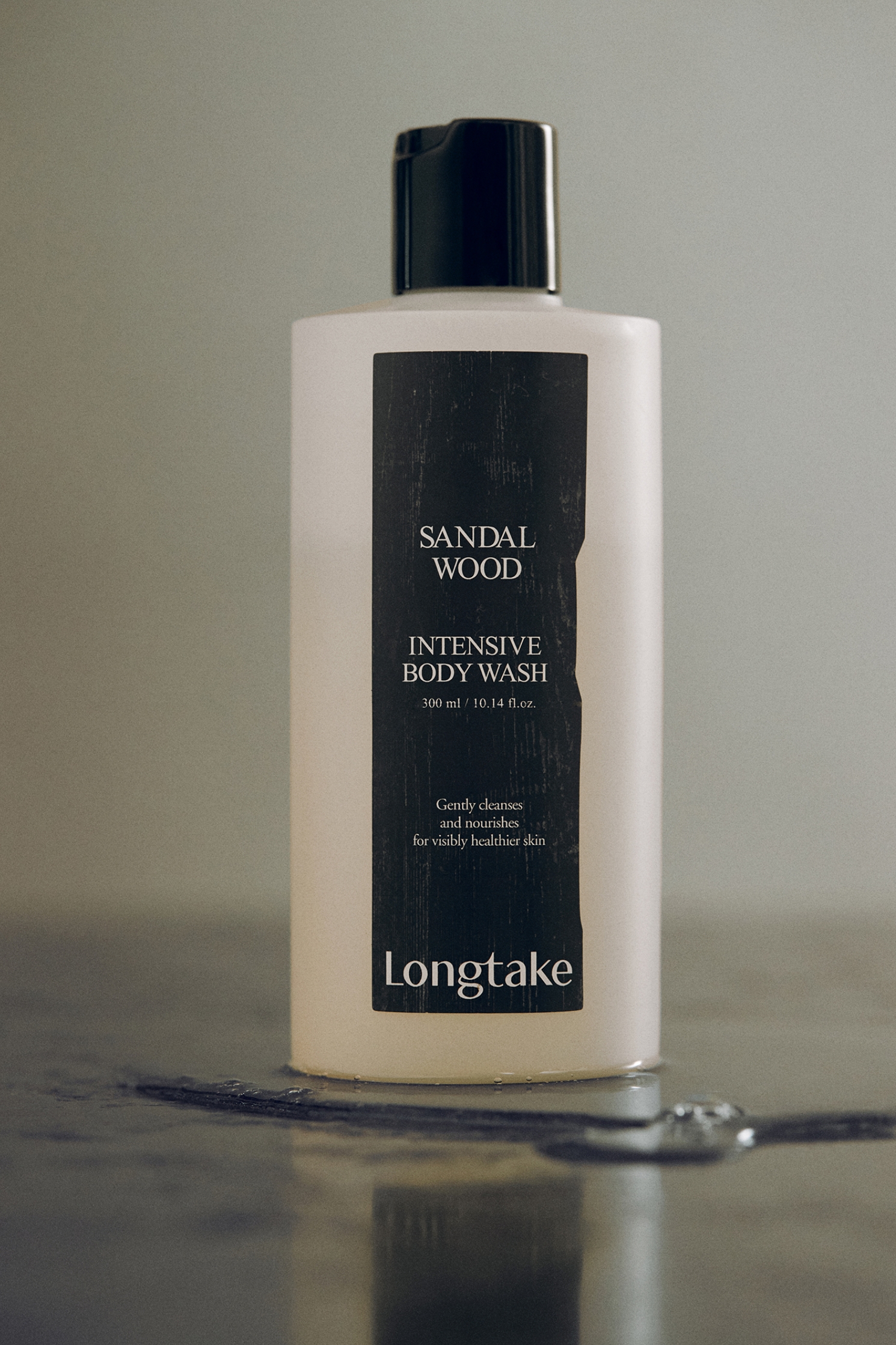
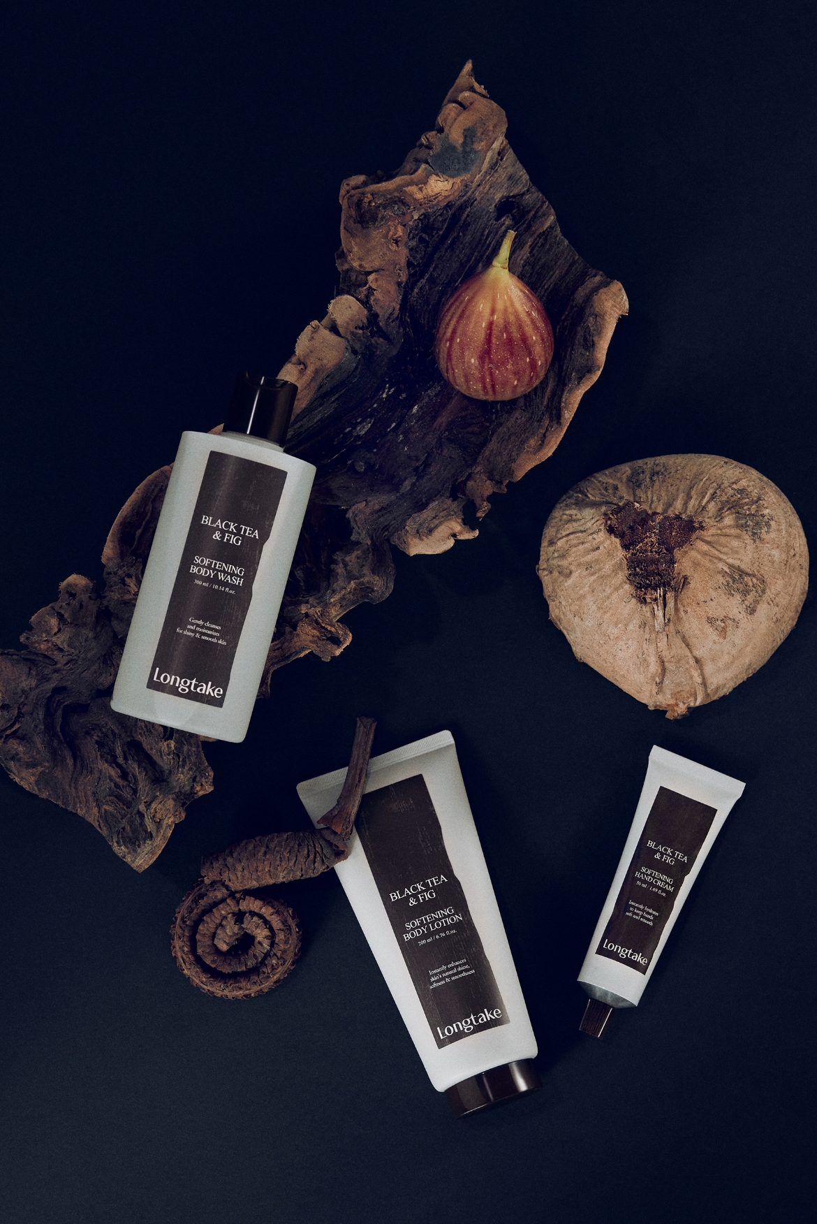
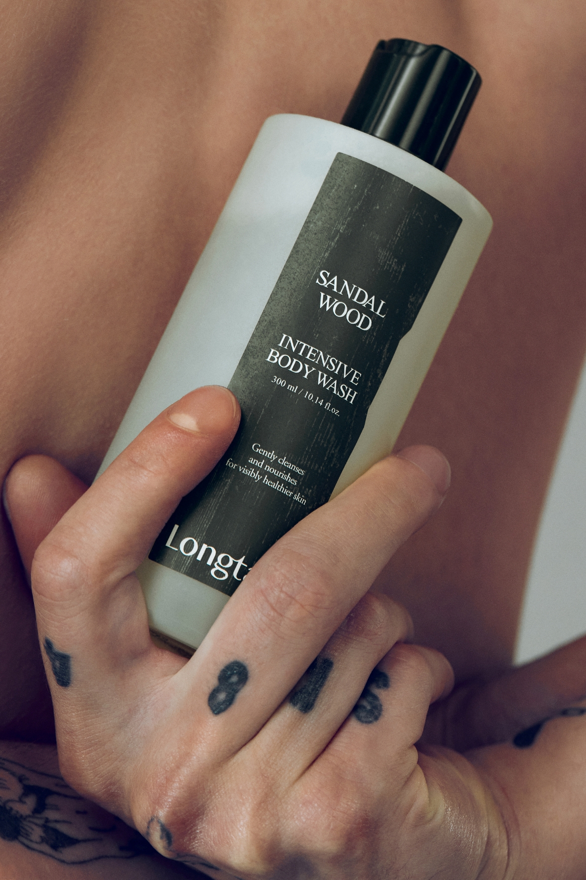
As the new body care line is applied directly to the skin, we aimed to convey a fresh and clean impression—distinct from the heavier, high-performance image of the
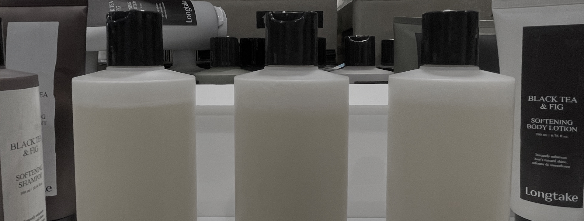
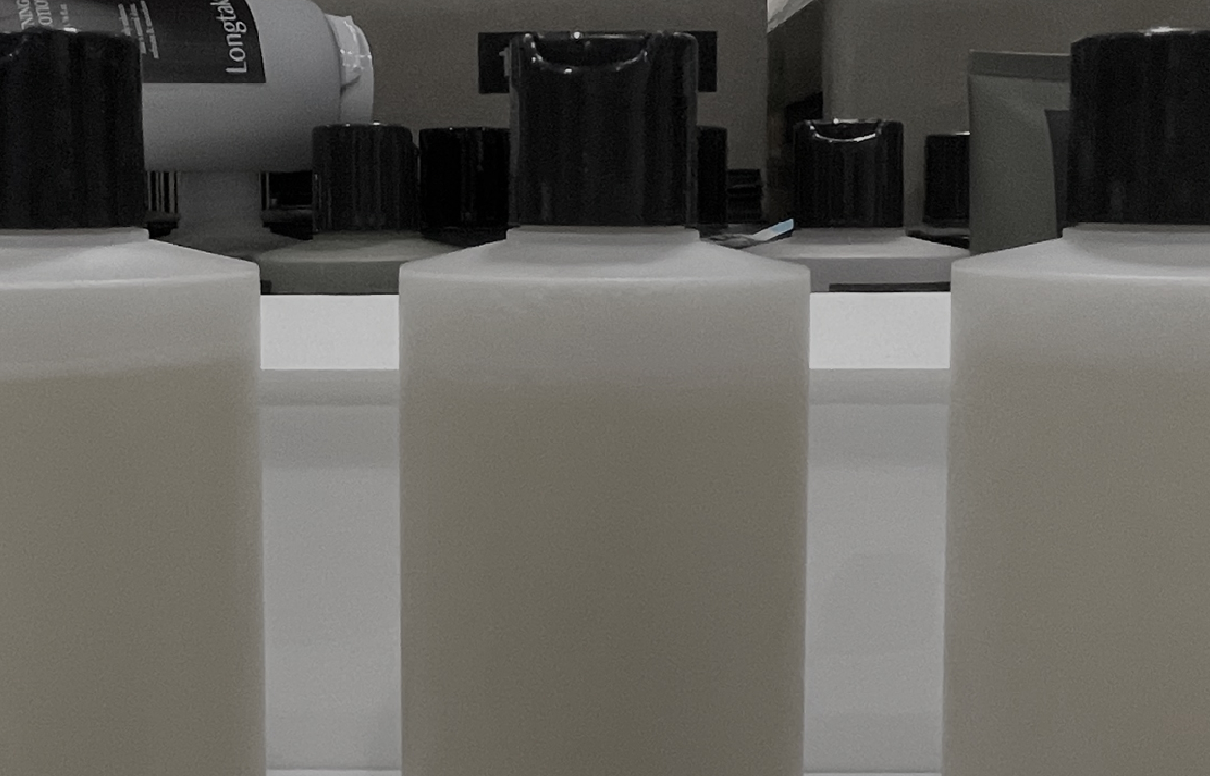
hair care line. To prevent confusion in bathroom settings, we introduced transparency to the containers and adjusted the color palette, ensuring clear differentiation
while expressing a refreshing cleansing experience and long-lasting fragrance benefits. To reflect the scents, we explored a range of color adjustments—from modified
versions of the existing hues to entirely new, neutral tones that subtly imply a skin-friendly, body-appropriate feel. By carefully calibrating the opacity, warmth,
and transparency of each color, we arrived at the look that best represents the identity of the body care line.



Gift Package
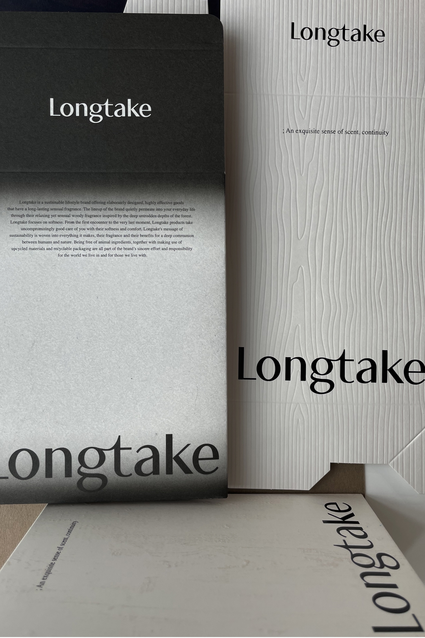
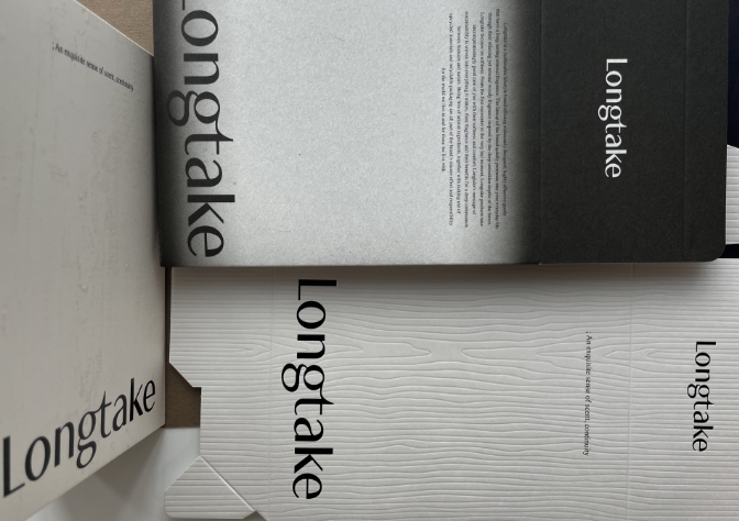
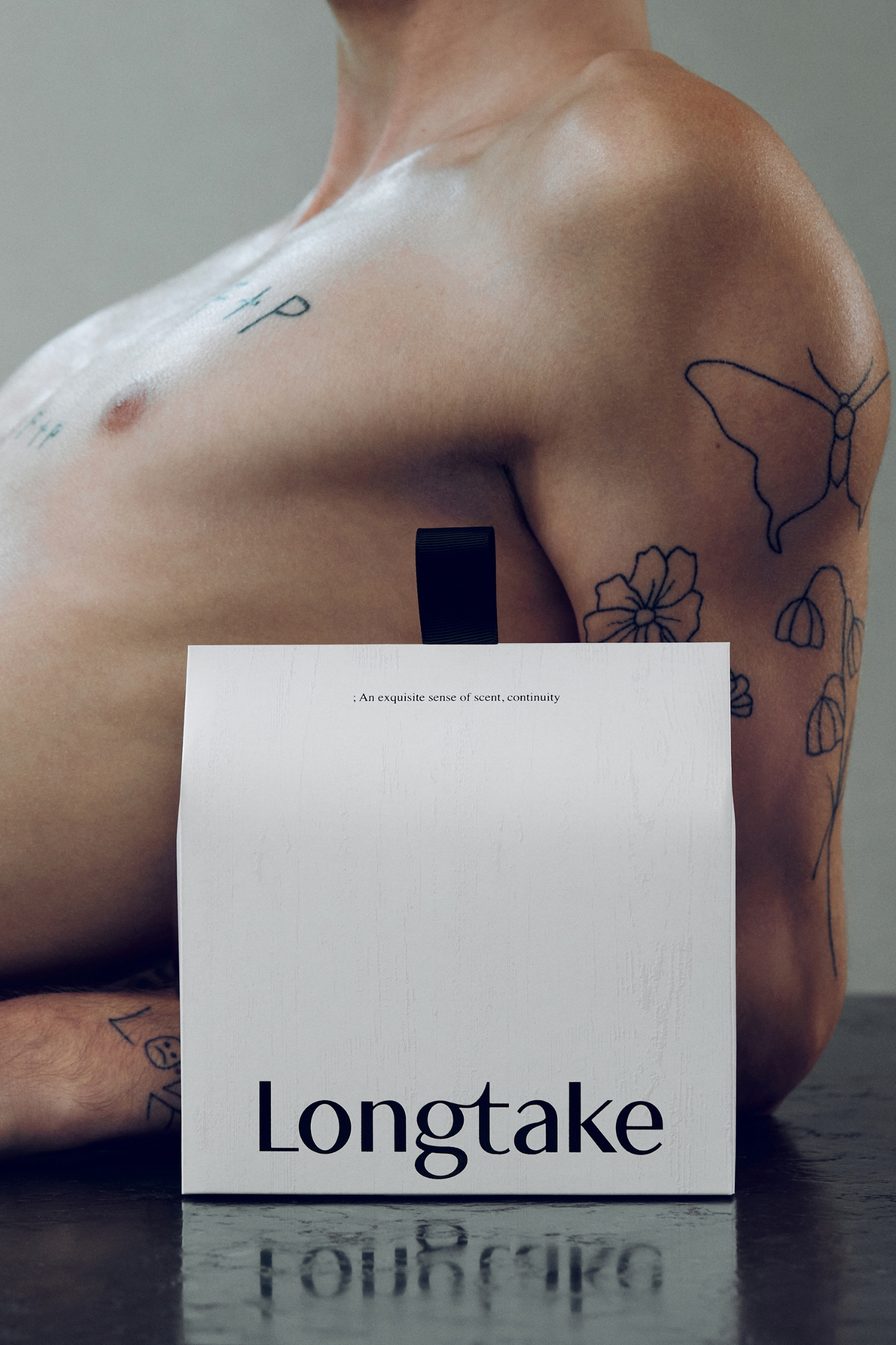
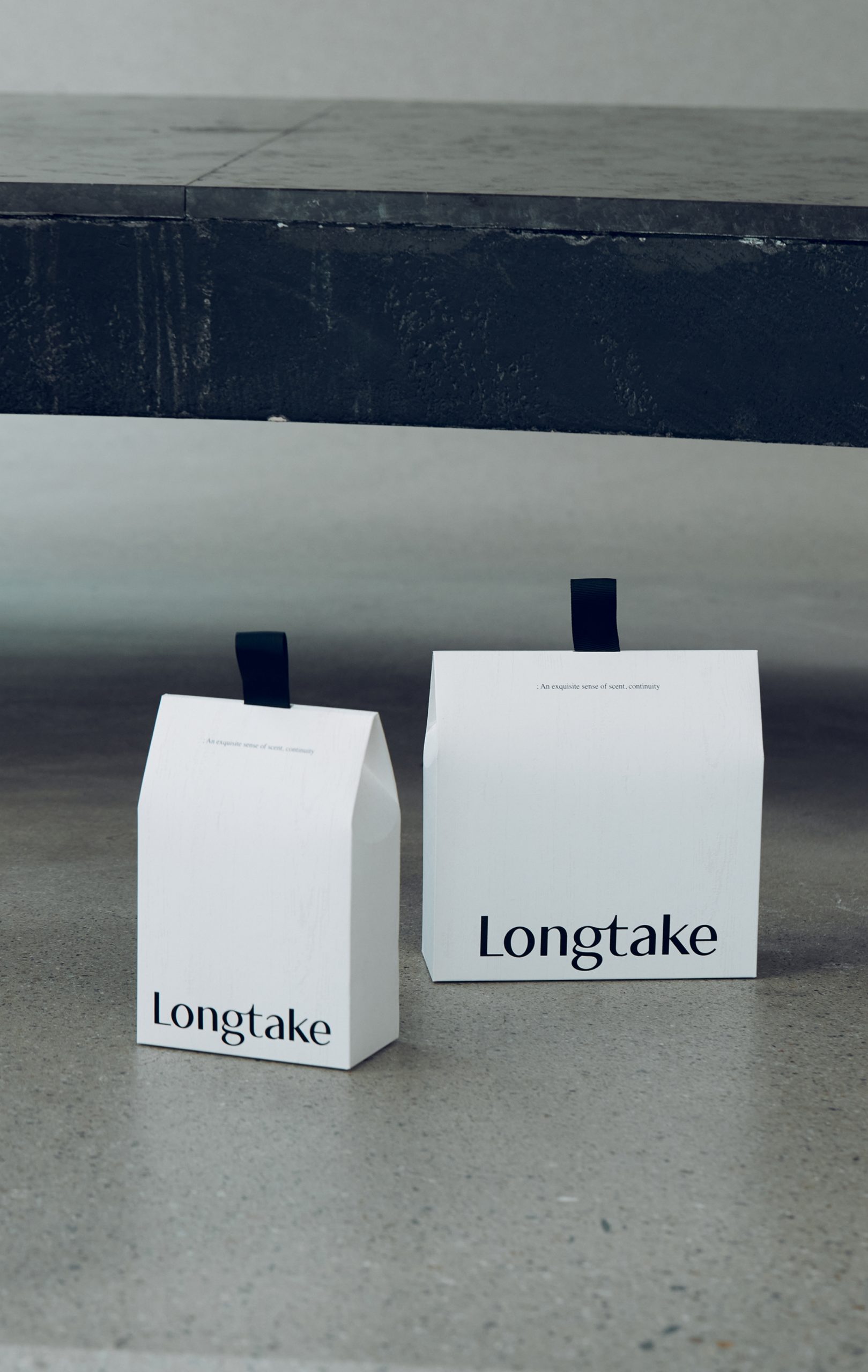
As the product experience expanded from hair to body and hands, we introduced a gift package. To accommodate varying product sizes and offer
customers the flexibility to select their preferred combinations, we developed two universal-size variations.
The package carries forward the identity of the product labels by placing the brand identifier (BI) prominently at the bottom for a grounded
presence, and by incorporating a real wood pattern. All non-essential elements were intentionally excluded to achieve a contemporary design
sensibility, making it well-suited for gifting.
- Amorepacific Creatives
- 디자인
- 권미연, 이성엽
- 비주얼 디렉팅
- 김두연
- BM팀
- 장윤경, 박미진
- 개발팀
- 최재용

