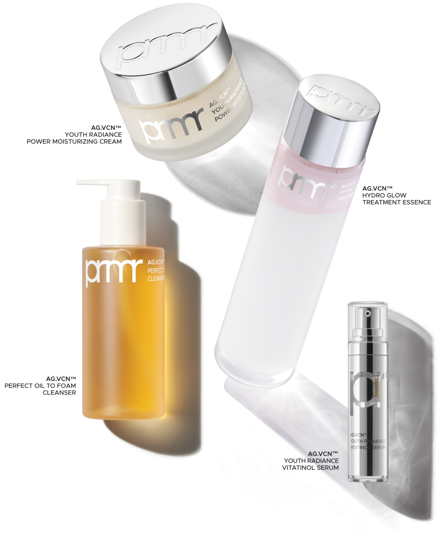
prmr wordmark & AG.VCN™
Summary
We developed the “prmr” wordmark to visually represent the rebranding of Primera—from a brand known for its eco-friendly naturalism to a proactive,
high-efficacy skincare brand that offers fundamental, skin barrier-based solutions to help maintain healthy, beautiful, and long-lasting skin. To
highlight the significant change since the original Primera wordmark, which was created 12 years ago using the Century Gothic typeface, we boldly
shortened the somewhat lengthy “primera” to “prmr,” conveying a more solid, refined, and impactful impression.

Starting from the form and structure of the original primera logo, prmr was developed through a series of design refinements to enhance its overall completeness.
These included testing variations in the length of the tail on the letter p, transforming the handwritten-style curves of m into more geometric and solid forms,
and adjusting the shape of r to reflect the structure of m. As a result, the current prmr logo maintains a bold and intuitive form while emphasizing an organic
sense of connection among all the letters.


Primera’s AG.VCN technology targets invisible, potential aging factors to care for micro-aging and protect the skin barrier. This technology is intuitively
represented through the use of a silver-toned aluminum cap. The cap, made from 100% recyclable metal, enhances the product’s aesthetic quality while avoiding
unnecessary chemical processing—only essential treatments are applied. By enabling consumers to remove the label and separate the metal cap from the glass
bottle, the design encourages sustainable consumer behavior that aligns with Primera’s commitment to sustainability.

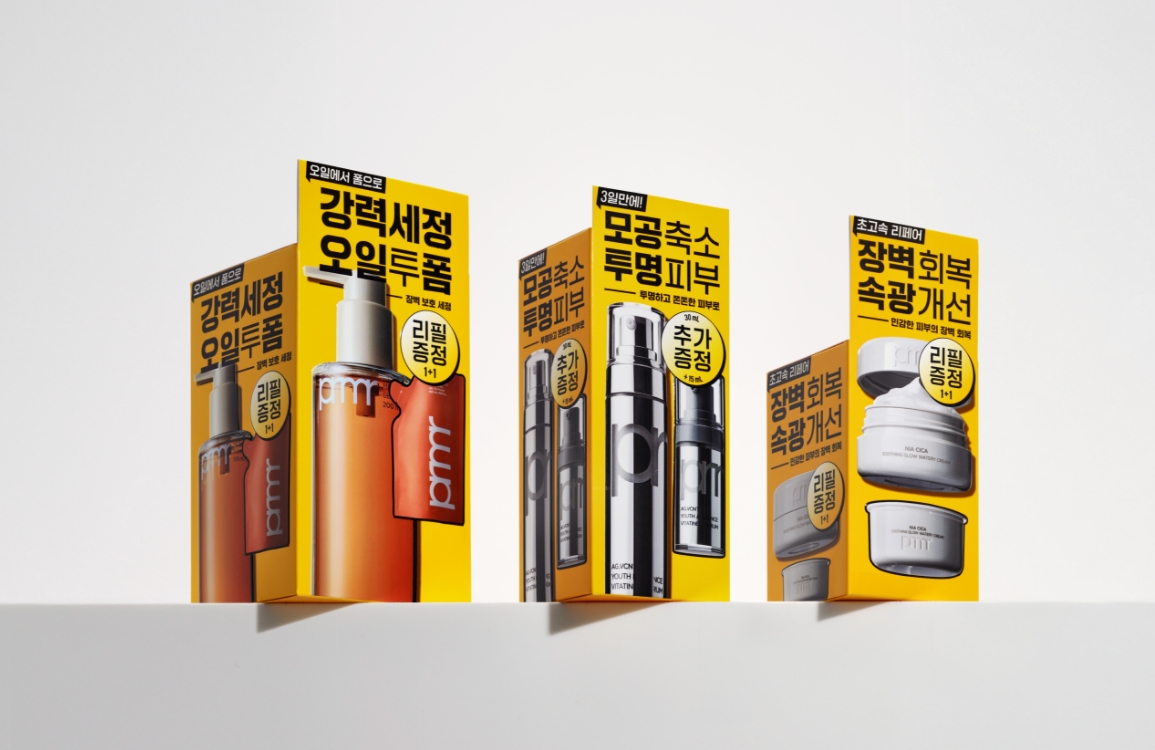
Using the Metropolis typeface—which complements the new prmr wordmark and ensures readability—we conveyed Primera’s trustworthy voice focused on skin
barrier care and high-performance efficacy. Each panel of the packaging was carefully designed to balance white space and messaging, effectively
delivering information about the brand and product. We also used Acopack recycled paper made from 100% FDC-certified recycled pulp to intuitively
and aesthetically express our commitment to sustainability.


- Amorepacific Creatives
- 디자인
- 박민희
- 촬영
- 이윤지, Ban Studio
- BM팀
- 이규림, 김민경
- 개발팀
- 한진형, 김보람
- 비주얼
- Ban Studio
- 디자인 스튜디오
- orkr


