Innisfree 5th Generation Design Renewal
Summary
Global naturalism brand Innisfree has renewed its brand and product design for the fifth generation under the following three design values.
“Design that captures the image of Jeju’s pristine nature”
“Eco-friendly design that reflects sustainable attributes”
“Design that creates a fun and lively emotional experience for millennial consumers.”
“Eco-friendly design that reflects sustainable attributes”
“Design that creates a fun and lively emotional experience for millennial consumers.”

Concept
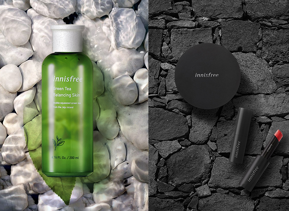
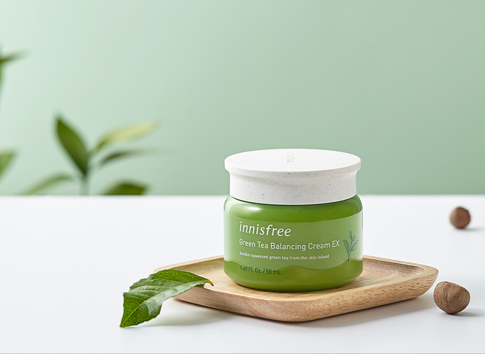
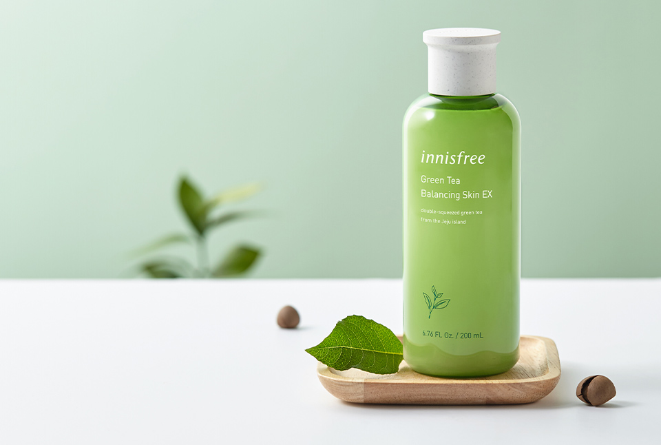
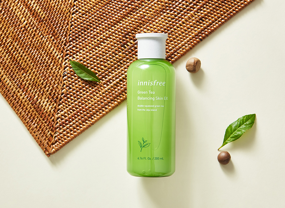
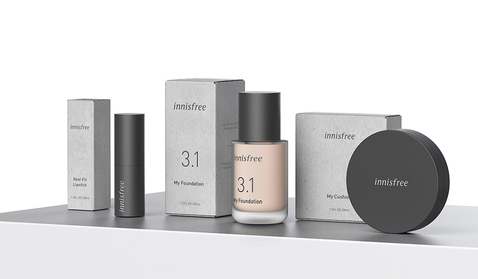
Innisfree’s product design is inspired by the motif of a “clean, natural ingredient vial,” embodying the brand’s commitment to continuously researching fresh, natural ingredients.
Building on this design heritage, the container’s cap has been optimized for better grip by increasing the surface area where fingers come into contact, while the interplay of soft curves and defined edges creates a modern and distinctive form. To avoid a lightweight, artificial feel, an EF (emotional feeling) material reminiscent of the natural texture and grain of stone has been applied, conveying Innisfree’s unique naturalistic sensibility to consumers.
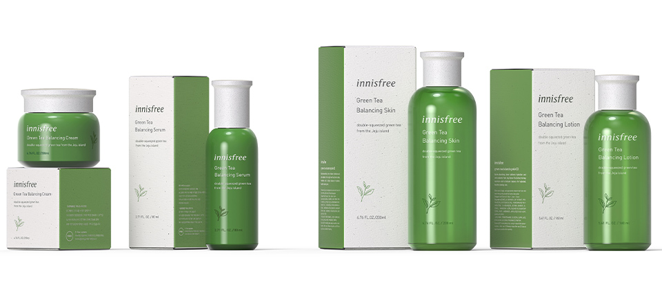
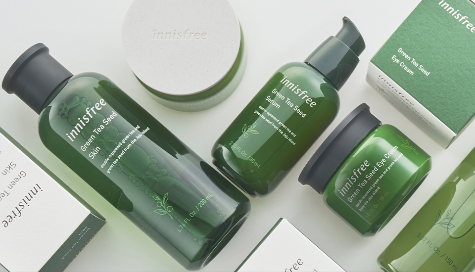
Harmonizing with this, the bottle is finished in warm, rich colors inspired by the natural landscapes of Jeju Island, the brand’s heritage. The renewed logo, now more solid and confident, complements minimal, clean typography and layouts, paired with vibrant ingredient graphics.
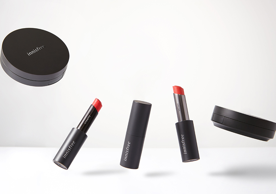
The makeup design draws inspiration from Jeju’s signature stone, basalt, with a deep black-gray color for the containers and a complementary light gray tone for the packaging boxes, creating a confident and sophisticated look that appeals to the millennial generation. The lower part of the cushion mirrors the shape of the skincare cap for a consistent look, while the lipstick design adds visual weight to the color and incorporates a magnet for a more dynamic and engaging tactile experience.
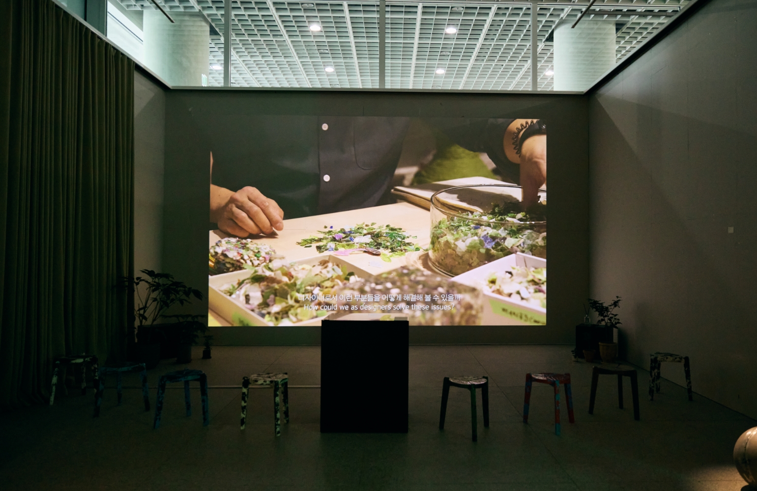
The residue left after using green tea, Innisfree’s key ingredient, is recycled into paper, which is then used for packaging boxes. The finish features a felt texture without coating, allowing the natural grain of green tea leaves to convey the essence of Jeju’s nature to customers.
Through this comprehensive design renewal—encompassing the brand logo, product packaging, and graphic design—Innisfree aims to evolve into a more modern and authentic nature-inspired brand.
- Amorepacific Creatives