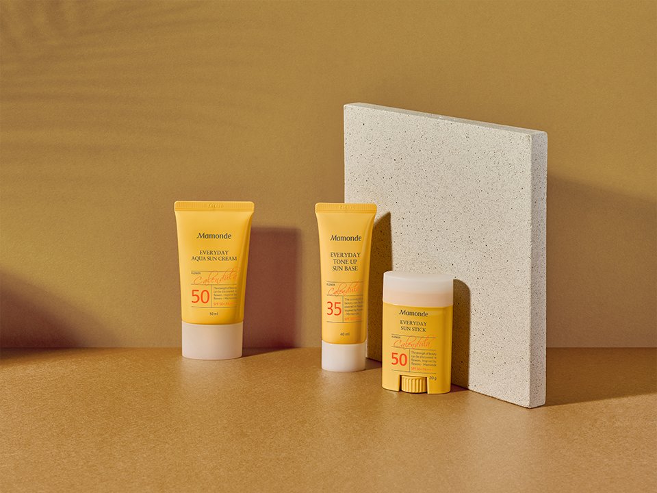
Mamonde Skincare Line Visual
Summary
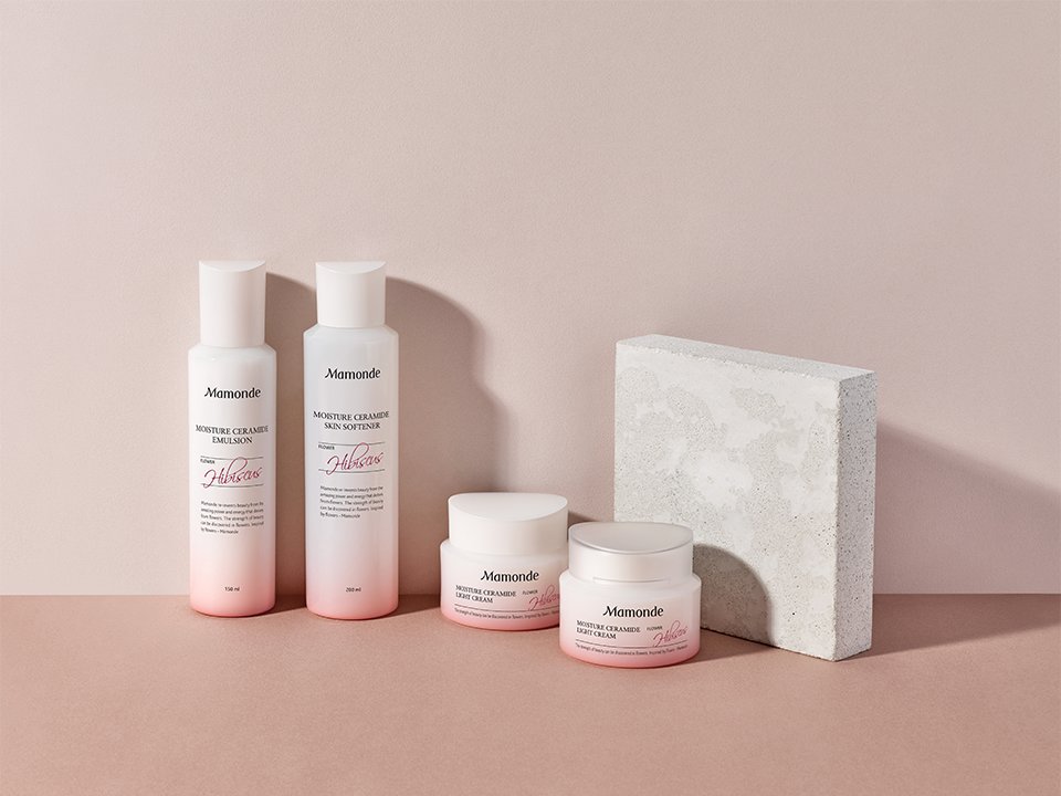
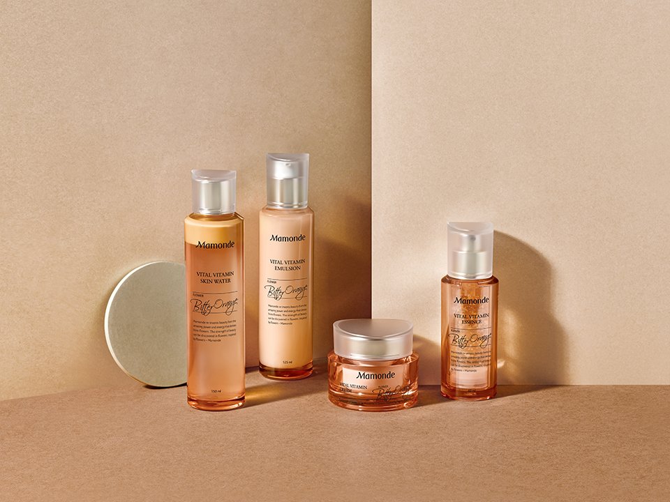
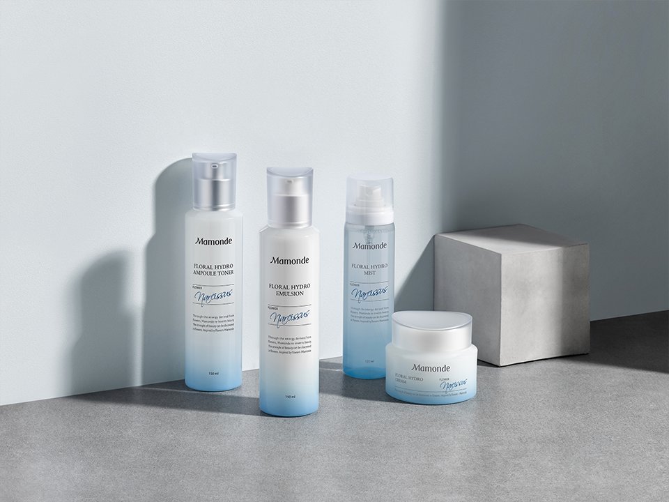
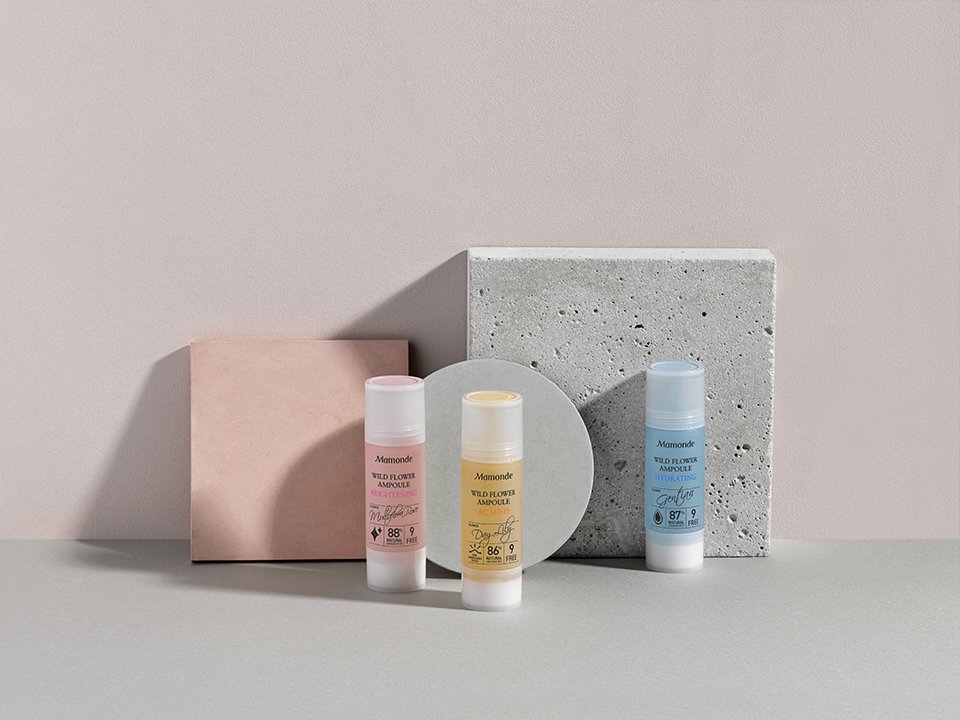
For Mamonde’s representative line, we planned a directed cut to showcase the identity of the product. This directed cut was approached from a brand design perspective rather than a product perspective, and focused on visually expressing the overall appeal of the product itself.
Concept
“Shadow effects that make products appear three-dimensional”
In the skincare line, the bright product colors can make the shape and details less visible. To address this, we actively used the shadows cast by the products onto the background. This not only added a sense of depth to the overall composition but also reduced visual monotony by emphasizing the shadows created by the product shapes.
In the skincare line, the bright product colors can make the shape and details less visible. To address this, we actively used the shadows cast by the products onto the background. This not only added a sense of depth to the overall composition but also reduced visual monotony by emphasizing the shadows created by the product shapes.
- Amorepacific Creatives