The Secret of Ageless Beauty
Summary
With the concept of The Secret of Ageless Beauty, we designed a limited-edition Sulwhasoo collection exclusively for Tmall’s Singles’ Day. We created a story based on the fantasy, “When the key unlocks the secret door, Sulwhasoo’s secret beauty is revealed,” and developed pop-style graphics to introduce a fresh image of Sulwhasoo to younger Chinese consumers.
Concept
November 11th, known as Singles’ Day, is a once-a-year celebration in China and home to the country’s largest online shopping event. As the world’s biggest shopping festival in terms of sales, the day is filled with excitement and anticipation for both customers and Sulwhasoo. Since Singles’ Day is a moment when long-awaited events are revealed, we saw it as the perfect opportunity to unveil Sulwhasoo’s beauty secrets. The story was built around the theme of embarking on a journey to discover hidden beauty.

As a limited online release on Tmall and a key moment that global brands compete for, Singles’ Day called for a unique approach to attract consumer attention. In shaping the design direction, we focused on the following three key points:
1. Storytelling Design
| Effective storytelling design optimized for the spread of videos and visuals.
| Effective storytelling design optimized for the spread of videos and visuals.
2. Eye-catching in Online
| Graphics designed to stand out on the Tmall platform.
| Graphics designed to stand out on the Tmall platform.
3. Color Variaition
| Distinct color schemes for each product line to create a visually rich and layered impression.
| Distinct color schemes for each product line to create a visually rich and layered impression.
While previous Sulwhasoo Limited Collections featured graphics inspired by traditional Korean motifs, the Double 11 Festival design focused more on conveying Sulwhasoo’s core message. We felt that incorporating just a touch of Korean elements into the graphics would be sufficient. The foundation of the graphic story was established during the ideation phase.
“Since it’s the day when beauty secrets are revealed, how about visualizing a journey to uncover them?”
“Because secrets are hard to find, it might be interesting to use repeated motifs like staircases, mazes, keys, and doors.”
“Placing key products from each line throughout the space could help tell the story and create a meaningful connection with the products.”
“Because secrets are hard to find, it might be interesting to use repeated motifs like staircases, mazes, keys, and doors.”
“Placing key products from each line throughout the space could help tell the story and create a meaningful connection with the products.”
“Each time the secret room is unlocked, Sulwhasoo’s unique beauty secrets are revealed.
The key to unlocking it is in your hands.”
The key to unlocking it is in your hands.”

The graphics were created in collaboration with Blow, a versatile and sensuous design agency based in Hong Kong. By layering and repeating labyrinthine elements—such as keys, keyholes, stairs, and ladders—we created a sense of mystery, while simple, repetitive patterns evoke the feeling of navigating a maze. Keys inspired by traditional Korean two-stone ornaments are arranged to draw the eye, while hidden keyholes, endless stairs, and ladders guide the viewer’s gaze fluidly throughout the space. The strategically placed main products suggest that the mystery is about to be solved, and the graphics, rich with hidden details, offer the joy of discovery while keeping viewers engaged. A consistent motif runs through the video, visuals, and detail pages, establishing a unified visual language.
The color palette combines mysterious and alluring purple, vibrant and refined orange, and cheerful yellow to create a vivid, pop-inspired mood. Gold and bronze accents are subtly woven into the graphics to add a touch of luxury.
The color palette combines mysterious and alluring purple, vibrant and refined orange, and cheerful yellow to create a vivid, pop-inspired mood. Gold and bronze accents are subtly woven into the graphics to add a touch of luxury.


We applied a three-step color variation to each line. The entry-level Yoonjo Essence features a light and cheerful yellow, the Essential Line uses a vibrant and sophisticated orange, and the anti-aging functional Jinseol Line adopts a mysterious and alluring burgundy as its key color. This approach clearly distinguishes each line while creating a rich and harmonious color composition.


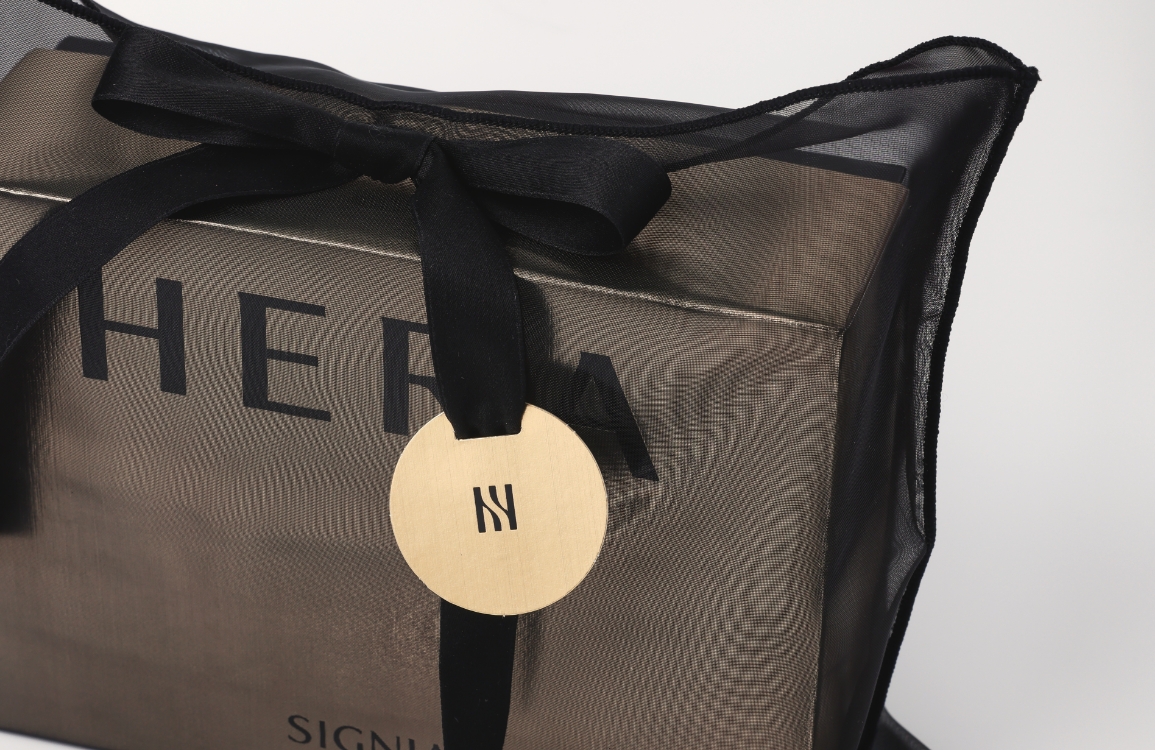
To effectively showcase the well-designed graphics of The Secret of Ageless Beauty Edition, the front of the box was cropped to maximize visual impact. The camera angle was positioned from below, aiming upward, to convey a dynamic, ascending feel using imagery of keys, ladders, and stairs. Warm tones were chosen to harmonize with the graphic elements. To ensure the trendy graphics aligned with Sulwhasoo’s product identity and to highlight the vivid front-facing colors, the background was set in deep green and navy blue. Rather than displaying the products and boxes in a conventional layout, the boxes were used as colorful pedestals or graphic elements themselves. The accompanying wrapping paper featured a background color distinct from that of the boxes, emphasizing contrast and expressing the Korean aesthetic of negative space by prioritizing background over product. Dynamic shots were captured of the wrapping paper fluttering in the wind, and particular attention was given to beautifully presenting the ribbon ends of the box packaging.


Preview
As this project accounted for a large share of sales, a cross-functional team (CFT) was formed, and all members worked collaboratively with a shared goal from planning to delivery. Thanks to the dedication of everyone who contributed to expanding the graphics into compelling visuals and videos and ensuring a smooth launch in China, we achieved outstanding results. I would like to once again express my sincere gratitude to all involved teams.
- Amorepacific Creatives
- Design
- Kang Hyelim, BLOW
- Visual
- Kim Yeseul, Lee Jihee,
Lee Youngeun, Choi Hyeyun - Film
- Han Minjung, aL