IOPE BIO ESSENCE
Summary
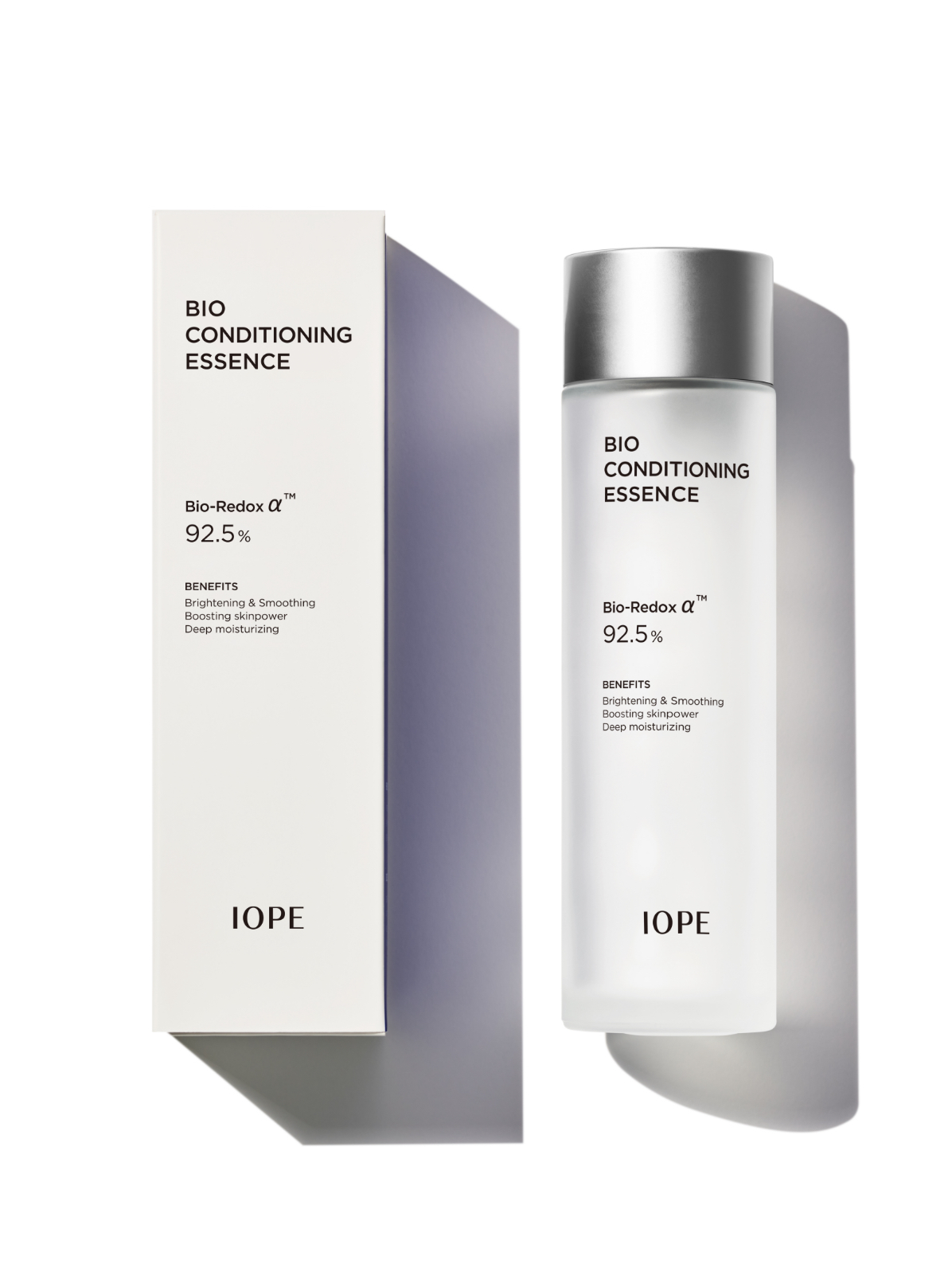
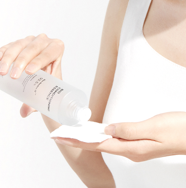
Since its launch in 2012, Bioessence has been a key asset in IOPE’s skin science portfolio. This renewal—the first in nearly four years—was guided by a deep analysis of how the product should appear in today’s marketplace while honoring its legacy. To reflect IOPE’s identity and commitment to essentials, we stripped the design down to its core. The simplified look incorporates subtle enhancements for improved usability, such as a dispense volume guide and optimized screw speed.
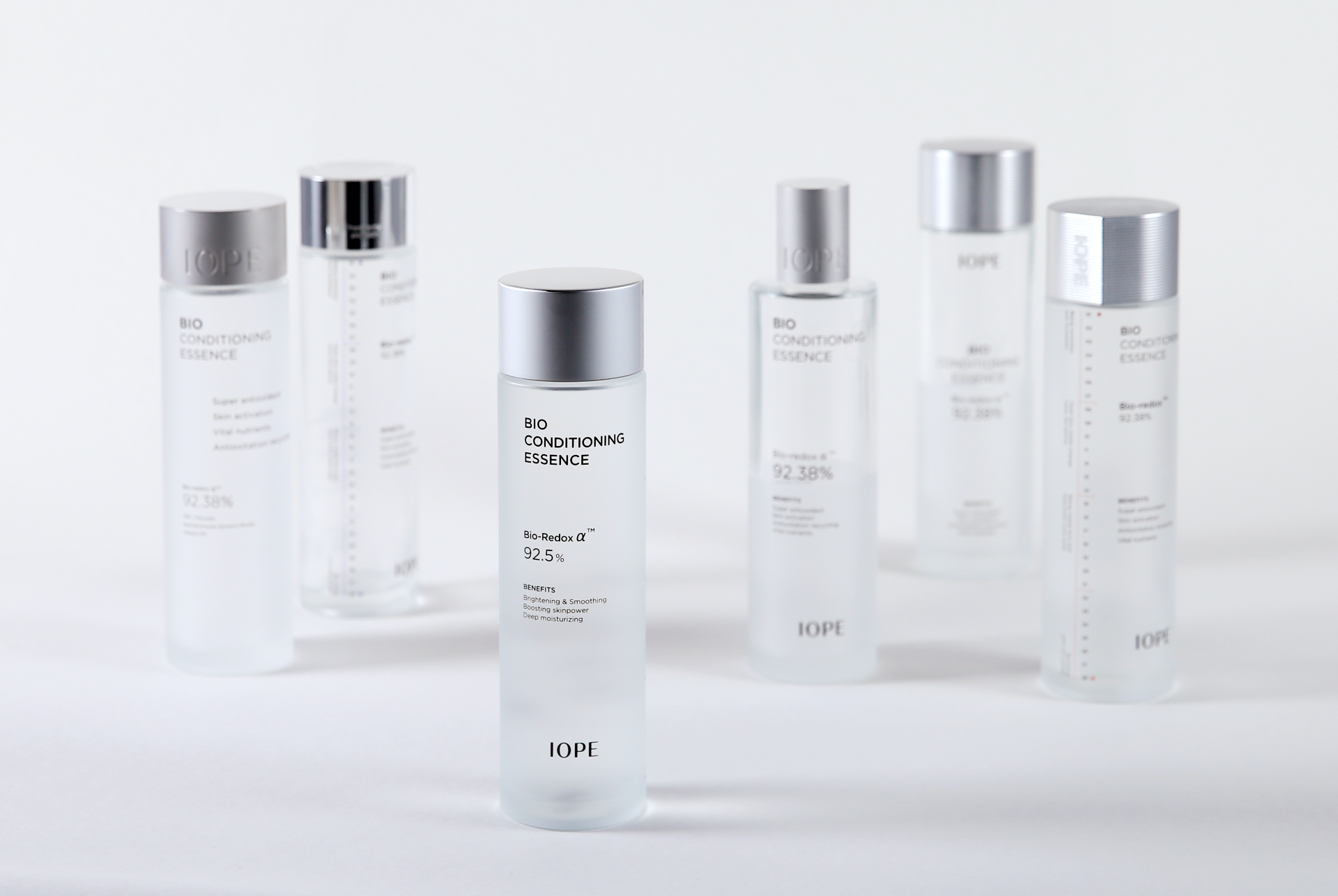
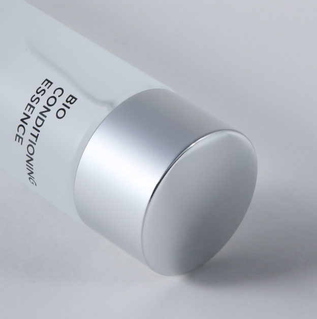
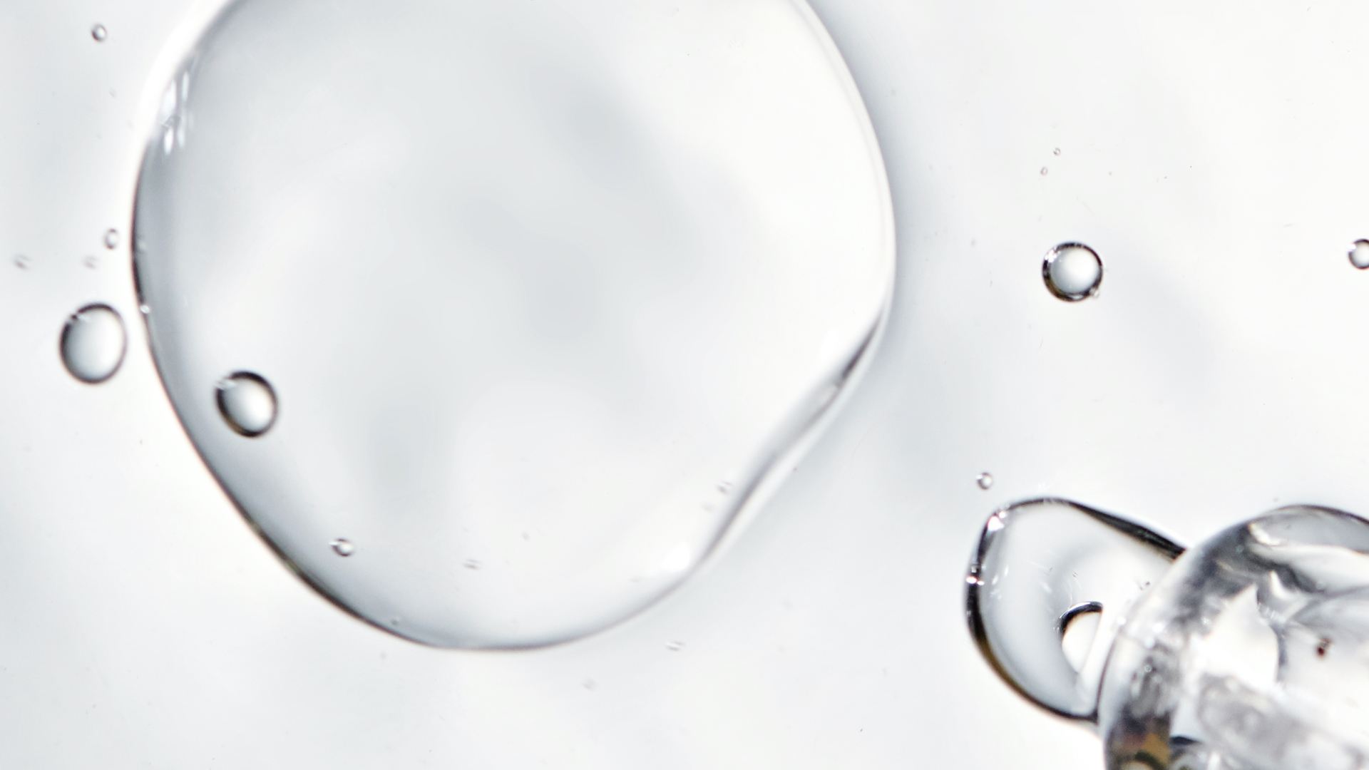
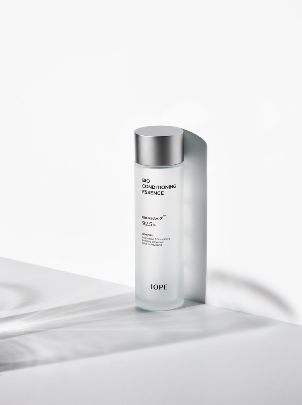
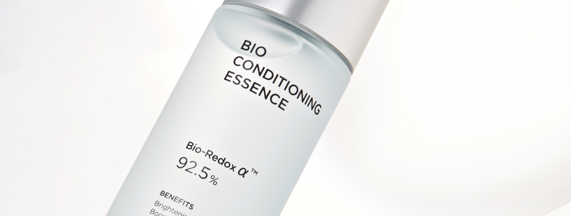
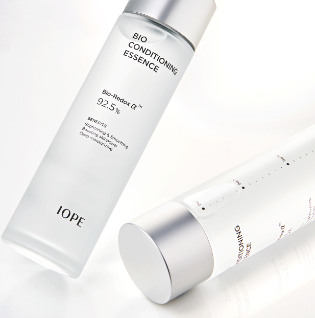
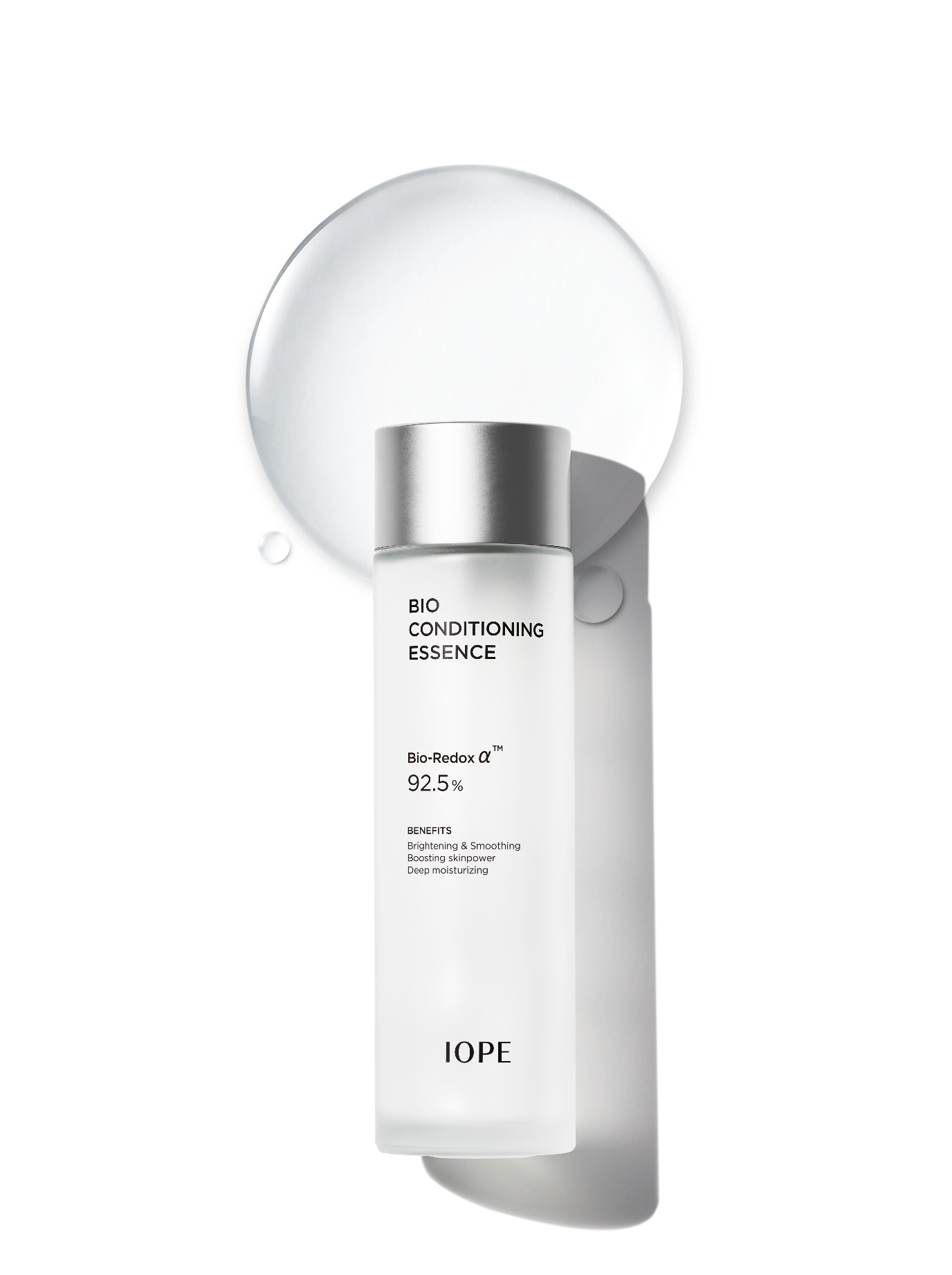
In the container design, we aimed for maximum simplicity. We removed the pink pearl finish and the C-cut details from both the inner and outer caps. Instead, we added a glossy finish to the top of the metal cap to highlight the clarity and transparency of the formula inside.
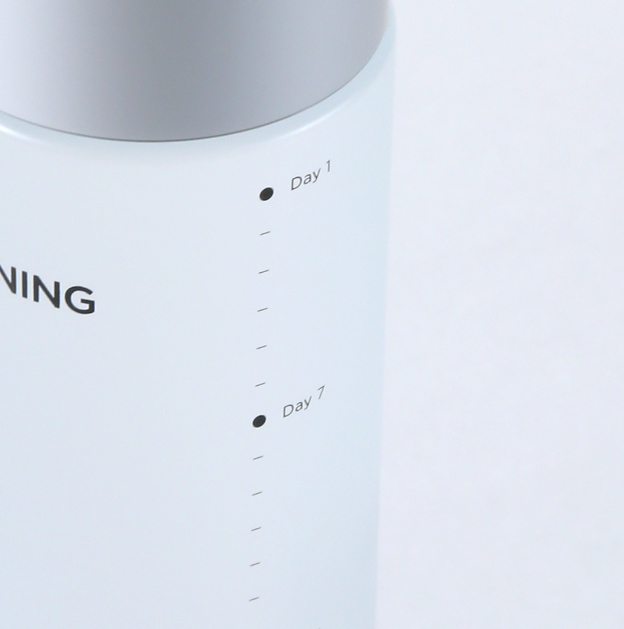
The front, sides, and back of the container were used efficiently. A measuring scale on the side provides detailed, user-friendly usage instructions, giving the impression of a professionally prescribed essence.
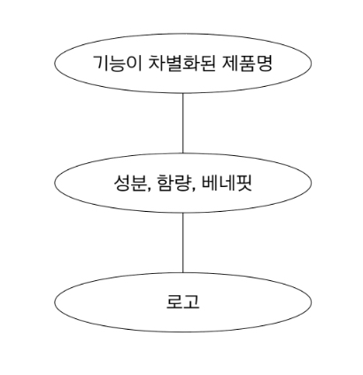
IOPE’s new layout follows a three-tier structure—a strategic system that improves readability by organizing information by importance.
The brand logo is placed at the bottom, while the product name—emphasizing its unique features—is positioned at the top to enhance visibility, especially in digital environments. The center section highlights the brand’s proprietary technology or key ingredient, along with concentration and benefits, clearly distinguished using a mix of uppercase and lowercase for optimal readability. The overall layout is left-aligned, giving it a more functional and modern appearance compared to the previous design.
The brand logo is placed at the bottom, while the product name—emphasizing its unique features—is positioned at the top to enhance visibility, especially in digital environments. The center section highlights the brand’s proprietary technology or key ingredient, along with concentration and benefits, clearly distinguished using a mix of uppercase and lowercase for optimal readability. The overall layout is left-aligned, giving it a more functional and modern appearance compared to the previous design.
- Amorepacific Creatives
- Product Design
- Kim Yaesol, Sung Yujin
- Visual Design
- Kang Rami, Kim Yaesol,
Sung Yujin, Hwang Juyoung