Vitalbeautie WATERPLUS ENERGY
Summary
Waterplus Energy is VITALBEAUTIE’s energy booster that keeps your mind sharp when you need energy and revitalizes your tired body.
We designed the product and promotional set considering the new product category of good water supplement, Amorepacific”s patented formula technology, and the target audience of MZ and working women.


Concept
The goal for Waterplus Energy was to upgrade the brand’s existing vitamin drink into a high-performance energy supplement, which required transforming the design into a trendier,
more expandable energy booster aesthetic. By emphasizing the “3PM ENERGY UP” callout alongside the product name, we created a memorable nickname that helps define the product category.
To further build the water supplement category, we developed delicious-looking beverage visuals. Additionally, the sharp, eye-catching color contrast reinforces the unique
product identity and helps build brand recognition on digital channels.


Product
We used vivid and powerful colors to project the image of a high-performance water supplement for the MZ Generation target audience.
Built on the concept of an energy booster for the 3 p.m. recharge, we highlighted its function with a key callout (“3PM ENERGY UP”) and used a bold,
solid primary color to differentiate the product on retail shelves.


Pouch
Unlike the rigid and restrained designs of other drink products, we used a typography-driven layout with English text to create a fashionable, modern image that appeals to young customers.
We removed unnecessary information to enhance the appeal of the colors and graphics, making the simple act of carrying the product in daily life look unique and stylish.

Promotion Set
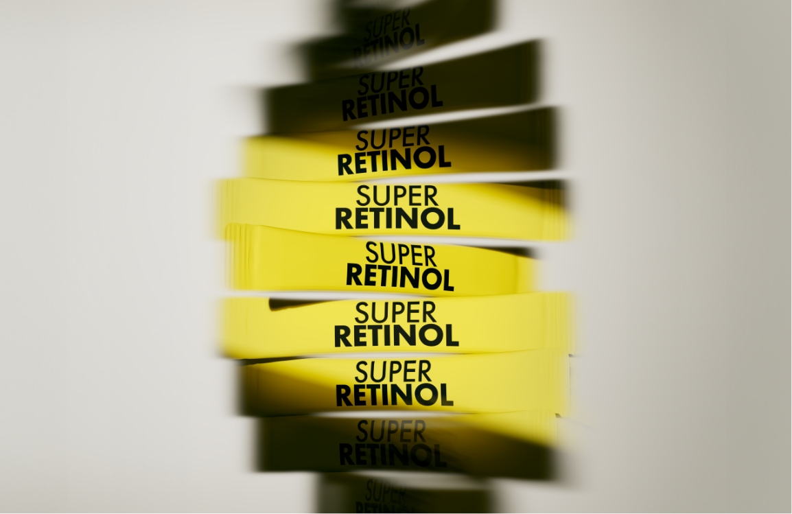
By combining graphics that symbolize an energy boost with a key tagline, we created a design that is simple yet eye-catching.
For digital channels, we paired the product with a vibrant yellow background and intuitive graphics, a combination designed specifically to improve thumbnail standout and capture attention.
For an energetic boost to your day.
With a vibrant, colorful
style
that makes the simple act of carrying it
effortlessly cool.
THE NEW ENERGY SUPPLEMENT
With a vibrant, colorful
style
that makes the simple act of carrying it
effortlessly cool.
THE NEW ENERGY SUPPLEMENT


Beauty begins with health, and health is completed by beauty.
Through relentless research, we develop innovative products
that empower people to take on new challenges and achieve their goals.
We design healthy beauty solutions tailored to each individual’s
lifestyle. This is the inner beauty solution proposed by VITALBEAUTIE.
Through relentless research, we develop innovative products
that empower people to take on new challenges and achieve their goals.
We design healthy beauty solutions tailored to each individual’s
lifestyle. This is the inner beauty solution proposed by VITALBEAUTIE.
- Amorepacific Creatives
- Product Design
- Park Sohee, Kang Sooji
- Photography
- Lee Yunjin
- BM
- Kim Sulim
- Development
- Kim Boram
- Set Design & Visual
- Park Sohee
