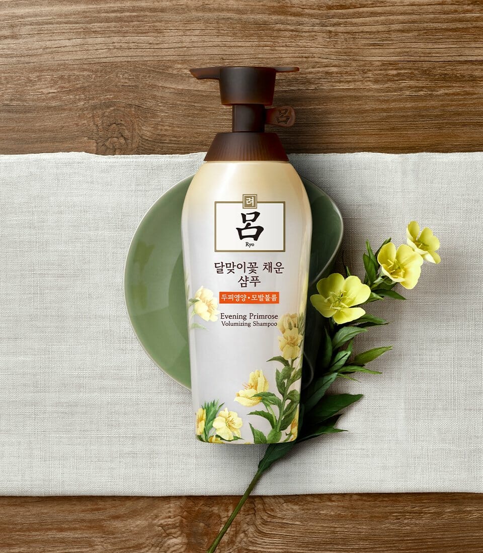
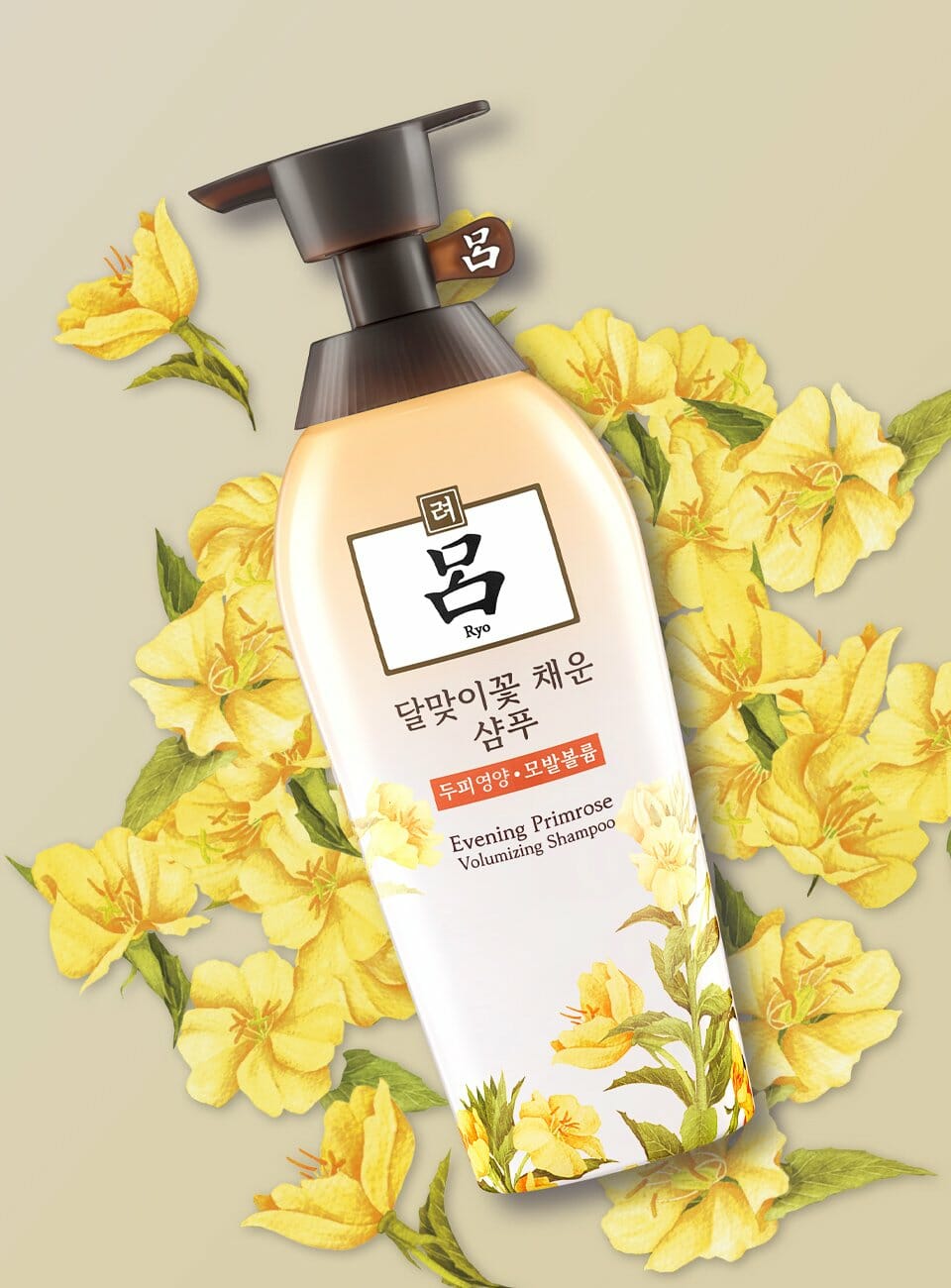
Volumizing Shampoo, Conditioner
함초수 샴푸 컨디셔너
Summary
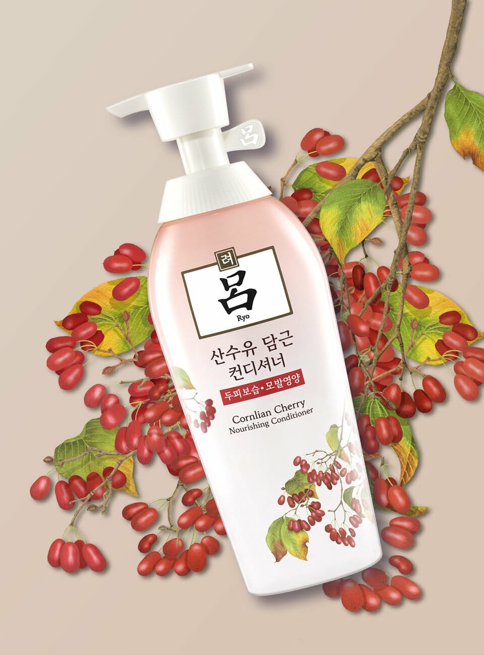
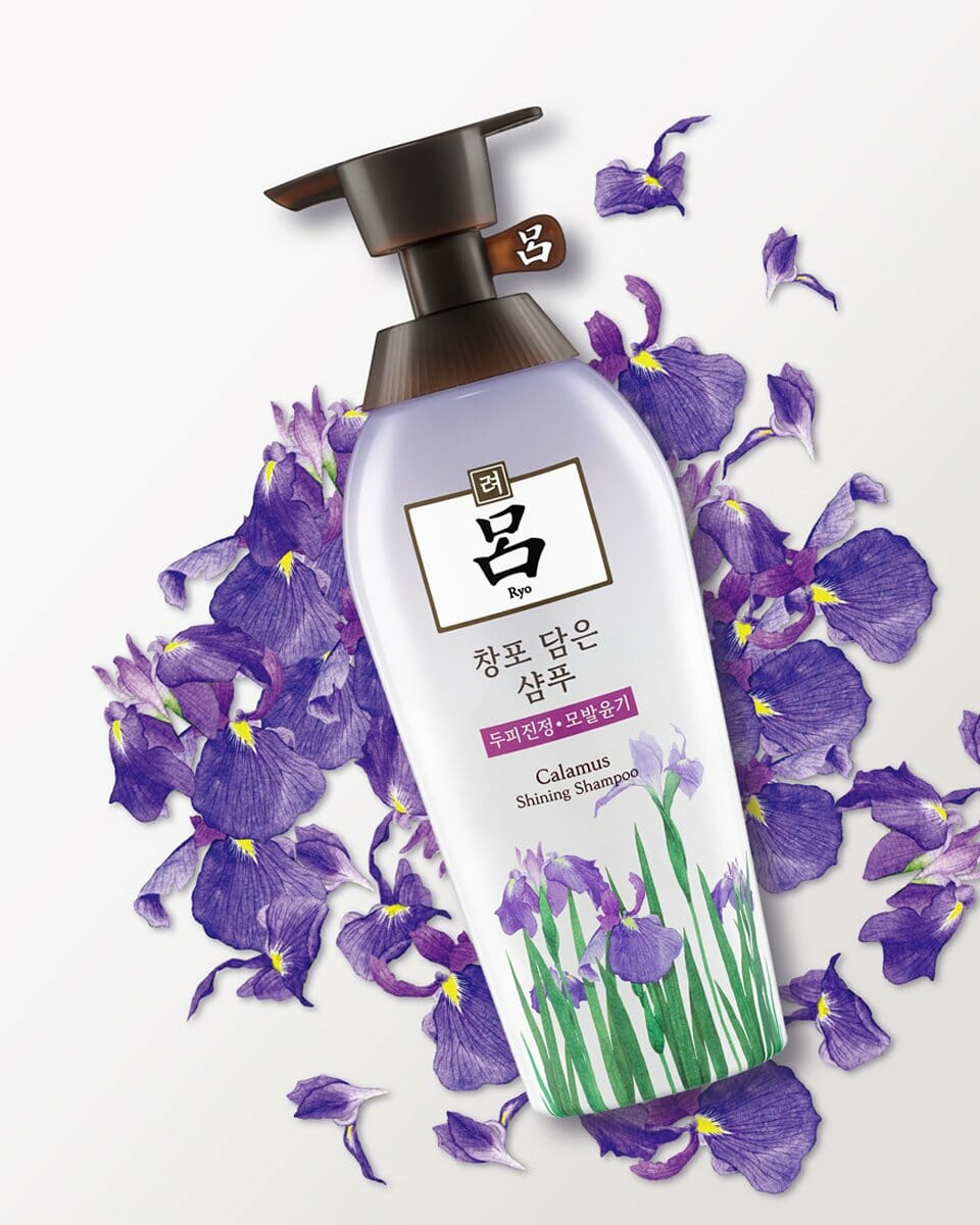
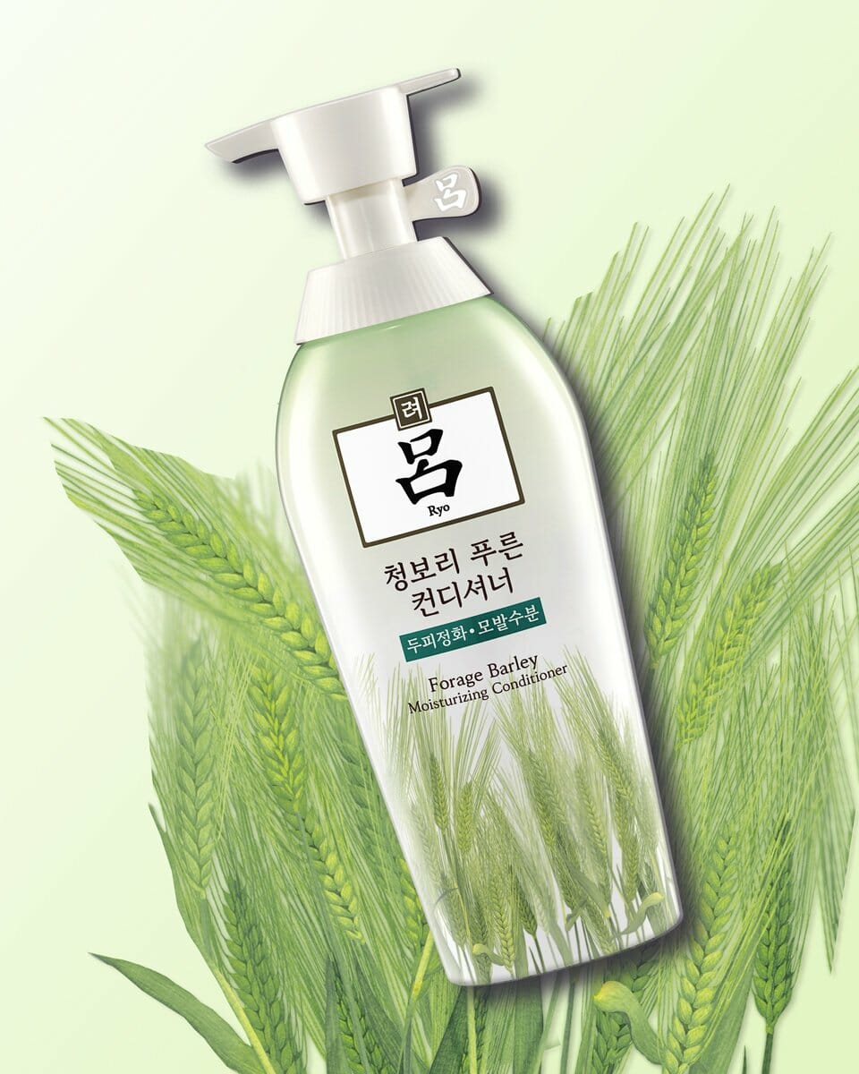
기존 함초수 라인 4종의 AD 버전으로, 좋은 원료를 정성 들여 담았음을 고객이 느낄 수 있도록 표현하는 목적의 프로젝트였습니다. 그와 더불어 함초수 라인의 각 성분에 대한 표현과 주요 기능을 강조하였습니다. 제품이 매장에 진열되었을 때 군집성을 보여줄 수 있게 하기 위해 갭 컬러와 용기 컬러를 통일하였습니다.
This line is an AD version of the existing Volumizing line consisting of four types. The purpose of this project is to make customers feel that the product is made of good ingredients. It also emphasizes the main function of each ingredient used for the line. Uniform colors are used for caps and containers to accentuate the grouping of products when displayed within the store.
Concept
화학성분을 최대한 배제하고 자연의 원료를 담았음을 보여주기 위해 용기 컬러를 흰색으로 통일하였으며 원료표현에 있어서 기존 일러스트보다 좀 더 정리되고 차분한 톤의 일러스트로 표현하였습니다. 또한 샴푸에 부착되는 POP의 경우 기존의 올드한 이미지를 탈피하여 좀 더 간결하고 모던하게 표현하여 문안 가독성을 높였습니다.
To show that natural ingredients are used for the product, the color of containers is unified as white color, and ingredients are expressed with illustrations in a calmer tone compared to the tone used for the existing illustrations. In the case of POPs attached to shampoo, a simpler modern style -- rather than the old image of the existing design -- is used to improve legibility.
- Amorepacific Creatives