MAMONDE Brand Identity Design
Summary
The all-new Mamonde aims to evolve into “a beauty brand that creates your own naturalness through hyper-flora technology and boundaryless innovation.”
Launched in 1991, Mamonde continues to honor its heritage of promoting independent and empowered women, reflecting the values of the time,
Mamonde has been rebranded as a new beauty brand, reflecting the contemporaneity of 2023.
Powered by HYPER FLORA
‘Your True Beauty, Blossoming with Hyper Flora’
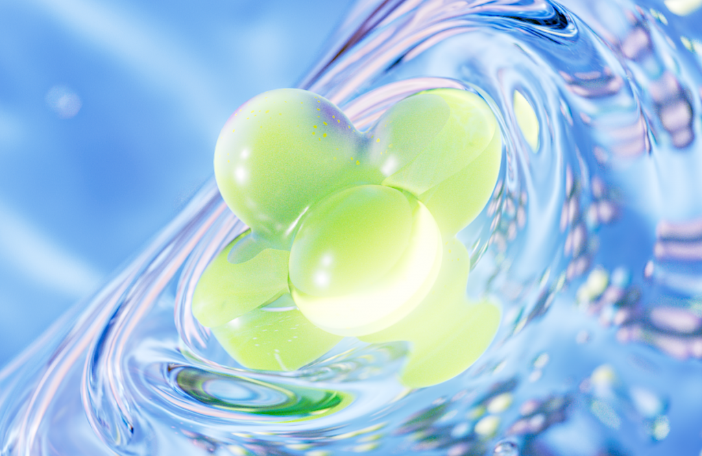
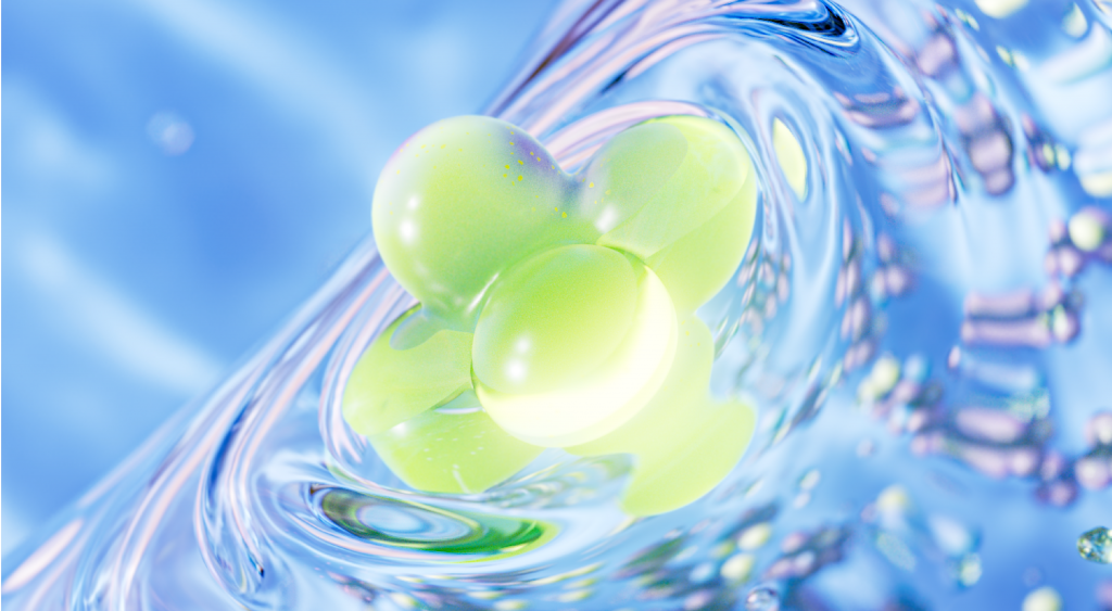
‘Hyper Flora’ is Mamonde’s proprietary skin solution, which achieves optimal synergy by combining potent active ingredients derived from flowers with powerful skincare boosters. For the past 32 years, Mamonde has consistently researched flowers at the Amorepacific Botanical Garden and our own labs. Through this rebranding, we have newly established ‘Hyper Flora™’ as our unique, ingredient-combining technology.
To bring this concept to life, we created 3D motion graphics that visualize the origin and principles of this unique technology, making a potentially complex idea both intuitive and engaging. These visuals are the foundation of Mamonde’s new brand universe, embodying our core message: to break the boundaries of beauty and empower everyone to let their life blossom in their own unique way.
‘Your True Beauty, Blossoming with Hyper Flora’
‘Hyper Flora’ is Mamonde’s proprietary skin solution, which achieves optimal synergy by combining potent active ingredients derived from flowers with powerful skincare boosters. For the past 32 years, Mamonde has consistently researched flowers at the Amorepacific Botanical Garden and our own labs. Through this rebranding, we have newly established ‘Hyper Flora™’ as our unique, ingredient-combining technology.
‘Hyper Flora’ is Mamonde’s proprietary skin solution, which achieves optimal synergy by combining potent active ingredients derived from flowers with powerful skincare boosters. For the past 32 years, Mamonde has consistently researched flowers at the Amorepacific Botanical Garden and our own labs. Through this rebranding, we have newly established ‘Hyper Flora™’ as our unique, ingredient-combining technology.
To bring this concept to life, we created 3D motion graphics that visualize the origin and principles of this unique technology, making a potentially complex idea both intuitive and engaging.
These visuals are the foundation of Mamonde’s new brand universe, embodying our core message: to break the boundaries of beauty and empower everyone to let their life blossom in their own unique way.

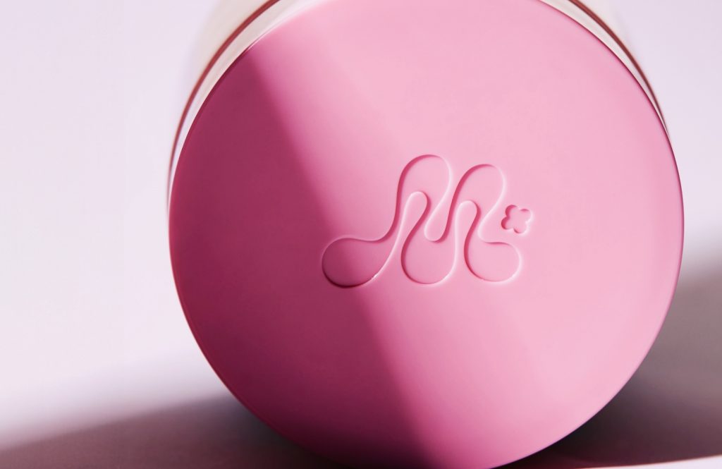
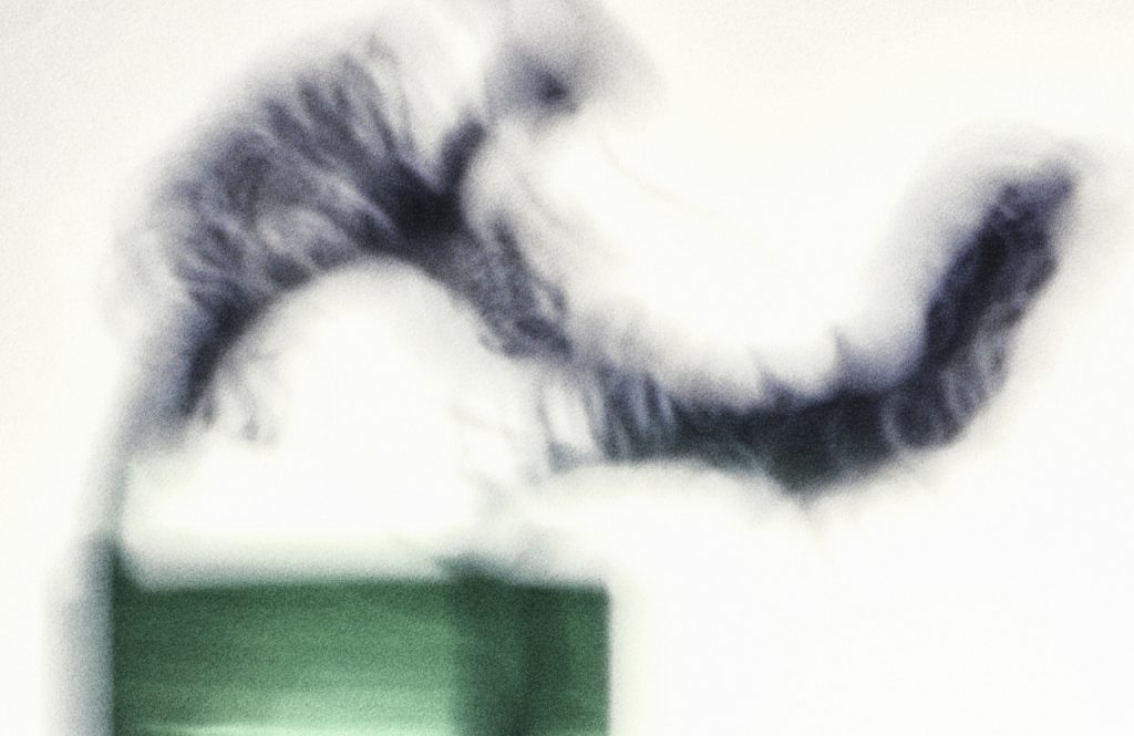
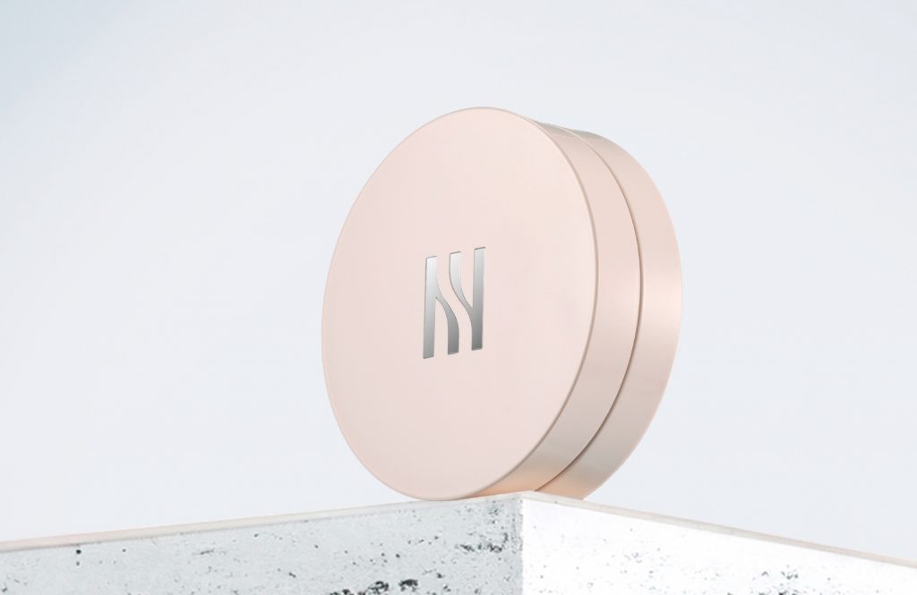
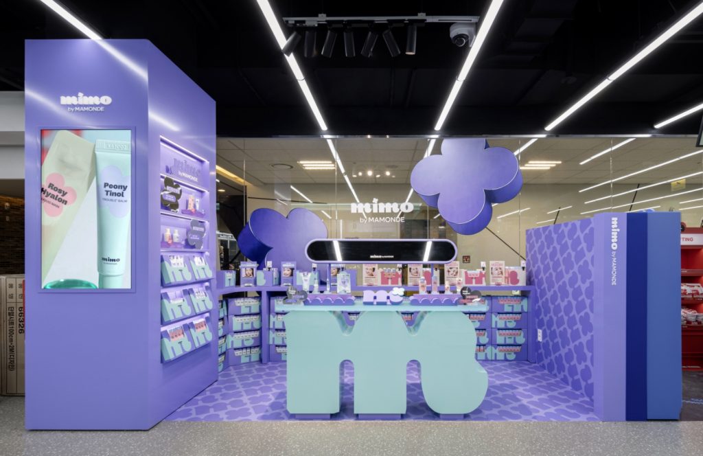
New Brand Symbol
Mamonde’s new symbol is a crucial element that signifies the brand’s renewed identity and evolution.
The design consists of two core components: a rhythmic form inspired by the brand’s initial, “M,” and the four-leaf “Flora” motif, which represents the pinnacle of Mamonde’s proprietary technology.
Breaking away from the conventions of a traditional monogram, this symbol creates a unique form exclusive to Mamonde, defined by organic lines that feel dynamic and full of movement. It is the visual embodiment of ‘Hyper Flora,’ symbolically expressing the brand’s energetic pursuit of freedom and diversity.
Breaking away from the conventions of a traditional monogram, this symbol creates a unique form exclusive to Mamonde, defined by organic lines that feel dynamic and full of movement. It is the visual embodiment of ‘Hyper Flora,’ symbolically expressing the brand’s energetic pursuit of freedom and diversity.

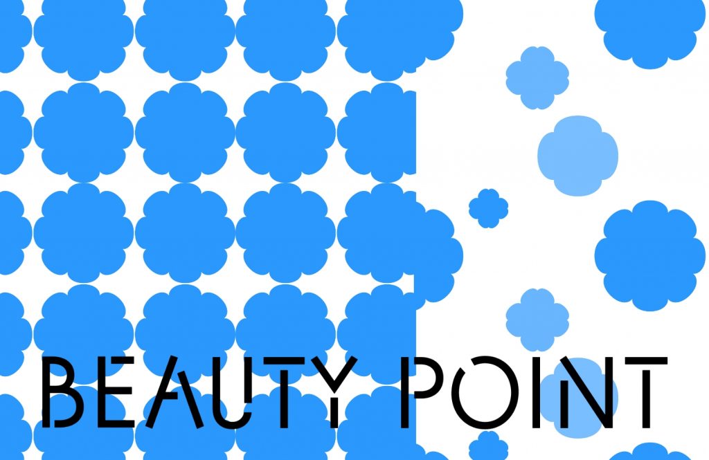
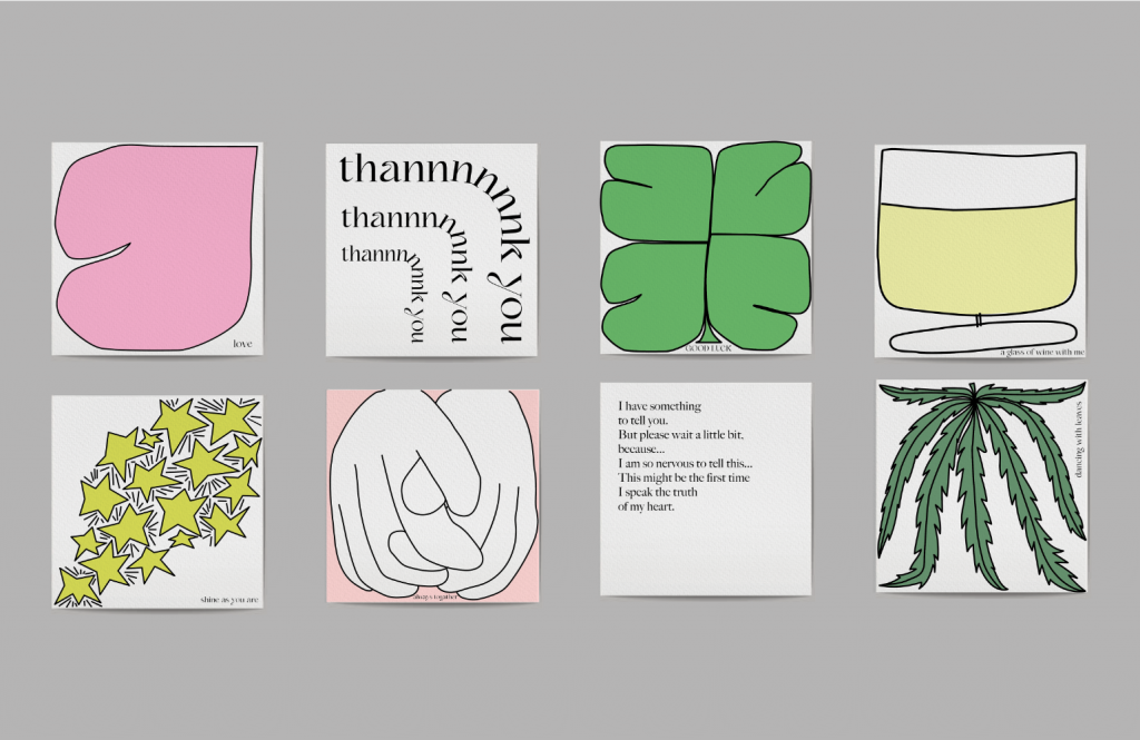
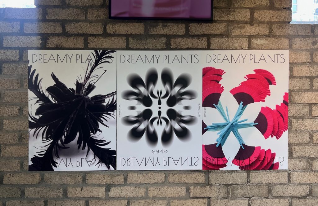
Super Graphic
‘Super Graphic’ is the term we use to define the unique graphical system extended from our new symbol.
It is not a fixed or static element but a constantly evolving,
organic entity that represents Mamonde’s continuous growth and its free, vibrant transformations.
It is not a fixed or static element but a constantly evolving,
organic entity that represents Mamonde’s continuous growth and its free, vibrant transformations.


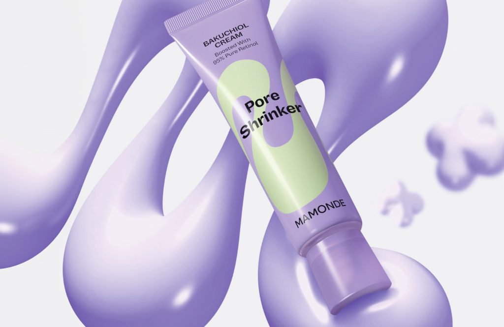
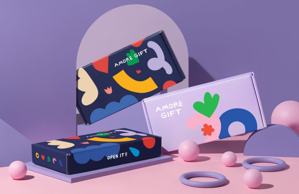
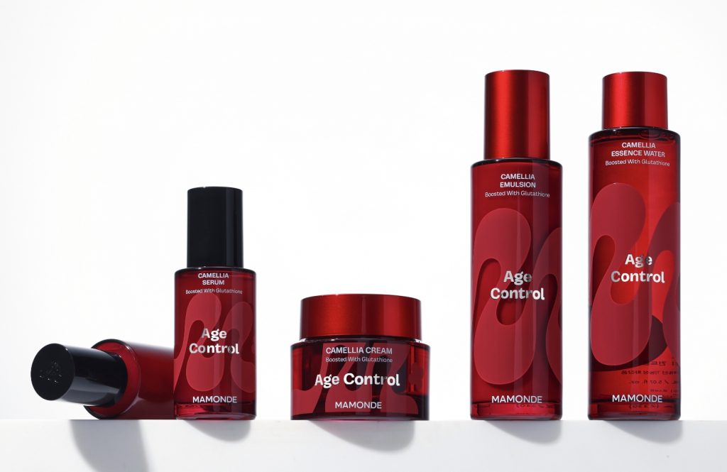
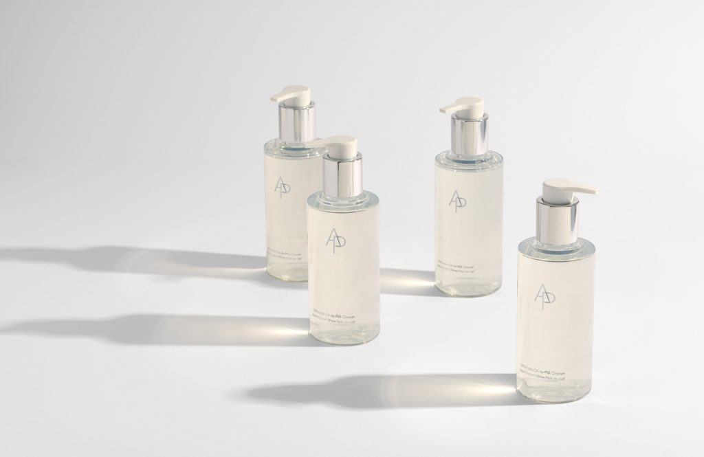
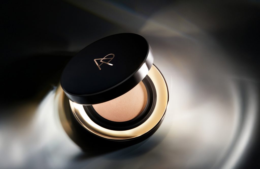
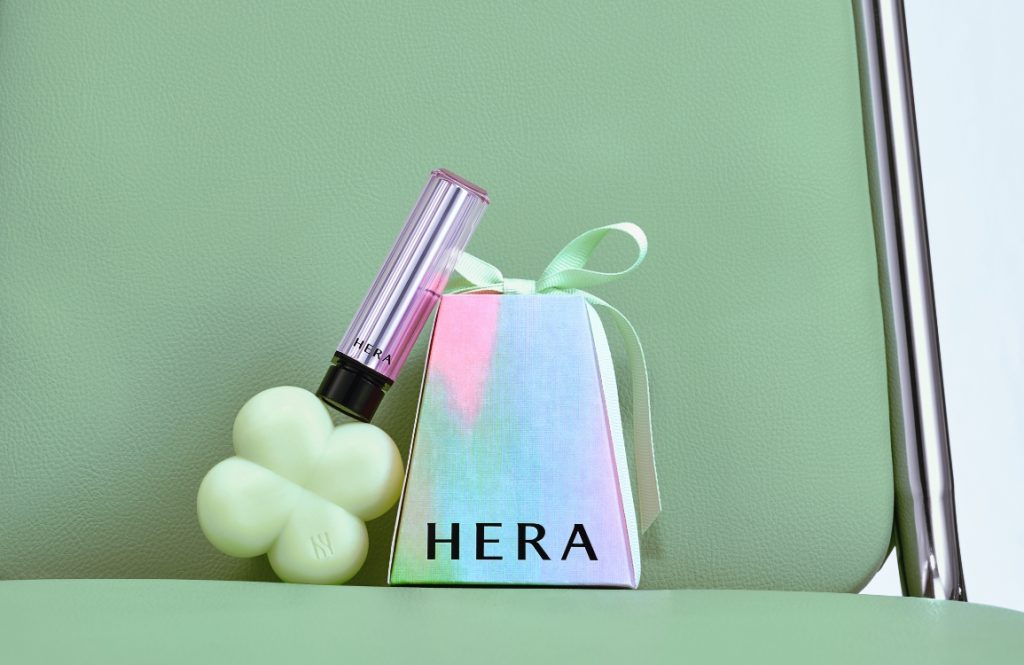
In product packaging, Mamonde’s Super Graphic serves as the main visual element, expressing the unique characteristics of each item.
However, its role extends far beyond packaging.
It is a dynamic and unifying entity that encompasses all brand visuals and content, constantly showcasing diverse forms and new evolutions.
As Mamonde’s key differentiating design asset, the Super Graphic is used to communicate the brand’s identity freely and without boundaries.


- Amorepacific Creatives
- Brand Design
- 이혜진, 위아인, 채승원, 민채현
- BM
- 마몽드팀
- Graphic Design Studio
- F&B Happy, POT
- 3D Motion
- Offthegrid
- 2D Motion
- 오민아
- Photography
- 이윤진