Salon Plus Clinic 10
Summary
Mise en Scène’s Salon Plus Clinic 10 line has launched a new gray hair cover dye. Targeted at women in their 30s and 40s, the product blends
technology and emotion in a premium formulation. As the age group concerned with gray hair continues to get younger, we aimed to break away
from the typical, old-fashioned image often associated with gray hair dye. The persona was defined as a confident woman who values quality
of life and balance, and the design process included concept planning, model selection, shooting, retouching, and layout design.


Concept
We pursued a rational and chic tone and mood to reflect the professional quality of this premium dye product. Consumer research revealed that when
buying gray hair dye with a clear purpose, customers value color information, model cuts, and a premium brand image. To convey a salon-grade feel,
we emphasized ‘Salon Plus Clinic 10,’ already well-known for its hair care line, and presented a fresh image of gray hair dye using modern model
shots and a refined design.

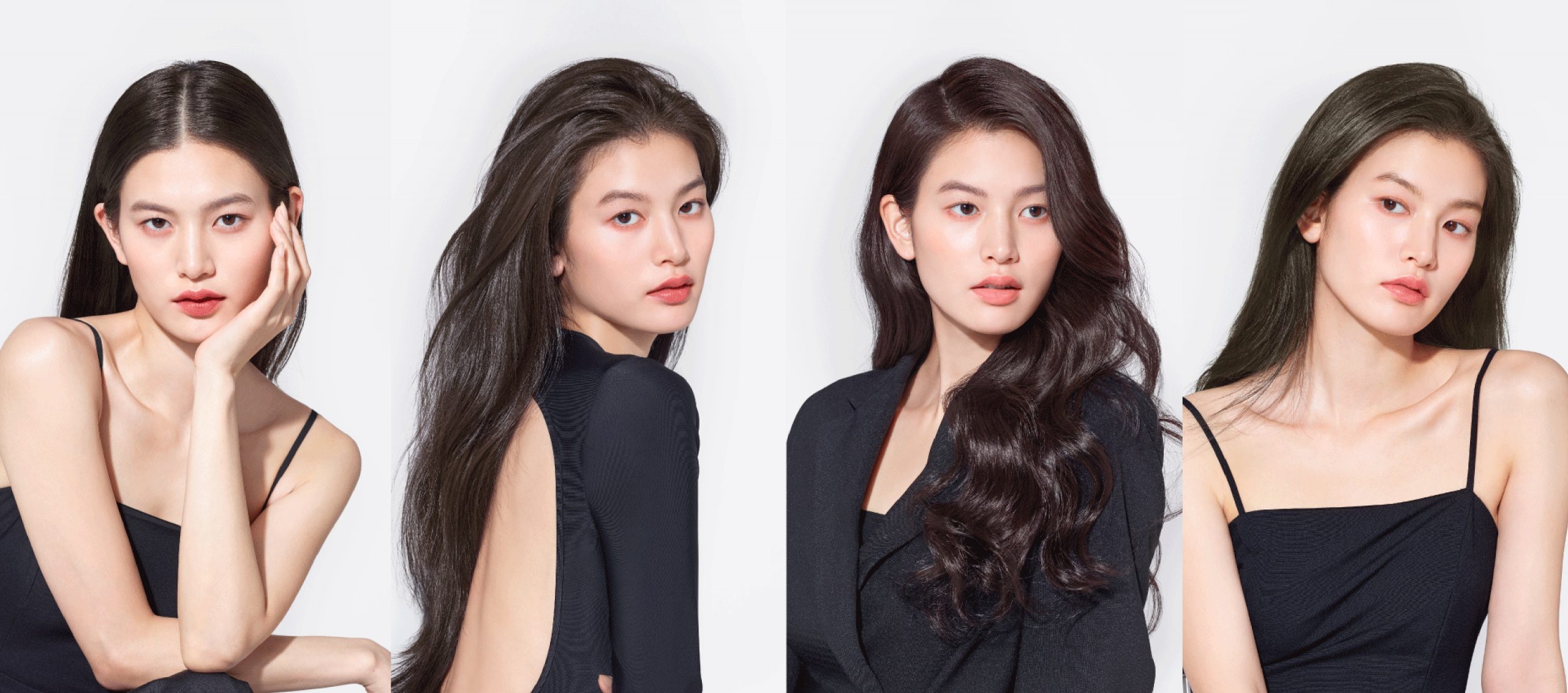
The front-facing model image is the key element in determining the packaging’s appeal. We selected a model whose look best captured the product’s concept and
styled the hair and makeup to accentuate her attractive features. While outfits varied in style, they were all kept in neutral tones to draw focus to the hair.
Strong lighting and high contrast were used to highlight the color and shine of the hair, ensuring visibility in retail displays. Hair and wardrobe styling were
tailored to match each of the eight color concepts, and the shoot included diverse poses to suit the mood of each. Selected cuts were later placed into layout
designs to ensure a harmonious visual composition across the range.

Model shots were taken with the overall layout framework already in place to ensure optimal proportions. While designing the layout, we focused on expressing
a strong brand identity and premium feel while maximizing space for the model image within a minimal design. The BI, ‘Salon Plus Clinic 10,’ was placed prominently
at the top in a large font size, and other graphic elements were intentionally omitted to maintain a clean and open look. Color chips and key product information
were also placed at the top to reinforce immediate recognition. Other details were moved to the top panel, side panel, and POP stickers, allowing the front to
remain minimal and impactful. This bold composition helps maximize attention in the competitive retail environment for hair dye products.
- Amorepacific Creatives
- 디자인
- 안윤정
- BM팀
- 박효성
- MC팀
- 송귀민
- 개발팀
- 김지훈


