LABO-H Hair Strengthening Clinic
라보에이치 모발강화클리닉 라인 신규 디자인
Summary
새롭게 선보이는 라보에이치의 모발강화 클리닉 라인은 두피부터 모발 끝까지 자연스럽게 이어지는 손상 회복의 흐름을 설계하고, 모발 본연의 탄력과 부드러움을 되찾는 데 집중한 제품이다. 실험실에서 영감을 받은 디자인, 따뜻한 무드의 컬러, 지속가능한 패키징까지—브랜드가 지향하는 케어의 철학이 제품 전반에 담겨 있다.
This article has been translated by an AI.
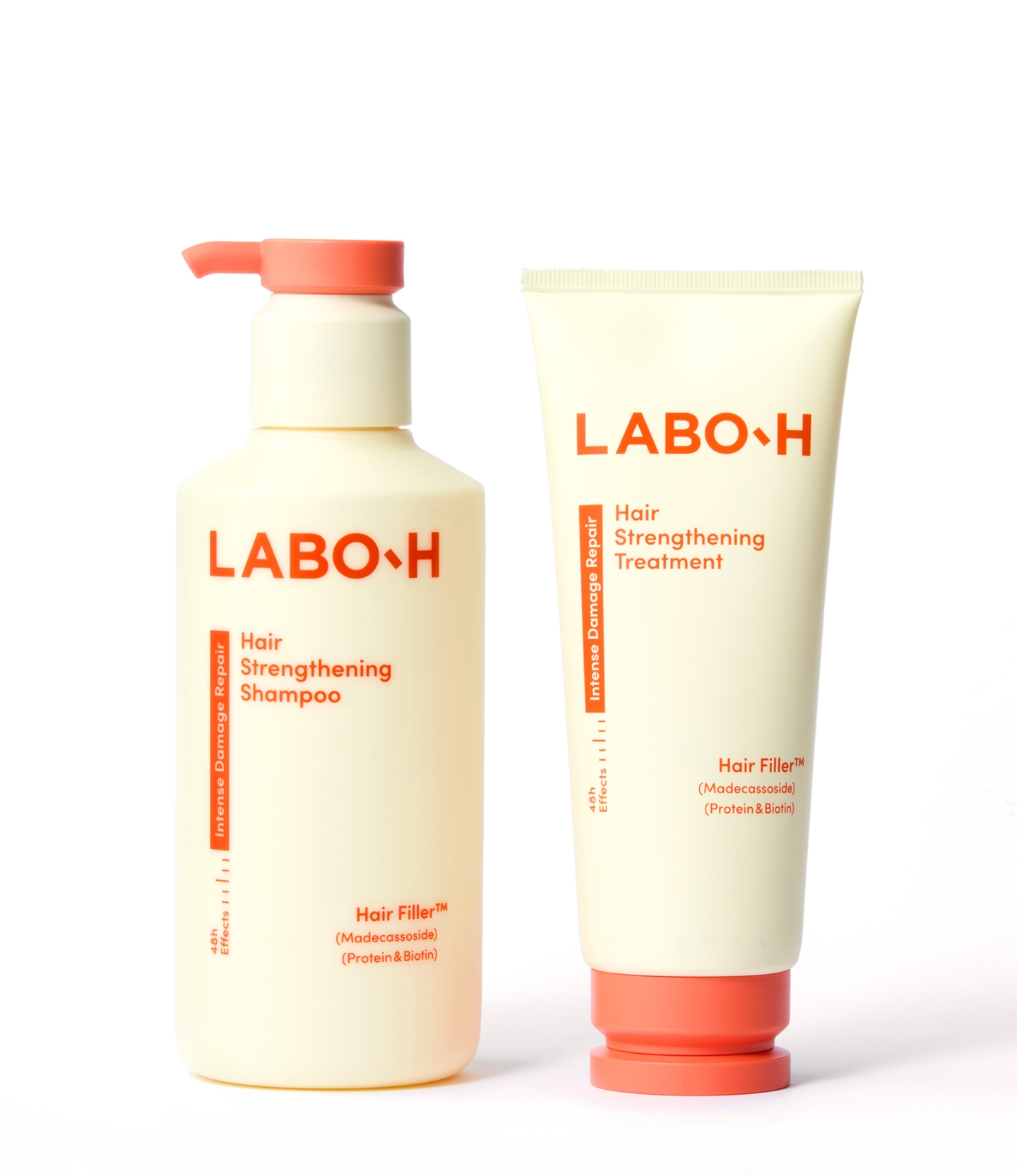
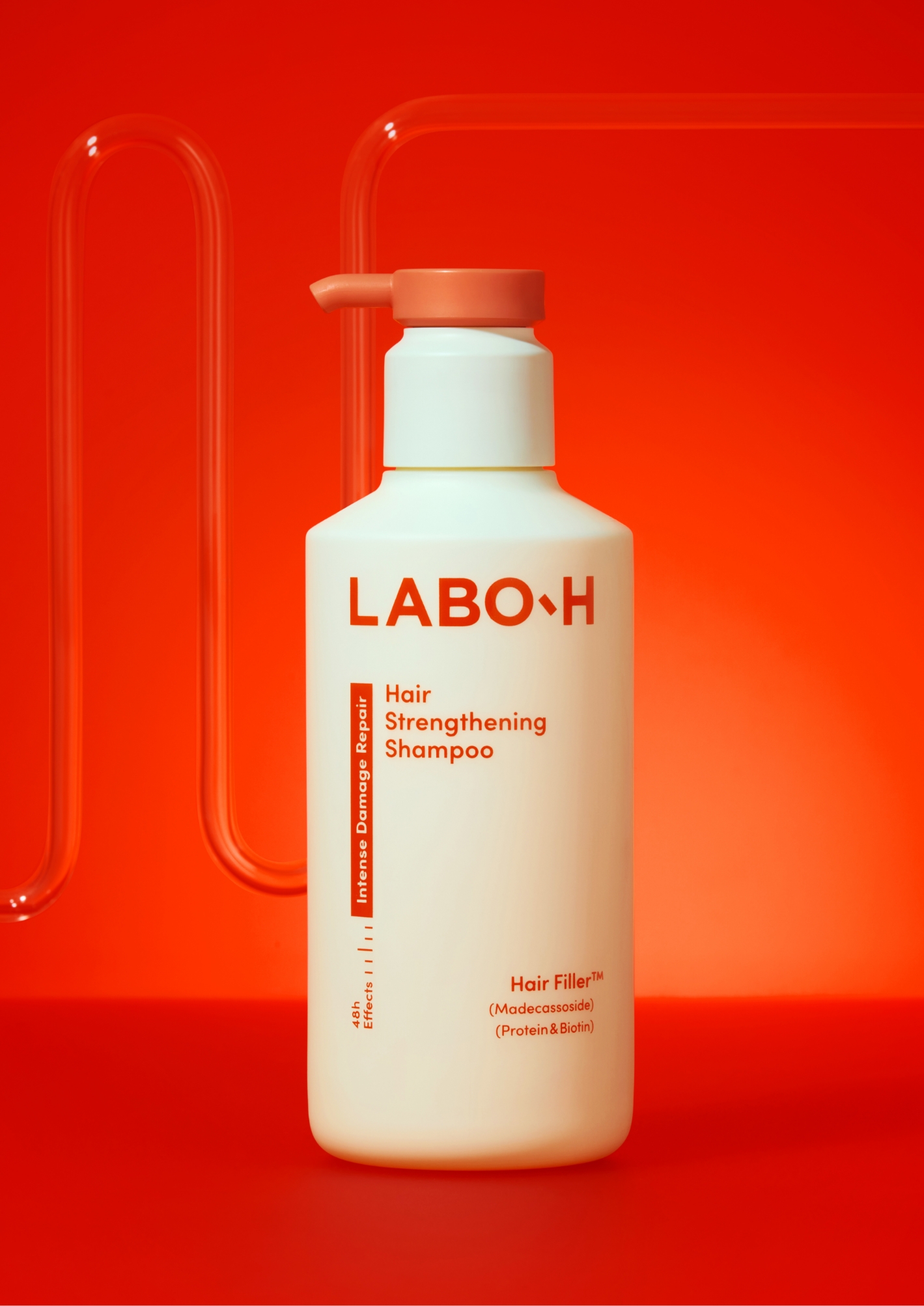
The newly introduced hair strenthening line of Lab-H is designed to support a seamless recovery flow from scalp to ends, helping hair regain its natural resilience and softness. Inspired by the brand’s lab-based identity, the design reflects scientific precision through structural forms, warm-toned colors, and sustainable packaging—clearly articulating the brand’s direction in hair care.
The newly introduced hair strenthening line of Lab-H is designed to support a seamless recovery flow from scalp to ends, helping hair regain its natural resilience and softness. Inspired by the brand’s lab-based identity, the design reflects scientific precision through structural forms, warm-toned colors, and sustainable packaging—clearly articulating the brand’s direction in hair care.
Project Goal
라보에이치는 두피 케어에 특화된 브랜드로, 정교한 기술력과 실험실 기반의 정체성을 바탕으로 두피 중심의 전문 시장에서 탄탄한 입지를 구축해왔다. 이번 모발 강화 클리닉 라인의 출시는 이러한 전문성을 ‘두피 기반 모발 케어’로 확장하고, 라보에이치만의 차별화된 케어 기준을 제시함으로써 브랜드 인지도를 넓히고 새로운 고객 접점을 만드는 것을 목표로 진행되었다. 이를 통해 기존 고객층을 유지함과 동시에, 새로운 카테고리 진입을 통해 브랜드의 추가 매출 성장을 도모하고자 했다.
디자인 측면에서도 변화가 필요했다. 기존 라보에이치의 두피 기반 제품들은 랩 컨셉을 기반으로 이성적이고 차가운 인상을 주는 구조적 형태와 강한 인상을 주는 그래픽을 중심으로 디자인이 전개되어 왔다. 하지만 손상케어 시장의 주요 타겟은 2030 여성 고객이며, 이 카테고리에서는 부드러운 색감과 감성적인 디자인 코드가 중요한 역할을 한다. 이에 따라 이번 프로젝트에서는 라보에이치의 실험실 기반 디자인 언어를 유지하되, 보다 정제된 형태와 톤으로 재구성해 새로운 카테고리에서도 브랜드 철학이 유연하게 작동할 수 있도록 방향을 설정했다.
디자인 측면에서도 변화가 필요했다. 기존 라보에이치의 두피 기반 제품들은 랩 컨셉을 기반으로 이성적이고 차가운 인상을 주는 구조적 형태와 강한 인상을 주는 그래픽을 중심으로 디자인이 전개되어 왔다. 하지만 손상케어 시장의 주요 타겟은 2030 여성 고객이며, 이 카테고리에서는 부드러운 색감과 감성적인 디자인 코드가 중요한 역할을 한다. 이에 따라 이번 프로젝트에서는 라보에이치의 실험실 기반 디자인 언어를 유지하되, 보다 정제된 형태와 톤으로 재구성해 새로운 카테고리에서도 브랜드 철학이 유연하게 작동할 수 있도록 방향을 설정했다.
Labo H has established a strong position in the professional scalp care market, building on precise technology and a laboratory-based identity.
The launch of the Hair Strengthening Clinic line aimed to extend this expertise into scalp-based hair care, presenting Labo H’s distinctive care standards, broadening brand awareness, and creating new customer touchpoints. The goal was to retain the existing customer base while entering a new category to drive additional revenue growth.
From a design perspective, change was essential. Labo H’s scalp-focused products had been developed under a lab concept, centered on structural forms that conveyed a rational, clinical impression and graphics with strong visual impact. However, the primary target of the damaged-hair care market is women in their 20s and 30s, where softer color palettes and emotional design codes play a key role. In response, this project maintained Labo H’s laboratory-driven design language while reinterpreting it with more refined forms and tones, ensuring that the brand’s philosophy could adapt seamlessly to a new category.
From a design perspective, change was essential. Labo H’s scalp-focused products had been developed under a lab concept, centered on structural forms that conveyed a rational, clinical impression and graphics with strong visual impact. However, the primary target of the damaged-hair care market is women in their 20s and 30s, where softer color palettes and emotional design codes play a key role. In response, this project maintained Labo H’s laboratory-driven design language while reinterpreting it with more refined forms and tones, ensuring that the brand’s philosophy could adapt seamlessly to a new category.
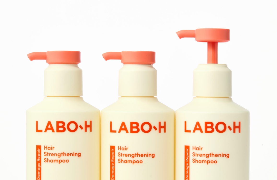
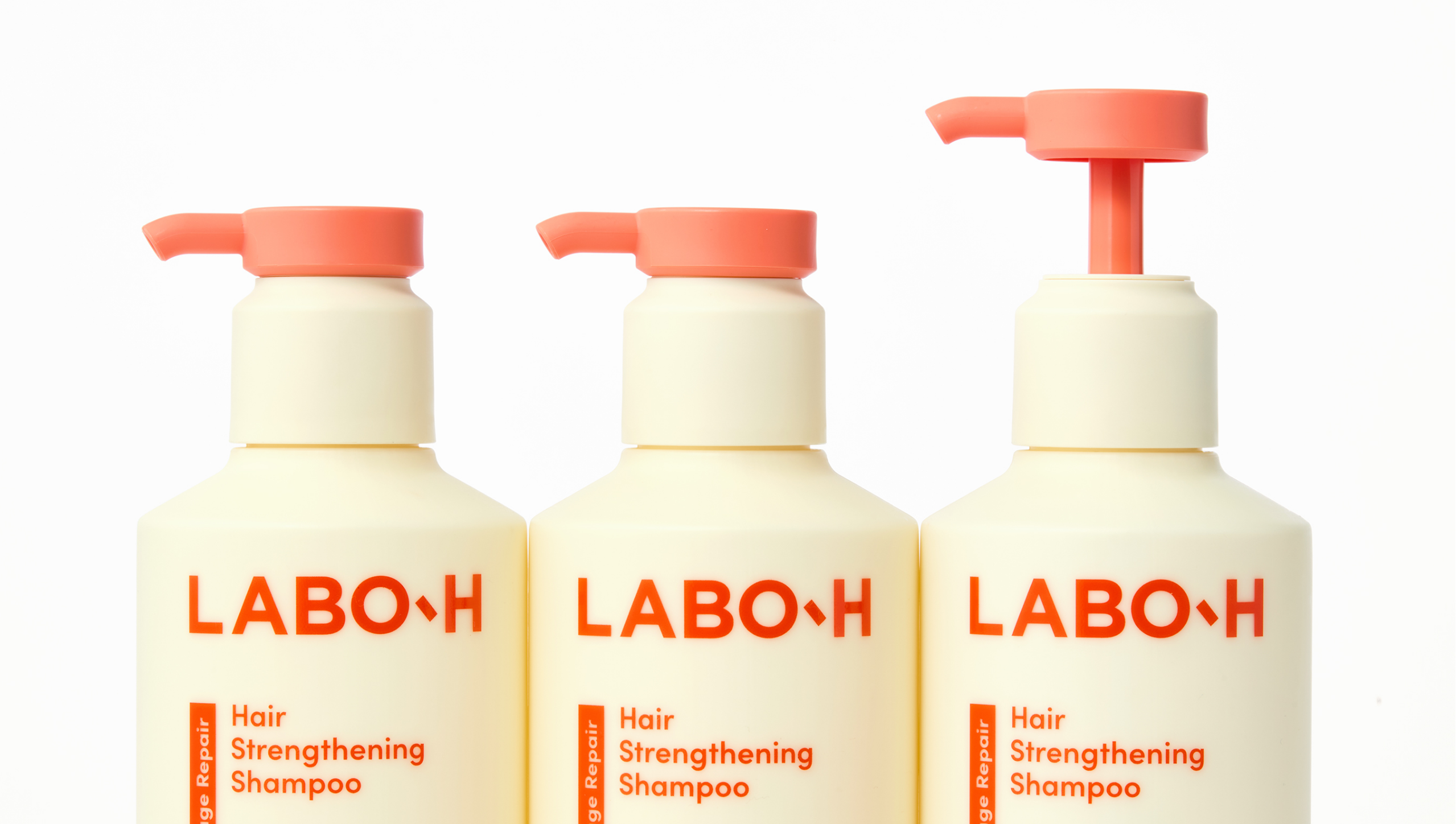
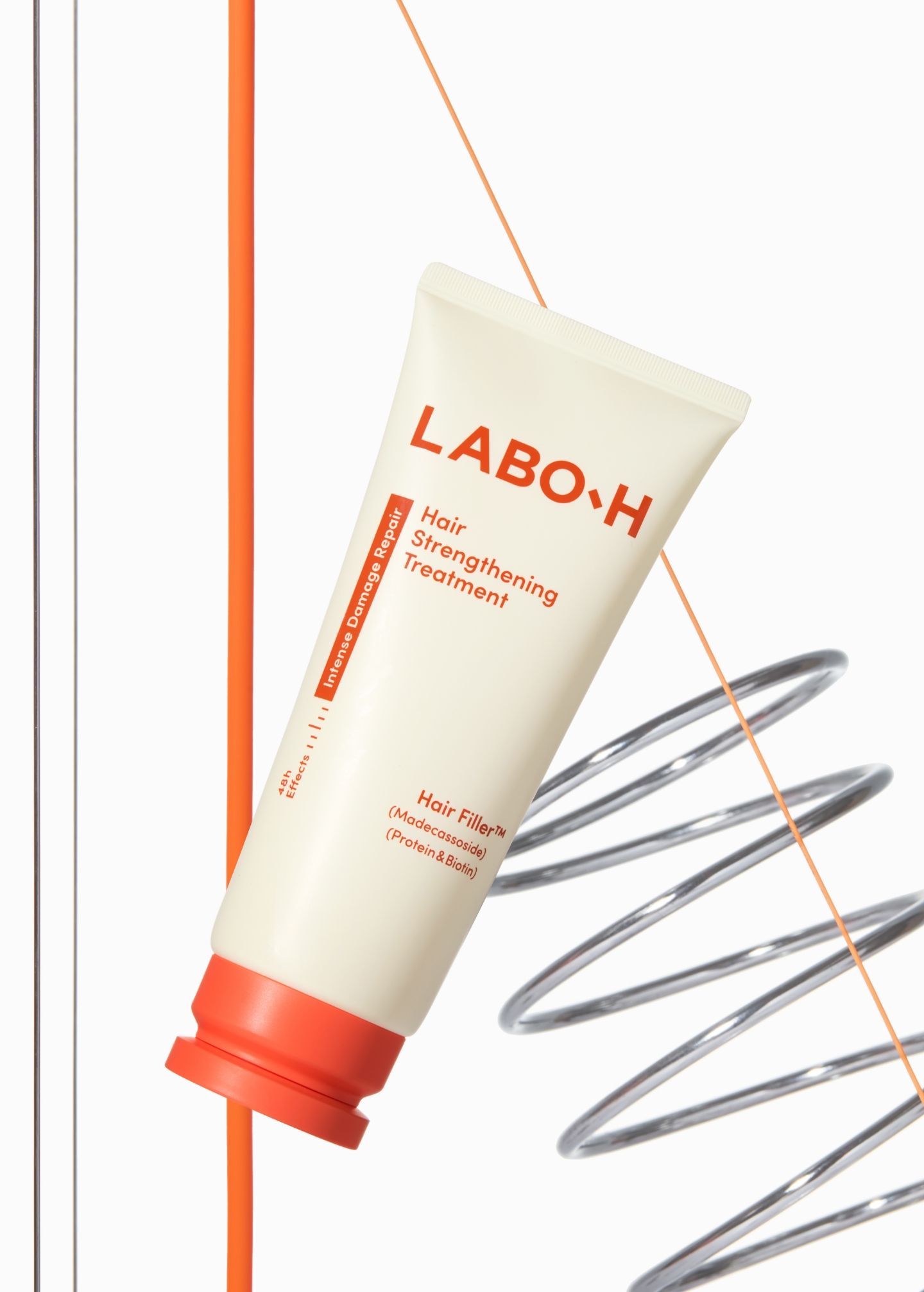
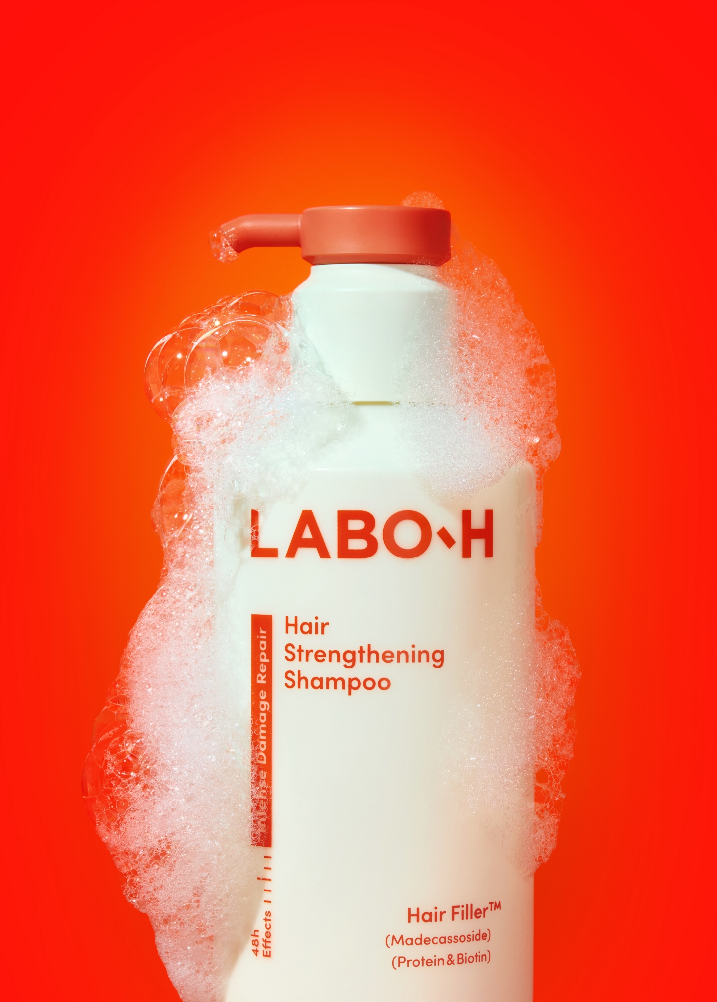
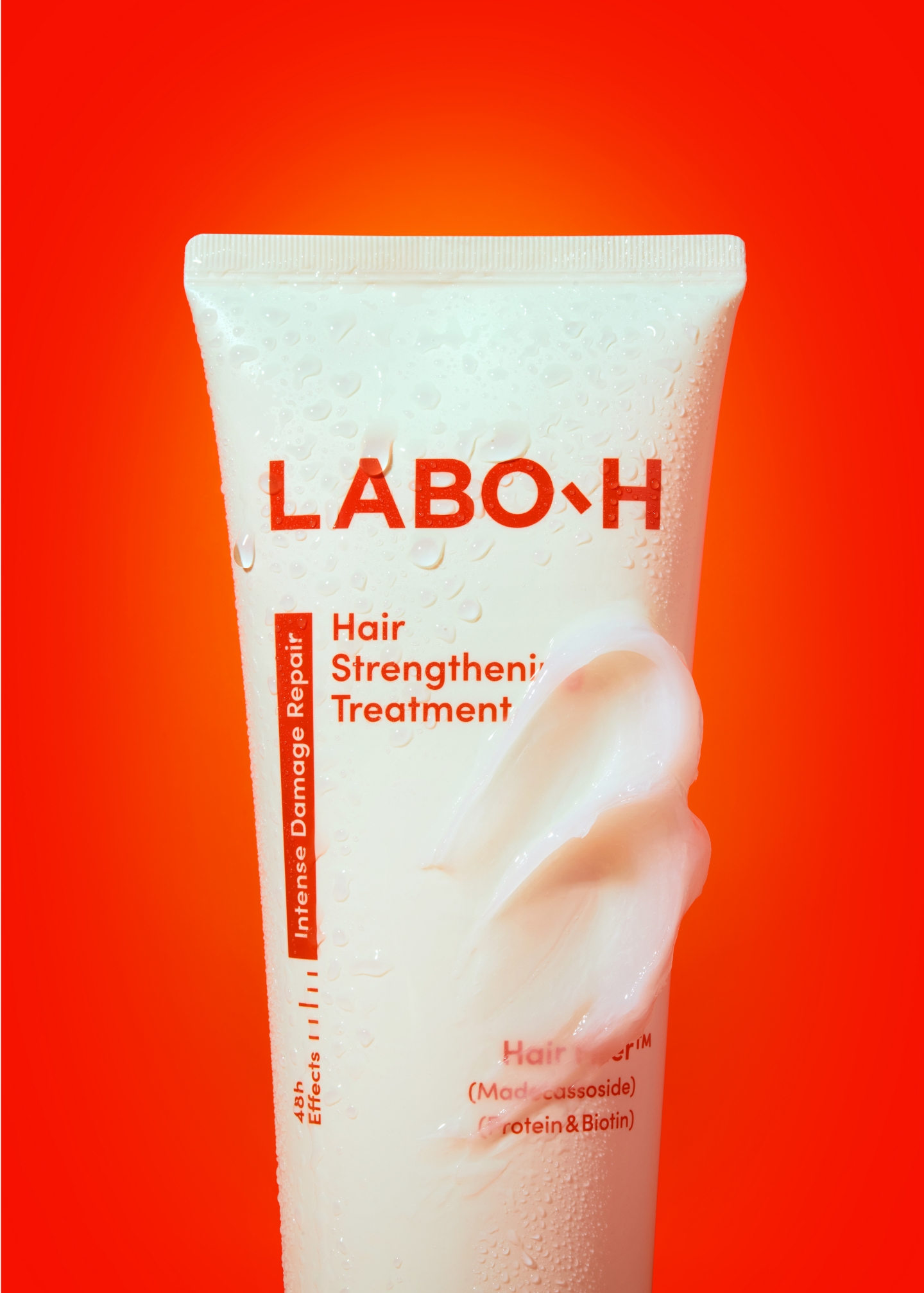
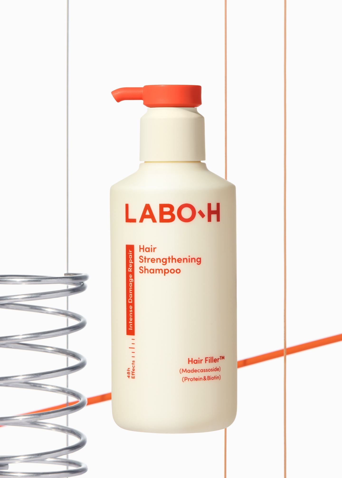
형상 디자인: 기능성과 감성을 담은 형상 설계
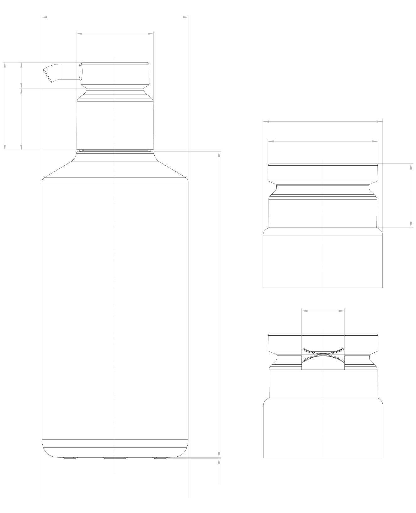
이번 라인의 형상은 라보에이치의 대표 샴푸의 형상에서 출발했다.
실험실 비이커에서 착안한 특이성있는 기존 형태를 근간으로 하되, 손상케어 라인에서는 이를 보다 부드럽고 유려한 곡선으로 다듬었다. 이러한 형상 변화는 기능성과 사용성을 높이는 동시에, 두피부터 모발 끝까지 끊김 없이 이어지는 케어 흐름을 시각적으로 표현하고자 했다.
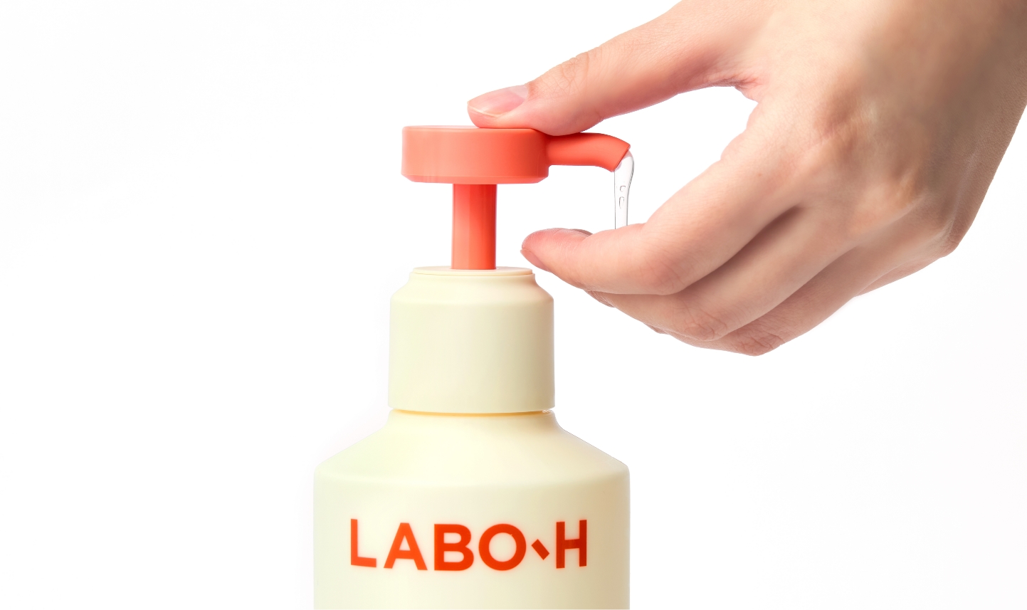
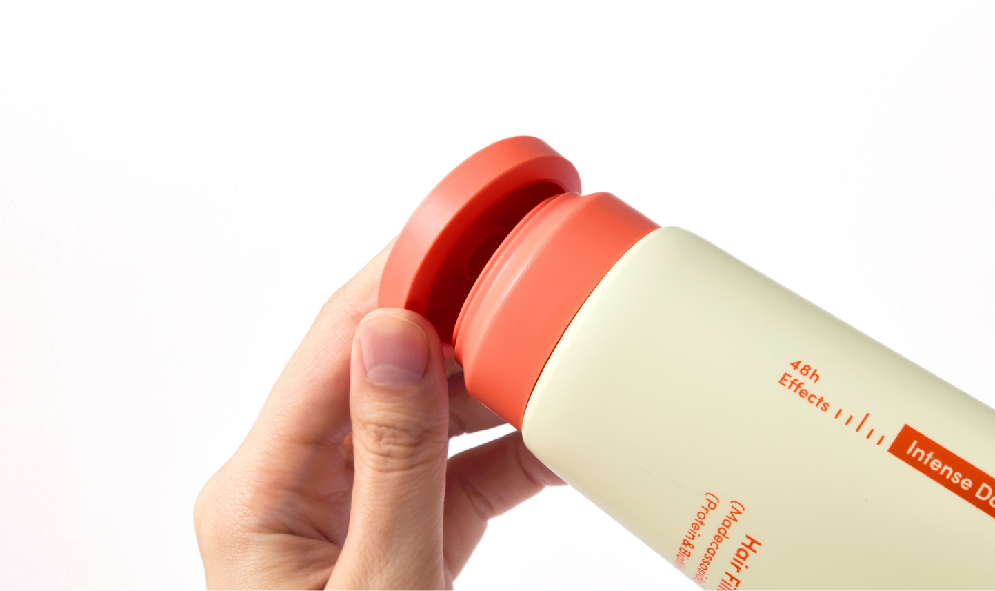
샴푸와 트리트먼트는 동일한 형상을 공유해 일관된 인상을 형성하고, 각각의 기능에 맞춘 디테일로 정리하였다. 샴푸는 넓고 평평한 버튼으로 보다 편리한 사용이 가능하며, 트리트먼트는 동일한 형상을 하단 캡에 적용해 보관 안정성을 확보했다. 또한 움푹 들어간 부분을 통해 쉽게 열고 닫을 수 있도록 설계했다.
실험실 비이커에서 착안한 특이성있는 기존 형태를 근간으로 하되, 손상케어 라인에서는 이를 보다 부드럽고 유려한 곡선으로 다듬었다. 이러한 형상 변화는 기능성과 사용성을 높이는 동시에, 두피부터 모발 끝까지 끊김 없이 이어지는 케어 흐름을 시각적으로 표현하고자 했다.
샴푸와 트리트먼트는 동일한 형상을 공유해 일관된 인상을 형성하고, 각각의 기능에 맞춘 디테일로 정리하였다. 샴푸는 넓고 평평한 버튼으로 보다 편리한 사용이 가능하며, 트리트먼트는 동일한 형상을 하단 캡에 적용해 보관 안정성을 확보했다. 또한 움푹 들어간 부분을 통해 쉽게 열고 닫을 수 있도록 설계했다.
Form Design: Shaping Function and Sensibility
The form of this line originates from Labo H’s signature shampoo bottle,which draws its distinctive structure from laboratory beakers.
For the damaged-hair care line, this recognizable form was refined into softer, more fluid curves. This transformation enhances both functionality and sensibility, while visually expressing the seamless care flow from scalp to hair ends.
Both the shampoo and treatment share the same form language, creating a unified impression, yet each is detailed to suit its specific function. The shampoo features a wide, flat pump top for easier dispensing, while the treatment applies the same form to the lower cap, ensuring stability when stored upright. A recessed grip area was also incorporated for effortless opening and closing.
Both the shampoo and treatment share the same form language, creating a unified impression, yet each is detailed to suit its specific function. The shampoo features a wide, flat pump top for easier dispensing, while the treatment applies the same form to the lower cap, ensuring stability when stored upright. A recessed grip area was also incorporated for effortless opening and closing.
그래픽 시스템: 실험실 기반의 시각 언어
라보에이치의 주요 그래픽 언어인 비이커의 눈금 그래픽 자산을 계승하여 일관된 브랜드 언어로 작동하도록 했다. 다만 기존의 라보에이치 제품에 적용했던, 직접적이고 구체적으로 묘사된 눈금 디테일을 덜어내어 손상케어 카테고리 특유의 부드러운 감성과도 충돌 없이 어우러지도록 했다. 그래픽을 정돈함과 동시에 브랜드 워드마크는 확대 적용하여 브랜드 존재감과 주목도를 강화했다.
Graphic System: Laboratory-Inspired Visual Language
The beaker measurement mark—one of Labo H’s core graphic assets—was carried over to maintain a consistent brand language.
However, the direct and highly detailed depiction used in previous products was simplified, allowing it to harmonize with the softer sensibility of the damaged-hair care category. While the graphics were refined for subtlety, the brand wordmark was applied at a larger scale to reinforce presence and visual impact.
However, the direct and highly detailed depiction used in previous products was simplified, allowing it to harmonize with the softer sensibility of the damaged-hair care category. While the graphics were refined for subtlety, the brand wordmark was applied at a larger scale to reinforce presence and visual impact.
CMF & Sustainability : 감성적 CMF와 지속 가능성을 고려한 포장재
제품의 메인 컬러에는 부드러운 영양감을 연상시키는 옐로우 아이보리를 적용하고, 서브 컬러로는 강한 회복력과 에너지를 상징하는 코랄 오렌지를 조합해 대비감과 주목도를 높이면서도 제품의 핵심 가치를 시각적으로 전달하고자 했다. 전체적으로 무광 마감을 적용해 제품의 부드럽고 소프트한 속성을 강조했으며, 시각적·촉각적 경험을 통해 손상케어 제품으로서의 성격을 직관적으로 드러내고자 했다. 디자인과 함께 지속가능성 측면에서도 개선을 시도했다. 샴푸에는 메탈리스 펌프를 적용해 분리배출의 용이성을 높였고, 용기 역시 PET 보다 재활용성이 우수한 PP·PE 소재를 사용해 환경 부담을 줄였다.
CMF & Sustainability: Sensory CMF with a Sustainable Approach
The main color of the product features a soft Yellow Ivory, evoking a sense of gentle nourishment, paired with a Coral Orange that symbolizes strong recovery and energy. This combination increases contrast and visual impact while conveying the product’s core values.
A matte finish was applied throughout to emphasize the soft, delicate qualities of the product, allowing its damaged-hair care purpose to be communicated intuitively through both visual and tactile experience. Alongside design considerations, improvements were also made in sustainability. The shampoo incorporates a metal-free pump for easier recycling, while the containers use PP and PE materials—more recyclable than PET—to reduce environmental impact.
A matte finish was applied throughout to emphasize the soft, delicate qualities of the product, allowing its damaged-hair care purpose to be communicated intuitively through both visual and tactile experience. Alongside design considerations, improvements were also made in sustainability. The shampoo incorporates a metal-free pump for easier recycling, while the containers use PP and PE materials—more recyclable than PET—to reduce environmental impact.
- Amorepacific Creatives
- Product Design
- 안윤정
- BM
- 장은지
- Development
- 이성현
- Photography
- 김나은스튜디오, 이윤진