The Seoul Illustration Fair_APBADAs
Summary
Our character, Dolpung, and his ‘APBADAs’ friends moved from Jeju Island to Seoul to earn money for a trip to see the aurora.
To help them gain more love and recognition, we decided to create an offline experience. We believed it was important to first
win over dedicated character fans before aiming for mainstream popularity, so we chose to participate in the Seoul Illustration
Fair (SIF), a holy grail for character enthusiasts. This was our third time participating, and as always, it was an invaluable
opportunity to experience customer reactions and feedback firsthand—insights we could never get from the office. This experience
has broadened our perspective on character management. For this year’s SIF, our content planners, spatial designers, product
designers, and graphic designers all collaborated to create our most polished outcome yet. In the following sections, we will
share the story of how we prepared and created ‘Dolpung’s Pojangmacha.’
Concept
The Seoul Illustration Fair is a four-day event from December 22-25 that attracts around 60,000 visitors. As
this was our third time participating, we wanted to create a deeply immersive concept to give visitors a memorable
experience. With over 800 booths at the venue, we knew visitors would be selective. Based on our past learnings, we brainstormed ways
to offer an experience more interesting and fun than any other booth.
To create content that would make people want to stay and explore, while also reflecting the APBADAs’s story of moving to Seoul and
trying various jobs, we developed a ‘pojangmacha’ (Korean street food stall) concept, selling winter favorites like fish-shaped
pastries and roasted sweet potatoes. With its red tarp tent, retro-style menu, and even steaming hot fishcake broth to warm up frozen
bodies, we were confident no other concept could be more stimulating or intriguing. This was the beginning of our obsessive dedication to a concept.
Event & Space Design Summary

The booth space for “Dolpung’s Pojangmacha” measured 2.5m x 6m with two open sides. Since our primary goal at Seoilpe was
to increase Instagram followers (@dolpoong_APBADAs), we approached the project by planning the layout and content strategy
in parallel. This dual focus ensured that both the follow event and product sales were seamlessly integrated into the booth
experience. By aligning the physical design with digital engagement, we maximized opportunities to attract visitors,
encourage participation, and build a stronger community presence.
For the year-end follow event, we combined the seasonal keyword “New Year’s Fortune” with our booth concept keyword “fishcake skewers.” Participants would select a fishcake skewer, and we presented them with a fortune amulet that matched the color painted on the end of their skewer. Each amulet featured cheerful illustrations designed to encourage participants to take photos and share them on social media. To ensure wide appeal, the fortunes were divided into six themes: Diet Luck, Wealth Luck, Love Luck, Health Luck, Concentration Luck, and Academic Luck. This playful approach not only fit our pojangmacha (food cart) concept but also created a memorable and shareable experience for visitors.
For the year-end follow event, we combined the seasonal keyword “New Year’s Fortune” with our booth concept keyword “fishcake skewers.” Participants would select a fishcake skewer, and we presented them with a fortune amulet that matched the color painted on the end of their skewer. Each amulet featured cheerful illustrations designed to encourage participants to take photos and share them on social media. To ensure wide appeal, the fortunes were divided into six themes: Diet Luck, Wealth Luck, Love Luck, Health Luck, Concentration Luck, and Academic Luck. This playful approach not only fit our pojangmacha (food cart) concept but also created a memorable and shareable experience for visitors.

For the spatial design, we focused on intuitively conveying the elements of a pojangmacha.
Interestingly, pojangmachas have many logical design features:
1. High Visibility: Achieved with a brightly colored tarp and a bold sign.
2. Food Emphasis: A dark interior with focused lighting directly on the food.
3. Proximity: Detailed menus are only visible up close.
4. Orderly Display: Food is often arranged in neat rows.
5. Convenience: Items like plastic bags and paper cups are hung in easy-to-reach places.

This is the completed space. We used a real second-hand refrigerated showcase, folding tables, and kitchenware from a snack shop.
Starting with the ‘Fishcake Fortune Telling,’ our obsessively detailed concept and diverse content made our booth one of the hottest
spots at the fair, gaining us over 4,000 new followers. In the next section, we’ll share the story of the special edition products we developed.


Product Design Summary
The most important goal when developing new merchandise for this SIF was to expand our product categories beyond just stationery and desk accessories.
We introduced new, higher-priced seasonal items for winter like snow makers, blankets, and fuzzy socks, while also creating new, low-priced paper goods
to capture the year-end and New Year’s season. Additionally, based on consistent requests from fans at previous events, we developed products that could
be sold year-round, like doll keychains and Jibbitz-style shoe charms.

Product 01. Blanket
To connect the winter season with the booth’s pojangmacha (food cart) concept, we set the design direction around the nighttime atmosphere. Using a deep navy base
color and a large snowy background illustration, we showcased as many characters and personalities as possible while staying within the 10-color production limit.
During production, we sampled multiple fabrics—ranging from wool fleece to microfiber—to test how different materials absorbed dye. This process ensured that both
the tactile experience and the vividness of the APBADAs characters’ colors were maximized. The result was a blanket that not only fit the seasonal and conceptual
theme but also delivered both comfort and visual richness.

Product 02. Snow Maker
The biggest challenge in creating the Snowmaker was ensuring shape stability, given the fragile nature of snow, while preventing the pure white surface from
looking monotonous. To address this, we added subtle design elements that preserved the overall Dolpung silhouette and center of gravity, allowing the form
to remain visually stable. Details that were previously expressed only through color—such as Dolpung’s belly and the small face graphics—were enhanced using
embossing and debossing techniques, creating depth and detail even within a single color. Finally, Dolpung’s signature identity color was applied across the
entire surface with a matte finish, resulting in a more durable and high-quality appearance that elevated the tactile and visual experience of the product.


Product 03-04. Year-end card & Stickers
[Year-end card]
Created for the Christmas season, these goods used a hand-drawn stroke style to match the cozy mood of the holidays. We prepared
two sticker concepts: a pastel blue ‘winter vacation’ theme and a vibrant red ‘pojangmacha’ theme. Both used a horizontal layout,
rather than a typical vertical one, to make the small graphics more visible and to display well with other products.
[Stickers]
We prepared two sticker sheet concepts. The first was a pastel blue ‘Winter Vacation’ theme that could be used all winter long. The
second was a vibrant red ‘Pojangmacha’ theme that directly reflected the mood of our booth. For both designs, we used a horizontal
layout instead of the narrow, vertical format common for sticker sheets. This allowed the small, intricate graphics to be more visible
at a glance. We also considered how the sheets would be displayed in-store, ensuring the layout would not obstruct other products when placed together.

Product 05. Jibbitz
This product was developed as an extension of our best-selling character charms. At past events, many visitors mistook the charms for Jibbitz,
and we reflected this feedback by producing them with the same silicone material. While the earlier 8-piece set presented a price barrier,
this new release comes as a 2-piece set—making it more accessible and encouraging impulse purchases. By addressing both customer expectations
and price accessibility, we created a product that maintains the charm of the original while broadening its appeal to a wider audience.

Product 06. Calendar
This poster calendar was designed to serve both as a functional date keeper and an interior decor item. The project began with a bold concept of
Dolpung dressed in a black rabbit costume at the center, in celebration of the 2023 Year of the Rabbit. From there, the design evolved to highlight
the unique charms of various APBADAs characters. During development, we discovered that when a character’s design matched the theme of a given month,
it not only made the calendar easier to read but also enhanced its visual appeal. By deriving keywords for each month and aligning them with suitable
characters, we created a final calendar that was both practical and playful, adding warmth and cuteness to everyday life.

Product 07. Sleep Socks
For the winter season, we created fuzzy sleep socks in pastel tones that emphasize a cute and cozy aesthetic. During the design process, we
explored multiple directions: patterns featuring the characters, designs highlighting their arms and legs, and even playful B-grade style graphics.
After careful discussion, we chose to feature the characters’ faces on the soles of the socks. This direction balanced mass appeal, consumer preference,
and production cost efficiency. From the front, the socks look like ordinary, everyday items that can be worn casually, while the character faces hidden
on the soles provide a fun and unexpected detail. Internally, we positioned this item as “incognito fandom sleep socks”—a product that allows fans to
enjoy a subtle connection to the characters in daily life, while still carrying a unique, playful twist.

Product 08. Doll Pouch
With the popularity of the APBADAs character dolls, we developed smaller keychain versions that can be carried anywhere. To enhance practicality,
we designed them as mini pouches that can hold AirPods, lipstick, or small accessories, and they can even function as coin purses. To capture each
character’s unique charm while emphasizing cuteness, we slightly adjusted their proportions, creating an adorable “mini-me” version of the APBADAs
lineup. For the crab character “Gerter,” we also experimented with a bubble-blowing design sample. Although production costs prevented mass production,
the internal response to this prototype was overwhelmingly positive. We hope to revisit and produce this special edition in the future.

Product 09. Rubber gloves
To showcase the multi-legged features of the characters Kkumi and Ttugi, we proposed rubber gloves—a practical item used in everyday life that also integrates the
APBADAs worldview. Since rubber gloves are typically hung on the sink to dry, we imagined that even in a household setting, the characters’ distinctive traits
could shine through. We also came up with a playful idea to package and sell them in bundles resembling squid packaging, further reinforcing the pojangmacha
(street food stall) concept. This direction allowed us to break away from the more common stationery items and explore kitchenware goods as a new category
for APBADAs merchandise. Although mass production was not possible due to high minimum order quantities, the samples were showcased at the Seoul Illustration
Fair, where they received very positive feedback from visitors.
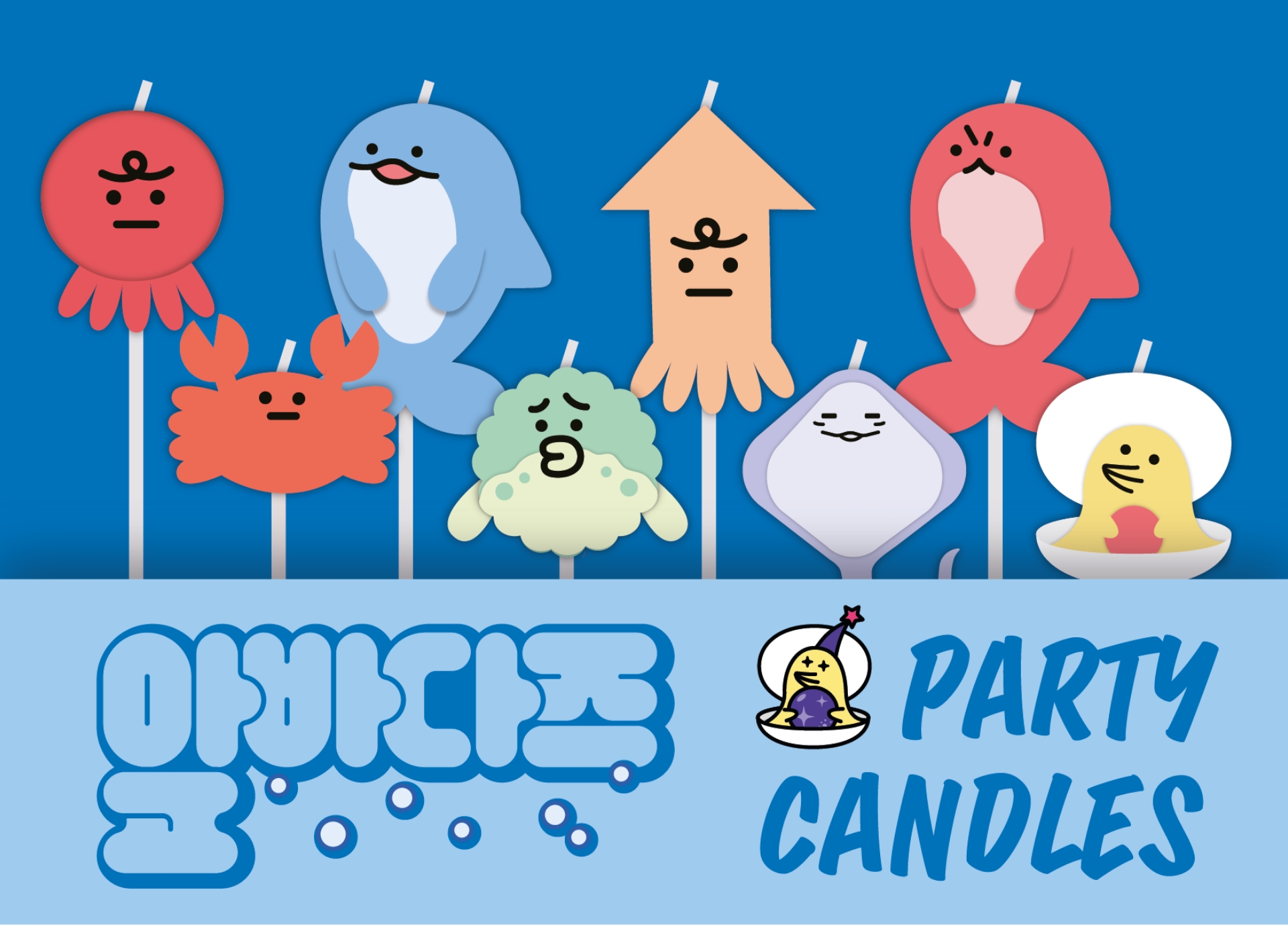
Product 10. Party Candles
We proposed party candles as a merchandise item designed for year-end parties, gatherings, and birthdays, as well as for adding a special
celebratory mood to everyday desserts. This concept reached the final design stage, as we saw great potential for promoting the APBADAs
characters through photogenic moments. Unfortunately, due to production schedule constraints, it never made it to mass production. The
idea was to allow people to feel the joy of celebrating together by using candles featuring the APBADAs friends, creating not only a
festive atmosphere but also a memorable keepsake in photos. Though unrealized, we still hope this item will be developed in the future.
Package Design Summary
We designed the packaging to enhance the immersive experience for visitors at our booth during the Seoul Illustration Fair, allowing them to feel even
more connected to Dolpungi-ne. The packaging not only highlighted the goods but also extended the playful concept to the moment visitors carried them
home. Inspired by pojangmacha street stalls and casual Korean snacks, the packaging was developed to reflect the fun of the theme.
Since our merchandise ranged from small postcards and stickers to large dolls, we designed packaging in three sizes—large, medium, and small—to suit
each item. Many visitors at the fair shared feedback that the packaging and concept were memorable and fun, which made us proud, as we believe it
also contributed to stronger sales.

Package 01. Tteokbokki container
This was the packaging that stayed truest to the concept. It instantly brought to mind pojangmacha street stalls and casual snacks,
and the effect was even stronger when the small APBADAs doll was placed inside.
To create the tteokbokki-style packaging, we even purchased a heat-sealing machine—something we hesitated over until the very last
moment. In hindsight, it was the best decision. Not only did the slightly pressed look of the doll inside the container add to the
cuteness, but sealing the packages directly on-site also became a fun performance element.
Package 02. Plastic Bag
This packaging was created for medium-sized, bulkier items, excluding large dolls and small stationery. It worked especially well in combination with
the tteokbokki container, amplifying the pojangmacha synergy. It even allowed us to recreate the food-cart detail of hanging a stack of
plastic bags to tear off and use on the spot—making it an indispensable element of the concept.
Rather than generic white or black bags, we used APBADAs’s signature color to increase the sense of completion. For the artwork, we
chose the character “Ori” carrying the APBADAs friends on its back in flight, symbolizing “swift delivery.” The Dolpungine logo was
designed in a rounded arch style, giving the impression that there might really be a Dolpungine shop out there.


Package 03. Round Sticker
We created round stickers to showcase the characters’ playful and expressive faces. From the contrasting moods of Dolpung and Dolpung-E, to the look-alike
sisters Kkumi and Ttugi, the anxious Bokjangi, and the gentle smile of Ori, each design gives a glimpse into their unique personalities. These stickers
were applied to paper bags and tteokbokki containers, not only serving a practical purpose as seals but also adding another layer of charm by making the
packaging itself more memorable and engaging.

Package 04. Paper Bag
We designed a paper bag to hold the smallest stationery items—such as postcards, stickers, pens, and charms. While paper bags are commonly used for stationery,
we borrowed the structure of food packaging, like fish-shaped bread or fried snack bags, to instantly evoke the feel of a pojangmacha (street food stall). To
emphasize this playful mood, the bag was printed in a single color using the APBADAs signature blue, keeping the design simple yet distinctive. The artwork
featured all the APBADAs characters gathered together, giving visibility to the brand’s lineup, while the brand name “Dolpungine” was placed prominently at
the top—reminiscent of the branding on traditional Bungeobbang bags. This design not only carried the items but also conveyed the full street food cart
experience, extending the booth concept down to even the smallest goods.

Package 05. Felt bag
For the largest dolls, we focused on utility and eco-friendliness over the concept. We chose a reusable, non-woven fabric bag so it wouldn’t be thrown away after one use.
This packaging was designed to hold our largest dolls. Since there were no food-inspired containers big enough for the “large” size, we prioritized utility and eco-friendliness
over concept. To avoid excessive bulk and to prevent the bag from being discarded after a single use, we chose a non-woven fabric bag as a reusable shopping alternative.
Because this packaging was intended for continuous use, the design emphasized visibility of the Dolpung character from APBADAs rather than the Dolpungine food-cart theme.
Behind Story
This is the scene at ‘Dolpung’s Pojangmacha.’ Thanks to the explosive interest over the four days of the fair, our Instagram followers surpassed 10,000!


Instagram Story
About 80 Instagram stories featuring reviews of ‘Dolpung’s’ were uploaded, and these are the regrams. Thank you so much for your interest!

Summary
Our character, Dolpung, and his ‘APBADAs’ friends moved from Jeju Island to Seoul to earn money for a trip to see the aurora. To help them gain more love and recognition,
we decided to create an offline experience. We believed it was important to first win over dedicated character fans before aiming for mainstream popularity, so we chose to
participate in the Seoul Illustration Fair (SIF), a holy grail for character enthusiasts. This was our third time participating, and as always, it was an invaluable opportunity
to experience customer reactions and feedback firsthand—insights we could never get from the office. This experience has broadened our perspective on character management.
For this year’s SIF, our content planners, spatial designers, product designers, and graphic designers all collaborated to create our most polished outcome yet. In the
following sections, we will share the story of how we prepared and created ‘Dolpung’s Pojangmacha.’
Concept
Based on what we learned and experienced while participating in “Seoul Illustration Fair,” which drew about 60,000 visitors over four days, we thought deeply
about how to create a more engaging and entertaining experience.
With more than 800 booths in the fair, visitors could only selectively browse, so we needed content that would make them want to stop by and spend time with us.
To reflect a concept that fit APBADAs—who has moved from Jeju to Seoul and is trying out different jobs—we designed a winter pojangmacha (street food cart)
theme, evoking fish-shaped buns, roasted sweet potatoes, and steaming odeng broth under a retro red tent and old-style menu board.
We were confident that no concept could be more stimulating or entertaining, and so began preparing to “open” our food stall. It was the beginning of our full-on commitment to the concept.
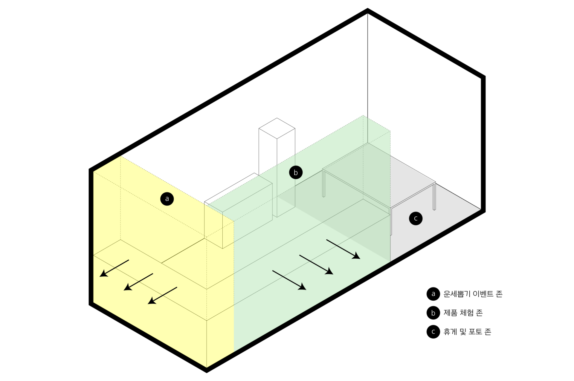
Layout
The space where DOLPOONG’s Cart Bar will be set up is a 2.5m x 6m booth with two open sides. DOLPOONG’s first goal for participating in Seoilpe was to
increase Instagram followers (@dolpoong_APBADAs), so we started planning the layout and content simultaneously to ensure that the follow event and product
sales would be successful. The booth space for ‘Dolpung’s Pojangmacha’ was 2.5m x 6m with two open sides. Since our primary goal was to increase our Instagram
followers (@dolpoong_APBADAs), we planned the layout and content in parallel to optimize both the follower event and product sales.
Booth Design
Once the booth concept and content were finalized, we considered how best to convey the pojangmacha (street food cart) theme through booth design.
Given the nature of the event as a character-focused fair and the storytelling style of our Instagram webtoons, we decided to emphasize
imagery that could be instantly understood. We identified fun and distinctive elements of a food cart and incorporated them into the
design. Interestingly, a pojangmacha comes with many logical design cues of its own:
1. It must be eye-catching from afar → bold colors and strong typography
2. The food must stand out → lighting that highlights the food brightly
3. The detailed menu should only be visible up close
4. Food should be displayed neatly in rows and columns
5. Convenient items should be within easy reach → plastic bags, tissues, and paper cups hanging on the table
By incorporating these elements throughout, and adding showcase refrigerators, folding tables, snack bar kitchenware, and stainless
steel counters, we created a booth design unique to APBADA that immediately evoked the feel of a real pojangmacha (street food cart).
Amidst the crowded fairground filled with countless brands, Dolpungine stood out as a booth that caught visitors’ eyes even from afar, drawing many of them to stop by.
Product Design Summary
In developing new merchandise for the 2022 Seoul Illustration Fair Dolpungine, our top priority was expanding the
APBADA goods category, which had previously focused mainly on stationery and desk items.
We introduced a new line of products with higher price points—such as snowmakers, blankets, and sleep socks—that
reflected the broader “seasonality” of winter. At the same time, to capture the short-term “seasonality” of the
year-end and New Year’s holiday period, we produced new paper goods at more affordable price points.
In addition, we expanded into products with year-round appeal, such as plush keyrings and Jibbitz, which had been
consistently requested by consumers at previous APBADA offline events. This approach allowed us to offer a diverse range of items, from seasonal goods to sustainable, long-term sellers.
Product 01. Blanket
When planning the blanket design, we set the direction to capture both the season of winter and the booth concept of a pojangmacha (street food cart) by focusing
on the nighttime atmosphere. A large illustration of a snowy background was placed on a deep navy base, allowing us to showcase as many APBADAs characters and
their personalities as possible while staying within the 10-color printing limit.
During production, we sampled various materials—from wool fleece to microfiber fabrics—carefully considering how each fabric’s dye absorption would affect the colors. Through
this process, we achieved a blanket with a satisfying tactile feel while also capturing the vibrant colors and charm of the characters to the fullest.

Product 02. Snow Maker
The biggest challenge in creating the Snowmaker was ensuring shape stability, given the fragile nature of snow, while preventing the pure white surface
from looking monotonous. To address this, we added subtle design elements that preserved the overall Dolpung silhouette and center of gravity, allowing
the form to remain visually stable. Details that were previously expressed only through color—such as Dolpung’s belly and the small face graphics—were
enhanced using embossing and debossing techniques, creating depth and detail even within a single color. Finally, Dolpung’s signature identity color was
applied across the entire surface with a matte finish, resulting in a more durable and high-quality appearance that elevated the tactile and visual experience of the product.
Product 03-04. Year-end card & Stickers
[Year-end card]
Created for the Christmas season, these goods used a hand-drawn stroke style to match the cozy mood of the holidays. We prepared two
sticker concepts: a pastel blue ‘winter vacation’ theme and a vibrant red ‘pojangmacha’ theme. Both used a horizontal layout, rather
than a typical vertical one, to make the small graphics more visible and to display well with other products.
[Stickers]
We prepared two sticker sheet concepts. The first was a pastel blue ‘Winter Vacation’ theme that could be used all winter long. The second
was a vibrant red ‘Pojangmacha’ theme that directly reflected the mood of our booth. For both designs, we used a horizontal layout instead
of the narrow, vertical format common for sticker sheets. This allowed the small, intricate graphics to be more visible at a glance. We
also considered how the sheets would be displayed in-store, ensuring the layout would not obstruct other products when placed together.
Product 05. Jibbitz
This product was developed as an extension of our best-selling character charms. At past events, many visitors mistook the charms for Jibbitz, and
we reflected this feedback by producing them with the same silicone material. While the earlier 8-piece set presented a price barrier, this new
release comes as a 2-piece set—making it more accessible and encouraging impulse purchases. By addressing both customer expectations and price
accessibility, we created a product that maintains the charm of the original while broadening its appeal to a wider audience.

Product 06. Calendar
This poster calendar was created for the 2022 Seoul Illustration Fair, which took place just before the New Year. Among many formats—desk, poster,
and card calendars—we chose the poster type because it served both as a practical way to check dates and as an interior decor item.
The initial concept featured Dolpung in a black rabbit costume, representing the 2023 Year of the Rabbit. From there, the design evolved to showcase the unique charm of all the APBADAs characters. Each month’s design was developed with a seasonal keyword in mind, and the characters that best suited the theme were placed within the monthly layout. This approach not only enhanced the cuteness of the calendar but also made the dates easier to read, according to visitor feedback. The final result was a calendar that combined practicality with playful storytelling.
The initial concept featured Dolpung in a black rabbit costume, representing the 2023 Year of the Rabbit. From there, the design evolved to showcase the unique charm of all the APBADAs characters. Each month’s design was developed with a seasonal keyword in mind, and the characters that best suited the theme were placed within the monthly layout. This approach not only enhanced the cuteness of the calendar but also made the dates easier to read, according to visitor feedback. The final result was a calendar that combined practicality with playful storytelling.
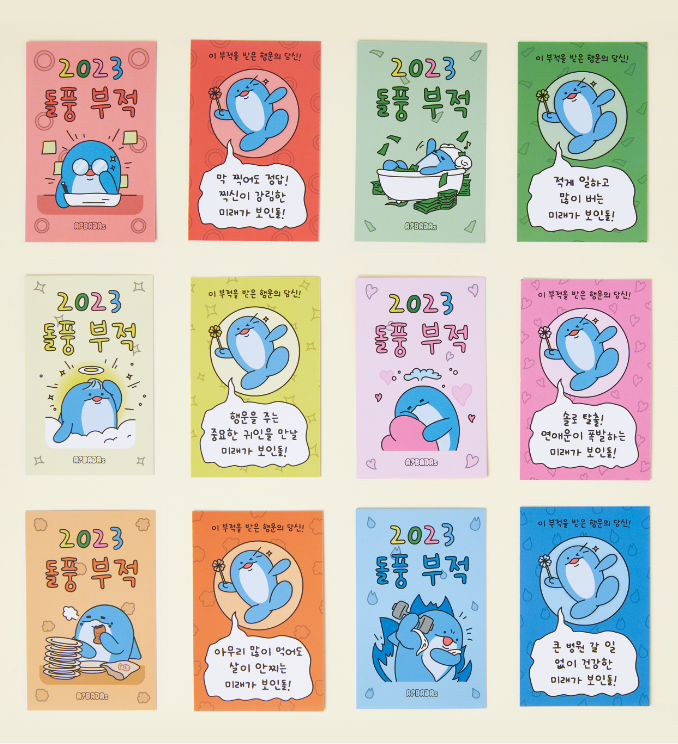
Product 07. New Year Fortune Talisman
At fairs like this, it only takes a single lap around the venue before your bag is stuffed—there are so many booths handing out stickers and postcards just for
a follow. While the excitement from the balloons we gave away at the last Seoul Illustration Fair still hadn’t faded even in winter, our team wanted to prepare
a goodie that could only be found at Dolpung’s pojangmacha.
That’s when we remembered how popular our fortune-drawing event had been, and realized that many people look forward to checking their fortunes at the end of
the year. Inspired by this, we created the New Year Fortune Talisman. From charms for not gaining weight to wealth, love, health, focus, and academic success,
we selected universally positive fortunes and designed them as talismans illustrated with Dolpung.
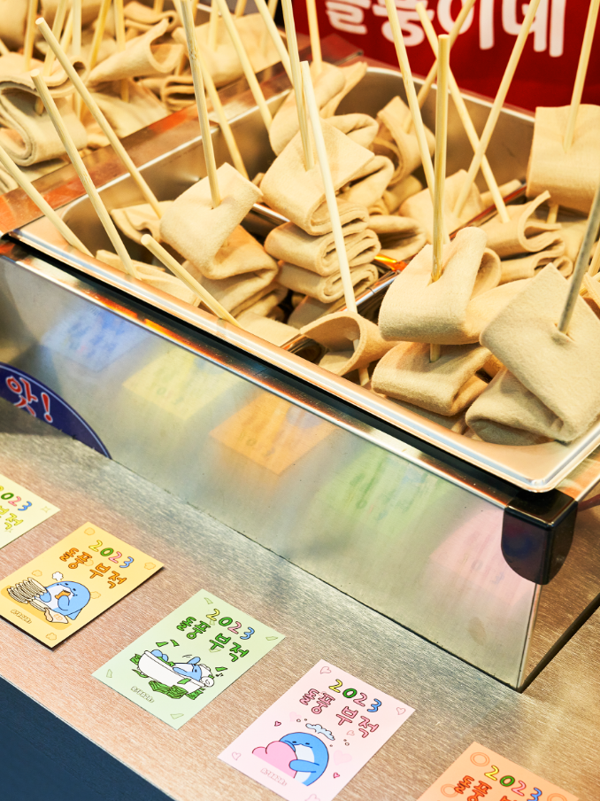
The event matched the pojangmacha concept: when customers picked a fish cake skewer, the staff would immediately read out their New Year fortune. Thanks to the surprisingly realistic
fish cake props—so convincing that people wondered if they were real—and the cheerful energy of the Dolpungine staff, we were able to introduce our booth to more than 4,000 visitors.
Product 08. Sleep Socks
These sleep socks were designed as a perfect winter-season item, matching well with pastel colors and a cute aesthetic. When considering the designs,
we explored several directions: character patterns, socks with character arms and legs as playful points, and even quirky ‘B-grade’ style concepts.
After much discussion, we decided to move forward with a design that placed the characters’ faces on the soles of the socks, balancing popularity,
consumer preference, and production cost. At first glance, the socks look ordinary and can be worn daily, but the hidden character faces on the soles
add an element of fun. Internally, we developed these goods under the concept of ‘incognito sleep socks.’
Product 09. Doll Pouch
With the popularity of the APBADAs character dolls, we developed smaller keychain versions that can be carried anywhere. To enhance practicality, we designed them as
mini pouches that can hold AirPods, lipstick, or small accessories, and they can even function as coin purses. To capture each character’s unique charm while emphasizing
cuteness, we slightly adjusted their proportions, creating an adorable “mini-me” version of the APBADAs lineup. For the crab character “Gerter,” we also experimented
with a bubble-blowing design sample. Although production costs prevented mass production, the internal response to this prototype was overwhelmingly positive. We hope
to revisit and produce this special edition in the future.
Product 10. Rubber gloves
To showcase the multi-legged features of the characters Kkumi and Ttugi, we proposed rubber gloves—a practical item used in everyday life that also
integrates the APBADAs worldview. Since rubber gloves are typically hung on the sink to dry, we imagined that even in a household setting, the characters’
distinctive traits could shine through. We also came up with a playful idea to package and sell them in bundles resembling squid packaging, further reinforcing
the pojangmacha (street food stall) concept. This direction allowed us to break away from the more common stationery items and explore kitchenware goods as a
new category for APBADAs merchandise. Although mass production was not possible due to high minimum order quantities, the samples were showcased at the Seoul
Illustration Fair, where they received very positive feedback from visitors.
Product 11. Party Candles
We proposed party candles as a merchandise item designed for year-end parties, gatherings, and birthdays, as well as for adding a special celebratory mood to everyday
desserts. This concept reached the final design stage, as we saw great potential for promoting the APBADAs characters through photogenic moments. Unfortunately, due
to production schedule constraints, it never made it to mass production. The idea was to allow people to feel the joy of celebrating together by using candles featuring
the APBADAs friends, creating not only a festive atmosphere but also a memorable keepsake in photos. Though unrealized, we still hope this item will be developed in the future.
Package Design Summary
We designed the packaging to enhance the immersive experience for visitors at our booth during the Seoul Illustration Fair, allowing them to
feel even more connected to Dolpungi-ne. The packaging not only highlighted the goods but also extended the playful concept to the moment
visitors carried them home. Inspired by pojangmacha street stalls and casual Korean snacks, the packaging was developed to reflect the fun of the theme.
Since our merchandise ranged from small postcards and stickers to large dolls, we designed packaging in three sizes—large, medium, and small—to
suit each item. Many visitors at the fair shared feedback that the packaging and concept were memorable and fun, which made us proud, as we
believe it also contributed to stronger sales.
Package 01. Tteokbokki container
This was the packaging that stayed truest to the concept. It instantly brought to mind pojangmacha street stalls and casual
snacks, and the effect was even stronger when the small APBADAs doll was placed inside.
To create the tteokbokki-style packaging, we even purchased a heat-sealing machine—something we hesitated over until the very
last moment. In hindsight, it was the best decision. Not only did the slightly pressed look of the doll inside the container
add to the cuteness, but sealing the packages directly on-site also became a fun performance element.
Package 02. Plastic Bag
This packaging was created for medium-sized, bulkier items, excluding large dolls and small stationery. It worked especially well in
combination with the tteokbokki container, amplifying the pojangmacha synergy. It even allowed us to recreate the food-cart detail of
hanging a stack of plastic bags to tear off and use on the spot—making it an indispensable element of the concept.
Rather than generic white or black bags, we used APBADAs’s signature color to increase the sense of completion. For the artwork, we chose
the character “Ori” carrying the APBADAs friends on its back in flight, symbolizing “swift delivery.” The Dolpungine logo was designed
in a rounded arch style, giving the impression that there might really be a Dolpungine shop out there.
Package 03. Round Sticker
We created round stickers to showcase the characters’ playful and expressive faces. From the contrasting moods of Dolpung and Dolpung-E, to the
look-alike sisters Kkumi and Ttugi, the anxious Bokjangi, and the gentle smile of Ori, each design gives a glimpse into their unique personalities.
These stickers were applied to paper bags and tteokbokki containers, not only serving a practical purpose as seals but also adding another layer
of charm by making the packaging itself more memorable and engaging.
Package 04. Paper Bag
We designed a paper bag to hold the smallest stationery items—such as postcards, stickers, pens, and charms. While paper bags are commonly used for stationery,
we borrowed the structure of food packaging, like fish-shaped bread or fried snack bags, to instantly evoke the feel of a pojangmacha (street food stall). To
emphasize this playful mood, the bag was printed in a single color using the APBADAs signature blue, keeping the design simple yet distinctive. The artwork
featured all the APBADAs characters gathered together, giving visibility to the brand’s lineup, while the brand name “Dolpungine” was placed prominently at
the top—reminiscent of the branding on traditional Bungeobbang bags. This design not only carried the items but also conveyed the full street food cart
experience, extending the booth concept down to even the smallest goods.
Package 05. Felt bag
For the largest dolls, we focused on utility and eco-friendliness over the concept. We chose a reusable, non-woven fabric bag so it wouldn’t be thrown away after
one use.This packaging was designed to hold our largest dolls. Since there were no food-inspired containers big enough for the “large” size, we prioritized utility
and eco-friendliness over concept. To avoid excessive bulk and to prevent the bag from being discarded after a single use, we chose a non-woven fabric bag as a
reusable shopping alternative. Because this packaging was intended for continuous use, the design emphasized visibility of the Dolpung character from APBADAs
rather than the Dolpungine food-cart theme.
Behind Story
This is the scene at ‘Dolpung’s Pojangmacha.’ Thanks to the explosive interest over the four days of the fair, our Instagram followers surpassed 10,000!
Instagram Story
About 80 Instagram stories featuring reviews of ‘Dolpung’s’ were uploaded, and these are the regrams. Thank you so much for your interest!
- Amorepacific Creatives
- Project Planning
- Yoo Doyeong, Kim Yura, Cho Youngin
- Space Planning & Design
- Kim Yura, Son Sangyun, Yoo Doyeong, Cho Youngin
- Merchandise Design
- Kim Yura, Kim Taeeun, Yoo Suah, Cho Youngin
- Package Design
- Kim Taeeun, Yoo Suah
- Photography
- Lee Yunjin


![Exhibition [The House of Beauty Scientists] 's work list thumbnail](https://cdn-design.amorepacific.com/contents/2024/08/02172154/24_88_list_thumb.jpg)