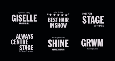
Mise-en-Scène New BI - Wordmark & Symbol System
Summary
Mise-en-scène began in 2002 as a hair coloring brand and has since grown into a total haircare brand focused on styling.
This new BI (Brand Identity) project was initiated to align the brand with global expansion and digital communication
environments. At the center of the redesign are a new wordmark that visually reconstructs the brand’s philosophy and a new symbol that inherits its core identity.
01. New Wordmark : A Cinematic Identity
Overview
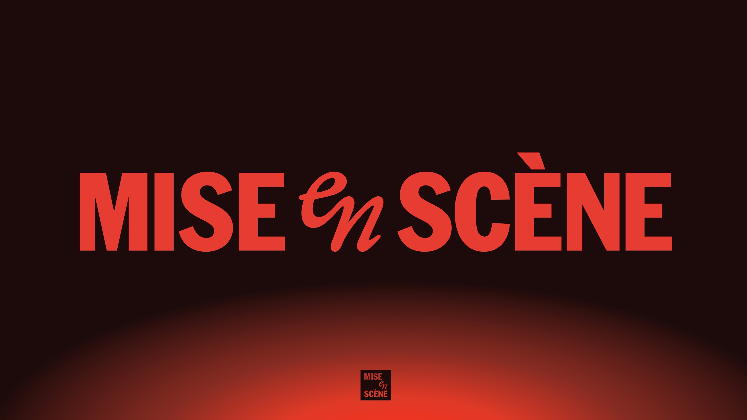
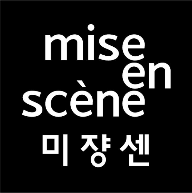
The name “Mise-en-scène” originates from the French term meaning “the staging of a scene” in film.
This project focused on making that concept more intuitively understood.
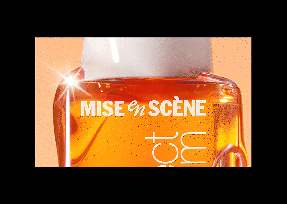
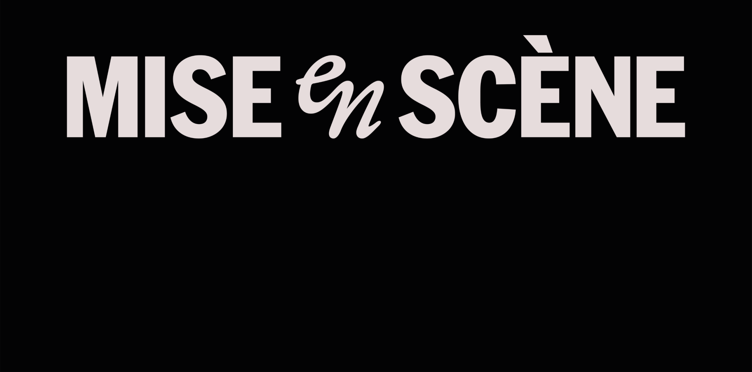
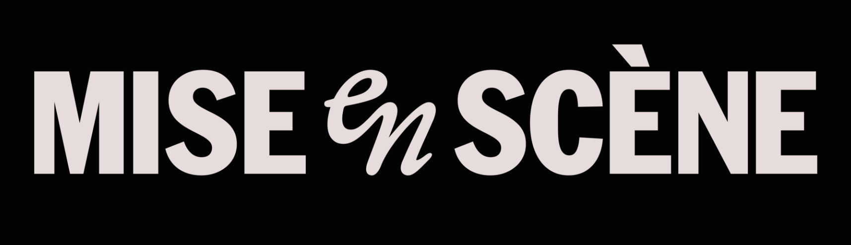
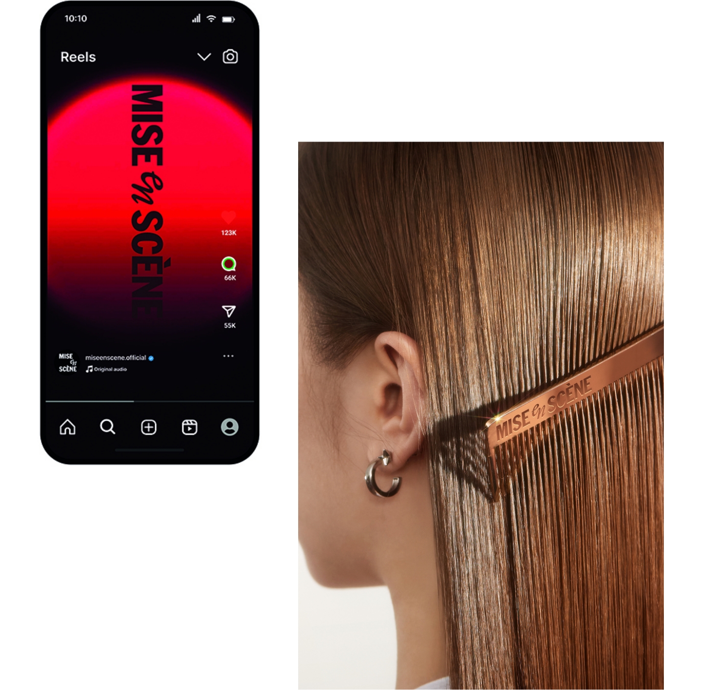
The new wordmark visualizes the brand message—“styling is self-direction”—by arranging the brand name in a cinematic, scene-like structure.
Through this, the name itself becomes a stage that embodies the brand’s worldview.
Previous Logo
The former black square logo was effective in offline environments but presented legibility and complexity issues when scaled down for mobile or global platforms.
Additionally, the French brand name was a barrier to global consumers who could not easily read or pronounce it.
These challenges demanded a structural redesign of the entire BI system. A key goal was to introduce a single-language structure and a visually narrative-driven system.
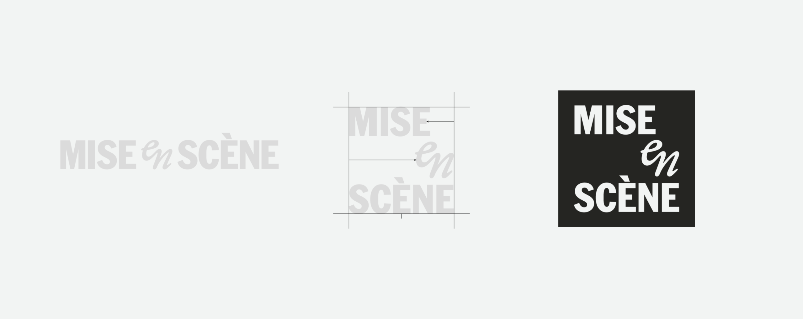
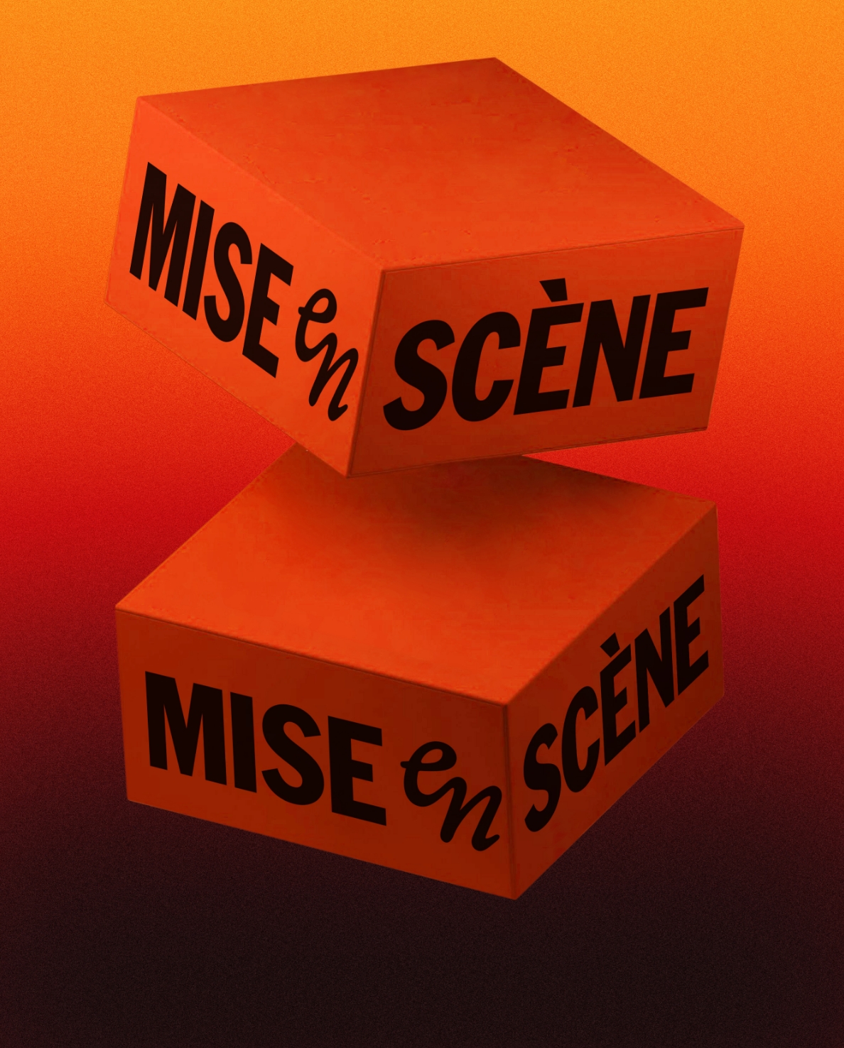
The new wordmark draws inspiration from the brand name and is visualized not simply as a text combination, but as a cinematic structure staged like a scene.
This is the most direct expression of the brand philosophy that “styling is self-direction.”
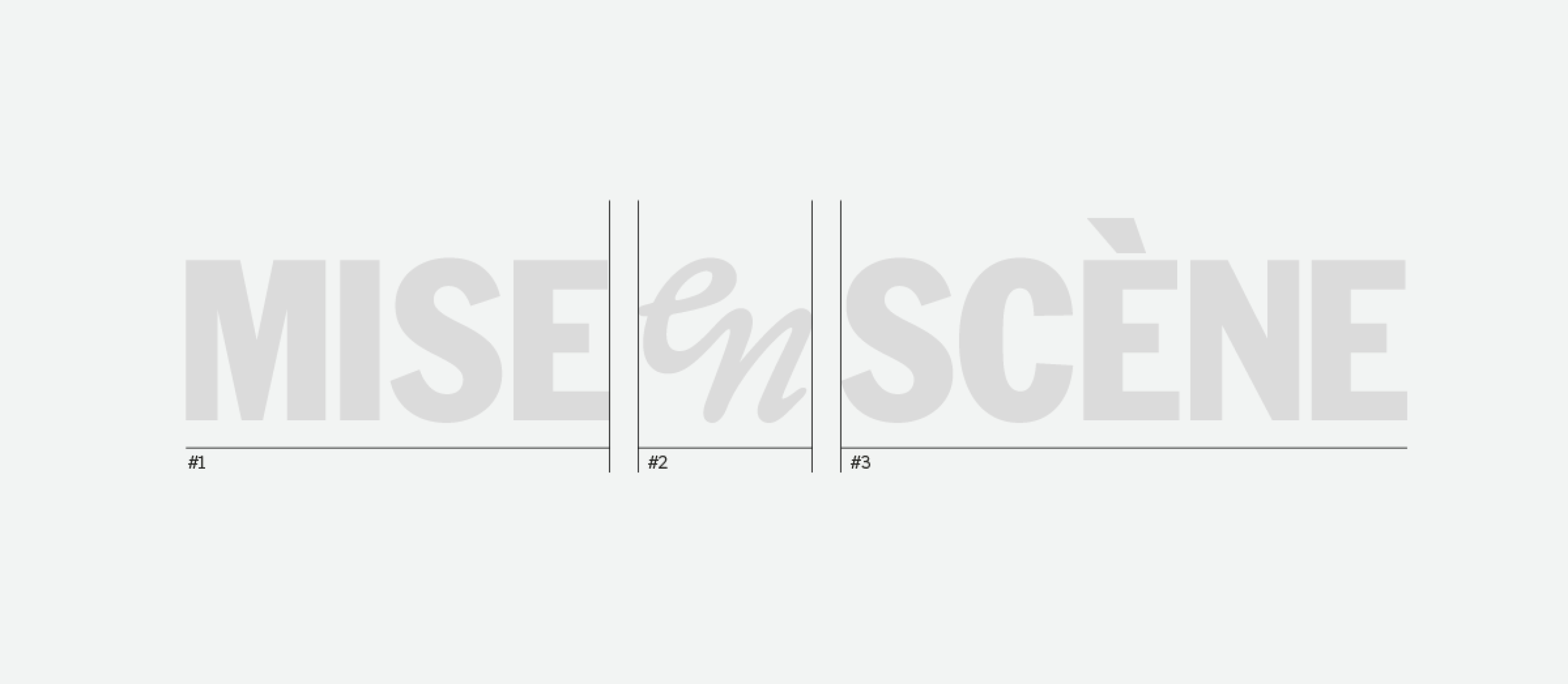
The wordmark separates and refines the words ‘MISE,’ ‘en,’ and ‘SCÈNE’ into visually distinct units, guiding the viewer’s eye and reinforcing the meaning.


Each syllable is differentiated through sharp contrast in weight, size, and serif presence. ‘MISE’ and ‘SCÈNE’ are rendered in bold, upright sans-serif
typefaces that convey stability and emphasize a cinematic mood. The ‘en’ is crafted in a script style, metaphorically expressing the flick of styled hair.
Designed as a single glyph, it adds rhythm and flexibility to the overall composition. Its intentional asymmetric alignment naturally draws the eye toward
‘SCÈNE.’ Through the segmentation and visual emphasis on ‘SCÈNE,’ users can intuitively interpret the brand name and naturally associate it with the English word “scene.”
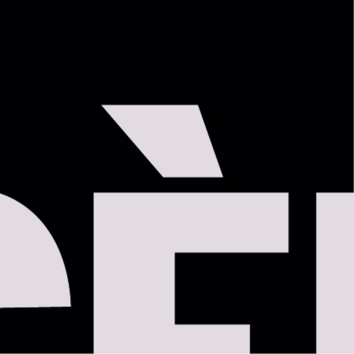


02. Symbol : the legacy black square

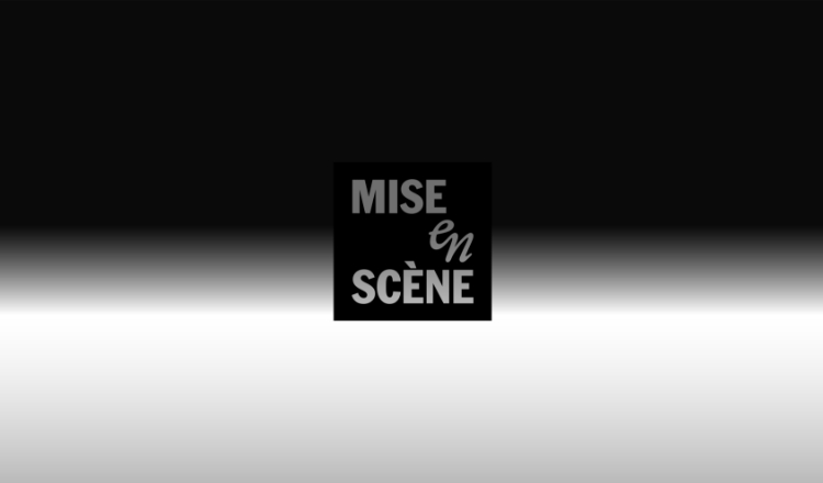
The new symbol preserves the symbolic and emotional value of the long-standing black square
logo while visually reflecting the brand’s evolved direction and philosophy.
logo while visually reflecting the brand’s evolved direction and philosophy.
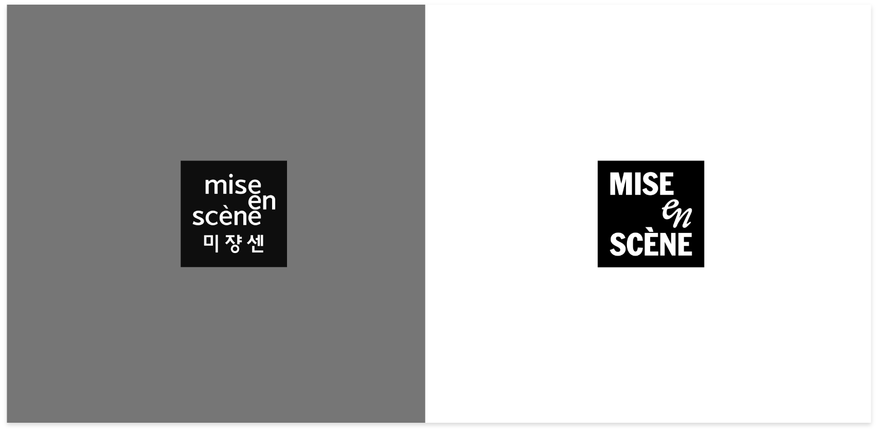
While the original black square logo had strong shelf presence, it featured a visually dense composition with triple-E
typography and bilingual content within a square frame—limiting its versatility on mobile and digital platforms.
As the logo transitioned to a wordmark form, the legacy black square was redefined as a supporting symbol.
The symbol design is a condensed reflection of the wordmark’s visual structure.
By placing the key word ‘SCÈNE’ at the visual center, it delivers a consistent narrative aligned with the brand’s message.
It is designed to work effectively both alongside the wordmark and as a standalone element, maintaining high legibility and recognizability.
In real-world application, it shows strong adaptability and cohesion across touchpoints.
Brand Concept
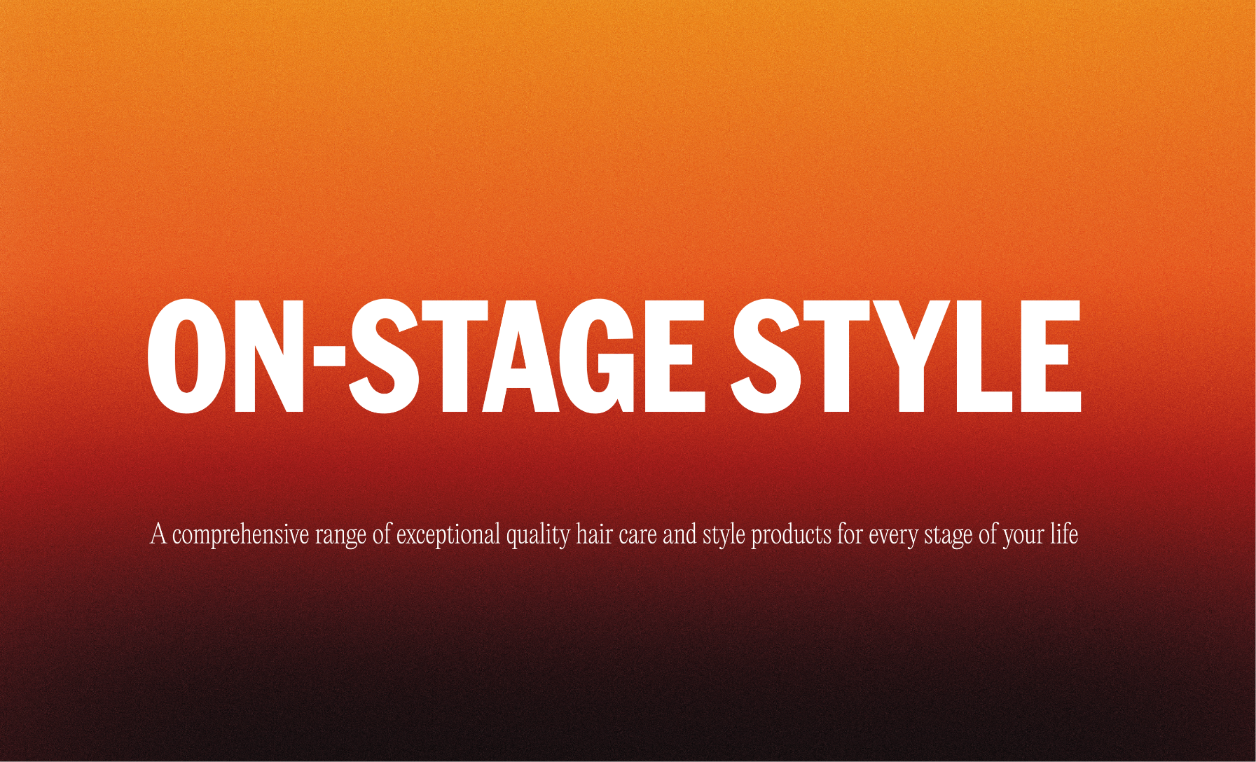
Mise-en-scène’s new brand concept is redefined as ON STAGE STYLE. Where the brand once positioned itself as an artist on
stage—admired from a distance—it now expands the concept of stage into daily life. In 2025, Mise-en-scène’s “stage” broadens to encompass every moment in life.
No longer a mere observer, the brand becomes a part of customers’ everyday scenes, offering haircare and styling solutions
that help them shine with glossy, stage-ready hair at every life stage.
Typography
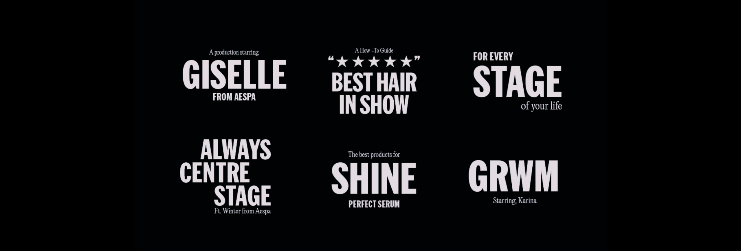
The brand’s new typographic system is inspired by film, theater, and performance posters, reinforcing its bold visual identity.
The cinematic sans-serif serves as the primary voice for impactful messaging, balanced by a contrasting sub-typeface that conveys
elegance and sophistication. Together, this dual-typeface system captures the brand’s uniquely expressive, dramatic tone and ensures
consistent editorial-style communication across all design applications.
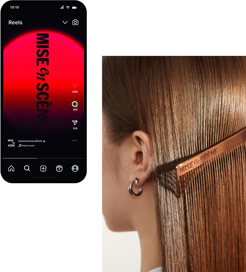
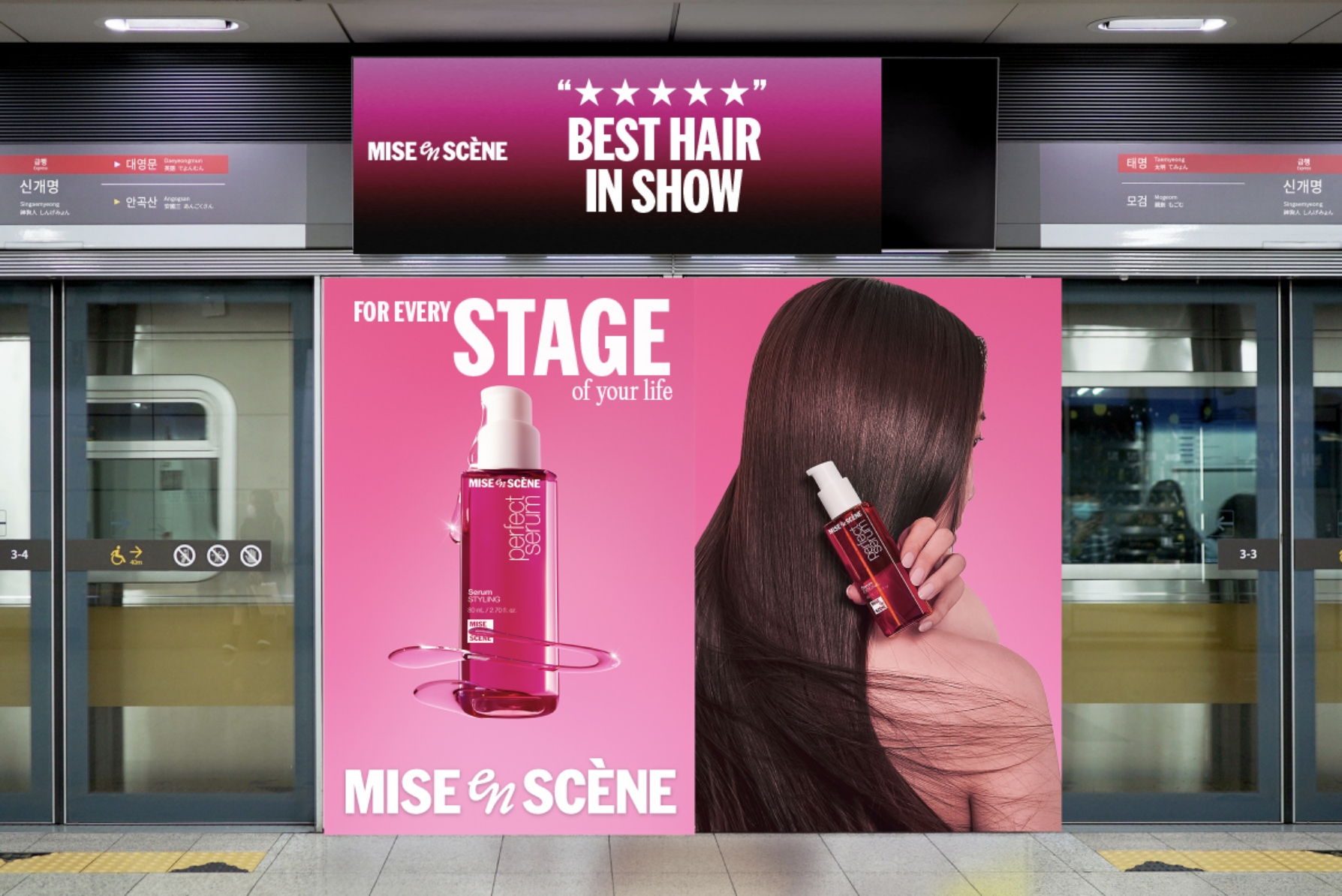
Brand Visual Identity in Use
- Amorepacific Creatives
- Design
- Kang Minhee, Koo Hyewon, Kim Soyoung
- Baek Inwoo, Lee Sungyub, Choi Eunhye
- Kang Minhee, Koo Hyewon,
- Kim Soyoung, Baek Inwoo,
- Lee Sungyub, Choi Eunhye
- Logo Design with
- BASE Melbourne
- BM
- Byun Jongwook, Lee Yoonju
- Visual
- Motiv Ideas, Kang Minhee, Lee Sungyub
- Motiv Ideas, Kang Minhee,
- Lee Sungyub
- Photography
- Shin Sangwoo, seongyoun.vhae Studio