HOLITUAL Ultra Nourishing Advanced Skincare
Summary
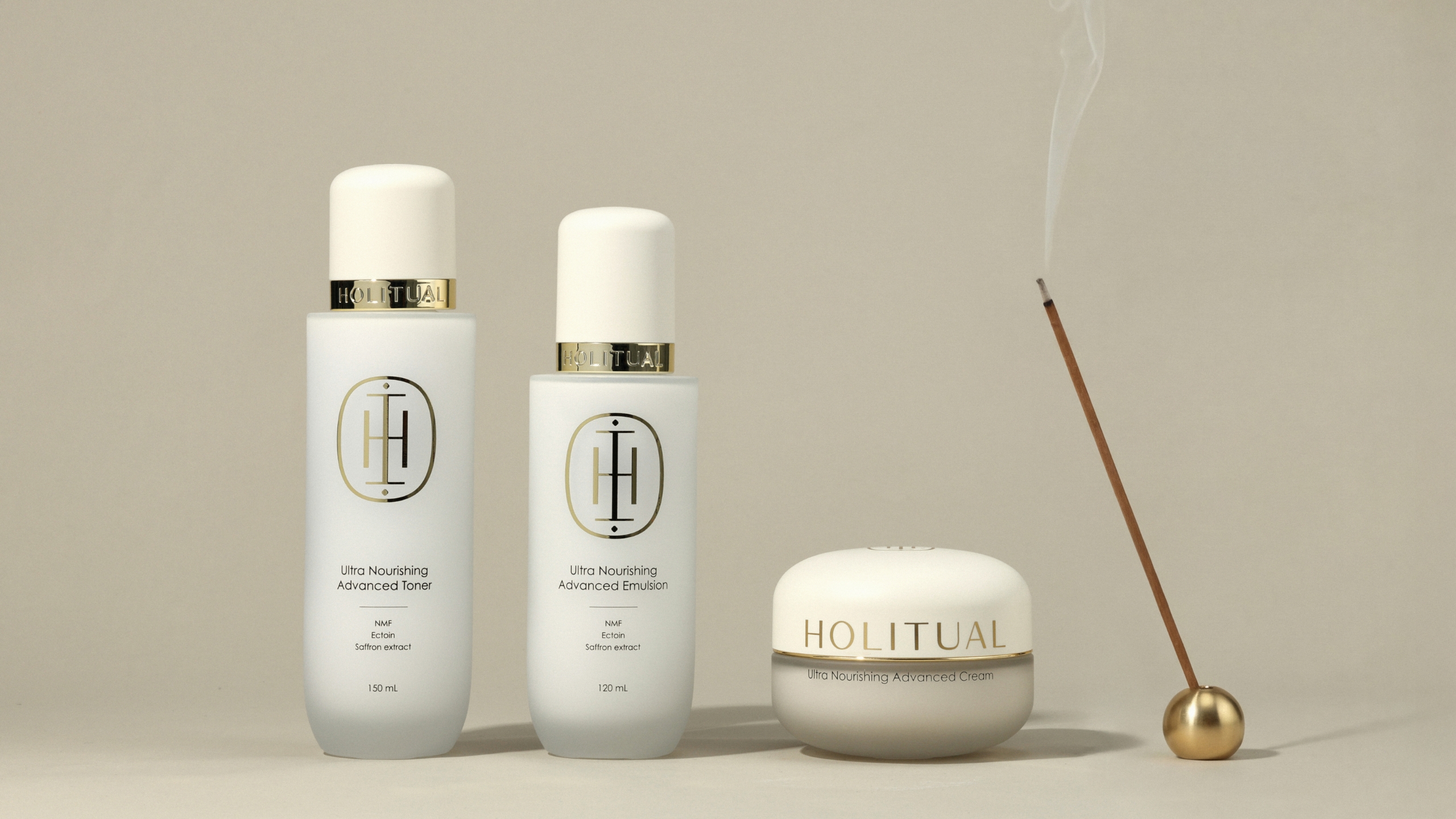
The Ultra Nourishing Advanced Line represents HOLITUAL’s most refined approach to total anti-aging care.
This premium skincare collection is designed to empower the skin to withstand extreme environments and the passage of time.
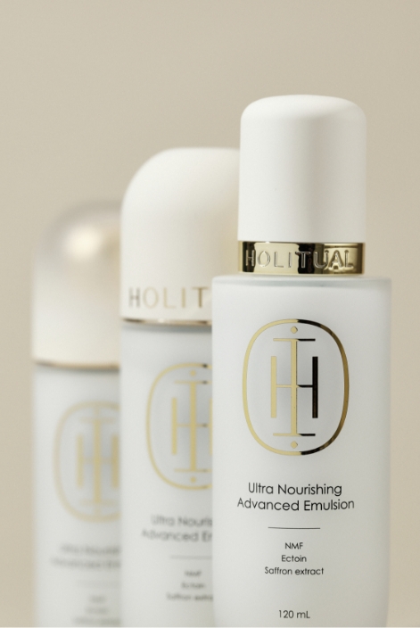
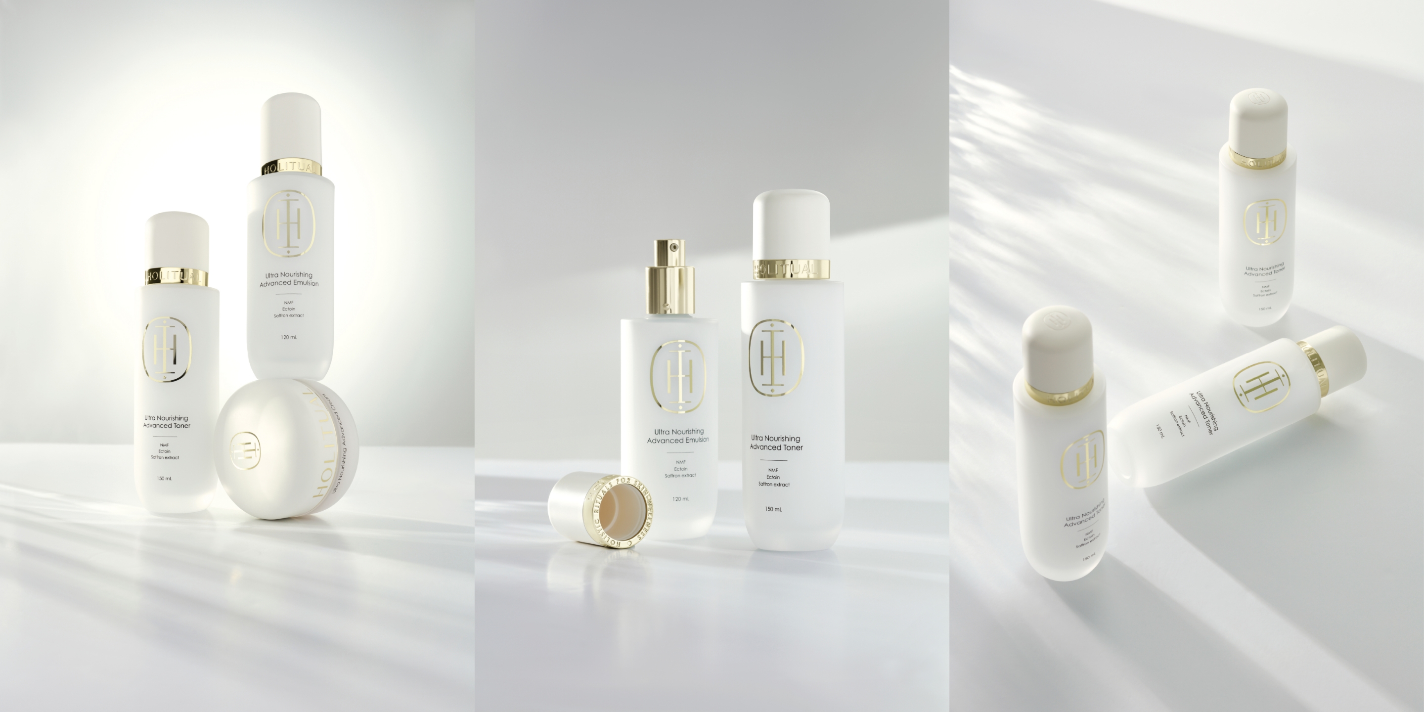
The design for the new Toner and Emulsion expands upon the visual heritage established by the Ultra Nourishing Cream.
It originated from a commitment to create a cohesive and unified aesthetic across the entire product line.
Shape
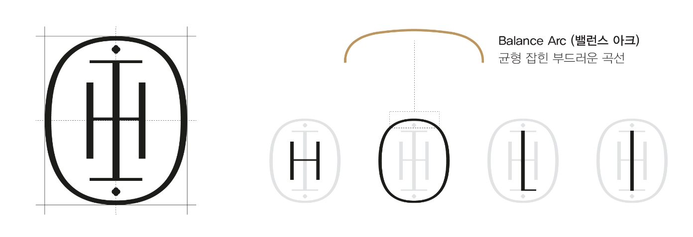
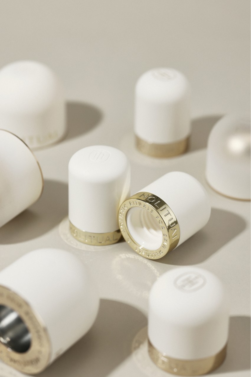
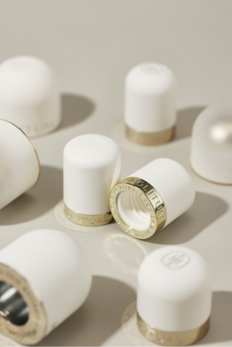
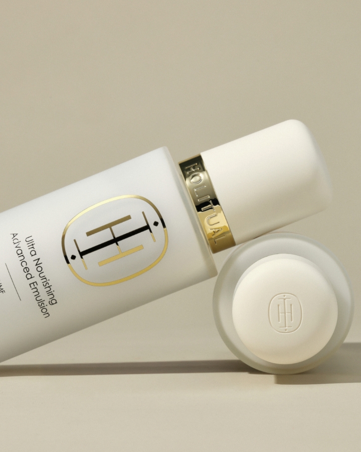
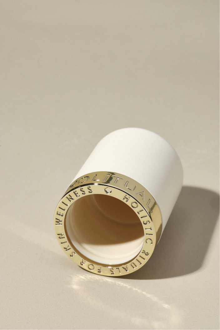
The HOLITUAL symbol is a form created by sculpturally reconstructing the letters H, O, L, and I from the brand logotype.
Through the harmony of straight lines and curves, perfect symmetry, and a balanced axial structure, it embodies the ‘refined order’ that the brand pursues.
In particular, the gentle curve at the top softens the overall visual impression and provides a sense of stability; this element is defined internally as the ‘Balance Arc.’
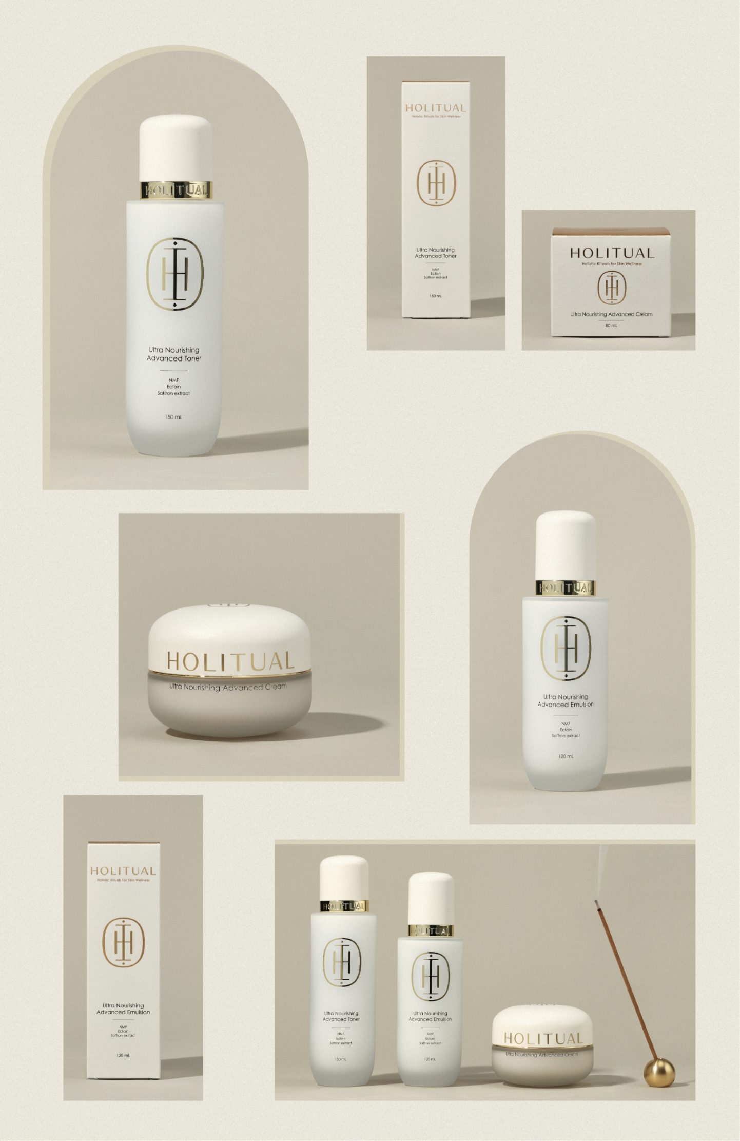
This specific curve is applied to the cap of the Ultra Nourishing Cream, serving as the formative standard that defines the overall product design.
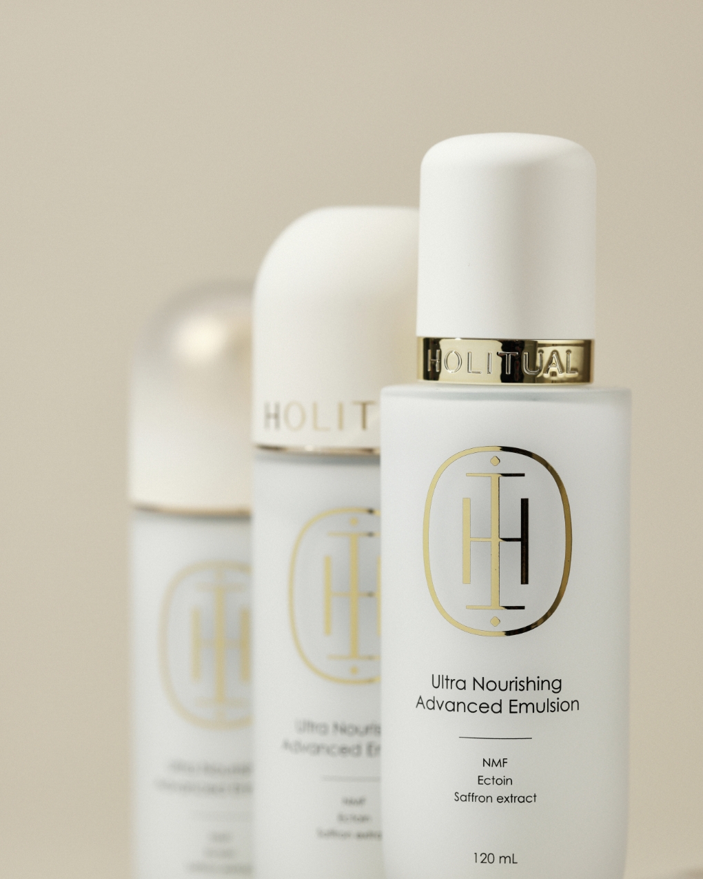
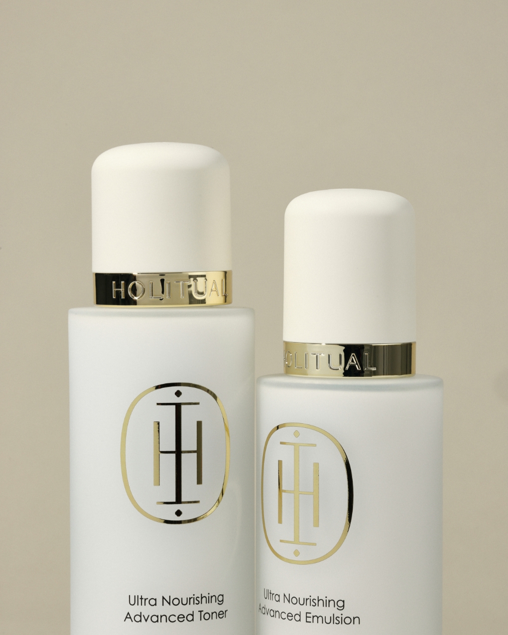
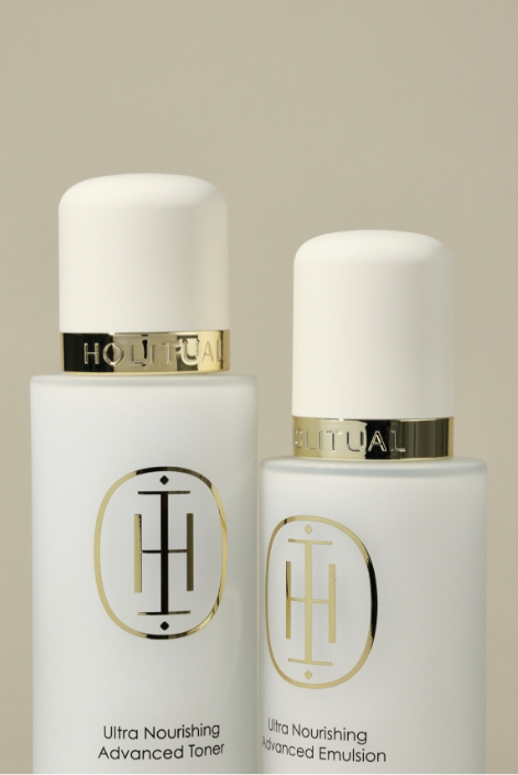
For the Toner and Emulsion, we sought to extend the ‘language of curves’ established by the Cream within the same design context.
Working within the constraints of using stock containers, we carefully adjusted the top and bottom curvatures to achieve harmony.
We refined the overall proportions to maintain a visual resemblance to the Cream while ensuring the cap did not appear overly voluminous.
Additionally, while the symbol was applied to the top of the cap as with the Cream, we opted for debossing instead of gold foil to accommodate the limited surface area. This approach ensures the symbol is perceived with greater balance within the product’s silhouette.
Additionally, while the symbol was applied to the top of the cap as with the Cream, we opted for debossing instead of gold foil to accommodate the limited surface area. This approach ensures the symbol is perceived with greater balance within the product’s silhouette.
Material
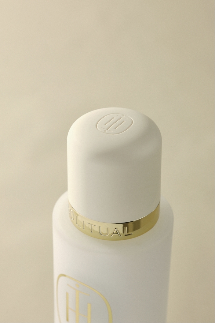
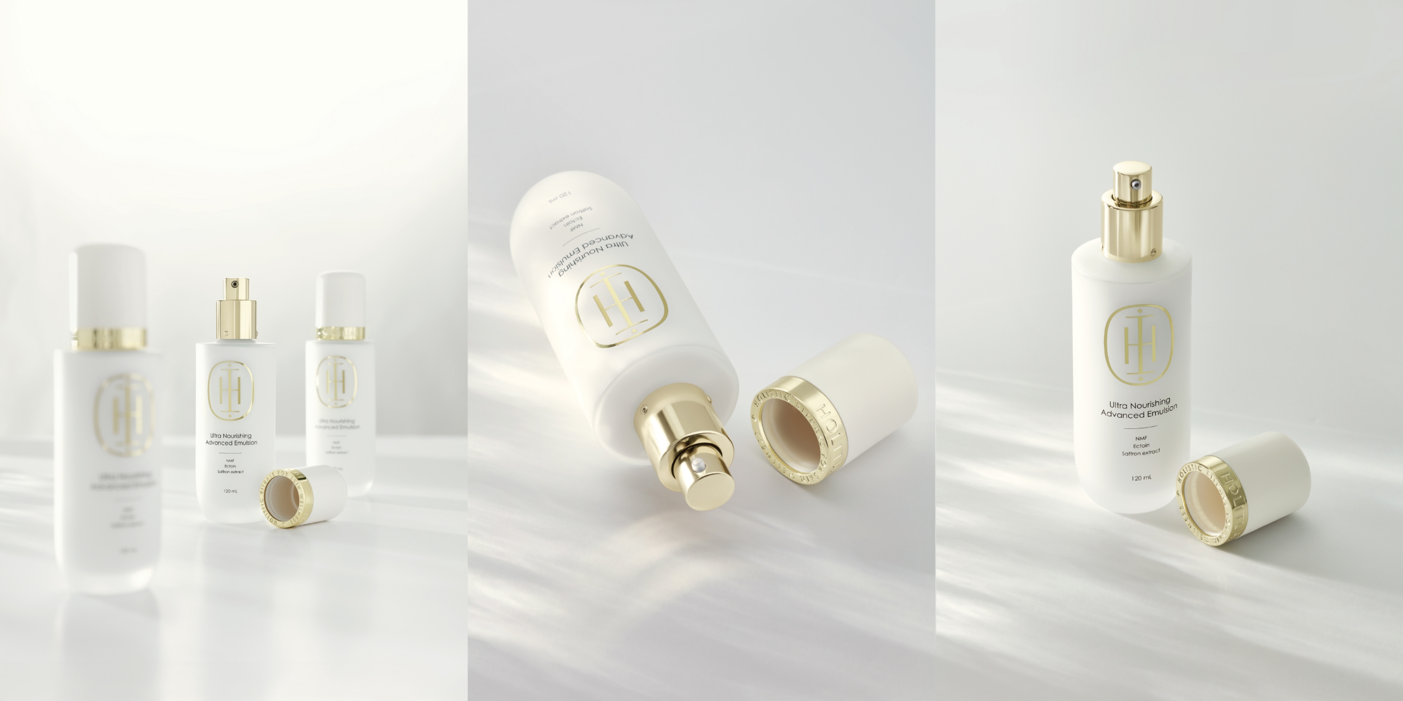
Material Gold serves as a pivotal element in communicating luxury within HOLITAUL’s design language.
Just as the Ultra Nourishing Advanced Cream utilized gold as a restrained accent, we applied this same principle to the Toner and Emulsion.
Rather than covering the entire product, gold is strategically placed at key focal points to naturally assert the premium status of the line.
From the front view, the HOLITUAL wordmark commands a strong presence, sitting above the bold gold section of the symbol. Furthermore, the design is engineered to reveal the debossed brand slogan, ‘HOLISTIC RITUALS FOR SKIN WELLNESS,’ the moment the cap is opened. These details transform the entire usage process into a seamless ritual, fostering a natural and deep connection between the customer and the brand.
From the front view, the HOLITUAL wordmark commands a strong presence, sitting above the bold gold section of the symbol. Furthermore, the design is engineered to reveal the debossed brand slogan, ‘HOLISTIC RITUALS FOR SKIN WELLNESS,’ the moment the cap is opened. These details transform the entire usage process into a seamless ritual, fostering a natural and deep connection between the customer and the brand.
Material
Material Gold serves as a pivotal element in communicating luxury within HOLITAUL’s design language.
Just as the Ultra Nourishing Advanced Cream utilized gold as a restrained accent, we applied this same principle to the Toner and Emulsion.
Rather than covering the entire product, gold is strategically placed at key focal points to naturally assert the premium status of the line.
From the front view, the HOLITUAL wordmark commands a strong presence, sitting above the bold gold section of the symbol. Furthermore, the design is engineered to reveal the debossed brand slogan, ‘HOLISTIC RITUALS FOR SKIN WELLNESS,’ the moment the cap is opened. These details transform the entire usage process into a seamless ritual, fostering a natural and deep connection between the customer and the brand.
From the front view, the HOLITUAL wordmark commands a strong presence, sitting above the bold gold section of the symbol. Furthermore, the design is engineered to reveal the debossed brand slogan, ‘HOLISTIC RITUALS FOR SKIN WELLNESS,’ the moment the cap is opened. These details transform the entire usage process into a seamless ritual, fostering a natural and deep connection between the customer and the brand.


Visual
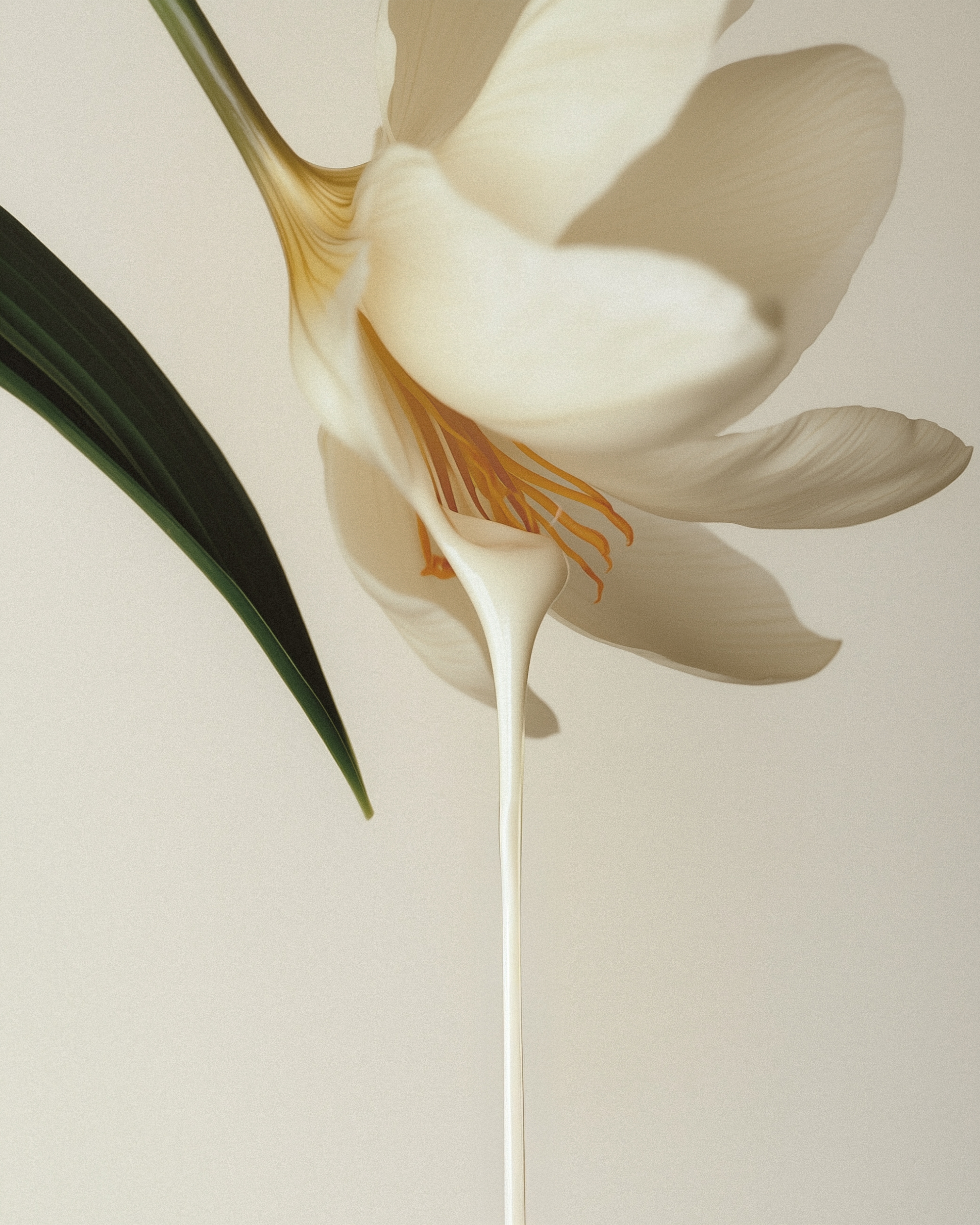
To visually expand the product’s design language, we utilized generative AI during the visual production process.
Our goal was to stage an image where the container sits in perfect equilibrium upon a rounded, curved surface, reflecting HOLITUAL’s core value of balance between body and mind.
Due to the physical limitations of fabricating such props, we adopted a hybrid approach: the product containers were captured through photography, while the ceramic base was created using generative AI and then composited.
Initially, we explored various styles using Midjourney, and subsequently refined the forms and textures using Gemini’s Nanobanana to enhance the final quality.
Applying this same process, we also visualized the toner flowing from a Saffron flower—the line’s key ingredient—to intuitively convey the sensorial experience of the product.
Applying this same process, we also visualized the toner flowing from a Saffron flower—the line’s key ingredient—to intuitively convey the sensorial experience of the product.
The Ultra Nourishing Advanced Toner
and Emulsion share a consistent
design language with the Cream,
visually expanding the balanced care
experience that HOLITUAL pursues.
and Emulsion share a consistent
design language with the Cream,
visually expanding the balanced care
experience that HOLITUAL pursues.
- Amorepacific Creatives
- Product Design
- Kang Sooji
- BM
- Yoon Hana
- Development
- Son Bobae, Kang Kyunghee
- Photography
- Shin Sangwoo, Kim Dooyeon