AMOREPACIFIC communication PROJECT ‘BEAUTY IN MOTION’
Summary
Beauty in Motion is a communication message created to drive change in the organizational culture and ways of working among internal members. Beyond simply delivering a message, its core objective was to help members personally understand the meaning of change and translate it into action.
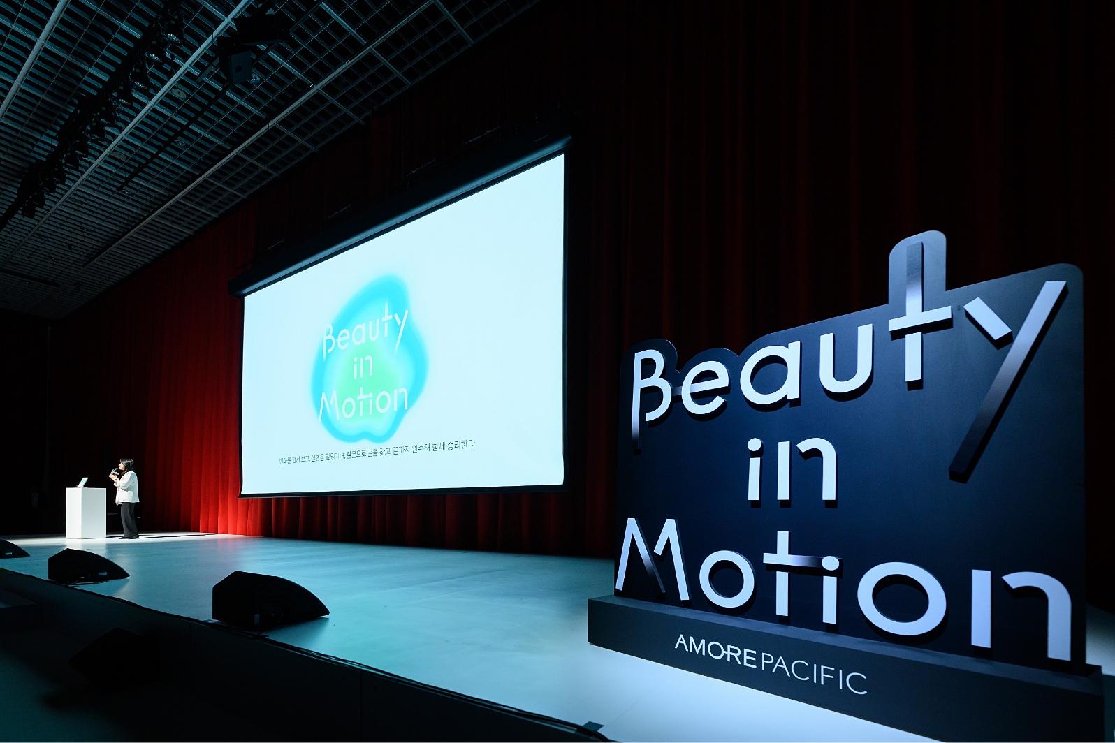
To achieve this, we developed a logo that visually establishes the campaign’s identity, along with a key visual that intuitively communicates the campaign’s values and direction to members. The design direction was centered on how to express the meaning embedded in the name “Beauty in Motion” — movement, change, and the beauty that Amorepacific pursues — through a visual language.
The developed logo and key visual assets were first unveiled at a company-wide sharing session held at Amore Hall, and will continue to serve as a visual expression of the evolving ways of working among members.
‘Beauty in Motion’
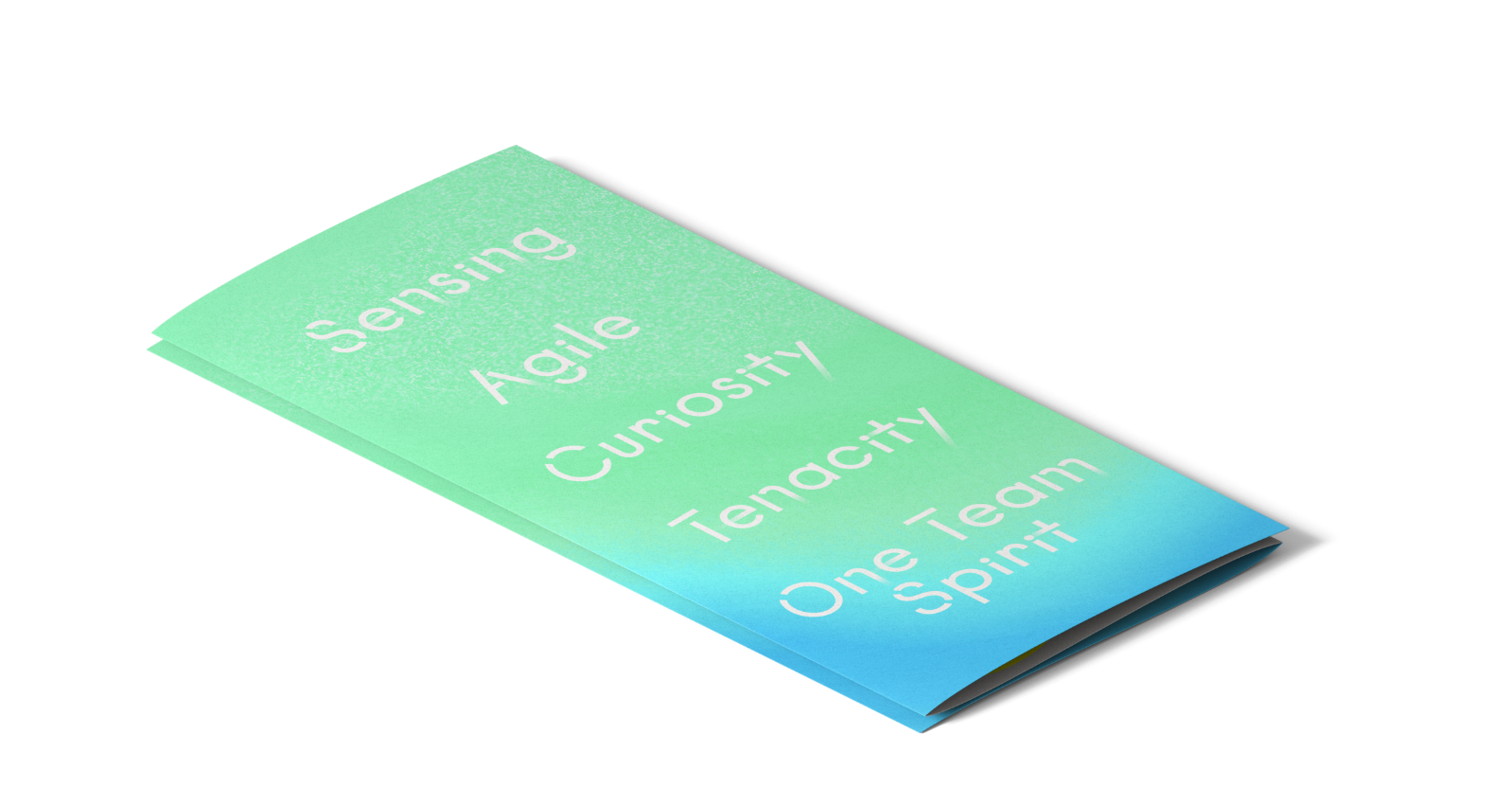
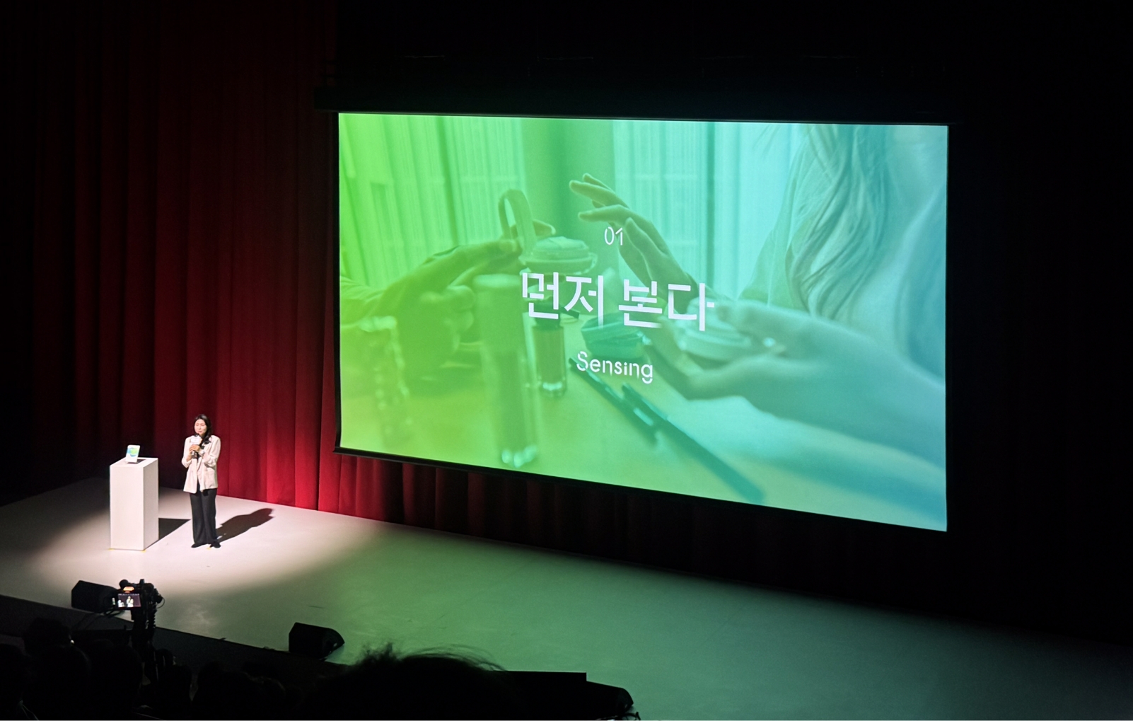
Sensing · Move Fast · Ask Questions
· See It Through · Win Together
· See It Through · Win Together
Beauty in Motion is built around five key phrases: Sensing, Move Fast, Ask Questions, See It Through, and Win Together.
Each phrase offers a clear direction for how members define their way of working, and together,
they form the broader picture of the organizational culture that Beauty in Motion aims to create.
The design process began with the question of how to visually express the meaning and energy of these keywords.
The core challenge in developing the logo and key visual was to translate a way of working defined
through words into a visual language that members could intuitively understand and relate to.
For this, we carried out an ideation process centered on “Motion,”
the core word of Beauty in Motion, deriving a range of visual keywords from it.
the core word of Beauty in Motion, deriving a range of visual keywords from it.
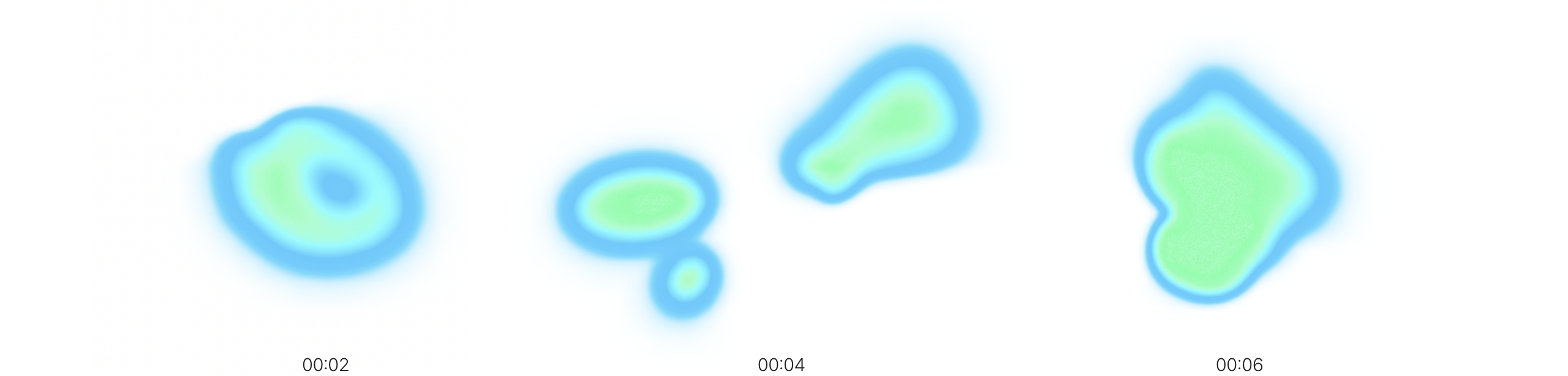
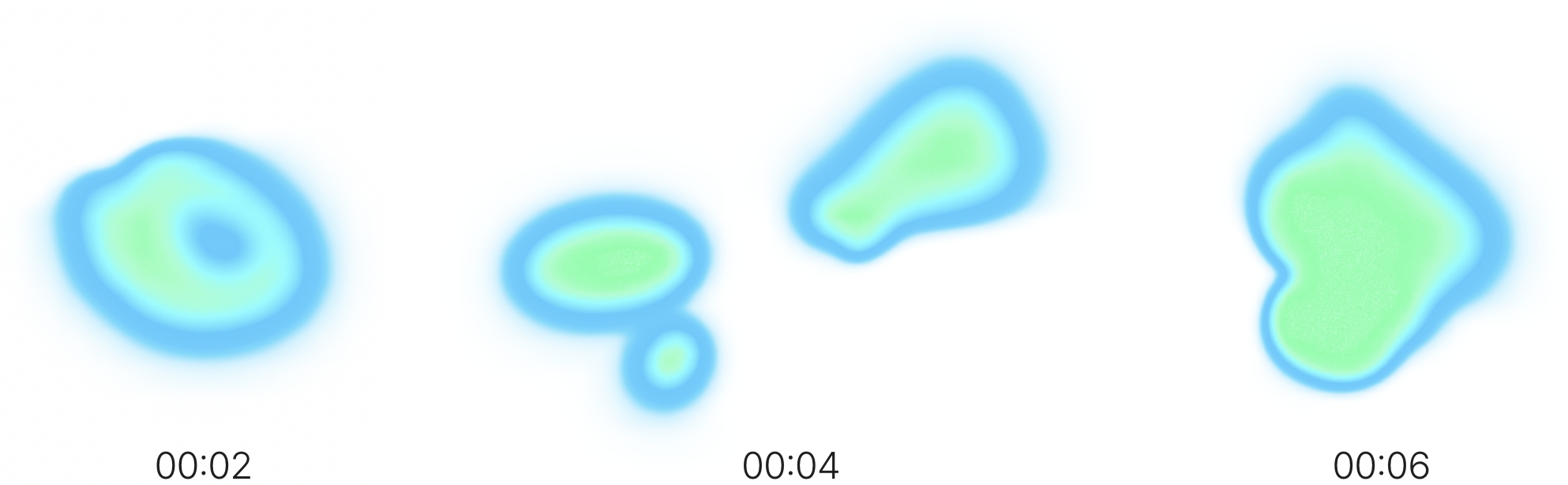
The core concept of the key visual is “continuous motion.” It visually expresses a flow in which one large mass gradually breaks down into smaller units; these smaller units move with greater speed and agility, and at times come together as one to move toward a shared goal.
This concept naturally encompasses the meanings behind the five keywords of Beauty in Motion. The ability to sense what is ahead and move quickly, the attitude of moving forward through constant questioning, the executional drive to see things through, and the strength to unite and overcome challenges together at decisive moments — all of these are embedded in a single movement, where masses divide and come together again.
Based on this idea, we created a motion-based key visual that captures the process of masses splitting apart and gathering together, expressing the energy of Beauty in Motion not as a static image, but as a living, moving form.
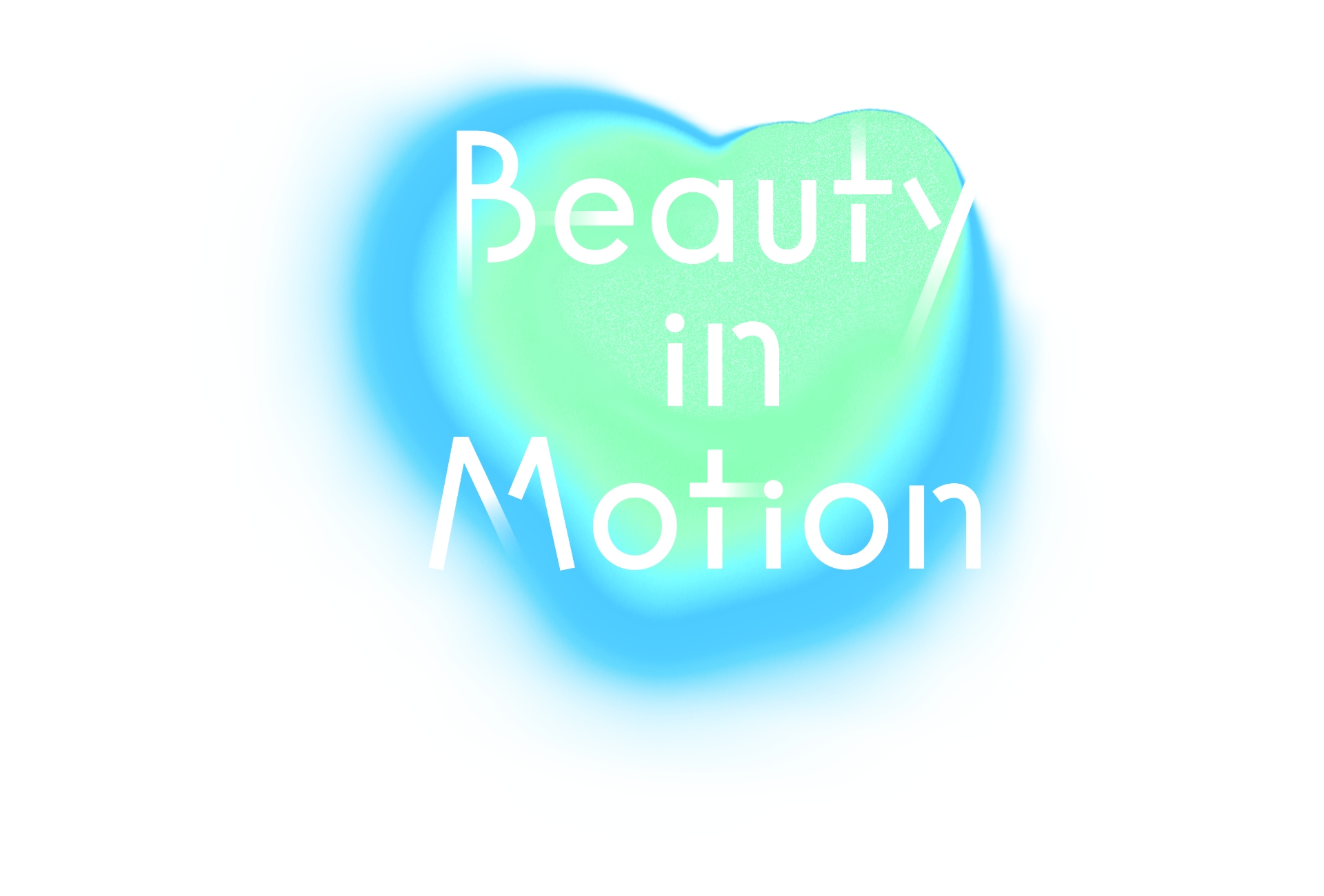
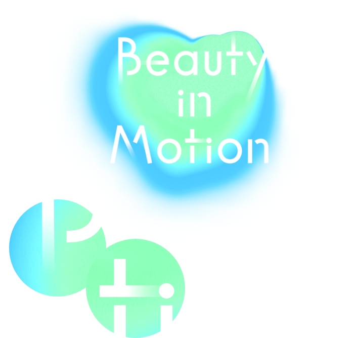

The logo design was built on a basic type structure using APHQ, a typeface that reflects Amorepacific’s corporate identity. A gradient was applied to the ends of the strokes to visually express a sense of speed. The key focus of the logo design was to convey movement and direction even within a static form. In this way, the concept of “continuous motion” embedded in the key visual was carried consistently into the logo as well.
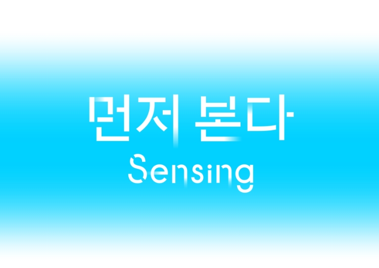
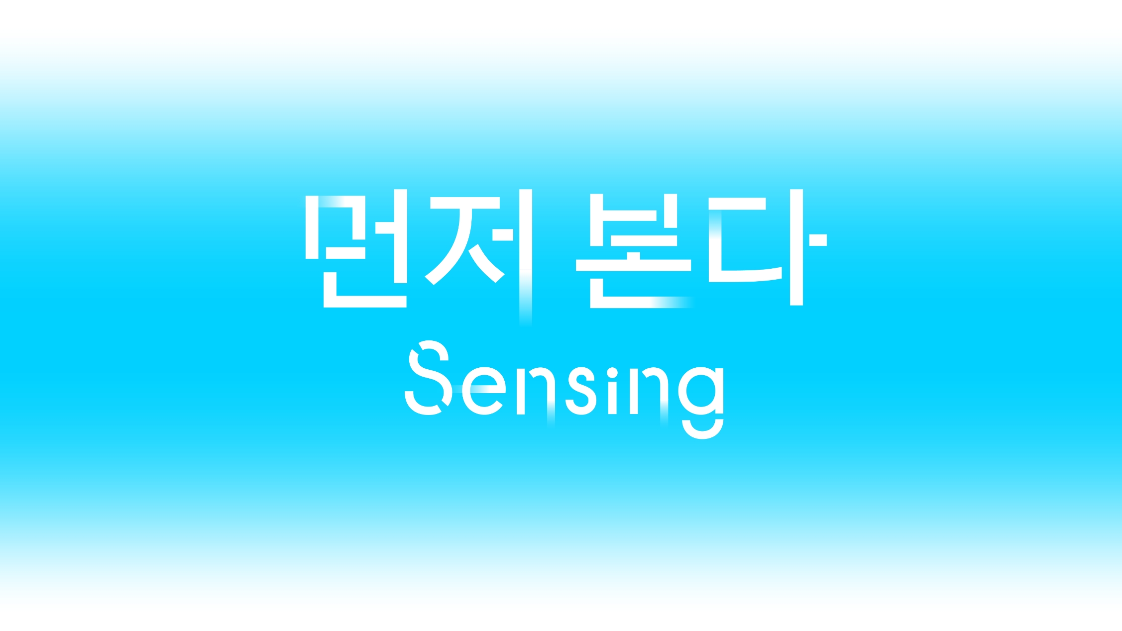
The same principle was applied to the typography for the five keywords. In both Korean and English, movement was expressed consistently at the ends of each stroke, allowing each Beauty in Motion keyword to function not merely as text, but as a visual element carrying its own sense of direction and energy.
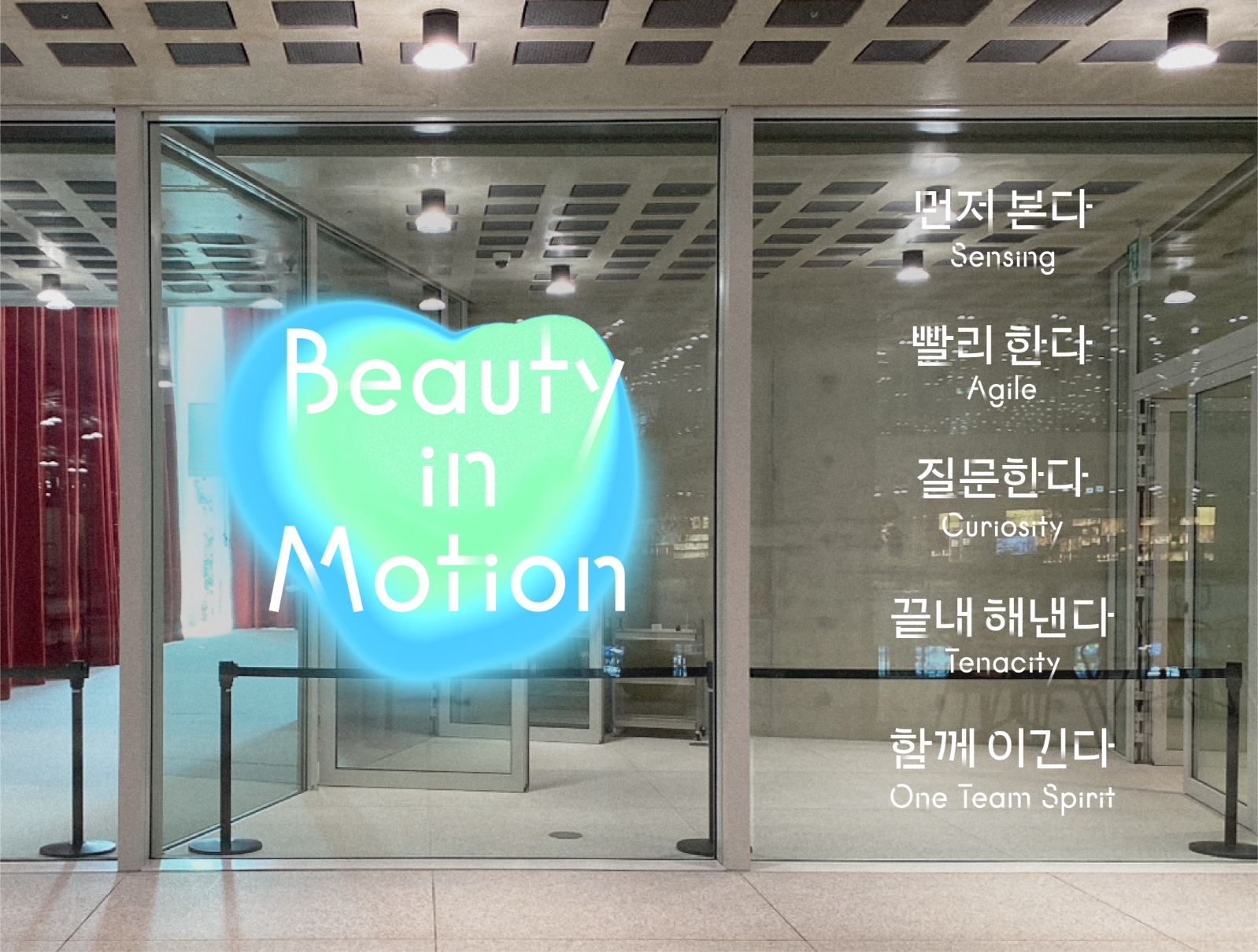
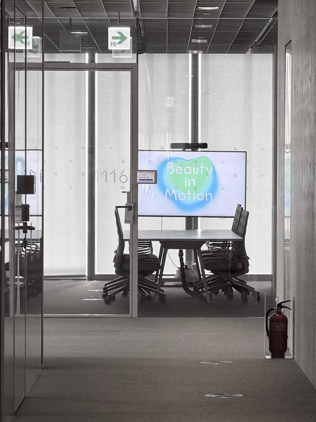
All visual elements, including the developed logo and key visual, were applied throughout Amorepacific’s global headquarters. By allowing members to naturally encounter the Beauty in Motion message within the spaces where they work every day, the visuals were designed to continuously communicate the meaning behind the shift in organizational culture.
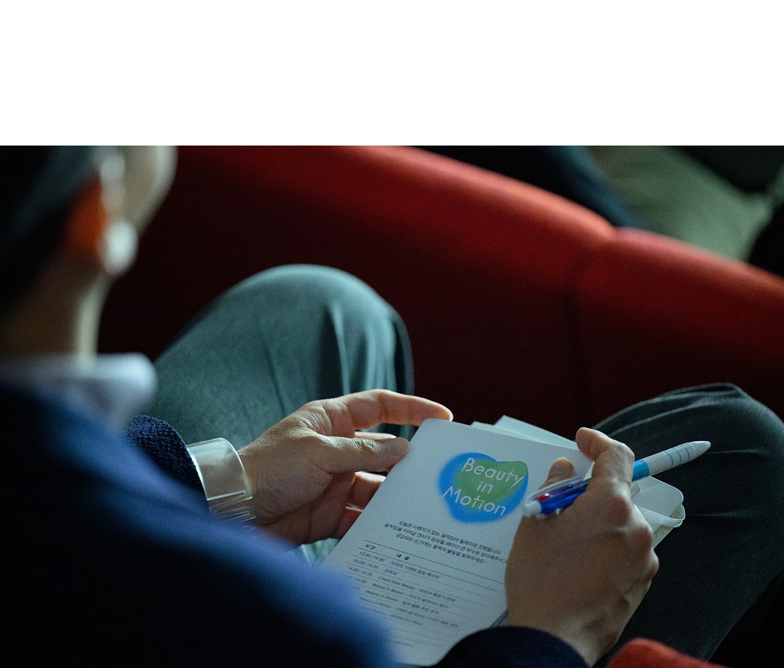
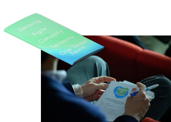
The developed key visual was first unveiled at a company-wide session where the new ways of working were introduced to all members, along with a shared vision of how they would continue to evolve moving forward. To add meaning to the event, dedicated invitations and merchandise were also produced for the session.
Through this project, we hope that the developed logo and key visual will go beyond simply existing as
visual outcomes, and contribute to bringing the meaning of Beauty in Motion’s five keywords into the
way each member works in a tangible and meaningful way.
visual outcomes, and contribute to bringing the meaning of Beauty in Motion’s five keywords into the
way each member works in a tangible and meaningful way.
- Amorepacific Creatives
- keyvisual & Logo Design
- Cheon Nari, Kang Yoosun
- Typo development
- Jeong Jiyun
- Motion graphic / looping motion
- KILBO / Kang Minchae
- Design Direction
- Han Jeongmin
- BM
- Son Sohee, Choi Rina