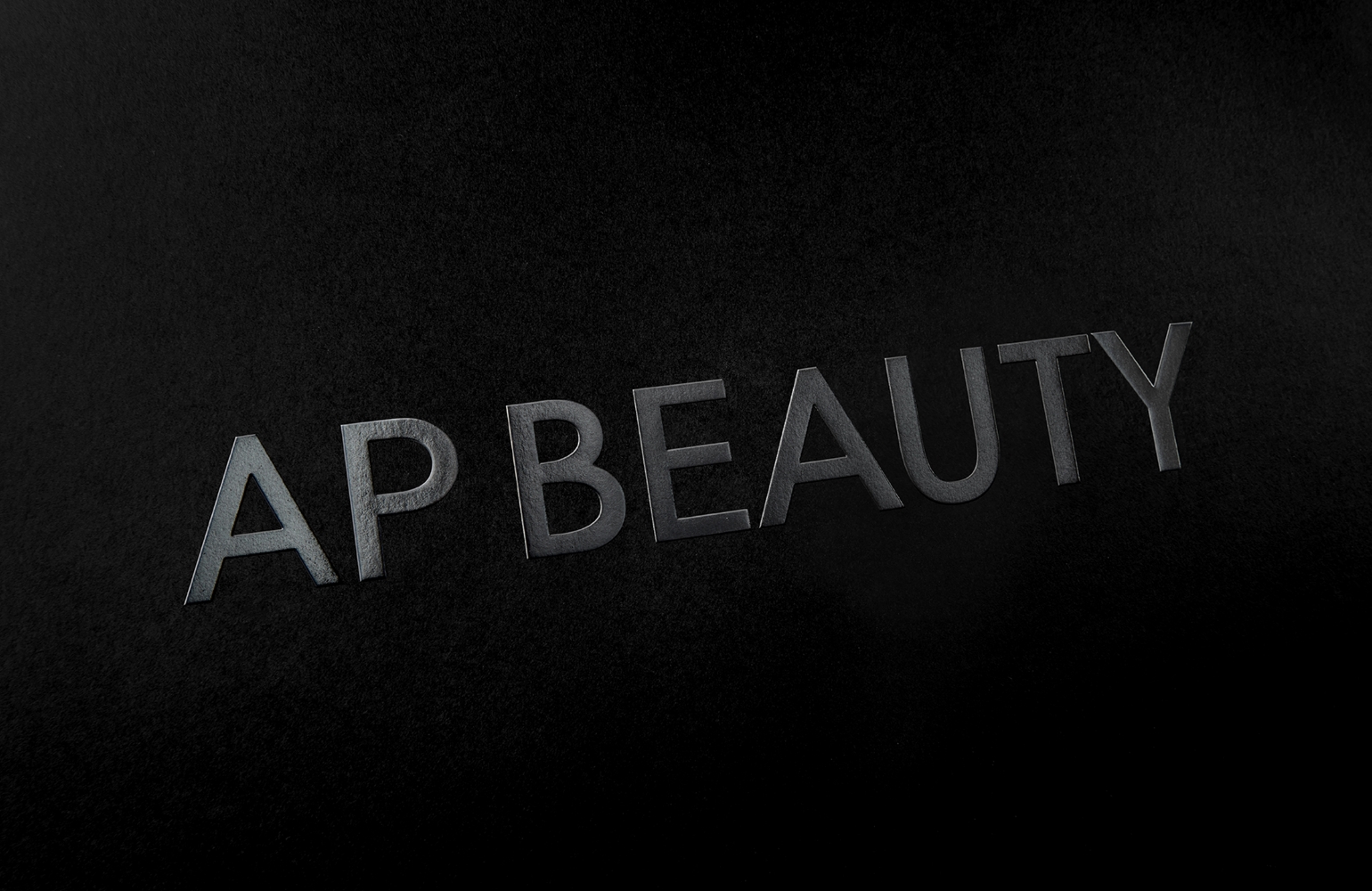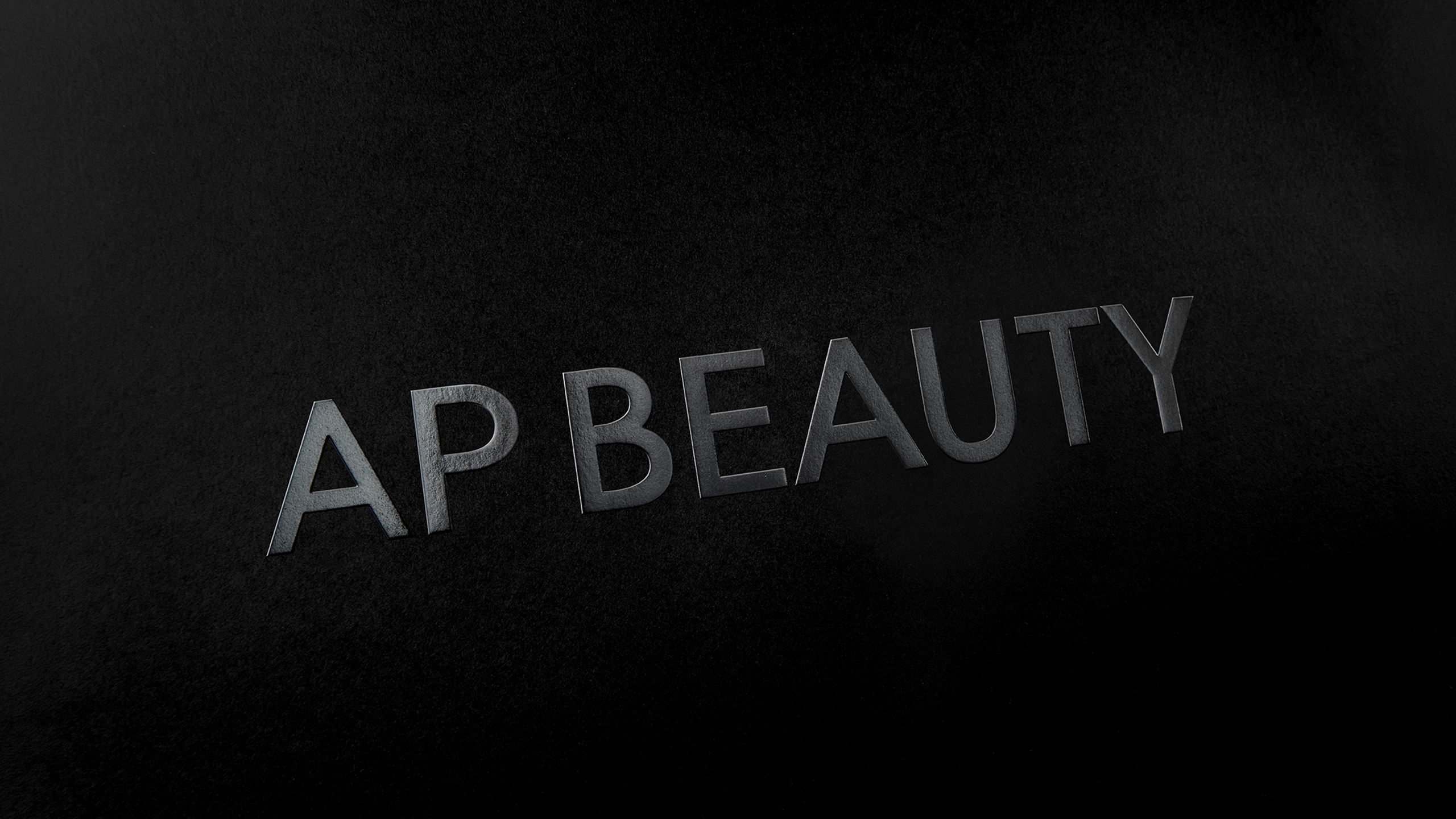
AP BEAUTY Wordmark
Summary
AP BEAUTY is a high-performance skincare brand that proposes a refined luxury experience, built on innovative research that goes beyond the limits of skin science.
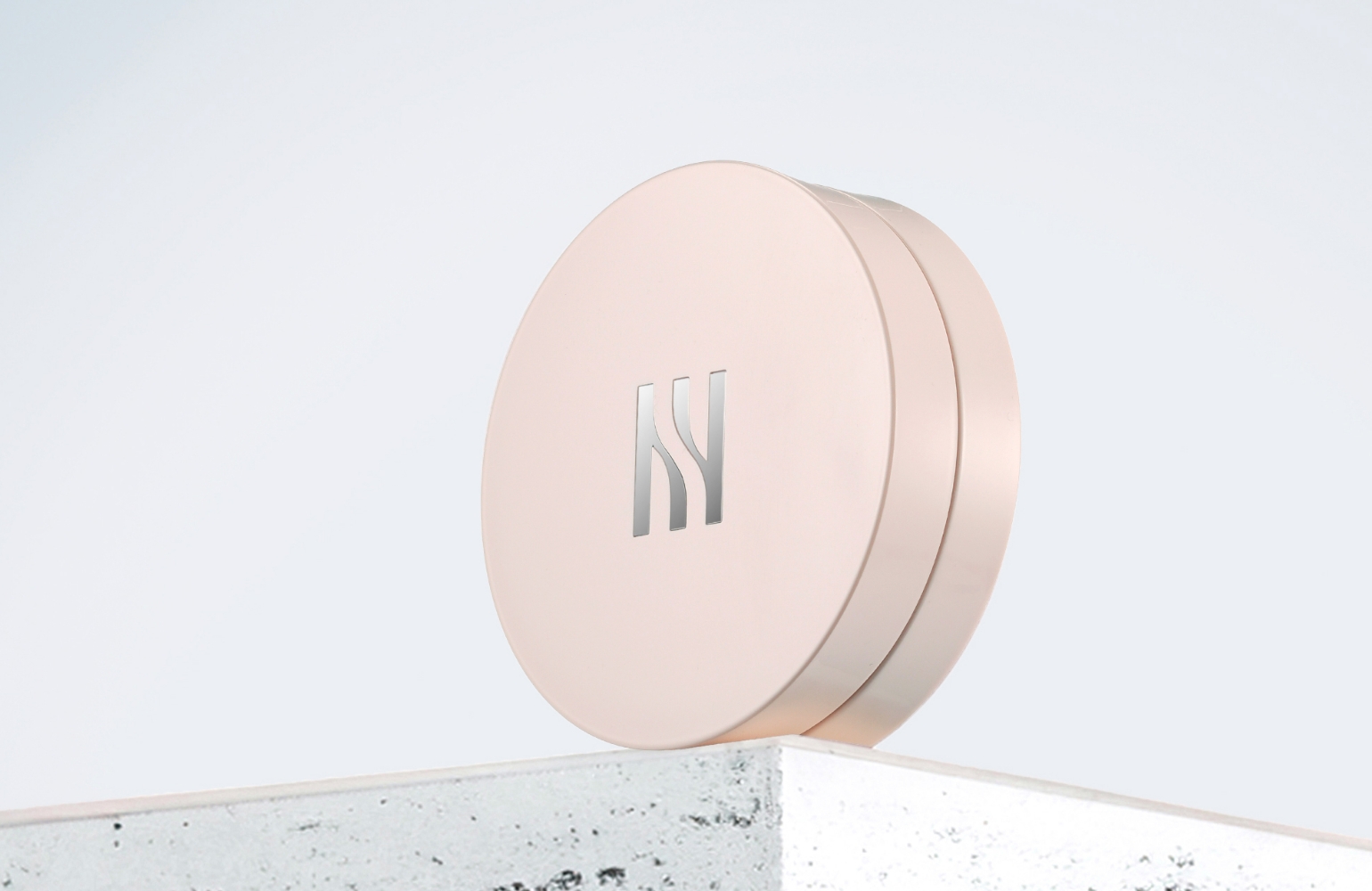
Previously, the AP monogram had been used as the brand’s symbolic asset. However, as the brand expanded across retail spaces and digital environments, the need for a wordmark that could communicate the brand name more directly became increasingly important.
This project focused on developing a wordmark that maintains the impression of the existing AP monogram while allowing customers to clearly read and remember the brand name.
Rather than simply combining typefaces, the process was about creating a brand asset that embodies AP BEAUTY’s refined attitude and visual balance.
Previously, the AP monogram had been used as the brand’s symbolic asset. However, as the brand expanded across retail spaces and digital environments, the need for a wordmark that could communicate the brand name more directly became increasingly important.
This project focused on developing a wordmark that maintains the impression of the existing AP monogram while allowing customers to clearly read and remember the brand name.
Rather than simply combining typefaces, the process was about creating a brand asset that embodies AP BEAUTY’s refined attitude and visual balance.
Background
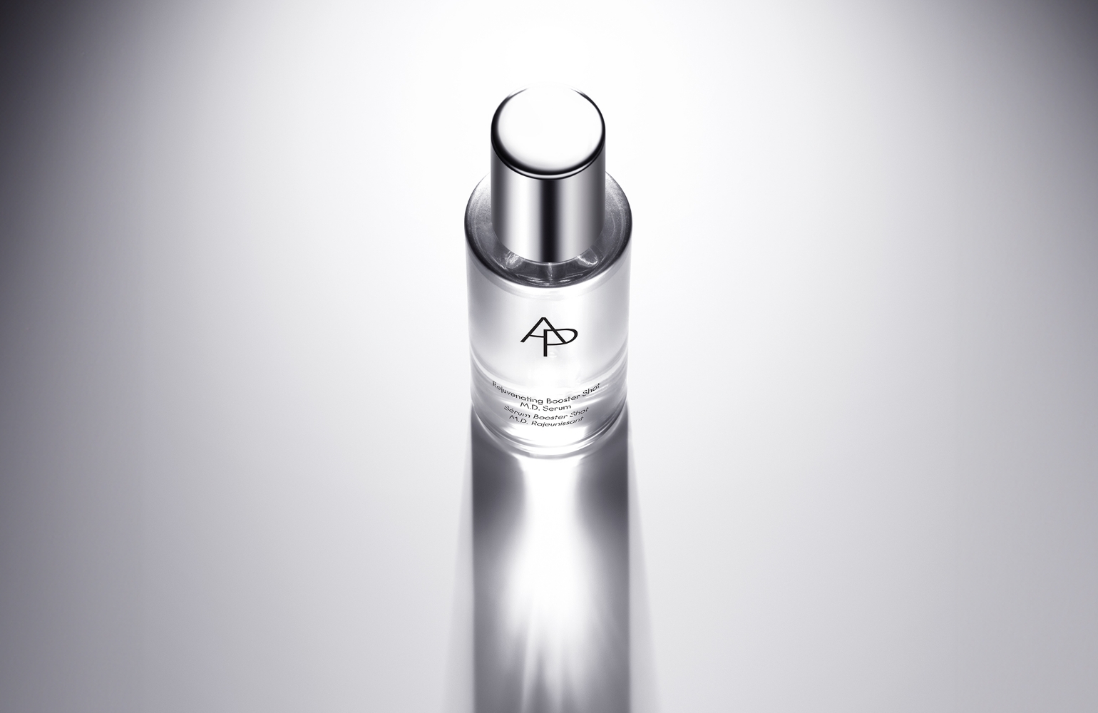
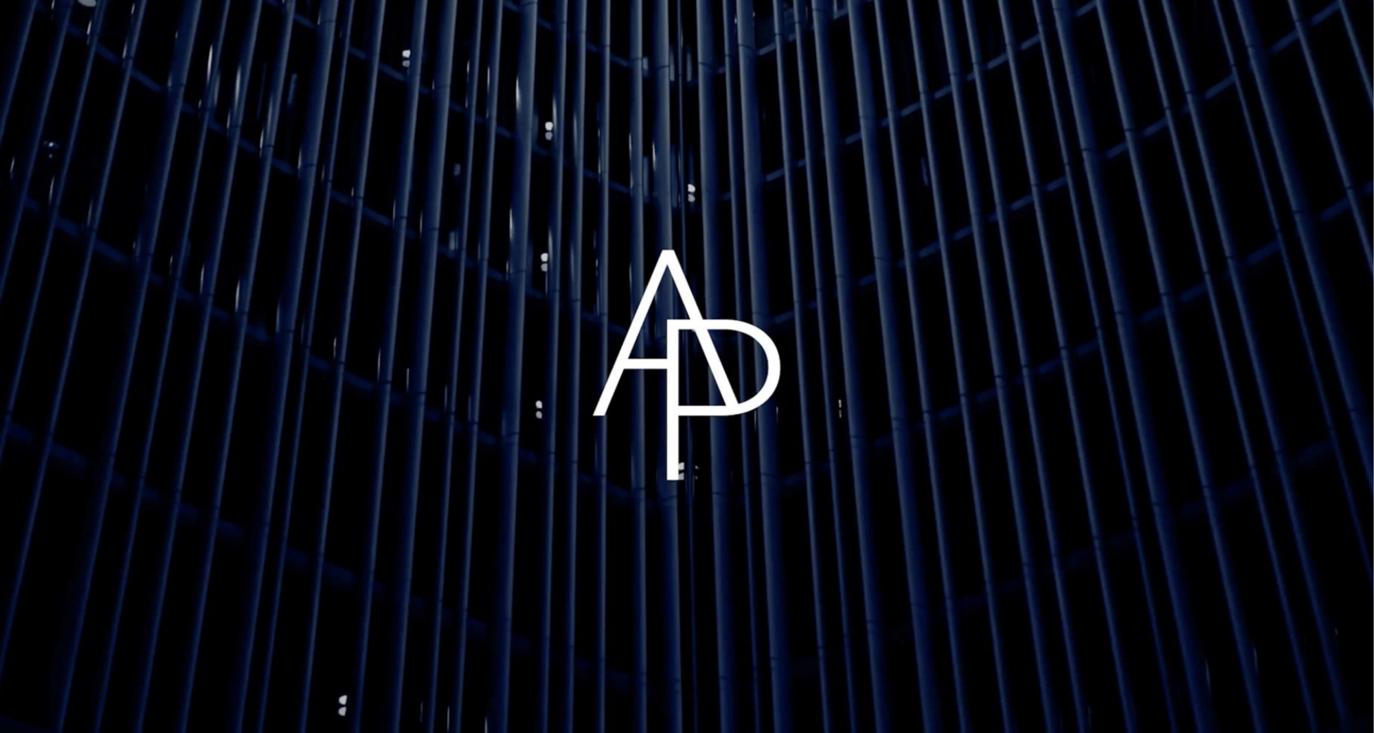
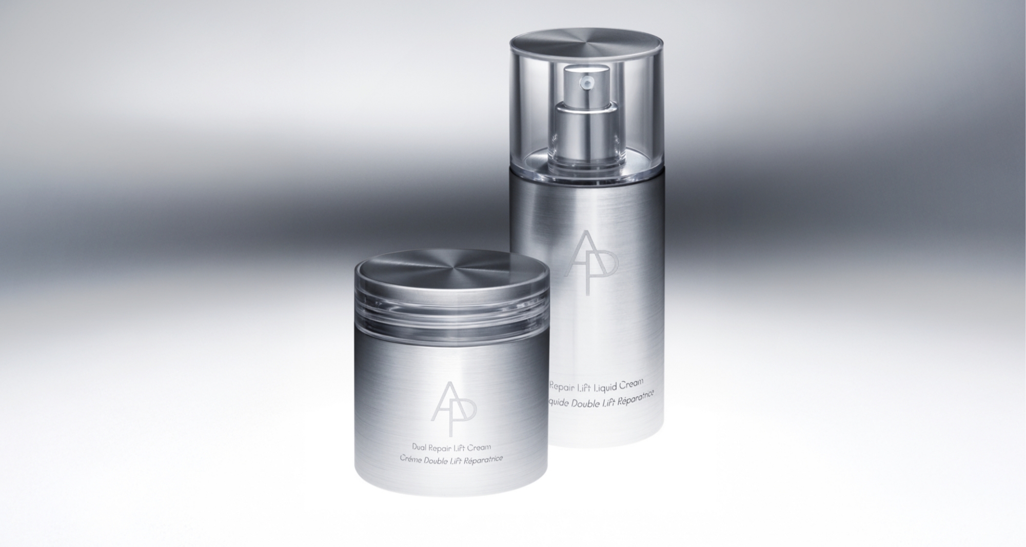
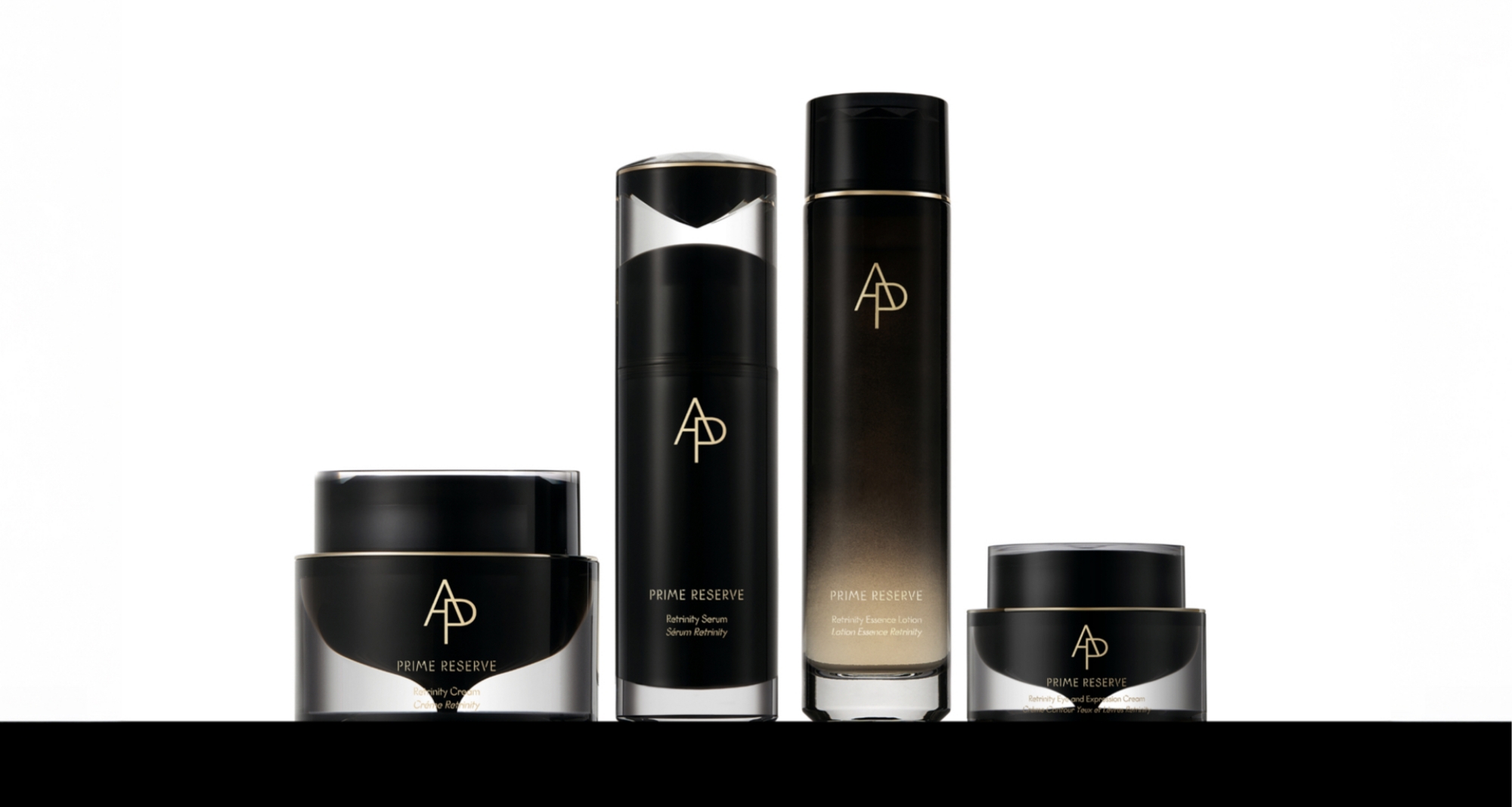
AP BEAUTY has built a distinctive brand identity centered on its unique AP monogram.
The monogram has functioned as a key asset representing the brand across products, retail spaces, and digital channels, delivering a strong sense of trust and a distinctive impression to existing customers.
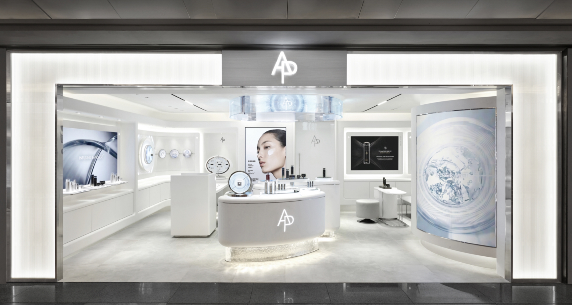
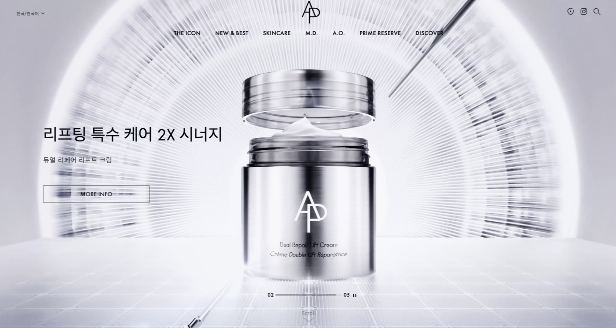
However, as the brand’s touchpoints expanded, situations began to arise that could not be fully addressed through the monogram alone. In cases where distributor regulations required a logo with the brand name clearly written, in physical spaces that called for a horizontal logo, or in digital environments where the logo is displayed at a small scale, there was a need for a structure in which the name AP BEAUTY could be read more clearly.
For new customers in particular, a monogram composed only of the letters A and P may not immediately connect to the brand name. Customers encountering the brand for the first time needed to be able to see the logo, read the name, remember it, and search for it. The development of the AP BEAUTY wordmark began as a way to solve these practical issues within real usage environments.
The key challenge in developing the wordmark was to make the name AP BEAUTY clearly readable, while allowing it to connect naturally with the existing AP monogram as part of a unified brand asset. To achieve this, the development process was reviewed based on four main criteria: whether it was clearly visible across various digital and retail environments, whether it maintained a consistent impression with the existing monogram, and whether it could remain stable across different usage conditions. We also repeatedly verified whether the wordmark could be read naturally and comfortably, and whether it could serve as a long-lasting brand asset.
However, as the brand’s touchpoints expanded, situations began to arise that could not be fully addressed through the monogram alone. In cases where distributor regulations required a logo with the brand name clearly written, in physical spaces that called for a horizontal logo, or in digital environments where the logo is displayed at a small scale, there was a need for a structure in which the name AP BEAUTY could be read more clearly.
For new customers in particular, a monogram composed only of the letters A and P may not immediately connect to the brand name. Customers encountering the brand for the first time needed to be able to see the logo, read the name, remember it, and search for it. The development of the AP BEAUTY wordmark began as a way to solve these practical issues within real usage environments.
The key challenge in developing the wordmark was to make the name AP BEAUTY clearly readable, while allowing it to connect naturally with the existing AP monogram as part of a unified brand asset. To achieve this, the development process was reviewed based on four main criteria: whether it was clearly visible across various digital and retail environments, whether it maintained a consistent impression with the existing monogram, and whether it could remain stable across different usage conditions. We also repeatedly verified whether the wordmark could be read naturally and comfortably, and whether it could serve as a long-lasting brand asset.
The initial development of
the wordmark began from
three main directions.
the wordmark began from
three main directions.
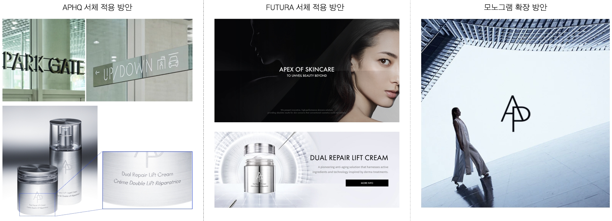
The proposal based on the APHQ typeface, which represents Amorepacific’s headquarters building, was meaningful in terms of its connection to the group identity.
The proposal based on Futura, the typeface currently used in brand communication, also had the advantage of creating a modern and refined impression.
However, both directions had limitations in directly connecting with the distinctive formative quality of the existing AP monogram.
In contrast, the monogram extension direction was the approach that could most naturally maintain continuity with the existing brand asset, while also establishing a distinctive impression unique to AP BEAUTY. Accordingly, the final development proceeded by expanding the visual language of the AP monogram across the entire wordmark.
However, both directions had limitations in directly connecting with the distinctive formative quality of the existing AP monogram.
In contrast, the monogram extension direction was the approach that could most naturally maintain continuity with the existing brand asset, while also establishing a distinctive impression unique to AP BEAUTY. Accordingly, the final development proceeded by expanding the visual language of the AP monogram across the entire wordmark.
After the direction was defined, we proceeded with extending the formative characteristics of the AP monogram across the entire wordmark.
Based on the angle of the A, the wide counter of the P, and the weight and proportion of the strokes, we repeatedly adjusted the forms and rhythm of the letters that make up BEAUTY. We printed and compared the proposals, continuously verifying whether the same impression could be maintained even when the size or usage environment changed. In particular, the development process included reviewing whether the wordmark could be remain legible and visually consistent as a unified brand asset across various conditions, including small-size applications, black-and-white reversal, digital screens, and physical printed materials.
Based on the angle of the A, the wide counter of the P, and the weight and proportion of the strokes, we repeatedly adjusted the forms and rhythm of the letters that make up BEAUTY. We printed and compared the proposals, continuously verifying whether the same impression could be maintained even when the size or usage environment changed. In particular, the development process included reviewing whether the wordmark could be remain legible and visually consistent as a unified brand asset across various conditions, including small-size applications, black-and-white reversal, digital screens, and physical printed materials.
For the wordmark to function stably
as an actual brand asset,
it needed
to be carefully refined not only
in terms of its formal completeness,
but also in its letter spacing and
proportions, stroke weight,
detailed form,
and recognizability
across various environments.
as an actual brand asset,
it needed
to be carefully refined not only
in terms of its formal completeness,
but also in its letter spacing and
proportions, stroke weight,
detailed form,
and recognizability
across various environments.
The completeness of a wordmark is determined not only by the form of each individual letter, but also by the proportional relationships created when the letters are placed side by side.
Even letters designed with the same height and width can carry different visual weights, which means that letter width, inner space, stroke direction, and the ratio between curves and straight lines all need to be adjusted together.
For the AP BEAUTY wordmark, the width and inner space of each letter in BEAUTY were carefully refined based on the wide counter and stable proportions of the existing AP monogram. In particular, we reviewed how letters with different inner spaces and stroke densities, such as P, B, and E, could appear balanced within a single word. Because B and E can appear structurally dense, while T and Y can create a stronger sense of openness at their endings, the visual weight of each letter needed to be adjusted individually.
Through this process, we created a wordmark that maintains a consistent visual density even as the brand name becomes longer, while remaining clearly legible even at smaller sizes.
For the AP BEAUTY wordmark, the width and inner space of each letter in BEAUTY were carefully refined based on the wide counter and stable proportions of the existing AP monogram. In particular, we reviewed how letters with different inner spaces and stroke densities, such as P, B, and E, could appear balanced within a single word. Because B and E can appear structurally dense, while T and Y can create a stronger sense of openness at their endings, the visual weight of each letter needed to be adjusted individually.
Through this process, we created a wordmark that maintains a consistent visual density even as the brand name becomes longer, while remaining clearly legible even at smaller sizes.
In typography, letter spacing is not arranged by applying the same numerical value throughout.
Instead, it is adjusted based on the visual balance that changes according to the form of each letter.
Kerning is the process of adjusting the space between individual letters to create text that is more legible and natural, and is distinct from tracking, which applies a consistent spacing value across an entire word.
Emil Ruder, a master of Swiss typography, emphasized in Typographie: A Manual of Design that not only the letters themselves, but also the white space formed inside and around them, are essential elements of typography. In the context of wordmark design, this means that the empty spaces created between the letterforms must be refined together with the shapes of the black strokes.
Hildegard Korger also explains in Schrift und Schreiben that letter spacing should not be understood simply as a numerical distance, but as the relationship between the inner space of each letter and the space between letters. When letters are mechanically placed at equal intervals, differences in form created by circles, diagonals, and straight lines can cause some areas to appear too dense while others appear too open. Therefore, good letter spacing should not be based on numerically equal intervals, but should be the result of optical refinement so that the spaces between letters feel visually balanced.
The AP BEAUTY wordmark was also refined not by applying the same spacing value between all letters, but through repeated adjustments based on the visual volume created by each letter’s counter and external spacing. In combinations where straight lines, curves, and diagonals meet, such as A–P, P–B, and T–Y, the balance of visible white space was more important than the actual measured distance.
If the spacing became too wide, the connection between AP and BEAUTY felt loose. If it became too narrow, AP BEAUTY could appear compressed into a single mass and lose legibility. Therefore, the key was to find a point of balance where AP and BEAUTY could connect naturally as one brand name, while each letter remained clearly distinguishable.
The final wordmark was completed by reviewing the spacing between each pair of letters one by one. By refining the counter, external spacing, and overall rhythm of the word, we achieved optical spacing that remains stable and legible at both small and large sizes.
Emil Ruder, a master of Swiss typography, emphasized in Typographie: A Manual of Design that not only the letters themselves, but also the white space formed inside and around them, are essential elements of typography. In the context of wordmark design, this means that the empty spaces created between the letterforms must be refined together with the shapes of the black strokes.
Hildegard Korger also explains in Schrift und Schreiben that letter spacing should not be understood simply as a numerical distance, but as the relationship between the inner space of each letter and the space between letters. When letters are mechanically placed at equal intervals, differences in form created by circles, diagonals, and straight lines can cause some areas to appear too dense while others appear too open. Therefore, good letter spacing should not be based on numerically equal intervals, but should be the result of optical refinement so that the spaces between letters feel visually balanced.
The AP BEAUTY wordmark was also refined not by applying the same spacing value between all letters, but through repeated adjustments based on the visual volume created by each letter’s counter and external spacing. In combinations where straight lines, curves, and diagonals meet, such as A–P, P–B, and T–Y, the balance of visible white space was more important than the actual measured distance.
If the spacing became too wide, the connection between AP and BEAUTY felt loose. If it became too narrow, AP BEAUTY could appear compressed into a single mass and lose legibility. Therefore, the key was to find a point of balance where AP and BEAUTY could connect naturally as one brand name, while each letter remained clearly distinguishable.
The final wordmark was completed by reviewing the spacing between each pair of letters one by one. By refining the counter, external spacing, and overall rhythm of the word, we achieved optical spacing that remains stable and legible at both small and large sizes.
Reference
Emil Ruder, *Typography: A Manual of Design*, Niggli, 1967, p.44.
Hildegard Korger, *Schrift und Schreiben*, VEB Fachbuchverlag Leipzig, 1972, p.23.
Hildegard Korger, *Schrift und Schreiben*, VEB Fachbuchverlag Leipzig, 1972, p.23.

The weight of a wordmark is not simply a matter of making the strokes thicker or thinner.
It is a process of considering how the same form is perceived across different application environments.
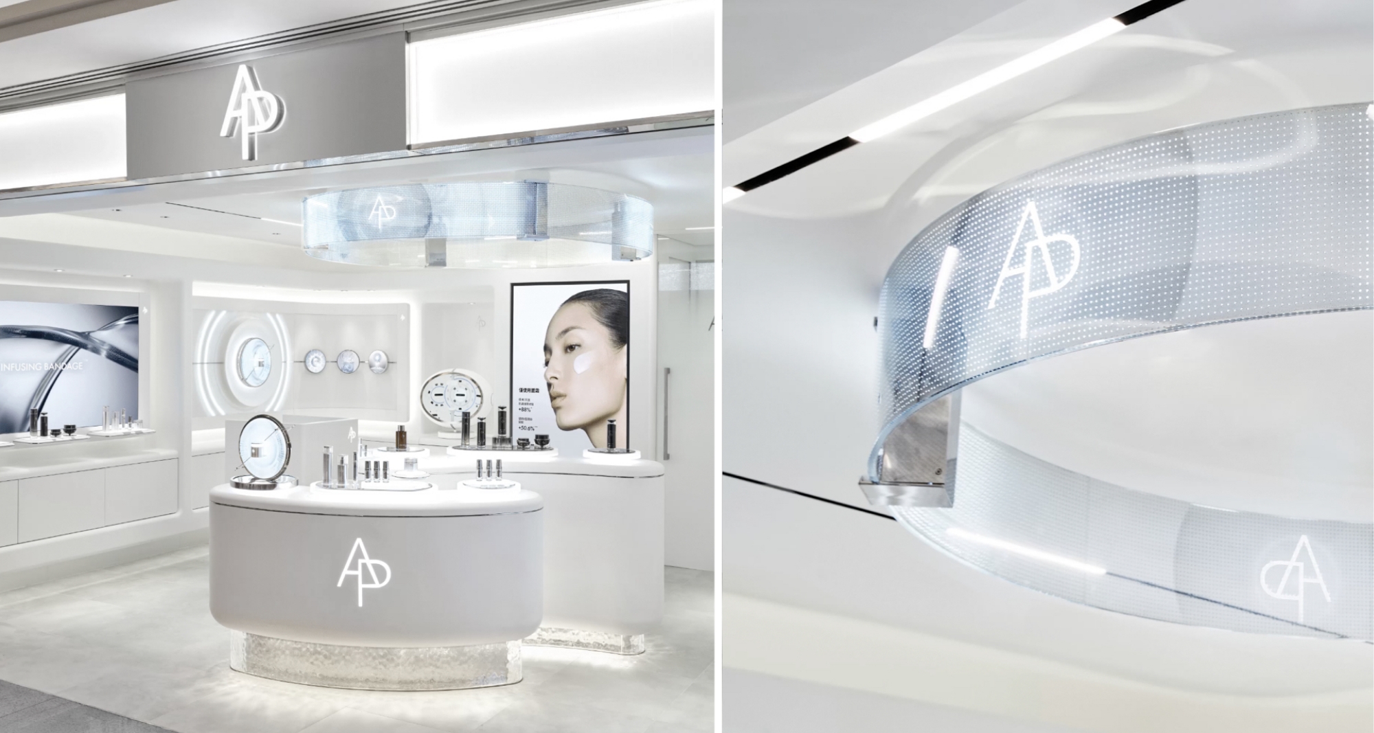
On small digital screens, strokes that are too thin can appear blurred or broken, while on large-scale façades or illuminated signs, light diffusion and material reflection can make the wordmark appear thicker than it actually is. Therefore, the weight of the wordmark needed to be calibrated across screens, printed materials, metal signage, and illuminated environments.
For the AP BEAUTY wordmark, we reviewed legibility at small sizes, presence on large-scale signage, and the possible visual changes in weight that could occur during post-processing and production. If the strokes were too thin, visibility became weak in digital environments and from a distance. If they were too thick, the wordmark moved away from the refined luxury impression that the brand aims to convey.
The final weight was adjusted to maintain both legibility and elegance. The key was to find a visual weight that could remain stable and readable in actual usage environments, while preserving the refined attitude of a high-performance skincare brand that AP BEAUTY pursues.
On small digital screens, strokes that are too thin can appear blurred or broken, while on large-scale façades or illuminated signs, light diffusion and material reflection can make the wordmark appear thicker than it actually is. Therefore, the weight of the wordmark needed to be calibrated across screens, printed materials, metal signage, and illuminated environments.
For the AP BEAUTY wordmark, we reviewed legibility at small sizes, presence on large-scale signage, and the possible visual changes in weight that could occur during post-processing and production. If the strokes were too thin, visibility became weak in digital environments and from a distance. If they were too thick, the wordmark moved away from the refined luxury impression that the brand aims to convey.
The final weight was adjusted to maintain both legibility and elegance. The key was to find a visual weight that could remain stable and readable in actual usage environments, while preserving the refined attitude of a high-performance skincare brand that AP BEAUTY pursues.
We also explored ways to reflect the sharp edge details seen in the products and spaces within the wordmark.
In some proposals, the stroke endings and corners were refined to appear sharper, aiming to create a high-tech impression reminiscent of light catching on an edge.
However, through reviewing actual application environments and post-processing production feasibility, we found that overly pronounced details could instead make the form feel heavy and blunt. At smaller sizes, the details could become blurred, while on large-scale signage, certain parts of the form could appear stronger than necessary.
As a result, the AP BEAUTY wordmark was refined not by adding decorative details, but by removing unnecessary elements and enhancing the completeness of the form, proportion, and spacing itself. The most effective way to convey the brand’s refined attitude was not to add stronger features, but to leave only what was necessary and arrive at the clearest point of balance.
However, through reviewing actual application environments and post-processing production feasibility, we found that overly pronounced details could instead make the form feel heavy and blunt. At smaller sizes, the details could become blurred, while on large-scale signage, certain parts of the form could appear stronger than necessary.
As a result, the AP BEAUTY wordmark was refined not by adding decorative details, but by removing unnecessary elements and enhancing the completeness of the form, proportion, and spacing itself. The most effective way to convey the brand’s refined attitude was not to add stronger features, but to leave only what was necessary and arrive at the clearest point of balance.
A wordmark is not a graphic that is completed at a single size.
It must function as the same brand asset across a wide range of environments, including small digital screens, social media thumbnails, printed materials, packaging, store façades, and illuminated signs.
Therefore, in developing the AP BEAUTY wordmark, it was important not only to refine the form itself, but also to verify whether the brand name remained clearly legible when the size and medium changed.
We repeatedly reviewed whether the letters remained readable without becoming blurred on small screens, whether the wordmark avoided appearing too light or loose on large-scale signage, and whether its visual weight remained stable in black-and-white reversal and on dark backgrounds.
In particular, for environments such as store façades, where light, viewing distance, and material properties have a significant impact, we adjusted the detailed proportions and spacing while considering how strokes could appear to spread or how spacing could appear narrower. Through this process, we secured the scalability needed for the wordmark to be used with a consistent impression across retail spaces, digital channels, printed materials, and signage.
We repeatedly reviewed whether the letters remained readable without becoming blurred on small screens, whether the wordmark avoided appearing too light or loose on large-scale signage, and whether its visual weight remained stable in black-and-white reversal and on dark backgrounds.
In particular, for environments such as store façades, where light, viewing distance, and material properties have a significant impact, we adjusted the detailed proportions and spacing while considering how strokes could appear to spread or how spacing could appear narrower. Through this process, we secured the scalability needed for the wordmark to be used with a consistent impression across retail spaces, digital channels, printed materials, and signage.
The AP BEAUTY wordmark was developed to communicate the brand name clearly across various environments, including retail spaces, façades, digital channels, and printed materials.
If the existing AP monogram was an asset that symbolized the brand, this wordmark is an asset that allows the name AP BEAUTY to be read and remembered more directly. The monogram conveys the symbolic essence of the brand in a condensed form, while the wordmark clearly communicates the brand name. Although the two elements serve different roles, they were designed to connect within the same visual language.
This project was not simply about maintaining an existing brand asset, but about expanding it in response to changing retail and digital environments. The AP BEAUTY wordmark is a new brand identity built so that the formative impression of the monogram and the clear legibility of the wordmark can work together.
If the existing AP monogram was an asset that symbolized the brand, this wordmark is an asset that allows the name AP BEAUTY to be read and remembered more directly. The monogram conveys the symbolic essence of the brand in a condensed form, while the wordmark clearly communicates the brand name. Although the two elements serve different roles, they were designed to connect within the same visual language.
This project was not simply about maintaining an existing brand asset, but about expanding it in response to changing retail and digital environments. The AP BEAUTY wordmark is a new brand identity built so that the formative impression of the monogram and the clear legibility of the wordmark can work together.
- Amorepacific Creatives
- Design Directing
- Lee OhKyung
- Identity Design
- Hwang Sunyoung
- Photography
- Kim Kwangrae