ARITAUM
| VMD Visual Design
Summary
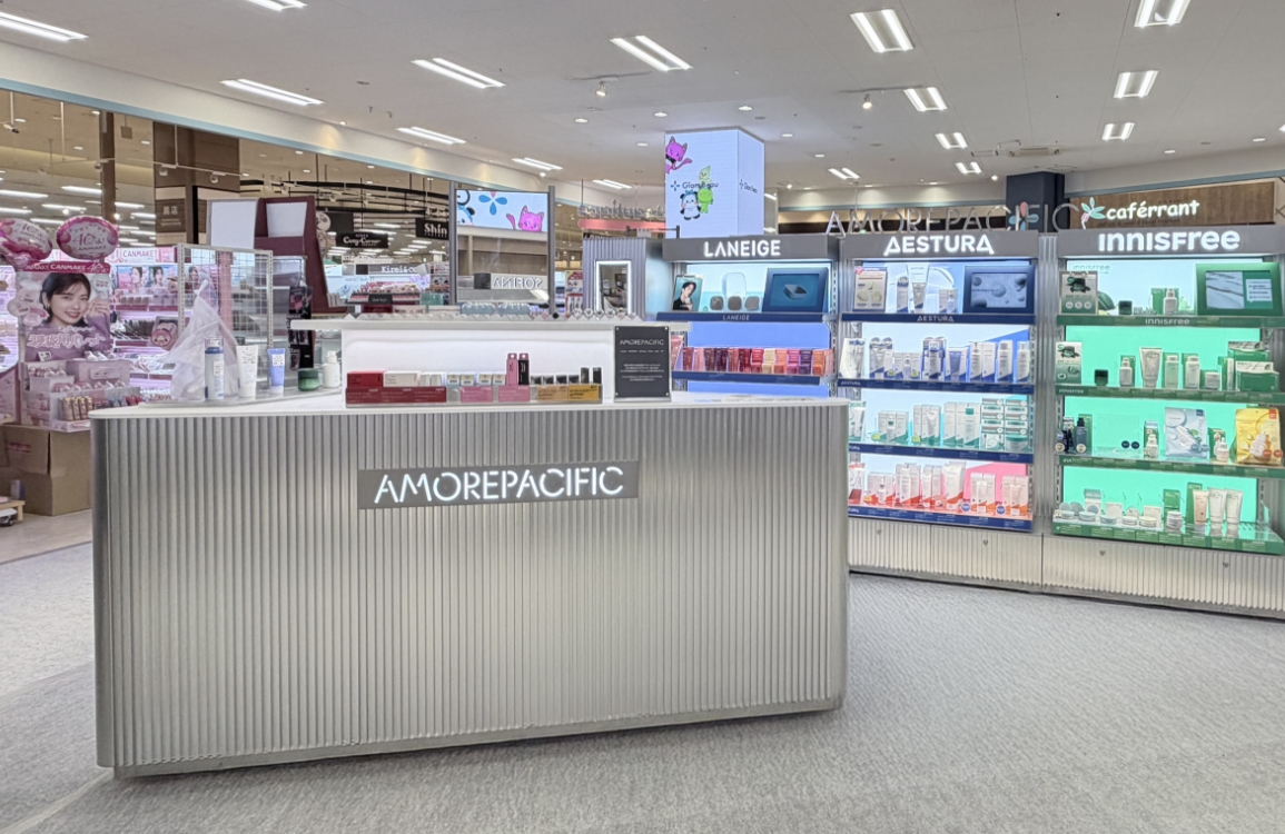
We worked on a project to improve the image of ARITUAM’s VMD. The existing ARITUAM lacked uniformity in images and typefaces between each branch,
which drew less attention to its flagship products. To improve the space environment, we developed visual guidelines for the VMD that could be used
consistently, including images, typefaces, colors, and layouts. Since ARITUAM’s products from various brands are spread out in one space, they
wanted to create an organized feeling with intuitive images. We suggested using Korean wordings that are easier to read than English, in line with the
5060 female target, and applied visuals that reflect this to ARITUAM stores.


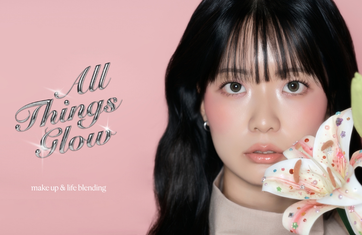
LOOK&FEEL
Select a background that highlights the color of the brand and product, and shoot in a minimalist mood without complicated props to convey an intuitive image.
Avoid placing a large number of products or props that may distract the viewer’s attention.
LAYOUT
Place key copy, brand name, logo, or product name according to the guidelines.
TYPEFACE
Use consistent fonts to build the Aritaum brand image. We recommend using “ARITA DOTUM” for Korean titles and “Objective” for English titles, as they offer excellent visibility and readability.
Recommended fonts:
ARITA DOTUM M
ARITA DOTUM SB
Objective M
Recommended fonts:
ARITA DOTUM M
ARITA DOTUM SB
Objective M
TEXT COLOR
Consider the background brightness when specifying text colors, prioritizing colors that match the visual mood.


TEXT COLOR
Consider the background brightness when specifying text colors, prioritizing colors that match the visual mood.


- Amorepacific Creatives
- Creative Directing
- 이오경, 여유미
- Art Directing
- 남승원
- Photography
- 신상우
- VMD
- 박문경, 박다은