HAPPYBATH CREAM IN body wash & body lotion
Summary
HAPPYBATH is launching a new moisturizing line based on survey results.
This body wash product uses Amorepacific’s unique technology, which incorporates one full bottle of cream into the body wash, ensuring your skin remains moisturized and free of tightness even after shower. The product will be launched in two scents that complement its moisturizing properties: a mild and clean White Musk scent, and a Baby Powder scent. The focuses on incorporating the insights from surveys in the most straightforward way possible, so the product can be clearly recognized and to customers in a short period of time when displayed on the main sales channel, which is the shelves of large discount stores.
This body wash product uses Amorepacific’s unique technology, which incorporates one full bottle of cream into the body wash, ensuring your skin remains moisturized and free of tightness even after shower. The product will be launched in two scents that complement its moisturizing properties: a mild and clean White Musk scent, and a Baby Powder scent. The focuses on incorporating the insights from surveys in the most straightforward way possible, so the product can be clearly recognized and to customers in a short period of time when displayed on the main sales channel, which is the shelves of large discount stores.

Product Concept
“What factors do you consider important when purchasing body wash?”
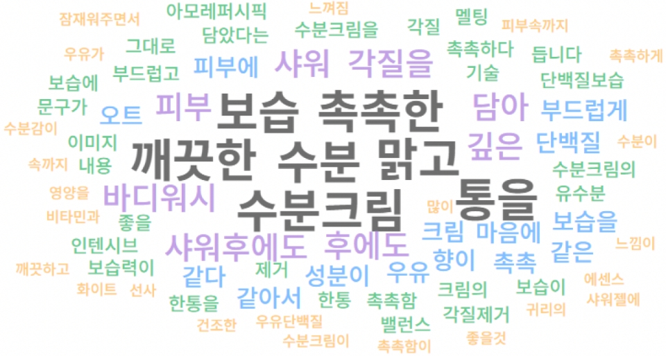
Based on customer survey results, we found that customers prioritize scent and moisturization when purchasing body wash.
In the moisturization concept, keywords that evoke purchase intent include #moisture, #moisturizing cream, #clean, and #clear—basic keywords that stick to the fundamentals.
Based on this, we aimed to convey the product’s moisturizing concept clearly and strongly to customers in the complex offline supermarket aisles, focusing on a product name that intuitively captures the concept and a simple design centered on an image of a cream container, rather than overwhelming customers with complex ingredients or technical information.
Q. When purchasing body wash,
what factors do you consider most important?
what factors do you consider most important?


Q. Among the above concepts, which elements
make you want to purchase the product, and why?
make you want to purchase the product, and why?


Design concept
We spent a lot of time considering how to capture the image of the product’s most important concept: “a jar of cream.” After establishing three criteria, we aimed to express them accordingly.
1. When purchasing the product, clear shelf visibility and intuitive features should support easy offline self-selection.
2. After purchase, the product’s graphics should evoke satisfaction with its moisturizing properties, reminiscent of a jar of cream, when used.
3. During the usage period, a graphic design that feels unobtrusive even when placed in the bathroom.
Below are the two final candidates. Which design do you think better meets the criteria?
We spent a lot of time considering how to capture the image of the product’s most important concept: “a jar of cream.” After establishing three criteria, we aimed to express them accordingly.
1. When purchasing the product,
clear shelf visibility and intuitive features should support easy offline self-selection.
2. After purchase,
the product’s graphics should evoke satisfaction with its moisturizing properties, reminiscent of a jar of cream, when used.
3. During the usage period,
a graphic design that feels unobtrusive even when placed in the bathroom.
Below are the two final candidates. Which design do you think better meets the criteria?

Final design candidate. Option 1

Final design candidate. Option 2


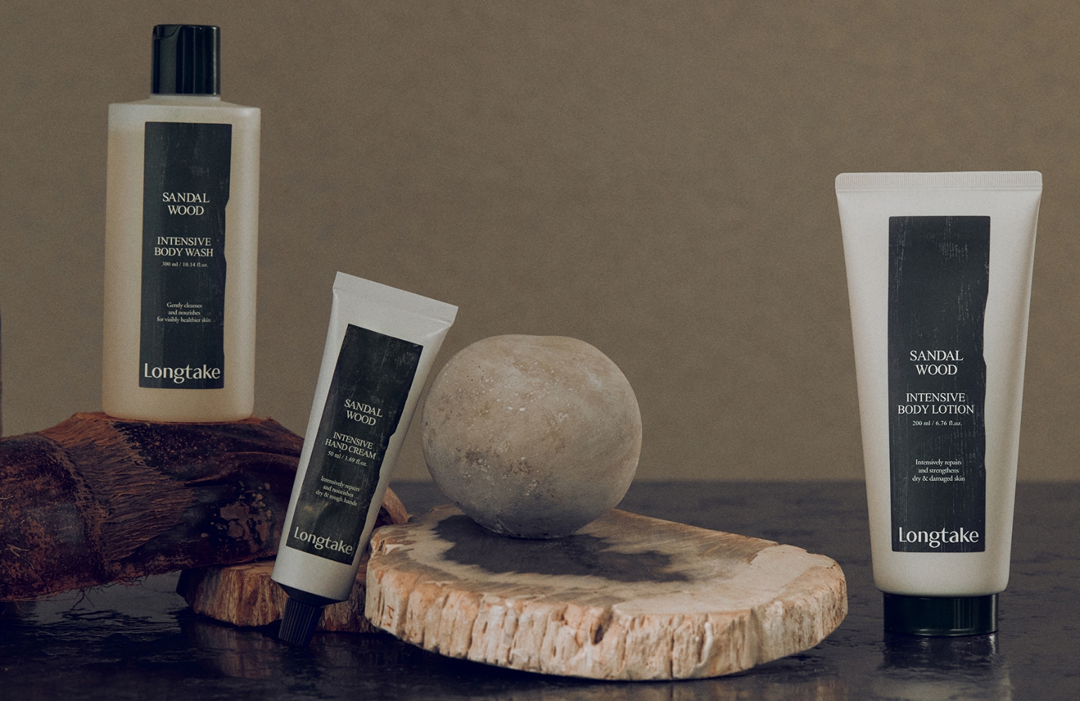
Visual concept
We created communication visuals for the Happy Bath Cream line, focusing on the most important concept of “a tube of cream.”
Since the image of cream is delicate and soft, we thought it might easily distract attention from other elements.
So we aligned the product composition and color tones to make the creamy texture the main focus and completed the visuals.

- Amorepacific Creatives
- Product Design & Visual Directing
- Koo Suyeon, Shim Seyeong
- Photography
- Shin Sangwoo
- BM
- Kim Hyojou, Jo Ara
- Development
- Choe Jaeyong