AMOREPACIFIC BRAND CHALLENGE BRANDING PROJECT
Summary
The Amorepacific Brand Challenge is a university marketing competition designed to discover global talent capable of leading the “New Beauty” business.
It began in the early 2000s for Korean university students and has successfully been held 15 times.
Starting this year, the competition has expanded beyond Korea to include university students from the United States and Japan, transforming into a truly global marketing contest.
Reflecting this evolution, the key visual embodies the concept of moving beyond a domestic event to emphasize its new global identity.
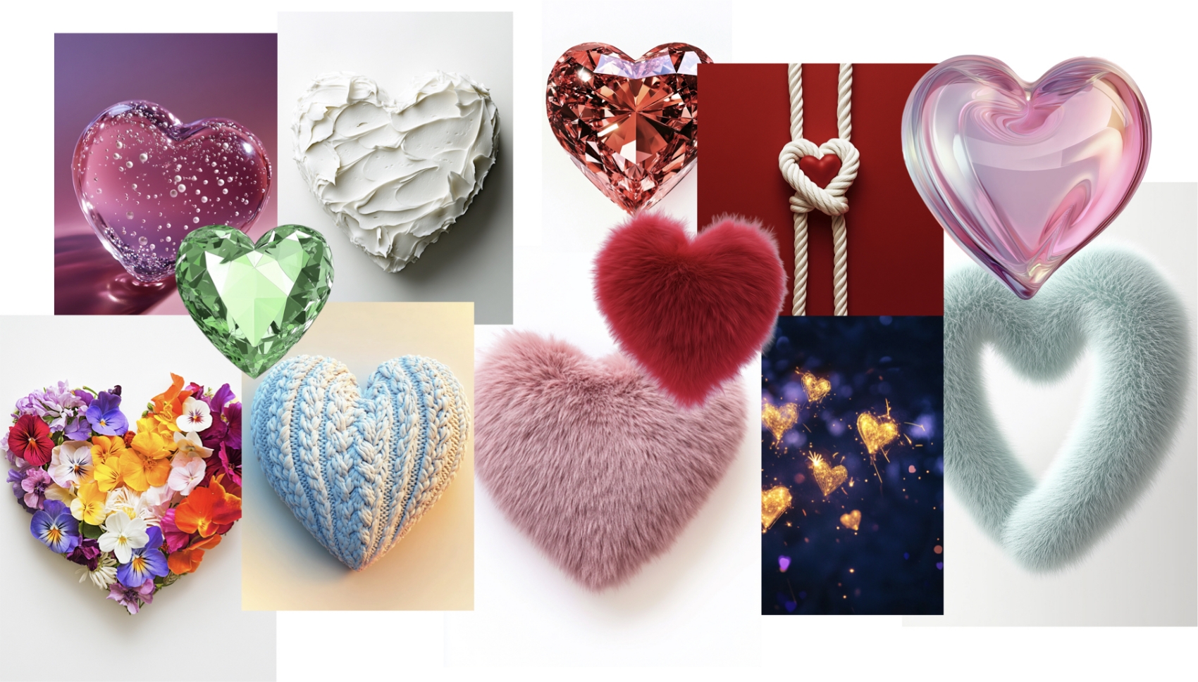
Image generated by AI
This project was created as a global competition that brings together people of different nationalities and backgrounds, aiming to visually express the value of diversity, where differences are respected and harmoniously connected.
At its core lies Amorepacific’s philosophy of “New Beauty” the belief that everyone is beautiful just as they are. We also sought to expand upon the meaning of “Amore,” the brand’s name, which stands for love.
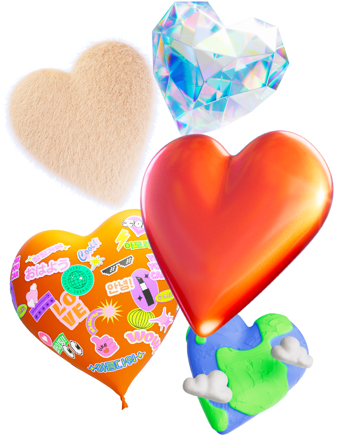
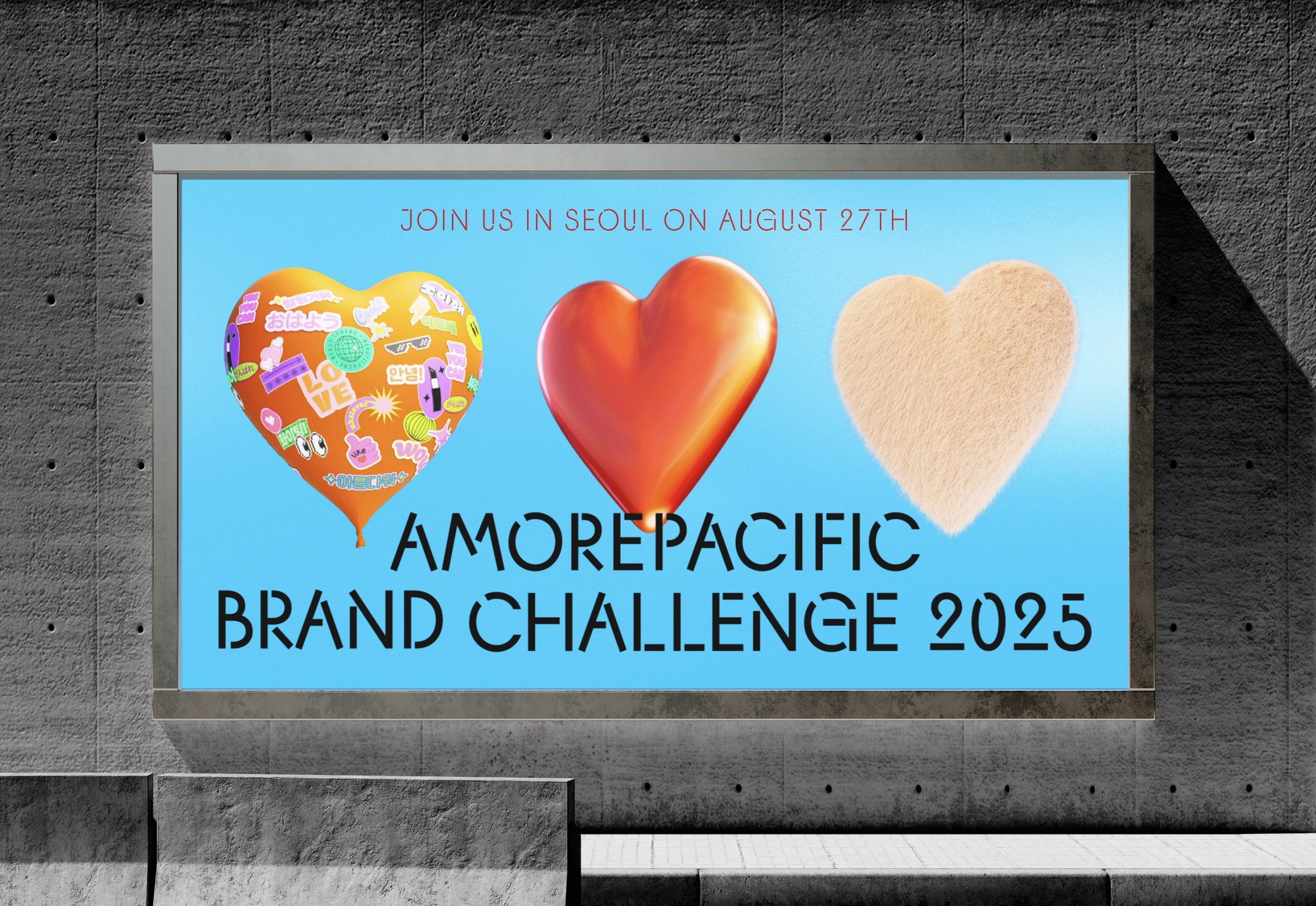
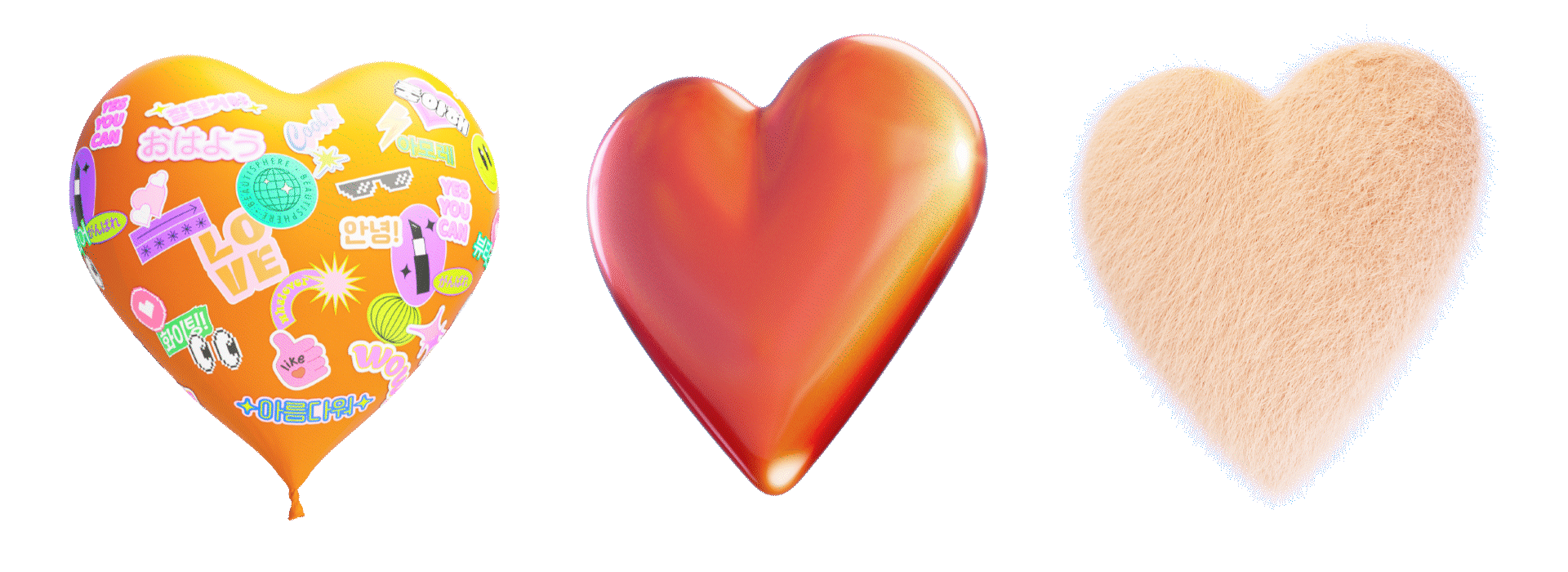
To connect these three key values — diversity, beauty, and love (Amore) — into a single form, we defined the project’s key visual as “hearts in diverse forms.” Using AI-generated imagery, we explored countless variations of hearts, each revealing its own unique texture and personality.
Some hearts are covered in soft fur, while others take on the cool, sleek surfaces of metal or glass. Together, these hearts embody the harmony of individuality a visual expression of the very essence of New Beauty.
At its core lies Amorepacific’s philosophy of “New Beauty” the belief that everyone is beautiful just as they are. We also sought to expand upon the meaning of “Amore,” the brand’s name, which stands for love.
To connect these three key values — diversity, beauty, and love (Amore) — into a single form, we defined the project’s key visual as “hearts in diverse forms.” Using AI-generated imagery, we explored countless variations of hearts, each revealing its own unique texture and personality.
Some hearts are covered in soft fur, while others take on the cool, sleek surfaces of metal or glass. Together, these hearts embody the harmony of individuality a visual expression of the very essence of New Beauty.
AMORE ‘HEART’
In this project, we created five symbolic heart key visuals based on AI-generated imagery. The classic red heart serves as the primary image and is applied across various brand applications, while the remaining hearts each embody their own distinct personality and meaning.
For instance, one heart symbolizes connection and communication, as if people from different languages and cultures are coming together to place stickers on it. Another heart reflects light from multiple angles, shimmering with movement, while others are filled with soft, fluffy textures that evoke warmth and playfulness.
For instance, one heart symbolizes connection and communication, as if people from different languages and cultures are coming together to place stickers on it. Another heart reflects light from multiple angles, shimmering with movement, while others are filled with soft, fluffy textures that evoke warmth and playfulness.
We also developed motion graphics in which these five hearts continuously transform,
visually expressing the essence of New Beauty a world where diverse forms of beauty and individuality coexist.
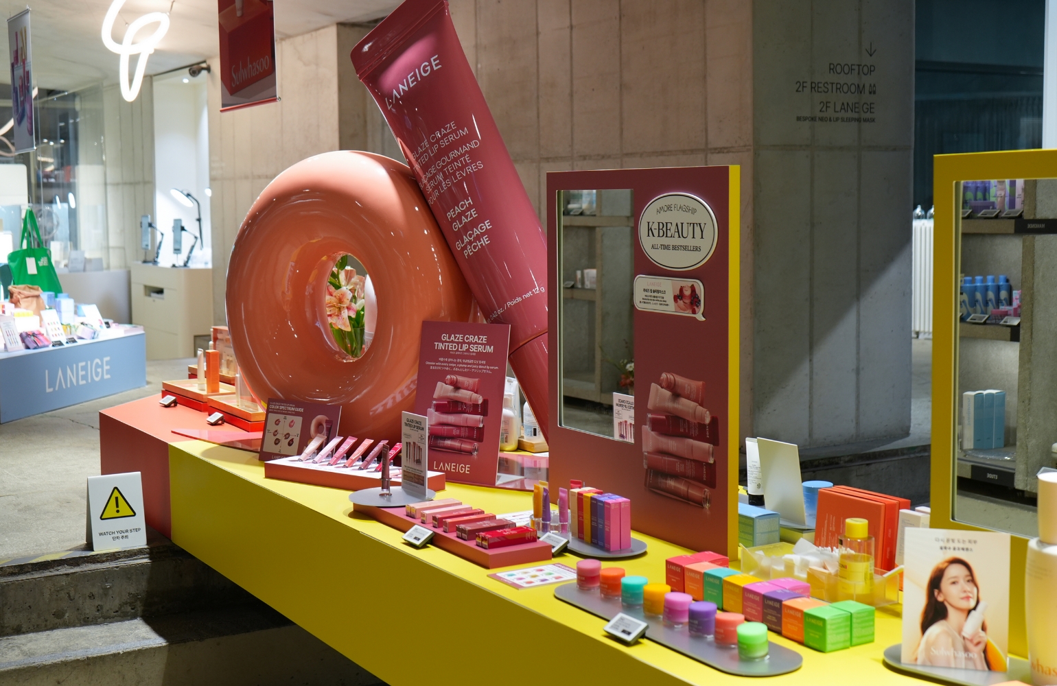
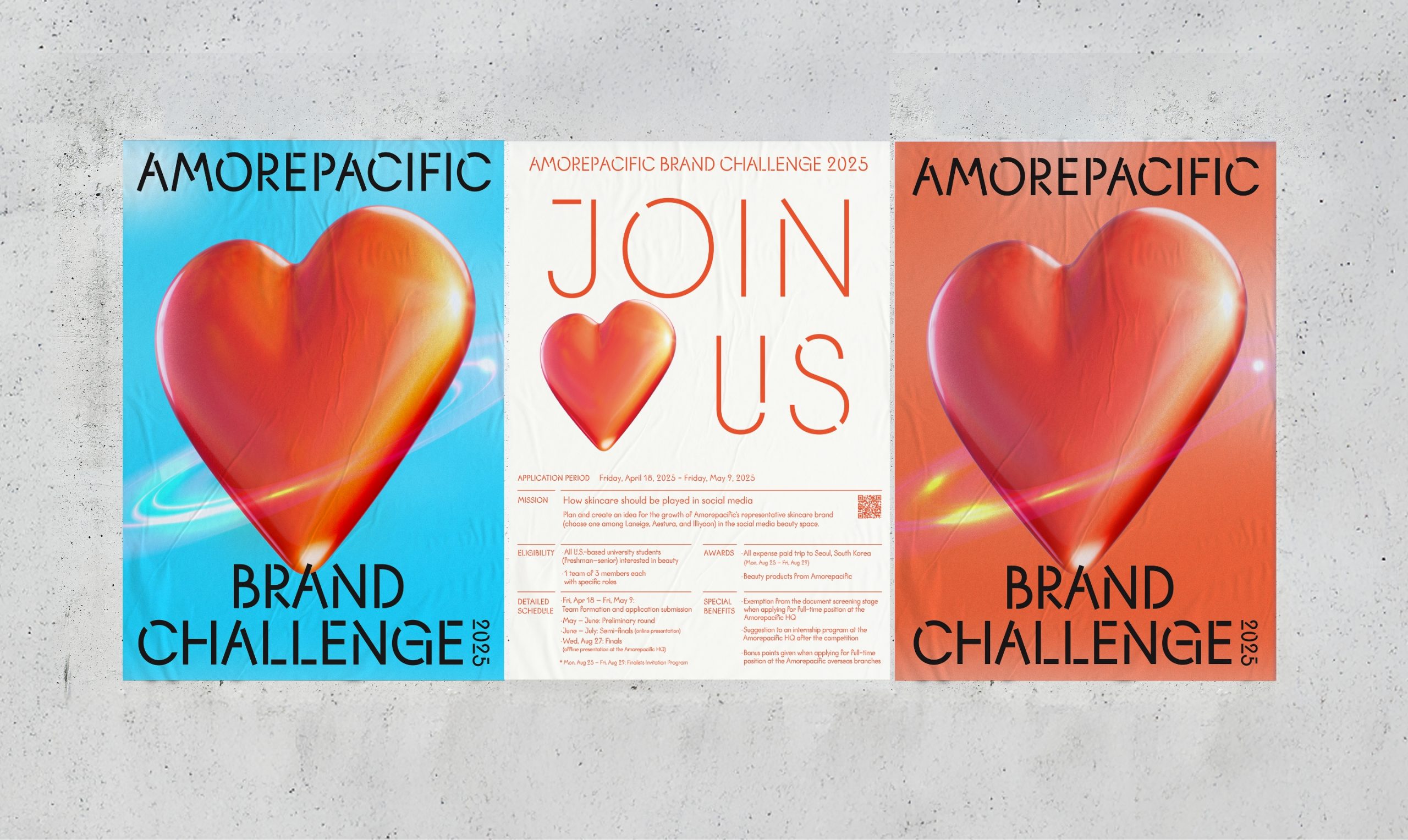
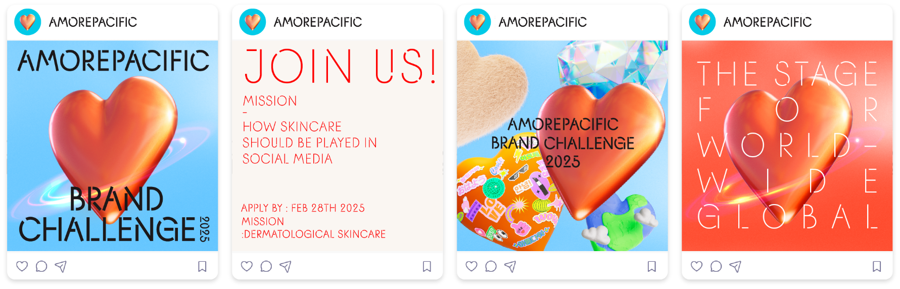
We utilized the developed visual assets to create social media promotional content.
We designed the competition website to maintain the same visual identity, ensuring a consistent brand experience across all touchpoints.
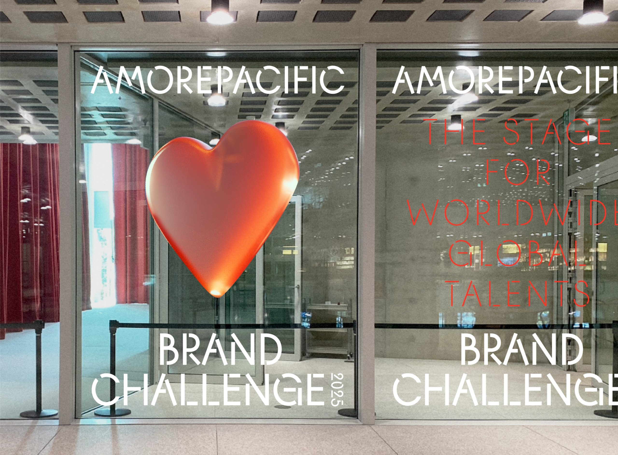
We also designed and set up the venue for the
final presentation, which was held on August 27.
final presentation, which was held on August 27.
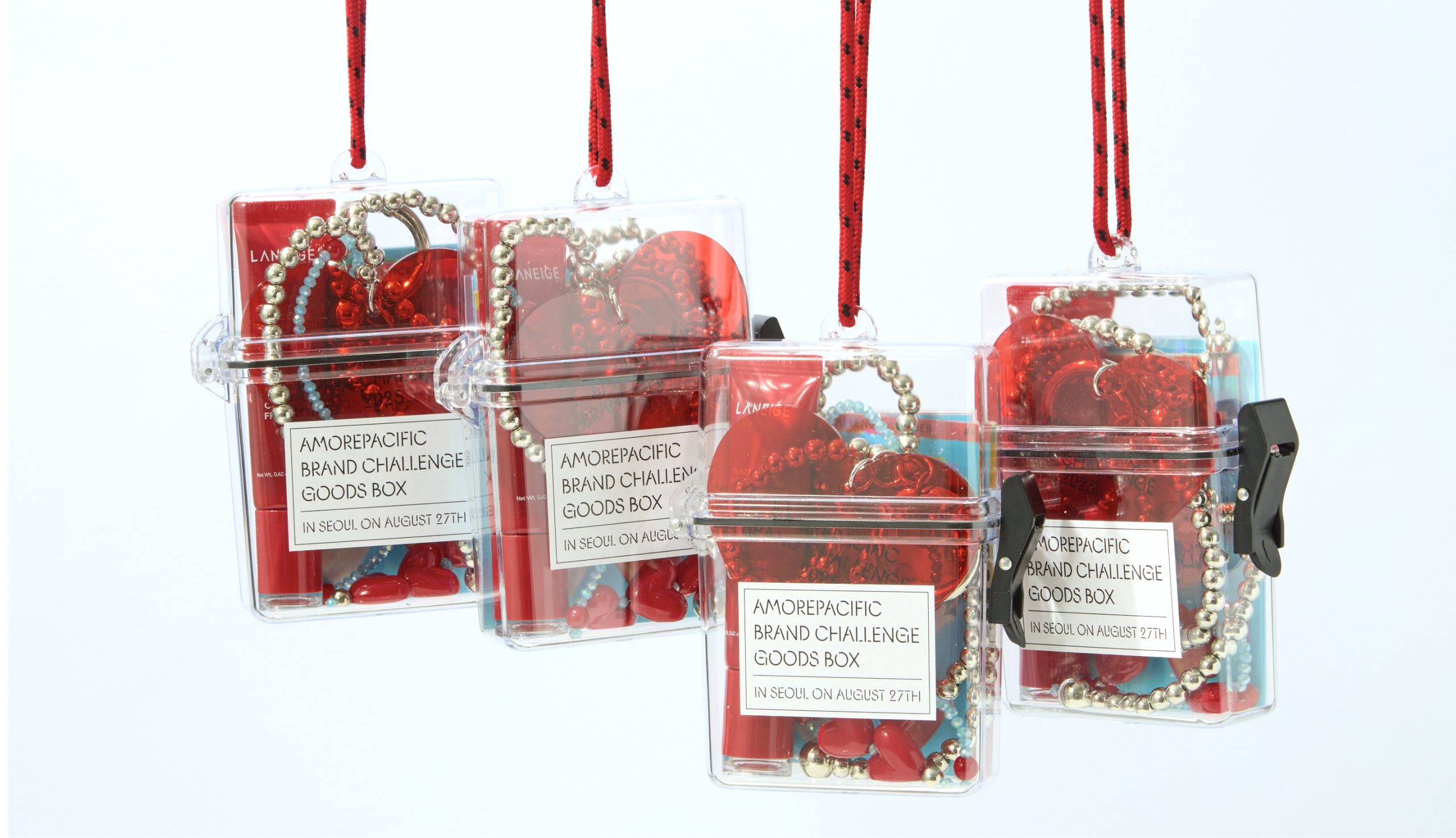
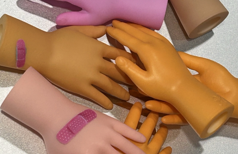
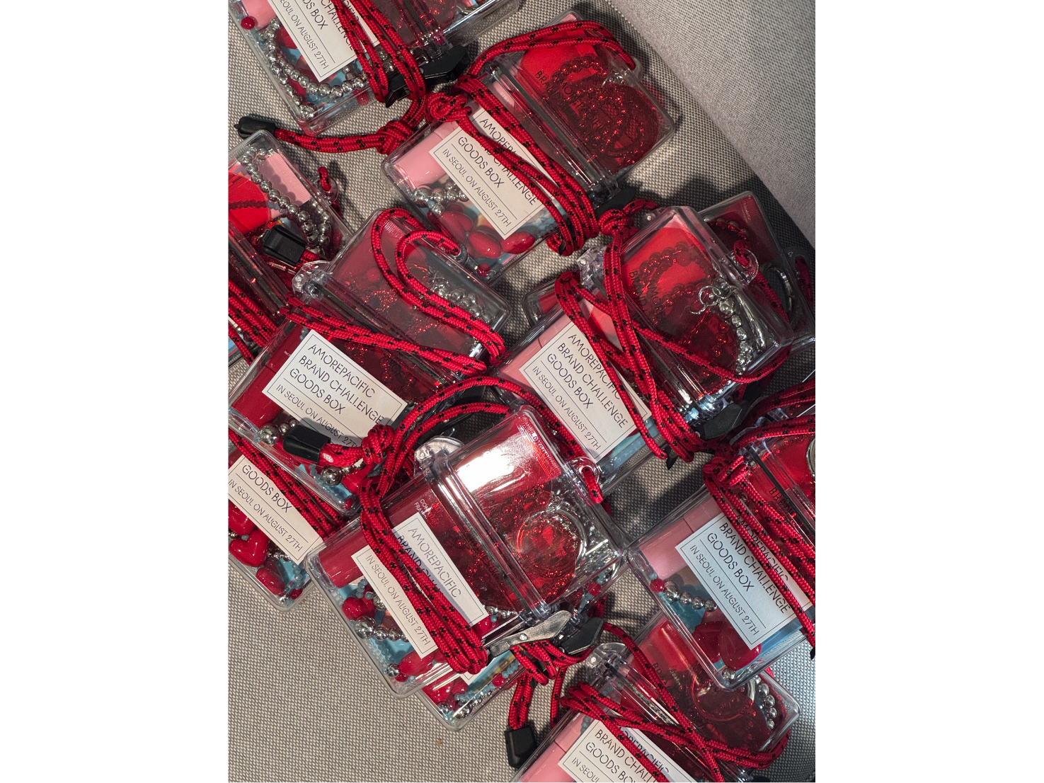
GOODS BOX
We filled the merchandise box with items that young people in their early twenties
from around the world—participants in the brand challenge event—would love.
from around the world—participants in the brand challenge event—would love.
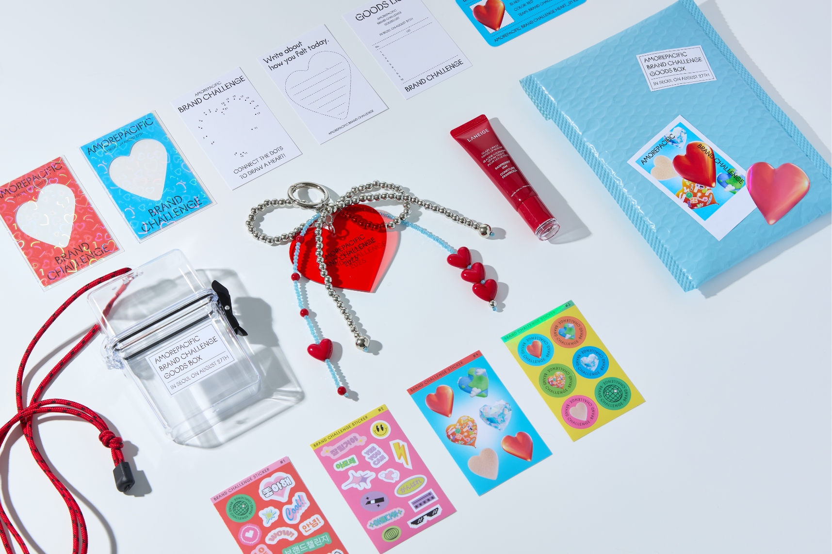
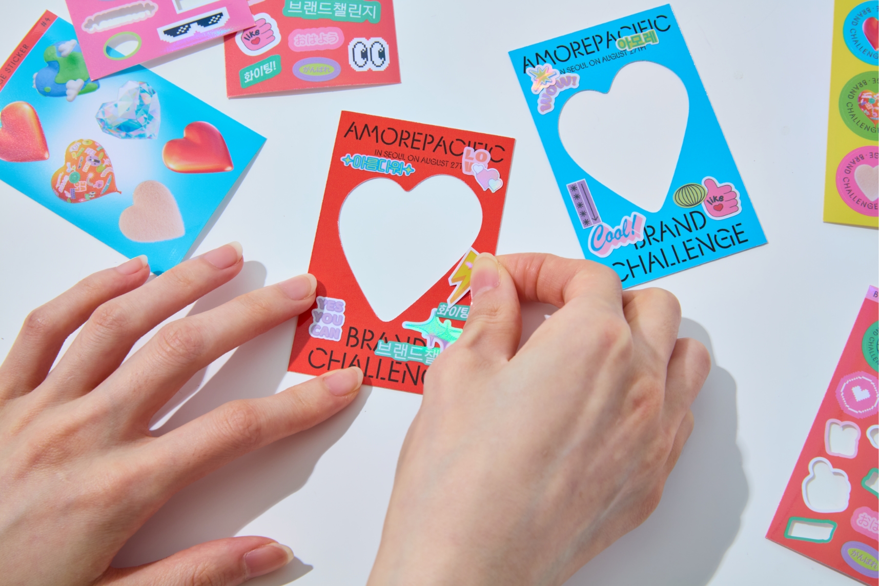
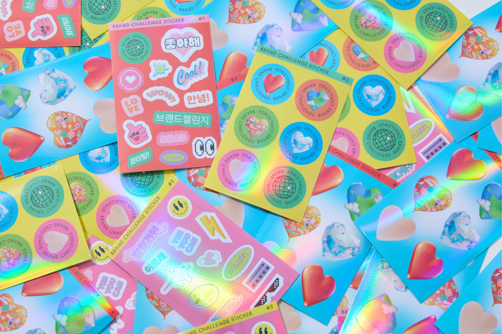
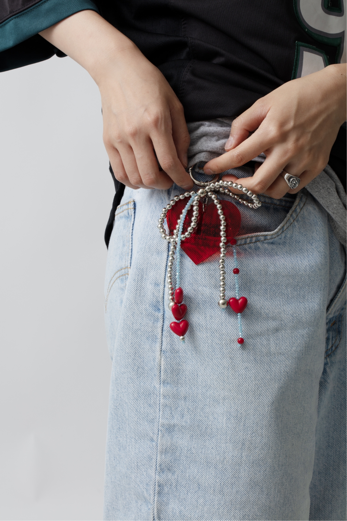
Inside are various stickers, photo frames, and photo cards created using the brand challenge visuals, keyrings inspired by the key visual motif, and even Laneige’s new lip balm.
The stickers were meticulously sized so they could be used freely elsewhere or perfectly fit onto the photo card frames.
With diverse finishing techniques and holographic sleeves, the design was made to instantly evoke the reaction: “It’s so pretty—I want it!”
The case containing the goods was also carefully designed to double as a bag. We envisioned participants from different countries wearing their gifted merchandise crossbody on the day of the event.
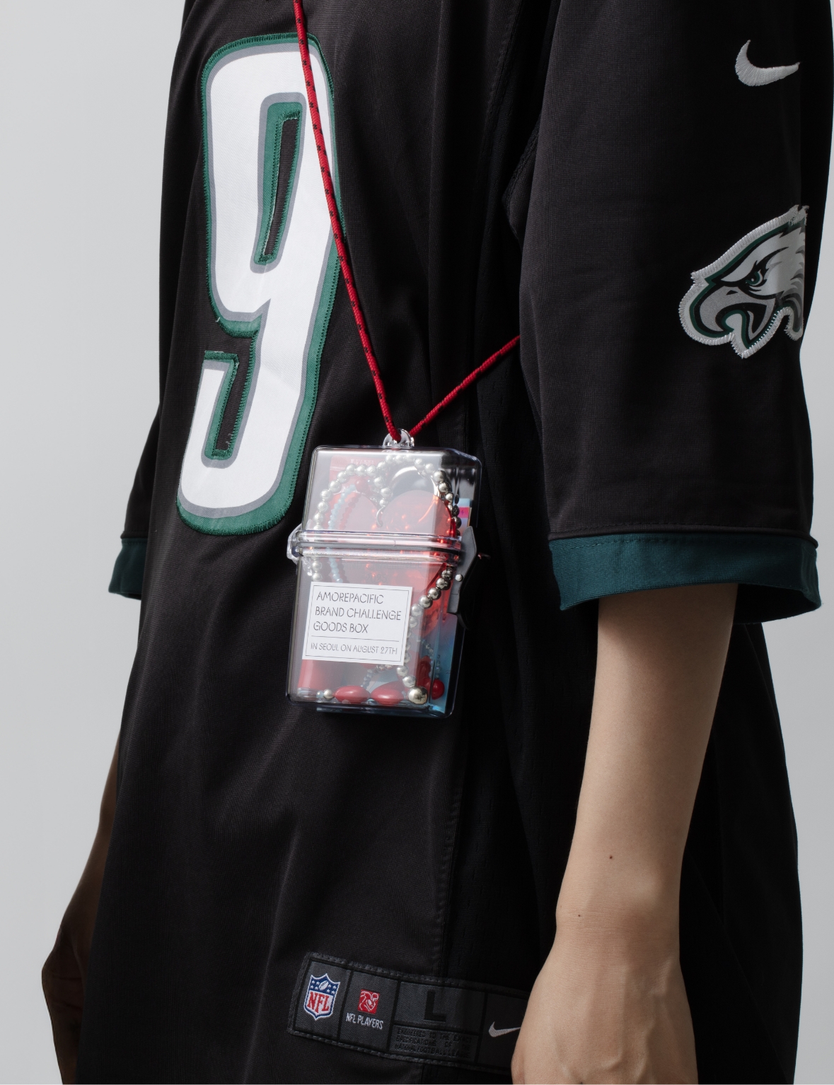
The case containing the goods was also carefully designed to double as a bag. We envisioned participants from different countries wearing their gifted merchandise crossbody on the day of the event.
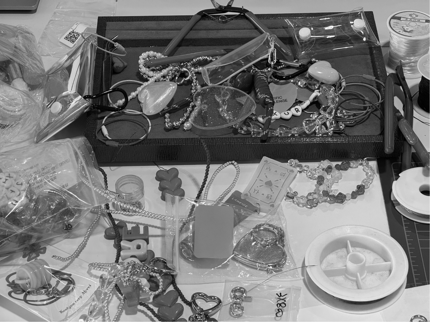
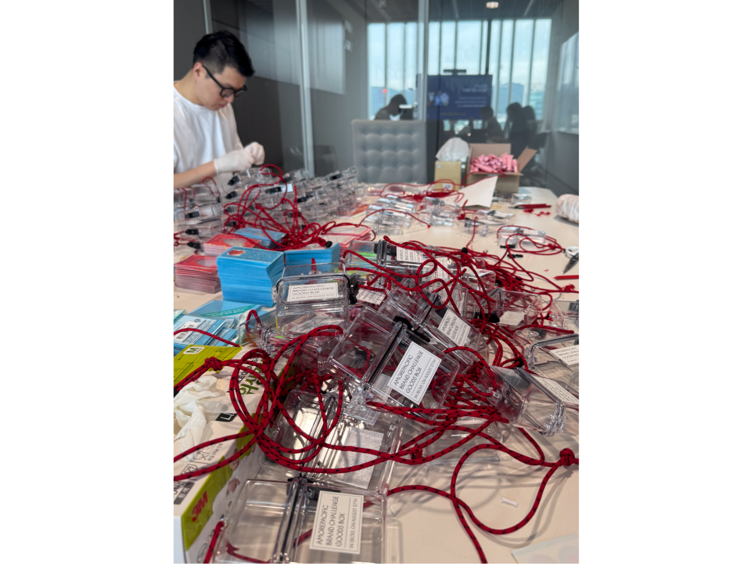
The process of creating these goods was one challenge after another.
At first, we personally bought beads and experimented with various ways of assembling them.
After several rounds of sampling, we collaborated with a specialized manufacturer to achieve higher productivity and quality.
Because of the small production quantity, it was difficult to find a partner who could meet our specific requests for cord length and packaging methods.
Every step—from cutting and tying the cords, to packing the contents, and wrapping the final product—was carried out entirely in-house.
- Amorepacific Creatives
- keyvisual Concept & Design
- Cheon Nari
- Motion graphic / Motion variation
- Reframe Studio / Gao Yang
- goods design
- Kang Yoosun, Jeong Jiyun
- Photography
- Lee Yunjin
- BM
- Han Winnerin