MEDIAN NEW BI System
Summary
In September 2025, Median introduced a renewed BI system to strengthen its competitiveness on the global stage.
We refined the previously separated wordmark and inconsistent logo placements, establishing a cohesive structure that harmoniously integrates both Korean and English versions.
By unifying these elements into a single graphic system and redefining the Median Blue color, we built a design strategy that ensures the BI is consistently recognized with the same position and impression across all applications.
Through this renewal, Median has achieved greater cohesion and presence in both domestic and international markets, fulfilling the core goals of this project.
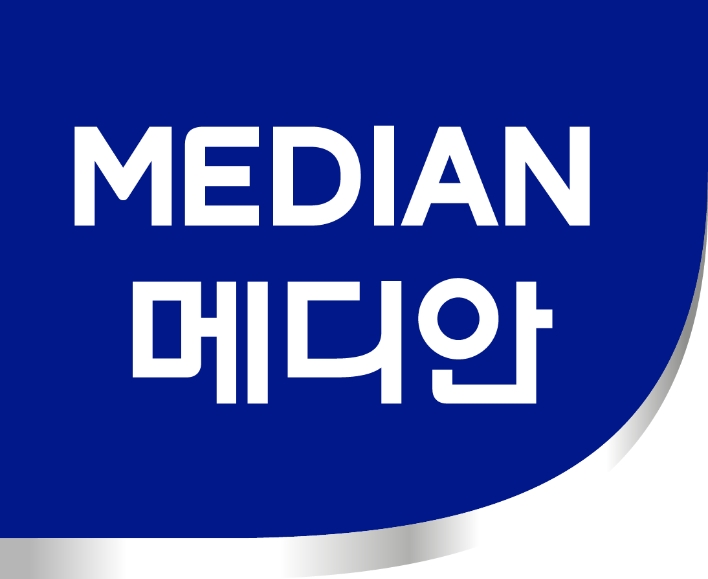
We are pleased to present the new BI system for Median—featuring a clearer, more refined logo and an organized graphic structure.
Background
Although Median had both Korean and English wordmarks, they were used inconsistently across products in varying positions and sizes, resulting in a lack of cohesive brand communication.
Each product relied on its own visual direction, creating a product-centric rather than brand-centric approach.
This revealed the need for a unified BI system that would enable both domestic and global consumers to instantly recognize the brand at a glance.
Additionally, the retail environment differs between markets: the Korean market focuses on vertical displays that highlight functional messaging, while overseas markets use horizontal displays that secure a wider BI area and emphasize brand visibility.
These differences in display structures provided a clear framework for defining the direction of the integrated system. This project went beyond simply updating the logo.
It aimed to reorganize the fragmented wordmarks into a single cohesive graphic system and to establish a consistent, brand-led visual identity that remains effective across diverse display environments.
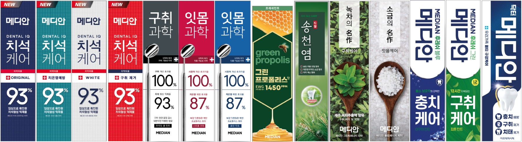
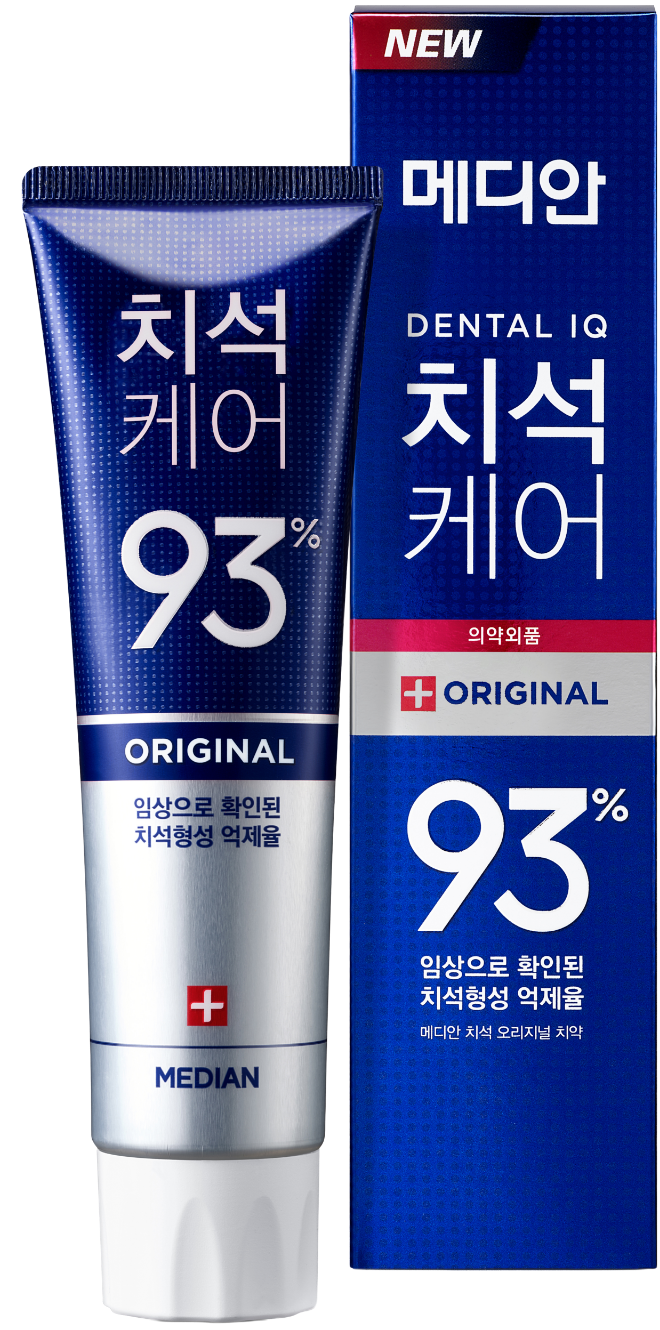
Current Product Design Status Before BI Unification
MEDIAN BI Design Principle
To enhance Median’s brand cohesion and presence,
we continuously cross-validated the following criteria throughout the BI design process.
we continuously cross-validated the following criteria throughout the BI design process.
1. Enhanced visibility and brand cohesion
2. Visual consistency across both horizontal and vertical formats
3. Maximized spatial efficiency
4. Seamless integration with product graphics
2. Visual consistency across both horizontal and vertical formats
3. Maximized spatial efficiency
4. Seamless integration with product graphics
Design Approach
We unified the Korean and English wordmarks within a single graphic structure, establishing a system that enables intuitive brand recognition regardless of language.
By meticulously adjusting the weight and height of both wordmarks, we achieved visual balance and ensured a cohesive form that reads naturally as one integrated identity.
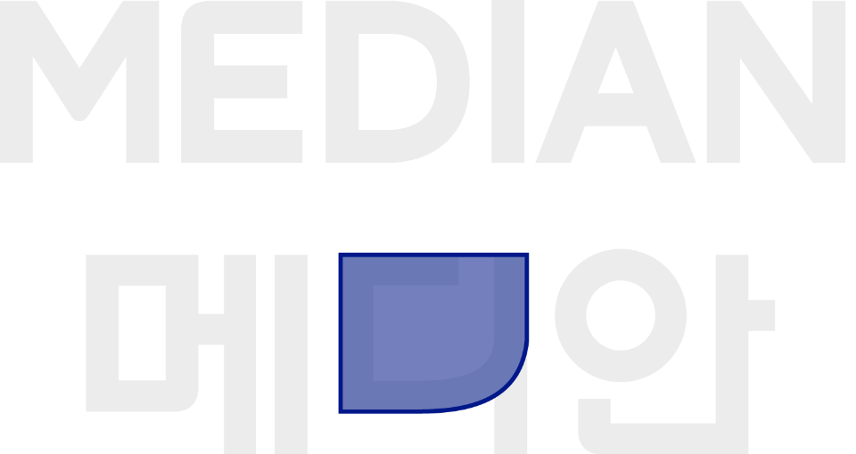
By applying the soft curve shared by the key forms—the Korean 디 and the letter D—as the framing motif of the BI system, we created a visual identity in which both languages connect organically within a single brand.
This curved motif is consistently applied across packaging, shelf displays, and digital communication, delivering a unified and seamless brand experience.
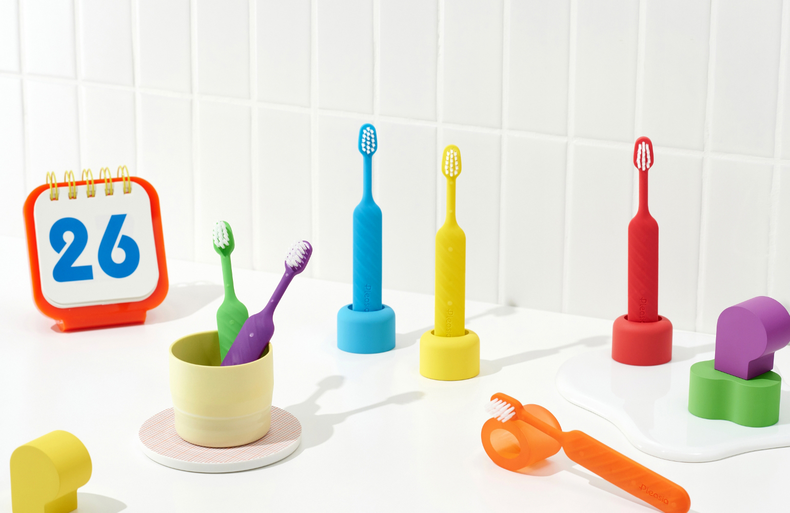
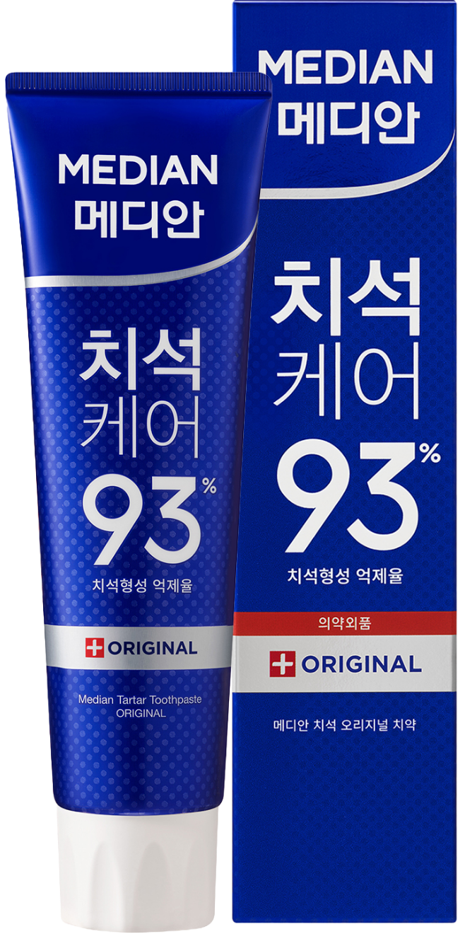
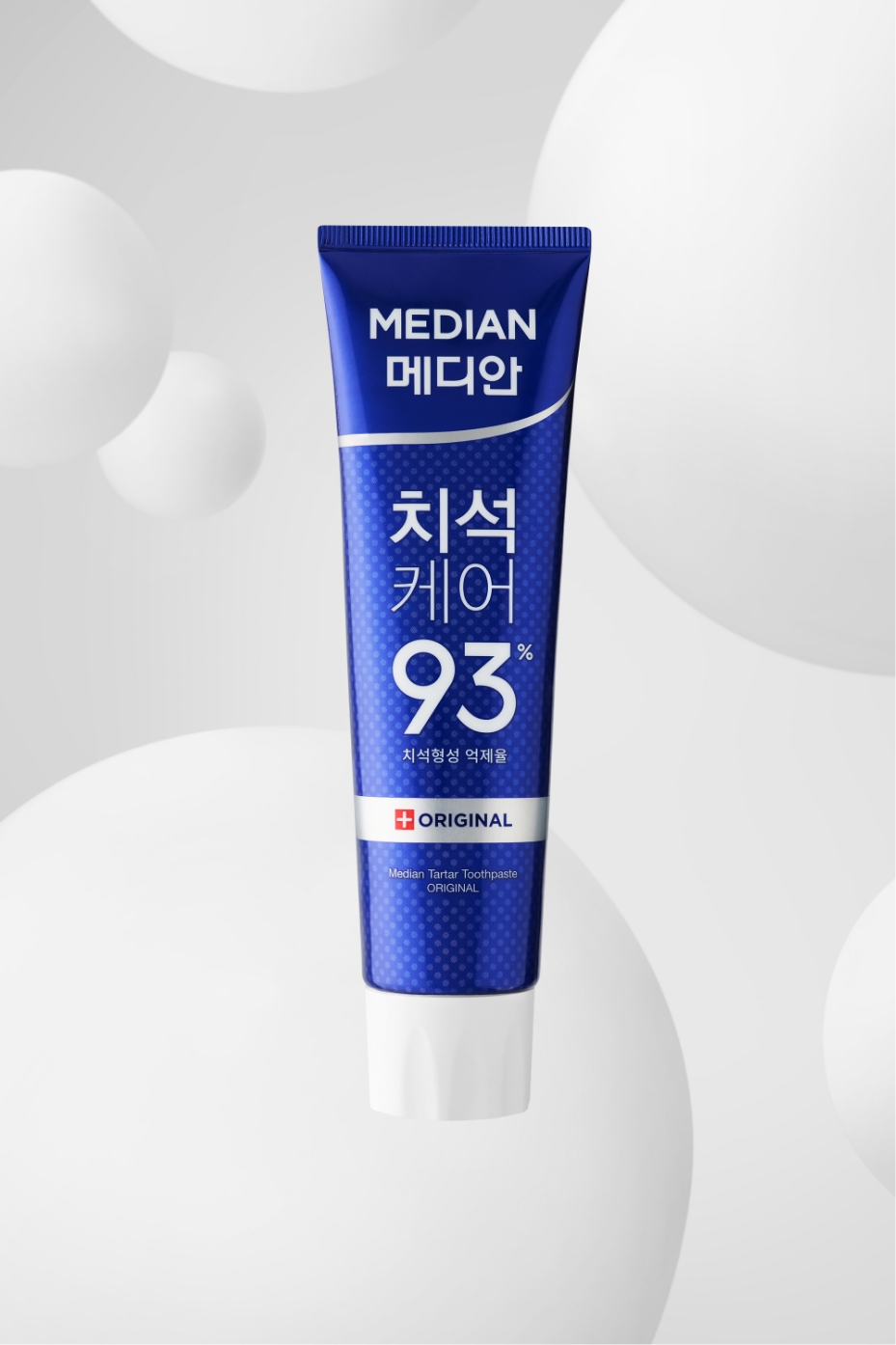
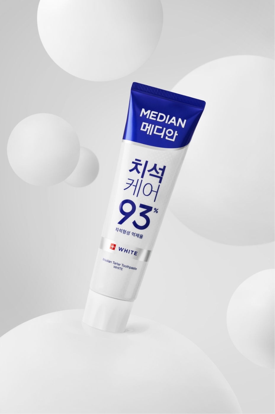
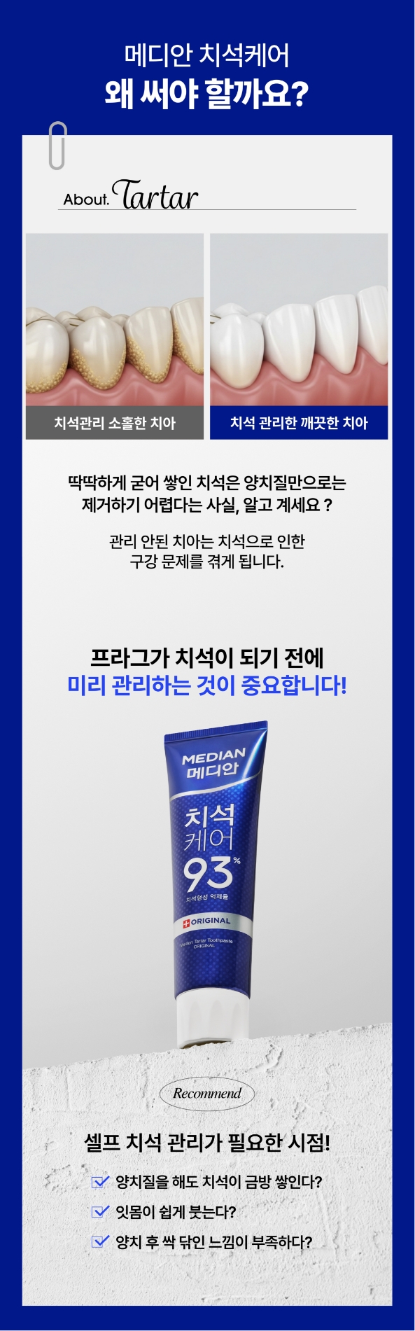
Design Execution: Tartar Care Line
Based on these design principles, the new BI was first applied to the Tartar Care line, where it was translated into a fully refined design structure.
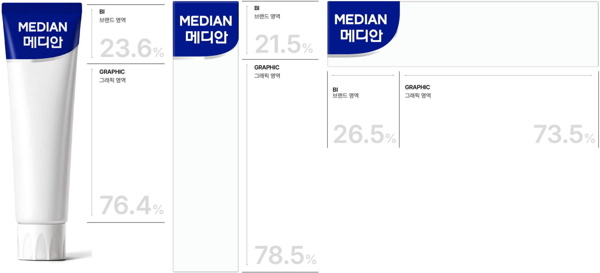
By carefully balancing the proportion between the BI brand area and the product graphic area, the system ensures a visually harmonious impression—even when each line employs different graphic elements.
This consistent structure creates a strong sense of brand cohesion, allowing products to appear connected as a unified flow, even when they are displayed individually.
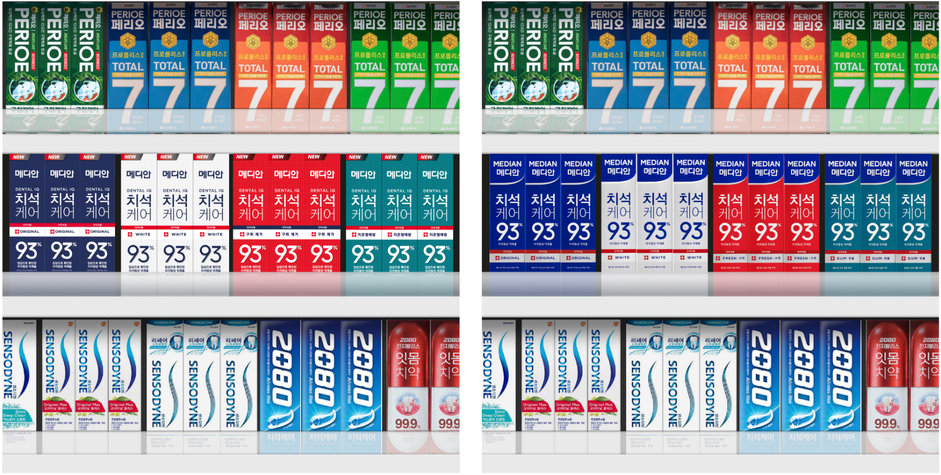
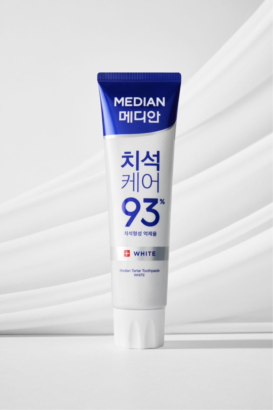
Color System
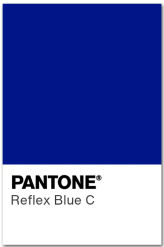
Median’s color system was refined to clearly express the brand’s sense of expertise and trustworthiness.
The original blue of the Tartar Care line was integrated with the newly defined BI Blue, establishing it as the core identity color that represents the brand.
This BI color harmonizes organically with the graphics of each product line, ensuring a consistent brand impression and expanding into a unified color strategy across the entire brand.
Before
–
after
Visual Communication
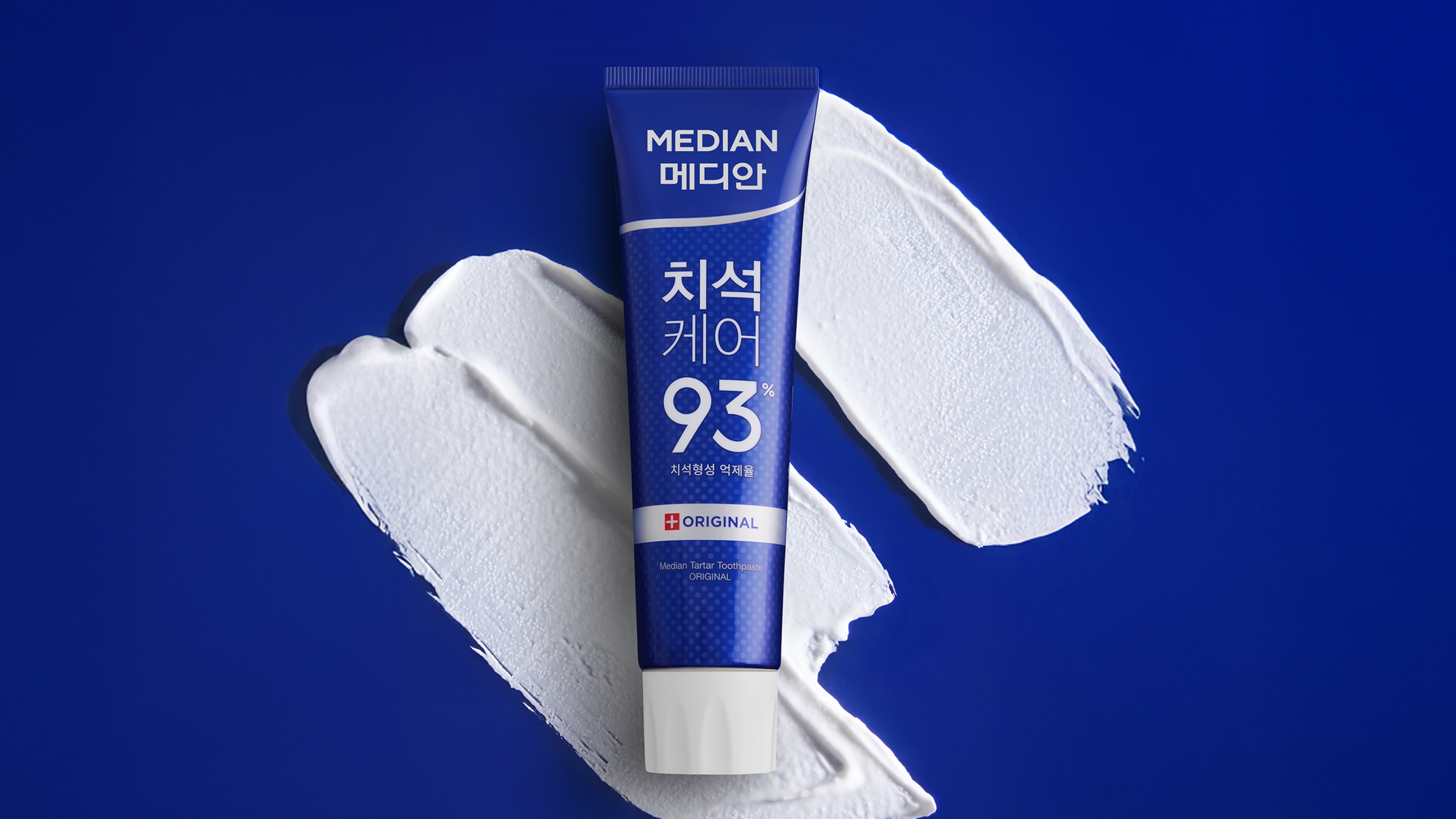
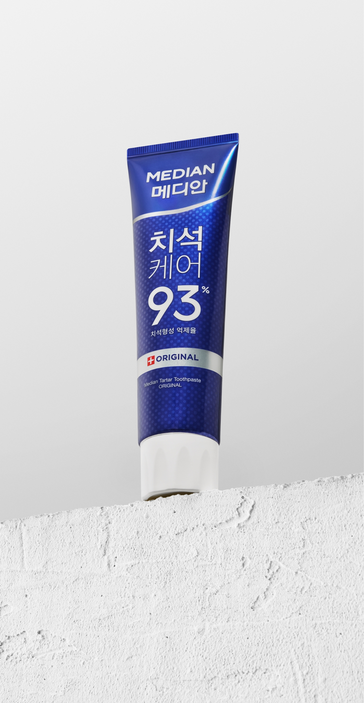
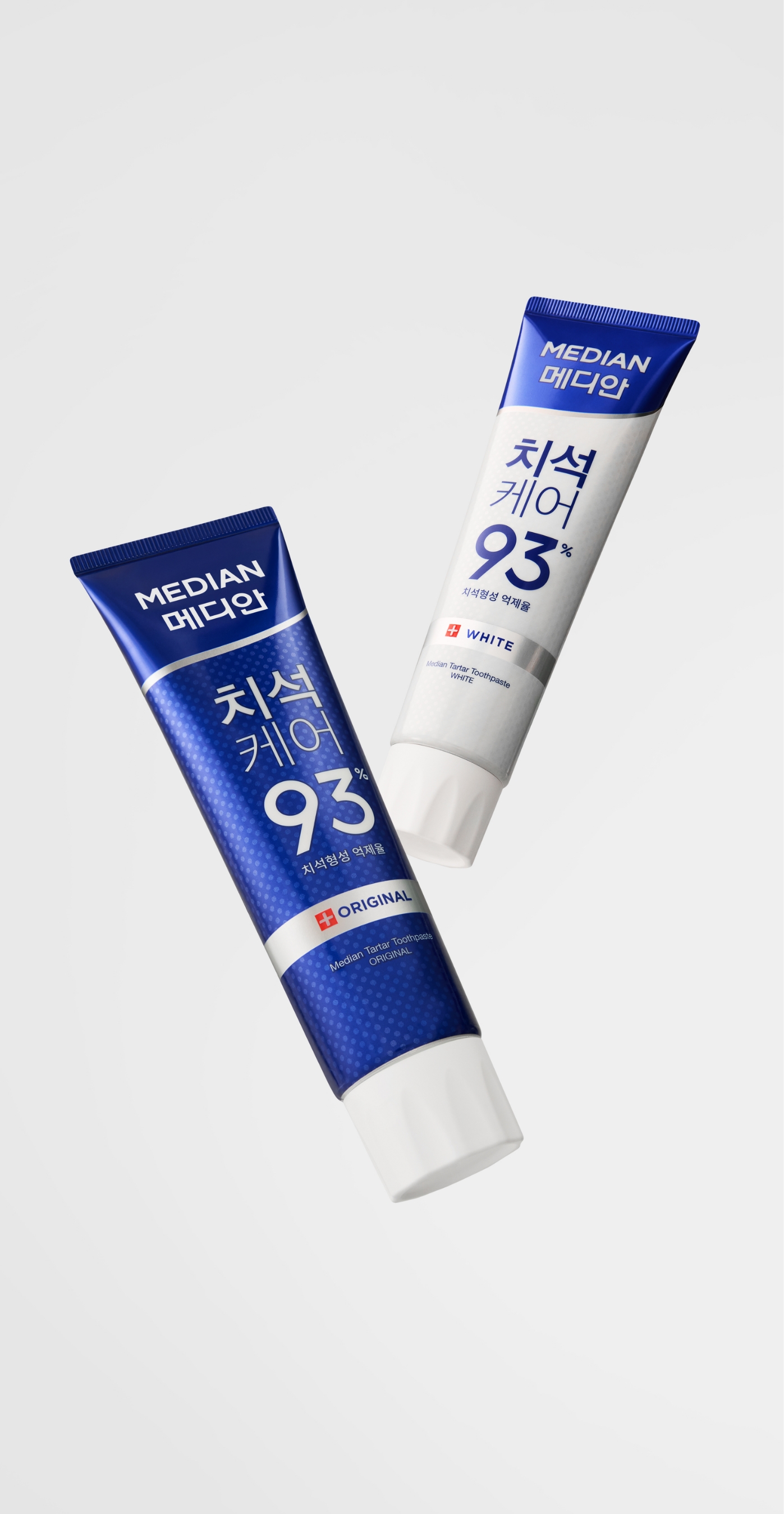
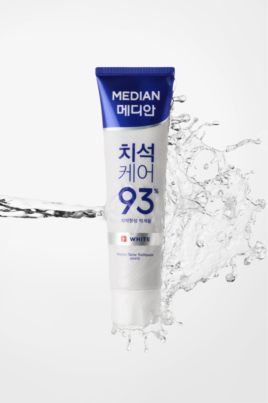
To visually express Median’s longstanding leadership and expertise as a tartar-care brand, we created a new set of key visuals.
The visuals center around the brand’s signature blue tone, conveying both cleanliness and scientific credibility, while refined lighting and a minimal backdrop highlight the product’s texture and details.
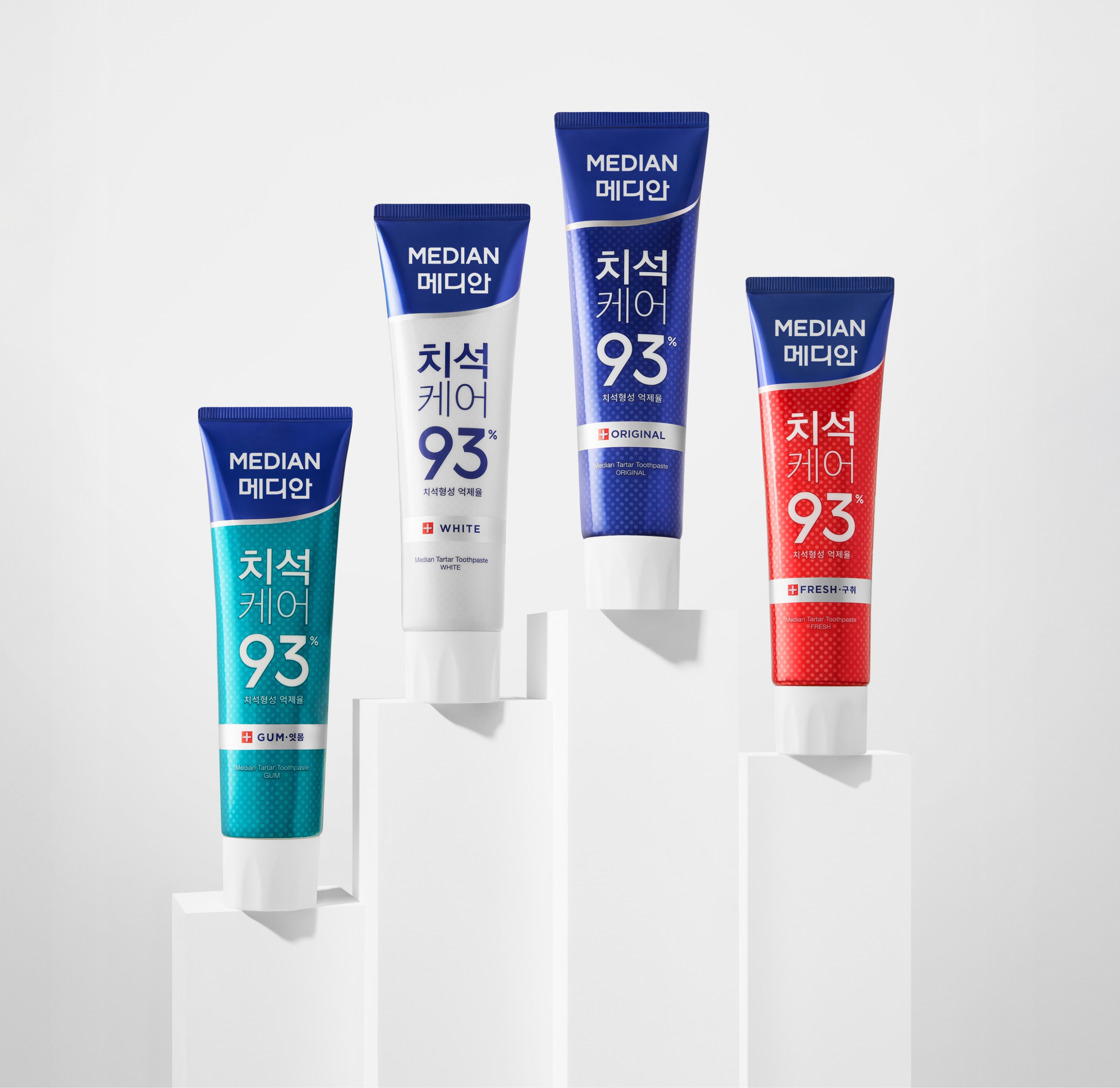
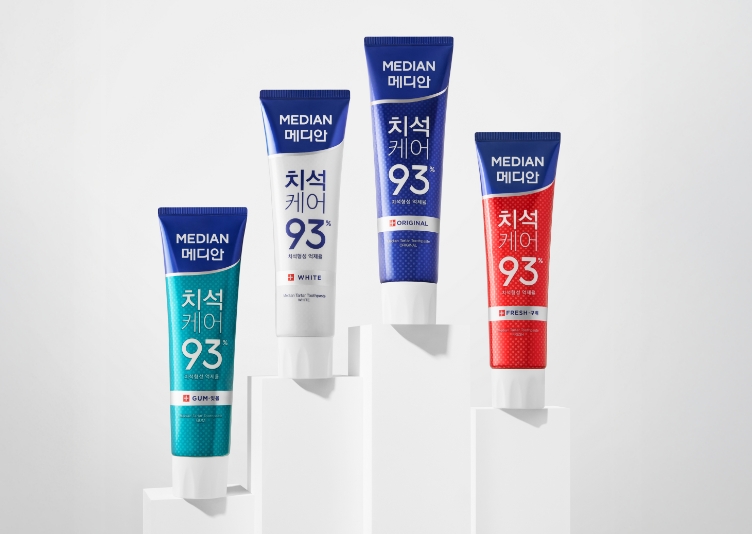
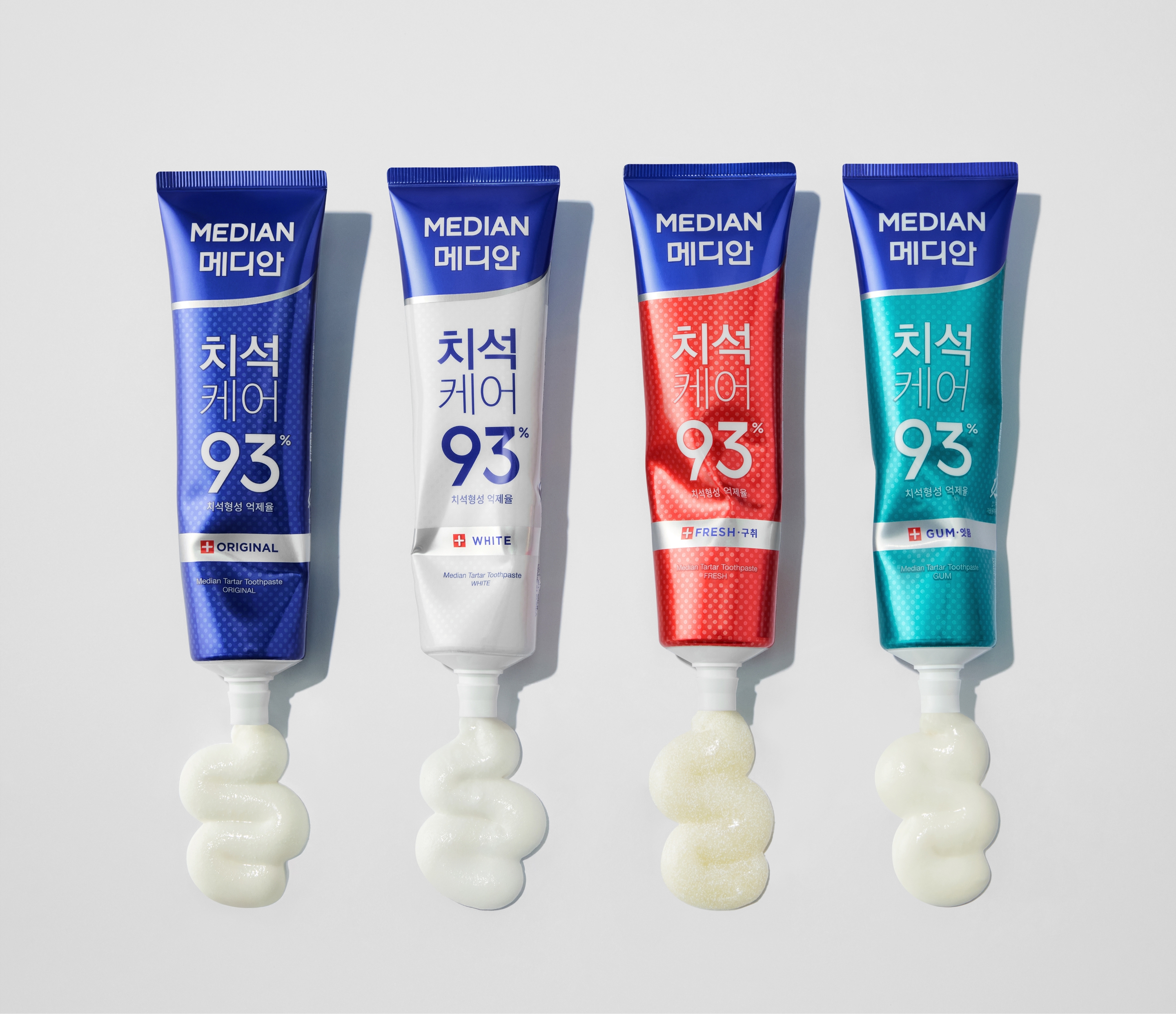
The two hero products—Original and White—are placed together at the center in a duo composition, emphasizing the brand’s core identity and the balance within the lineup.
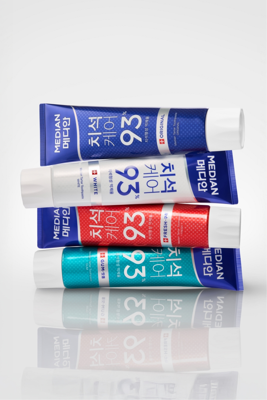
In the group shots, multiple products are arranged with a clear sense of order, visually reinforcing Median’s confidence and presence as a leading dental-care brand.
Visual Communication
To visually express Median’s longstanding leadership and expertise as a tartar-care brand, we created a new set of key visuals.
The visuals center around the brand’s signature blue tone, conveying both cleanliness and scientific credibility, while refined lighting and a minimal backdrop highlight the product’s texture and details.
The two hero products—Original and White—are placed together at the center in a duo composition, emphasizing the brand’s core identity and the balance within the lineup.
In the group shots, multiple products are arranged with a clear sense of order, visually reinforcing Median’s confidence and presence as a leading dental-care brand.
PDP Design
The Median Tartar Care line extends the NEW BI visual identity into the digital space, ensuring that offline and online environments connect seamlessly into a unified brand experience.
To align with the tone and manner of the visual photography, Median Blue was incorporated to more clearly express the brand’s cleanliness and professional character.
Additionally, the BI’s silver line and rounded graphic elements were applied to key page-transition moments, allowing Median’s unique visual identity to appear naturally within a dynamic and rhythmic flow.
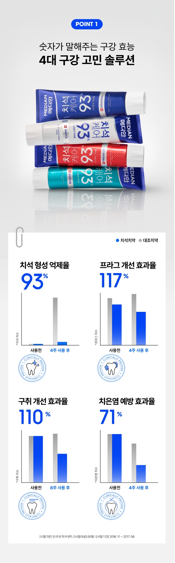
Drawing inspiration from scientific journals, we applied a structured editorial layout and clip-style graphic elements to establish a functional and professional dental brand identity.
The clinical graph was redesigned to present all four key results at a glance, and newly developed clinical icons further enhanced the sense of expertise.
While BI Blue anchors the overall color palette, a brighter blue was introduced as an accent to add clarity and freshness throughout the page.
In the middle section of the detail page, large 3D video content was placed to create strong points of focus and visual refresh throughout the page.
The first video illustrates how TSPP acts on substances that cause tartar formation, effectively inhibiting the buildup of tartar.
The second video visually demonstrates how fluoride forms a protective layer on the teeth, strengthening them and shielding them from cavities.
Through these two videos, Median enables consumers to intuitively understand the brand’s scientific expertise. These visual assets not only enhance product comprehension but also encourage longer page engagement.
- Amorepacific Creatives
- Design
- Baek Inwoo, Yoon Minhae, Koo Hyewon
- Lee Sungyub, Kwon Miyeon, Lee Hyungwoo
- Park Jihyeon
- Visual Directing
- Kwon Miyeon, Park Jihyeon
- Photography
- Freehand Studio
- Motion Graphic
- JIIN KIM
- BM
- Kim Yeseul, Jung Jihye