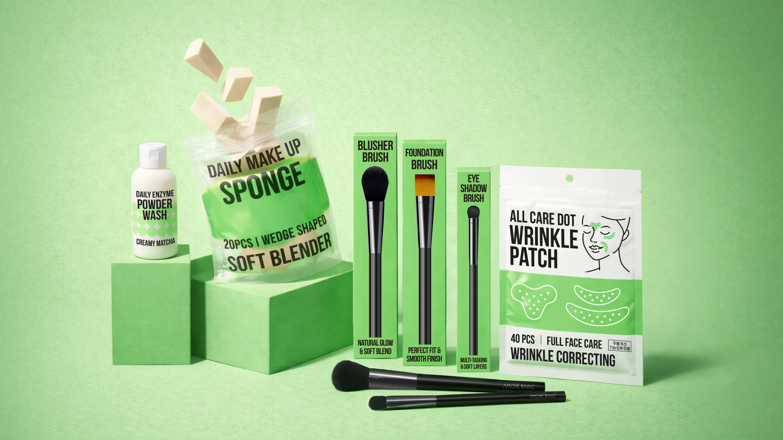
AMORE BASIC BEAUTY ITEM SERIES
Summary
AMORE BASIC launched in 2023 as an Amore Mall private brand offering beauty tools at an accessible price point.
Through this project, the brand expanded its scope beyond tools into a broader range of beauty items.
Centered on the concept of “simple yet effective efficacy,” the project focused on building a trend-responsive PB lineup designed to attract new customers.
Background
Amore Mall’s private-brand (PB) product line has grown on the strengths of reasonable pricing and practicality.
however, there was a clear need to expand beyond a portfolio centered primarily on beauty tools.
In response, the core mission of this project was to proactively identify untapped demand within categories not directly handled by Amorepacific, and to swiftly launch new beauty items that offer strong market competitiveness in terms of price, functionality, and capacity—surpassing existing alternatives without compromising value.
History
AMORE BASIC has established a minimalist visual identity grounded in its brand value of “only what’s necessary, at a reasonable price.”
The existing neon green key color, combined with a black-and-white palette and clear text layout rules, had already accumulated in consumers’ minds as core brand assets of AMORE BASIC.
In this project, the design strategy was therefore set to extend and further refine these established assets, rather than redefine them.
Brand Concept
The core keywords of this line are Simple Efficacy, Synergy Booster, and Smart Value.
Accordingly, the design focuses on an essential, minimal, and daily visual language—free of unnecessary embellishment—prioritizing the intuitive communication of efficacy and usability.
The role of the design was to achieve this efficiently, leveraging the development speed characteristic of PB products while maintaining the integrity of the brand identity.
Package Design
The shared premise of this AMORE BASIC package design project was to visually communicate the speed and efficiency made possible by PB products.
Rather than pursuing novelty or experimental approaches, the focus was on maximizing the use of the brand system already familiar to consumers, while refining the information structure so that each product’s function and usage context could be understood at a glance.
Although all designs operated within the same overarching design keywords, the detailed strategies were flexibly adjusted in recognition of the fact that the consumer’s first impression varies depending on each product’s specific attributes.
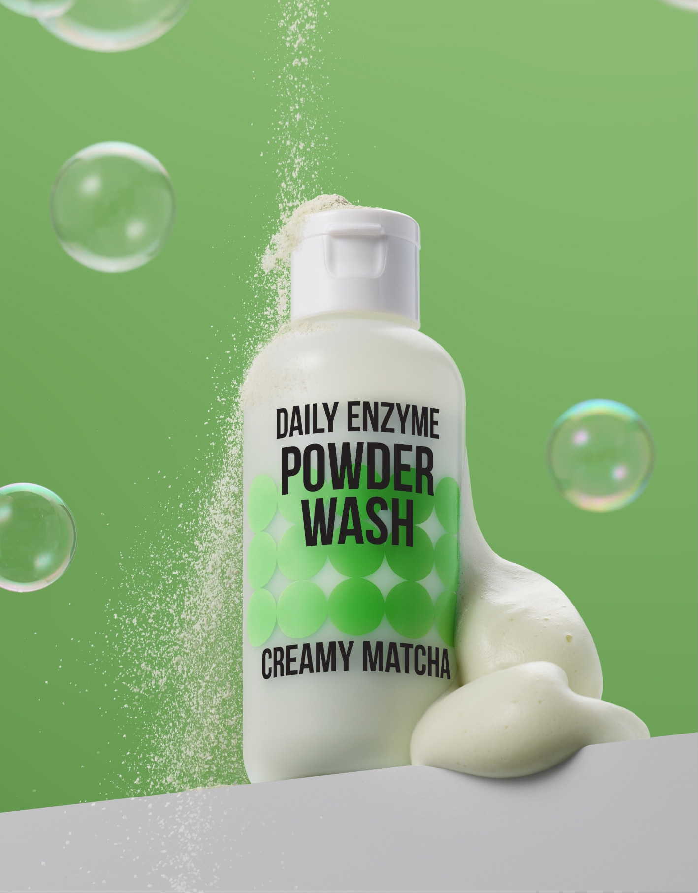
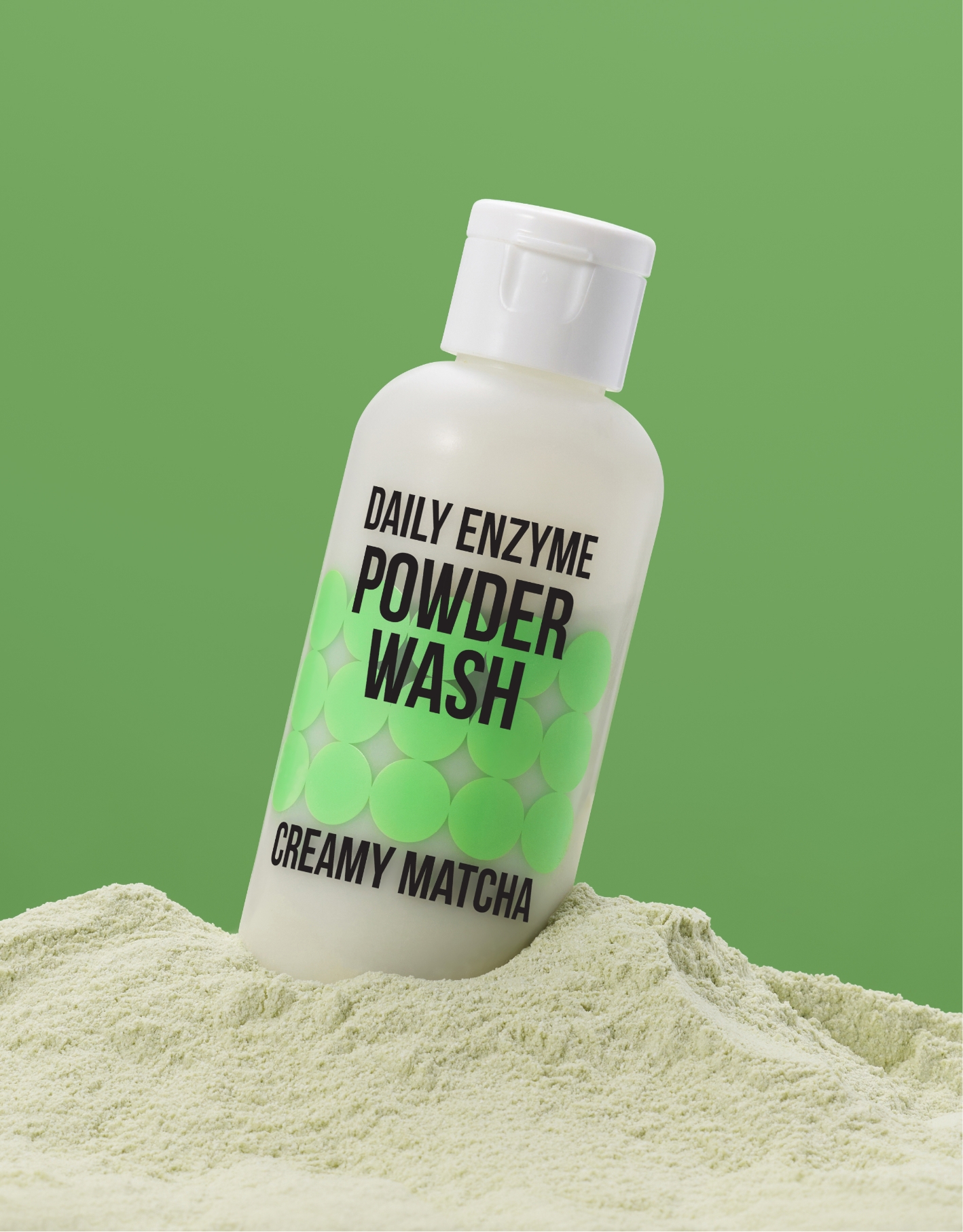
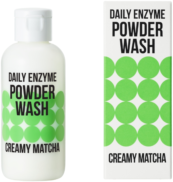
1. Daily Matcha Enzyme Powder Wash
As the starting point for expanding AMORE BASIC’s beauty item lineup, the powder wash placed the highest priority on maintaining continuity with the brand identity.
The color scheme retained the existing neon green as the main color, combined with black and white, so that despite being a new product, it would be recognized as something that feels like “the AMORE BASIC you already know.”
Considering the tight development timeline and the scale of the SKU lineup, introducing a new color system was deemed unconvincing at this stage and potentially risky.
Instead, we made a deliberate decision to actively leverage the existing neon green as a core brand asset.
The text layout directly inherited AMORE BASIC’s established rules, while sharpening the focus on enabling instant recognition of the product’s essence as a “powder wash.” The product name was placed most prominently at the top, with key points about ingredients and texture organized as supporting information above and below. This structure allows consumers, at the moment they encounter the package, to immediately understand what the product is and why it is needed.
The central pattern functioned as an important visual device for this product. Inspired by the round granules of enzyme powder, the pattern expresses an image of “cleansing and refinement” through the negative space and flow created as the particles come together. Rather than serving as a purely decorative graphic, the pattern acts as a visual translation of the product’s physical properties and functionality—an attempt to extend AMORE BASIC’s existing formal language to the next level.
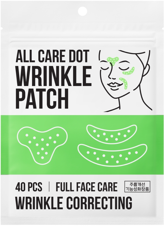
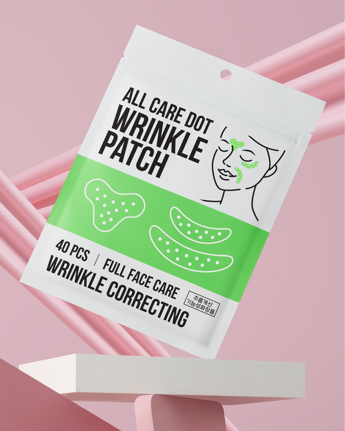
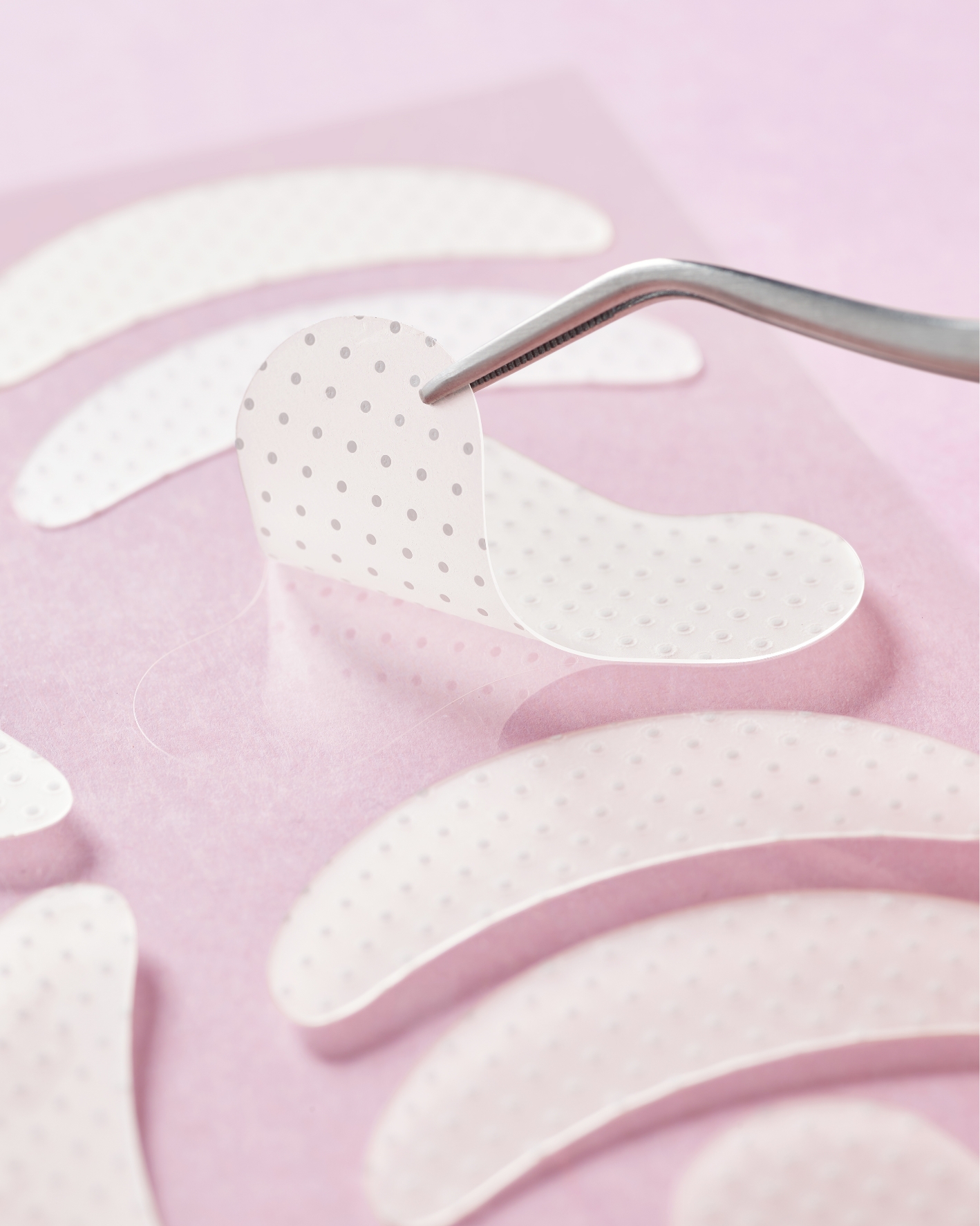
2. All Care Dot Wrinkle Patch
Because the All Care Dot Wrinkle Patch was also developed under the premise of rapid planning and launch, the package needed to communicate its usage context immediately, rather than relying on model photography or elaborate visual styling.
In a market where comparable products tend to fall into categories dominated by model imagery, emotive illustrations, or typography-driven designs, we chose the direction that most clearly conveys how the product is used.
An illustration that intuitively shows the placement and shape of the patches was applied to the front of the package. This decision went beyond simple information delivery; it was a UX-driven design choice intended to allow first-time users to understand and use the product instantly, without requiring additional explanation. The text layout remained largely aligned with AMORE BASIC’s existing rules, with the information hierarchy reorganized to maintain brand consistency. Instead of excessive claims, the copy focuses on essential functions and key information, ensuring clarity and credibility.
An illustration that intuitively shows the placement and shape of the patches was applied to the front of the package. This decision went beyond simple information delivery; it was a UX-driven design choice intended to allow first-time users to understand and use the product instantly, without requiring additional explanation. The text layout remained largely aligned with AMORE BASIC’s existing rules, with the information hierarchy reorganized to maintain brand consistency. Instead of excessive claims, the copy focuses on essential functions and key information, ensuring clarity and credibility.
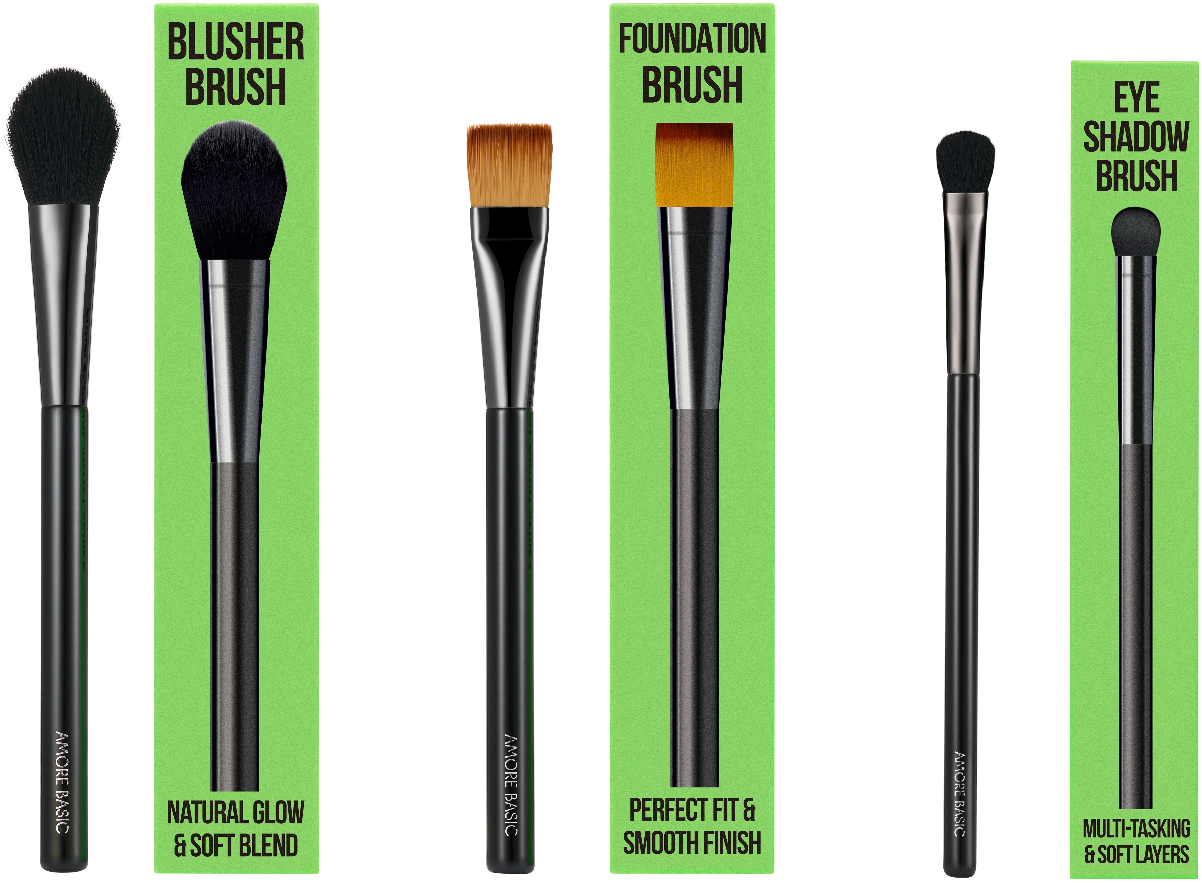
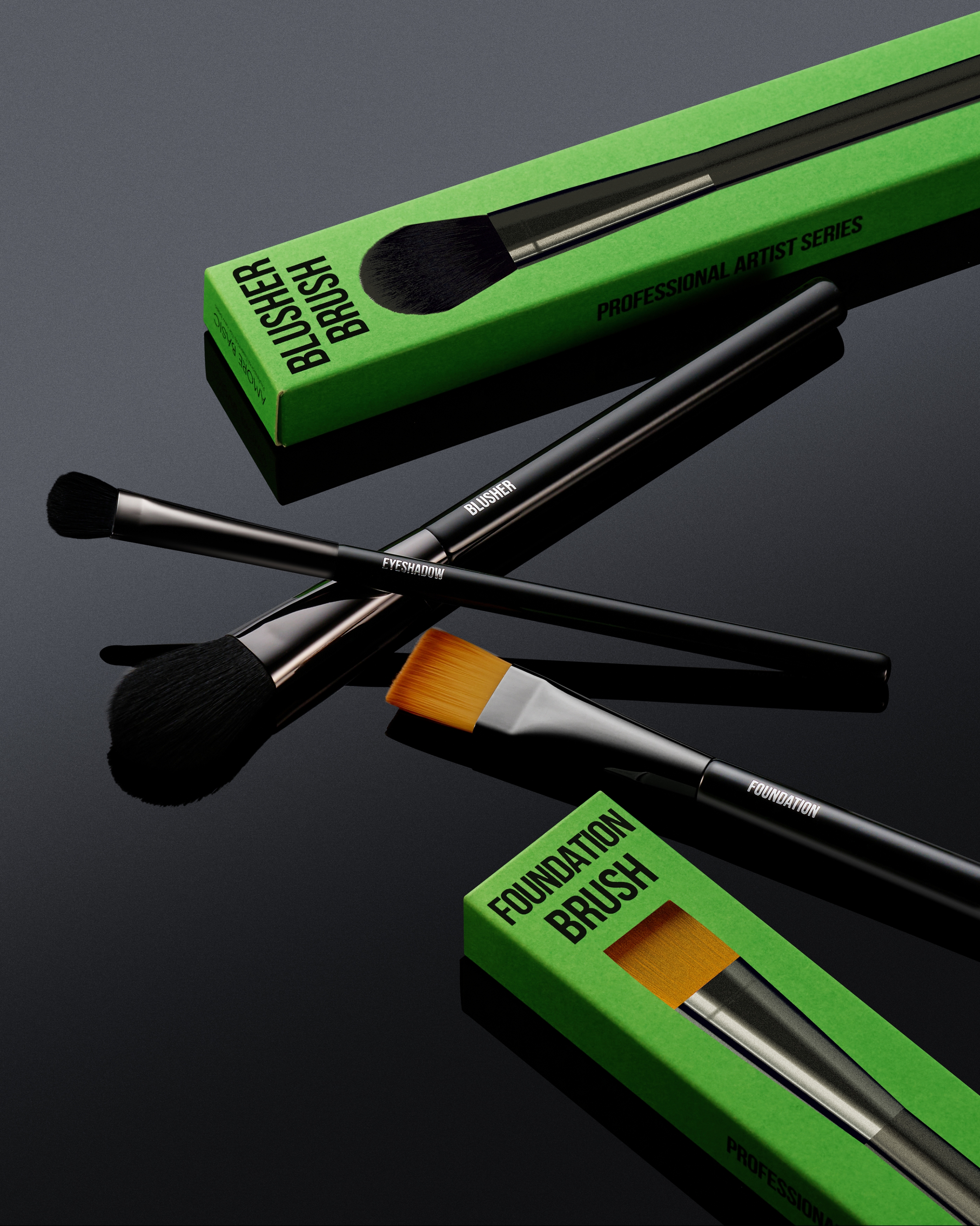
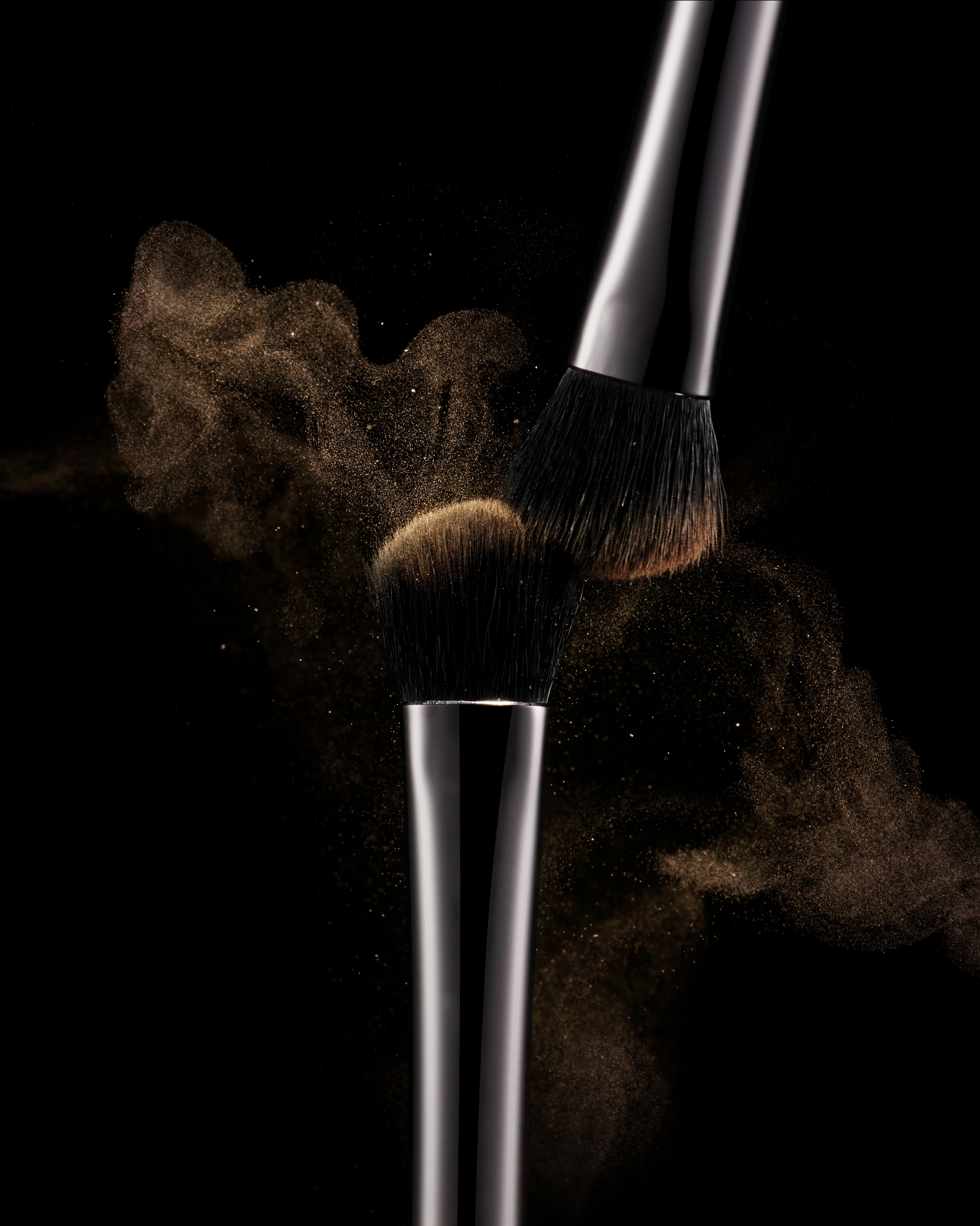
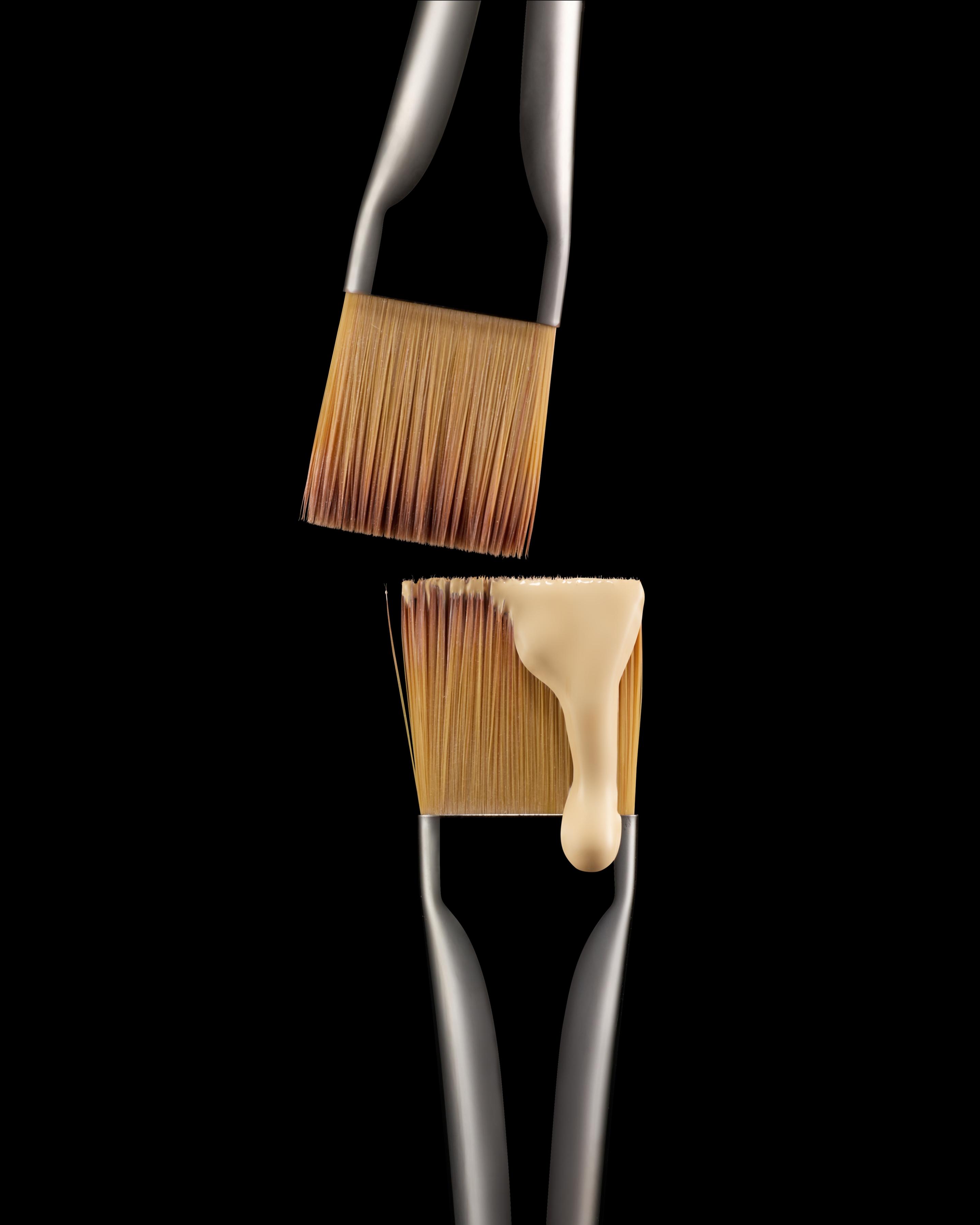
3. Professional Artist Shadow Brush Set (3 Types)
This brush line was developed in collaboration with makeup master Jinsu Lee as part of the Just Makeup program.
The package and product design were conceived together to ensure that the term “professional” would be perceived not as a marketing claim, but as a tangible aspect of real usability.
On the brush handle, the brand logo is placed discreetly at the lower section, while the opposite side features the intended use—such as foundation, powder, or blusher—marked near the top of the brush. This detail was carefully considered so that even when the brushes are stored upright in a stand, the text naturally falls within the user’s line of sight, allowing the function of each brush to be identified at a glance.
For the outer box design, priority was given to the presence of the product itself rather than overt brand expression. A life-size image of the brush is used as the main visual, allowing the length, color, density, and shape to be understood immediately. AMORE BASIC’s text layout system is applied to the top and bottom of the image, maintaining a clear connection to the brand. This approach was intended to visually secure the sense of trust and intuitiveness expected from a product developed through professional collaboration.
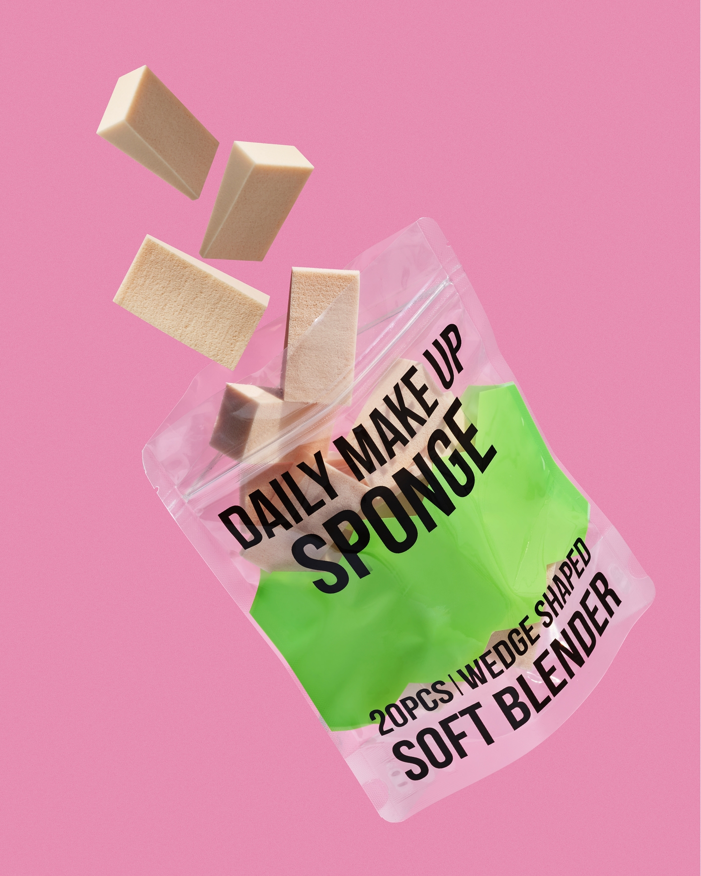
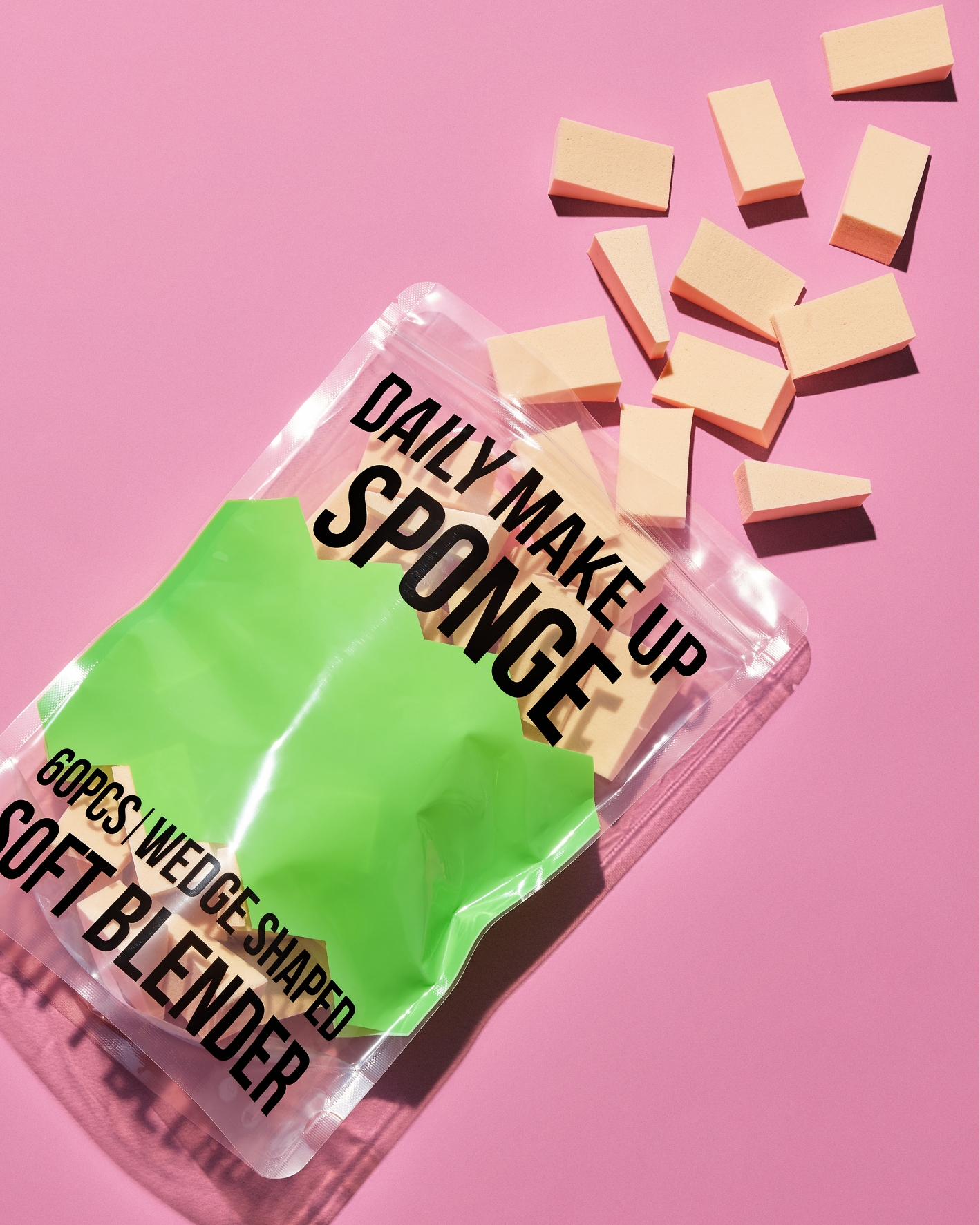
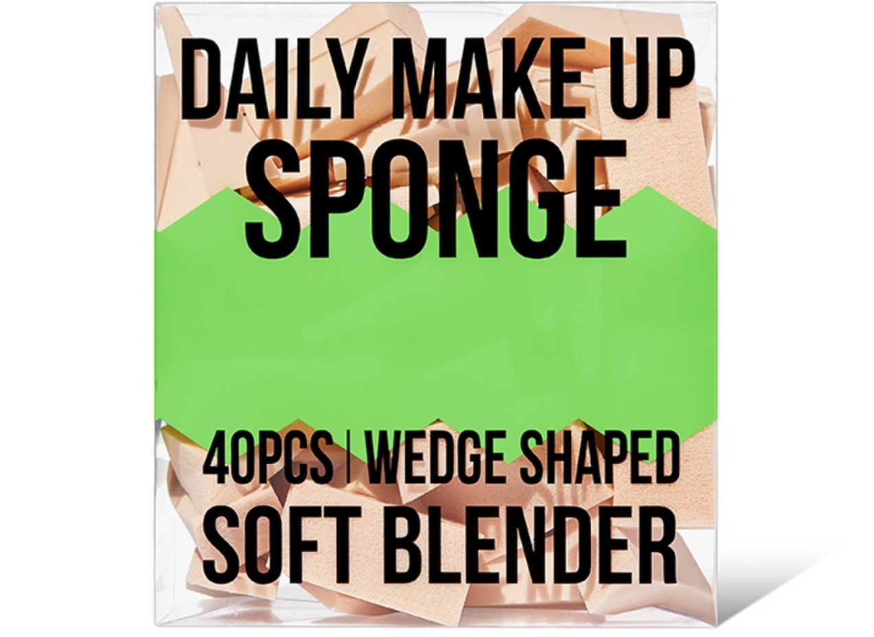
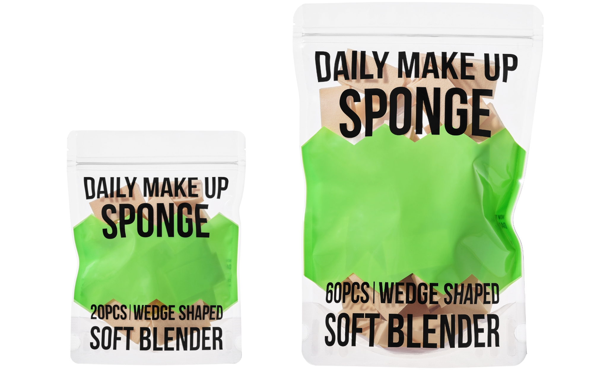
4. Daily Makeup Sculpting Sponge
The sculpting sponge serves as a case study showing how packaging design can function not merely as outer wrapping, but as a direct lever for improving business structure.
The existing 40-count sponge product was packaged in a transparent PET case, which posed a cost burden when used as a promotional giveaway.
To address this, the quantity was restructured into 20-count and 60-count options, and the packaging was changed to a transparent pouch.
This shift went beyond simple cost reduction.
By decreasing overall volume and weight, it improved logistics efficiency and was also expected to contribute to a reduced carbon footprint.
From a design perspective, the use of a transparent pouch allowed the contents to be visible, and this choice embodied the brand’s Smart Value keyword through the packaging structure and material selection itself.
before
after
- Amorepacific Creatives
- Package Design
- Kim Taeeun
- BM & Visual direction
- Kim Sumin, Park Jisoo
- Development
- Kim Kinam, Oh Juwon


