PRIMERA PACKAGING DESIGN RENEWAL PROJECT
Summary
The Primera packaging renewal project was initiated to adapt to the shifting offline retail landscape and to support global market expansion.
Moving away from the previous structure that prioritized individual product characteristics, we redefined the design strategy to enhance brand consistency and visibility.
The goal of this project is to maximize the on-shelf blocking effect through a single color and a unified design language, thereby securing a distinct brand presence in the global environment.
Unifying Scattered Individualities into a Single Brand Language
The Primera packaging renewal project began with a clear and distinct objective.
Previously, Primera’s packaging was designed to highlight the efficacy and individuality of each product, utilizing specific colors and finishes tailored to each line.
While this approach successfully differentiated individual products and created a colorful impression when displayed together, the new strategy aims to consolidate these scattered elements into a cohesive brand identity.
However, considering the evolving retail landscape and the brand’s expansion trajectory, a redefinition of the secondary packaging’s role became necessary.
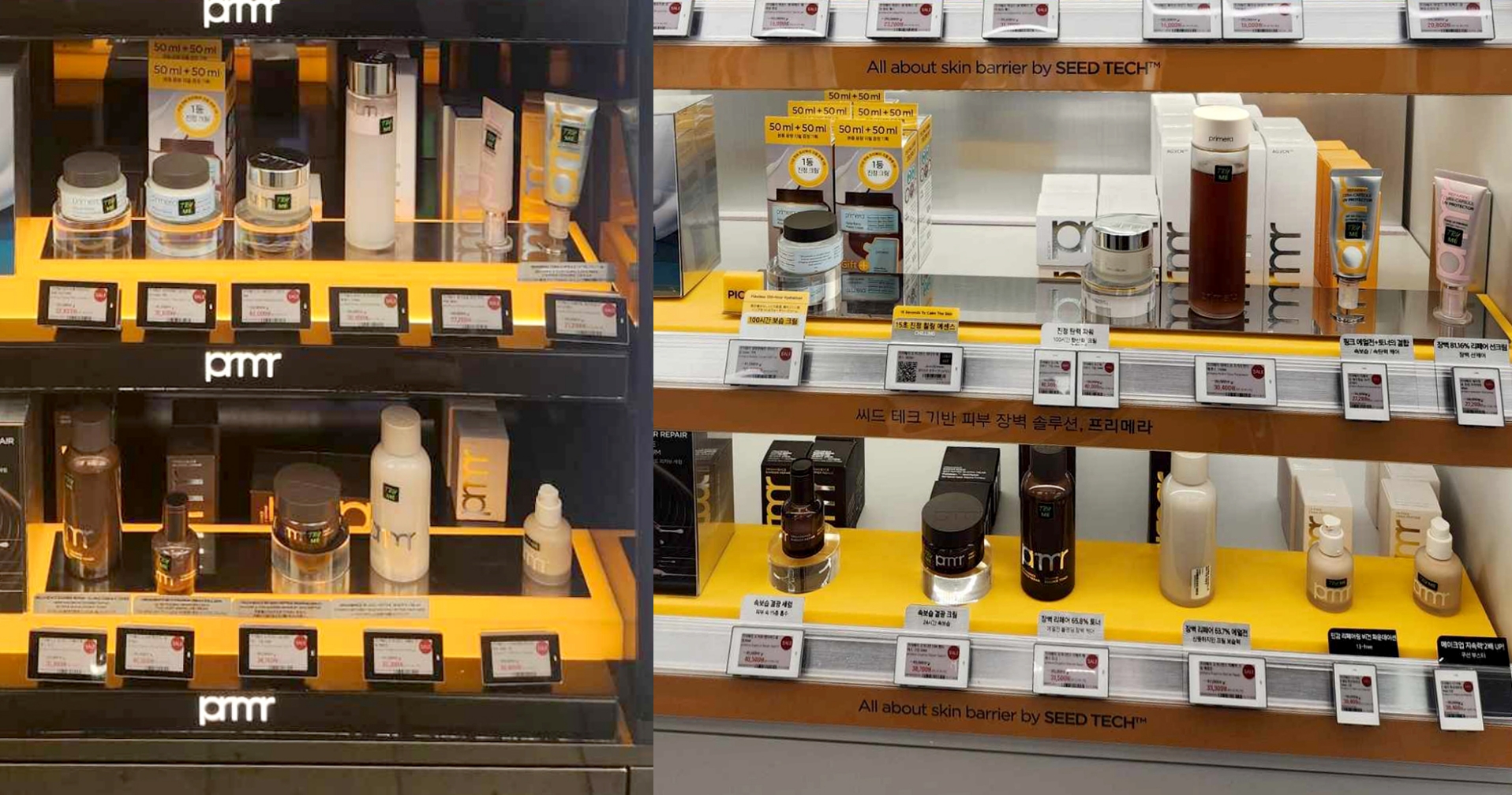
The offline retail environment is rapidly shifting towards Multi-Brand Stores (MBS). In such spaces, the brand’s collective presence (blocking effect) and visibility on the shelf have become more critical than the descriptive power of individual products.
Furthermore, with the acceleration of global expansion, there are increasing instances in overseas markets where only a limited number of SKUs are stocked or products are displayed without sufficient VMD support. For a brand not yet familiar to local consumers, a visually fragmented packaging system can limit the ability to clearly convey brand identity.
Against this backdrop, Primera needed to strengthen brand visibility and recognition through ‘unification’ rather than ‘diversity.’ Consequently, we strategically chose to integrate the packaging under a single color and a unified design language.
Packaging Design Strategy for Enhanced Brand Recognition
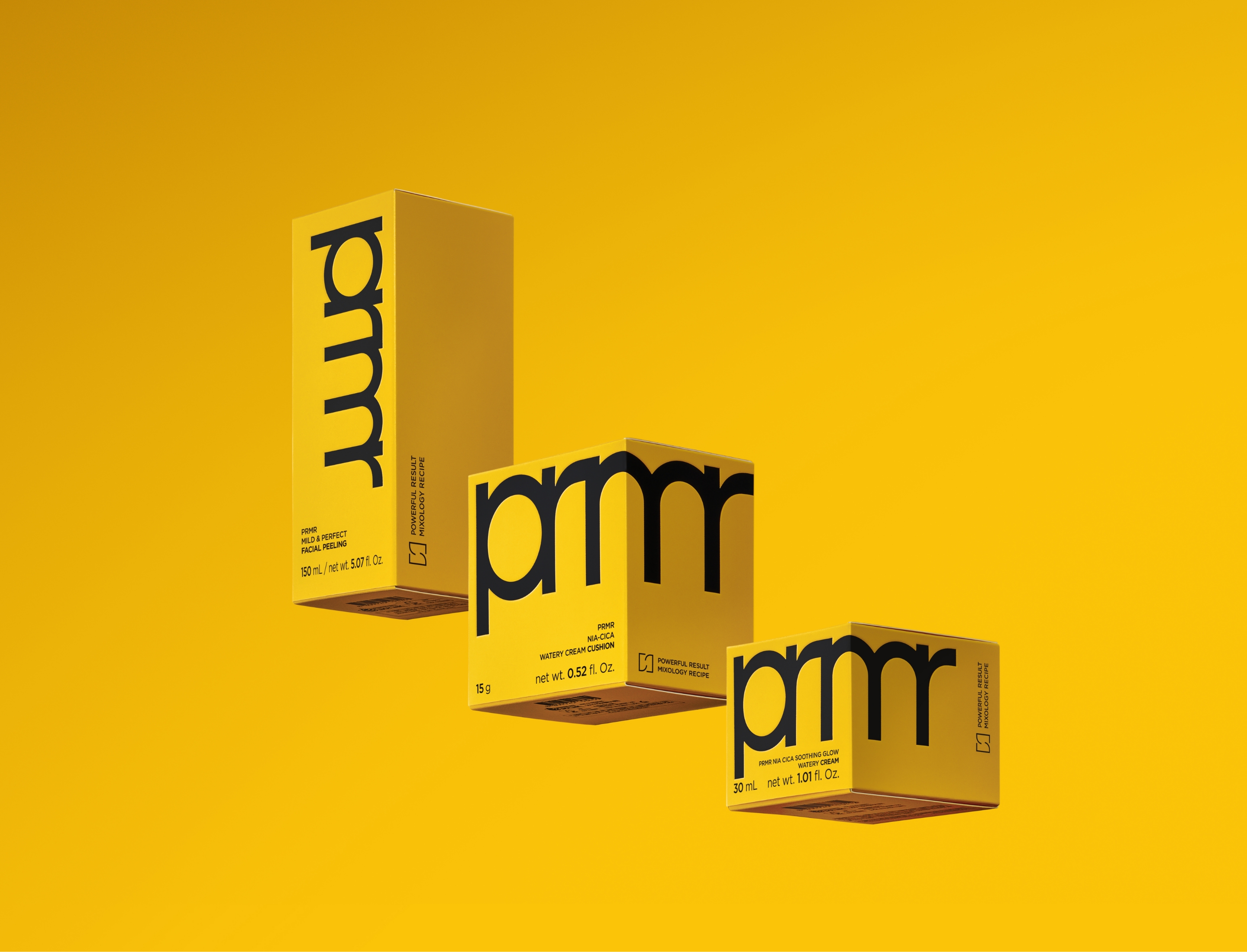
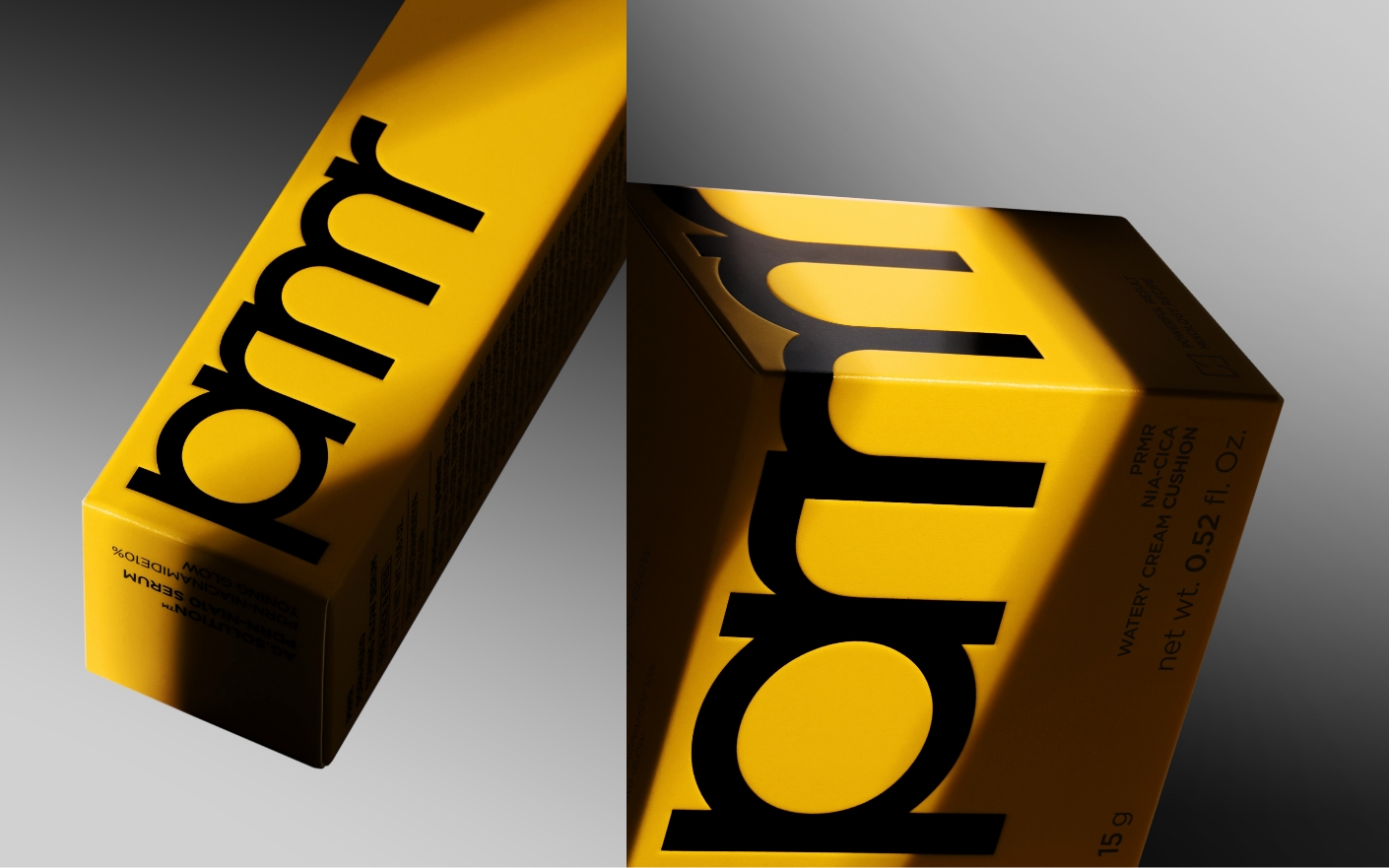
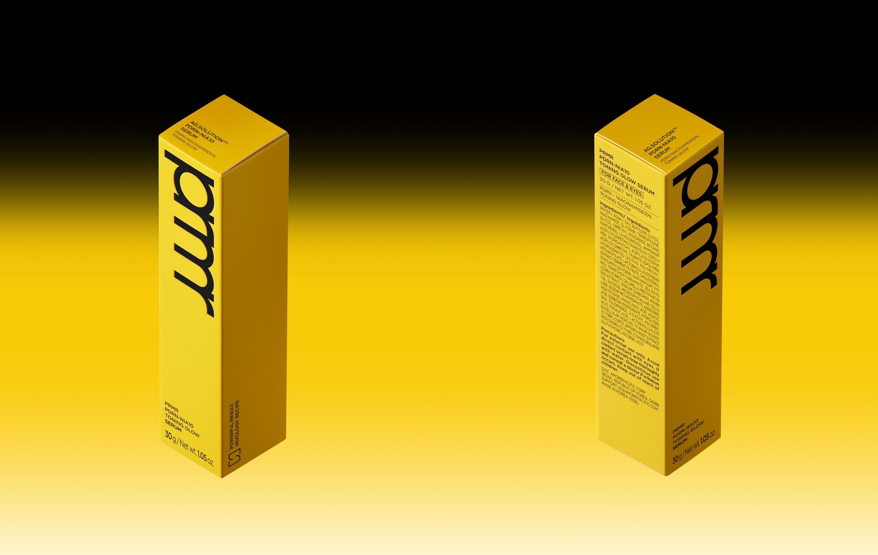
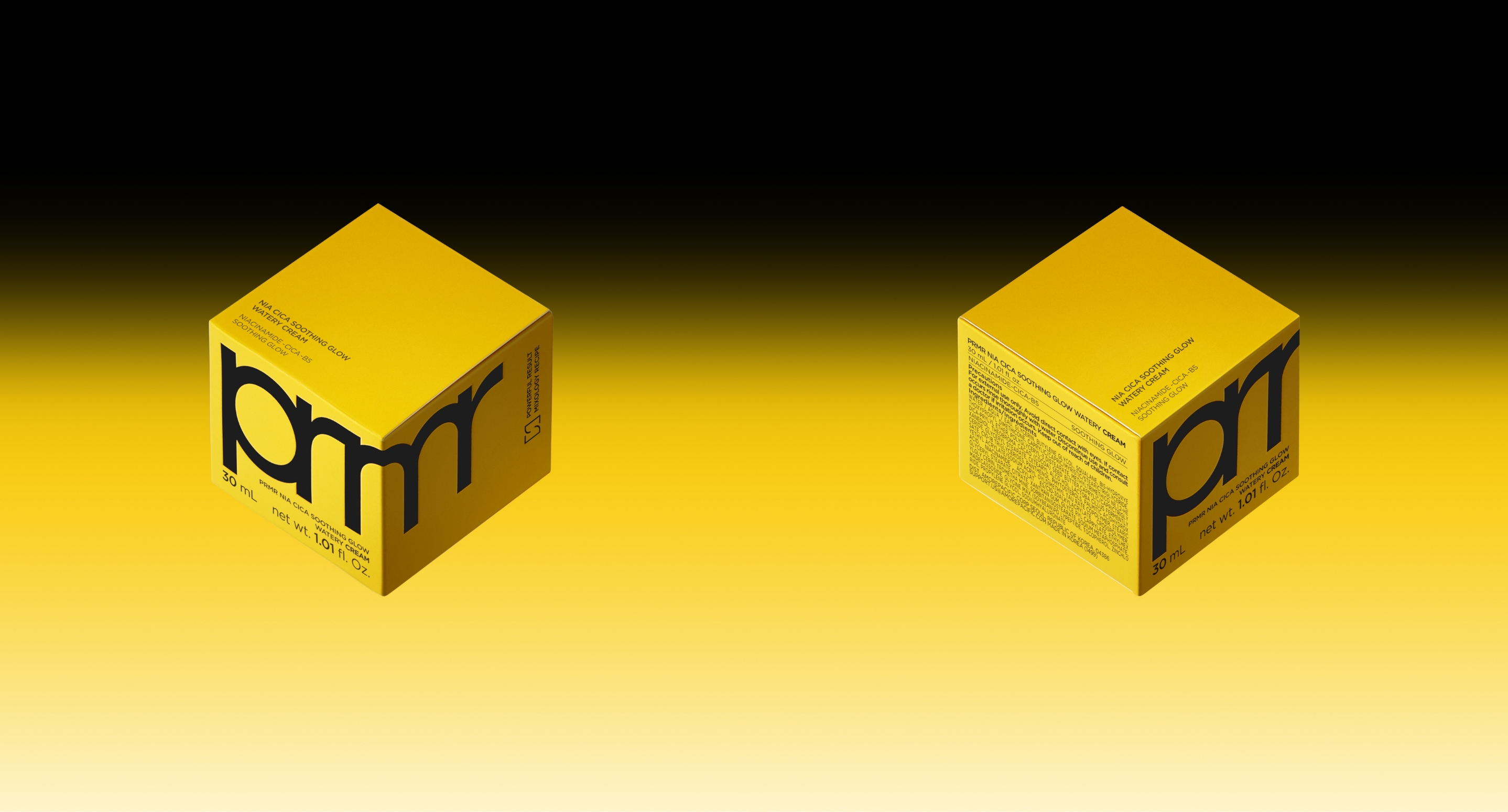
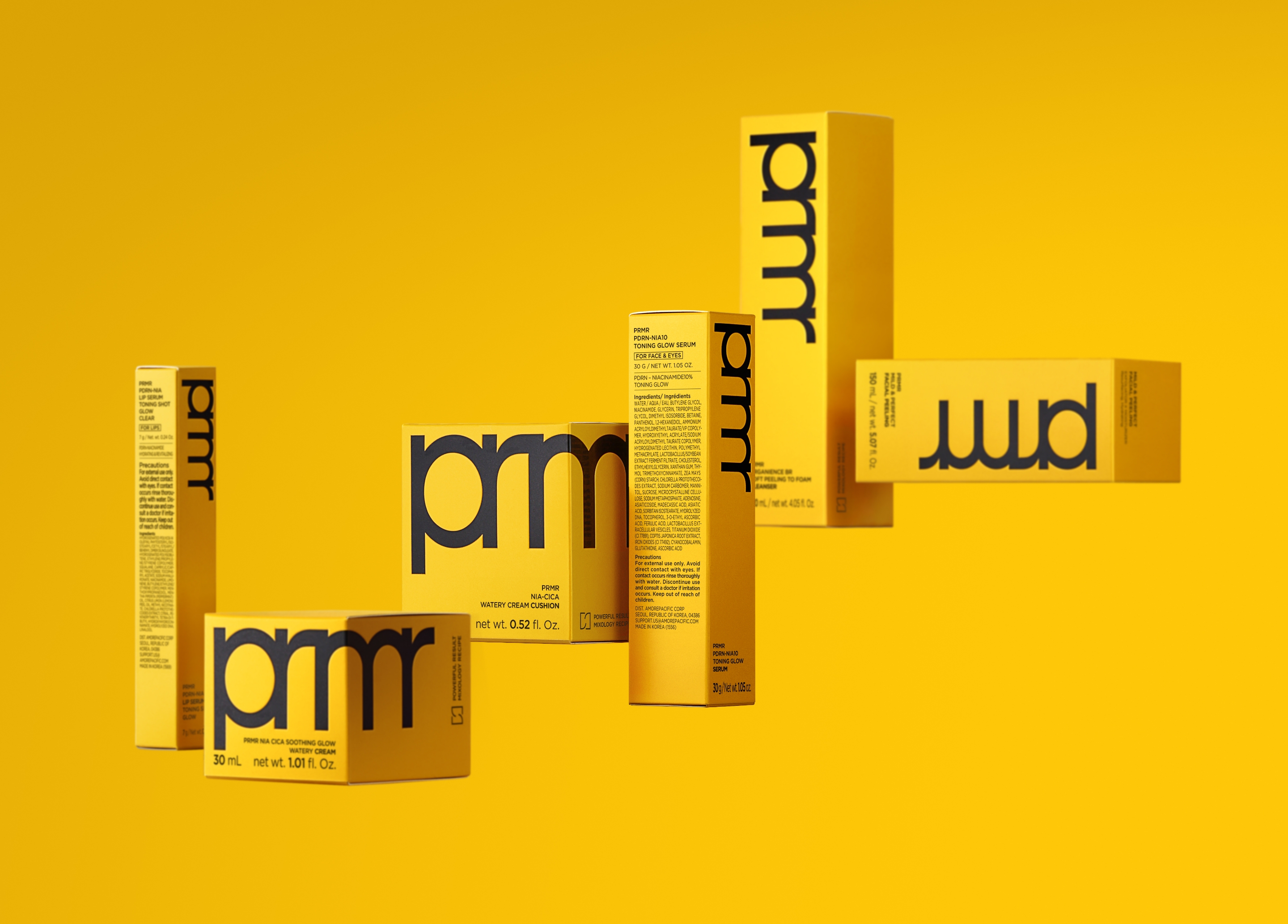
The final design direction for the Primera packaging renewal features the extensive application of ‘prmr Yellow,’ the brand’s signature color. With its high visibility, this color effectively communicates the brand’s unique personality. Furthermore, it serves as a strategic element in securing clear brand recognition for Primera across both offline retail channels and global distribution environments.
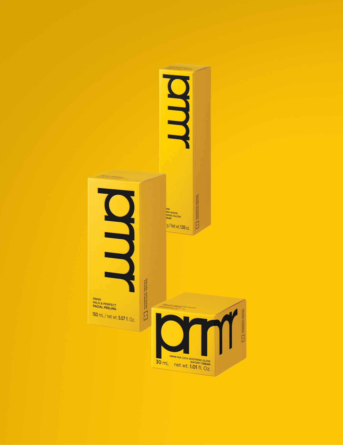
A bold ‘prmr’ logo is positioned on the front panel to enhance brand identification, while the typography is rendered in black to ensure clarity and convey a refined impression. Furthermore, to facilitate integrated SKU management, we adopted a combined Korean-English layout. This design ensures consistent operations across diverse global markets and retail environments.
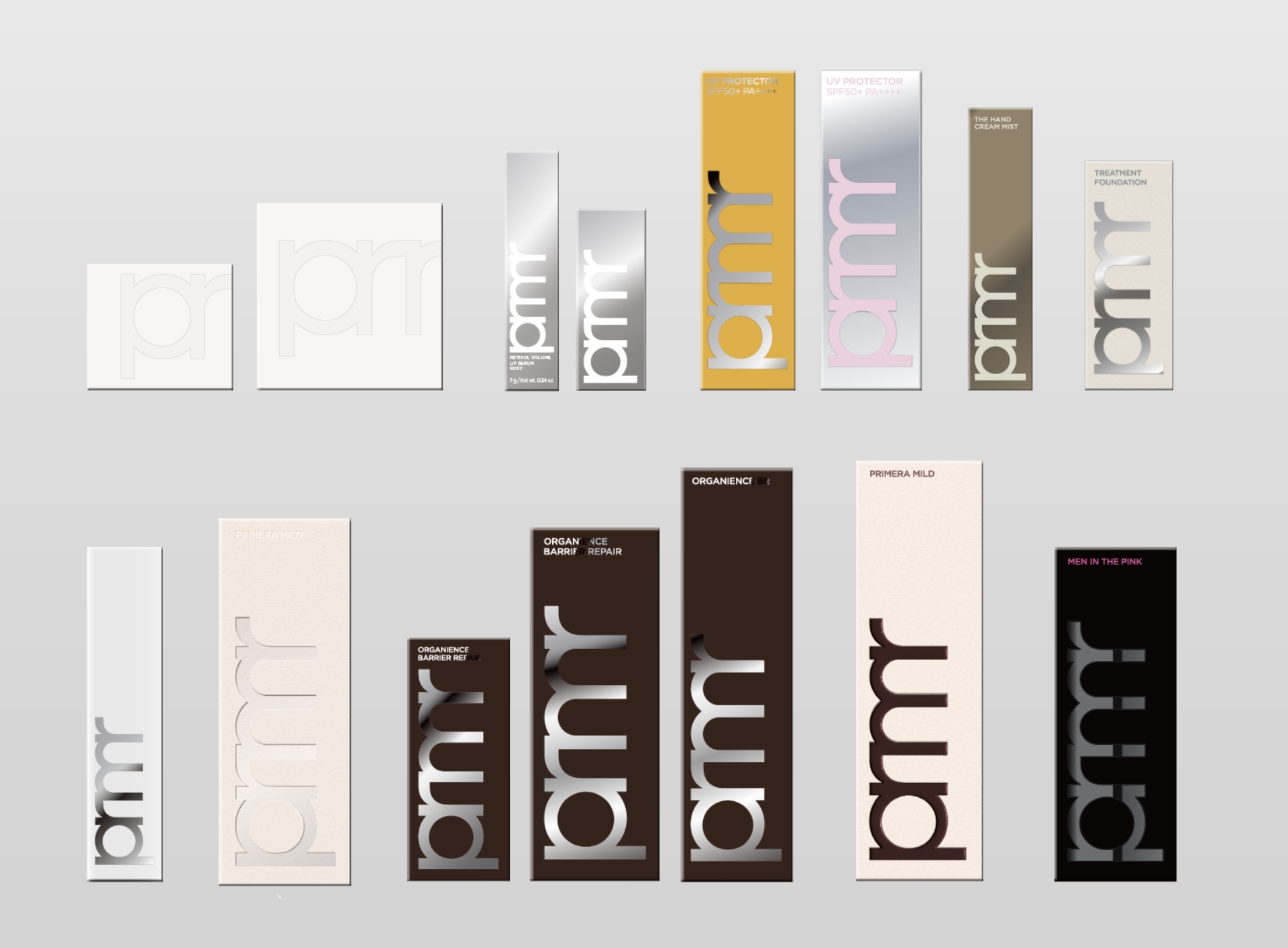
Before arriving at this final solution, multiple design directions were explored during the initial phase. We tested various approaches, including options that differentiated skincare and makeup lines, sophisticated black-centric designs that added a sense of weight, and concepts visualizing Primera’s ‘mixology’ through patterns.
While each concept possessed unique merits, they were evaluated against specific criteria: the on-shelf blocking effect in offline MBS environments and brand visibility in the global market. Consequently, the direction that offered the most immediate and intuitive brand recognition was selected as the final design for this renewal.
While each concept possessed unique merits, they were evaluated against specific criteria: the on-shelf blocking effect in offline MBS environments and brand visibility in the global market. Consequently, the direction that offered the most immediate and intuitive brand recognition was selected as the final design for this renewal.
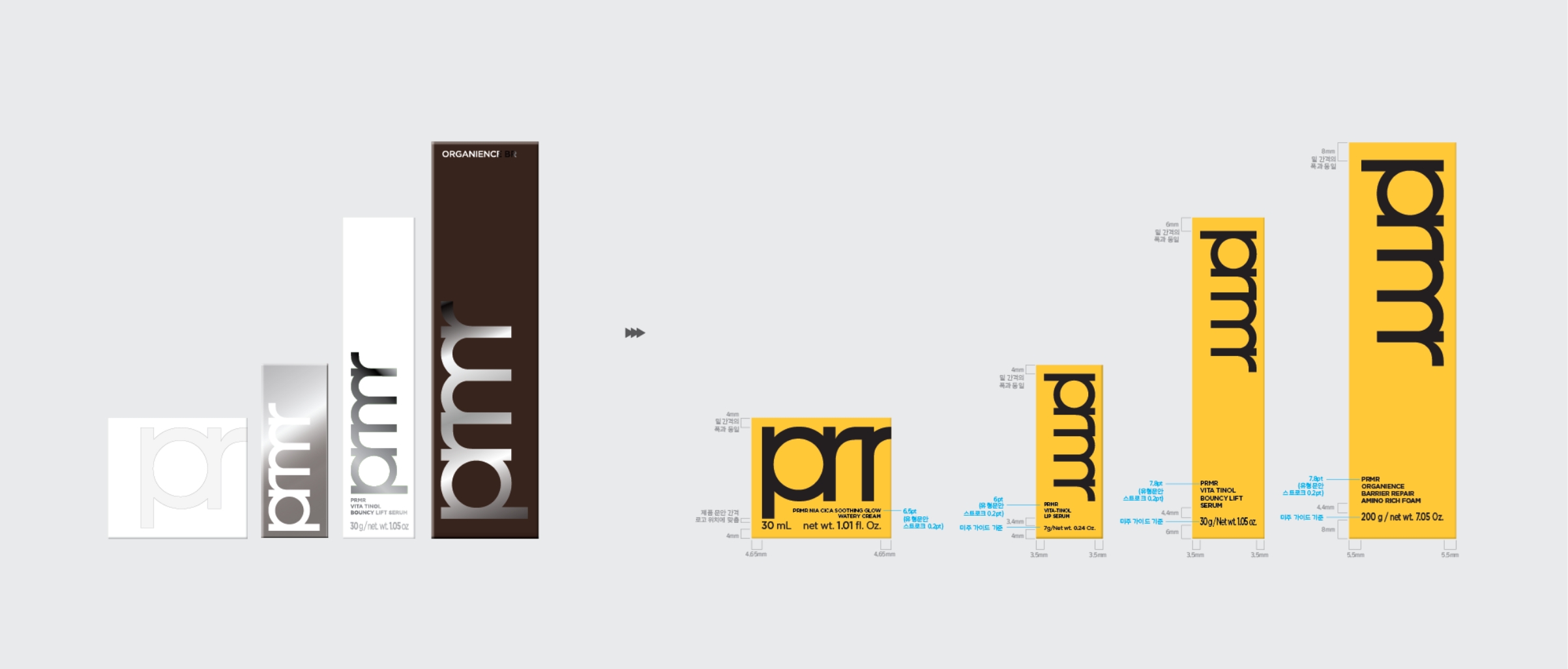
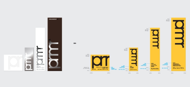
Establishing Design Logic and Guidelines
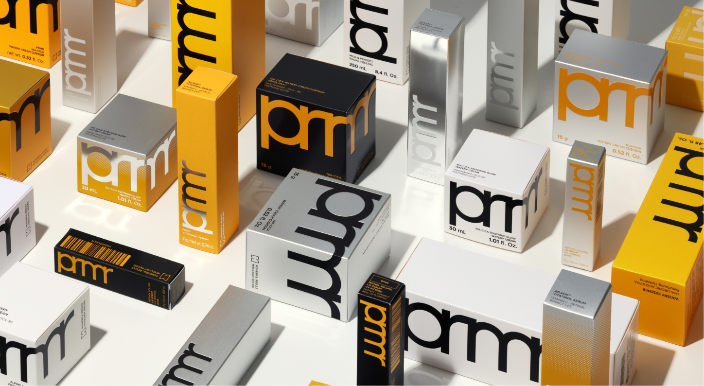
Acknowledging the varying sizes and ratios of the secondary packaging, we established a design logic to ensure consistent brand recognition throughout the renewal. The structure was engineered to maximize the visibility of the bold ‘prmr’ logo on individual boxes while maintaining visual cohesion when displayed as a group.
This logic has been systematized into guidelines and distributed to ensure scalability under the same principles as new SKUs are introduced. Our goal was to establish a sustainable packaging system that serves as a long-term asset, rather than just a temporary design update.
This logic has been systematized into guidelines and distributed to ensure scalability under the same principles as new SKUs are introduced. Our goal was to establish a sustainable packaging system that serves as a long-term asset, rather than just a temporary design update.
When displayed together, the blocking effect created by ‘prmr Yellow’ clearly asserts the brand’s presence. The core objective of this renewal was to ensure the brand is recognized before the individual product, allowing the entire shelf to be read as a single, cohesive entity.
This renewal represents more than a mere aesthetic update; it was a strategic choice regarding how the brand should be perceived amidst a shifting retail landscape. We anticipate that this project will contribute to delivering a clear and consistent brand experience as Primera expands into new markets and diverse retail environments.
This renewal represents more than a mere aesthetic update; it was a strategic choice regarding how the brand should be perceived amidst a shifting retail landscape. We anticipate that this project will contribute to delivering a clear and consistent brand experience as Primera expands into new markets and diverse retail environments.
- Amorepacific Creatives
- Design Directing
- Han Jeongmin, Lee OhKyung
- Product Design
- Kim Bitnuri, Hong Damee
- BM
- Park Sungyeon, Choi Goeun
- Development
- Byun Jiyoung
- Photography
- Shin Sangwoo