Hera Gift Package Renewal
Summary
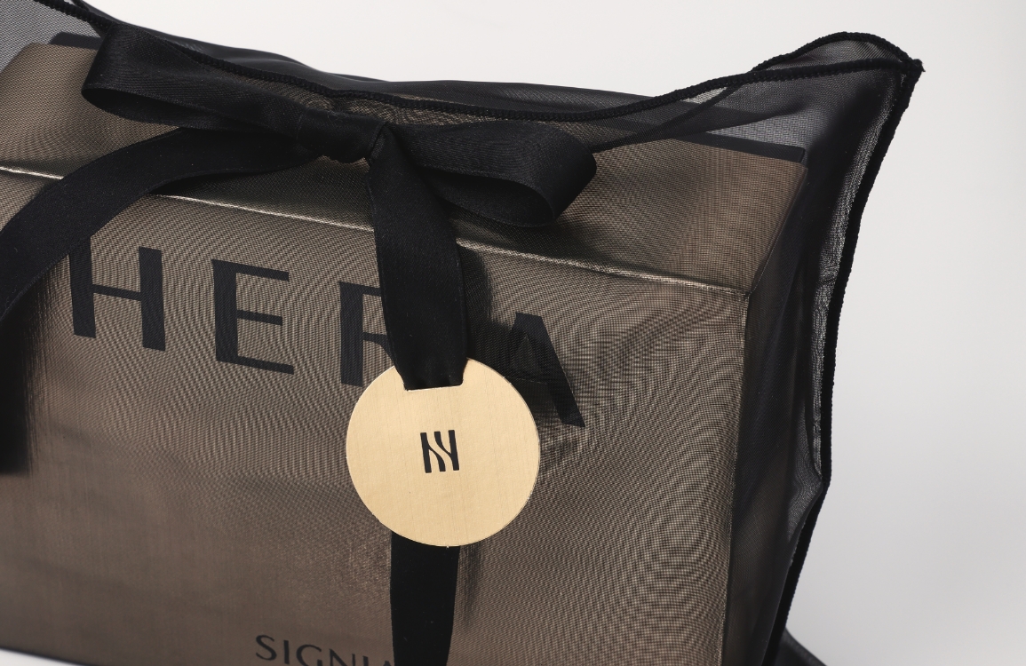
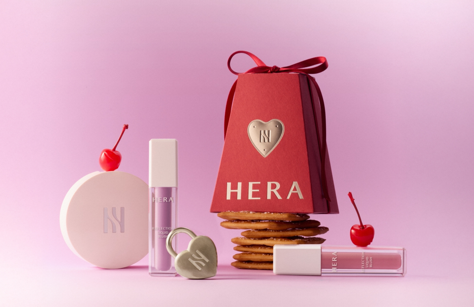
As part of a packaging renewal project to better express Hera’s brand identity, the previous design—featuring a direct representation of Seoul through the motif of the Han River line—was updated to a more minimal and modern design. The new packaging captures the essence of urban Seoul indirectly, with a clean, simple form and a bold, linear logo expression.
Concept
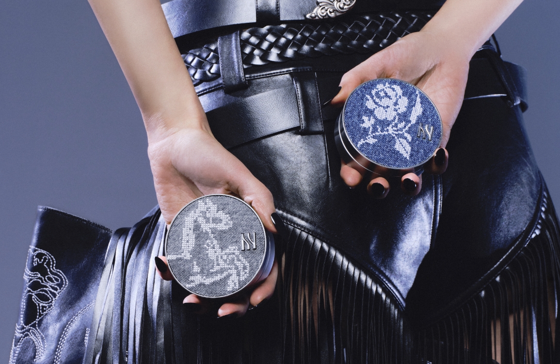
Under the concept of “SEOUL CHIC,” decorative elements were minimized. The logo and symbol were placed on both sides of the streamlined package to convey Hera’s edgy, chic image. The opening structure was also redesigned to enhance the anticipation of unwrapping a gift. Rather than using a traditional bow, a sleek straight-line knot paired with a gold tag was applied, aligning with the ‘SEOUL CHIC’ concept and creating a cohesive look across the entire packaging line. The result presents Hera as a modern, luxurious beauty brand rooted in contemporary Seoul aesthetics.


- Amorepacific Creatives
- Ryu Mirim