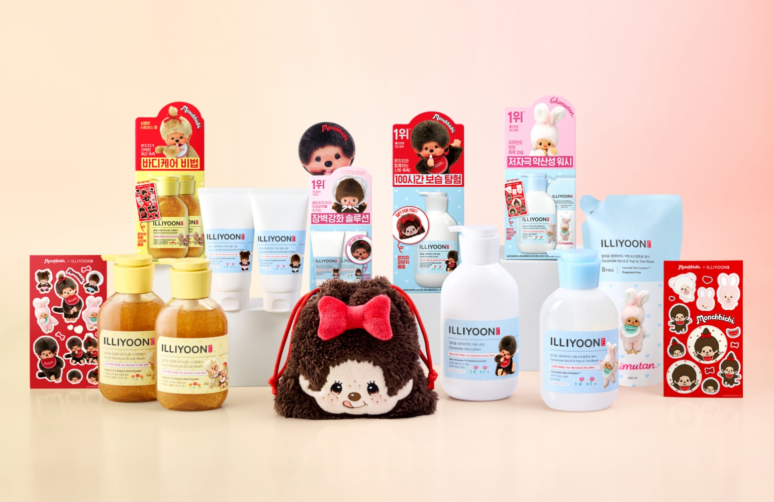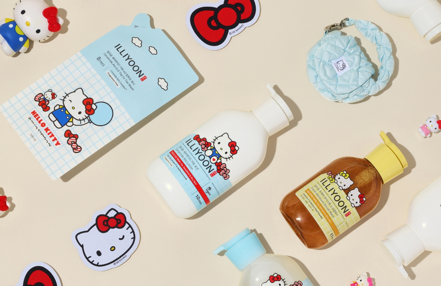
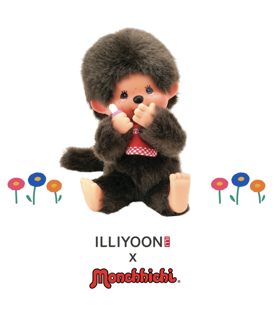
ILLIYOON X MONCHHICHI COLLABORATION
Summary
With the fresh, comforting charm that has made it beloved for so long, ILLIYOON X MONCHHICHI begins a springtime journey into light, refreshing hydration.
Blending ILLIYOON’s soothing moisture care for sensitive skin with MONCHHICHI’s signature warmth and playful sensibility, the experience of using the product becomes lighter, more delightful, and more enjoyable.
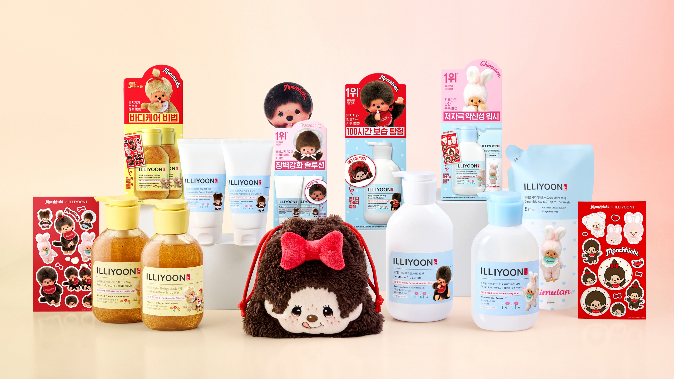
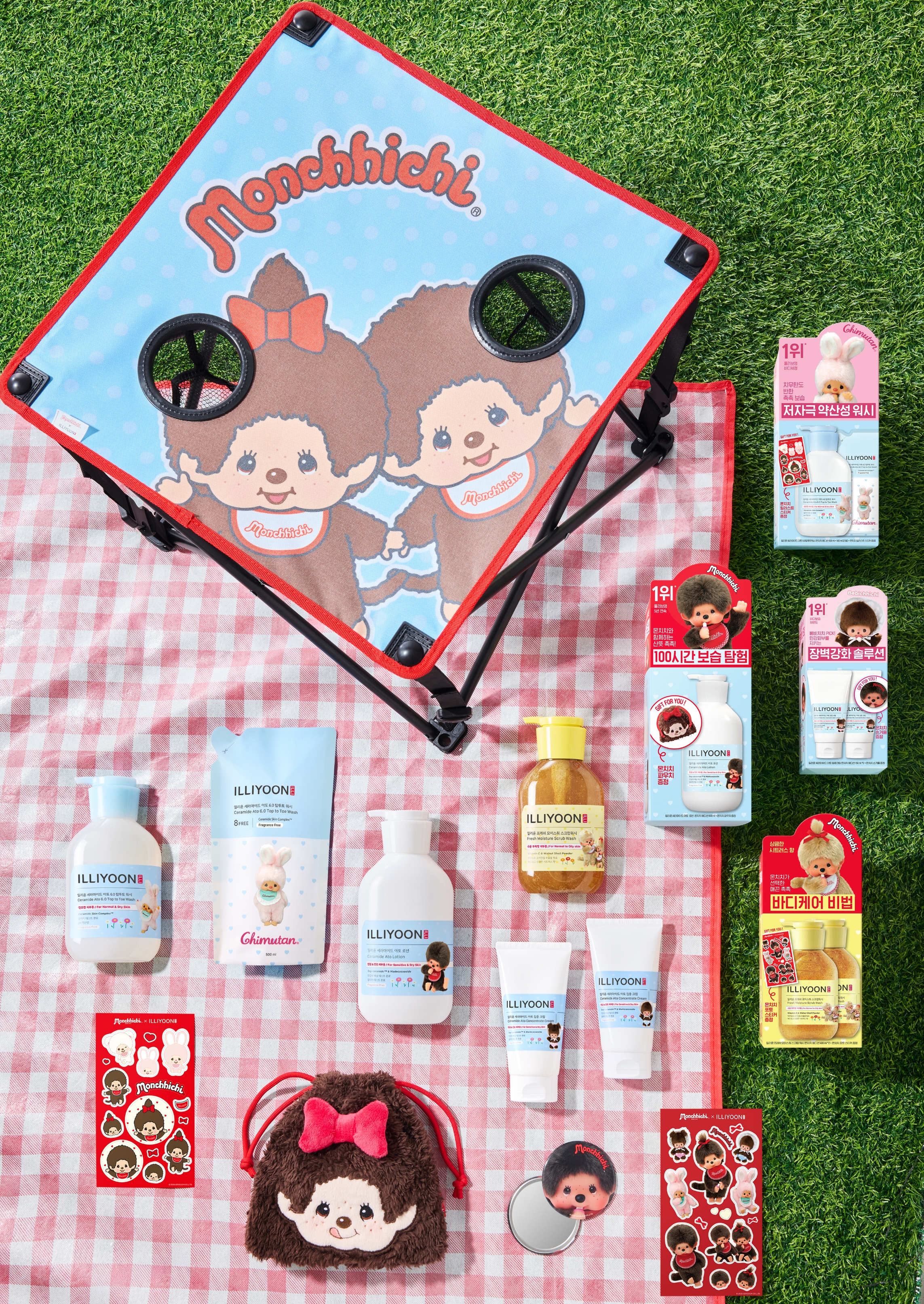
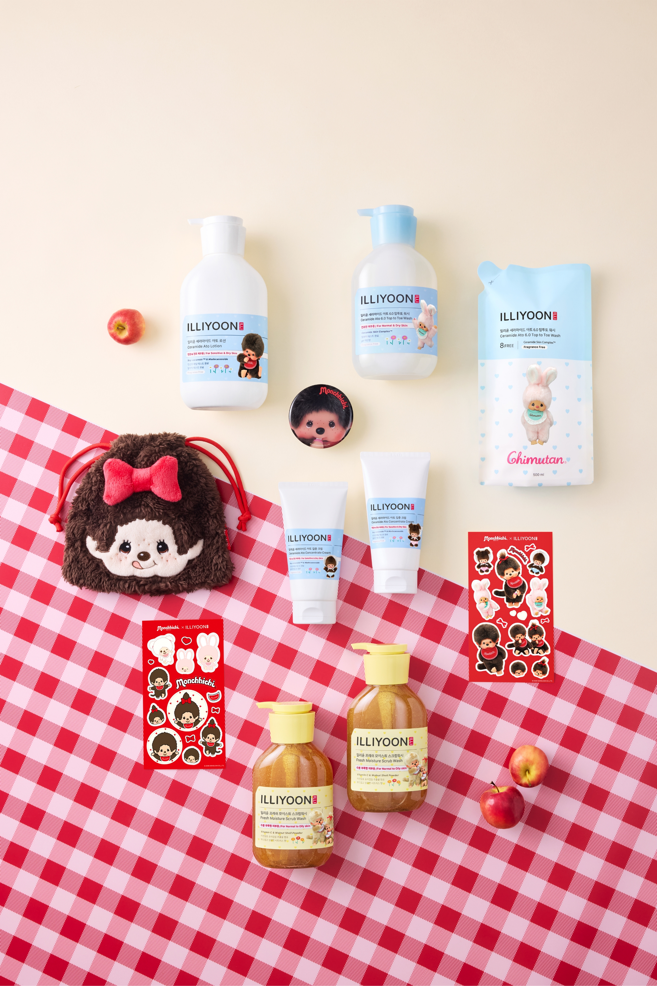
Along with the limited-edition packaging, a pouch, hand mirror, and both illustrated and photoreal sticker sets extend the experience beyond the product itself, offering a way to naturally enjoy MONCHHICHI’s distinctive charm in everyday life.
ABOUT MONCHHICHI
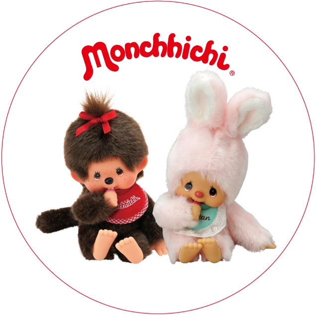
MONCHHICHI is a character that naturally draws the eye at first glance, defined by its round eyes and signature pose with a finger in its mouth.
Its small body, rounded silhouette, and the cozy impression conveyed through its soft, fluffy texture create a sensibility that is uniquely MONCHHICHI’s own.
In this collaboration, the design builds on these visual characteristics of MONCHHICHI to naturally bring warmth and liveliness to ILLIYOON’s understated brand image.
BRAND IDENTITY
ILLIYOON is a derma brand that cares gently for sensitive skin and helps maintain a healthy skin barrier.
With the goal of keeping skin in its most comfortable state, it offers a stable, easy-to-use experience that feels effortless in everyday life.
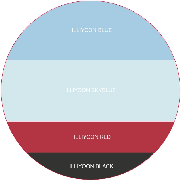
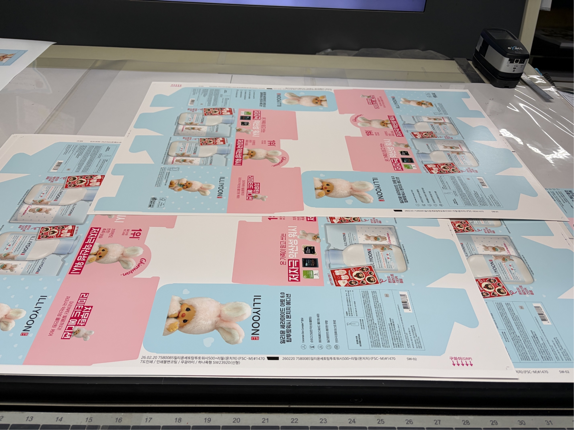
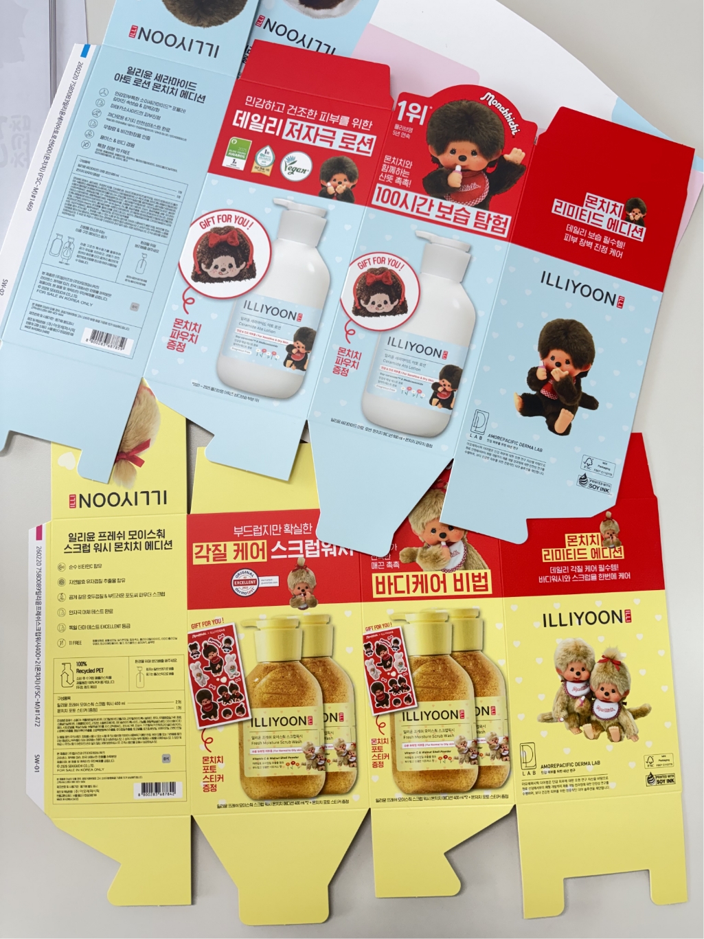
The design is developed around a clean brand structure and an organized layout so that the product’s function and key features can be communicated intuitively. In addition, the proportions and placement of elements are flexibly adjusted according to the label sizes of Ceramide Ato Lotion, Intensive Cream, Top-to-Toe Wash, and Fresh Moisture Scrub Wash, ensuring a consistent brand flow across various package formats. The stable palette of blue, sky blue, red, and black, along with a restrained visual tone, naturally conveys the trust and comfort characteristic of a derma brand.
The design is developed around a clean brand structure and an organized layout so that the product’s function and key features can be communicated intuitively. In addition, the proportions and placement of elements are flexibly adjusted according to the label sizes of Ceramide Ato Lotion, Intensive Cream, Top-to-Toe Wash, and Fresh Moisture Scrub Wash, ensuring a consistent brand flow across various package formats. The stable palette of blue, sky blue, red, and black, along with a restrained visual tone, naturally conveys the trust and comfort characteristic of a derma brand.
ILLIYOON Brand Logic
MONCHHICHI Character Assets
COLLABORATION CONCEPT
This ILLIYOON × MONCHHICHI collaboration begins with the idea of visually expressing the sensation of “moisture” through MONCHHICHI.
Using MONCHHICHI—with its round, soft form and cozy presence that feels almost within reach—as a medium, the design conveys ILLIYOON’s comfortable user experience in a more intuitive way.
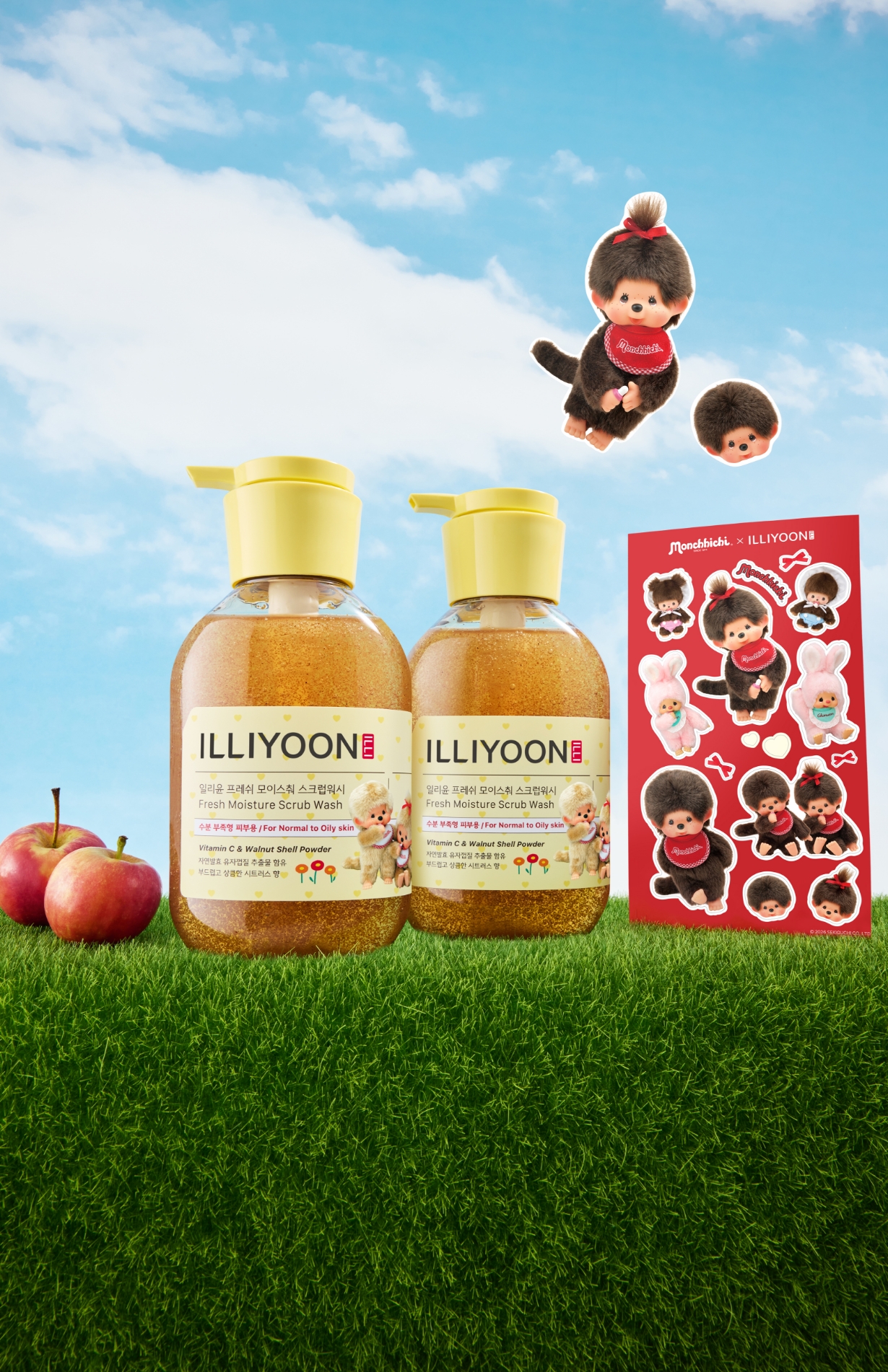
Under the concept of the “Fresh Hydration Spring Picnic Explorers,” ILLIYOON’s image of lightweight, easily absorbing moisture is expanded through the atmosphere and colors of spring, along with MONCHHICHI’s playful movement. Floral illustrations, heart patterns, and the line-specific color points of red, pink, and yellow are used to evoke both a tactile sensibility and a sense of seasonality at the same time.
Under the concept of the “Fresh Hydration Spring Picnic Explorers,” ILLIYOON’s image of lightweight, easily absorbing moisture is expanded through the atmosphere and colors of spring, along with MONCHHICHI’s playful movement. Floral illustrations, heart patterns, and the line-specific color points of red, pink, and yellow are used to evoke both a tactile sensibility and a sense of seasonality at the same time.
A
B
C
Lable Design A, B, C
Colour Matching Background
A key strategy of this ILLIYOON × MONCHHICHI collaboration is the thoughtful matching of color and character.
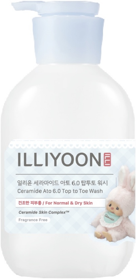
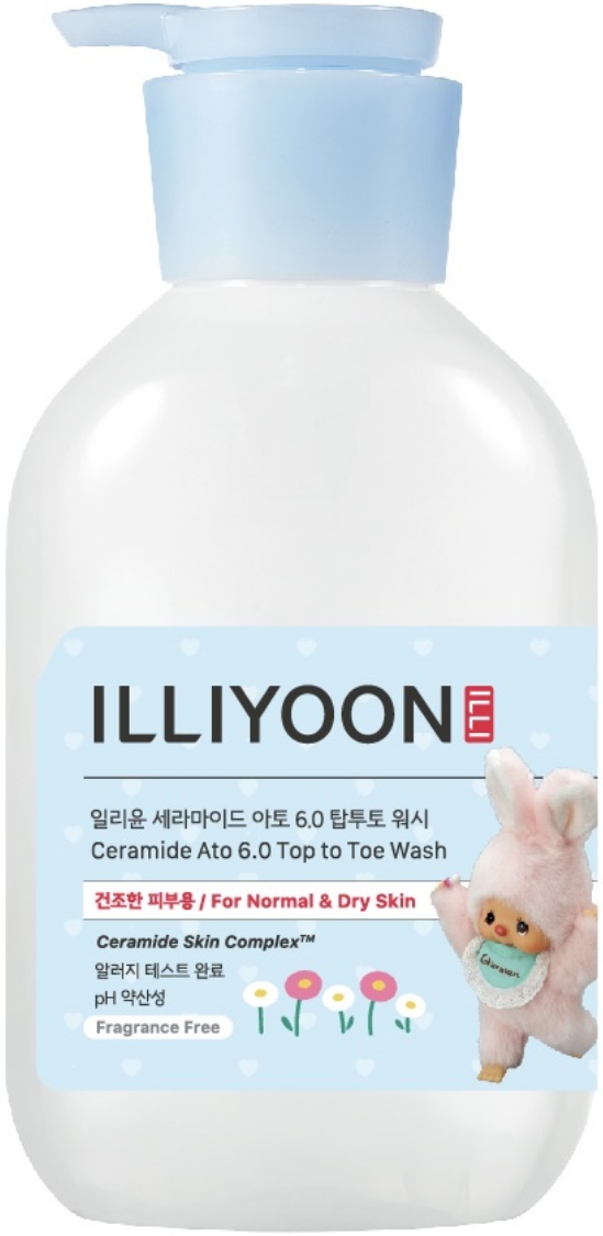
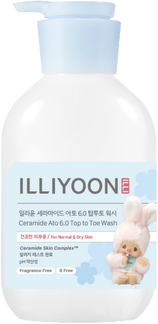
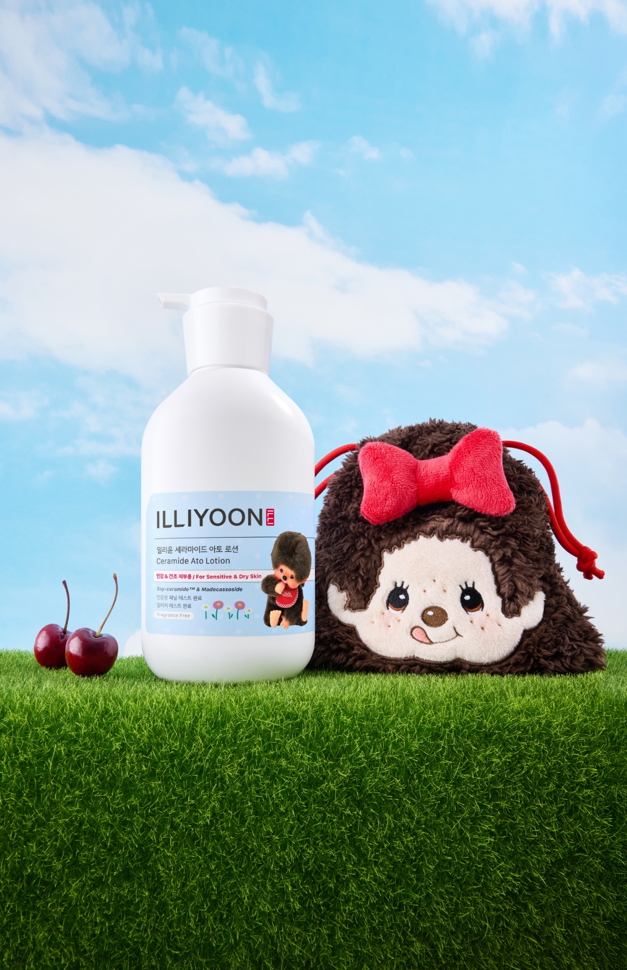
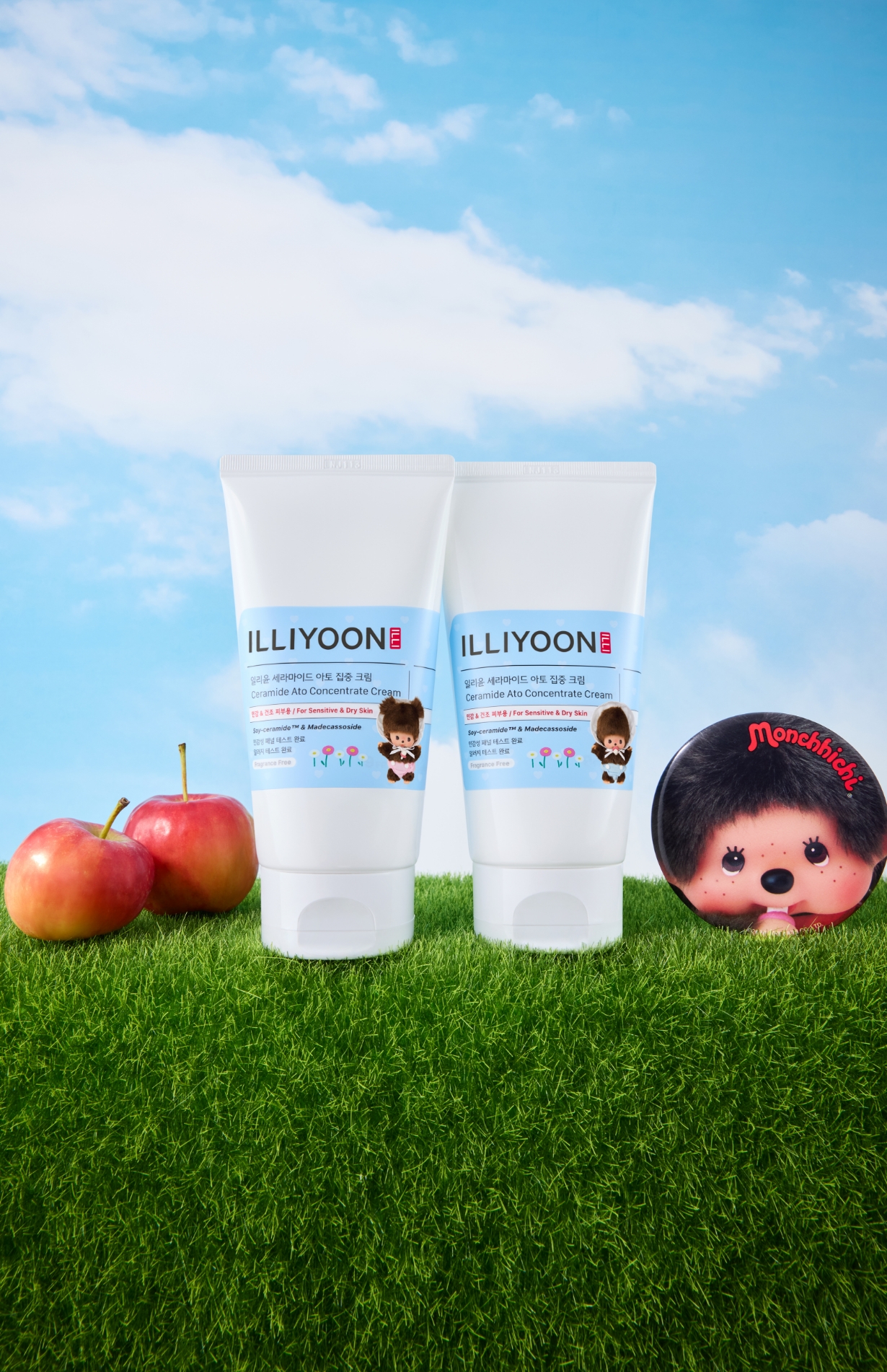
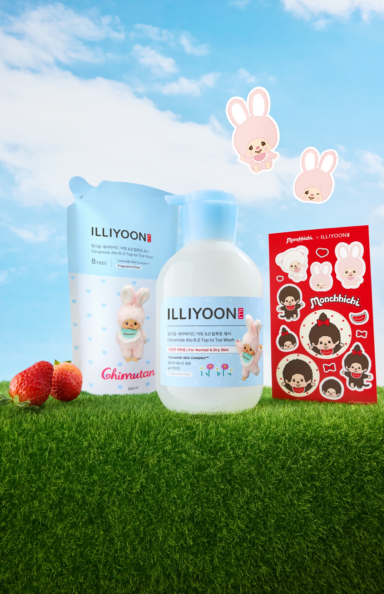
MONCHHICHI Boy is paired with the clear sky-blue tone of Ceramide Ato Lotion to emphasize a soft and comforting image, while Intensive Cream features both Bebichhichi Girl and Boy to suit its two-piece set format and create an even cozier mood. Chimutan is applied to Top-to-Toe Wash to naturally convey a clean and refreshing energy, while Beige MONCHHICHI is matched with Fresh Moisture Scrub Wash to visually express the scrub’s soft yet invigorating texture.
Each character’s color and mood are designed to connect naturally with the product experience and the distinct mood of each line, going beyond simple character application so that MONCHHICHI’s sensibility can be felt even in the moment of use.
Package Design Background
The character-specific colors and moods established through this color matching are naturally carried through into the overall graphic structure of the package design.
The upper area is defined as the key zone that shapes the package’s first impression, with a character assigned to each product so that distinctions between products can be made more intuitively.
In particular, the visual weight of the upper area is carefully adjusted so that MONCHHICHI’s form and expression can be recognized at a glance, while red and pink accents further highlight the character’s lively and lovable charm.
From a distance, the products read as a cohesive and stable series, while up close, the individuality and mood of each character become more vividly apparent.
From a distance, the products read as a cohesive and stable series, while up close, the individuality and mood of each character become more vividly apparent.
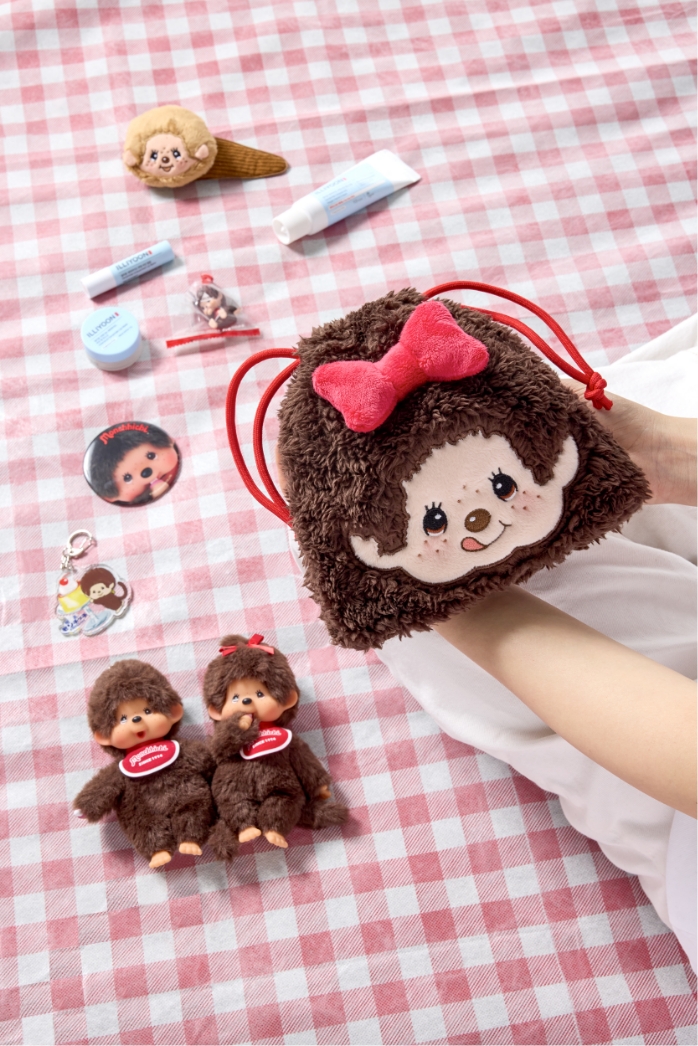
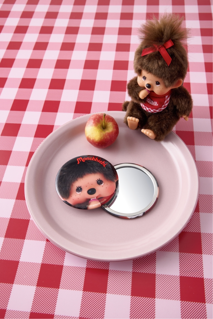
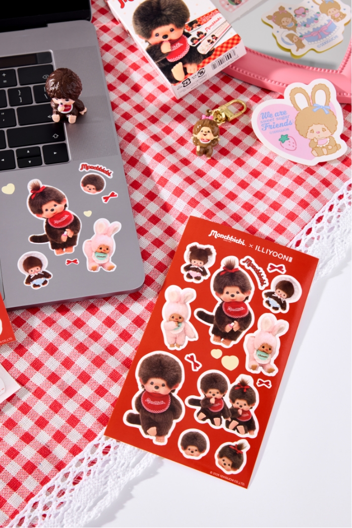
Life Style Goods
The goods for this collaboration are designed as light, easy-to-use items that can naturally bring MONCHHICHI’s mood into everyday life and stay close at hand.
The hand mirror prominently features MONCHHICHI’s face so that the character’s cute and cozy mood can be felt each time it is used, while the pouch is made with a material that evokes a soft, furry texture, allowing MONCHHICHI’s atmosphere to be conveyed not only visually but also through touch.
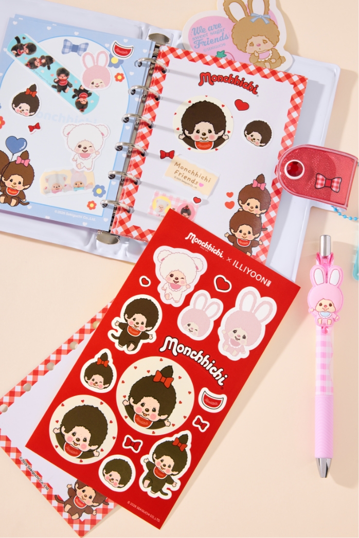
In addition, the stickers are offered in both illustrated and photoreal styles so they can be used in a variety of ways according to personal preference, extending the experience of MONCHHICHI’s diverse charm even through these small items.

- Amorepacific Creatives
- Design Direction
- Baek Inwoo
- Product Design
- Park Jihyeon
- BM
- Lee Nakyoung
- Development
- Han Jinhyoung
- Photography
- Freehand Studio