MIMO BY MAMONDE Brand Design
Summary
In September 24, MAMONDE launched the MAMONDE sub-brand <MIMO by MAMONDE> to focus on the trend-leading Zalpa (Z+alpha)
generation consumer base from teenagers who start to worry about skin care with the target of the ultra-low-cost consumption
channel Daiso to those in their early and mid-30s, and to expand opportunities for brand experience.
As a result of regular meetings of people in charge of related departments at 10 p.m. every Thursday and active field follow-ups, the <mimo by MAMONDE> project has launched a total of 10 new products in 6 months from kickoff in March to launch in September. In this article, I would like to capture the brand launch process that was completed through active collaboration with related departments.
As a result of regular meetings of people in charge of related departments at 10 p.m. every Thursday and active field follow-ups, the <mimo by MAMONDE> project has launched a total of 10 new products in 6 months from kickoff in March to launch in September. In this article, I would like to capture the brand launch process that was completed through active collaboration with related departments.
Design Concept
Mimmo by Mamonde is a sub-brand that inherits Mamonde’s floral heritage and embodies the concept of “My Minimal Mamonde”.
While maintaining key design elements from the Mamonde brand—such as its BI, symbol, and color palette—the design highlights the flower heritage motif to ensure strong visibility within Daiso’s visually complex retail environment.
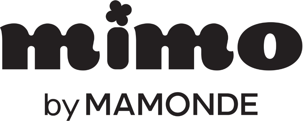
Whereas Mamonde’s BI features an uppercase M as its motif, Mimmo distinguishes itself as a sister brand by using a lowercase m.
Mimmo’s BI combines the essence of Mamonde’s wordmark and symbol, creating a youthful and vibrant logo that reflects its brand personality.
Floral shapes are used as a shared visual language, linking the brand’s enduring flower heritage with its story and concept.
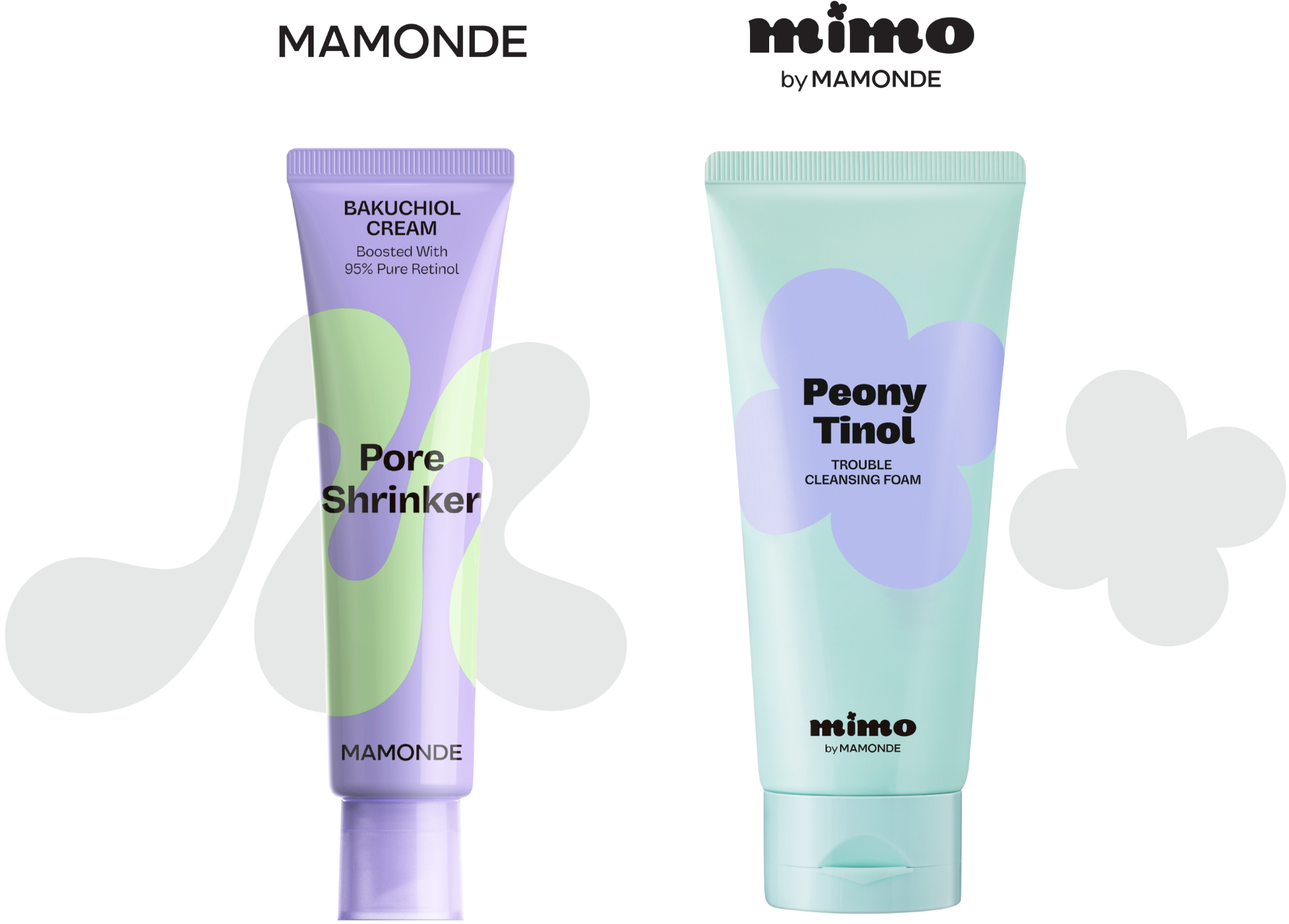
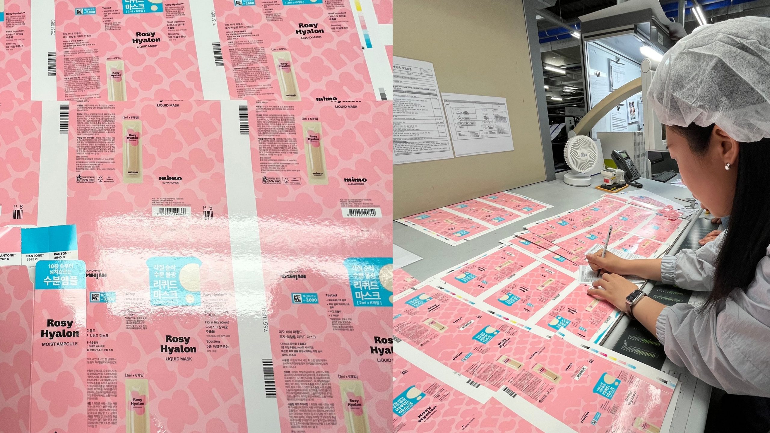
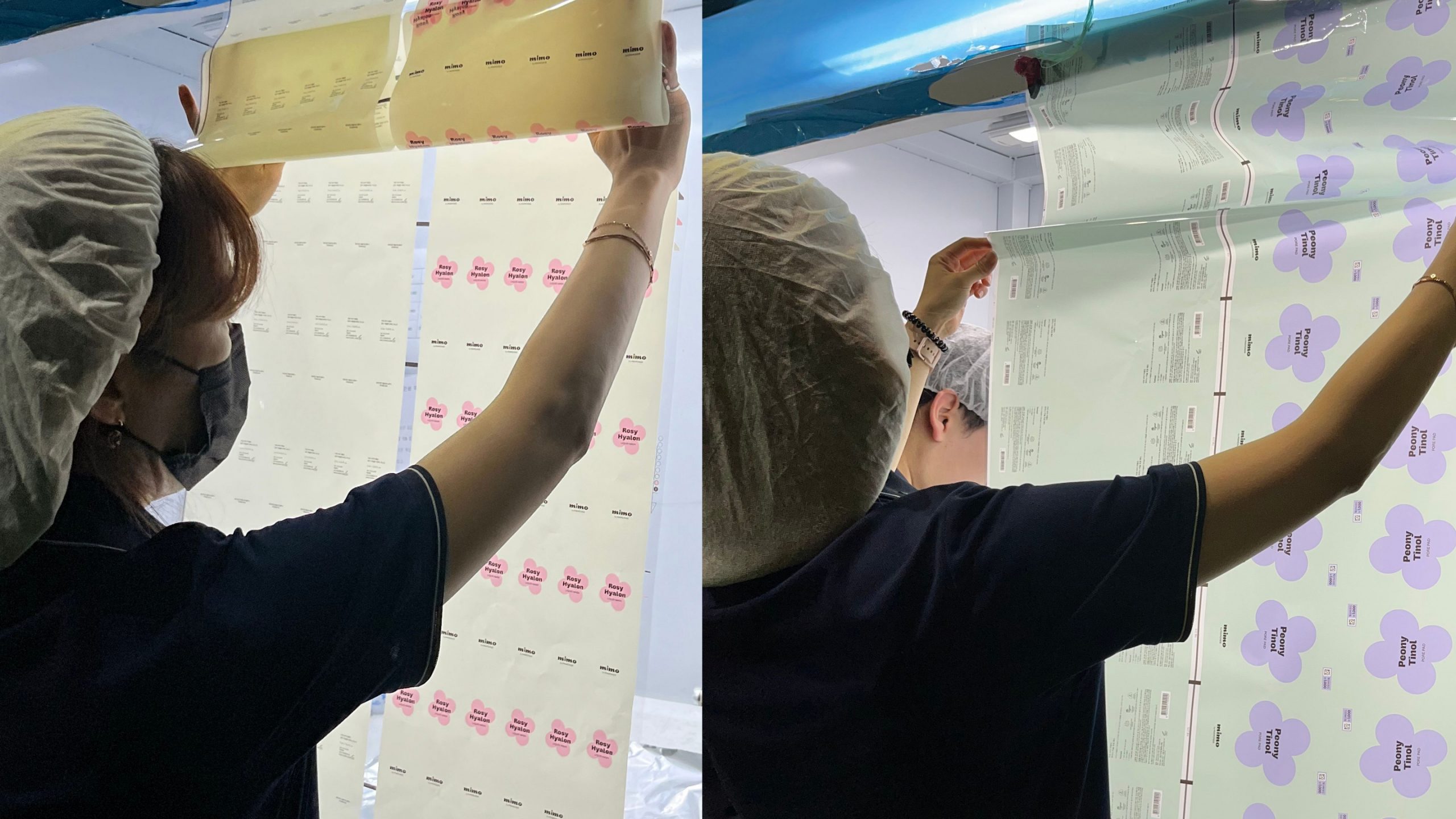
Package Design
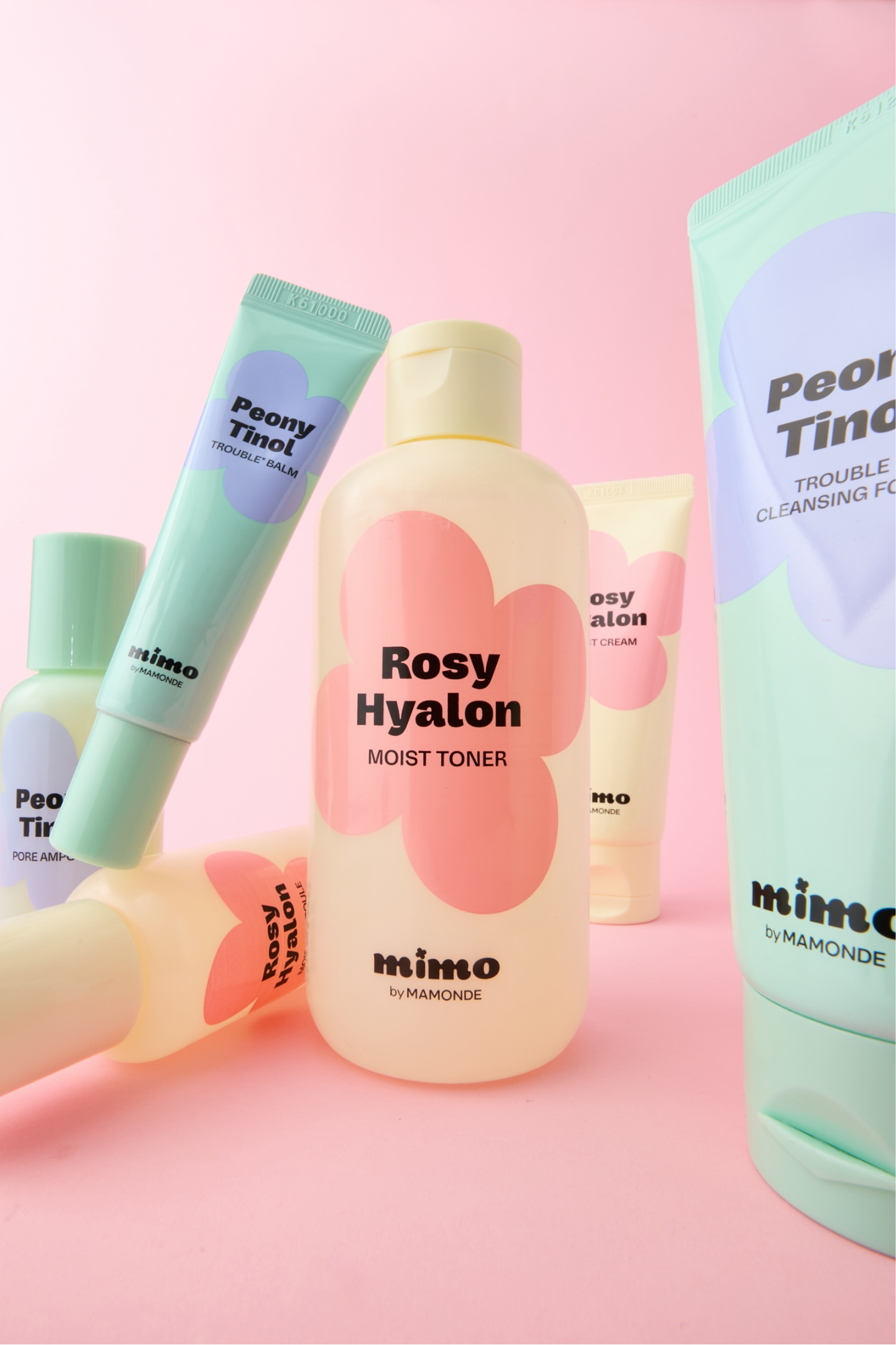
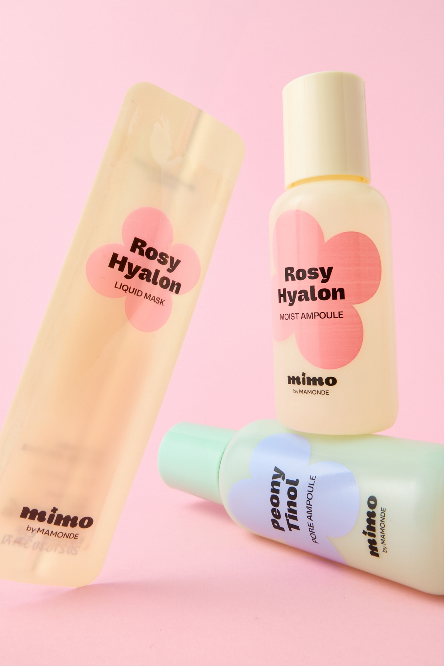
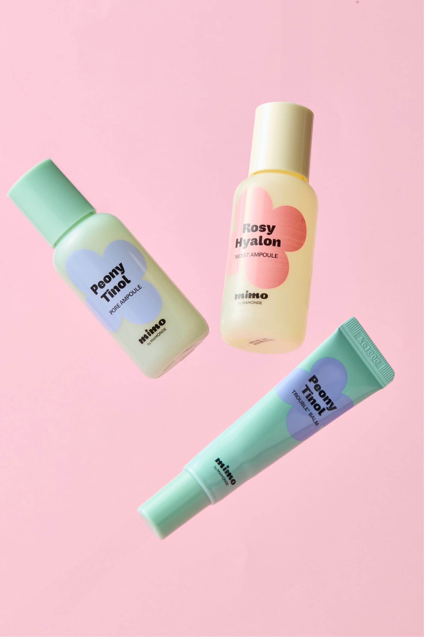
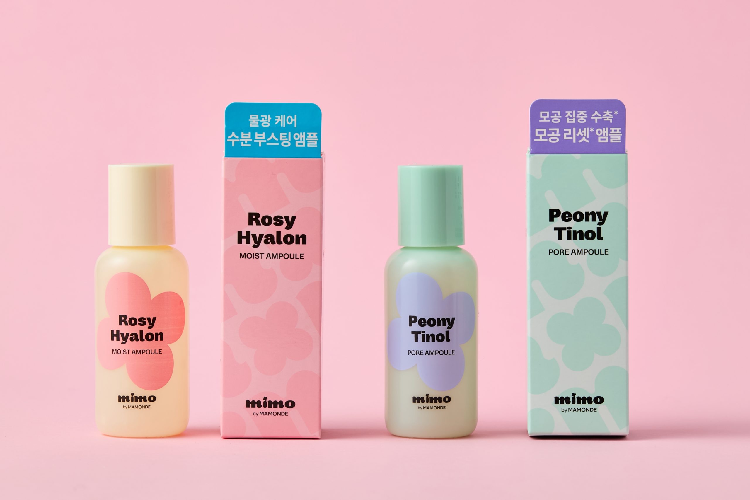
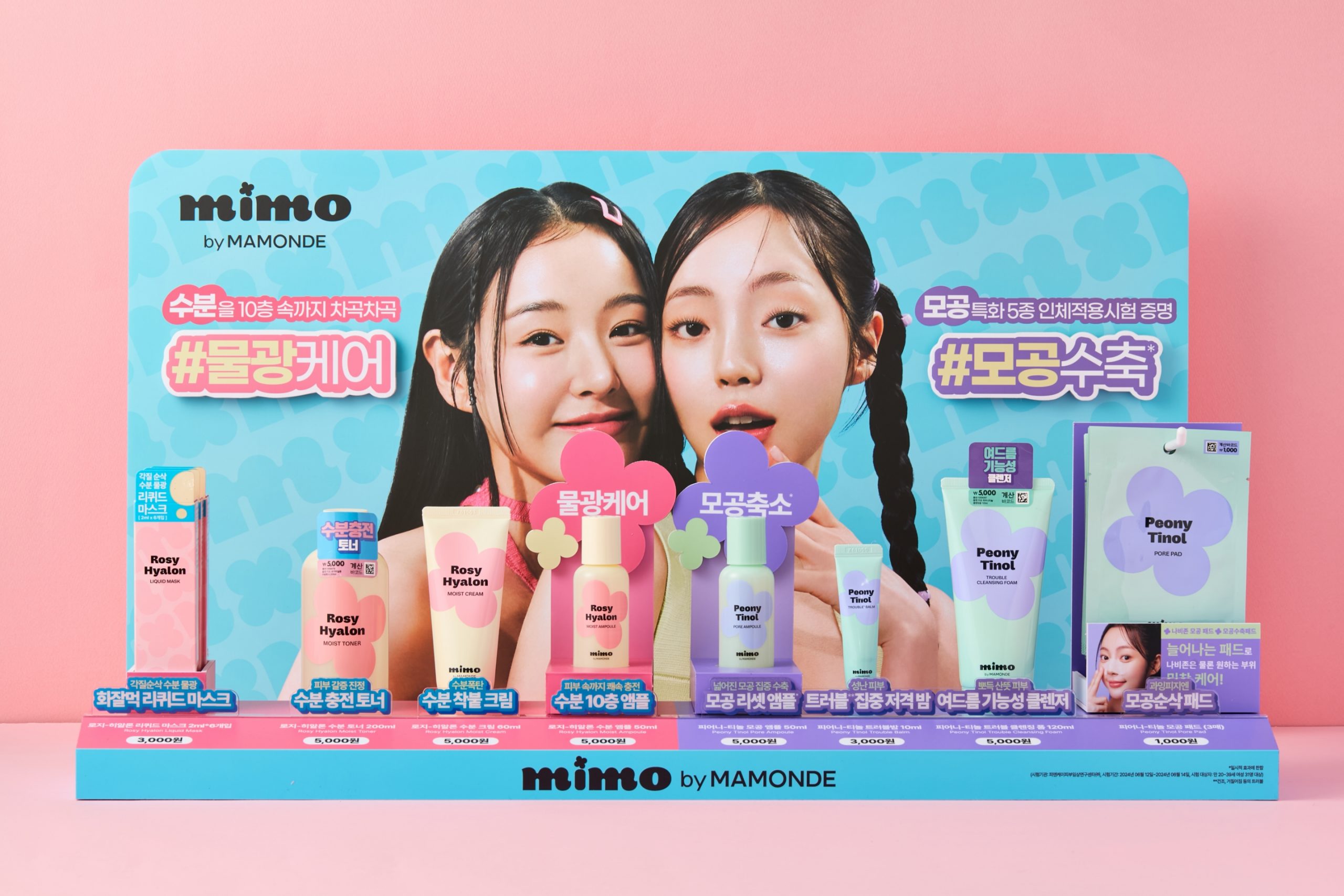
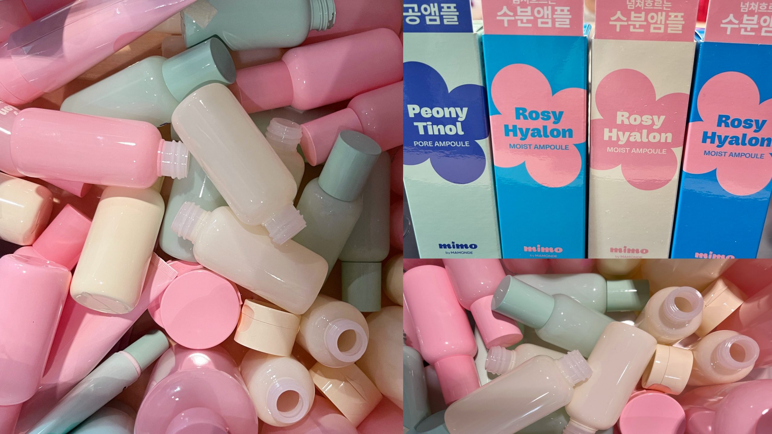
The Mimmo by Mamonde product lineup focuses on entry-level skincare designed to address the key skin concerns of teenage customers: the Rosy-Hyalon line for dry and sensitive skin, and the Peony-Tinol line for pore concerns caused by excess sebum and cleansing.
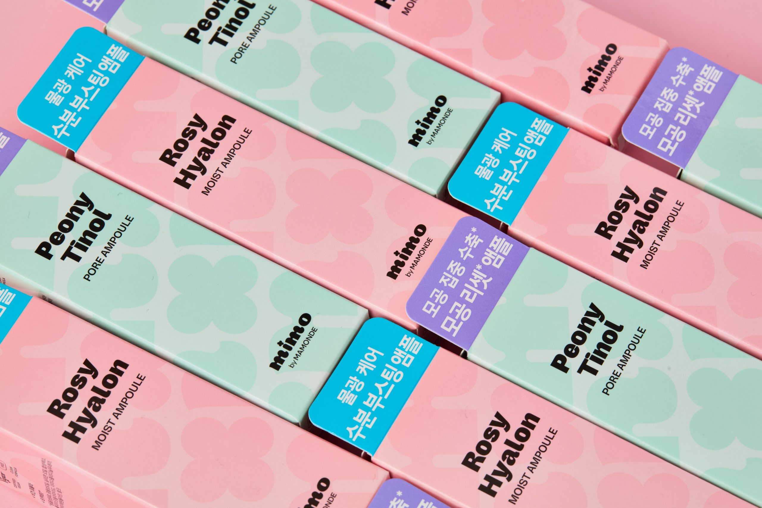
In selecting the line colors, we maintained consistency with the Mamonde brand while incorporating the vibrant and playful sensibility of Daiso’s Gen-Z audience. The color harmonies were inspired by the natural hues of the skincare ingredients and main floral extracts—resulting in a yellow and pink scheme for Rosy-Hyalon and a mint and purple scheme for Peony-Tinol. For the secondary packaging, we designed a playful pattern by arranging the m symbol alongside floral shapes, visually representing the fusion and synergy between beauty and flowers. Vibrant two-tone color contrasts were applied as accents to convey a youthful and energetic brand image.
In selecting the line colors, we maintained consistency with the Mamonde brand while incorporating the vibrant and playful sensibility of Daiso’s Gen-Z audience. The color harmonies were inspired by the natural hues of the skincare ingredients and main floral extracts—resulting in a yellow and pink scheme for Rosy-Hyalon and a mint and purple scheme for Peony-Tinol. For the secondary packaging, we designed a playful pattern by arranging the m symbol alongside floral shapes, visually representing the fusion and synergy between beauty and flowers. Vibrant two-tone color contrasts were applied as accents to convey a youthful and energetic brand image.
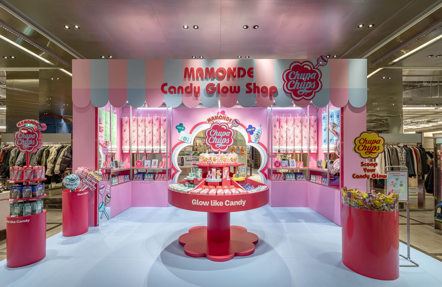
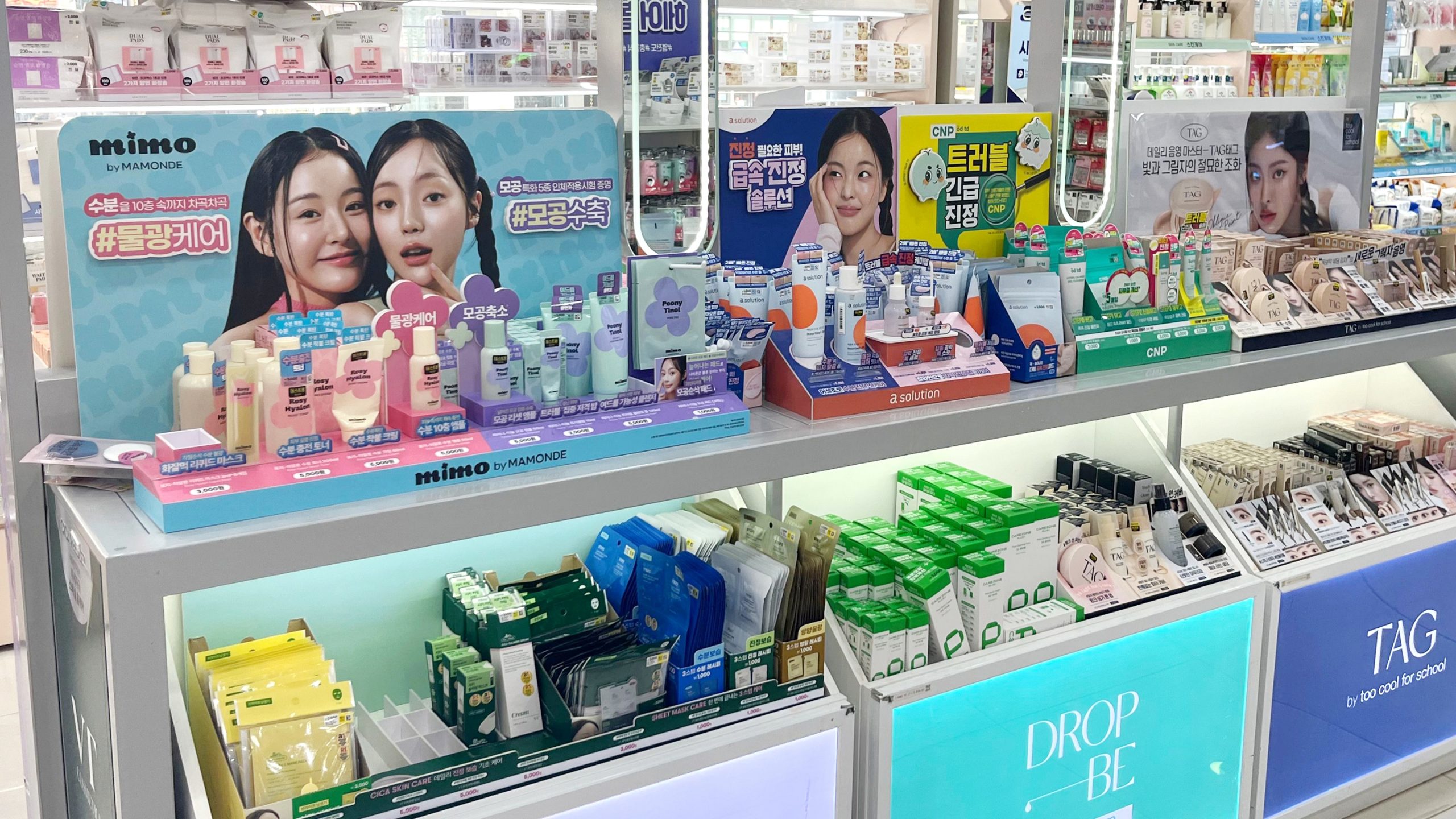
VMD Design
Given Daiso’s diverse product lineup, a distinctive VMD design strategy was essential to stand out among numerous competing brands.
We focused on the back-wall design, which captures the customer’s first impression, incorporating dual model cuts tailored to the two product lines—the Moisture Glow Line and the Pore Care Line.
Blue was selected as the main VMD color to unify the pink and mint tones across both lines, expressing a bright, vibrant, and clean beauty brand mood.
The Best Teamwork, Beauty Avengers
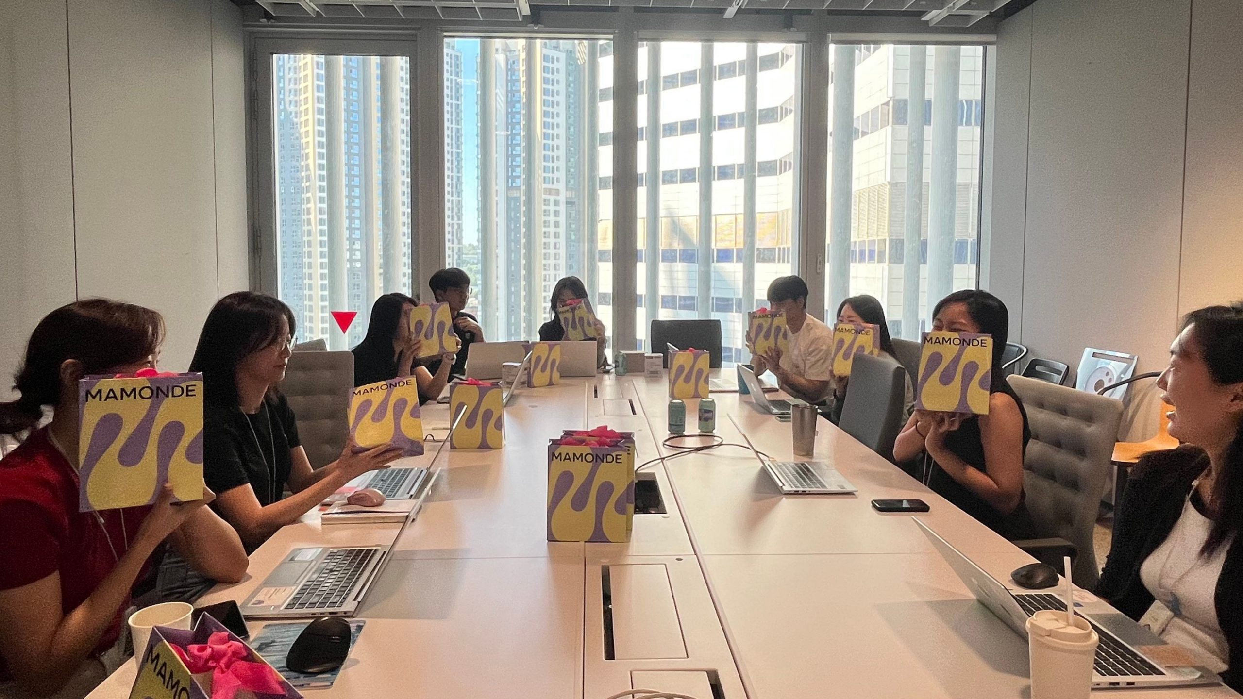
The Beauty by Mamonde Project launched a total of eight product lines in just six months—from its kickoff in March 2024 to the official launch in September. Team members from relevant departments held ten weekly meetings every Thursday at 10 a.m., diligently following up on their assigned tasks to ensure the project was completed with both speed and quality. This project was especially meaningful, as everyone worked together with a shared focus on achieving both efficiency and excellence. Following the launch, the project received highly positive feedback from customers, who praised the products for their “high quality relative to price” and “reliability as essential Daiso beauty items”. We sincerely hope that the brand will continue to grow and become an integral part of customers’ daily beauty routines.
The Beauty by Mamonde Project launched a total of eight product lines in just six months—from its kickoff in March 2024 to the official launch in September. Team members from relevant departments held ten weekly meetings every Thursday at 10 a.m., diligently following up on their assigned tasks to ensure the project was completed with both speed and quality. This project was especially meaningful, as everyone worked together with a shared focus on achieving both efficiency and excellence. Following the launch, the project received highly positive feedback from customers, who praised the products for their “high quality relative to price” and “reliability as essential Daiso beauty items”. We sincerely hope that the brand will continue to grow and become an integral part of customers’ daily beauty routines.
- Amorepacific Creatives
- Product & VMD Design
- Han Jisun, We Ahin
- BM
- Kang Jeonga
- Development
- Oh Juwon, Yeo Minji
- Photography
- Lee Yunjin