AMORE SEONGSU TONER Design story
Summary
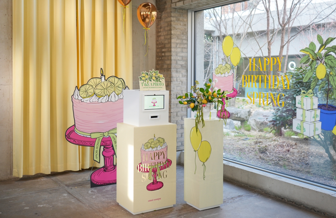
‘Amore Seongsu Toner’ was launched when AMORE Seongsu opened in 2019, and it has a language play that contains the name of Seongsu-dong called
“clean and grateful water” and the name of AMORE Seongsu stores. With the meaning of “clean water,” the project has been redesigned and renewed
for this product, which has been in operation since the opening of the stores by putting the logo of AMORE Seongsu in a transparent and decorative
bottle. As the number of foreign visitors to AMORE Seongsu increases and more customers are looking for exclusive products that can only be bought
at AMORE Seongsu stores, we wanted to renew it with a more signature product.


Concept
First, we considered the key characteristics of the current Seongsu Toner.
The first is that it is a signature product developed to commemorate the opening of Amore Seongsu. The second is that it incorporates playful wordplay using the name “Seongsu.” The third is that it features Hangul-based design.
The goal of this project was to preserve these existing characteristics while enhancing the product’s collectible value. Personally, I found the pun-based design particularly interesting, but it was a bit disappointing that many customers didn’t notice it—so I wanted to make it more recognizable.
We also thought it would be meaningful to infuse the exclusive product with the story of Amore Seongsu itself, to further elevate its collectible value. At first, we considered highlighting aspects of the space’s past—such as its transformation from a car repair shop or its appeal to car enthusiasts. But in the end, we decided to focus on the core essence of Amore Seongsu: love. Amore Seongsu was created to tell stories of love, and it shares the message: “Love makes the world go round.” We believe that love changes us, connects us, and moves the world. In that belief, we are telling stories of love alongside nature—the origin of life and the mother of love. Seongsu represents compassion for small and vulnerable animals, gratitude for neighbors and friends, reverence for seasonal blooms, and love in all the forms that move the world. That’s why we wanted to embed *Amore Seongsu’s love* into the *Amore Seongsu Toner*.
We also thought it would be meaningful to infuse the exclusive product with the story of Amore Seongsu itself, to further elevate its collectible value. At first, we considered highlighting aspects of the space’s past—such as its transformation from a car repair shop or its appeal to car enthusiasts. But in the end, we decided to focus on the core essence of Amore Seongsu: love. Amore Seongsu was created to tell stories of love, and it shares the message: “Love makes the world go round.” We believe that love changes us, connects us, and moves the world. In that belief, we are telling stories of love alongside nature—the origin of life and the mother of love. Seongsu represents compassion for small and vulnerable animals, gratitude for neighbors and friends, reverence for seasonal blooms, and love in all the forms that move the world. That’s why we wanted to embed *Amore Seongsu’s love* into the *Amore Seongsu Toner*.

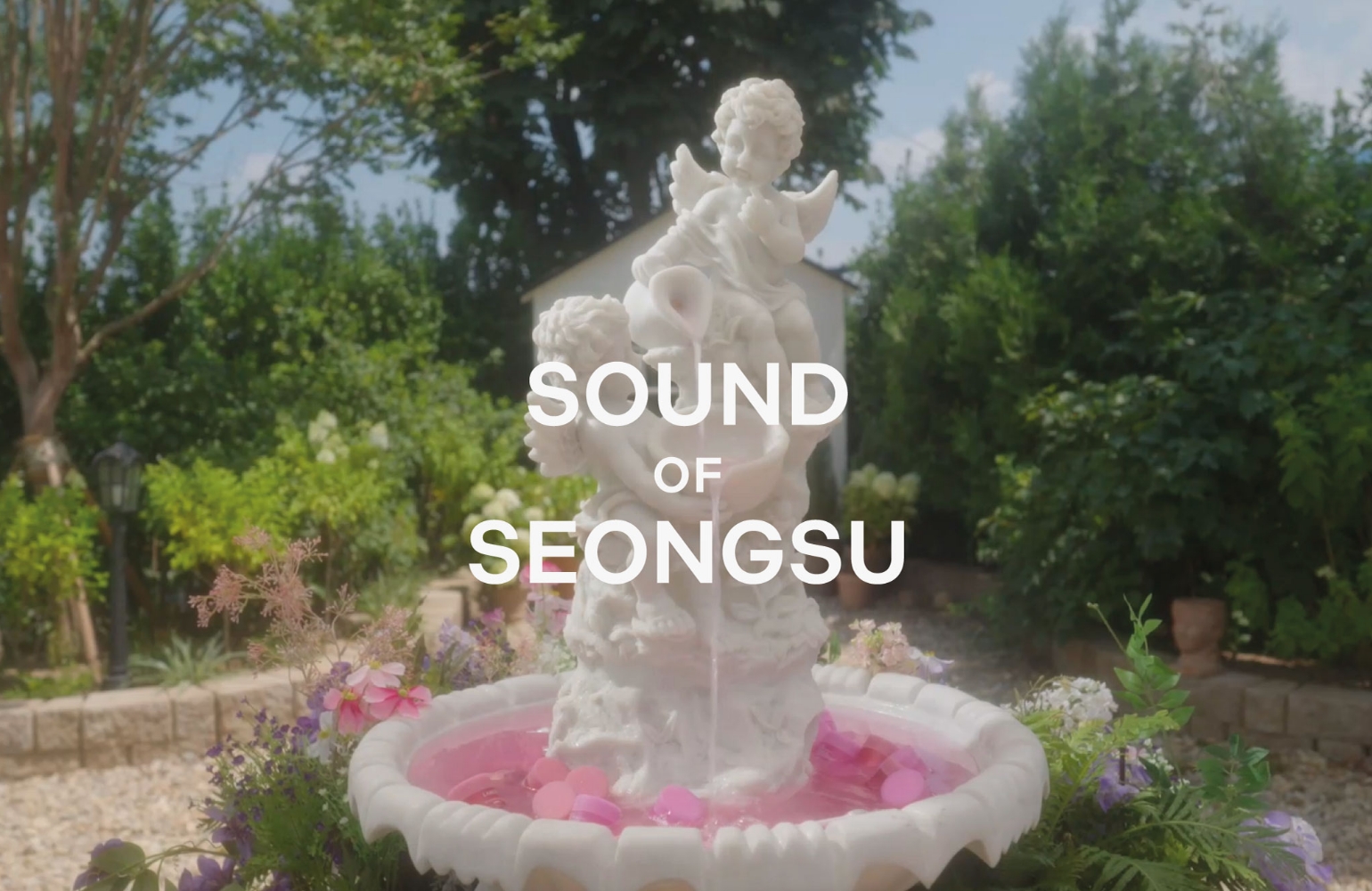
I felt that illustrations would be the most effective way to convey the story.
I wanted the wordplay in “Seongsu” (meaning *holy water*) to be intuitively felt, so I chose a detailed pen illustration style with a mythical aesthetic to bring that nuance to life.
To center the design around the toner product, I selected a fountain—symbolizing *pure water*—as the main motif, and aimed to express the many facets of love conveyed by Amore Seongsu through surrounding elements.
At the heart of the fountain, a central heart radiates love into a blooming forest of affection. Around it, I illustrated: Cupid holding a golden flower, A baby angel playing a love song, A mother bird feeding her chick,
A cat stretching with heart-shaped spots, Heart-shaped clouds formed by the wind, Two swans gazing lovingly at each other. Together, these elements create a scene that visualizes the gentle, ever-present energy of love.


Illustration
The illustrations were created in collaboration with artist Choi Hwan-wook.
When I decided to pursue detailed illustrations, Choi Hwan-wook immediately came to mind—an artist I had been following for a long time. Not only is he exceptionally skilled in intricate pen work, but his signature style—warm and fairy-tale-like—felt like a perfect match for the project’s concept.
Thanks to the charming illustrations he brought to life, I was inspired to expand the product’s main motif and create background illustrations that further developed the world of Seongsu.
The artist also illustrated the Amore Seongsu characters, Cupid and the baby angel, adding a whimsical, fairy-tale touch to the overall design.
Heart-shaped details—such as the bleeding heart flower, a cat’s fur pattern expressed as hearts, and a bird gazing at a face—were thoughtfully woven throughout the artwork, making the illustrations all the more enchanting.
Video
The video was created in collaboration with artist Kim Wan-soo.
Although he primarily works in stop-motion animation, I was drawn to his ability to tell stories through simple movements, which led me to propose the collaboration.
Since the illustrations for Amore Seongsu have a fairy-tale-like quality, it felt only natural to bring them to life through a short animated video.
I also believed that releasing the video alongside the product launch would create a positive synergy.
We planned three videos: a teaser to spark curiosity about the *Forest of Love* story, a looping video featuring the endlessly flowing Seongsu fountain, and a story video that highlights Amore Seongsu’s unique expressions of love.
In the story video, we focused on showcasing the charming illustrations and building a narrative that would immerse viewers in the whimsical world of Seongsu.


Package design
To convey the wordplay of “holy water” to customers, we selected a narrow, rectangular container with proportions similar to those of a traditional holy water bottle.
However, the rounded edges on both sides of the container’s front were wider than expected, which meant the illustrations had to be printed at a smaller size. To address this, we opted for a label format instead of direct printing and spent a considerable amount of time designing a label that would both complement the container and accommodate the graphics.
We aimed for a label size that could include the necessary text around the illustration without appearing too cramped, while also ensuring that the overall shape harmonized with the tone of the artwork. Ultimately, we chose a pointed shape, which better suited the delicacy of the illustrations. The label frame was inspired by those found in old Western books, with careful attention paid to the thickness and contour to ensure it aligned seamlessly with the design.
While the product includes English and Chinese text, we wanted to feature Korean text prominently on the front. One of the key challenges was finding a Korean font that matched the mood of the illustration while remaining highly legible. After extensive exploration, we selected a font that preserves the vertical serif strokes, pairs well with the English serif font, and evokes the feel of handwriting with a pen.
The final decision was the color scheme. We considered a single-tone blue version for a calmer, more refined look, and a full-color version for a more playful and charming appeal. While I personally preferred the single-tone design, after factoring in the retail environment, target age group, and sales conditions, we ultimately moved forward with the full-color version.

Visual
We focused on two key elements: highlighting the product’s *clean water* qualities and conveying the *Forest of Love* illustration concept.
For the shoot, we used water, plaster sculptures, and plants. Since we had little prior experience working with natural materials, we were initially quite concerned. To create a forest-like atmosphere, we deliberately avoided using flowers and instead sourced a wide range of plant materials. We also incorporated plaster sculptures of baby angels to harmonize with the illustrations.
However, arranging the plants in a way that felt natural proved more difficult than expected, and we do regret not experimenting with a broader variety of compositions.
That said, thanks to Sang-woo’s photography, we were able to achieve vibrant results by playing with shadows and close-up shots. The water-based visuals, in particular, effectively emphasized the product’s clean and pure qualities while keeping the focus squarely on the product—something we were very happy with in the end.
- Amorepacific Creatives
- Product Design
- Yoo Suah
- BM
- Shin Heesun
- Illustration
- Choe Hwanuk Artist
- Video
- Han Donghun Artist
- Photography
- Shin Sangwoo