PUZZLE WOOD_Bath bomb
퍼즐우드 베쓰밤
퍼즐우드 배쓰밤은 리미티드 에디션으로 개발되어 2023년 7월 처음 선보였습니다.
퍼즐우드 배쓰밤은 퍼즐우드를 오감으로 느낄 수 있는 힐링 리추얼 특화 제품입니다. 자연 그대로의 원시림을 품은 고혹한 휴식의 향 퍼즐우드 향이 시각, 청각, 촉각, 후각, 나의 모든 감각을 통해 느껴지며, 아무에게도 방 받지 않는 나만의 공간에서 즐기는 나만의 안온한 힐링 시간을 선사해 줍니다.
퍼즐우드 배쓰밤은 퍼즐우드를 오감으로 느낄 수 있는 힐링 리추얼 특화 제품입니다. 자연 그대로의 원시림을 품은 고혹한 휴식의 향 퍼즐우드 향이 시각, 청각, 촉각, 후각, 나의 모든 감각을 통해 느껴지며, 아무에게도 방 받지 않는 나만의 공간에서 즐기는 나만의 안온한 힐링 시간을 선사해 줍니다.
This Article has been translated by AI.
The PUZZLE WOOD Bath Bomb was developed as a limited edition and first debuted in July 2023.
PUZZLE WOOD Bath Balm is a specialized healing ritual that lets you experience PUZZLE WOOD through all five senses. The exquisite relaxing scent of virgin forests, PUZZLE WOOD is experienced through all of your senses – sight, sound, touch, and smell – to create your own private healing experience in your own space, where no one else can disturb you.
퍼즐우드 배쓰밤은 리미티드 에디션으로 개발되어 2023년 7월 처음 선보였습니다.
This Article has been translated by AI.
PUZZLE WOOD Bath Bomb was developed as a limited edition and first debuted in July 2023.
PUZZLE WOOD Bath Bomb was developed as a limited edition and first debuted in July 2023.

퍼즐우드 배쓰밤은 리미티드 에디션으로 개발되어 2023년 7월 처음 선보였습니다. 퍼즐우드 배쓰밤은 퍼즐우드를 오감으로 느낄 수 있는 힐링 리추얼 특화 제품입니다.
자연 그대로의 원시림을 품은 고혹한 휴식의 향 퍼즐우드 향이 시각, 청각, 촉각, 후각, 나의 모든 감각을 통해 느껴지며, 아무에게도 방 받지 않는 나만의 공간에서 즐기는 나만의 안온한 힐링 시간을 선사해 줍니다.
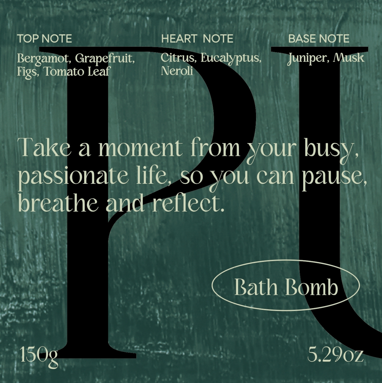
PUZZLE WOOD Bath Bomb is a specialized healing ritual that lets you experience PUZZLE WOOD through all five senses.
The exquisite relaxing scent of virgin forests, PUZZLE WOOD is experienced through all of your senses – sight, sound, touch, and smell – to create your own private healing experience in your own space,
where no one else can disturb you.

배쓰밤 제품의 특성상 규격 / 컬러 / 컬러의 조합 등을 고려해야 했기에 담당 BM과의 논의를 거쳐 중량을 먼저 정한 후 여러 색의 조합을 고려해 보았습니다.
향 / 보습 / 탄산 등의 기능이 포함되어 있어서 한 가지 색상으로만 진행하기에는 단조로워 보일 수 있다는 생각을 했고 이에 따라 3가지 이상의 컬러 조합을 선택하였습니다.
퍼즐우드 브랜드의 아이덴티티인 딥그린 컬러와 잘 조화를 이룰 수 있는 컬러 계열 중 두 가지를 선택 하였고 ‘마일드함’ ‘보습’ 이 느껴질 수 있는 화이트 컬러를 중간에 넣어주어 컬러의 균형감을 잡고자 하였습니다.

Considering the nature of bath bomb products, it was necessary to take into account standards, colors, and color combinations.
After discussions with the responsible Brand Manager, the weight was decided first, and then various color combinations were considered.
The inclusion of features like fragrance, moisturizing, and effervescent made it seem that proceeding with only a single color might result in a lackluster appearance.
As a result, a selection of more than three color combinations was made.
Two colors that would harmonize well with PUZZLE WOOD brand’s identity color of deep green were chosen, and a white color was added to the mix to give a sense of mildness and moisturization, aiming to achieve a balanced palette of colors.


몸과 마음이 힐링되는 동안 아보카도 오일, 올리브 오일, 호호바씨 오일의 블렌딩 작용으로 피부도 보습 힐링 시간을 갖게 됩니다.
식물 유래 성분을 사용하여 프랑스 이브 비건 인증을 받았으며, 미네랄 오일, 실리콘 오일, 동물유래성분, PEG등 유해물질을 함유하지 않아 더욱 안심하고 사용 가능합니다.
식물 유래 성분을 사용하여 프랑스 이브 비건 인증을 받았으며, 미네랄 오일, 실리콘 오일, 동물유래성분, PEG등 유해물질을 함유하지 않아 더욱 안심하고 사용 가능합니다.
While your body and mind are being relaxed, your skin is being moisturized and soothed by a blend of avocado oil, olive oil, and jojoba seed oil.
The plant-derived ingredients are certified vegan by France Eve and are free of mineral oil, silicone oil, animal derivatives, and PEG for added peace of mind.
베쓰밤 제품 관련된 키워드들 중 목욕, 힐링, 여유, 리프레시, 우울감 해소등 감성적인 키워드들이 주로,
촉각, 후각, 시각적 감각등이 활용되는 감성적인 제품 카테고리로 디자인 변주의 필요성을 인지했습니다.
촉각, 후각, 시각적 감각등이 활용되는 감성적인 제품 카테고리로 디자인 변주의 필요성을 인지했습니다.
The keywords related to Bath bomb products are mainly emotional keywords such as bath, healing, relaxation, refreshment, and depression relief,
As an emotional product category that utilizes touch, smell, and visual senses, we recognized the need to change the design.
As an emotional product category that utilizes touch, smell, and visual senses, we recognized the need to change the design.


패키지 디자인은 베쓰밤을 경험하면서 연상되는 상상속의 무디한 씬을 연상할 수 있도록,
회화적 감성을 담은 아트웍을 활용해 깊은 숲속 휴식의 향 , 기분등의 감성을 시각화 하고자 했습니다.
회화적 감성을 담은 아트웍을 활용해 깊은 숲속 휴식의 향 , 기분등의 감성을 시각화 하고자 했습니다.
The package design is meant to evoke a moody scene from the imagination of experiencing Bath Bomb,
We wanted to visualize the scent, mood, and feelings of relaxation in the deep forest by using artwork with a painterly sensibility.
We wanted to visualize the scent, mood, and feelings of relaxation in the deep forest by using artwork with a painterly sensibility.


회화적 터치감을 강조한 아트웍 위로 쉼의 메세지를 전하는 세리프가 강조된 서체가 매칭되어 감성적인 무드를 더했습니다.
정사각 비율의 단상자 레이아웃을 기존 단상자 레이아웃에서 어느 정도로 변주의 정도를 가져갈지 많은 고민이 있었고,
여러 번의 스터디를 통해 변주의 정도를 테스트해 보며, 로고와 서체의 배치에 과감한 변화를 주었습니다.
정사각 비율의 단상자 레이아웃을 기존 단상자 레이아웃에서 어느 정도로 변주의 정도를 가져갈지 많은 고민이 있었고,
여러 번의 스터디를 통해 변주의 정도를 테스트해 보며, 로고와 서체의 배치에 과감한 변화를 주었습니다.
The artwork, which emphasizes a painterly touch, is matched with a typeface that emphasizes serifs that convey the message of rest,
adding to the emotional mood. There was a lot of thought about how much to deviate from the existing single box layout with square proportions, We did several studies to test how far we could go, and made drastic changes to the placement of the logo and typeface.
adding to the emotional mood. There was a lot of thought about how much to deviate from the existing single box layout with square proportions, We did several studies to test how far we could go, and made drastic changes to the placement of the logo and typeface.
회화적 터치감을 강조한 아트웍 위로 쉼의 메세지를 전하는 세리프가 강조된 서체가 매칭되어 감성적인 무드를 더했습니다.
정사각 비율의 단상자 레이아웃을 기존 단상자 레이아웃에서 어느 정도로 변주의 정도를 가져갈지 많은 고민이 있었고,
여러 번의 스터디를 통해 변주의 정도를 테스트해 보며, 로고와 서체의 배치에 과감한 변화를 주었습니다.
정사각 비율의 단상자 레이아웃을 기존 단상자 레이아웃에서 어느 정도로 변주의 정도를 가져갈지 많은 고민이 있었고,
여러 번의 스터디를 통해 변주의 정도를 테스트해 보며, 로고와 서체의 배치에 과감한 변화를 주었습니다.


- Amorepacific Creatives
- Design
- 김유정, 조아라
- Visual Directing
- 우시아
- Photography
- 신상우
- BM
- 여지예
- MC
- 전채린